


In a previous article, I showed you how to create two types of CSS loaders: a spinner and a progress bar. In this article, you’ll learn about another variation called a filling CSS loader.
I think a demo is worth thousands of words, so check out this Codepen:
In the above Pen, I’m showing you four different CSS filler-style loaders – but we can make even more. You can check out this collection I created to see more than 20 different loaders.
You might think the article is going to be super long – I mean, how long will it take to explain how to create 20 different CSS loaders?
Well don’t worry – this tutorial will be super quick, because I’ll show a few CSS tricks that help you create as many variation as you want. The loaders look different, but all of them rely on the same techniques. By simply adjusting a few setting you can get a whole new loader.
The Initial Loader Configuration
Like all the CSS Loaders I create, the HTML code is a simple as a single element. Nothing more! Here’s what it looks like:
<div class="loader">Loading</div>
Then we apply the following CSS:
.loader {
  font-weight: bold;
  text-transform: uppercase;
  color: #0000; /* or transparent */
  -webkit-text-stroke: 1px #000;
}
Nothing fancy so far. We make the text transparent and we add a black stroke to it. Here’s what that looks like:

The -webkit-text-stroke is still tagged as experimental, but it has good browser support so you should be able to use it without any issues. This said, it’s always good to test your code in different browsers to make sure everything works fine.
How to Fill the Text with Colors
Now it’s time to fill our text (that’s why this technique is called the Filling CSS loaders!). To do this, we are going to rely on gradients and background-clip: text. Here’s the code:
.loader {
  background-image: conic-gradient(#000 0 0);
  background-position: left;
  background-size: 40% 100%;
  background-repeat: no-repeat;
  background-clip: text;
}
Or the shorthand version if you prefer more compact code:
.loader {
  background:
    conic-gradient(#000 0 0) text
    left/40% 100% no-repeat;
}
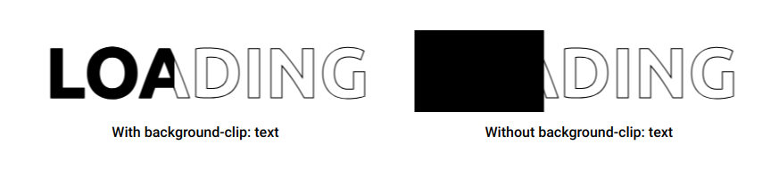
The above figure illustrates the difference between using or not using background-clip: text. It’s pretty clear that the left result is what we are aiming for. We are limiting the background coloration to only the text instead of the whole element.
The conic-gradient(#000 0 0) looks strange, right? It lets you have a one-color gradient. I wrote a small tip about it that I invite you to read to understand why we’re using that particular syntax in this article, “How to correctly define a one-color gradient“.
Believe it or not, we’re almost done because we have everything we need to make the CSS loaders. For the first loader, we simply animate the background-size as follows:
#l1 {
  animation: l1 1s linear infinite;
}
@keyframes l1 {  /*  width  height */
  0% {background-size: 0%   100%}
  to {background-size: 120% 100%}
}
We start with a width equal to 0% until we reach a width equal to 120%. I could have used 100%, but I want the full coloration to stay longer so I am using a value bigger than 100%. As for the height (the second value of the background-size), it remains at 100%.
The second loader uses the same animation, but instead of a linear timing function, we use steps() to have a discrete animation.
#l2 {
  font-family: monospace;
  animation: l2 2s steps(8, jump-none) infinite;
}
@keyframes l2 {
  0% {background-size: 0%           100%}
  to {background-size: 100% 100%}
}
The text contains 7 characters so we use 8 steps (N + 1). I am also using a monospace font to make sure all the characters have the same width. In case you are wondering about the jump-none value, read the following: How to correctly use steps() with animations.
That’s basically the main trick. By animating the background properties, we create different kinds of loaders. It’s either the background-size like the previous ones or the background-position like the below:
Can you figure out how they work before checking my code? This will be your first homework!
How to Use Multiple Gradients
Using one gradient is enough to create a lot of variations – but we can do even more if we introduce multiple gradients. If you check the fourth loader of the first demo, you’ll see that I’m using seven gradients – one gradient per character.
#l4 {
  font-family: monospace;
  --g: conic-gradient(#000 0 0) no-repeat text;
  background: var(--g) 0,var(--g) 1ch,var(--g) 2ch,var(--g) 3ch,var(--g) 4ch,var(--g) 5ch,var(--g) 6ch;
  background-position-y: bottom;
  animation: l4 3s infinite;
}
@keyframes l4 {
  0%     {background-size: 1ch 0   ,1ch 0   ,1ch 0   ,1ch 0   ,1ch 0   ,1ch 0   ,1ch 0   }
  14.28% {background-size: 1ch 100%,1ch 0   ,1ch 0   ,1ch 0   ,1ch 0   ,1ch 0   ,1ch 0   }
  28.57% {background-size: 1ch 100%,1ch 100%,1ch 0   ,1ch 0   ,1ch 0   ,1ch 0   ,1ch 0   }
  42.85% {background-size: 1ch 100%,1ch 100%,1ch 100%,1ch 0   ,1ch 0   ,1ch 0   ,1ch 0   }
  57.14% {background-size: 1ch 100%,1ch 100%,1ch 100%,1ch 100%,1ch 0   ,1ch 0   ,1ch 0   }
  71.43% {background-size: 1ch 100%,1ch 100%,1ch 100%,1ch 100%,1ch 100%,1ch 0   ,1ch 0   }
  85.71% {background-size: 1ch 100%,1ch 100%,1ch 100%,1ch 100%,1ch 100%,1ch 100%,1ch 0   }
  100%   {background-size: 1ch 100%,1ch 100%,1ch 100%,1ch 100%,1ch 100%,1ch 100%,1ch 100%}
}
I’m using the same gradient, so we consider a CSS variable --g to avoid repetition. Then, I call that variable 7 times inside the background property. All the gradients have the same Y position (bottom) but a different X position. That’s why you see the 0, 1ch, 2ch, …,6ch.
Now if you check the animation, I’m simply animating the height of each gradient individually. At 0%, all of them have a height equal to 0. Then I update their height one by one until all of them are at 100%. The width doesn’t change – it’s always equal to 1ch (the width of one character).
It may look difficult at first glance, but if you think about it one gradient at a time, it’s pretty simple.
What about the third loader, you might ask? For that one, I will rely on my online generator for wavy shapes to generate the gradient configuration:
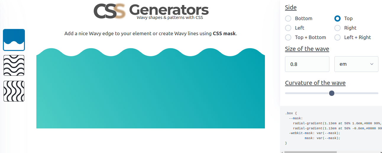
Then I animate the background-position like below:
#l3 {
  background:
    radial-gradient(1.13em at 50% 1.6em,#000 99%,#0000 101%) calc(50% - 1.6em) 0/3.2em 100%,
    radial-gradient(1.13em at 50% -0.8em,#0000 99%,#000 101%) 50% .8em/3.2em 100% repeat-x;
  background-clip: text;
  animation: l3 2s linear infinite;
}
@keyframes l3 {
  0% {background-position: calc(50% - 1.6em) 0,     50%          .8em}
  to {background-position: calc(50% + 1.6em) 0,calc(50% + 3.2em) .8em}
}
This one is probably a bit trickier, but it’s another example to illustrate all the possibilities. From the simple gradient configuration to the most complex one, we can create as many loaders as we want.
What about creating your own CSS loader? You can use what you have learned from the article and try to create a loader that is not part of my collection. The best way to learn is to practice – so give it a try!
Conclusion
By creating some cool loaders, we went through a bunch of CSS tricks related to gradients and backgrounds. Even if creating loaders is not your goal, you can always re-use the same tricks to do something else.
Don’t forget to check my CSS Tip blog where I am sharing cool CSS tricks and demos.
Learn to code for free. freeCodeCamp's open source curriculum has helped more than 40,000 people get jobs as developers. Get started