


When dealing with complex CSS animations, there is a tendency to create expansive @keyframes with lots of declarations. There are a couple of tricks though that I want to talk about that might help make things easier, while staying in vanilla CSS:
The first one is more widely used and familiar but the second one is less common. There could be good reasons for that — chaining animations with commas is relatively easier than grokking the various timing functions that are available to us and what they do. There’s one especially neat timing function that gives us total control to create custom timing functions. That would be cubic-bezier() and in this post I will show you the power of it and how it can be used to create fancy animation without too much complexity.
Let’s start with a basic example showing how we can move a ball around in interesting directions, like an infinity (∞) shape:
As you can see, there is no complex code — only two keyframes and a cubic-bezier() function. And yet, a pretty complex-looking final infinity-shape animation is what we get.
Cool, right? Let’s dig into this!
cubic-bezier() functionLet’s start with the official definition:
A cubic Bézier easing function is a type of easing function defined by four real numbers that specify the two control points, P1 and P2, of a cubic Bézier curve whose end points P0 and P3 are fixed at (0, 0) and (1, 1) respectively. The x coordinates of P1 and P2 are restricted to the range [0, 1].
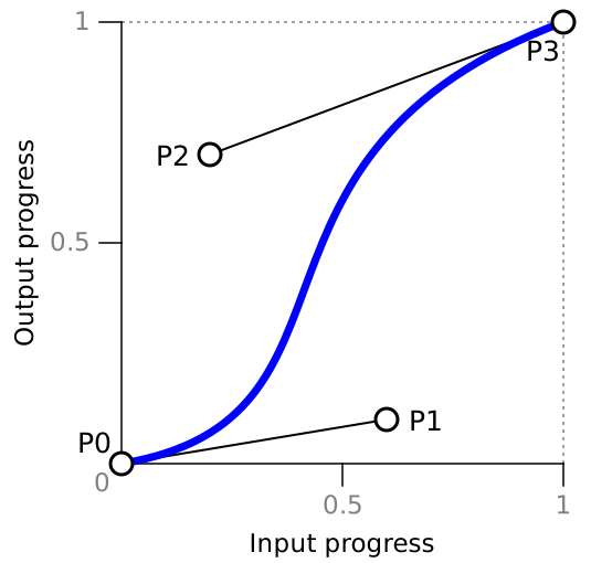
The above curve defines how the output (y-axis) will behave based on the time (x-axis). Each axis has a range of [0, 1] (or [0% 100%] ). If we have an animation that lasts two-second (2s), then:
0 (0%) = 0s
1 (100%) = 2s
If we want to animate left from 5px to 20px, then:
0 (0%) = 5px
1 (100%) = 20pxX, the time, is always restricted to [0 1]; however, Y, the output, can go beyond [0 1].
My goal is to adjust P1 and P2 in order to create the following curves:
You may think this is impossible to achieve because, as stated in the definition, P0 and P3 are fixed at (0,0) and (1,1) meaning they cannot be on the same axis. That’s true, and we will use some math tricks to “approximate” them.
Let’s start with the following definition: cubic-bezier(0,1.5,1,1.5). That gives us the following curve:

cubic-bezier(0,1.5,1,1.5)Our goal is to move (1,1) and make it at (0,1) which isn’t technically possible. So we will try to fake it.
We previously said that our range is [0 1] (or [0% 100%]) so let’s imagine the case when 0% is very close to 100%. If, for example, we want to animate top from 20px (0%) to 20.1px (100%) then we can say that both the initial and final states are equal.
Hm, but our element will not move at all, right?
Well, it will move a little because the Y value exceeds 20.1px (100%). But that’s not enough to give us perceptible movement:
Let’s update the curve and use cubic-bezier(0,4,1,4) instead. Notice how our curve is way taller than before:

But yet, still no movement — even if the top value is crossing 3 (or 300%). Let’s try cubic-bezier(0,20,1,20):

Yes! it started to move a little. Did you notice the evolution of the curve each time we increase the value? It’s making our point (1,1) “visually” closer to (0,1) when we zoom out to see the full curve and this is the trick.
By using cubic-bezier(0,V,1,V) where V is some very big value and both the initial and final states are very close together (or almost equal), we can simulate the parabolic curve.
An example is worth a thousand words:
I applied the “magic” cubic-bezier function in there to the top animation, plus a linear one applied to left. This gives us the curve we want.
For those of you math-minded folks out there, we can break that explanation down further. A cubic bezier can be defined using the following formula:
P = (1−t)³P0 + 3(1−t)²tP1 + 3(1−t)t²P2 + t³P3Each point is defined as follows: P0 = (0,0), P1 = (0,V), P2 = (1,V), and P3 = (1,1).
This gives us the two functions for x and y coordinates:
X(t) = 3(1−t)t² + t³ = 3t² - 2t³Y(t) = 3(1−t)²tV +3(1−t)t²V + t³ = t³ - 3Vt² + 3VtV is our big value and t is within the range [0 1]. If we consider our previous example, Y(t) will give us the value of top while X(t) is the time progress. The points (X(t),Y(t)) will then define our curve.
Let’s find the maximum value of Y(t). For this, we need to find the value of t that will give us Y'(t) = 0 (when the derivative is equal to 0):
Y'(t) = 3t² - 6Vt + 3VY'(t) = 0 is a quadratic equation. I will skip the boring part and will give you the result, which is t = V - sqrt(V² - V).
When V is a large value, t will be equal to 0.5. So, Y(0.5) = Max and X(0.5) will be equal to 0.5. That means we reach the maximum value at the halfway point in the animation, which conforms to the parabolic curve we want.
Also, Y(0.5) will give us (1 + 6V)/8 and this will allow us to find the max value based on V. And since we will always use a big value for V, we can simplify to 6V/8 = 0.75V.
We used V = 500 in the last example, so the max value there would come out to 375 (or 37500%) and we get the following:
0): top: 200px1): top: 199.5pxThere’s a difference of -0.5px between 0 and 1. Let’s call it the increment. For 375 (or 37500%) we have an equation of 375*-0.5px = -187.5px. Our animated element is reaching top: 12.5px (200px - 187.5px) and gives us the following animation:
top: 200px (at 0% of the time ) → top: 12.5px (at 50% of the time) → top: 199.5px (at 100% of the time)
Or, expressed another way:
top: 200px (at 0%) → top: 12.5px (at 50%) → top: 200px (at 100%)Let’s do the opposite logic. What value of V should we use to make our element reach top: 0px? The animation will be 200px → 0px → 199.5px, so we need -200px to reach 0px. Our increment is always equal to -0.5px. The max value will be equal to 200/0.5 = 400, so 0.75V = 400 which means V = 533.33.
Our element is touching the top!
Here is a figure that sums up that math we just did:

We will use almost the exact same trick to create a sinusoidal curve but with a different formula. This time we will use cubic-bezier(0.5,V,0.5,-V)
Like we did before, let’s see how the curve will evolve when we increase the value:

I think you probably get the idea by now. Using a big value for V gets us close to a sinusoidal curve.
Here’s another one with a continuous animation — a real sinusoidal animation!
Let’s get in the math for this one! Folllowing the same formula as before, we will get the following functions:
X(t) = 3/2(1−t)²t + 3/2(1−t)t² + t³ = (3/2)t - (3/2)t² + t³Y(t) = 3(1−t)²tV - 3(1−t)t²V + t³ = (6V + 1)t³ - 9Vt² + 3VtThis time we need to find the minimum and maximum values for Y(t). Y'(t) = 0 will give us two solutions. After solving for this:
Y'(t) = 3(6V + 1)t² - 18Vt + 3V = 0…we get:
t' = (3V + sqrt(3V² - V))/(6V + 1)t''= (3V - sqrt(3V² - V))/(6V + 1)For a big value of V, we have t'=0.211 and t"=0.789. That means that Y(0.211) = Max and Y(0.789) = Min. That also means that X(0.211)= 0.26 and X(0.789) = 0.74. In other words, we reach the Max at 26% of the time and Min at 74% of the time.
Y(0.211) is equal to 0.289V and Y(0.789) to -0.289V. We got those values with some rounding considering that V is very big.
Our sinusoidal curve should also cross the x-axis (or Y(t) = 0) at half the time (or X(t) = 0.5). In order to prove this, we use the second derivate of Y(t) — which should be equal to 0 — so Y''(t) = 0.
Y''(t) = 6(6V + 1)t - 18V = 0The solution is 3V/(6V + 1), and for a big V value, the solution is 0.5. That give us Y(0.5) = 0 and X(0.5) = 0.5 which confirms that our curve crosses the (0.5,0) point.
Now let’s consider the previous example and try to find the value of V that gets us back to top: 0%. We have:
0): top: 50%1): top: 49.9%-0.1%We need -50% to reach top: 0%, so 0.289V*-0.1% = -50% which gives us V = 1730.10.
As you can see, our element is touching the top and disappearing at the bottom because we have the following animation:
top: 50% → top: 0% → top: 50% → top: 100% → top: 50% → and so on ... A figure to sum up the calculation:

And an example to illustrate all curves together:
Yes, you see four curves! If you look closely, you will notice that I am using two different animations, one going to 49.9% (an increment of -0.01%) and another going to 50.1% (an increment of +0.01%). By changing the sign of the increment, we control the direction of the curve. We can also control the other parameters of the cubic bezier (not the V one that should remain a big value) to create more variations from the same curves.
And below, an interactive demo:
Let’s get back to our initial example of a ball moving around in the shape of an infinity symbol. I simply combined two sinusoidal animations to make it work.
If we combine what we did previously with the concept of multiple animations, we can get astonishing results. Here again is the initial example, this time as an interactive demo. Change the values and see the magic:
Let’s go further and add a little CSS Houdini to the mix. We can animate a complex transform declaration thanks to @property (but CSS Houdini is limited to Chrome and Edge support at the moment).
What kind of drawings can you make with that? Here is a few that I was able to make:

And here is a spirograph animation:
And a version without CSS Houdini:
There’s a few things to take away from these examples:
cubic-bezier() function.The same technique can also be used with the CSS transition property since it follows the same logic when it comes to timing functions. This is great because we’re able to avoid keyframes when creating some complex hover effect.
Here’s what I made without keyframes:
Mario is jumping thanks to the parabolic curve. We needed no keyframes at all to create that shake animation on hover. The sinusoidal curve is perfectly capable of doing all the work.
Here is another version of Mario, this time using CSS Houdini. And, yep, he’s still jumping thanks to the parabolic curve:
For good measure, here are more fancy hover effects without keyframes (again, Chrome and Edge only):
Now you have some magic cubic-bezier() curves and the math behind them. The benefit, of course, is that custom timing functions like this let us do fancy animations without the complex keyframes we generally reach for.
I understand that not everyone is math-minded and that’s okay. There are tools to help, like Matthew Lein’s Ceaser, which lets you drag the curve points around to get what you need. And, if you don’t already have it bookmarked, cubic-bezier.com is another one. If you want to play with cubic-bezier outside the CSS world, I recommend desmos where you can see some math formulas.
Regardless of how you get your cubic-bezier() values, hopefully now you have a sense of their powers and how they can help make for nicer code in the process.
此内容由惯性聚合(RSS阅读器)自动聚合整理,仅供阅读参考。 原文来自 — 版权归原作者所有。