


In a previous article, I showed you how to create some fancy shapes that you can use as section dividers on your websites (a slanted divider, an arrow divider, and others). In this article, we will study and learn how to make more CSS shapes using the same technique.
Here is an overview of the shapes we’ll look at here, applied to the header of my freeCodeCamp profile:
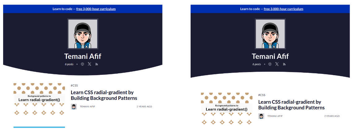
Cool right? Both designs are commonly used as section dividers. We will learn together how to create such shapes with some simple code.
Before we start, you can find the code of the shapes we are making (and more!) within my online collection. You can easily copy the code from there – but don’t go away right now! Understanding the logic behind the code is also important and will help you customize it to fit your needs.
How to Create a Rounded Edge using clip-path
Let’s start with the first shape: The rounded edge. It may sound surprising, but the code to create such a shape is as simple as one CSS declaration:
.rounded-edge {
  clip-path: ellipse(85% 100% at top);
}
Let’s draw a figure to understand how an “ellipse” creates a rounded edge shape.
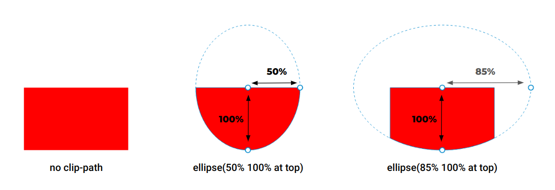
We start with a rectangle element with no clip-path applied to it. Then, we add clip-path: ellipse(50% 100% at top). As you can see, we have the ellipse shape. Its center is at the “top center” of the element and its radii are equal to 50% horizontally and 100% vertically. The shape is overflowing the element boundaries, which is why we only see the bottom half part of it. The top half is clipping nothing.
So you might be wondering: I said “top center”, but why in the code do we only have “top”?
By default, if we don’t specify the position it will be the center of the element. This is equivalent to “center”, “center center”, “50%” or “50% 50%”. Note how we can either define one value or two values. If the second value is omitted, it will be equal to “center” so defining “top” is the same as “top center”.
You don’t need to remember all the cases. Using the keywords such as "top”, “left”, and so on is, most of the time, enough – unless you need to create a custom shape (we will see this later on).
Let’s get back to the previous figure. If we increase the horizontal radius and make it bigger than 50% (85% for example), the ellipse will get bigger and will logically cover a bigger area. You start to see the trick, right? In the end, it’s only a portion at the bottom of the ellipse that is visible – the rounded edge we want!
As a bonus, it’s responsive, since we are relying on percentage values. The horizontal radius is relative to the width while the vertical one is relative to the height. This said, you can also rely on pixel values if you want a fixed size for your ellipse. In some cases, it can give a better result.
Here is a demo showing both cases. Resize the screen to notice the difference:
So what about the other variation? We just have to change “top” with “bottom”, right?
Exactly! By changing the center of the ellipse, you change the placement of the rounded edge and easily get the four directions.
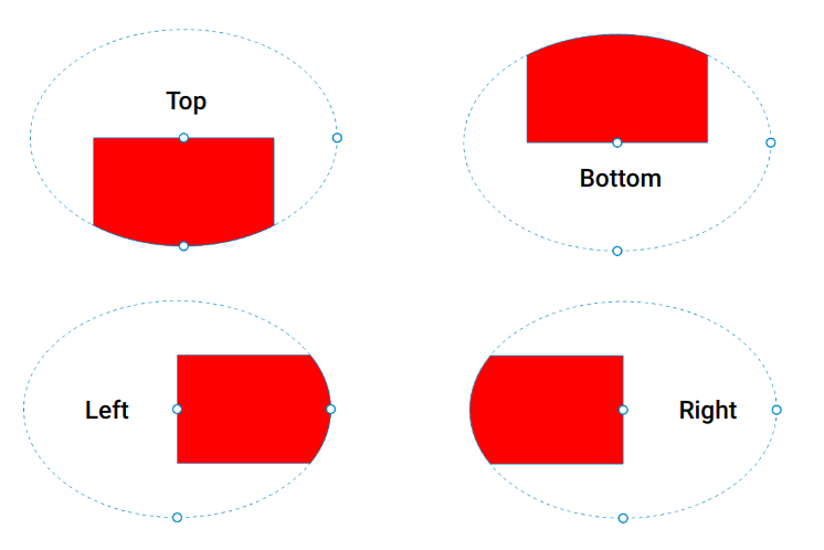
You can also get a more custom shape if you adjust the center of the ellipse using percentage values. Like for example using 30% 0% to get a rounded edge shifted to the left (note that top is equivalent to 50% 0%).
A lot of possibilities with only one line of code!
Go check the online version where you can find more examples and easily customize the shape by adjusting the existing code.
Let’s move to the second shape: the curved edge. This one is also pretty easy to create as it requires one line of code as well.
.curved-edge {
  mask: radial-gradient(60% 70px at bottom,#0000 100%,#000);
}
This time, we are going to rely on mask instead of clip-path but the logic is the same. We will hide some parts of the element and keep the remaining visible. When using mask, the hidden part is the transparent color of the gradient (the #0000) while the visible part is the opaque color of the gradient (the #000).
It doesn’t really matter which color you use, only the transparency of the color matters. So you are free to use any color syntax you want. Here’s an example using the rgb() syntax:
.curved-edge {
  mask: radial-gradient(60% 70px at bottom,rgb(0 0 0/0%) 100%,rgb(0 0 0/100%));
}
Or color names:
.curved-edge {
  mask: radial-gradient(60% 70px at bottom,transparent 100%,black);
}
And here is a figure to illustrate how it works.
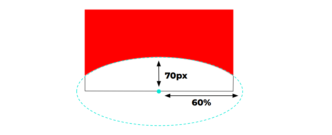
Similar to the ellipse function of the clip-path, the radial-gradient() will also create an ellipse shape. The only difference is that this time we will hide the inside part of the ellipse and show the outside part. And thanks to the overflowing part, we get the curved shape we want.
I think you know the rest of the story now. By adjusting the radii and the position of the center of the ellipse, we get the different variations. As a small homework assignment, try to update the previous code to get the top, left, and right directions. You can compare what you have found with my implementation.
When using this method, make sure you have enough space at the bottom. Unlike the rounded edge, the curved edge may hide some of your content at the bottom so it’s always good to include a padding equal to the vertical radius.
.curved-edge {
  padding-bottom: 70px;
  mask: radial-gradient(60% 70px at bottom,#0000 100%,#000);
}
How to Combine Both of These CSS Shapes
What about having both curves so you can create a curved rectangle shape? It’s possible by simply combining both bits of code like this:
.curved-rectangle {
  /* curved edge at the bottom */
  mask: radial-gradient(60% 70px at bottom,#0000 100%,#000);
  /* rounded edge at the top */
  clip-path: ellipse(80% 100% at bottom);
}
See it in play:
And the opposite effect by changing bottom with top:
.curved-rectangle {
  /* curved edge at the top */
  mask: radial-gradient(60% 70px at top,#0000 100%,#000);
  /* rounded edge at the bottom */
  clip-path: ellipse(80% 100% at top);
}
You will notice that I am either using top everywhere or bottom everywhere which makes both pieces of code easy to remember.
Now you might be wondering – how can we have the same curves and the top and bottom?
As you may have noticed, both curves don’t match, which makes the whole shape kind of broken. But we can fix this. We need to make sure both parts of the code create the same ellipse shape by setting the same radii.
.curved-header {
  /* curved edge at the top */
  mask: radial-gradient(80% 100% at top,#0000 100%,#000);
  /* rounded edge at the bottom */
  clip-path: ellipse(80% 100% at top);
}
Note the “80% 100% at top” which is the same in both declarations – but nothing will be visible if we use this code. Don’t forget that the clip-path will hide the outside part of the ellipse while the gradient will hide the inside part. So if both ellipses are the same, everything will be hidden.
To fix this, we have to offset the gradient and move it to the top to get the following:
.curved-rectangle {
  /* curved edge at the top */
  mask: radial-gradient(80% 100% at 50% -78% /* instead of 50% 0% */,#0000 100%,#000);
  /* rounded edge at the bottom */
  clip-path: ellipse(80% 100% at top);
}
The shape is now perfect and both curves are aligned.
If you don’t like to use magic numbers like the “-78%”, we can consider some math to get accurate results:
.curved-rectangle {
  --c: 80; /* control the curve */

  mask:
    radial-gradient(calc(var(--c)*1%) 100%
     at 50% calc(-100%*cos(asin(50/var(--c)))),
     #0000 100%,#000);
  clip-path: ellipse(calc(var(--c)*1%) 100% at top);
}
The code looks more complex (I will skip the boring geometry explanation) but you can easily control the curve by adjusting a single value.
So what about the bottom version? We update the code like the below:
.curved-rectangle {
  --c: 80; /* control the curve */

  mask:
    radial-gradient(calc(var(--c)*1%) 100%
     at 50% calc(100% + 100%*cos(asin(50/var(--c)))),
     #0000 100%,#000);
  clip-path: ellipse(calc(var(--c)*1%) 100% at bottom);
}
The top of the clip-path becomes bottom and inside the gradient, we use 100% + X instead of -X where X is the offset. You can always find all the code within my online collection.
Wrapping Up
How many lines of code do you have to remember? Only two lines of code – that’s all! You can create a rounded edge using clip-path:
.rounded-edge {
  clip-path: ellipse(85% 100% at top);
}
And you can create a curved edge using mask:
.curved-edge {
  mask: radial-gradient(60% 70px at top,#0000 100%,#000);
}
And by combining both, you get a curved rectangle:
.curved-rectangle {
  mask: radial-gradient(80% 100% at 50% -78%,#0000 100%,#000);
  clip-path: ellipse(80% 100% at top);
}
You don’t have to remember the verbose version where I am using math. Most of the time, you don’t really need to have accurate values and you can manually adjust the position until you get it right.
Don’t forget to bookmark my online collection of CSS shapes if you want to easily copy the code of any shape. I also recommend reading my “Modern guide for making CSS shapes” to know the secret behind creating more CSS shapes.
Learn to code for free. freeCodeCamp's open source curriculum has helped more than 40,000 people get jobs as developers. Get started