


If you are new to CSS gradients, you may have heard about something called radial-gradient(). If you have never used it before, you are in the right place to learn about it.
In this tutorial, I will focus on some real and practical examples to explain the secrets behind radial-gradient() and how it works.
CSS Gradients are usually used to create fancy patterns, so I have selected a few of them made with only radial-gradient(). By building them, we will learn everything about these gradients.
radial-gradient pattern #1
Let's start with the most basic pattern.
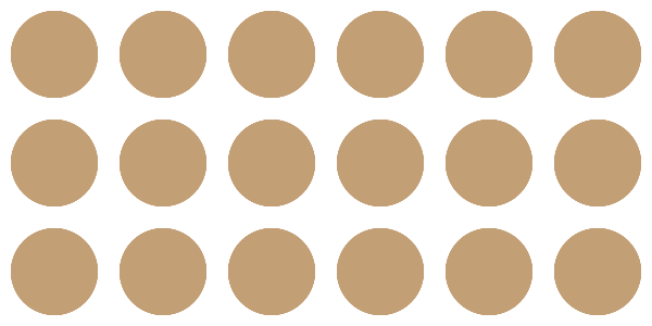
Pattern made with radial-gradient
Nothing complex so far – we are simply repeating circles. Circles, ellipses, half-circles, a quarter of circles, and so on...all are different shapes that we can create using radial-gradient().
To make it simple, we can consider the ellipse as the main shape since a circle is a particular case of an ellipse. Then by hiding some parts we get half of a circle, a quarter of a circle, and so on.
Let's zoom in on the pattern to identify the different values.
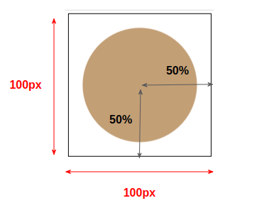
Illustration of the different values of the pattern
We are drawing inside an area that has dimensions of 100px*100px which is our background-size. We will consider a horizontal radius equal to 50% and a vertical one equal to 50% and the center of our shape will be the center of the area.
An ellipse is defined with two radii called the "horizontal radius" and the "vertical radius". If both are equal (like in our case) we get a circle.
This will give us the following code:
html {
  background-image: radial-gradient(50% 50% at center, ???);
  background-size: 100px 100px
}
We defined the setting of our gradient, and now we need to define the color configuration. We will draw a circle that will not touch the edge of the background-size area. From the 50%, we will have 80% of the main color and the remaining will be transparent.
html {
  background-image: radial-gradient(50% 50% at center, #c39f76 0% 80%,#0000 81% 100%);
  background-size: 100px 100px
}
Basically, we first define the center and size of our ellipse (the 50% 50% at center) then we fill it with a gradient coloration (the c39f76 0 80%,#0000 81% 100%). We get a full circle in this case because both radii are equal ( 50% of 100px ) and because we have no transition between the colors.
We have the main color from 0% to 80% and transparent from 81% to 100%. (We should have used 80% instead of 81% but we keep a small transition to avoid jagged edges.)
We can optimize the above code by removing the default values to get this:
html {
  background-image: radial-gradient(50% 50%,#c39f76 80%,#0000 81%);
  background-size: 100px 100px
}
The position is by default the center and we can omit 0% and 100% from the color configuration.
The above is not the only syntax to achieve that pattern. We can also use:
html {
  background-image: radial-gradient(40% 40%,#c39f76 99%,#0000);
  background-size: 100px 100px
}
We reduce the radius of our circle and we increase the percentage of the main color. Note that I didn't define any percentage with the transparent color since it should be 100% (the default value) that we can omit.
We can also use:
html {
  background-image: radial-gradient(#c39f76 56%,#0000 57%);
  background-size: 100px 100px
}
We omit the radius and the browser will use a default setting that needs another color configuration.
You don't have to memorize all the cases, just stick to one easy way (I recommend the first one). Later, with practice, you will discover different ways to achieve the same result and you will be able to optimize your syntax to reduce the amount of code used as I did with the last example.
radial-gradient pattern #2
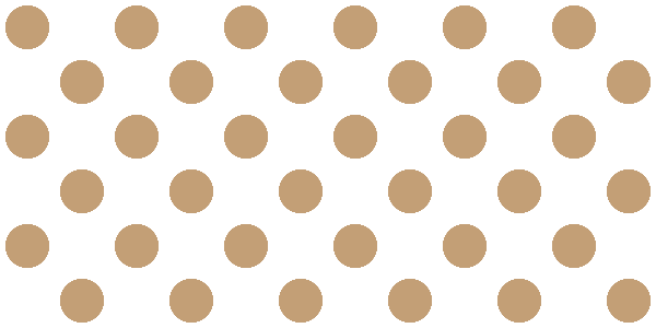
Pattern made with radial-gradient
For this one, I will use 2 radial-gradient()s. Let's not forget that we can have as many background layers as we want. This is a great feature that allows us to build complex patterns by combining different gradients with different configurations.
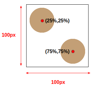
We are keeping the same background-size here, but we are using different positions for our circles. The code will be the following:
html {
   background-image:
     radial-gradient(?? at 25% 25%,??),
     radial-gradient(?? at 75% 75%,??);
   background-size: 100px 100px;
}
For the radius configuration, if we do some math, we can find that we need 25% for both circles to touch the edges. So we can use this code:
html {
   background-image:
     radial-gradient(25% 25% at 25% 25%,#c39f76 80%,#0000 81%),
     radial-gradient(25% 25% at 75% 75%,#c39f76 80%,#0000 81%);
   background-size: 100px 100px;
}
We can also use closest-side instead of 25% 25%. I know, it's a strange value, but it means "use a value of radius that allows the circle to touch the closest side to its center". This value is useful and can save us from dealing with some complex calculations.
html {
   background-image:
     radial-gradient(closest-side at 25% 25%,#c39f76 80%,#0000 81%),
     radial-gradient(closest-side at 75% 75%,#c39f76 80%,#0000 81%);
   background-size: 100px 100px;
}
radial-gradient() provide us with 3 other similar values ( closest-corner, farthest-side, and farthest-corner). We either define an explicit size for our radius or we use those values and the browser will automatically find the radius based on specific rules.
As I said previously, you don't need to memorize everything. I am trying to focus on the basics of radial-gradient() while providing as much information as possible that you may use later.
radial-gradient pattern #3
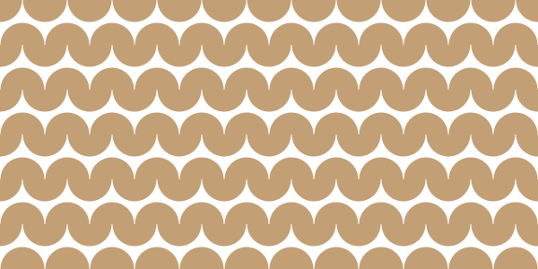
I am increasing the difficulty with this one. After the 1st and 2nd patterns, we can now try a more complex pattern. This one is also made using two gradients where we will not have full circles but a combination of two half circles.
Below is an illustration to help you understand the puzzle. I am using different colors to easily identify each gradient.
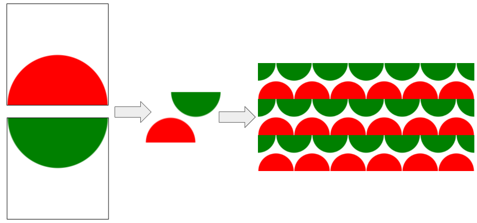
The center for the first gradient is placed at 50% 100% while the second one is placed at 50% 0% but we can also use top and bottom as their equivalent values.
html {
   background-image:
     radial-gradient(?? at top   ,??),
     radial-gradient(?? at bottom,??);
   background-size: 100px 100px;
}
For the radius, we can use 50% 50% like we did before, but this time I will try something different and consider 50px which is half the background-size.
When using a pixel value or any unit that's different from a percentage, we can specify only one radius and the browser will understand that we want a circle with that radius. This is still another way to define the size of our shape in addition to percentage and the specific values.
Our circle is touching the edge so the code will be:
html {
   background-image:
     radial-gradient(50px at top   ,#c39f76 99%,#0000),
     radial-gradient(50px at bottom,#c39f76 99%,#0000);
   background-size: 100px 100px;
}
Yes, the above will not give us the pattern we're going for – we still need a final touch. If you check the previous illustration, you'll notice that the second gradient (the green one) is shifted to the right by half the size. In other words, we need to update its background-position:
html {
   background-image:
     radial-gradient(50px at top   ,#c39f76 99%,#0000),
     radial-gradient(50px at bottom,#c39f76 99%,#0000);
   background-position: 0 0, 50px 0;
   background-size: 100px 100px;
}
We can optimize the code a little by using the shorthand version:
html {
   background:
     radial-gradient(50px at top   ,#c39f76 99%,#0000),
     radial-gradient(50px at bottom,#c39f76 99%,#0000) 50px 0;
   background-size: 100px 100px;
}
And since we are dealing with pixel values, we can add a CSS variable to make the code easy to adjust.
html {
   --s: 100px;
   background:
     radial-gradient(calc(var(--s)/2) at top   ,#c39f76 99%,#0000),
     radial-gradient(calc(var(--s)/2) at bottom,#c39f76 99%,#0000) calc(var(--s)/2) 0;
   background-size: var(--s) var(--s);
}
Instead of updating different values, we change only one!
radial-gradient pattern #4
Pattern background made with radial-gradient
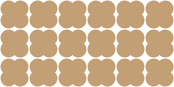
At first glance, this background looks a bit complex. But if we can identify the correct pattern it becomes easy.
This is the most difficult part when dealing with such a background. Sometimes it's not easy to identify the different background layers. My advice to get better at this exercise is to practice.
Intuitively, you may think that the pattern is this one and you will struggle to find the gradients

but it's not. The real pattern is this one
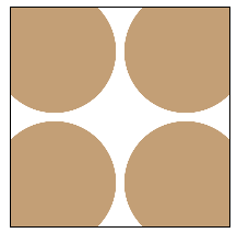
We have 4 circles placed at the corners with a small overflow. The code will be:
html {
   background:
     radial-gradient(closest-corner at 20% 20%,#c39f76 98%,#0000),
     radial-gradient(closest-corner at 80% 20%,#c39f76 98%,#0000),
     radial-gradient(closest-corner at 20% 80%,#c39f76 98%,#0000),
     radial-gradient(closest-corner at 80% 80%,#c39f76 98%,#0000);
   background-size: 100px 100px;
}
A good use for closest-corner to define the radius. For each layer, the browser will draw a circle placed at a specific position and touch the closest corner. This setting allows us to use an easy color configuration while having the needed overflow.
We can also use closest-side like below:
html {
   background:
     radial-gradient(closest-side at 20% 20%,#c39f76 140%,#0000 141%),
     radial-gradient(closest-side at 80% 20%,#c39f76 140%,#0000 141%),
     radial-gradient(closest-side at 20% 80%,#c39f76 140%,#0000 141%),
     radial-gradient(closest-side at 80% 80%,#c39f76 140%,#0000 141%);
   background-size: 100px 100px;
}
The only new thing in the above code is the color configuration where I am using values that are bigger than 100%. Since I am using closest-side to define the radius, I need to get bigger than 100% to create the overflow.
Don't forget such a trick, it can be helpful. The color values are not limited to the range [0% 100%] – they can go bigger.
In such situation, we can also rely on a CSS variable to avoid the repetition of the color configuration:
html {
   --c: #c39f76 98%,#0000;
   background:
     radial-gradient(closest-corner at 20% 20%,var(--c)),
     radial-gradient(closest-corner at 80% 20%,var(--c)),
     radial-gradient(closest-corner at 20% 80%,var(--c)),
     radial-gradient(closest-corner at 80% 80%,var(--c));
   background-size: 100px 100px;
}
radial-gradient pattern #5
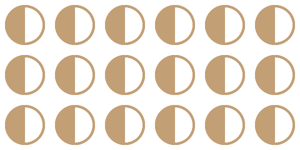
Pattern made with radial-gradient
Here's another non-intuitive pattern that may confuse many of you. You may see it as a circle that is half-filled and you might be wondering how it's possible to achieve that. In reality, it's a combination of two half circles like below:

And here's their code:
html {
  background:
    radial-gradient(50% 50% at left ,#0000 70%,#c39f76 71% 80%,#0000 81%),
    radial-gradient(50% 50% at right,#c39f76 0 80%,#0000 81%);
  background-size: 100px 100px;
}
This time, we are using a different color configuration for each one. The first one has 3 colors (transparent, then the main color, then transparent again). The second has the same color configuration we used with the previous examples.
This pattern is a good example to show how different colors configuration can be another way to get complex background patterns.
radial-gradient pattern #6
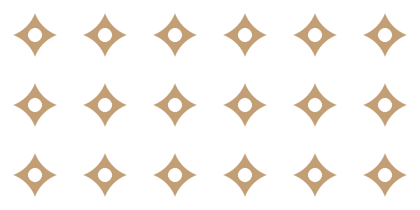
This is another pattern where it's not easy to identify the different layers – but if we look closely we can see two circles

The big circle is our first layer
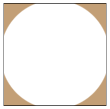
It's a circle placed at the center of the area (defined with background-size as usual) but this time the color configuration is not as usual. I am using a transparent color for the inside part and the main color outside. It should be noted that we have a small overflow as well.
html {
  background-image: radial-gradient(54% 54%,#0000 98%,#c39f76);
  background-size: 100px 100px;
}
As you can see, I am using 54% instead of 50% to create the overflow.
The second layer is a smaller circle with white color as the main color. The whole code will be:
html {
  background:
    radial-gradient(10% 10%,#fff 98%,#0000),
    radial-gradient(54% 54%,#0000 98%,#c39f76) 50px 50px;
  background-size:100px 100px;
}
Note the use of 50px 50px. Like with the 3rd pattern, we need to shift one of the layers by half the size to get the correct result – otherwise both circles will have the same center which is not the intended result.

radial-gradient pattern #7
Here's the last pattern before we end:
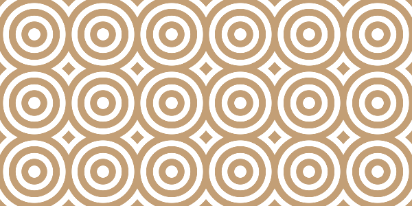
With this last example, I want to introduce repeating-radial-gradient() which is another way to write radial-gradient().
Our pattern is as follows:

We can achieve the above using radial-gradient() but the color configuration will get too lengthy (transparent, main color, transparent, main color, and so on).
In this case, the color configuration is nothing but a repeated pattern of "transparent, main color" and repeating-radial-gradient() is made for such a purpose. It allows us to define a pattern color configuration.
html {
  background-image: repeating-radial-gradient(#0000 0% 12%,#c39f76 13% 26% );
  background-size:100px 100px;
}
The above means that we have 12% of transparent color and then 13% of the main color ( 26 - 13 = 13) then we repeat the same until we cover all the area.
Wrapping up
Through exploring how to create different background patterns, we covered the basics of radial-gradient().
The article ends here, but this is just the beginning. radial-gradient() is more complex than the simple examples we just saw – but now you have the needed tools to practice and get used to it.
Go ahead and try to build your own pattern using radial-gradient(). If you need some inspiration, check my collection of CSS Patterns (more than 100 using CSS gradients). I also have another article about conic-gradient() if you want a follow up to this one.
Here’s another reference to get more details:
Learn to code for free. freeCodeCamp's open source curriculum has helped more than 40,000 people get jobs as developers. Get started