


If you have a website, it's helpful to have a loader so users can tell something is happening once they've clicked a link or button.
You can use this loader component in a lot of places, and it should be as simple as possible.
In this post, we will see how to build two types of loaders with only one <div> and a few lines of CSS code. Not only this but we will make them customizable so you can easily create different variations from the same code.
Here's what we'll build:
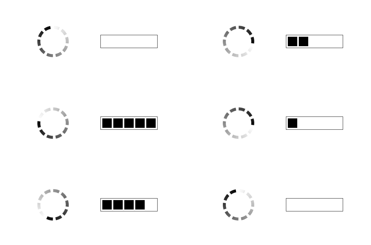
CSS-only Spinner and Progress Loader
Below is a demo of what we are building:
Click to see the full code
 .loader {
   --b: 10px;  / border thickness /
   --n: 10;    / number of dashes/
   --g: 10deg; / gap between dashes/
   --c: red;   / the color /

   width: 100px; / size /
   aspect-ratio: 1;
   border-radius: 50%;
   padding: 1px;
   background: conic-gradient(#0000,var(--c)) content-box;
   -webkit-mask:
     repeating-conic-gradient(#0000 0deg,
        #000 1deg calc(360deg/var(--n) - var(--g) - 1deg),
        #0000     calc(360deg/var(--n) - var(--g)) calc(360deg/var(--n))),
     radial-gradient(farthest-side,#0000 calc(98% - var(--b)),#000 calc(100% - var(--b)));
           mask:
     repeating-conic-gradient(#0000 0deg,
        #000 1deg calc(360deg/var(--n) - var(--g) - 1deg),
        #0000     calc(360deg/var(--n) - var(--g)) calc(360deg/var(--n))),
     radial-gradient(farthest-side,#0000 calc(98% - var(--b)),#000 calc(100% - var(--b)));
   -webkit-mask-composite: destination-in;
           mask-composite: intersect;
   animation: load 1s infinite steps(var(--n));
 }
 @keyframes load {to{transform: rotate(1turn)}}
We have 4 different loaders using the same code. By only changing a few variables, we can generate a new loader without needing to touch the CSS code.
The variables are defined like below:
--bdefines the border thickness.--ndefines the number of dashes.--gdefines the gap between dashes. Since we're dealing with a circular element, this one is an angle value.--cdefines the color.
Here is an illustration to see the different variables.

CSS Variables of the Spinner loader
Let's tackle the CSS code. We will use another figure to illustrate a step-by-step construction of the loader.

Step-by-Step illustration of the Spinner Loader
We first start by creating a circle like this:
.loader {
  width: 100px; /* size */
  aspect-ratio: 1;
  border-radius: 50%;
}
Nothing complex so far. Note the use of aspect-ratio which allows us to only modify one value (the width) in order to control the size.
Then we add a conic gradient coloration from transparent to the defined color (the variable --c):
.loader {
  width:100px; /* size */
  aspect-ratio: 1;
  border-radius: 50%;
  background: conic-gradient(#0000,var(--c));
}
In this step, we introduce the mask property to hide some parts of the circle in a repetitive manner. This will depend on the --n and --d variables. If you look closely at the figure, we will notice the following pattern:
visible part
invisible part
visible part
invisible part
etc
To do this, we use repeating-conic-gradient(#000 0 X, #0000 0 Y). From 0 to X we have an opaque color (visible part) and from X to Y we have a transparent one (invisible part).
We introduce our variables:
We need a gap equal to
gbetween each visible part so the formula betweenXandYwill beX = Y - g.We need
nvisible part so the formula ofYshould beY = 360deg/n. A full circle is360degso we simply divide it byn
Our code so far is:
.loader {
  width: 100px; /* size */
  aspect-ratio: 1;
  border-radius: 50%;
  background: conic-gradient(#0000,var(--c));
  mask: repeating-conic-gradient(#000 0 calc(360deg/var(--n) - var(--g)) , #0000 0 calc(360deg/var(--n))
}
This next step is the trickiest one, because we need to apply another mask to create a kind of hole in order to get the final shape. To do this we will logically use a radial-gradient() with our variable b:
radial-gradient(farthest-side,#0000 calc(100% - var(--b)),#000 0)
A full circle from where we remove a thickness equal to b.
We add this to the previous mask:
.loader {
  width: 100px; /* size */
  aspect-ratio: 1;
  border-radius: 50%;
  background: conic-gradient(#0000,var(--c));
  mask:
   radial-gradient(farthest-side,#0000 calc(100% - var(--b)),#000 0),
   repeating-conic-gradient(#000 0 calc(360deg/var(--n) - var(--g)) , #0000 0 calc(360deg/var(--n))
}
We have two mask layers, but the result is not what we want. We get the following:

It may look strange but it's logical. The "final" visible part is nothing but the sum of each visible part of each mask layer. We can change this behavior using mask-composite. I would need a whole article to explain this property so I will simply give the value.
In our case, we need to consider intersect (and destination-out for the prefixed property). Our code will become:
.loader {
  width: 100px; /* size */
  aspect-ratio: 1;
  border-radius: 50%;
  background: conic-gradient(#0000,var(--c));
  mask:
    radial-gradient(farthest-side,#0000 calc(100% - var(--b)),#000 0),
    repeating-conic-gradient(#000 0 calc(360deg/var(--n) - var(--g)) , #0000 0 calc(360deg/var(--n));
  -webkit-mask-composite: destination-in;
          mask-composite: intersect;
}
We are done with the shape! We are only missing the animation. The latter is an infinite rotation.
The only thing to note is that I am using a steps animation to create the illusion of fixed dashes and moving colors.
Here is an illustration to see the difference

A Linear Animation vs a Steps Animation
The first one is a linear and continuous rotation of the shape (not what we want) and the second one is a discrete animation (the one we want).
Here is the full code including the animation:
Click to see the full code
 .loader {
   --b: 10px;  / border thickness /
   --n: 10;    / number of dashes/
   --g: 10deg; / gap between dashes/
   --c: red;   / the color /

   width: 100px; / size /
   aspect-ratio: 1;
   border-radius: 50%;
   padding: 1px;
   background: conic-gradient(#0000,var(--c)) content-box;
   -webkit-mask:
     repeating-conic-gradient(#0000 0deg,
        #000 1deg calc(360deg/var(--n) - var(--g) - 1deg),
        #0000     calc(360deg/var(--n) - var(--g)) calc(360deg/var(--n))),
     radial-gradient(farthest-side,#0000 calc(98% - var(--b)),#000 calc(100% - var(--b)));
           mask:
     repeating-conic-gradient(#0000 0deg,
        #000 1deg calc(360deg/var(--n) - var(--g) - 1deg),
        #0000     calc(360deg/var(--n) - var(--g)) calc(360deg/var(--n))),
     radial-gradient(farthest-side,#0000 calc(98% - var(--b)),#000 calc(100% - var(--b)));
   -webkit-mask-composite: destination-in;
           mask-composite: intersect;
   animation: load 1s infinite steps(var(--n));
 }
 @keyframes load {to{transform: rotate(1turn)}}
You will notice a few differences with the code I used in the explanation:
I am adding
padding: 1pxand setting the background tocontent-boxThere is
+/1degbetween the colors of therepeating-conic-gradient()There are a few percentages of difference between the color inside the
radial-gradient()
Those are some corrections to avoid visual glitches. Gradients are known to produce "strange" results in some cases so we have to adjust some values manually to avoid them.
How to Create a Progress Loader
Like the previous one loader, let's start with an overview:
Click to see the full code
 .loader {
   --n:5;    / control the number of stripes /
   --s:30px; / control the width of stripes /
   --g:5px;  / control the gap between stripes /

   width:calc(var(--n)(var(--s) + var(--g)) - var(--g));
   height:30px;
   padding:var(--g);
   margin:5px auto;
   border:1px solid;
   background:
     repeating-linear-gradient(90deg,
       currentColor  0 var(--s),
       #0000 0 calc(var(--s) + var(--g))
     ) left / calc((var(--n) + 1)(var(--s) + var(--g))) 100%
     no-repeat content-box;
   animation: load 1.5s steps(calc(var(--n) + 1)) infinite;
 }
 @keyframes load {
   0% {background-size: 0% 100%}
 }
We have the same configuration as the previous loader. CSS variables that control the loader:
--ndefines the number of dashes/stripes.--sdefines the width of each stripe.--gdefines the gap between stripes.
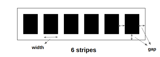
Illustration of the CSS Variables
From the above figure we can see that the width of the element will depend on the 3 variables. The CSS will be as follows:
.loader {
  width: calc(var(--n)*(var(--s) + var(--g)) - var(--g));
  height: 30px; /* use any value you want here */
  padding: var(--g);
  border: 1px solid;
}
We use padding to set the gap on each side. Then the width will be equal to the number of stripes multiplied by their width and the gap. We remove one gap because for N stripes we have N-1 gaps.
To create the stripes we will use the below gradient.
repeating-linear-gradient(90deg,
  currentColor 0 var(--s),
  #0000        0 calc(var(--s) + var(--g))
 )
From 0 to s is the defined color and from s to s + g a transparent color (the gap).
I am using currentColor which is the value of the color property. Note that I didn't define any color inside border so it will also use to the value of color. If we want to change the color of the loader, we only need to set the color property.
Our code so far:
.loader {
  width: calc(var(--n)*(var(--s) + var(--g)) - var(--g));
  height: 30px;
  padding: var(--g);
  border: 1px solid;
  background:
    repeating-linear-gradient(90deg,
      currentColor  0 var(--s),
      #0000 0 calc(var(--s) + var(--g))
    ) left / 100% 100% content-box no-repeat;
}
I am using content-box to make sure the gradient doesn't cover the padding area. Then I define a size equal to 100% 100% and a left position.
It's time for the animation. For this loader, we will animate the background-size from 0% 100% to 100% 100% which means the width of our gradient from 0% to 100%
Like the previous loader, we will rely on steps() to have a discrete animation instead of a continuous one.
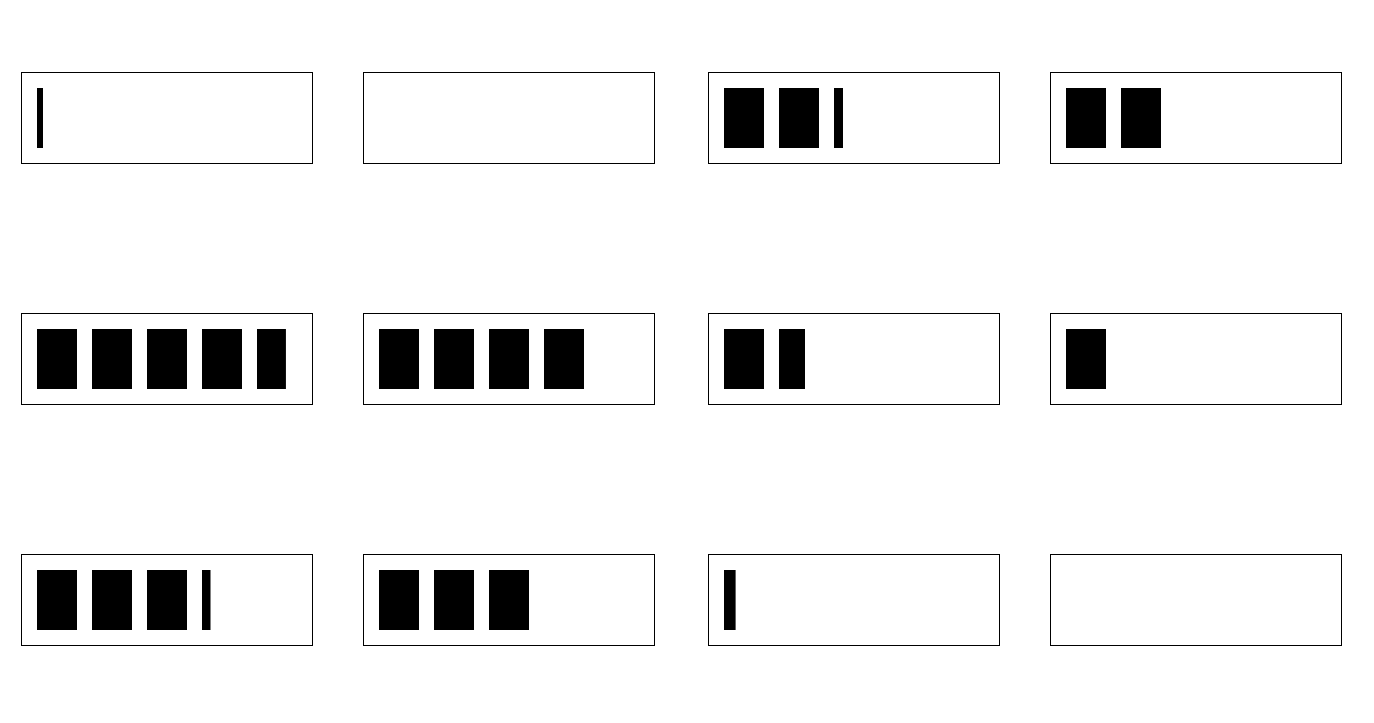
A Linear Animation vs a Steps Animation
The second one is what we want to create, and we can achieve it by adding the following code:
.loader {
  animation: load 1.5s steps(var(--n)) infinite;
}
@keyframes load {
  0% {background-size: 0% 100%}
}
If you look closely at the last figure, you will notice that the animation is not complete. We are missing one stripe at the end, even if we have used N. This is not a bug but how steps() is supposed to work.
To overcome this, we need to add an extra step. We increase the background-size of our gradient to contain N+1 stripes and use steps(N+1). This will get us to the final code:
.loader {
  width: calc(var(--n)*(var(--s) + var(--g)) - var(--g));
  height: 30px;
  padding: var(--g);
  margin: 5px auto;
  border: 1px solid;
  background:
    repeating-linear-gradient(90deg,
      currentColor  0 var(--s),
      #0000 0 calc(var(--s) + var(--g))
    ) left / calc((var(--n) + 1)*(var(--s) + var(--g))) 100%
    content-box no-repeat;
  animation: load 1.5s steps(calc(var(--n) + 1)) infinite;
}
@keyframes load {
  0% {background-size: 0% 100%}
}
Note that the width of the gradient is equal to N+1 multiplied by the width of one stripe and a gap (instead of being 100% )
Conclusion
I hope you enjoyed this tutorial. If you are interested, I have made more than 500 CSS-only single div loaders. I also wrote another tutorial to explain how to create the Dots loader using only background properties.
Find below useful links to get more detail about some properties I have used that I didn't explain thoroughly due to their complexity:
Learn to code for free. freeCodeCamp's open source curriculum has helped more than 40,000 people get jobs as developers. Get started