


Forget what you know about Graceful Degradation. Forget what you know about Developer Convenience. Forget what you know about Progressive Enhancement.
Instead of arguing over these terms, we should focus on how to change our culture. Create “fallforwards” not “fallbacks.”
In some ways this post is a semantic argument. Yet, it is an important one.
Lera Boroditsky, an assistant professor at Stanford, wrote an article on the effects of language on cognitive reasoning.
For those of us who studied philosophy and linguistics in college, this comes as no surprise. Yet, the depth of this influence bias is amazing.
This seems obvious in some cases. A language that often genders its vocabulary will have children that recognize their gender earlier (page 65 in the reference). In other cases it can be astounding. A 5-year-old girl living in an Australian Aboriginal community could discern cardinal directions. Intelligent adults in Western cultures struggle to gain a sense of direction.
The languages of these cultures actively shapes comprehension.
The girl from the example speaks a language with no relative spatial terms. Instead of an object being to the left of someone, it’s to the southwest.
The linguistic need turns into an intellectual need: keeping track of directions. The brain forges the neural pathways necessary to accomplish this need.
As it turns out, a semantic argument can be very important for creating culture shift.
In our world of web development, we talk a lot about fallbacks.
We use this word to mean “when this feature we’re using is not available to a user, how should our application behave?”
If JavaScript is disabled, what should this animation that depends on it do? If a browser doesn’t support object-fit, should the image squish or hold its aspect ratio?
Why does it matter if we use this word?
Most definitions of “fallback” refer to “retreat” or “emergency” or other negative words. If our language is negative, we may end with a negative opinion of those we support.
Or at the very least, we may view them with less sympathy.
We shouldn’t retreat from these users. We should support them and then push forward into a new and awesome future.
Is this different than “Progressive Enhancement?” No, not really. This is more about ditching the negative connotations.
Let’s get started. As an example, let’s take a simple design form: an article list.
Our first step is simple, clean markup. This, out of the box, works on all browsers and devices. Each article has a headline, description and link.
<section class="grid">
    <article class="item primary">
        <time class="date">12 Jan, 2017</time>
        <h2>Start Exploring the Magic of CSS Grid Layout</h2>
        <p class="description">Grid is an amazing new CSS Specification coming to major browsers in 2017. When it’s ready for use in production, it’s going to drastically change the way we do layout on the web. Currently, there’s...</p>
        <a href="http://bryanlrobinson.com/blog/2017/01/12/simple-grid-examples/" class="button">Read More</a>
    </article>
</section>
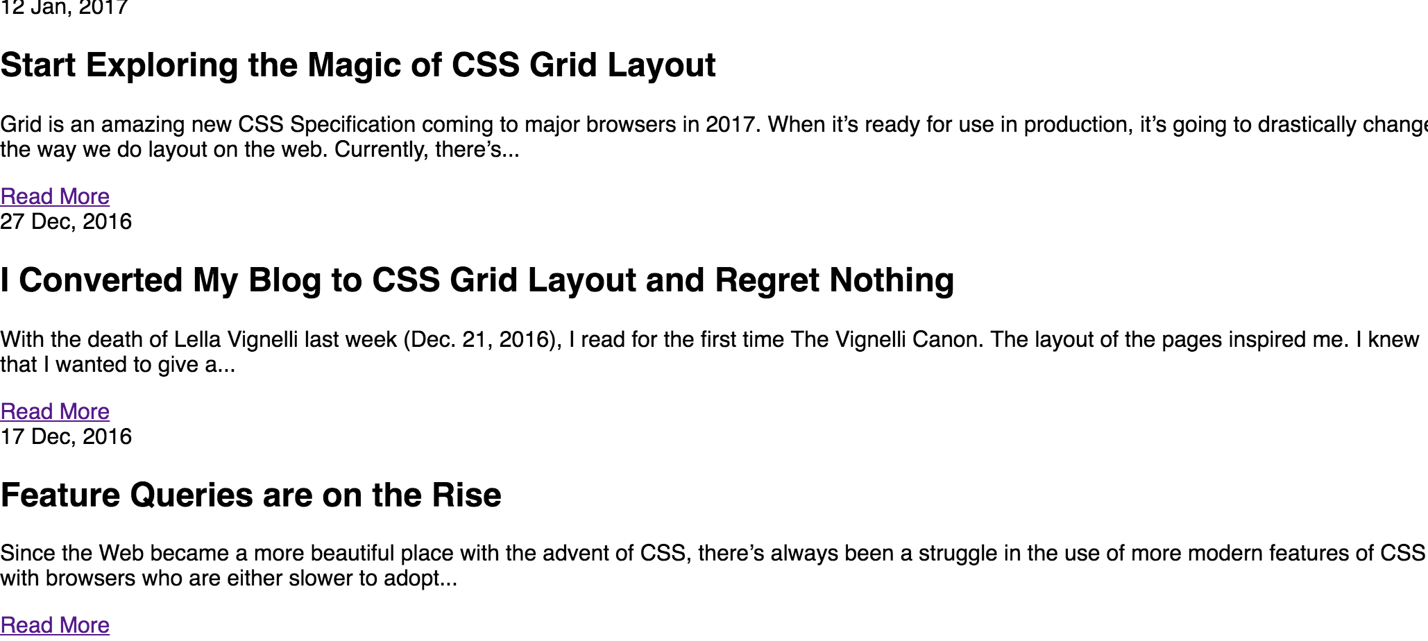
Not exactly revolutionary.
Next, we add simple styling, clean the margins and make it look good on mobile.
    .grid {
        margin: 10px 0;
    }

    .grid .item {
        box-sizing: border-box;
        margin: 0px 10px 10px;
        padding: 5vw;
        background-color: $brand-light;
    }
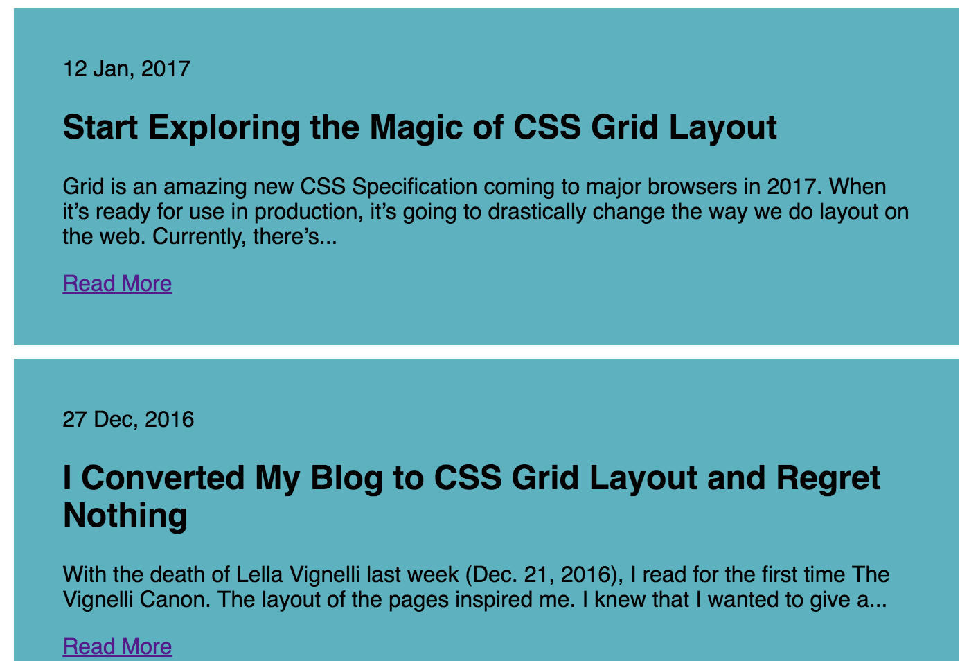
These styles should be basic. Strive to add visual hierarchy and weight with spacing, colors and small images and clean the reading experience.
When we’ve got more screen real estate than mobile, we expand into layout. In our case, a two-by-two card view would be nice on tablet. As we approach bigger sizes, though, the width of these boxes is too wide for our content.
In this example, we use media queries to affect the flex-basis to adjust the size of these boxes.
@media (min-width: 480px) {
    .grid {
        display: flex;
        flex-wrap: wrap;
    }
    .grid .item {
        margin: 0 5px 10px;
        flex: 1 calc(50% - 10px);
    }
}
@media (min-width: 768px) and (max-width: 1228px) {
    .grid .item {
        flex-basis: calc(33% - 10px);
    }
}
@media (min-width: 1228px) {
    .grid .item {
        flex-basis: calc(25% - 10px);
    }
}
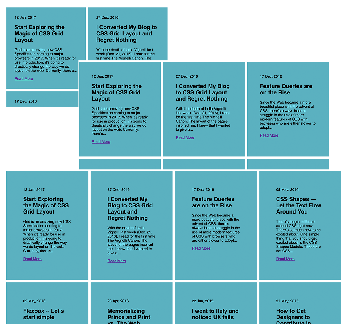
If this sounds like “mobile-first design,” you’re right. Mobile is a very restrictive place for design. It’s also very restrictive for powerful hardware available cheap. This means we need to put a premium on the content, not the “design.”
Once we get our simple layout done, we can expand on the layout. In our example, we have a perfectly nice layout for articles. We have served our audience. Now, let’s have fun.
CSS Grid Layout is something I’ve written about recently. I’ve even begun using it to lay out pages on this site.
Let’s make an impactful layout for our articles using some fun new code.
@supports (grid-auto-rows: 1px) {
    @media (min-width: 1100px) {
        .grid {
            display: grid;
            grid-template-columns: 1fr 1fr 1fr 1fr 1fr 1fr;
            grid-template-areas: "main   main main    second   third fourth"
                                  "main   main main    fifth    fifth fifth"
                                  "promo  promo promo  promo    promo promo"
                                  "sixth sixth seventh seventh eighth eighth"
                                  "sixth sixth seventh seventh ninth  tenth";
        }
        .grid .item {
            display: flex;
            flex-direction: column;
            justify-content: center;
            padding: 20px;

            &:nth-child(1) { grid-area: main; }
            &:nth-child(2) { grid-area: second; }
            &:nth-child(3) { grid-area: third; }
            &:nth-child(4) { grid-area: fourth; }
            &:nth-child(5) { grid-area: fifth; }
            &:nth-child(6) { grid-area: sixth; }
            &:nth-child(7) { grid-area: seventh; }
            &:nth-child(8) { grid-area: eighth; }
            &:nth-child(9) { grid-area: ninth;}
            &:nth-child(10) { grid-area: tenth; }
            &.promo { grid-area: promo; }
        }
    }
}
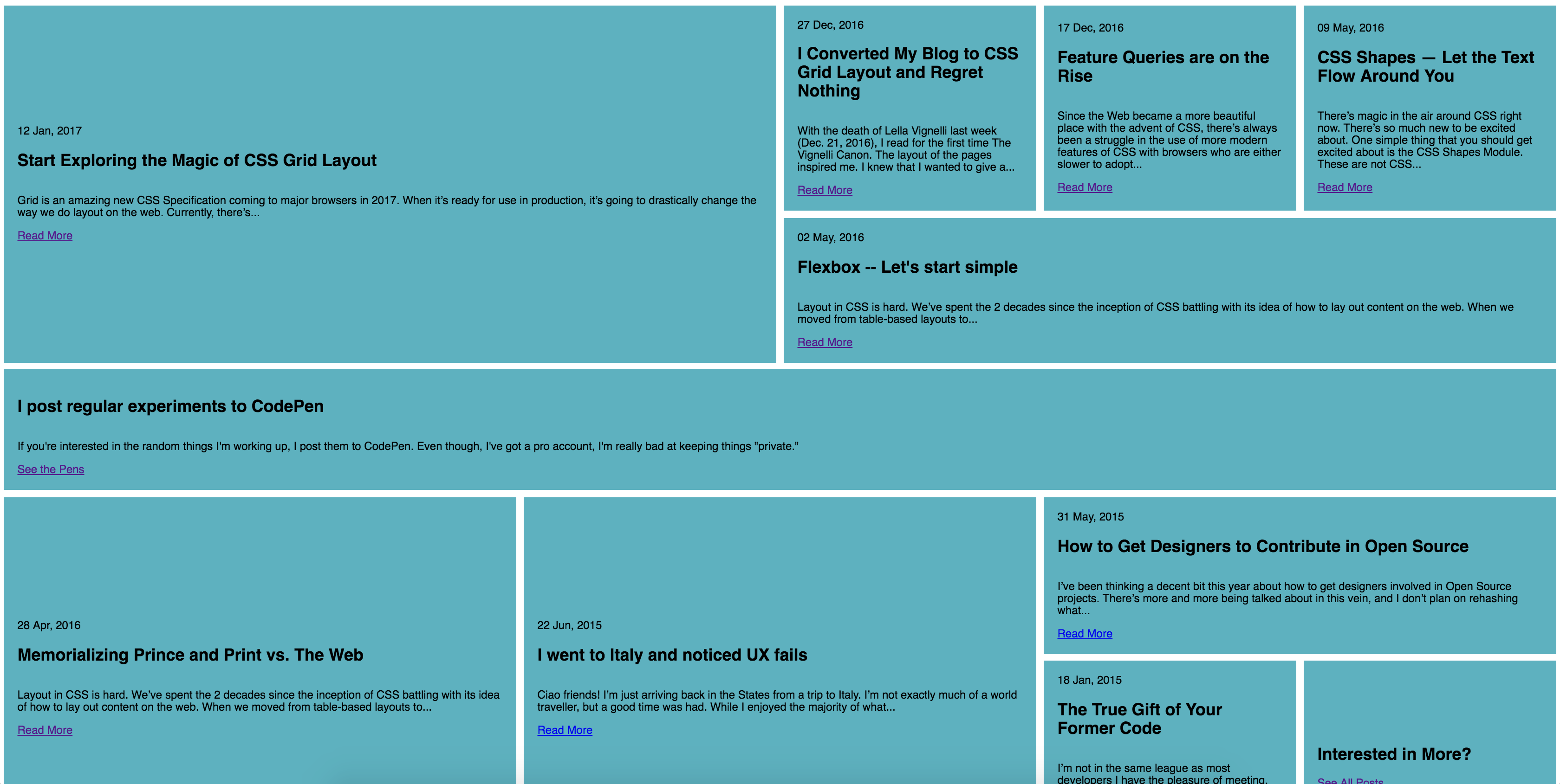
In the code above, I’m using CSS Feature Queries to identify if a browser supports Grid before using it. By utilizing grid-auto-rows and not just display: grid, I can have Edge ignore it for now, but begin seeing it when it updates in 2017.
With an idea of fallbacks, a developer might try to have Grid be the main layout engine. They might then fallback to flexbox using an @supports not (display: grid) query.
The problem is Internet Explorer doesn’t understand Feature Queries. This means your handcrafted fallback will fail, as well.
This is not a new concept. Call it Progressive Enhancement. Call it Moral Development. Call it Defensive Coding. Just don’t call it a Fallback. Support your users and fall forward into new design and code.
此内容由惯性聚合(RSS阅读器)自动聚合整理,仅供阅读参考。 原文来自 — 版权归原作者所有。