


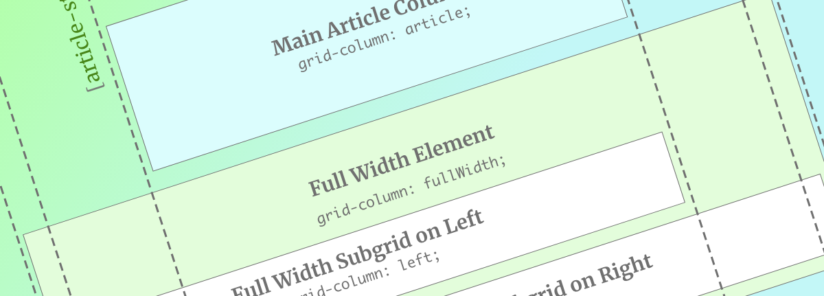
CSS Grid was missing one important piece when it’s Level 1 specification was released into the world: Subgrid. The Level 2 specification is still in “Working Draft” status, but we have our first browser implementation. Mozilla has the Subgrid syntax in Firefox Nightly.
Now that we have a live implementation, I’ve begun playing with the subgrid. Subgrid allows for elements that are grandchildren of the Grid container to take part in the initial grid definition. If you want a primer on all things Grid Level 2, read Rachel Andrew’s excellent article on it. For a fun layout using its power, read Michelle Barker’s CSS{IRL} post.
In this article, we’ll be exploring one specific use case: augmenting a Grid-infused article layout. This article layout will allow for certain sections of content to break out into full-width areas.
If you’re looking for more information on this design pattern, it’s covered in my CSS Grid course here.
Let’s dive in to the code.
Our first task will be setting up our article’s basic Grid. In this case, we’ll take advantage of the power of Grid’s “named grid lines” to make our lives easier down the road.
.article-body {
    display: grid;
    grid-template-columns: [fullWidth-start] 1rem
                           [left-start]      1fr
                           [article-start right-start] minmax(20ch, 80ch)
                           [article-end left-end] 1fr
                           [right-end] 1rem [fullWidth-end];
}
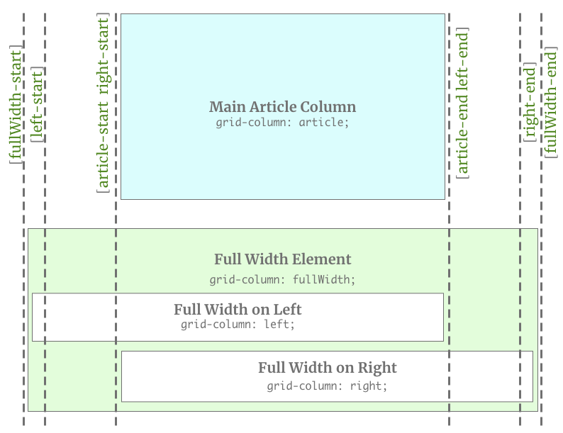
This setup gives us 1rem gutters on the left and right hand side, followed by “variably squishy” gutters of 1fr. Finally, we have a center column with a minimum size of 20ch and a maximum of 80ch. The ch unit giving us a comfortable reading line-length for the center column.
We can use the names in the braces ([]) to then place content in any of the areas we’ve created via grid-column: fullWidth;.
Struggling to visualize that? I don’t blame you. Here’s a quick graphic to illustrate:
Now that our grid is set up, we need to place content on it properly. Any elements within the article-body element will fill grid areas across the horizontal axis. This will look absolutely busted (a colloquialism meaning REALLY broken).
Let’s fix that by putting any direct child into the article grid column.
.article-body > * {
    grid-column: article;
}
.full-width {
    grid-column: fullWidth;
    background-color: lightblue; /* For that full-width feeling! */
}
Now our general content will be in a nice constrained column and any element with class="full-width" will go in a full-width stripe.
This is handy enough without going any deeper. Anything inside that element can no be styled as a full-with item with all the white space it wants. But what if you want to have an element centered the same way inside the stripe? You’d need to create a new grid context and create columns of the proper size. In our example, we could do that, but in some circumstances dealing with “variable squishiness” may make that impossible. Even though it’s possible in our case, the code would have us repeating ourselves in odd ways.
To create additional layouts inside our full-width stripe that take part in the initial grid declaration, we need subgrid!
The subgrid specification gives us access to the initial grid declaration’s columns and/or rows. I remember hearing some debate around the syntax and whether it should inherit the entire grid or let the author control columns or rows. I’m so glad they landed where they did. The syntax feels inspired.
In our use case, we just need the columns.
   .full-width {
        display: grid;
        grid-template-columns: subgrid;
   }
That’s it! we now get all of the columns that were declared on .article-body.
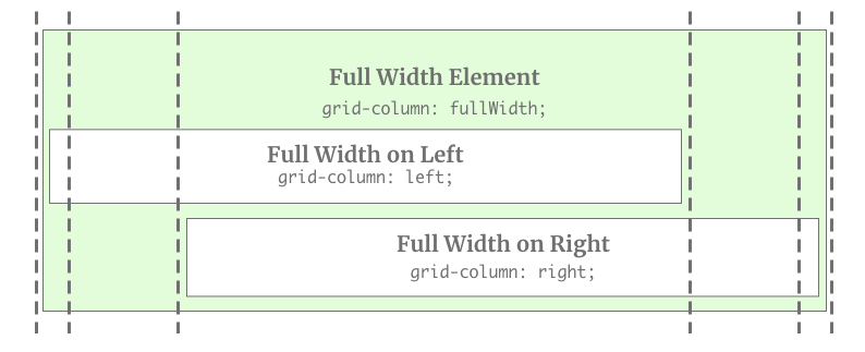
Let’s use those named lines and create some classes that we can use for various types of content inside a full-width stripe.
.fullWidth-center {
    grid-column: article;
}
.fullWidth-right {
    grid-column: right;
    text-align: right;
}
.fullWidth-left {
    grid-column: left;
}
When we put it all together, we can create some interesting layouts with minimal effort!
Here’s the finished Codepen. You’ll need to be running the Firefox Nightly build to see the finished product.
{% codepen ‘https://codepen.io/brob/pen/qBBxydZ?editors=0100’ ‘css,result’, ‘500’ %}
Speaking of needing a specific browser … I can hear a few of you out there!
“But Bryan!” you say. “Browsers don’t support this yet! Even when the modern browsers are supporting this, old browser still need support! I guess we can’t use this yet. Oh well!”
No, no. You don’t get off that easy.
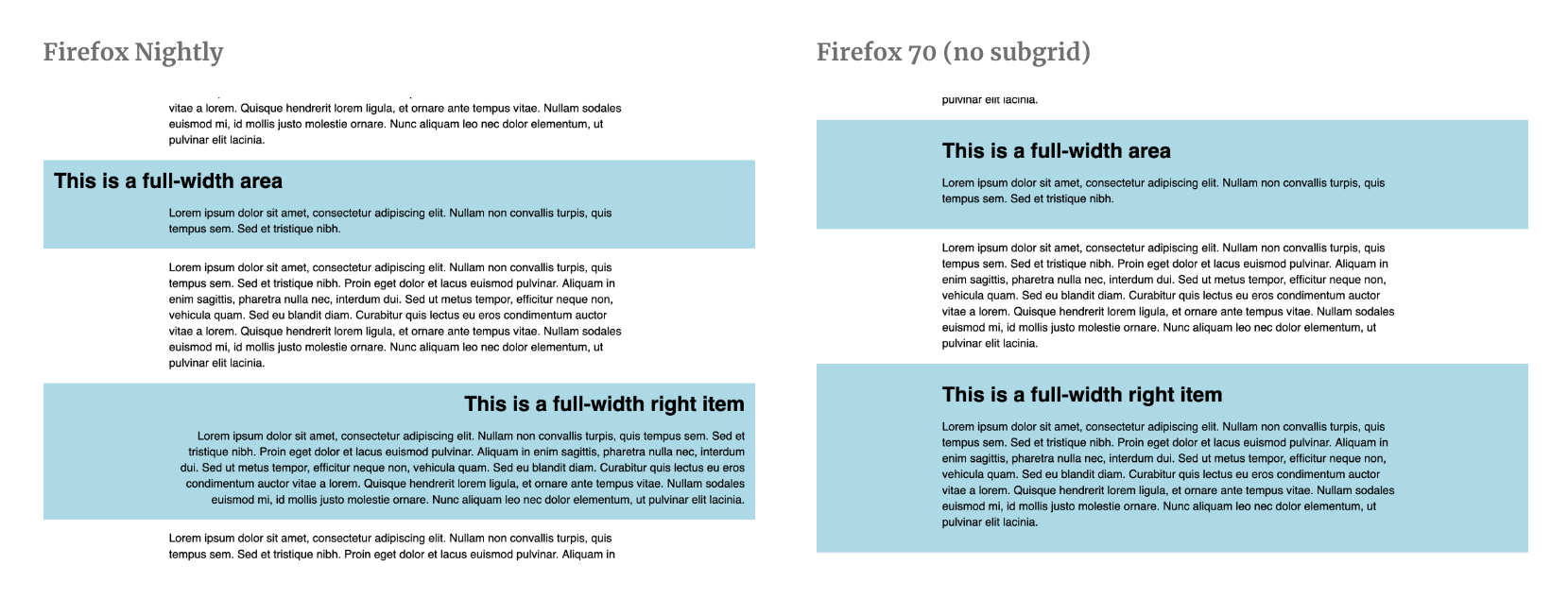
Just like supporting browsers that don’t support Grid yet, we can support browsers that don’t support subgrid.
Since we know the answer to the question “Do websites need to look exactly the same in every browser (… dot com…) is “No,” let’s talk about what this design pattern can look like in older browsers.
What if we started our stripes as full-width with centered content? In most situations that should be enough. It’s a clean design pattern and then we can “fall forward” into newer, cooler design patterns.
Let’s talk about what we need to change.
First, let’s declare a base style for .full-width. We’ll use one of my favorite unexpected design patterns: the self-centering stripe with grid.
.full-width {
    grid-column: fullWidth; /* Sets where the element is in the parent grid */
    background-color: lightblue; /* Pretty light blue! */

    display: grid; /* Sets a new Grid context */
    grid-template-columns: minmax(20ch, 80ch); /* 1 column to match the [article] sizing */
    justify-content: center; /* Center the content */

    padding: 1rem; /* Keeps gutters in shape for mobile */
}
Now, we’ll use the power of CSS Feature Queries to fall forward into subgrid support. In order to do this, we’ll unset a few values from the previous code and put our subgrid code in the CSS.
@supports (grid-template-columns: subgrid) {
    .full-width {
        grid-template-columns: subgrid; /* changes columns from 1 to inheriting grid lines */
        padding: 0; /* Unset padding... that's built into our columns */
    }
    /* All the other selectors we need */
    .fullWidth-center {
        grid-column: article;
    }
    .fullWidth-right {
        grid-column: right;
        text-align: right; /* Don't want to right align the text unless the element is right-aligned as well */
    }
    .fullWidth-left {
        grid-column: left;
    }
}
You now have an interesting layout in browsers that support subgrid and a perfectly lovely layout for browsers that don’t.
The future of web layout is amazing. What are some other design patterns you might use CSS Subgrid for? Send me a message on Twitter and let me know your thoughts.
此内容由惯性聚合(RSS阅读器)自动聚合整理,仅供阅读参考。 原文来自 — 版权归原作者所有。