
惯性聚合 高效追踪和阅读你感兴趣的博客、新闻、科技资讯
阅读原文 在惯性聚合中打开

推荐订阅源

Cloudbric
Cloudbric
T
Threat Research - Cisco Blogs
Simon Willison's Weblog
AWS News Blog
AWS News Blog
P
Privacy & Cybersecurity Law Blog
H
Help Net Security
云风的 BLOG
云风的 BLOG
G
GRAHAM CLULEY
Spread Privacy
Spread Privacy
Cyber Security Advisories - MS-ISAC
A
Arctic Wolf
Project Zero
Project Zero
Engineering at Meta
Engineering at Meta
P
Privacy International News Feed
Blog — PlanetScale
Blog — PlanetScale
Stack Overflow Blog
Stack Overflow Blog
M
MIT News - Artificial intelligence
The Register - Security
Recorded Future
Recorded Future
cs.AI updates on arXiv.org
C
Cisco Blogs
PCI Perspectives
PCI Perspectives
Recent Announcements
Martin Fowler
Martin Fowler
A
About on SuperTechFans
W
WeLiveSecurity
GbyAI
GbyAI
V
Vulnerabilities – Threatpost
The GitHub Blog
The GitHub Blog
D
Darknet – Hacking Tools, Hacker News & Cyber Security
C
Check Point Blog
Y
Y Combinator Blog
月光博客
月光博客
Scott Helme
Scott Helme
奇客Solidot–传递最新科技情报
奇客Solidot–传递最新科技情报
Google DeepMind News
F
Fortinet All Blogs
U
Unit 42
G
Google Developers Blog
钛媒体:引领未来商业与生活新知
钛媒体:引领未来商业与生活新知
T
Threatpost
Application and Cybersecurity Blog
Google Online Security Blog
Recent Commits to openclaw:main
OSCHINA 社区最新新闻
OSCHINA 社区最新新闻
Cisco Talos Blog
Cisco Talos Blog
博客园 - 三生石上(FineUI控件)
Hugging Face - Blog
Hugging Face - Blog
MongoDB | Blog
MongoDB | Blog
博客园 - 司徒正美

Bryan Robinson's Blog

Does our technology still work for us? Product pricing, dev bad habits, and the role of the pit of success Astro Server Island for latest Bluesky post (heavily cached!) Type-safe environment variables in Astro 5.0 New Website, but really is it? Netlify Durable Cache: Caching for a third-party world Introducing the Hygraph Astro Content Loader Integrating Astro.js Starlight Documentation into a Next.js Project Using Proxies Jamstack is meaningless 😱 Book Release: Eleventy by Example – Learn 11ty with 5 in-depth projects 11ty Second 11ty: Creating Template Filters 11ty Second 11ty: Global Data files (JS and JSON) 11ty second 11ty: The Render Plugin Part 1 Help needed: Netlify Frontend environment variables with Astro.js Quick experiment with the Slinkity 11ty plugin Creating a dynamic color converter with 11ty Serverless Using 11ty JavaScript Data files to mix Markdown and CMS content into one collection How to show your template code in 11ty blog posts New City, New Job, New Content Using Nunjucks Climbing the 11ty Performance leaderboard with Cloudinary, critical CSS and more Three JAMstack movements to watch in 2020 Create a Codepen promo watermark with no additional HTML, CSS or JS 3 underused CSS features to learn for 2020 Use CSS Subgrid to layout full-width content stripes in an article template Adapt client-side JavaScript for use in 11ty (Eleventy) data files CSS Gap creates a bright future for margins in Flex as well as Grid Create your first CSS Custom Properties (Variables) Use CSS Grid to create a self-centering full-width element Creating an 11ty Plugin - SVG Embed Tool Now offering design and code reviews at PeerReviews.dev Routing contact-form emails to different addresses with Netlify, Zapier and SendGrid Create an Eleventy (11ty) theme based on a free HTML template Client work and the JAMstack Grid vs. Flex: A Tale of a "Simple" Promo Space Using Eleventy The Tech Barrier to Entry What Can We Learn from CERN Let Practical CSS Grid - Launching My First Course Build Trust on the Web incorporating User Worries with your User Stories 2019 The Year of Markup-First Development Refactoring CSS into a Sass mixin Starting a new journey with Code Contemporary Dynamic Static Sites with Netlify and iOS Shortcuts Top 3 uses for the ::before and ::after CSS pseudo elements How To: Use CSS Grid to Mix and Match Design Patterns Use CSS ::before and ::after for simple, spicy image overlays Modern CSS: Four Things Every Developer and Designer Should Know About CSS 3 Strategies for Getting Started with CSS Grid CSS Tip: Use rotate() and skew() together to introduce some clean punk rock to your CSS The 5 Stages of Grid Love How To: A CSS-Only Mobile Off Canvas Navigation How To: Use CSS Grid Layout to Make a Simple, Fluid Card Grid Make a More Flexible Cover Screen with CSS Grid Can CSS Grid open up interesting CMS Layout options? Firefox 52 to Introduce New Box-Alignment Values Falling Forward — Rethinking Progressive Enhancement, Graceful Degradation and Developer Morality Start Exploring the Magic of CSS Grid Layout Feature Queries are on the Rise CSS Shapes — Let the Text Flow Around You Flexbox -- Let Memorializing Prince and Print vs. The Web I went to Italy and noticed UX fails How to Get Designers to Contribute in Open Source The True Gift of Your Former Code
I Converted My Blog to CSS Grid Layout and Regret Nothing
2016-12-27 · via Bryan Robinson's Blog

With the death of Lella Vignelli last week (Dec. 21, 2016), I read for the first time The Vignelli Canon.

The layout of the pages inspired me. I knew that I wanted to give a quick update to some of my blog posts to mirror some of the design from that book — a book that talks about grids, as well.

To do this, I decided to convert my blog posts to CSS Grid Layout.

With the release of this blog post, I’m also releasing the updated code into the wild.

This is a super simple implementation and doesn’t look quite right in the Firefox Developer build, due to height bugs (more in author’s note), but it’s really nice in other experimental browsers — such as Chrome with the experimental flag checked.

I’ve only converted one other blog post to the new layout at this point. Fittingly, it’s my post on Grid and Feature Queries.

I won’t dive into too many details, but here’s a snippet of some of the CSS I’m using to accomplish this layout.

.post {
    /* Sets this to be a grid,
    defines the columns and adds margin between rows */

    display: grid;
    grid-template-columns: 1fr 1fr 1fr 1fr 1fr;
    grid-row-gap: calc(.8rem + .5vw);
}

.post > p, .post > iframe, .post > .highlight {
    /* Sets my blog content to span the last 3 columns
    (using > p instead of a class
    to make my life easy with markdown) */

    width: 100%;
    grid-column: 3 / span 3;
}

aside {
    /* Sets asides to start at the first column line
    and spans the aside 2 columns */
    grid-column: span 2;
}

For those that don’t want to deal with adjusting the flags in their browsers to see both versions, here are two side-by-side examples of the differences in the blog posts.

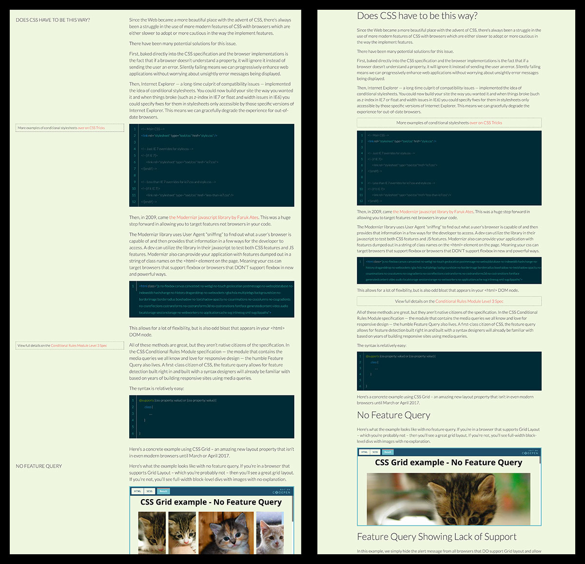
![Example Grid Layout Number 1](/images/blog/grid/side-by-side2.jpg)

Example Grid Layout Number 1

Edge supports Feature Queries, unlike its predecessor. So, it was able to see my Grid declarations. To fix this for my Edge viewers — since Edge has a VERY broken implementation of Grid — I implemented a second level of Feature Query to account for browsers that support Grid (which Edge TECHNICALLY does) but also don’t support -ms-grid (which Edge does, as well) to keep Edge from seeing display: grid.

The Feature Query now looks like this (could be more elegant, but my libsass doesn’t like compound Feature Queries right now):

@supports (grid-auto-rows: 1px) {
    display: grid;
    grid-template-columns: 1fr 1fr 1fr 1fr 1fr;
    grid-row-gap: calc(.8rem + .5vw);
    > p, iframe, .highlight {
        grid-column: 3 / span 3;
        width: auto;
    }
}

I originally ended the post by sarcastically saying “Thanks Microsoft.” As it turns out, this isn’t the worst thing in the world with the May 24th @supports update. So, “Thanks Microsoft for having someone looking out for us.”