
惯性聚合 高效追踪和阅读你感兴趣的博客、新闻、科技资讯
阅读原文 在惯性聚合中打开

推荐订阅源

K
Kaspersky official blog
小众软件
小众软件
Engineering at Meta
Engineering at Meta
博客园 - 三生石上(FineUI控件)
WordPress大学
WordPress大学
G
Google Developers Blog
Cyber Security Advisories - MS-ISAC
V
V2EX
freeCodeCamp Programming Tutorials: Python, JavaScript, Git & More
Google DeepMind News
Security Archives - TechRepublic
CTFtime.org: upcoming CTF events
C
Check Point Blog
aimingoo的专栏
aimingoo的专栏
罗磊的独立博客
钛媒体:引领未来商业与生活新知
钛媒体:引领未来商业与生活新知
MongoDB | Blog
MongoDB | Blog
L
LINUX DO - 热门话题
酷 壳 – CoolShell
酷 壳 – CoolShell
奇客Solidot–传递最新科技情报
奇客Solidot–传递最新科技情报
H
Help Net Security
Martin Fowler
Martin Fowler
G
GRAHAM CLULEY
Simon Willison's Weblog
OSCHINA 社区最新新闻
OSCHINA 社区最新新闻
博客园 - Franky
V
Vulnerabilities – Threatpost
云风的 BLOG
云风的 BLOG
博客园_首页
C
Cybersecurity and Infrastructure Security Agency CISA
量子位
Stack Overflow Blog
Stack Overflow Blog
Recent Announcements
让小产品的独立变现更简单 - ezindie.com
I
Intezer
Scott Helme
Scott Helme
A
About on SuperTechFans
博客园 - 司徒正美
Hacker News: Ask HN
Hacker News: Ask HN
The GitHub Blog
The GitHub Blog
Forbes - Security
Forbes - Security
Threat Intelligence Blog | Flashpoint
博客园 - 聂微东
人人都是产品经理
人人都是产品经理
The Cloudflare Blog
cs.CV updates on arXiv.org
Spread Privacy
Spread Privacy
T
Tailwind CSS Blog
S
Security Affairs
宝玉的分享
宝玉的分享

Bryan Robinson's Blog

Does our technology still work for us? Product pricing, dev bad habits, and the role of the pit of success Astro Server Island for latest Bluesky post (heavily cached!) Type-safe environment variables in Astro 5.0 New Website, but really is it? Netlify Durable Cache: Caching for a third-party world Introducing the Hygraph Astro Content Loader Integrating Astro.js Starlight Documentation into a Next.js Project Using Proxies Jamstack is meaningless 😱 Book Release: Eleventy by Example – Learn 11ty with 5 in-depth projects 11ty Second 11ty: Creating Template Filters 11ty Second 11ty: Global Data files (JS and JSON) 11ty second 11ty: The Render Plugin Part 1 Help needed: Netlify Frontend environment variables with Astro.js Quick experiment with the Slinkity 11ty plugin Creating a dynamic color converter with 11ty Serverless Using 11ty JavaScript Data files to mix Markdown and CMS content into one collection How to show your template code in 11ty blog posts New City, New Job, New Content Using Nunjucks Climbing the 11ty Performance leaderboard with Cloudinary, critical CSS and more Three JAMstack movements to watch in 2020 Create a Codepen promo watermark with no additional HTML, CSS or JS 3 underused CSS features to learn for 2020 Use CSS Subgrid to layout full-width content stripes in an article template Adapt client-side JavaScript for use in 11ty (Eleventy) data files CSS Gap creates a bright future for margins in Flex as well as Grid Create your first CSS Custom Properties (Variables) Use CSS Grid to create a self-centering full-width element Creating an 11ty Plugin - SVG Embed Tool Now offering design and code reviews at PeerReviews.dev Routing contact-form emails to different addresses with Netlify, Zapier and SendGrid Create an Eleventy (11ty) theme based on a free HTML template Client work and the JAMstack Grid vs. Flex: A Tale of a "Simple" Promo Space Using Eleventy The Tech Barrier to Entry What Can We Learn from CERN Let Practical CSS Grid - Launching My First Course Build Trust on the Web incorporating User Worries with your User Stories 2019 The Year of Markup-First Development Refactoring CSS into a Sass mixin Starting a new journey with Code Contemporary Dynamic Static Sites with Netlify and iOS Shortcuts Top 3 uses for the ::before and ::after CSS pseudo elements How To: Use CSS Grid to Mix and Match Design Patterns Use CSS ::before and ::after for simple, spicy image overlays Modern CSS: Four Things Every Developer and Designer Should Know About CSS 3 Strategies for Getting Started with CSS Grid The 5 Stages of Grid Love How To: A CSS-Only Mobile Off Canvas Navigation How To: Use CSS Grid Layout to Make a Simple, Fluid Card Grid Make a More Flexible Cover Screen with CSS Grid Can CSS Grid open up interesting CMS Layout options? Firefox 52 to Introduce New Box-Alignment Values Falling Forward — Rethinking Progressive Enhancement, Graceful Degradation and Developer Morality Start Exploring the Magic of CSS Grid Layout I Converted My Blog to CSS Grid Layout and Regret Nothing Feature Queries are on the Rise CSS Shapes — Let the Text Flow Around You Flexbox -- Let Memorializing Prince and Print vs. The Web I went to Italy and noticed UX fails How to Get Designers to Contribute in Open Source The True Gift of Your Former Code
CSS Tip: Use rotate() and skew() together to introduce some clean punk rock to your CSS
2018-01-24 · via Bryan Robinson's Blog

In 2018, the web design industry is going to start looking very different. Literally.

With all the tools we’re gaining in CSS, designers are going to have new ability to experiment. I wrote about some of those tools on CSS Tricks: Five Design Fears to Vanquish with CSS Grid.

I’m still convinced that taking inspiration from punk rock design of the 70s and 80s is going to be a trend.

If you want to start small, introduce some angles to your design. This is a simple trick to angle a stripe of content without adding awkward white space.

{% include ad-space.html %}
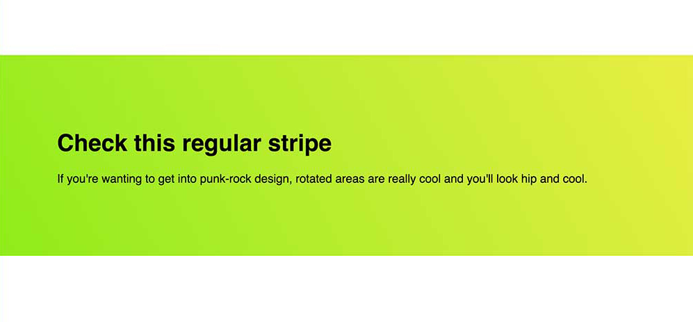
Start with a regular stripe

Regular Stripe Image

We all know this design pattern: full width background and nice promotional content.

We set up very simple markup:

<section class="stripe">
    <h1>Check this regular stripe</h1>
    <p>If you're wanting to get into punk-rock design, rotated areas are really cool and you'll look hip and cool.</p>
</section>

Add a pinch of very simple CSS and we’re done.

.stripe {
    background-image: linear-gradient(240deg, #eaee44, #90ec19);
    padding: 5rem;   
}

This is a lovely serviceable stripe of content. You also get to dig on a nice linear-gradient while you’re there.
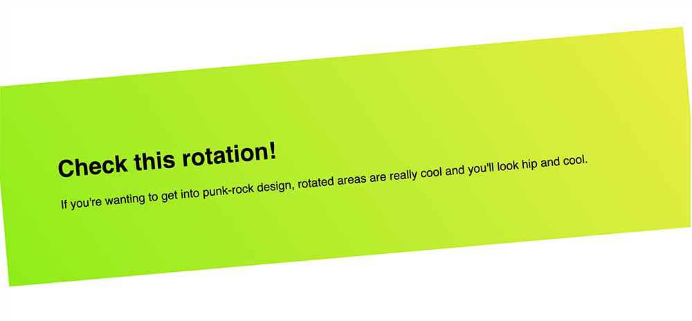
Use transform: rotate() to introduce the angle

Rotate the first stripe

The transform CSS property has a load of great functions. One of the easiest functions to use is rotate(). It takes an angle unit such as 45deg and rotates the element by that amount. A positive integer is a clockwise turn and negative is a counter-clockwise turn.

.stripe {
    background-image: linear-gradient(240deg, #eaee44, #90ec19);
    padding: 5rem;
    
    transform: rotate(-5deg);
}

You’ll notice from the photo that this introduces an issue. This is still a rectangle and by rotating the rectangle, we see the corners.

This doesn’t feel professional, so we need this to stay flush to the browser edge.
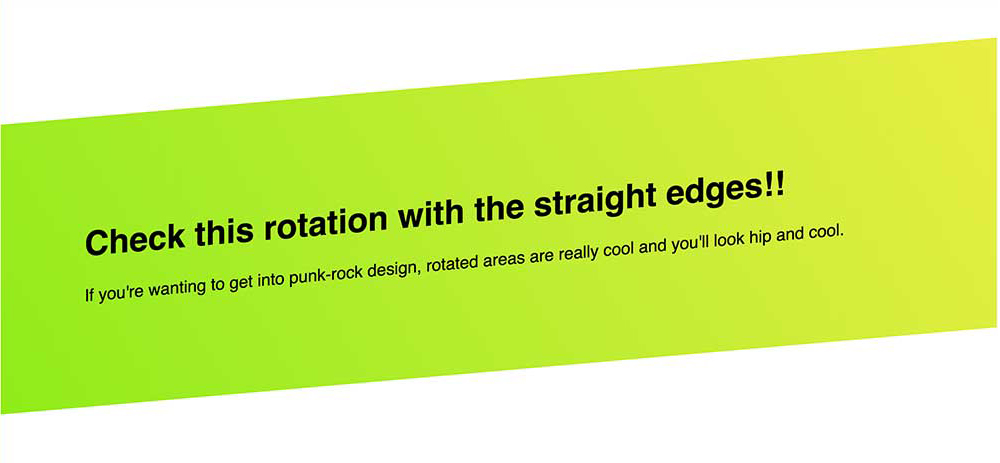
skew() to the rescue

Skew the rotated element

By taking the same angle we used in our rotate() function, we can skew the element back. This angles the left and right sides of our element back to their starting points.

The transform property can take multiple functions, so we apply it on the same line of CSS.

.stripe {
    background-image: linear-gradient(240deg, #eaee44, #90ec19);
    padding: 5rem;
    
    transform: rotate(-5deg) skew(-5deg);
}

The discerning designer eye will notice one more issue with our implementation. The text is now skewed. This may be something you want. The skewed text bothers me slightly, so let’s unskew it.
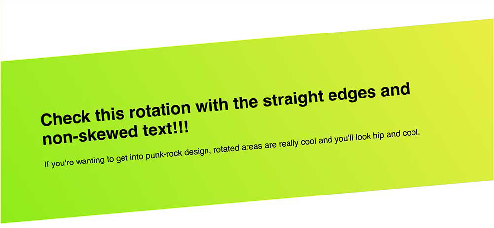
Time to unskew the text

Unskew the text

I’m not a huge fan of introducing new markup for styling if I can avoid it, but with the introduction of a content container, we can fix our text skew.

Chances are decent, you had a container here anyway to set a width on your content.

By applying a skew of the negative angle we’ve been using, the text will re-skew back to its initial angle. You can also use this method to un-rotate the text, as well, if that’s your need.

Full Markup:

<section class="stripe">
    <div class="stripe__content">
        <h1>Check this rotation with the straight edges and non-skewed text!!!</h1>
        <p>If you're wanting to get into punk-rock design, rotated areas are really cool and you'll look hip and cool.</p>
    </div>
</section>

Full CSS:

.stripe {
    background-image: linear-gradient(240deg, #eaee44, #90ec19);
    padding: 5rem;
    
    transform: rotate(-5deg) skew(-5deg);
}
.stripe__content {
    transform: skew(5deg);
}

This gives us clean lines with a hint of punk rock. See this in action on CodePen.

If you’re still doing things the same way you’ve always done them, it’s time to spice things up. Adding angles is an easy and painless way of tossing some cayenne into your design process.