


If your users scale the text size in Android or iDeviceOS, that doesn’t always affect the size of text on a web page. It’s a function of browser and authored code, as opposed to a standardized approach. That may be changing.
The current state of affairs in the three rendering engines…
Firefox on Android supports scaling a web page’s text if you adjust the system font size. It doesn’t seem to care if you use px units. You don’t need to do anything special; it just works.
Safari will not scale a web page’s text with the OS settings unless the author adds some CSS. This code points to the system font properties (such as size):
body {
  font: -apple-system-body;
  /* other styles, including font-family */
}
This feature query checks for support while trying to limit it to touch devices only, then sets the font size:
@supports (font: -apple-system-body) and (not (-webkit-touch-callout: default)) {
  :root {
    font-size: 100%;
  }
}
The rest of your styles have to use relative units or this breaks down.
Google has opted not to follow Firefox’s lead and support OS text sizes by default. Google has also opted not to mimic Safari and make platform-specific features. Instead, Google has decided to use its weight in the CSSWG to mint a new value for the <meta> element:
<meta name="text-scale" content="scale">For this to work, however, the author will need to “opt-in” by not setting a base font size in your CSS:
body {
  /* font-size: yeah, no */
}
You actually can set one, but it should be a percentage. You then need to avoid fixed units (such as px) throughout your site. If this seems familiar, it’s the core thesis of my aptly-named post The Ultimate Ideal Bestest Base Font Size That Everyone Is Keeping a Secret, Especially Chet.
Read Josh Tumath’s post Try text scaling support in Chrome Canary for more details.
Let’s combine those into one set of code that will work in Safari and now Chrome. Firefox was always on point, so no effort needed there.
Add this HTML to the <head> of your page (it’s the CSSWG code):
<meta name="text-scale" content="scale">Add this to the CSS of your page (it’s Apple’s code):
body {
  font: -apple-system-body;
  /* other styles, including font-family */
}
@supports (font: -apple-system-body) and (not (-webkit-touch-callout: default)) {
  :root {
    font-size: 100%;
  }
}
Done.
I made a demo. It has images and a table. Visit the debug version in your mobile browser.
See the Pen Untitled by Adrian Roselli (@aardrian) on CodePen.
Seriously, visit the debug version in your mobile browser. I’m not dealing with desktop here.
With your Android device, install Chrome Canary from the Google Play store. If you are using an Android device with another app store, I leave it to you to sort that out. Then, using chrome://flags, enable Experimental Web Platform Features in Chrome Canary.
In Android, go to Settings → Accessibility → Display size & text; in the Size options section, go to Font size and make it as large as possible.
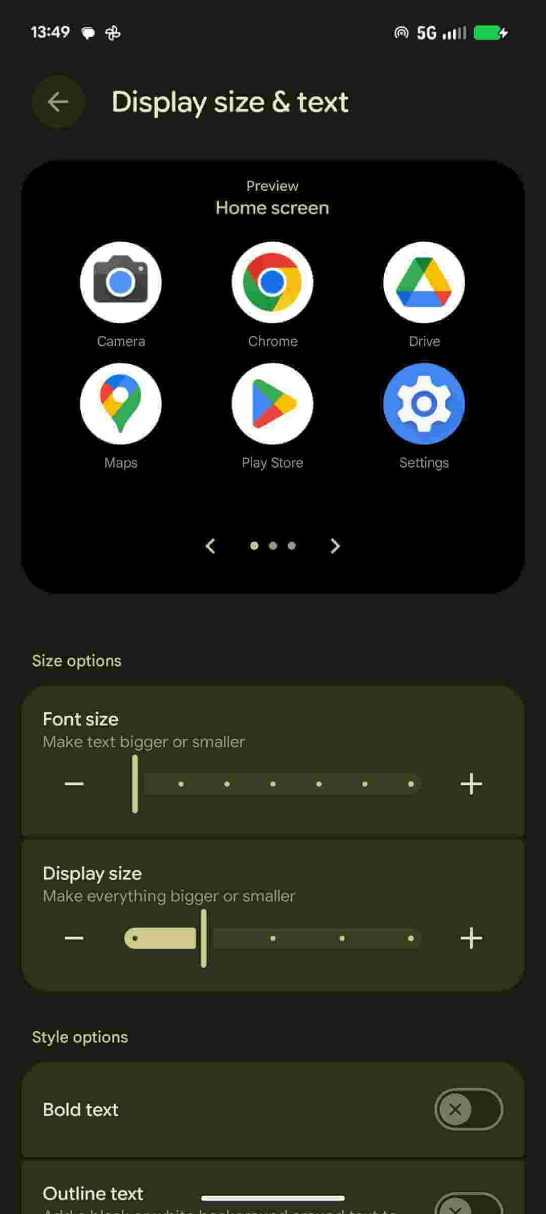
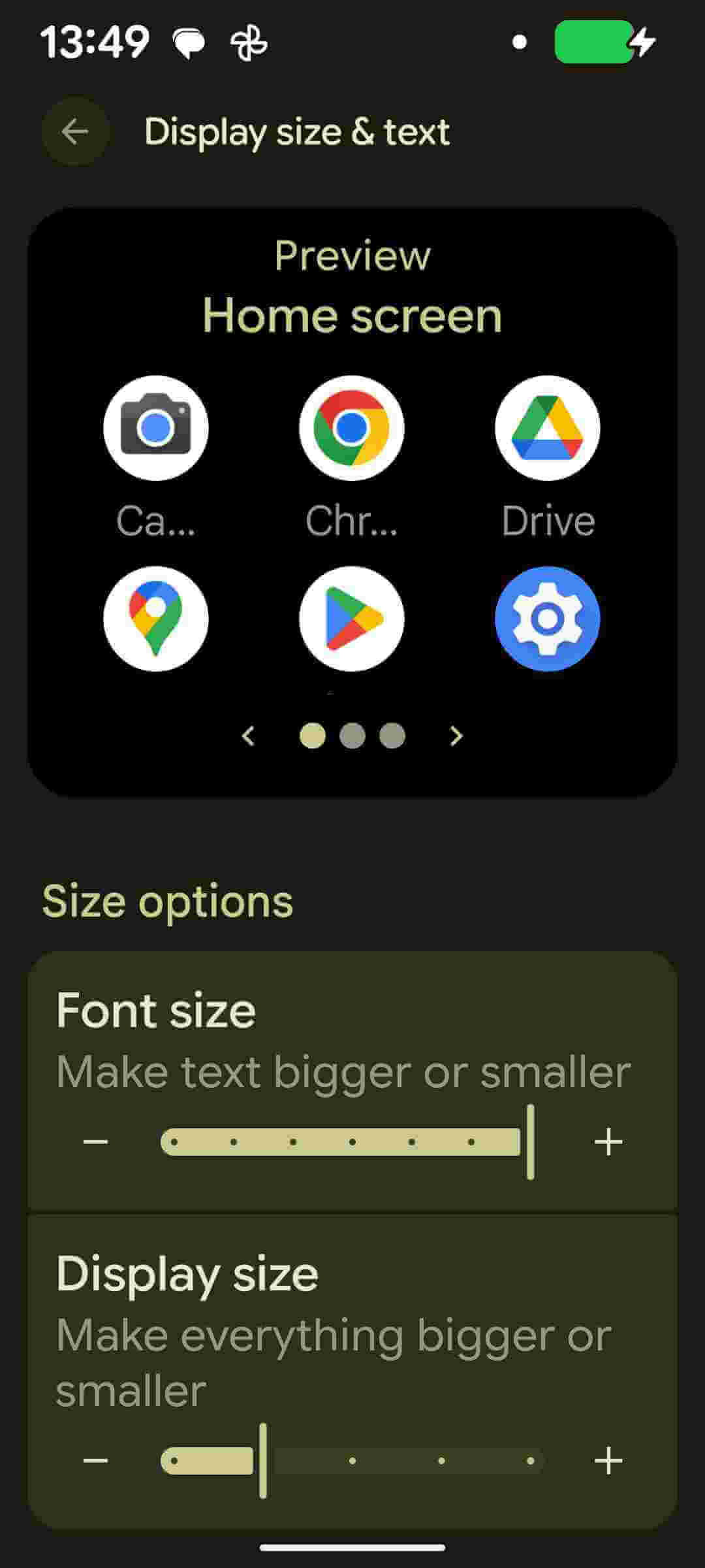
In iDevices, go to Settings → Accessibility → Display & Text Size → Larger Text, toggle Larger Accessibility Sizes, then drag that slider all the way to the to max.
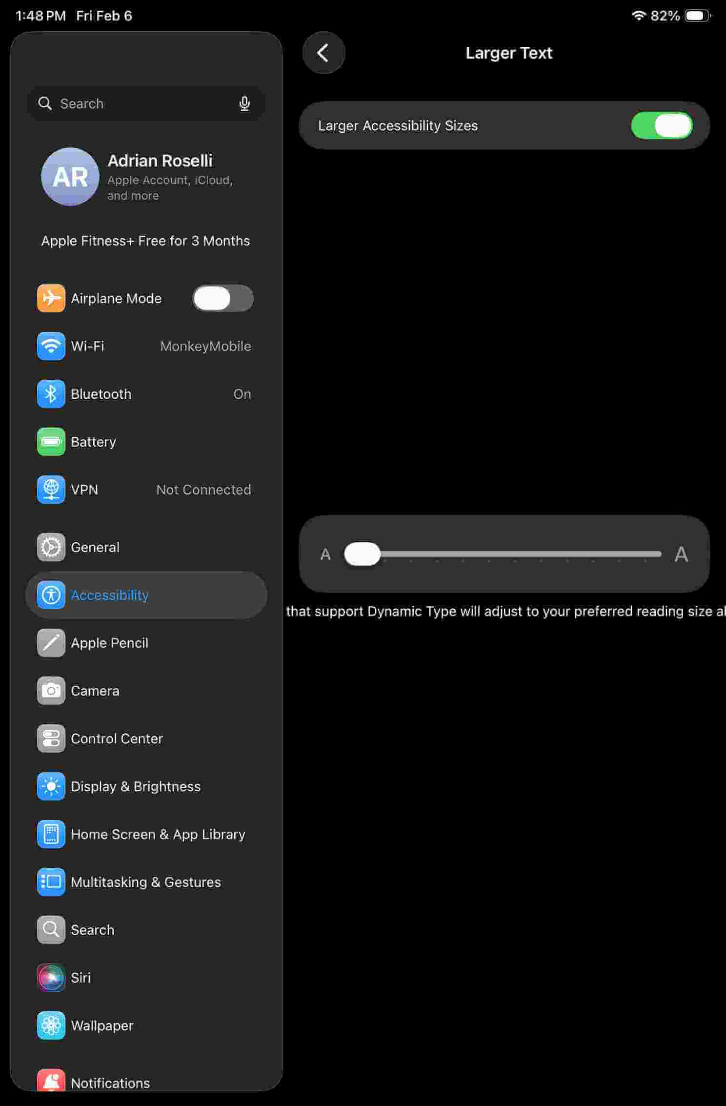
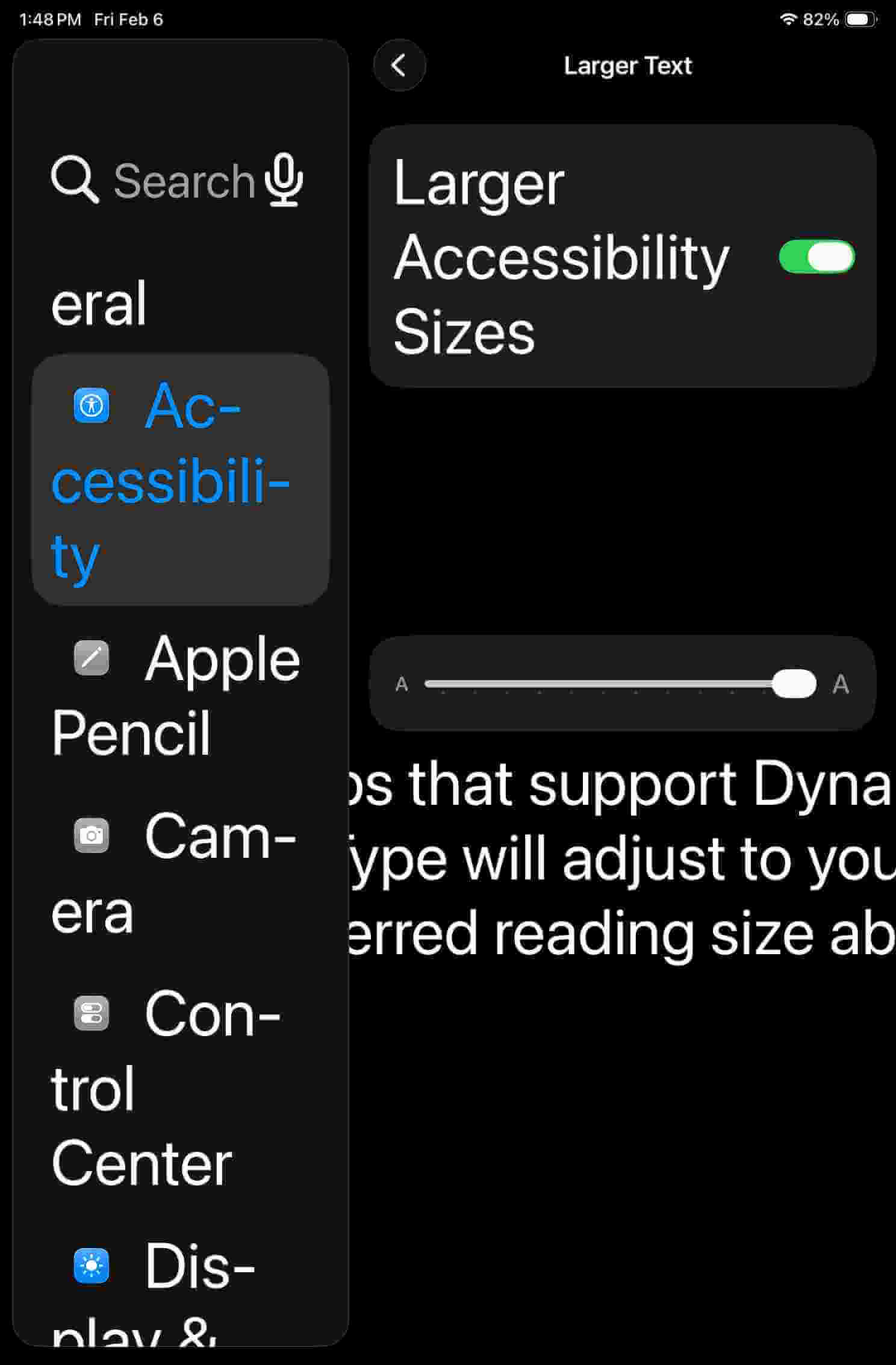
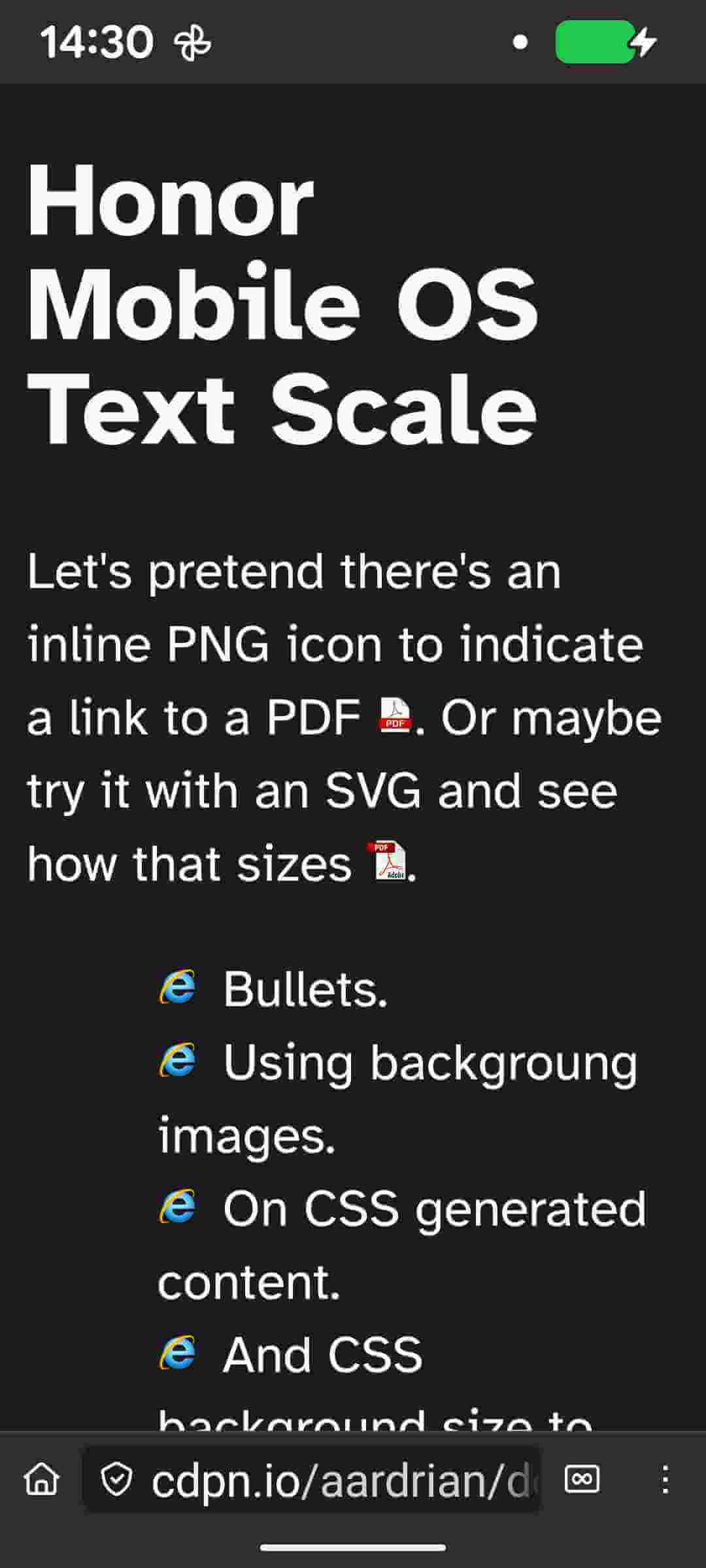
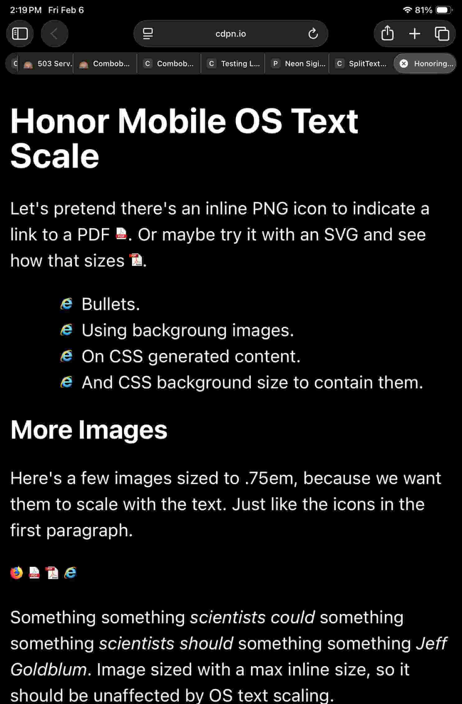
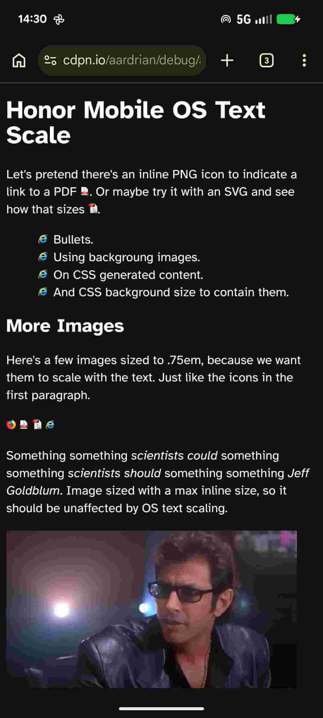
These are before (small text) and after (largest text) images of Frankenstyle’s Demo. Your experience may differ. If you’re reading this from the future, it may differ a lot.
None of these required a browser reload. It may take a moment, so be patient.



Things that may better inform those words and pictures above:
env(preferred-text-scale) (not addressed in this post)<meta> element<meta> might better belong in WHATWG HTML, I could find no corresponding issue with WHATWG.此内容由惯性聚合(RSS阅读器)自动聚合整理,仅供阅读参考。 原文来自 — 版权归原作者所有。