


I spent years teaching CSS layout on this blog. I put everything I know into The Layout Maestro course: 70+ lessons and 150+ interactive examples that teach you how to think CSS layouts, not just memorize syntax.
There are a lot of CSS properties that some don’t know about, or they know about them, but forget to use them when they’re needed. Some of those can save you using JavaScript to achieve a specific result, or some can save your time by writing less CSS. As a front-end developer, I came across such things every now and then, and I asked myself, why not list all those less-used and interesting CSS properties in an article?
In this article, I will go through some different CSS properties that I hope you find them interesting. For some properties, I will try to show the browser support for them, and apply the progressive enhancement approach, so you can be encouraged to use it without the fear of saying “This is not supported in browser X, what should I do?”.
Are you ready? Let’s dive in the less-used so you can know more. :)
place-items with CSS Grid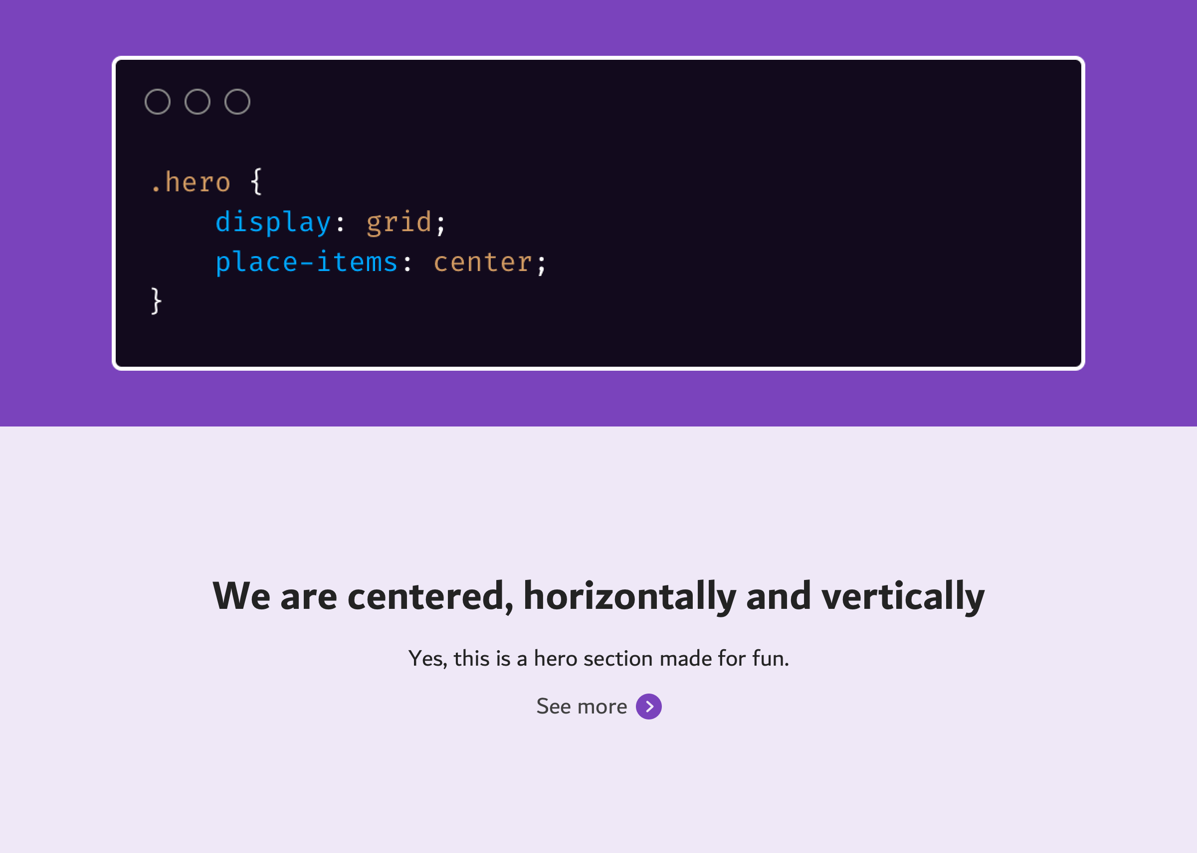
I learned about this trick from Benjamin De Cock. You can center an element horizontally and vertically with two lines of CSS.
<div class="hero">
  <div class="hero-wrapper">
    <h2>CSS is awesome</h2>
    <p>Yes, this is a hero section made for fun.</p>
    <a href="#">See more</a>
  </div>
</div>
.hero {
  display: grid;
  place-items: center;
}
Before going into details, it’s worth mentioning that place-items is a shorthand property that combines justify-items and align-items. Here is how the code above could be:
.hero {
  display: grid;
  justify-items: center;
  align-items: center;
}
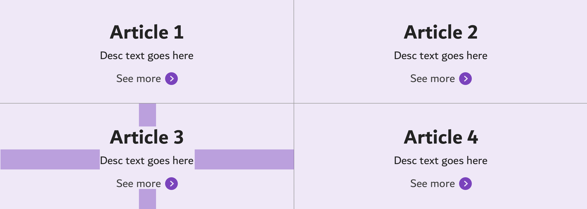
You may wonder, how this works? Well, let me explain that. When the place-items is used, it’s applied on each cell in the grid. That means it will center the cell’s content. That means, this technique can work with multiple cells. If we increase the number of columns, that will be more clear.
.hero {
  display: grid;
  grid-template-columns: 1fr 1fr;
  place-items: center;
}
margin: auto with Flexbox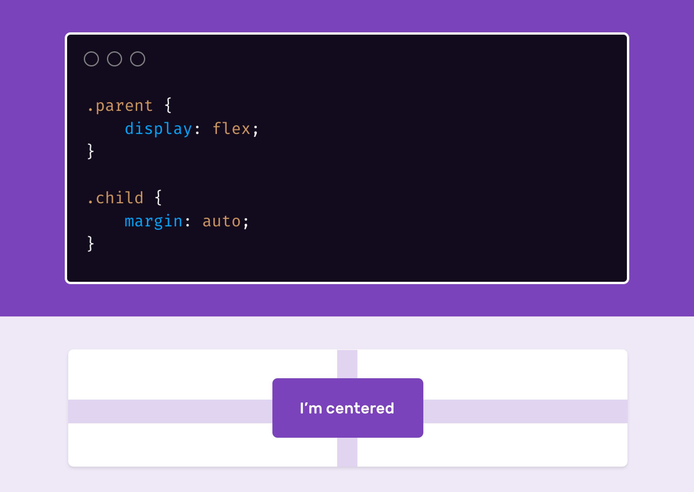
Combined with flexbox, margin: auto can center a flex item horizontally and vertically very easily.
<div class="parent">
  <div class="child"></div>
</div>
.parent {
  width: 300px;
  height: 200px;
  background: #ccc;
  display: flex;
}

.child {
  width: 50px;
  height: 50px;
  background: #000;
  margin: auto;
}
Isn’t that cool?
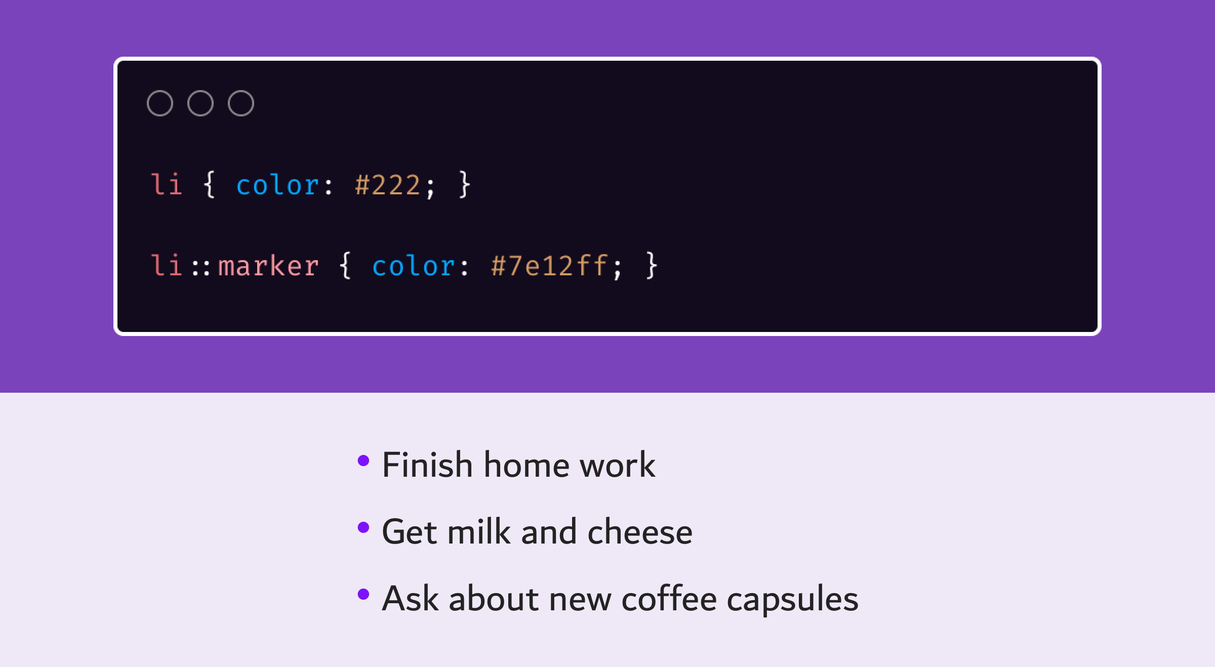
First, let me be clear that I wasn’t aware that the little default circle next to each list item is called a marker. Before I know about the ::marker pseudo-element, the process was to reset the list style, and then to add the circle as a ::before or ::after pseudo-elements. That’s isn’t practical. Here is the bad way of doing this:
ul {
  list-style: none;
  padding: 0;
}

li {
  color: #222;
}

li::before {
  content: "•";
  color: #ccc;
  margin-right: 0.5em;
}
As you see, the <li> color is #222, while the ::before pseudo-element is #ccc. If the <li> and ::before have the same color, then the circle will inherit by default, and thus the pseudo-element is not needed at all.
Let’s see a better way of doing this.
li {
  color: #222;
}

li::marker {
  color: #ccc;
}
And we’re done! Isn’t that much, much easier?
The ::marker is supported in Firefox 68+ and Safari 11.1+. It’s supported behind a flag in Chrome and Edge 80+.
text-align PropertyWith the rising popularity of CSS flexbox and grid, it’s common for someone who has just started with CSS to use the modern methods for centering and alignment instead of text-align. However, the old methods still work.
Using the text-align: center can solve an issue quickly. Consider the following example.

The content needs to be centered. Is it worth to use flexbox or grid? With text-align, this can be easily achieved.
I don’t have to explain about the browser support for text-align, you should guess that yourself (Sorry!).
display: inline-flex Property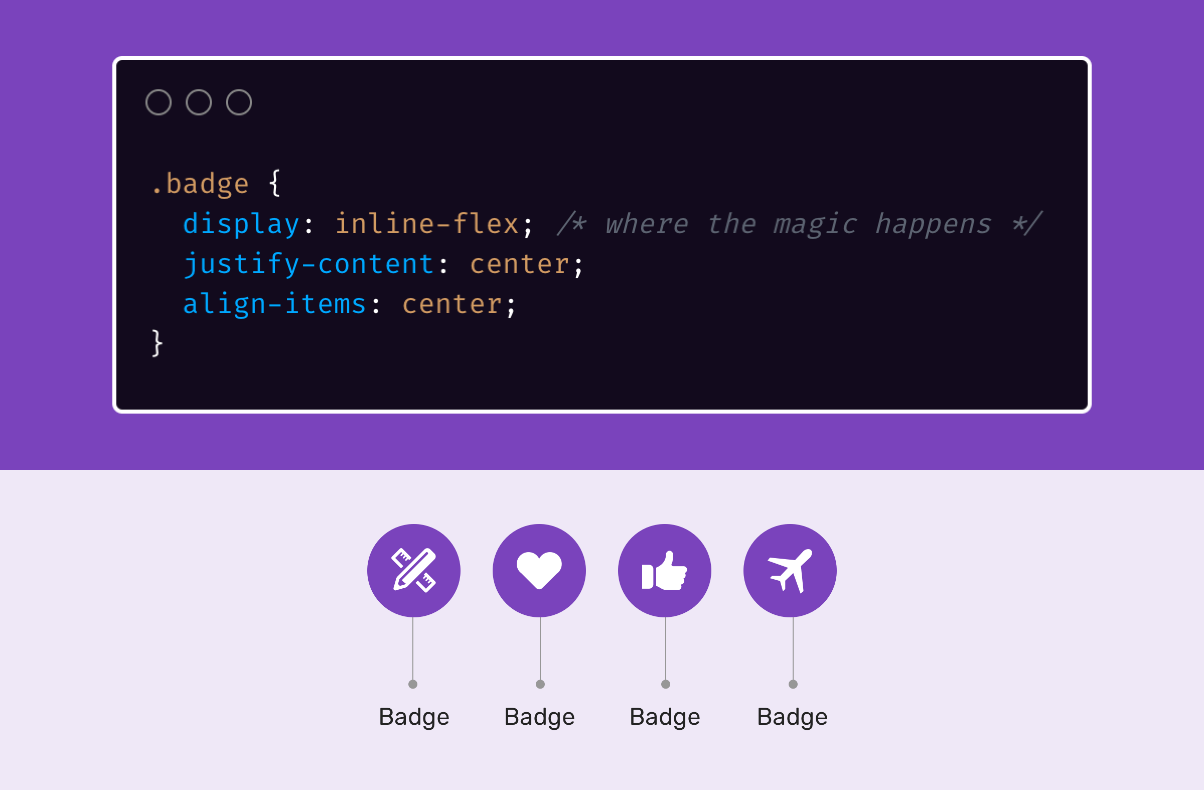
Do you remember if you needed to display a list of badges inline, and each one of them should be a flexbox element? That’s what inline-flex is for.
<span class="badge"><svg></svg></span>
<span class="badge"><svg></svg></span>
<span class="badge"><svg></svg></span>
<span class="badge"><svg></svg></span>
.badge {
  display: inline-flex; /* where the magic happens */
  justify-content: center;
  align-items: center;
}
Next time you need an inline element with a flex functionality, remember to use inline-flex. Simple and easy.
column-rule Property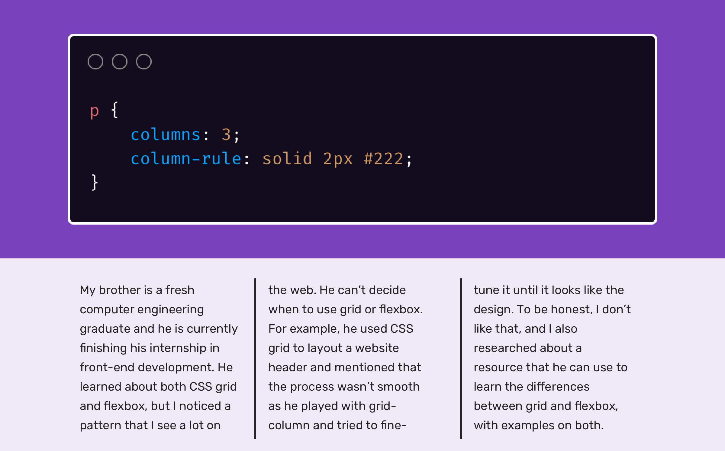
CSS columns is a layout method which can divide an element into columns. A common use-case for it is to divide a paragraph text content into two lines. However, the less common thing about it is that we can add borders between the columns. I learned about this tip from Manuel Matuzovic’s article.
p {
  columns: 3;
  column-rule: solid 2px #222;
}
The column-rule property name might not reflect its purpose, but imagine it as border-right. The property is well supported in all browsers (IE 10+, Firefox 3.5+, Chrome 4+, Safari 3.1+, Edge 12+).
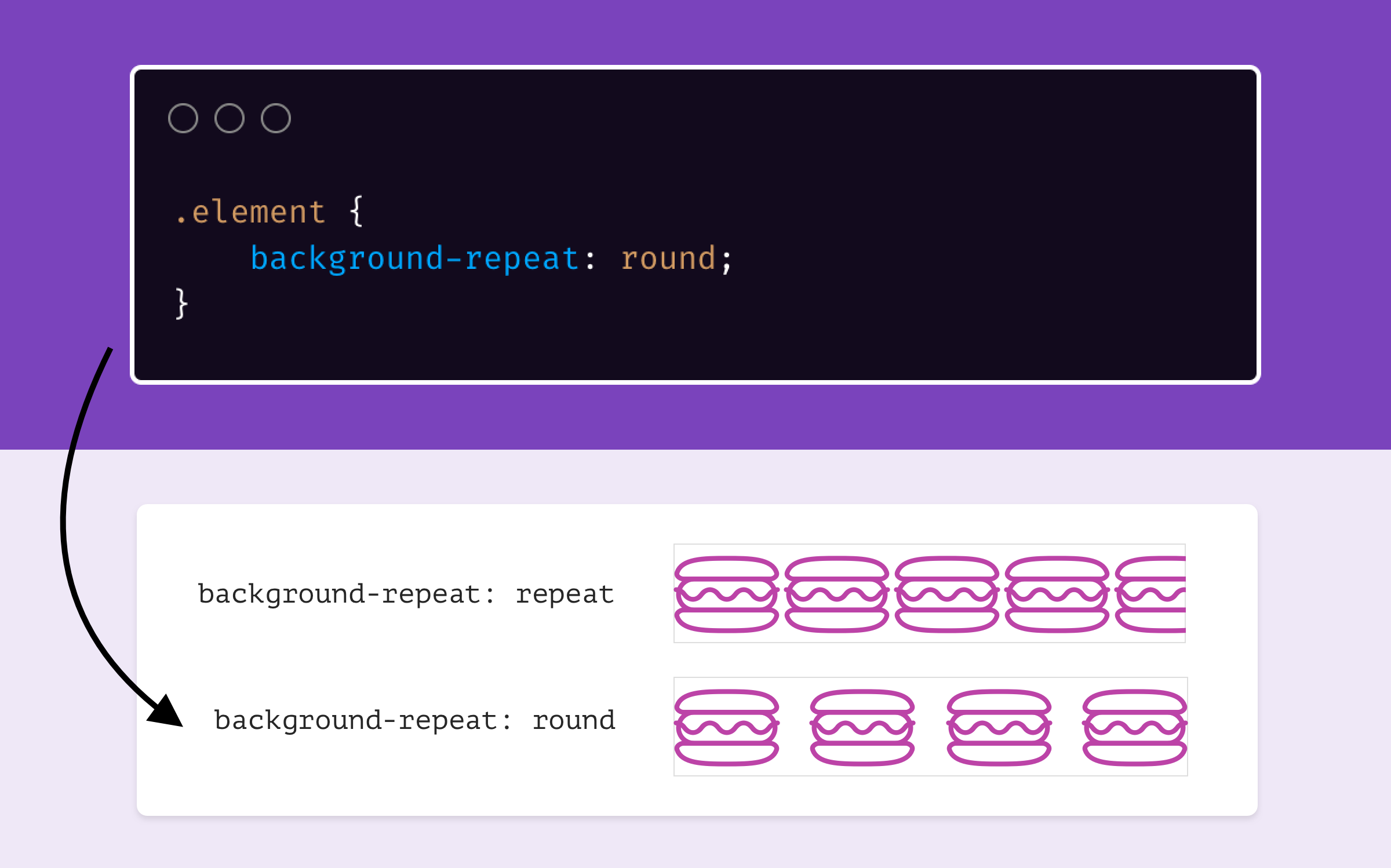
I recently learned about this value from a tweet by Addy Osmani. There is a value for background-repeat which prevent the clipping of a background.
.element {
  background-size: contain;
  background-repeat: round;
}
According to CSS Tricks, here is how round works:
tile the image in both directions. Never crop the image unless a single image is too large to fit. If multiple images can fit with leftover space, squish them or stretch them to fill the space. If it’s less than half one image width left, stretch, if it’s more, stretch.
It’s Magical. Isn’t it?
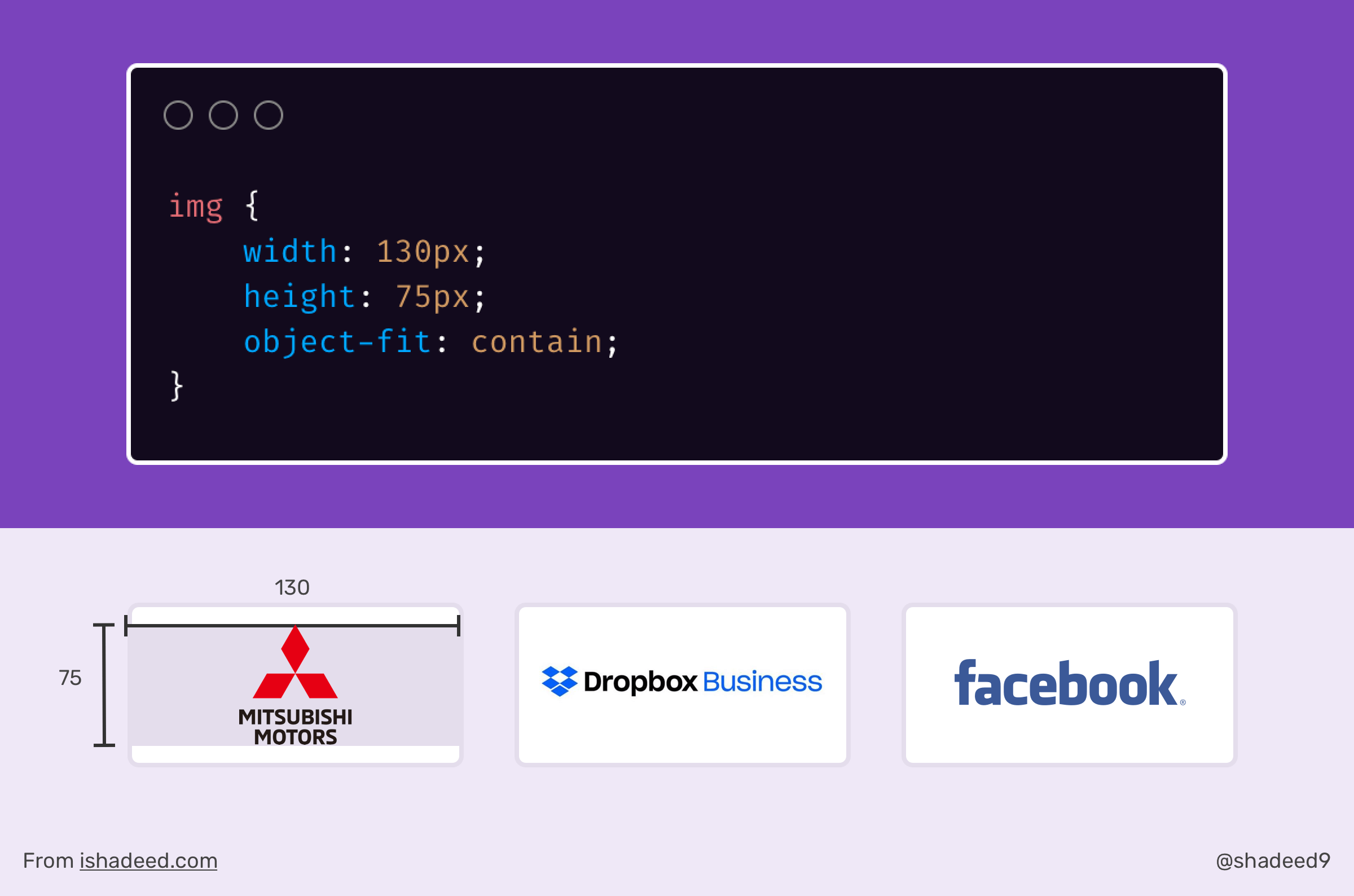
The object-fit CSS property is magical. When I first knew about it, it changed a lot of things and made my life easier as a front-end developer. Recently, I was working on a section that displays a grid of logos. That kind of thing is sometimes hard due to the inconsistent sizes of the logos. Some of them have a horizontal shape, some have a vertical one.
By using object-fit: contain, I was able to control the width and height of the logos and force the image to be contained in the defined width and height.
<ul class="brands">
  <li class="brands__item">
    <a href="#">
      <img src="img/logo.png" alt="" />
    </a>
  </li>
  <li><!-- other logos --></li>
</ul>
img {
  width: 130px;
  height: 75px;
  object-fit: contain;
}
By defining a width and height, we will force the image to be contained. This is a huge benefit. Even better, we can wrap the above in a @supports to avoid stretching the logo image in browsers that don’t support object-fit.
@supports (object-fit: contain) {
  img {
    object-fit: contain;
    height: 75px;
  }
}
That’s a wrap. Do you have a comment or a suggestion? Please feel free to ping me on @shadeed9.
Thank you for reading.
此内容由惯性聚合(RSS阅读器)自动聚合整理,仅供阅读参考。 原文来自 — 版权归原作者所有。