


A guide to everything you need to know about centering in CSS
By Ahmad Shadeed - @shadeed9
Before starting, can you please choose your favorite plate from the
below?
You will play with it throughout the guide.
To center an inline element like a link or a
span or an img, all you
need is text-align: center.
<div class="desk">
  <span class="plate"></span>
</div>
.desk {
  text-align: center;
}
For multiple inline elements, the process is similar. It’s possible by using text-align: center.
<div class="desk">
  <span class="plate"></span>
  <span class="plate"></span>
</div>
.desk {
  text-align: center;
}
By changing the desk display type to flex, we can easily center the content of it.
.desk {
  display: flex;
  justify-content: center;
}
Even for multiple inline items, the centering works seamlessly.
.desk {
  display: flex;
  justify-content: center;
}
With a grid container, the plate will be centered according to its grid area. Note that this won’t work with more than one plate unless they are wrapped in an element.
I wrote a guide about grid and flexbox alignment. Learn about box alignment.
.desk {
  display: grid;
  justify-content: center;
}
A block element with a known width and height can be centered by using an auto value for the left and right margins.
.plate {
  width: 120px;
  height: 120px;
  margin-left: auto;
  margin-right: auto;
}
With multiple block elements, they should be wrapped in an element to be centered.
.tray {
  display: flex;
  margin-left: auto;
  margin-right: auto;
}
You can use flexbox to center the plate.
.desk {
  display: flex;
  justify-content: center;
}
Also, you don’t need to wrap the plates in wrapper to center them. Flexbox can do that!
.desk {
  display: flex;
  justify-content: center;
}
By absolutely positioning the plate, we can easily center it horizontally with CSS transforms.
.plate {
  position: absolute;
  left: 50%;
  transform: translateX(-50%);
}
I wrote a guide about CSS positioning in detail. Learn about CSS positioning.
In case the element width is known, you can use a negative margin instead of CSS transforms.
.plate {
  position: absolute;
  left: 50%;
  margin-left: -60px;
}
One of the easiest ways to vertically center an element is using padding.
.desk {
  padding-top: 24px;
  padding-bottom: 24px;
}
The vertical-align property can be used for one or multiple elements.
In this example, the fork and the knife should be centered vertically with the plate.
.desk {
  text-align: center;
}

.plate,
.fork,
.knife {
  vertical-align: middle;
}


To align the plate, fork, and knife, we can use flexbox for that.
.desk {
  display: flex;
  justify-content: center;
  align-items: center;
}
By positioning an element absolutely, it’s possible to center it vertically with CSS transforms.
.plate {
  position: absolute;
  top: 50%;
  transform: translateY(-50%);
}
If the element height is known, you can use negative margin instead of positioning.
.plate {
  position: absolute;
  top: 50%;
  margin-top: -60px;
}
With CSS grid, we can use align-items to center an item vertically to its grid area.
.desk {
  display: grid;
  align-items: center;
}
We can combine padding and text-align to center an element horizontally and vertically.
.plate {
  text-align: center;
  padding-top: 24px;
  padding-bottom: 24px;
}
By absolutely positioning the plate to the left and right sides.
.plate {
  position: absolute;
  left: 50%;
  top: 50%;
  transform: translate(-50%, -50%);
}
By using setting justify-content and align-items to center, it’s easy and straightforward.
.plate {
  display: flex;
  justify-content: center;
  align-items: center;
}
With the place-items property, it combines justify-items and align-items.
.desk {
  display: grid;
  place-items: center;
}
Other Articles That I Wrote
Resources
I’m writing an ebook
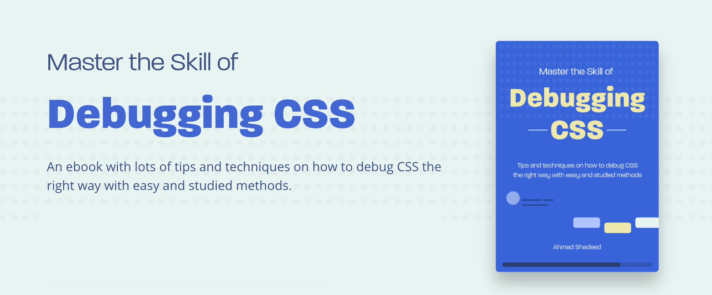
I’m excited to let you know that I’m writing an ebook about Debugging CSS. If you’re interested, head over to debuggingcss.com and subscribe for updates about the book.
此内容由惯性聚合(RSS阅读器)自动聚合整理,仅供阅读参考。 原文来自 — 版权归原作者所有。