


I spent years teaching CSS layout on this blog. I put everything I know into The Layout Maestro course: 70+ lessons and 150+ interactive examples that teach you how to think CSS layouts, not just memorize syntax.
When I write CSS, I wish there is a way to have flex-wrap detection in CSS. In some cases, I design a simple component that is responsive with flex-wrap, but the point is that I want to have even more control and be able to detect when an item is wrapped. This post goes into more detail about one of the wishes I have for CSS in 2023.
In this post, I will try to explain why we need it and what the use-cases can get benefit from that.
To get you into the context, flex-wrap is a way that we can decide if flex items should wrap into a new line or not. Allowing the flex items to wrap can result in a component that works responsively regardless of its container width.
.list {
  display: flex;
  flex-wrap: wrap;
}
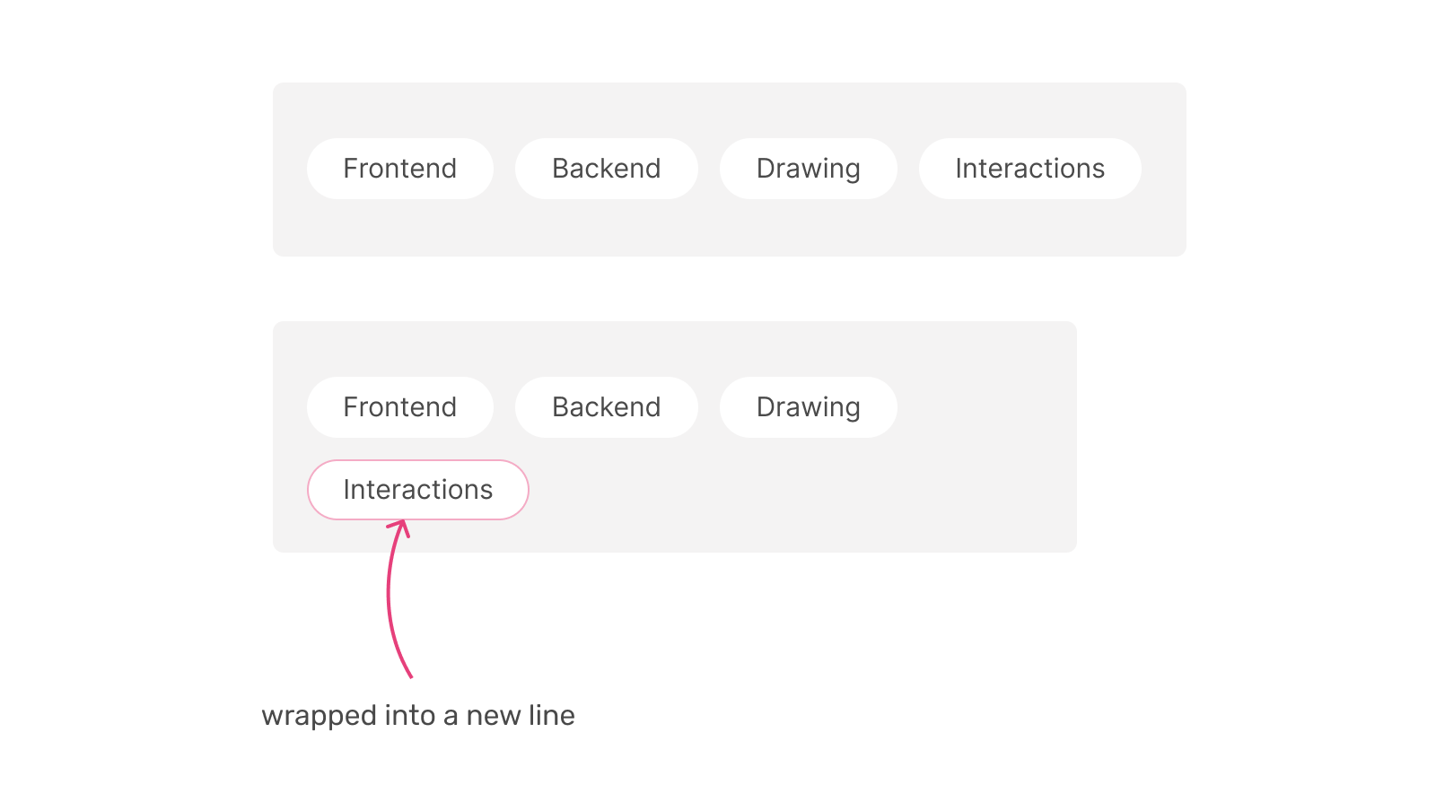
It’s that simple.
I tend to avoid using flex-wrap when building a site header. I prefer to use a media query and estimate the safest breakpoint to hide the navigation and show the mobile menu toggle.
Consider the following example.
.site-header {
  display: flex;
  align-items: center;
}

@media (max-width: 600px) {
  .site-header {
    /* Hide the navigation, and show the mobile menu toggle. */
  }
}
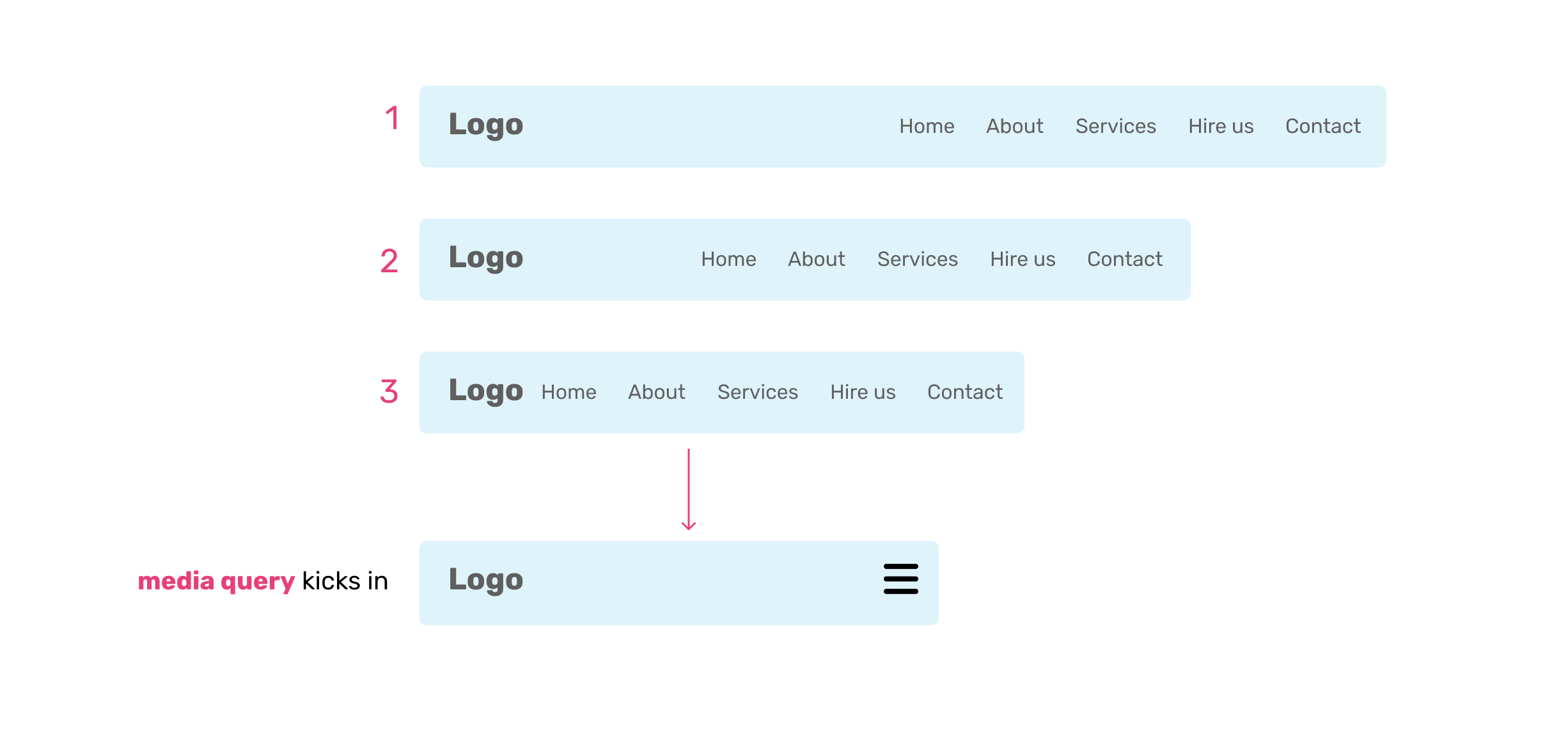
To make the site header responsive, I add a media query in the second state. The reason is I assume that the navigation might get an additional item and there is still enough space for it.
If I do the mobile stuff in the third state, the design might fail when the navigation has more items.
If I have flex-wrap state detection, this will make my job a lot easier. I can imagine something like this:
.site-header {
  display: flex;
  flex-wrap: wrap;
  align-items: center;
}

.site-header:has(.nav:wrap) {
  /* Hide the navigation, and show the mobile menu toggle. */
}
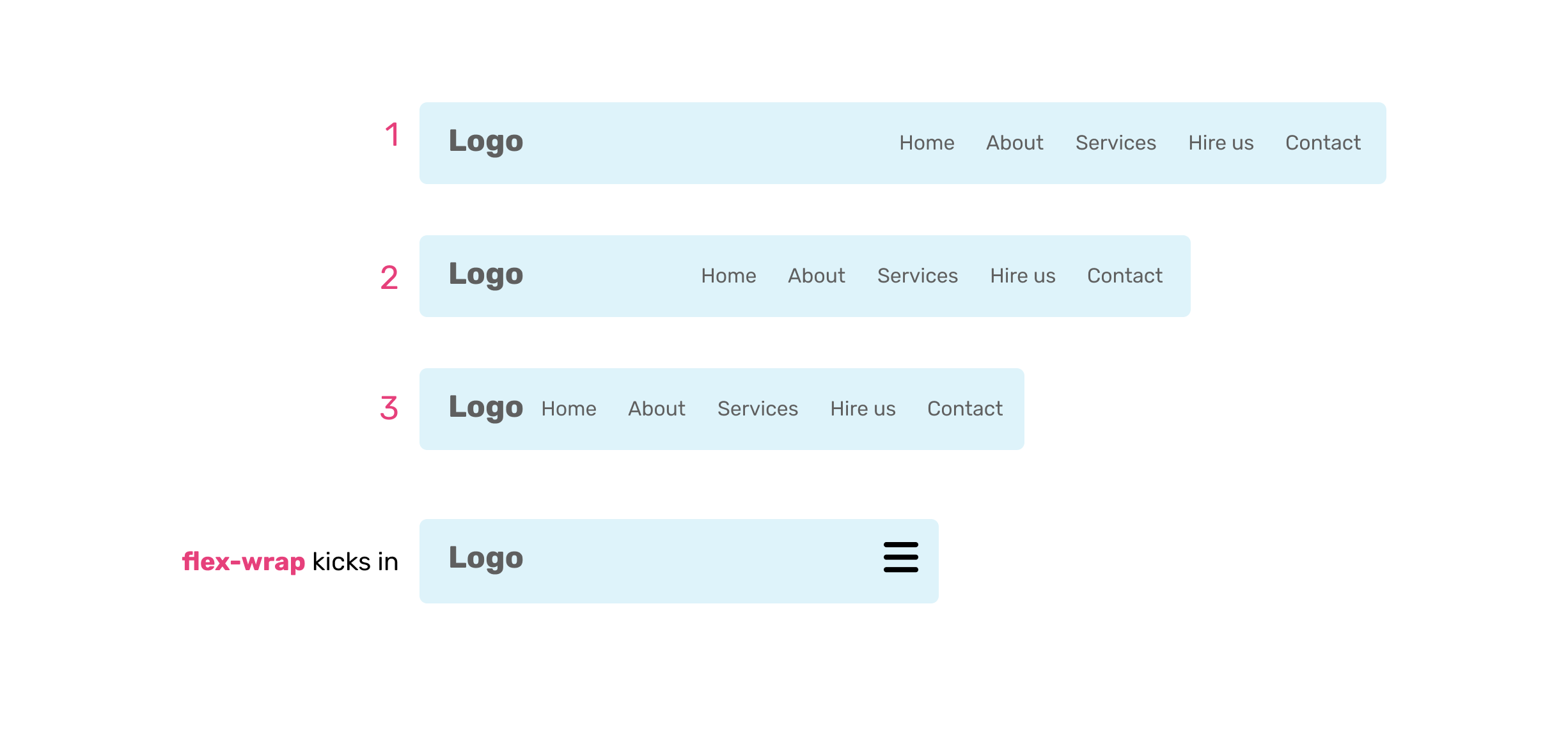
I used :has because I need to know if the child item is wrapped (The navigation links, in our case).
You might be wondering if both the media query and the flex-wrap detection give us the same result. Correct, but that’s not always the case.
I can break the media query-based navigation by just adding a long text.
Consider the following figure:
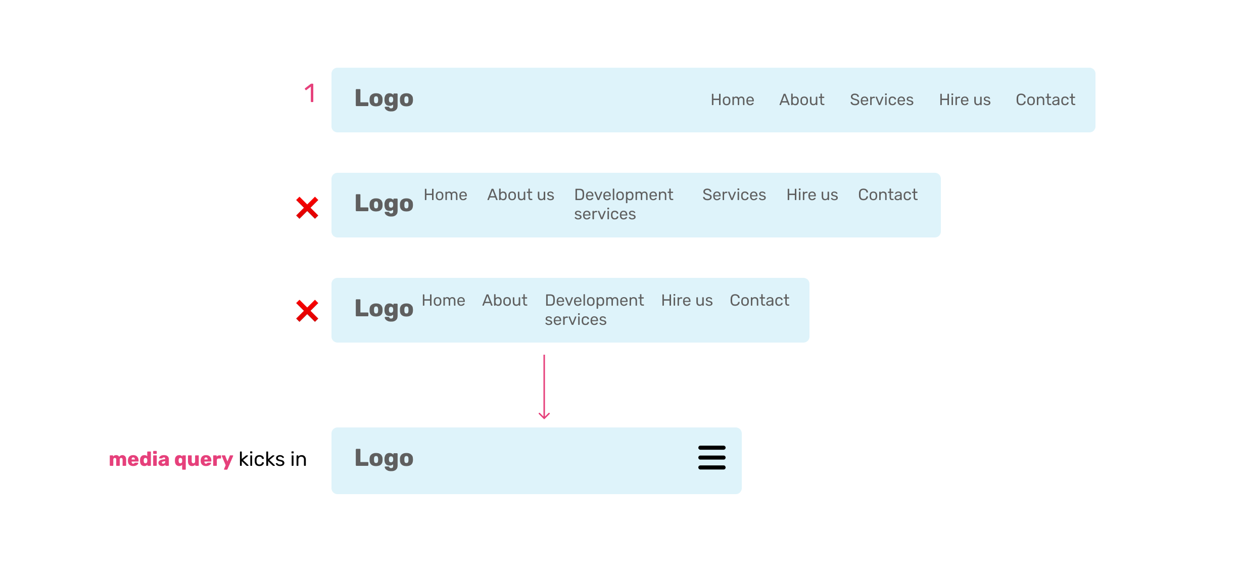
The media query won’t know that we have more navigation items, thus the need to kick in. It works based on the viewport width, not our content.
When working on a multilingual website, the same navigation items for English might look different in length compared to Arabic, for example.
Consider the following example.
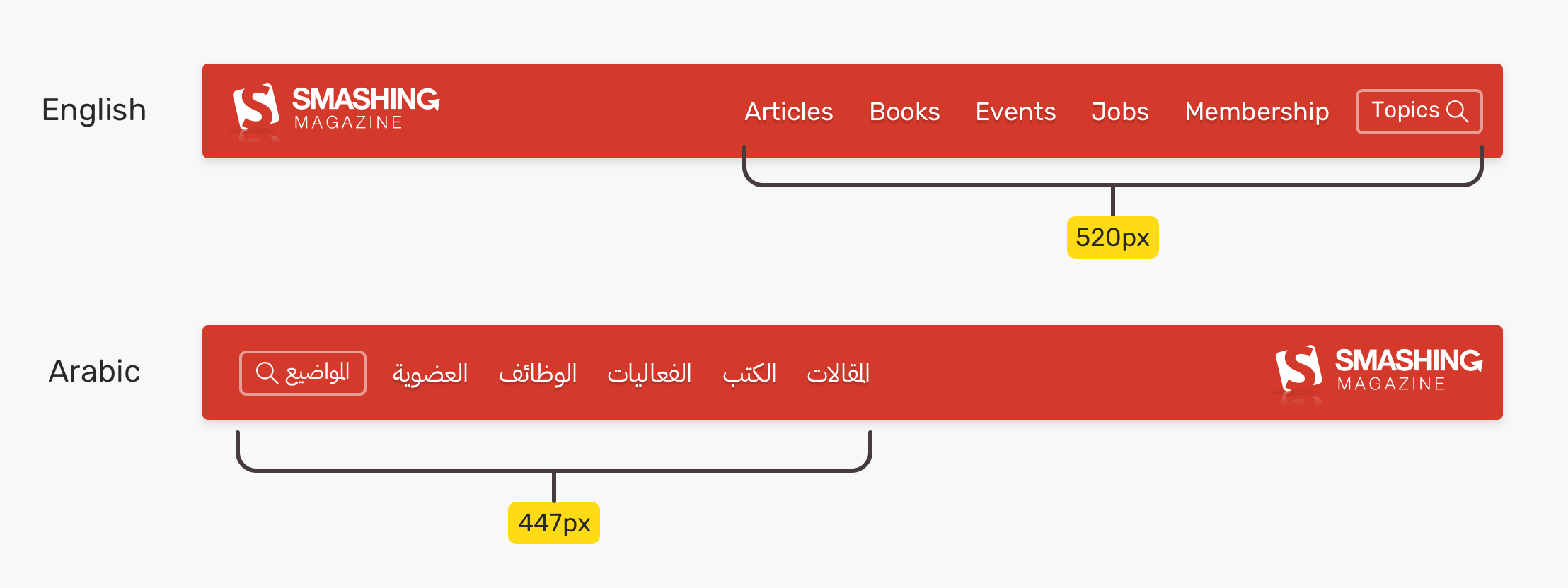
When the viewport size gets smaller, the media query might kick in too early. This doesn’t happen all the time, but it’s possible. What I can do in such a case is to have a new media query, just for the RTL layout.
@media (max-width: 700px) {
  html[dir="rtl"] {
    .site-header {
      /* Custom CSS... */
    }
  }
}
With flex-wrap detection, the navigation will work regardless of the content length.
.site-header:has(.nav:wrap) {
  /* Hide the navigation, and show the mobile menu toggle. */
}
We can use flexbox to lay out a tabs component. On mobile, I want the design to switch to a list instead of tabs. The trick is to know when the tab items are wrapped.
This isn’t possible in the current CSS (except with hacks I don’t prefer to use). We can use a media query to do that, but it’s not perfect.
@media (min-width: 600px) {
  .tabs {
    display: flex;
    flex-wrap: wrap;
  }
}
Again, the media query above doesn’t know anything about the content. It is just an estimation from the front-end developer.
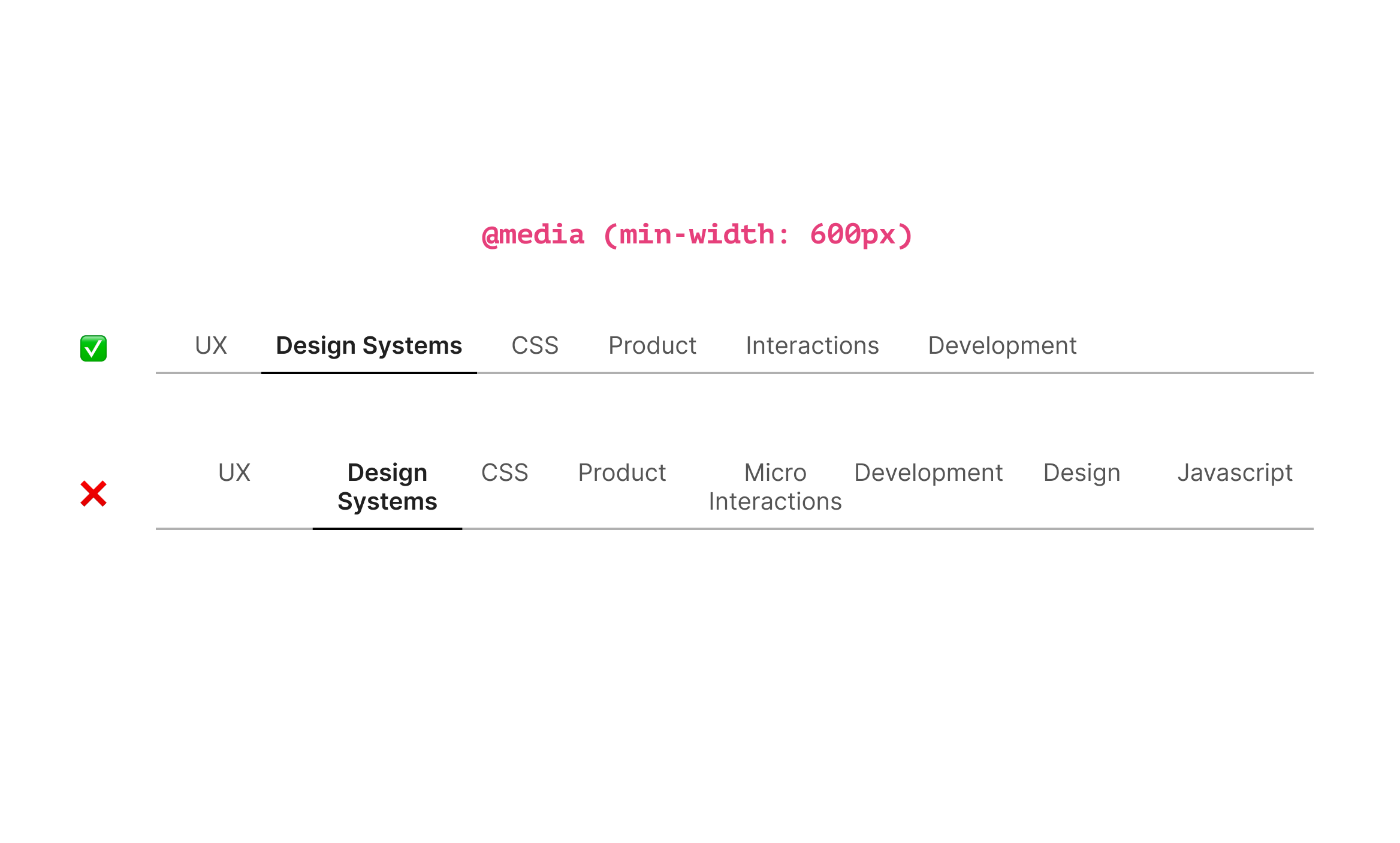
As you see, it can fail when we have more tabs. If we can detect when the first flex item is wrapped, we can fix that in a much clearer way.
.tabs {
  display: flex;
  flex-wrap: wrap;
}

.tabs:wrap {
  flex-direction: column;
  border-bottom: 0;
}

.tabs:wrap .tab__item {
  flex: 1;
}
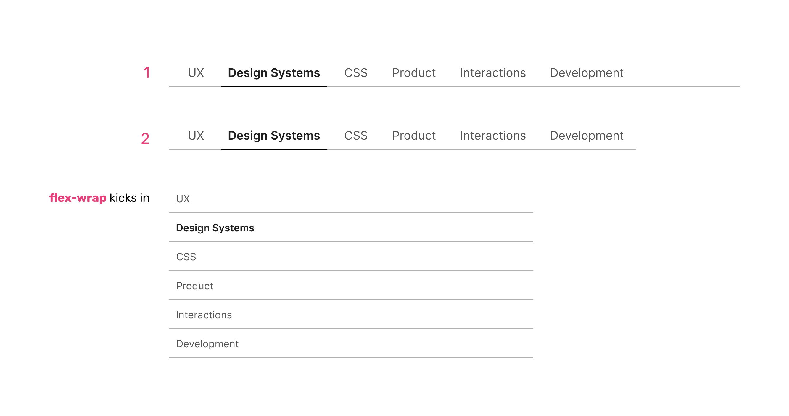
Auto margins and flexbox are useful. We can use it to push a flex item to the far end of its container.
.card {
  display: flex;
  flex-wrap: wrap;
}

.actions {
  margin-left: auto;
}
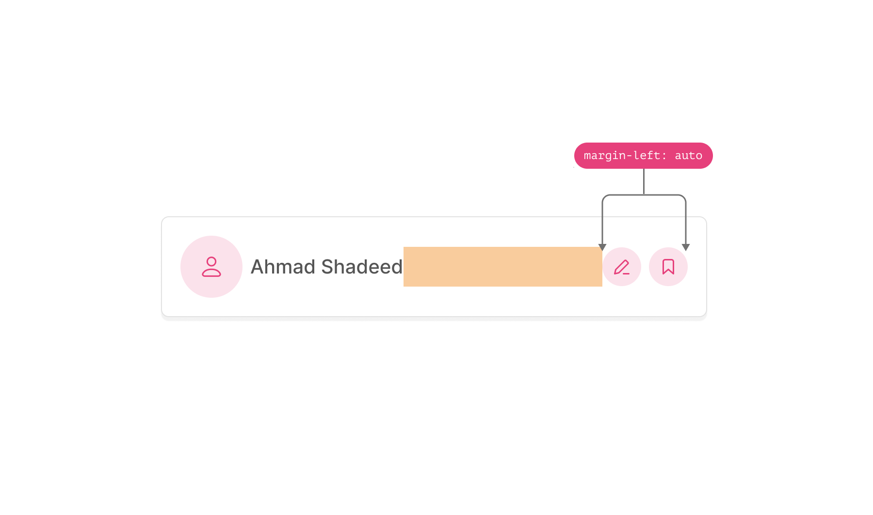
The challenge here is that the card might look weird when it’s wrapped. We don’t know when that will happen.
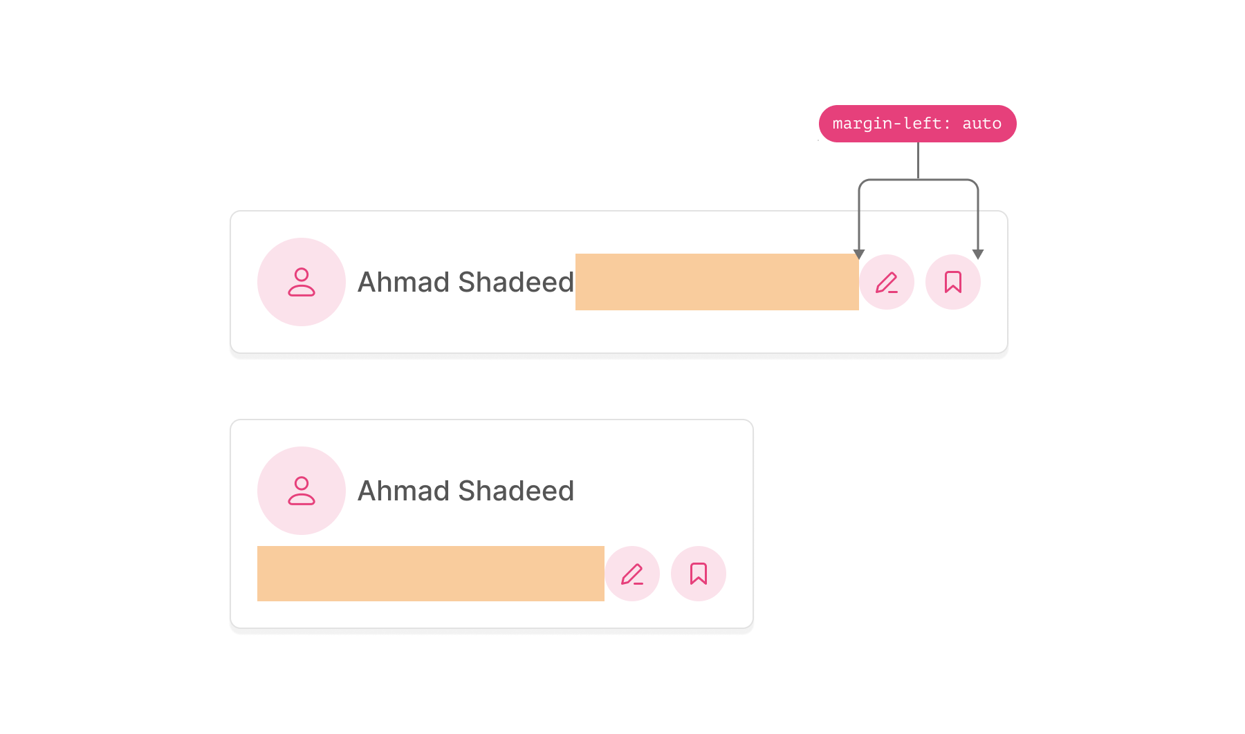
If we have flex-wrap detection, the job will be much easier.
.card {
  display: flex;
  flex-wrap: wrap;
}

.card:wrap .actions {
  margin-left: initial;
}

.card:wrap .actions__item {
  /* show the label */
}
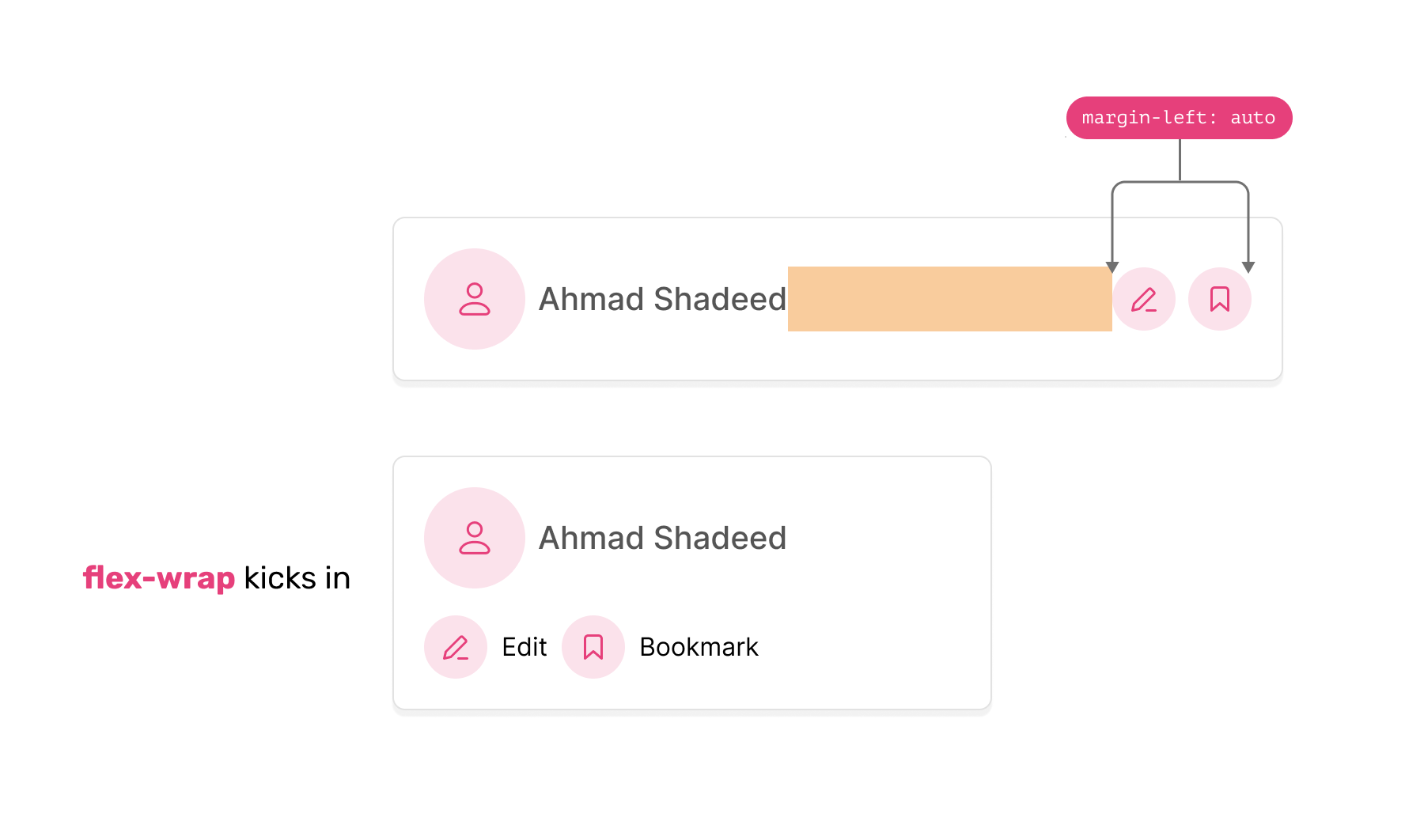
So, do we need flex wrapping detection? It’s a big yes for me. The above are a few examples of where flex wrapping detection can be helpful. I believe having this feature is the closest thing to a content query in CSS.
What about you? Do you think that this feature should be implemented in CSS?
此内容由惯性聚合(RSS阅读器)自动聚合整理,仅供阅读参考。 原文来自 — 版权归原作者所有。