


I spent years teaching CSS layout on this blog. I put everything I know into The Layout Maestro course: 70+ lessons and 150+ interactive examples that teach you how to think CSS layouts, not just memorize syntax.
Selection is a habit formed by computer users many years ago. On the web, we select content for different reasons. Maybe we want to copy a text and quote it somewhere, or maybe coping is just a habit that some users do to make reading easier. For mobile, selecting content is harder and for me, it’s annoying. I don’t like to select content on mobile. It just doesn’t feel right!
In this article, I will go through everything about selection in CSS, which includes the pseudo-element ::selection, and user-select. The goal of the article is to get you aligned with all those techniques and to let you know when and where to use them.
According to Mozilla Developer Network (MDN):
The ::selection CSS pseudo-element applies styles to the part of a document that has been highlighted by the user (such as clicking and dragging the mouse across text).
To use the ::selection pseudo-element, all you need to do is the following:
p::selection {
  color: #fff;
  background-color: #000;
}
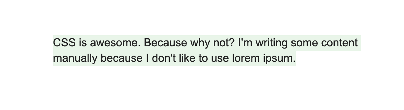
::selectionIt’s worth noting that only color, background, and text-shadow properties are supported with ::selection.
What if we want a custom selection effect? For example, controlling the height of selection, and having a custom background? See the below figure:
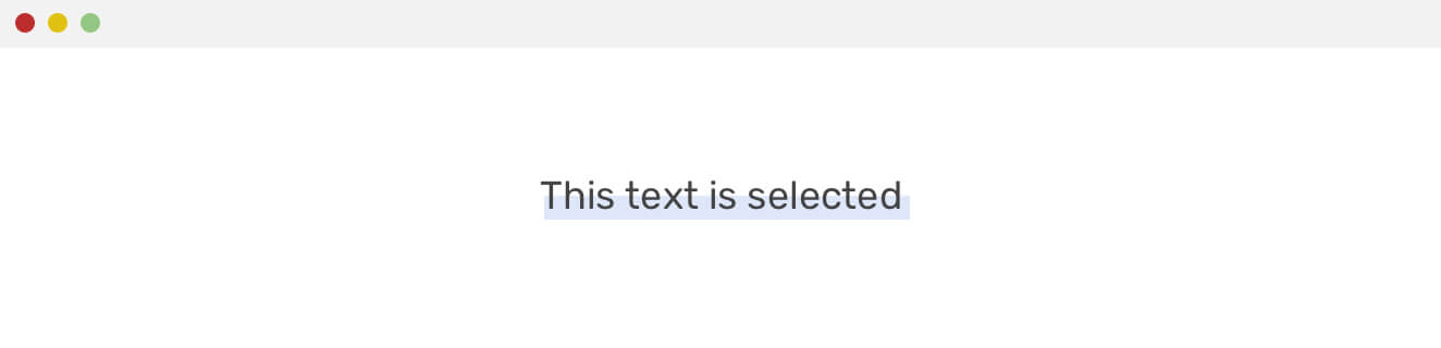
It’s possible, but a bit tricky. Here is an explanation of how it’s done:
Now, when the text is selected, the pseudo-element will cover 50% of the text vertically. This mimics the effect we needed.
p {
  position: relative;
  color: #fff;
}

p:after {
  content: attr(data-content);
  position: absolute;
  color: #000;
  top: 0;
  left: 0;
  width: 100%;
  height: 50%;
  background-color: #fff;
}

p::selection {
  background: rgba(76, 125, 225, 0.18);
}
Credits goes to this question on StackOverflow.
As another option, I tweaked the above and used CSS gradients instead. The point here is using a white gradient that has a 50% height and doesn’t repeat the background.
h1:after {
  content: attr(data-content);
  position: absolute;
  color: #000;
  top: 0;
  left: 0;
  width: 100%;
  background: linear-gradient(#fff, #fff) top/100% 50% no-repeat;
}
See the below figure for a visual explanation.
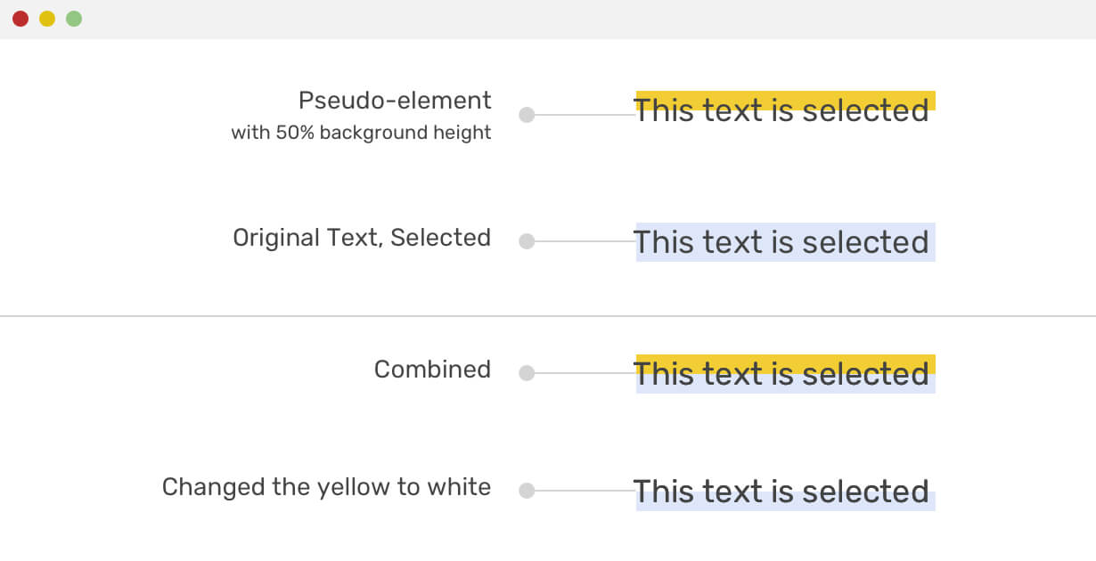
I hope it’s more clear now! See the demo on CodePen.
While working on the previous demo, I asked myself a question: is it possible to animate the selection? For example, while the text is selected and the mouse is not hovering, the height is 50% and When the mouse is hovering, the height can be increased to 80%.
p {
  transition: background 0.3s ease-out;
}

p:hover:after {
  background-size: 100% 80%;
}
Unfortunately, the solution above won’t work with multi-line text. To make it work, we should use JavaScript to wrap each word in an inline element, a <span>, for example. Once each word is in a <span> element, a pseudo-element should be added to each one, and the same technique can be used.
See the below script for wrapping each word in a <span> element.
let paragraph = document.querySelector(".text")
const words = paragraph.textContent.split(" ")

paragraph.innerHTML = ""

words.forEach(function (word) {
  let wordItem = document.createElement("span")
  wordItem.setAttribute("data-word", word)
  wordItem.innerHTML = word + " "
  paragraph.appendChild(wordItem)
})
Now, you need to style each <span> element, and then add a pseudo-element for each one.
span {
  position: relative;
  font-size: 1.25rem;
  line-height: 1.4;
}

span::after {
  content: attr(data-word);
  position: absolute;
  left: 0;
  right: 0;
  top: -0.28em;
  height: 75%;
  padding-top: 0.14em;
  background: #fff;
  pointer-events: none;
}

span::selection {
  background: rgba(#4c7de1, 0.18);
}
This solution works, but not with all text. For example, the text below has a comma, number, full capital words. Notice that the selection is not consistent in all words.
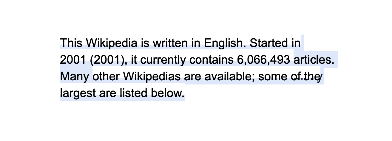
I would say that having a multi-line selection style is hacky, and shouldn’t be used globally on a website. Maybe it’s totally fine if it’s were used for one paragraph only.
::selection and text-shadowSince text-shadow is one of the supported properties for a custom selection, we can get creative with some interesting effects by using multiple text shadows. Let’s explore some:
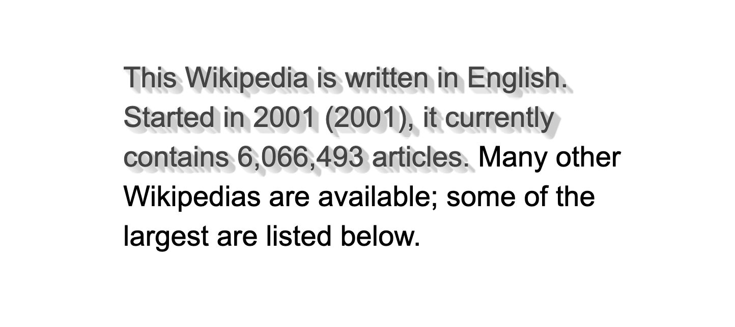
p::selection {
  color: #444444;
  background: #ffffff;
  text-shadow:
    1px 0px 1px #cccccc,
    0px 1px 1px #eeeeee,
    2px 1px 1px #cccccc,
    1px 2px 1px #eeeeee,
    3px 2px 1px #cccccc,
    2px 3px 1px #eeeeee,
    4px 3px 1px #cccccc,
    3px 4px 1px #eeeeee,
    5px 4px 1px #cccccc,
    4px 5px 1px #eeeeee,
    6px 5px 1px #cccccc,
    5px 6px 1px #eeeeee,
    7px 6px 1px #cccccc;
}
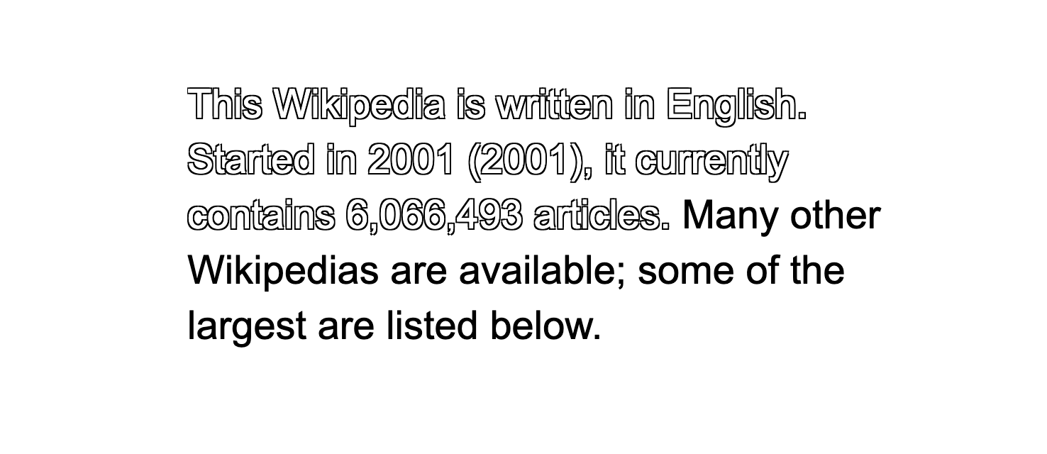
As per this article on CSS tricks, we can simulate a text outline by using text-shadow.
p::selection {
  color: #fff;
  text-shadow:
    -1px -1px 0 #000,
    1px -1px 0 #000,
    -1px 1px 0 #000,
    1px 1px 0 #000;
}
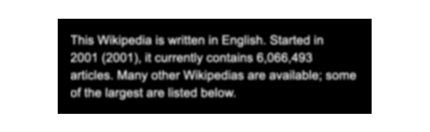
Another interesting effect is to blur the text on selection. By making the color transparent, the text-shadow will still be there and mimics a blur effect.
p::selection {
  color: transparent;
  text-shadow: 0 0 3px #fff;
}
And I’m sure you can come up with more and more examples. The possibilities are endless with text-shadow.
It’s recommended not to use a heavy text-shadow style as they will cause performance issues. I tried to cause a performance issue for you :D See below:
That neon effect is very heavy. Notice that while selecting the text, there is a lag between the time I select and the time that the selected style appears. Also, notice those glitches at the top and left sides. Please use text-shadow carefully.
The short answer is yes. For me, I found it weird to selected a page and found that the content inside an input is selected. See the figure below:
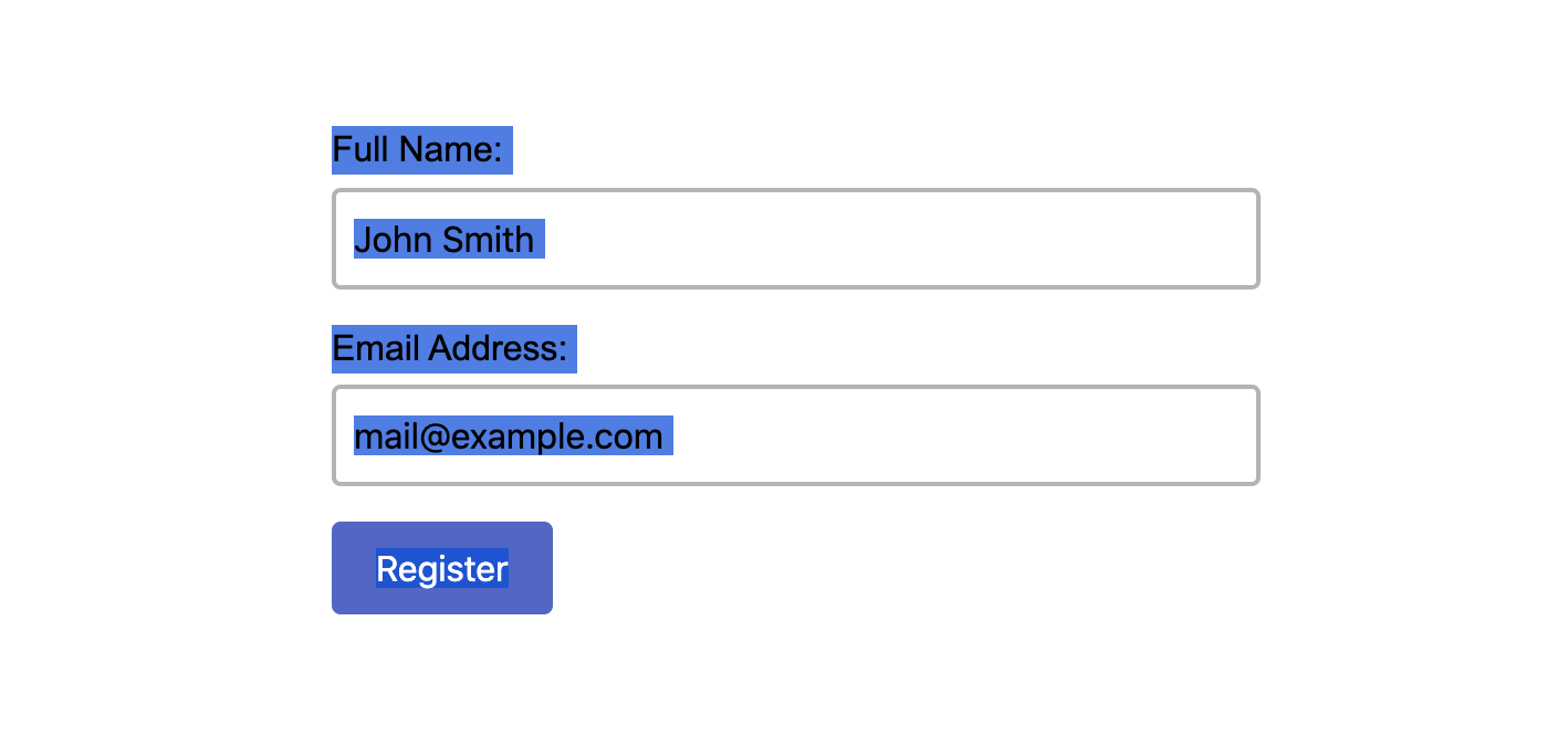
For example, the button text can be selected. We will come to discuss whether or not to allow selecting form elements in the user-select section.
However, things don’t stop there. Selection is more than just selecting text. In the next section, I will explain the user-select CSS property and how we can get the benefit of it.
user-select PropertyThe user-select property gives us the ability to wether the user can select a specific text or not. It can be useful to disable text selection in some use-cases, which will be useful for the user to avoid selecting any unwanted neighboring content. (I borrowed the word neighboring from the CSS spec).
The possible values for the property are:
none, auto, text, contain, all
If an element has an icon as a symbol or a font icon, then it will be selected within the text. This is not practical and not useful at all. Consider the following:
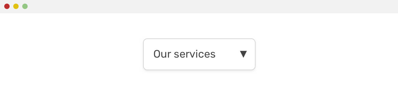
<button>Our Services<span aria-hidden="true">▼</span></button>
When selected, it looks like this.
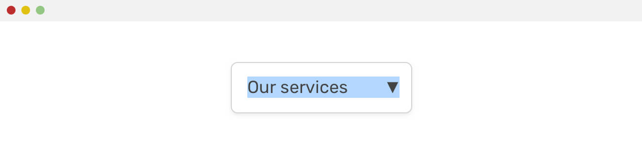
That’s not necessary at all. Notice that it has the aria-hidden attribute to avoid exposing it to screen readers. We can use this:
button span[aria-hidden="true"] {
  user-select: none;
}
That way, we prevented the icon from being selected, and at the same time, this ties it to the aria-hidden attribute. So anything that shouldn’t be selected, is most likely shouldn’t be exposed to screen readers.
A common thing that I consider annoying is accidentally selecting the checkbox’s label while clicking on it. See the below figure:
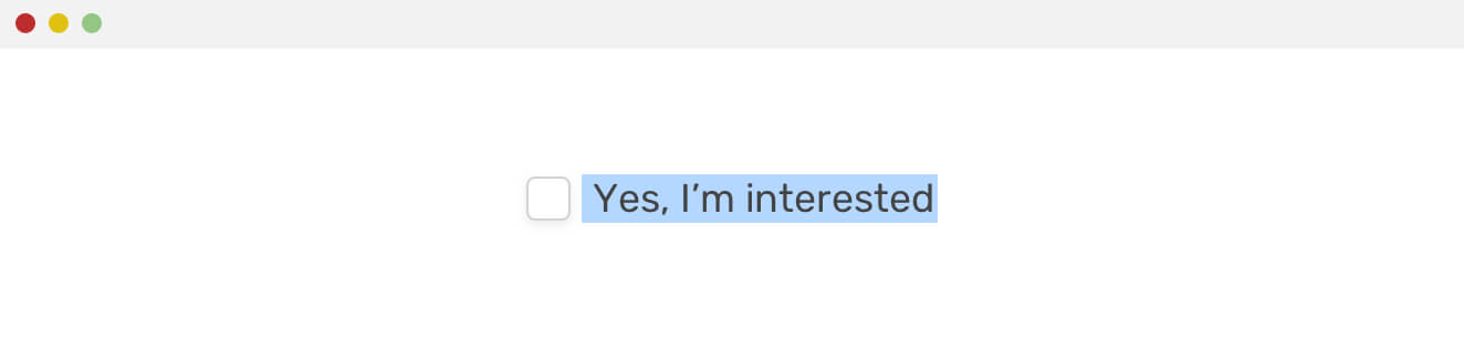
This can be solved by adding the following to the <label> element:
label {
  user-select: none;
}
An interesting value for user-select is all. If applied to a parent element, all text contained within it will be selected with one click only. This could be useful for content that is related and should be selected all together. For example, selecting a code snippet.
.embed-code {
  user-select: all;
}
See the Pen Selection in CSS - Multiline by Ahmad Shadeed (@shadeed) on CodePen.
A web application should feel like a real application. Can you select the button’s text for a computer application? No, you can’t. On the web, it’s important to reflect that something feels like a real app, even if it’s made via HTML and CSS.
Let’s take some examples from the wild.
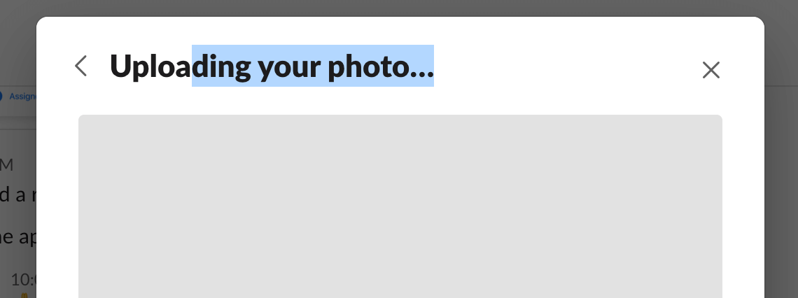
Slack allows selecting labels and inputs. However, the button’s content is not selectable.
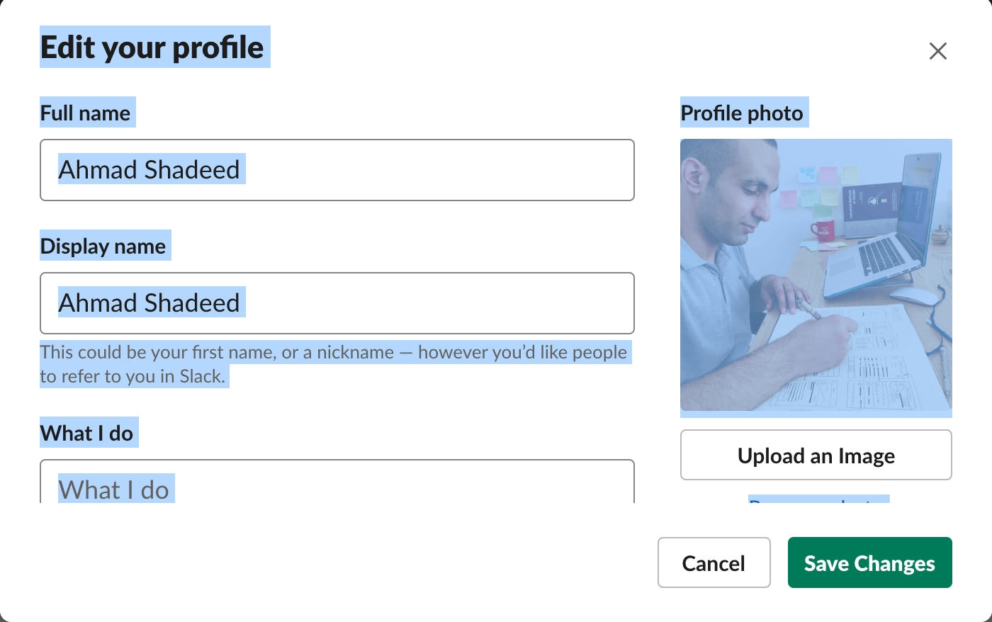
And here is me selecting a modal title.
The interesting thing is that the chat date is not selectable.
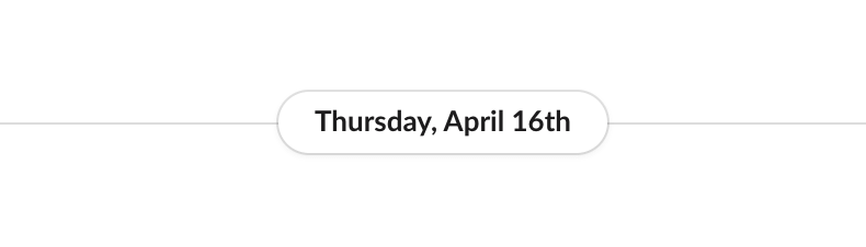
It feels weird to select text in an app. Slack does have places where user-select: none is used, but it’s less than expected. As a user, I find no benefit at all from copying a modal title.
I like Notion better. It feels more like a real app, not a website that I can select its text.

For the figure above, none of the text is selectable, which is expected.
It’s a bad practise to disable text selection globally. When used, make sure to apply it to certain elements where selection is not useful. You can make a utility class for it, like the one below:
.disable-selection {
  -webkit-user-select: text;
  -moz-user-select: text;
  -ms-user-select: text;
  user-select: text;
}
There is a UX pattern that annoys me which shows a warning when a user tries to select content from an article. This is annoying, and makes the user feel that he is controlled. It looks like the figure below:
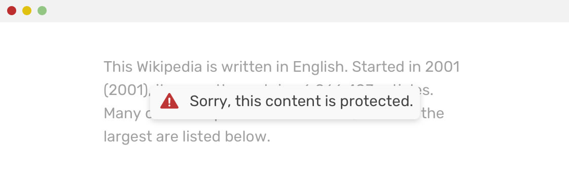
Please, don’t do this..
p {
  -webkit-touch-callout: none;
}
::selection styles doesn’t work.user-select: none works as expected.I tried to include a real example which shows an issue from Wikipedia. I copied text, and the icon (listen) was copied with it. This is annoying. See the figure below:
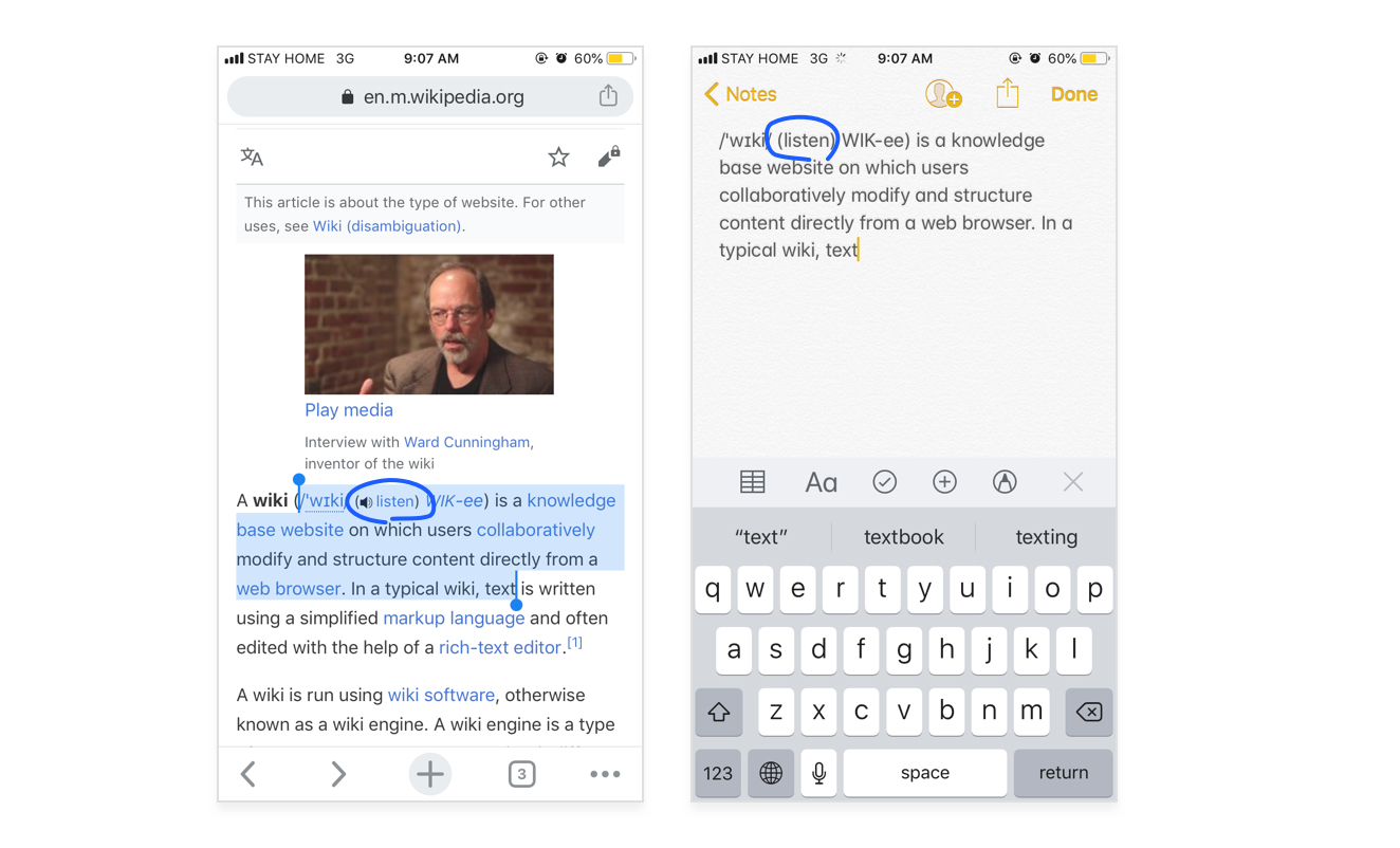
Instead of coping “listen”, it’s better to add user-select: none to it so when selected, it won’t be copied with the text.
That’s a wrap. Do you have a comment or a suggestion? Please feel free to ping me on @shadeed9.
此内容由惯性聚合(RSS阅读器)自动聚合整理,仅供阅读参考。 原文来自 — 版权归原作者所有。