


The default position for an element is position: static, which doesn’t have any effect on the element.
Consider the next figure where all the cats are sitting
together:
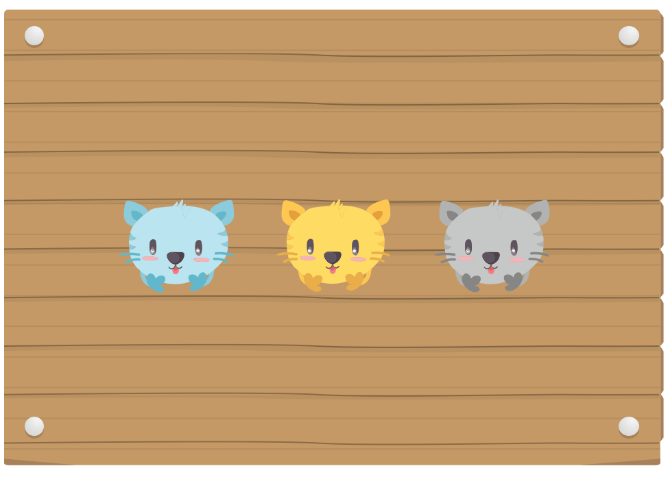
An element with position: relative. The top and
bottom properties specify the vertical offset from its
normal position. The left and
right properties specify the horizontal offset from
its normal position. In the next figure, we
have a naughty cat that walked to the bottom without its
owner permission.
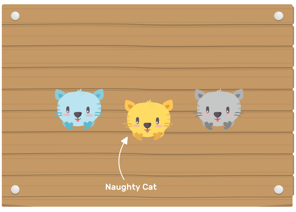
An element with position: absolute. The top and
bottom properties specify the vertical offset from its
containing block. The left and right
properties specify the horizontal offset from its
containing block. In the next figure, we have a naughty
cat that escaped to the top-left corner without its owner
permission.
For absolute positioning, the containing block is the closest positioned parent (An element with a position other than static)

An element with position: fixed. The top and
bottom properties specify the vertical offset from its
containing block. The left and
right properties specify the horizontal offset from
its containing block. The containing block
for fixed positioned elements is the viewport, except when
an element’s parent has one of the following properites
applied to it: transform, filter or
perspective.
The naughty cat has escaped to the top-left corner of the viewport.

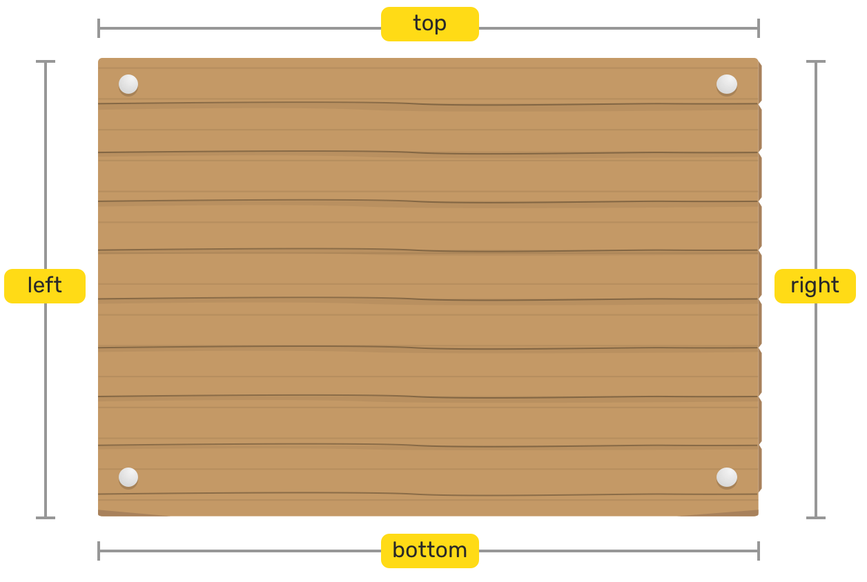
Those properties represents the direction of where the
element should be positioned, in case it has position: relative. They also represent the boundaries of the
containing block, if the element has position: absolute.
Before we start, I would like to highlight the two elements we have in the canvas.
The nail corners are the boundaries that we will use to position the fabric piece.
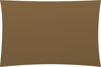

For positioning to work, we will need to define a parent that the fabric will relate to. To do so, we should add position: relative to the wooden wrapper.
By adding position: relative, it’s like letting the fabric know that its boundaries are the four nails only.
.wood-wrapper {
  position: relative;
}
position: absolute will position the fabric relative to the wood wrapper, on each nail corner as we declared each one of left, top, right, and bottom.
.wood-wrapper {
  position: relative;
}

.fabric {
  position: absolute;
  left: 0;
  top: 0;
  right: 0;
  bottom: 0;
}
position: absolute will position the fabric relative to the wooden wrapper, on each nail corner as we declared each one of left, top, right, and bottom.
.wood-wrapper {
  position: relative;
}

.fabric {
  position: absolute;
  left: 0;
  top: 0;
  right: 0;
  bottom: 0;
}
We need to give the fabric a height of 50% while keeping it at the top of the wood. To do that, I removed the bottom property and replaced it with height: 50%.
.wood-wrapper {
  position: relative;
}

.fabric {
  position: absolute;
  left: 0;
  top: 0;
  right: 0;
  height: 50%;
}
Now that we added a height, let’s add a width too. The right property is not needed now.
.wood-wrapper {
  position: relative;
}

.fabric {
  position: absolute;
  left: 0;
  top: 0;
  width: 50%;
  height: 50%;
}
The fabric needs to be positioned from the top to the bottom, with a width of 50%.
.wood-wrapper {
  position: relative;
}

.fabric {
  position: absolute;
  left: 0;
  top: 0;
  bottom: 0;
  width: 50%;
}
An interesting trick for centering an element inside its containing block using all horizontal and vertical properties, in addition to margin: auto.
.wood-wrapper {
  position: relative;
}

.fabric {
  position: absolute;
  left: 0;
  top: 0;
  bottom: 0;
  right: 0;
  width: 120px;
  height: 120px;
  margin: auto;
}
position: absolute will position the fabric relative to the wooden wrapper, on each nail corner as we declared each one of left, top, right, and bottom.
.wood-wrapper {
  position: relative;
}

.fabric {
  position: absolute;
  left: 0;
  right: 0;
  top: 100%;
  height: 120px;
}
We want to center the fabric in the wood wrapper, with a width of 200px and a height of 100px.
.wood-wrapper {
  position: relative;
}

.fabric {
  position: absolute;
  left: 50%;
  top: 50%;
  width: 200px;
  height: 100px;
}
When we positioned the fabric 50% from the left and top, what’s being centered is its top-left corner, and not the actual fabric.
To solve that, we will need to trick it by using a negative margin with half of the width and half of the height, or we can use CSS transforms as an alternative to margins.
.wood-wrapper {
  position: relative;
}

.fabric {
  position: absolute;
  left: 50%;
  top: 50%;
  width: 200px;
  height: 100px;
  margin-left: -100px;
  margin-top: -50px;
}
The alternative way is to use CSS transforms instead of negative margins. By using transform: translate(-50%, -50%), the fabric will be translated 50% of its width to the left, and 50% of its height to the top.
.wood-wrapper {
  position: relative;
}

.fabric {
  position: absolute;
  left: 50%;
  top: 50%;
  width: 200px;
  height: 100px;
  transform: translate(-50%, -50%);
}
The food is centered in the wood wrapper and the cat needs to stick itself to the rope at the top. This is where position: sticky become handy.
The cat will be positioned to the top center of the wood wrapper in order to stick to the rope. Try to scroll inside the next wooden wrapper.
.wood-wrapper {
  position: relative;
}

.the-cat {
  position: sticky;
  top: 0;
}
The cat has escaped to the top-left corner of the viewport.
This is where position: fixed become handy.
Based on your understanding from the above, try to edit the values and see how the result will change.
I wrote another interactive article about how box alignment works for CSS grid and flexbox. Make sure to check it out!
Other Articles That I Wrote
此内容由惯性聚合(RSS阅读器)自动聚合整理,仅供阅读参考。 原文来自 — 版权归原作者所有。