


I spent years teaching CSS layout on this blog. I put everything I know into The Layout Maestro course: 70+ lessons and 150+ interactive examples that teach you how to think CSS layouts, not just memorize syntax.
The other day, I got a question about how to build a responsive stepper component and how to take care of the separator lines. The demo I got from the developer was a bit complex and have lots of unnecessary CSS stuff. As a result, I got the idea of writing about it.
In this article, I will explore different designs for a stepping component and see the best way to implement each one in HTML and CSS. Are you ready? Let’s dive in.
A stepper component can be used to make it easy to navigate through a long web page by dividing related elements and grouping them together.

When I started learning CSS, this was a challenging thing for me, and I understand why some newcomers might feel the same too. In the next few sections, I will take case-by-case examples and try to simplify and explain how to solve each one.
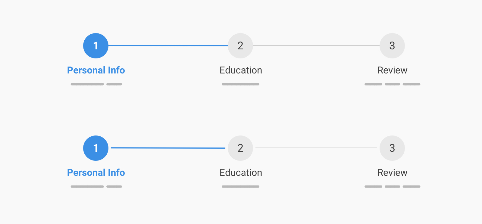
For this example, we have a horizontal stepper with a line between the items. Here are the expectations for the stepper:
<ol class="c-stepper">
  <li class="c-stepper__item">
    <h3 class="c-stepper__title">Step 1</h3>
    <p class="c-stepper__desc">Some desc text</p>
  </li>
  <!-- Other steps -->
</ol>
In CSS, we need to use flexbox to layout the items horizontally.
.c-stepper {
  display: flex;
  flex-wrap: wrap;
}

.c-stepper__item {
  flex: 1;
  display: flex;
  flex-direction: column;
  text-align: center;
}

.c-stepper__item:before {
  --size: 3rem;
  content: "";
  position: relative;
  z-index: 1;
  display: block;
  width: var(--size);
  height: var(--size);
  border-radius: 50%;
  margin: 1rem auto 0;
}
With that, we will have the following result.
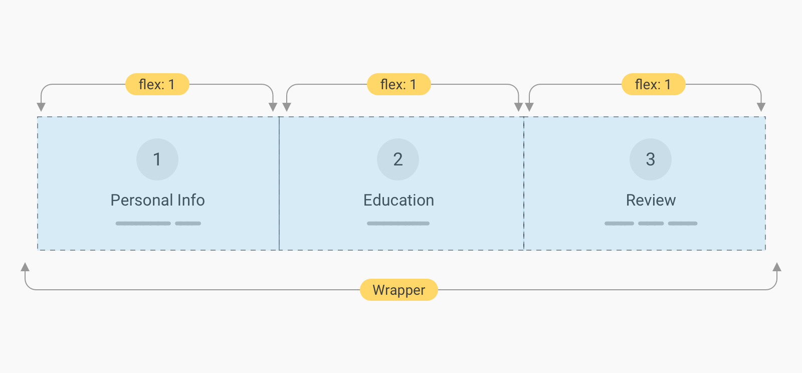
As you see, the content is centered and each item is equal to other siblings thanks to flex: 1. Next, we need to explore how to add a line between them.
.c-stepper__item:not(:last-child):after {
  content: "";
  height: 2px;
  background-color: #e0e0e0;
}
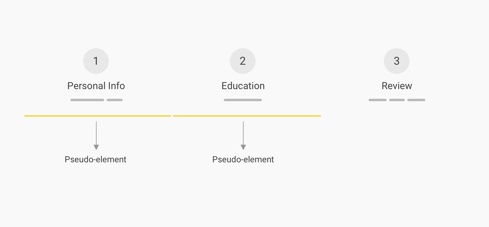
You might wonder how the pseudo-element is taking the full width when it doesn’t actually have an explicit width? Well, it’s stretching to fill the full horizontal space because it’s a flex item.
First, we need to move it to the top. Since it’s a flex item, we can get the benefit of the order property.
.c-stepper__item:not(:last-child):after {
  content: "";
  height: 2px;
  background-color: #e0e0e0;
  order: -1;
}
Now, we want to position it properly but without using position: absolute, since it’s not needed.
.c-stepper__item:not(:last-child):after {
  content: "";
  position: relative;
  top: 1.5rem;
  left: 50%;
  height: 2px;
  background-color: #e0e0e0;
  order: -1;
}
Here is an explanation of the above CSS:
position: relative to control the line without removing it from the document flow.top value is equal to half of the circle’s height.left: 50% to make the line starts from the center of the circle all the way to the center of the next item’s circle. This will allow us to color each line as per the progress if needed.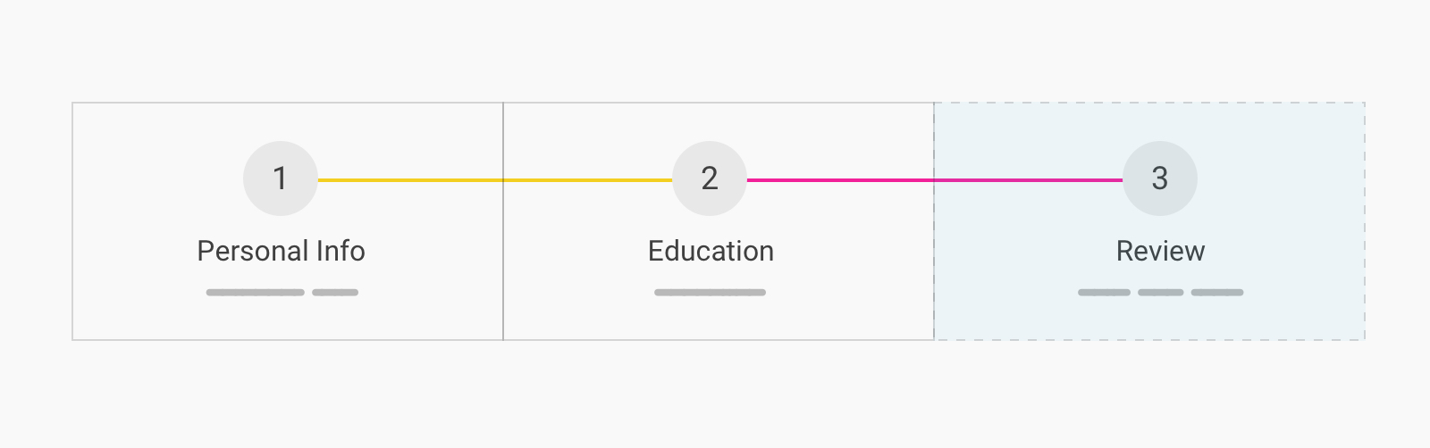
We can either add a stroke around each circle with the same background underneath the items, or we can work a bit more with a better solution that works great for both dark and light modes.
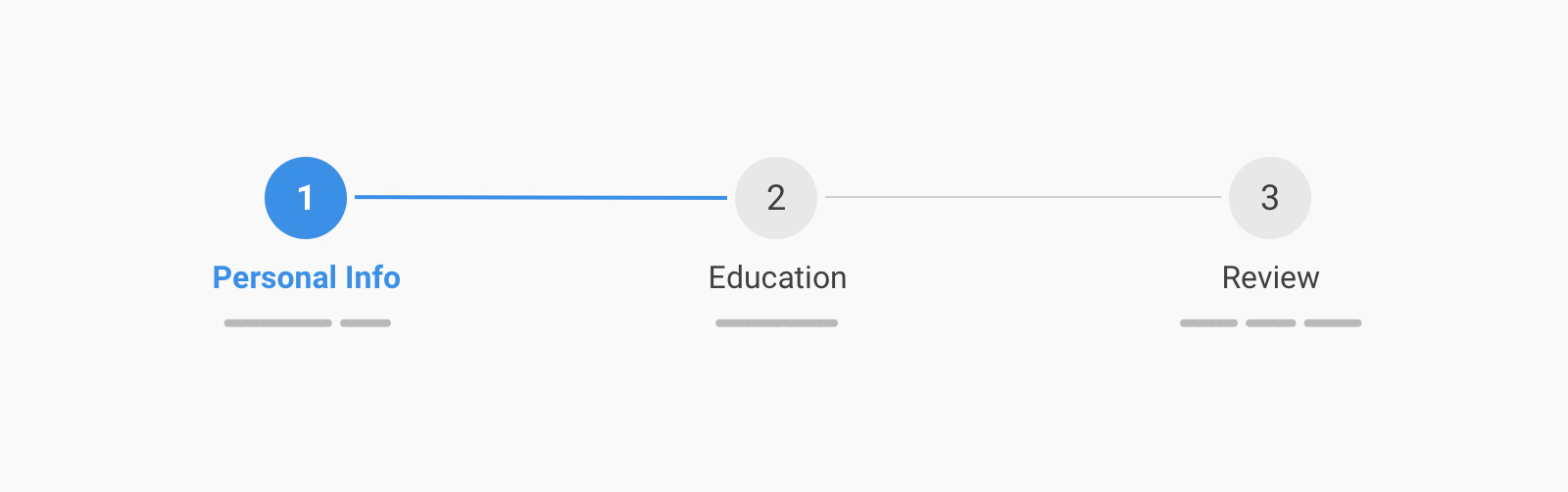
Before diving into the solution, I want to show you that the separator lines we have are actually hidden under each circle. I reduced the opacity for the number circles so you can see them.
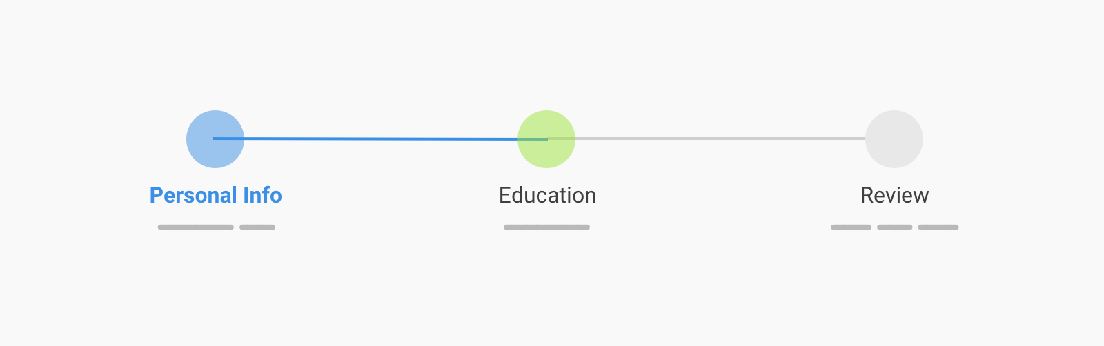
This is due to using left: 50% for the line. Let’s explore how to give it an offset from the left and right.
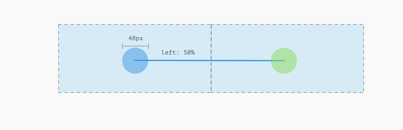
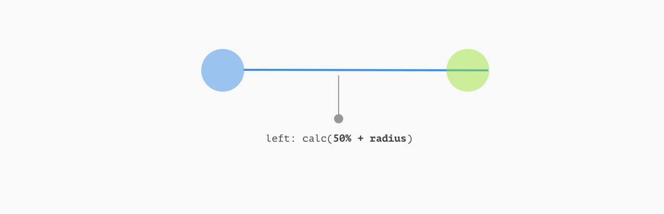
Since the line has left: 50%, it will start from the center of its parent.
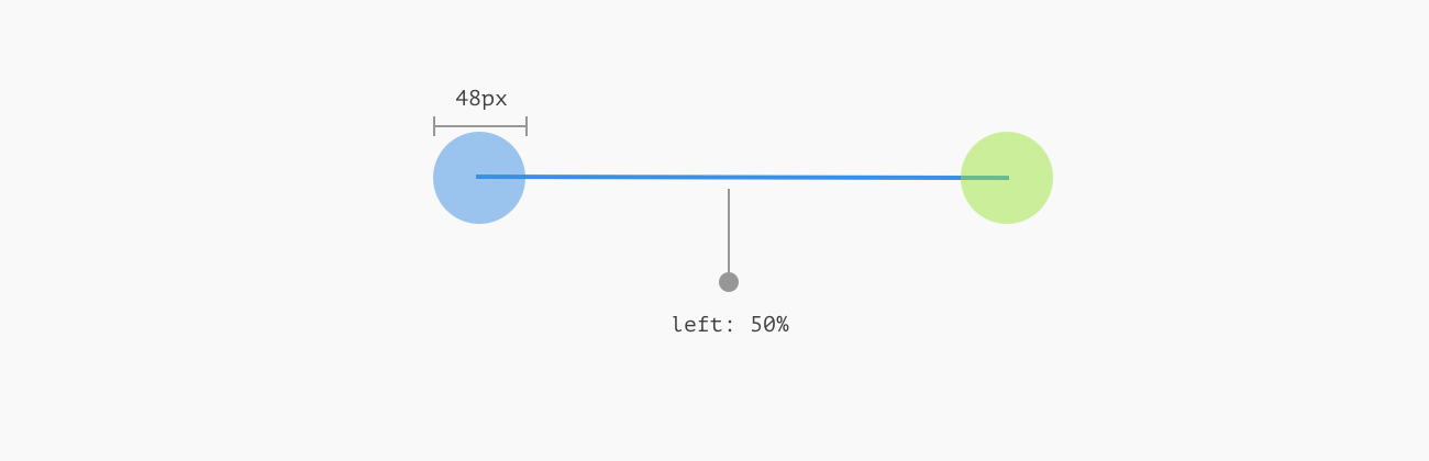
We use calc() to add the circle’s radius, this will make the separator line start from the end of the circle.
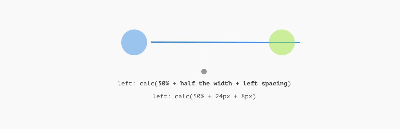
By adding the spacing we want (In this case it’s 8px) to the calc() function, we end up with a space on the left side of the separator line.
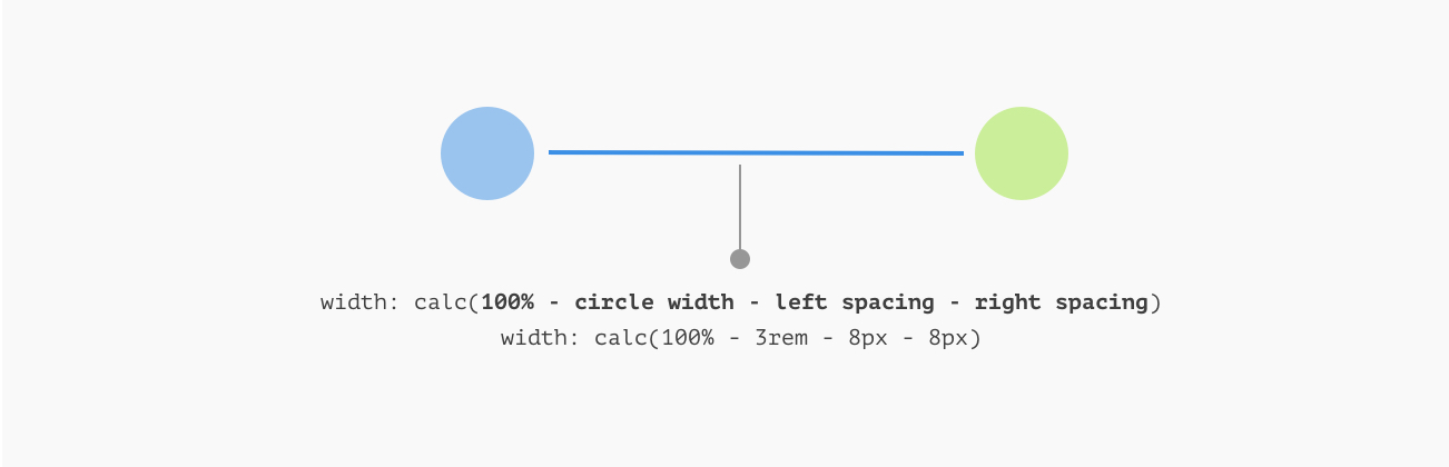
Finally, we need to create the spacing on the other side. The width is 100%, so we deduct the circle width along with the left and right spacing values.
To make it better, we can get the benefit of CSS variables so we can alter the size without manually editing the values.
.c-stepper {
    --size: 3rem;
    --spacing: 0.5rem;
}

.c-stepper__item:not(:last-child):after {
    width: calc(100% - var(--size) - calc(var(--spacing) * 2));
    left: calc(50% + calc(var(--size) / 2 + var(--spacing)));
}
Check out the below video for a demonstration.
Finally, implementing the separator like that can make the stepper works in a dark mode without adding a border to each circle to fake the effect.

See the Pen Horizontal Stepper: Example 1 by Ahmad Shadeed (@shadeed) on CodePen.

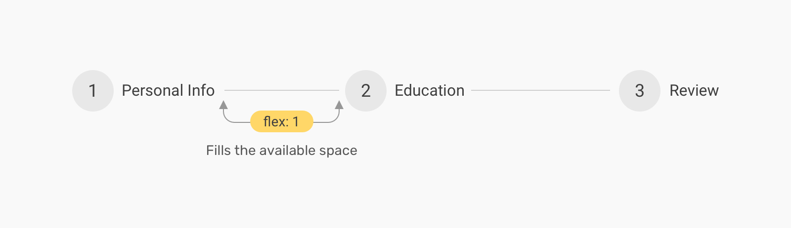
In this example, the separator line comes directly after the step title. The difference thing here is that the separator length varies based on the step title length.
<ol class="c-stepper">
  <li class="c-stepper__item">
    <h3 class="c-stepper__title">Step 1</h3>
  </li>
  <!-- Other steps -->
</ol>
Similar to the previous example, we’ll use flexbox to lay out the steps horizontally. Notice that we want to apply flex: 1 only to the first and second steps.
.c-stepper {
  display: flex;
  flex-wrap: wrap;
}

.c-stepper__item {
  display: flex;
  align-items: center;
  gap: 0.5rem;
}

.c-stepper__item:not(:last-child) {
  flex: 1;
}

.c-stepper__item:before {
  --size: 3rem;
  content: "";
  display: block;
  flex: 0 0 var(--size);
  height: var(--size);
  border-radius: 50%;
}
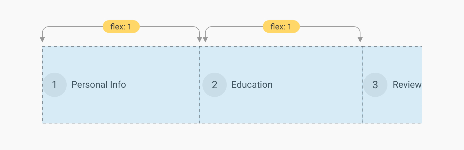
The separator line will be added as a pseudo-element. It will have flex: 1 so it can fill the remaining space.
.c-stepper__item:not(:last-child):after {
  content: "";
  flex: 1;
  height: 2px;
  background-color: #e0e0e0;
  margin-inline-end: 0.5rem;
}
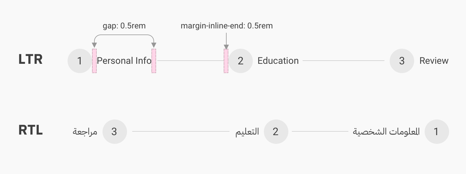
By using the gap on the .c-stepper__item and the margin-inline-end logical property for the separator line, we can ensure that the component will work on both LTR and RTL documents.
See the Pen Horizontal Stepper: Example 2 by Ahmad Shadeed (@shadeed) on CodePen.
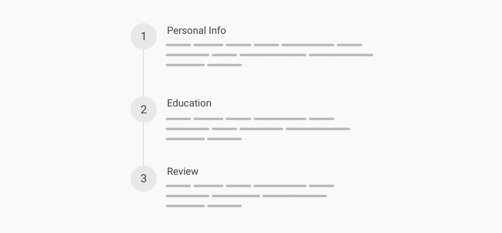
This is similar to the initial example, but the direction is vertical. I will use flexbox to layout the items.
<ol class="c-stepper">
  <li class="c-stepper__item">
    <div class="c-stepper__content">
      <h3 class="c-stepper__title">Step 2</h3>
      <p>Some desc text</p>
    </div>
  </li>
  <!-- Other steps -->
</ol>
.c-stepper__item {
  display: flex;
  gap: 1rem;
}

.c-stepper__item:before {
  --size: 3rem;
  content: "";
  position: relative;
  z-index: 1;
  flex: 0 0 var(--size);
  height: var(--size);
  border-radius: 50%;
  background-color: lightgrey;
}
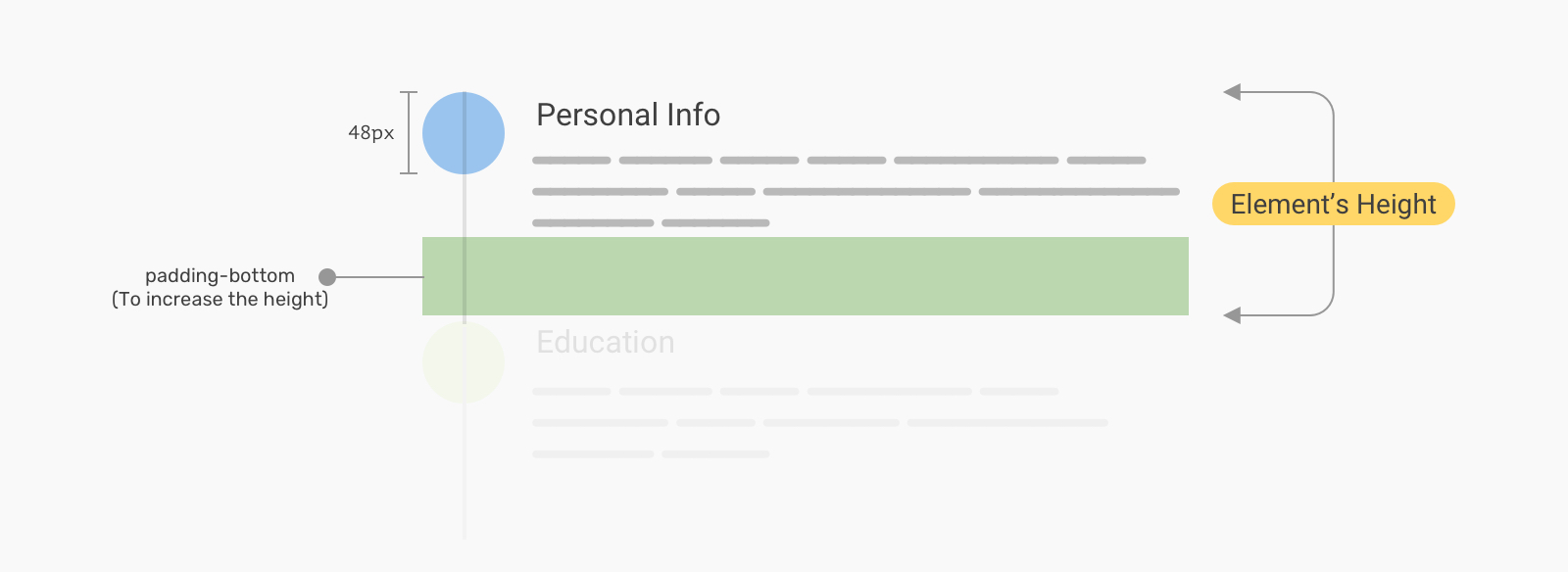
Now to the interesting part, which is the separator line. The line should be a bit taller than the content. How we can achieve that while avoid using fixed height or margin?
We can add a large padding-bottom for that purpose.
.c-stepper__item {
  position: relative;
  display: flex;
  gap: 1rem;
  padding-bottom: 4rem;
}

.c-stepper__item:not(:last-child):after {
  content: "";
  position: absolute;
  left: 0;
  top: 0;
  bottom: 0;
  transform: translateX(1.5rem);
  width: 2px;
  background-color: #e0e0e0;
}
To create a space between the separator line and the numbers, we can apply the same formula used in the horizontal stepper example or simply use top and bottom properties. Thanks to monochromer for pointing out about using the bottom property.
.c-stepper {
  --size: 3rem;
  --spacing: 0.5rem;
}

.c-stepper__item:not(:last-child):after {
  top: calc(var(--size) + var(--spacing));
  transform: translateX(calc(var(--size) / 2));
  bottom: var(--spacing);
}
With that, we can have spacing between the line and the circle.

See the Pen Vertical Stepper: Example 1 by Ahmad Shadeed (@shadeed) on CodePen.

This might not look like a stepper, it’s more of a timeline. Regardless of the naming, implementing this one can be done using flexbox.
First, the HTML markup looks like the below. Notice that the elements are ordered as per their semantics and importance, not as per the design mockup.
<ol class="c-timeline">
  <li class="c-timeline__item">
    <div class="c-timeline__content">
      <h3 class="c-timeline__title">Paris</h3>
      <p class="c-timeline__desc">On time</p>
    </div>
    <time class="c-timeline__time">10:03</time>
  </li>
  <!-- Other items -->
</ol>
Here is the basic CSS.
.c-timeline__item {
  display: flex;
  gap: 1.5rem;
}

.c-timeline__content {
  order: 1;
  /* Reorder the content as per the design. */
  padding-bottom: 3rem;
}
With that, we will have the following result. Good start!
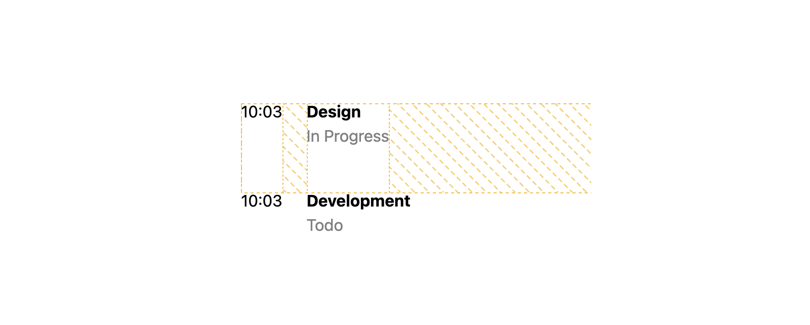
Next, we want to decide on where to include the separator line and the little circle. I thought that the .c-timeline__content is perfect for that job. We can use two pseudo-elements for both the separator and circle.
/* The separator line */
.c-timeline__item:not(:last-child) .c-timeline__content:before {
  content: "";
  position: absolute;
  right: 100%;
  top: 0;
  height: 100%;
  width: 2px;
  background-color: #d3d3d3;
}

/* The circle */
.c-timeline__content:after {
  content: "";
  position: absolute;
  left: -12px;
  top: 0;
  width: 20px;
  height: 20px;
  background-color: #fff;
  z-index: 1;
  border: 2px solid #d3d3d3;
  border-radius: 50%;
}
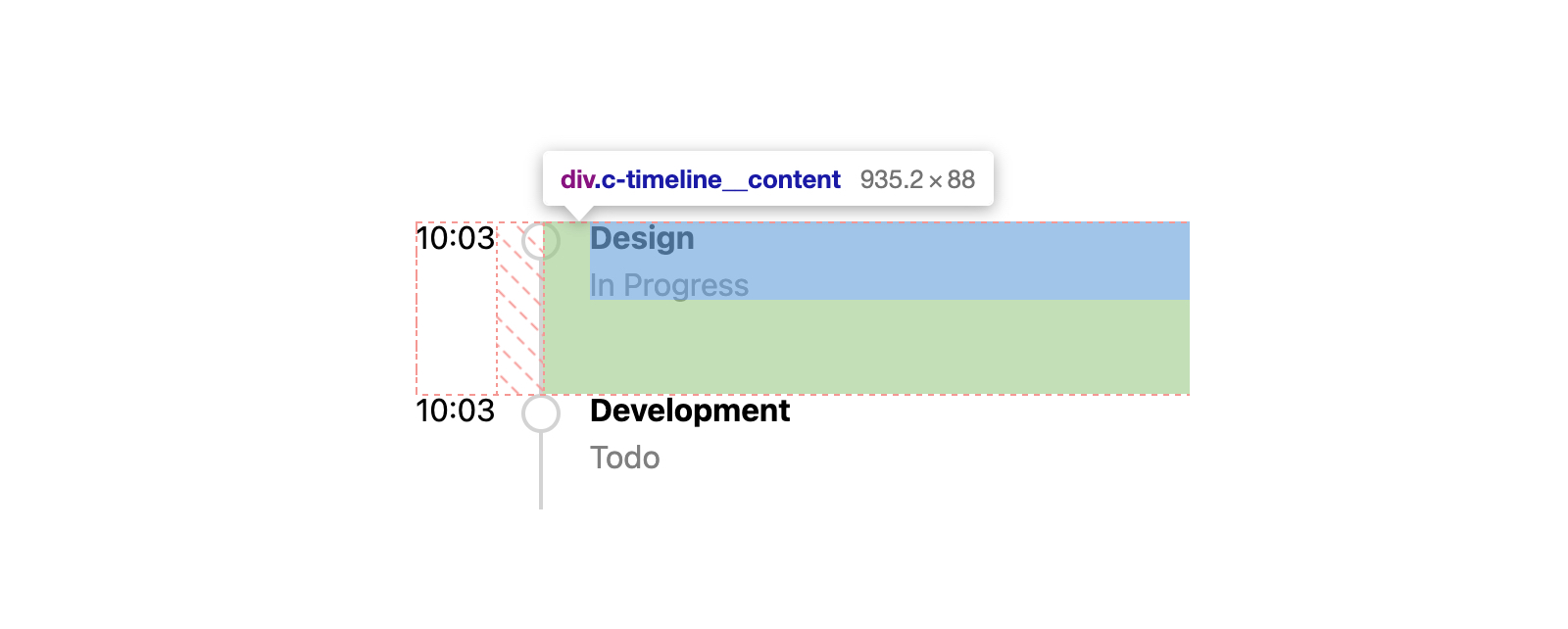
Next, we need to limit the width of the time element. Also, the timeline content should fill the rest of the available space, thus we will use flex: 1.
.c-timeline__time {
  flex: 0 0 100px;
}

.c-timeline__content {
  flex: 1;
}
The next step is to align the c-timeline__time content to the right, or the end in the logical CSS world.
.c-timeline__time {
  flex: 0 0 100px;
  text-align: end;
}
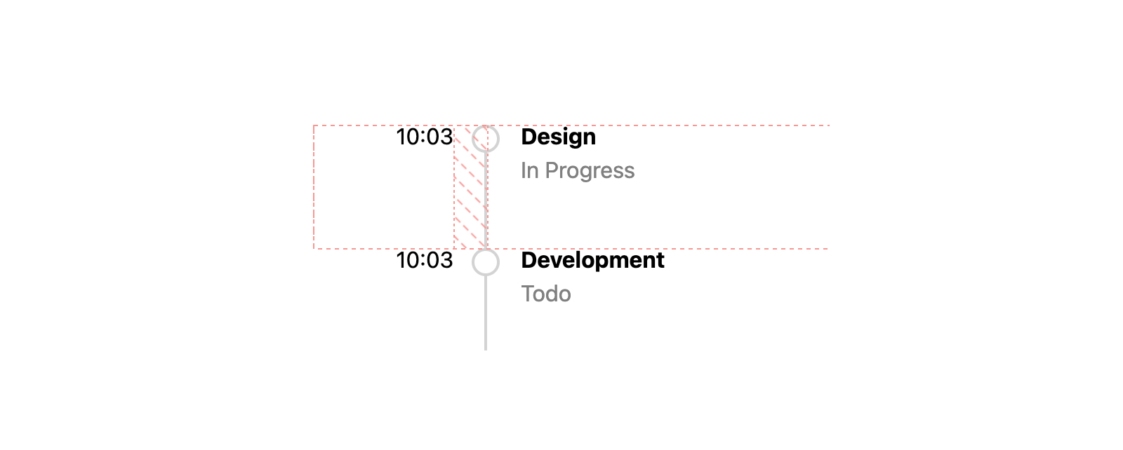
I want to highlight an important bit regarding the time of each item. In some cases, we don’t have control over the content an author might add a very long content either on purpose or by mistake.
By default, flex items won’t shrink below their minimum content size. If the .c-timeline__time element has a very long content, it will look like this even though it has flex: 0 0 100px.
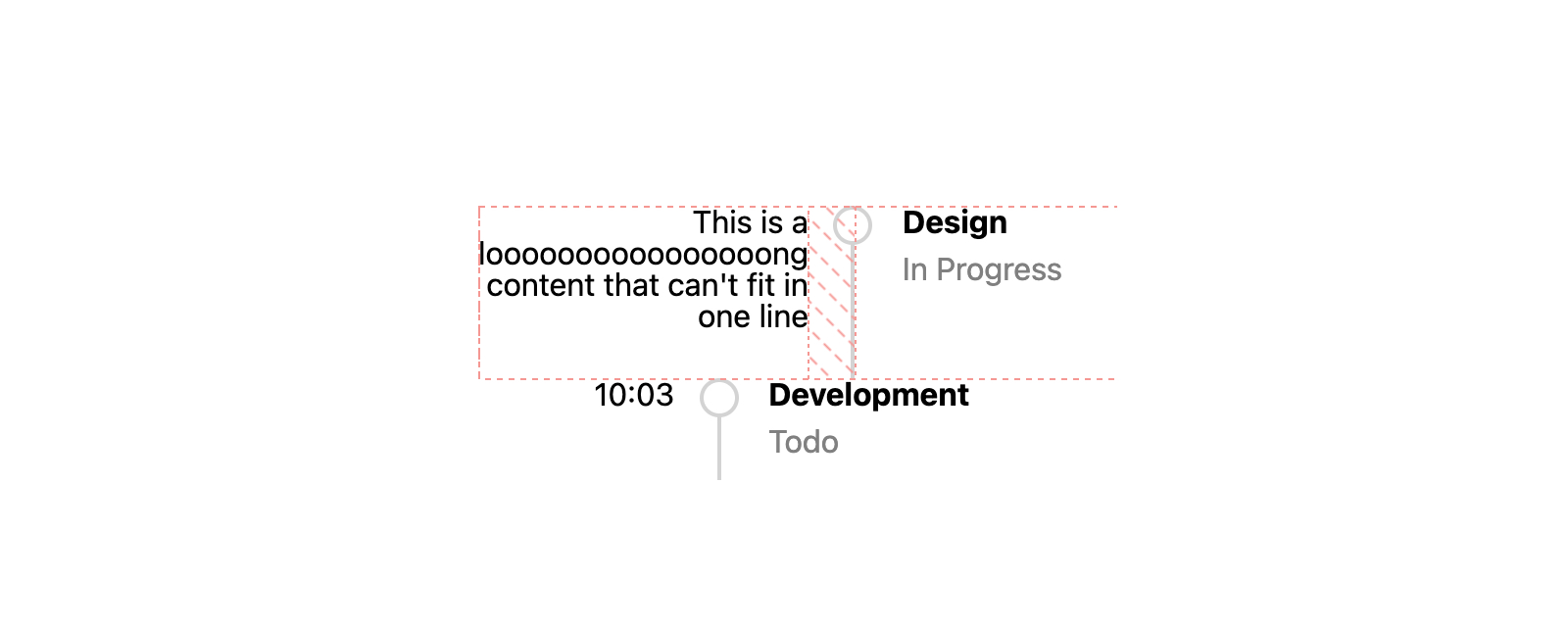
To fix that, we need to force flexbox to shrink below their minimum content size by adding min-width: 0 to the element, and also overflow-wrap to break long words.
.c-timeline__time {
  flex: 0 0 100px;
  text-align: end;
  min-width: 0;
  overflow-wrap: break-word;
  padding-bottom: 1rem;
}
See the Pen Vertical Stepper: Example 2 by Ahmad Shadeed (@shadeed) on CodePen.
I hope you enjoyed the article. Thanks for reading!
此内容由惯性聚合(RSS阅读器)自动聚合整理,仅供阅读参考。 原文来自 — 版权归原作者所有。