


We have a table and four plates. Throughout this article, we will learn how to align the plates differently for our guests by using Flexbox and Grid.
Make sure you’re not hungry when reading this. ;)

To start, I added a width and height for the plates.
<div class="c-table">
  <div class="c-plate salmon"></div>
  <div class="c-plate chicken"></div>
  <div class="c-plate steak"></div>
  <div class="c-plate kebab"></div>
</div>
.c-plate {
  width: 96px;
  height: 96px;
}
Since the plates are block elements, each one of them is in its own line.
To start, we should add display: flex to the .table element.
.c-table {
  display: flex;
}
Notice that the plates are next to each other. Since flexbox is a single layout direction, the flex items are either aligned in rows or columns. The default is rows.
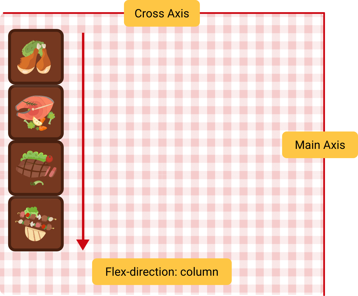
In flexbox, we have the two axes: main axis and cross axis. See the following figure. By default, the location of each axis is as the figure.
.c-table {
  display: flex;
  /* Default flex-direction */
  flex-direction: row;
}
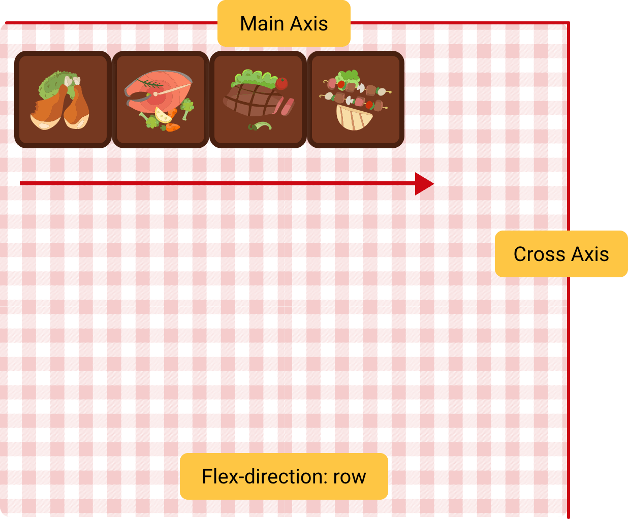
When the flex direction is flex-direction: column, the plates will be displayed vertically.
.c-table {
  display: flex;
  flex-direction: column;
}
The guests requested bigger plates, so we need to increase their width. I added the following CSS.
.c-plate {
  width: 50%;
  height: 96px;
}
The expected behaviour is that each plate have a width of 50% of the table, correct? Why it’s not working?
The reason is because flexbox doesn’t move the plates into a new line when there is no space available in the row.
To fix that, we should useflex-wrap: wrap, it will help in wrapping the plates correctly in case the space is not enough.
.c-table {
  display: flex;
  flex-wrap: wrap;
}
You might be wondering, why there is a space between each row of plates? Well, that’s a good question.
By default, flex items stretch in the cross axis because the default value for the table is align-items: stretch. In our case, the plates has a fixed height. Let’s remove it and see how the result will look.
.c-plate {
  width: 50%;
  height: initial;
}
As you see, the plates are not centered correctly. To align them, we need to control the flex items in the cross axis. For that, align-content property is perfect.
Note that this property won’t work with single line flex items. It needs flex-wrap: wrap to work properly.
To center the plates on the cross axis, I added align-content: space-evenly and the result looks like the following figure.
.c-table {
  display: flex;
  flex-wrap: wrap;
  align-content: space-evenly;
}

.c-plate {
  width: 50%;
  height: 90px;
}
normal, flex-start, flex-end, center, stretch, space-around, space-between, space-evenly, baseline, first-baseline, last-baseline
The justify-content works on the main axis of the flex container.
.c-table {
  display: flex;
  flex-wrap: wrap;
}

.c-plate {
  width: 90px;
  height: 90px;
}
To have an equal spacing between the plates across the main axis, I added justify-content: space-between. See the result in the following figure.
.c-table {
  display: flex;
  flex-wrap: wrap;
  justify-content: space-between;
}

.c-plate {
  width: 90px;
  height: 90px;
}
normal, flex-start, flex-end, center, stretch, space-around, space-between, space-evenly, baseline, first-baseline, last-baseline
By default, align-items works on the cross axis. I added align-items: center to center the plates vertically.
.c-table {
  display: flex;
  flex-wrap: wrap;
  justify-content: space-between;
  align-items: center;
}

.c-plate {
  width: 90px;
  height: 90px;
}
auto, normal, start, end, center, stretch, baseline, first baseline, last baseline
Let’s suppose that we have some custom alignment requests from our guests. The first and last plates needs to be aligned differntly. For that purpose, we can use align-self on those flex items.
.salmon {
  align-self: flex-start;
}
.kebab {
  align-self: flex-end;
}
auto, normal, start, end, center, stretch, baseline, first baseline, last baseline
For CSS grid, we have two axes: Inline and block. Those don’t change based on a specific direction. For this section, the plates are desserts.
I saved the best for last, so let’s enjoy some desserts with CSS grid.

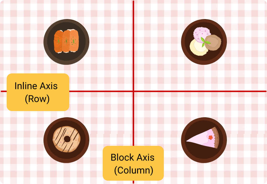
Grid child items can either be aligned to their grid container (the table), or the grid area they are in.
The parent element of grid child items (The table).
A part of the grid that the plate is placed it. The next figure has four grid areas. I highlighted one of them.
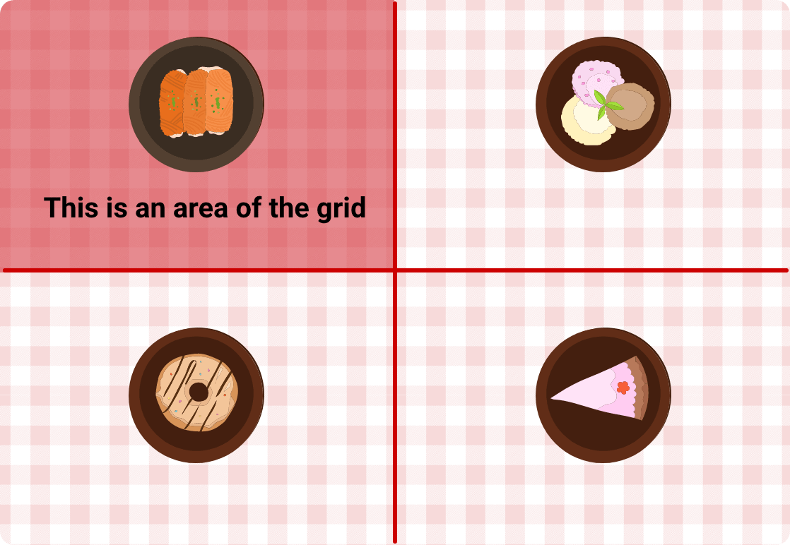
For CSS grid, we have two axes: Inline and block. Those don’t change based on a specific direction
<div class="table">
  <div class="c-plate konafa"></div>
  <div class="c-plate icecream"></div>
  <div class="c-plate donut"></div>
  <div class="c-plate cake"></div>
</div>
.table {
  display: grid;
}
We will have two columns and rows. See the next figure.
.table {
  display: grid;
  grid-template-columns: 1fr 1fr;
  grid-template-rows: 1fr 1fr;
}
All the plates should be centred horizontally to their grid area, the first row of plates is close to the top side and the second row is close to the bottom side.
By using justify-items, we can control how the plates will be aligned to its grid area.
.table {
  display: grid;
  grid-template-columns: 1fr 1fr;
  grid-template-rows: 1fr 1fr;
  justify-items: center;
}
auto, normal, start, end, center, stretch, baseline, first baseline, last baseline
Aligning the plates to the center is not enough. To make it better, the plates should be centered vertically and horizontally in its grid area.
Note: the container is the grid area
.table {
  display: grid;
  grid-template-columns: 1fr 1fr;
  grid-template-rows: 1fr 1fr;
  justify-items: center;
  align-items: center;
}
auto, normal, start, end, center, stretch, baseline, first baseline, last baseline
The guest with the ice cream wants to move the plate closer to him. To do so, we will use align-self property.
.icecream {
  align-self: start;
}
auto, normal, start, end, center, stretch, baseline, first baseline, last baseline
Even better, the guest with the ice cream wants the plate to be at the top right on the table. We can use the justify-self property.
.icecream {
  align-self: start;
  justify-self: end;
}
auto, normal, start, end, center, stretch, baseline, first baseline, last baseline
When we have a grid with fixed size columns, this will create an additional space in case the container is bigger than the columns. In that case, we can use justify-content to control the spacing between the columns.
.table {
  display: grid;
  grid-template-columns: 150px 150px;
}
By adding justify-content: space-between, the columns are distributed and the space between them is equal.
.table {
  display: grid;
  grid-template-columns: 150px 150px;
  justify-content: space-between;
}
auto, normal, start, end, center, stretch, baseline, first baseline, last baseline
When we have a grid with fixed size rows, this will create an additional space in case the container height is bigger than the rows. In that case, we can use align-content to control the spacing between the rows.
.table {
  display: grid;
  grid-template-columns: 1fr 1fr;
  grid-template-rows: 150px 150px;
}
By adding align-content: space-between, the rows are distributed and the space between them is equal.
.table {
  display: grid;
  grid-template-columns: 1fr 1fr;
  grid-template-rows: 150px 150px;
  align-content: space-between;
}
auto, normal, start, end, center, stretch, baseline, first baseline, last baseline
Other Articles That I Wrote
此内容由惯性聚合(RSS阅读器)自动聚合整理,仅供阅读参考。 原文来自 — 版权归原作者所有。