


I spent years teaching CSS layout on this blog. I put everything I know into The Layout Maestro course: 70+ lessons and 150+ interactive examples that teach you how to think CSS layouts, not just memorize syntax.
CSS background is one of the most used CSS properties. However, using multiple backgrounds is still not well known across all developers. I will hugely focus on the potential of using multiple backgrounds and leverage the CSS to its full power.
In this article, I will explain the background-image property in detail, and provide a visual explainer on how we can stack multiple backgrounds, and the actual benefit of it. Of course, there will be some visual examples, you’re in for a treat!
If you don’t know about CSS background property, I prefer to have a look at this reference by Mozilla Developer Network (MDN) that explains about how CSS background works.
The CSS background property is a shorthand for the following properties.
background-clip, background-color, background-image, background-origin, background-position, background-repeat, background-size, and background-attachment.
For this article, I will focus on background-image, background-position, and background-size. Are you ready? Let’s dive in!
Consider the following example.
.element {
  background: url(cool.jpg) top left/50px 50px no-repeat;
}
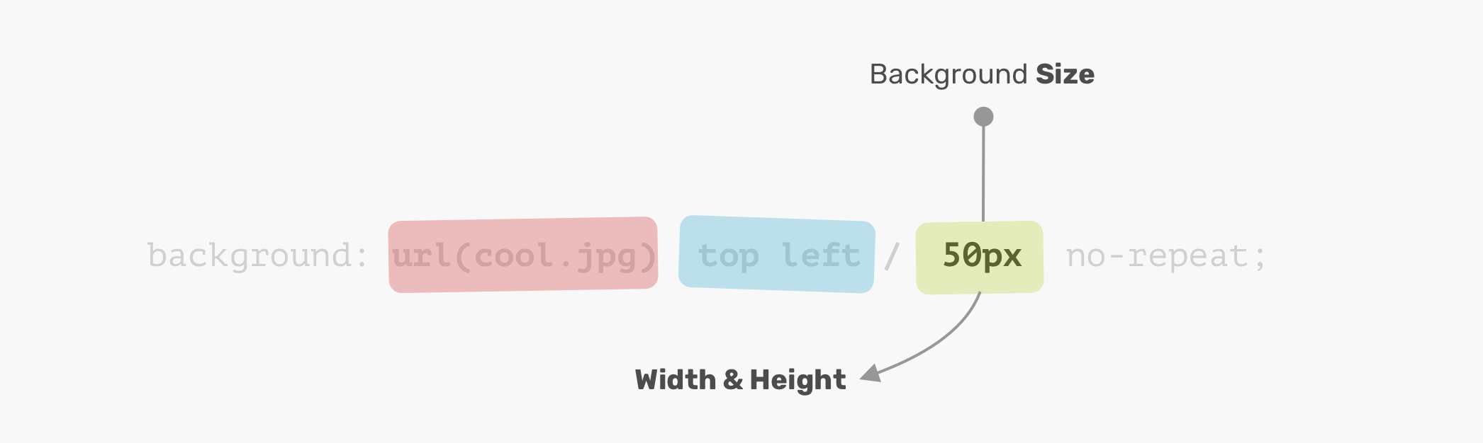
The background image is positioned at the top-left corner of the element, with a size of 50px * 50px. It’s important to understand and remember the order of the position and size.
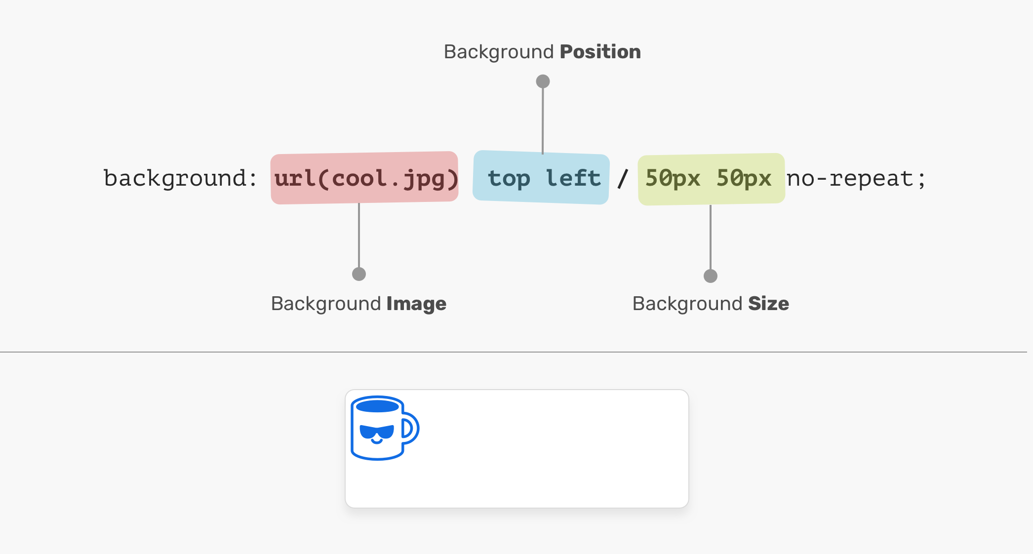
In the figure above, the background-position is followed by the background-size. It can’t work the other way around! In other words, the following CSS is invalid:
.element {
  /* Warning: Invalid CSS */
  background: url(cool.jpg) 50px 50px / top left no-repeat;
}
An element is positioned relative to the positioning layer set by the background-origin property. I like the flexibility of the background-position. It has multiple ways of positioning elements:
top, right, bottom, left, center)50%20px 2.5remtop 20px left 10px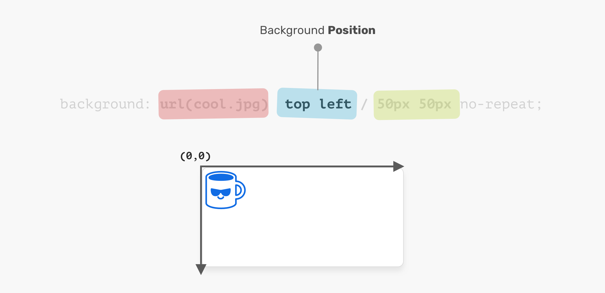
The coordinates system starts from the top-left corner, with the default value of 0% 0%.
It’s worth mentioning that the value top left is the same as left top. The browser is smart enough to determine which one of them is for the x-axis, and which is for the y-axis.
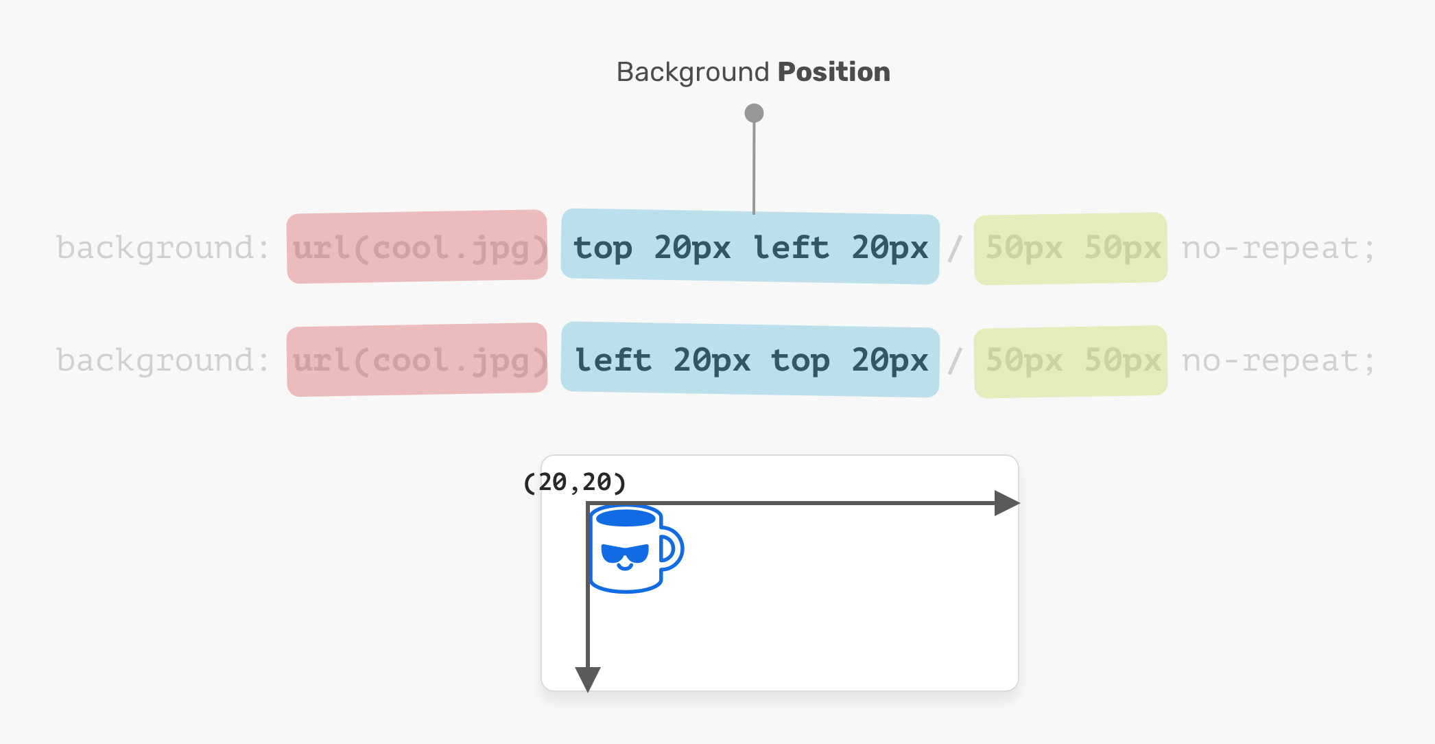
.element {
  background: url(cool.jpg) top left/50px 50px no-repeat;
  /* is the same as */
  background: url(cool.jpg) left top/50px 50px no-repeat;
}
The name of the property is self-explanatory. The size consists of width & height. For the background-size property, the first one is width, and the second is height.
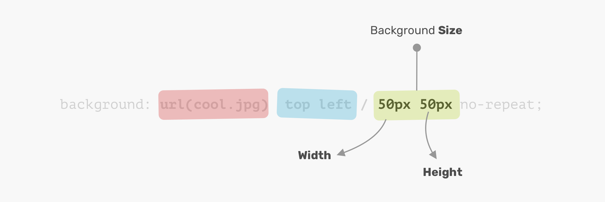
It’s not necessary to use two values. You can use one value and it will be used for the width and height.
Disclaimer: it’s worth mentioning that the CSS spec says: “If only one value is given the second is assumed to be auto”. However, that is not implemented in browsers and will change in the future. Thanks to Ilya Streltsyn for the note.
Now that I went through the basics of how a CSS background works, let’s explore how to use multiple backgrounds.
The background property can have one or more layers, separated by a comma. If the size of multiple backgrounds is the same, one of them will cover the other background.
.element {
  background:
    url(cool.jpg) top left/50px 50px no-repeat,
    url(cool.jpg) center/50px 50px no-repeat;
}
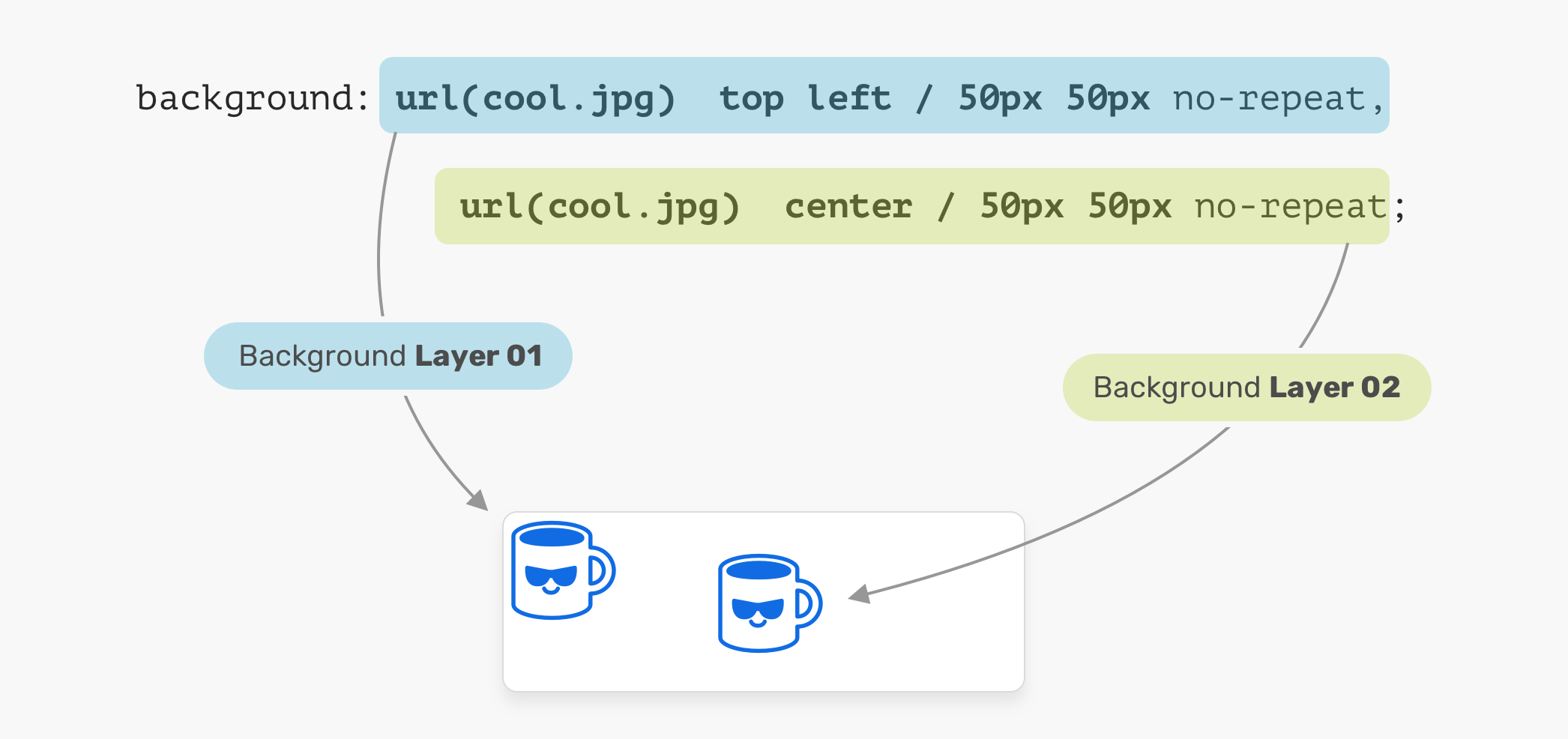
In the figure above, we have two background layers. Each one of them is positioned differently. That is a basic usage of multiple backgrounds. Let’s explore a more advanced example.
When placing multiple backgrounds, and one of them is taking the full width and height of its parent, the stacking order will take place. It can be a bit confusing to decide when backgrounds should stack above each other. Consider the following example.
.hero {
  min-height: 350px;
  background:
    url("table.jpg") center/cover no-repeat,
    url("konafa.svg") center/50px no-repeat;
}
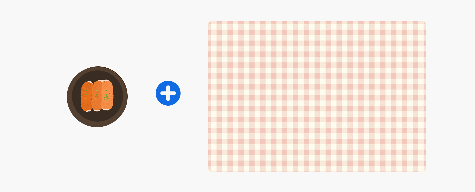
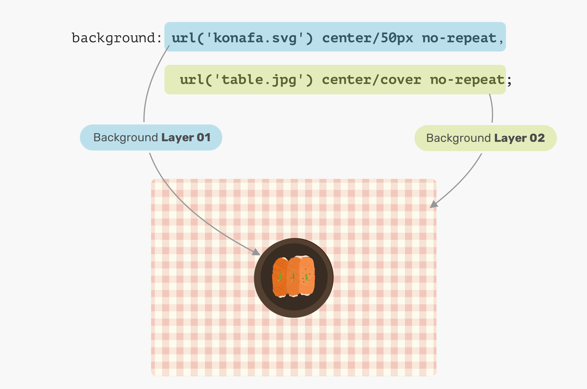
We have a plate and a table. What would you expect the result of the CSS above? Which will come first? The plate, or the table?
The answer is the table. In CSS, the first background can stack on the second one, and the second can stack on the third, and so on. By replacing the order of the backgrounds, the result will be as expected.
.hero {
  background:
    url("konafa.svg") center/50px no-repeat,
    url("table.jpg") center/cover no-repeat;
}
Say you want to draw two rectangles with CSS backgrounds, how would you do it? Thankfully, it’s fairly easy with CSS gradients. When a linear-gradient has the same color stops, the result will be a solid color. That’s it!
.hero {
  background: linear-gradient(#3c88ec, #3c88ec);
}

We can take this way further by exploring a very, very useful use-case for CSS gradients, which is drawing in CSS. Stay tuned for the use-cases section!
Often times, you might need to place an overlay on top of the hero section, so the text can be easy to read. This can be easily done by stacking two backgrounds.
.hero {
  background:
    linear-gradient(rgba(0, 0, 0, 0.15), rgba(0, 0, 0, 0.15)),
    url("landscape.jpg") center/cover;
}

What’s even better is that we can use the same method above to apply tints to an element. Consider the following:
.hero {
	background: linear-gradient(135deg, rgba(177, 234, 77, 0.25), rgba(69, 149, 34, 0.25),
    url("landscape.jpg") center/cover;
}

The possibilities of using CSS gradients to draw are endless. You can use linear-gradient or radial-gradient and more. For this basic example, I will explain how to draw a laptop.

Let’s disassemble the laptop and see what gradients we need to use.
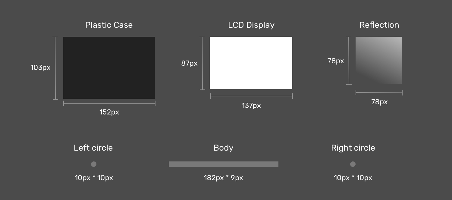
Notice how when the laptop items are dissembled, it’s easier now to think about how to implement this as multiple CSS backgrounds now. If you noticed, I created two circles to act as the rounded corners for the body since there is no direct way of doing a gradient with rounded edges.
Next is the drawing. The first thing is to define each gradient as a CSS variable, and its size. I like to use CSS variables since it can reduce code complexity and makes the code cleaner and easier to read. Once done, I will move to the step of positioning them.
:root {
  --case: linear-gradient(#222, #222);
  --case-size: 152px 103px;

  --display: linear-gradient(#fff, #fff);
  --display-size: 137px 87px;

  --reflection: linear-gradient(205deg, #fff, rgba(255, 255, 255, 0));
  --reflection-size: 78px 78px;

  --body: linear-gradient(#888, #888);
  --body-size: 182px 9px;

  --circle: radial-gradient(
    9px 9px at 5px 5.5px,
    #888 50%,
    transparent 50%
  );
  --circle-size: 10px 10px;
}
Now that we defined the gradients and their sizes, the next step is to position them. Consider the following figure for a better visual explainer.

As explained previously, an element that needs to be on the top should be defined first. In our case, the display reflection should be the first gradient.

The display is centered in the x-axis and is positioned 6px from the y-axis.

The case is positioned below the display, and it’s centered on the x-axis and positioned 0px from the y-axis.

That’s the most interesting component in the drawing. First, the body is a rectangle, and we have two circles for each side (left and right).

:root {
  --case: linear-gradient(#222, #222);
  --case-size: 152px 103px;
  --case-pos: center 0;

  --display: linear-gradient(#fff, #fff);
  --display-size: 137px 87px;
  --display-pos: center 6px;

  --reflection: linear-gradient(205deg, #fff, rgba(255, 255, 255, 0));
  --reflection-size: 78px 78px;
  --reflection-pos: top right;

  --body: linear-gradient(#888, #888);
  --body-size: 182px 9px;
  --body-pos: center bottom;

  --circle: radial-gradient(
    9px 9px at 5px 5.5px,
    #888 50%,
    transparent 50%
  );
  --circle-size: 10px 10px;
  --circle-left-pos: left bottom;
  --circle-right-pos: right bottom;
}

.cool {
  width: 190px;
  height: 112px;

  background-image: var(--reflection), var(--display), var(--case),
    var(--circle), var(--circle), var(--body);

  background-size: var(--reflection-size), var(--display-size), var(
      --case-size
    ), var(--circle-size), var(--circle-size), var(--body-size);

  background-position: var(--reflection-pos), var(--display-pos), var(
      --case-pos
    ), var(--circle-left-pos), var(--circle-right-pos), var(--body-pos);

  background-repeat: no-repeat;

  /*outline: solid 1px;*/
}
See the Pen Single Div by Ahmad Shadeed (@shadeed) on CodePen.
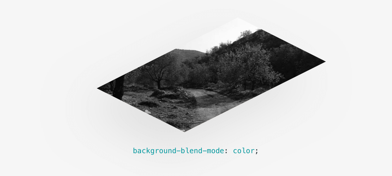
Having multiple backgrounds is exciting when you can blend them. The simplest use-case that I can explain is desaturating an image. Consider that you have a background-image in CSS, and you want to turn it into black and white.
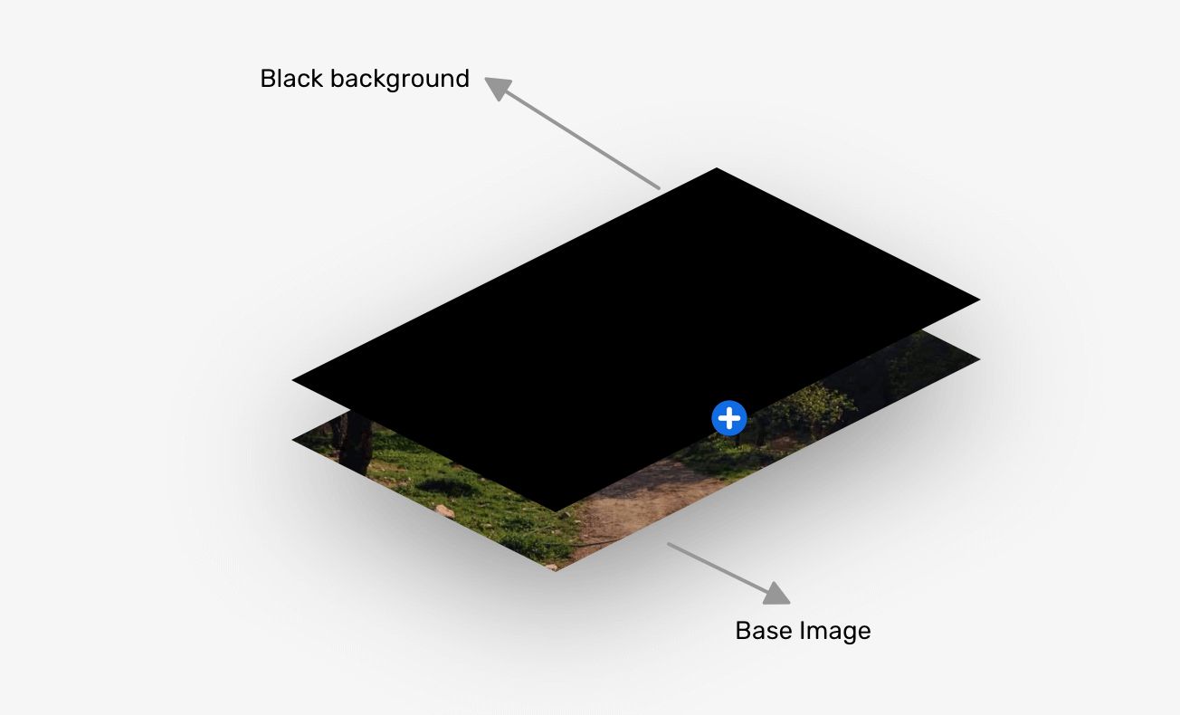
.hero {
  background:
    linear-gradient(#000, #000),
    url("landscape.jpg") center/cover;
  background-blend-mode: color;
}
That’s a wrap. Do you have a comment or a suggestion? Please feel free to ping me on @shadeed9.
Thank you for reading.
I’m excited to let you know that I’m writing an ebook about Debugging CSS.

If you’re interested, head over to debuggingcss.com and subscribe for updates about the book.
此内容由惯性聚合(RSS阅读器)自动聚合整理,仅供阅读参考。 原文来自 — 版权归原作者所有。