
惯性聚合 高效追踪和阅读你感兴趣的博客、新闻、科技资讯
阅读原文 在惯性聚合中打开

推荐订阅源

人人都是产品经理
人人都是产品经理
D
Docker
GbyAI
GbyAI
B
Blog RSS Feed
博客园 - 司徒正美
博客园 - Franky
美团技术团队
Cyber Security Advisories - MS-ISAC
aimingoo的专栏
aimingoo的专栏
C
Check Point Blog
IT之家
IT之家
让小产品的独立变现更简单 - ezindie.com
www.infosecurity-magazine.com
AI
AI
O
OpenAI News
Attack and Defense Labs
cs.CV updates on arXiv.org
T
Tailwind CSS Blog
酷 壳 – CoolShell
酷 壳 – CoolShell
S
Secure Thoughts
博客园 - 聂微东
L
LINUX DO - 最新话题
U
Unit 42
SecWiki News
SecWiki News
A
Arctic Wolf
Schneier on Security
Threat Intelligence Blog | Flashpoint
V
Visual Studio Blog
量子位
The Cloudflare Blog
cs.AI updates on arXiv.org
大猫的无限游戏
大猫的无限游戏
Google DeepMind News
G
Google Developers Blog
T
Threat Research - Cisco Blogs
TaoSecurity Blog
TaoSecurity Blog
Recent Commits to openclaw:main
B
Blog
博客园 - 【当耐特】
C
CERT Recently Published Vulnerability Notes
Scott Helme
Scott Helme
Last Week in AI
Last Week in AI
D
Darknet – Hacking Tools, Hacker News & Cyber Security
Microsoft Security Blog
Apple Machine Learning Research
F
Full Disclosure
Hacker News: Ask HN
Hacker News: Ask HN
A
About on SuperTechFans
博客园 - 三生石上(FineUI控件)
Latest news
Latest news

Ahmad Shadeed

Better fluid sizing with round() Use Cases for Field Sizing The Basics of Anchor Positioning Item Flow CSS Relative Colors Balancing Text In CSS Should masonry be part of CSS grid? CSS display contents CSS Grid Areas CSS Cap Unit An Interactive Guide to CSS Container Queries CSS :has() Interactive Guide CSS Nesting UX in DevTools CSS Nesting Future CSS: State Container Queries Rebuilding a comment component with modern CSS Conditional CSS with :has and :nth-last-child CSS Text balancing with text-wrap:balance CSS Masking Do we need CSS flex-wrap detection? My CSS Wishlist Conditional CSS CSS Style Queries Inside the mind of a frontend developer: Article layout Inside the mind of a frontend developer: Hero section CSS container queries are finally here The CSS behind Figma First Look At The CSS object-view-box Property Learn CSS Subgrid CSS :has Parent Selector Aligning Content In Different Wrappers Flexbox Dynamic Line Separator Hello, CSS Cascade Layers Building UI Components With SVG and CSS A Deep CSS Dive Into Radial And Conic Gradients Defensive CSS Building Real-life Components: Facebook Messenger Conditional Border Radius In CSS CSS Container Query Units Aligning a Button Label Vertically Comparing Design Mockups To Code Result Using HSL Colors In CSS Custom Scrollbars In CSS Let CSS Container Queries For Designers The State of CSS Cross-Browser Development Overflow Issues In CSS Inspect Element As A Way To Increase Your Curiosity Handling Text Over Images in CSS Digging Into CSS Logical Properties Clipping Scrollable Areas On The inline-start Side Understanding Clip Path in CSS The Art of Building Real-life Components Handling Short And Long Content In CSS CSS Scroll Snap A Deep Dive Into CSS Grid minmax() CSS Variables 101 Finding The Root Cause of a CSS Bug Learn CSS centering How to detect browser support for Flexbox Gap CSS Mistakes While On Autopilot Digging Into the Flex Property Understanding CSS Multiple Backgrounds Aligning Logo Images in CSS Grid for layout, Flexbox for components Colors in CSS Thinking About The In-between Design Cases min(), max(), and clamp() CSS Functions Image Techniques On The Web Everything About Auto in CSS Learn Box Alignment Let Learn CSS Positioning Intrinsic Sizing In CSS CSS Grid Template Areas In Action Hiding Elements On The Web Creating a Variable Color Font From Scratch Building a Football Ticket With CSS and SVG Blending Modes in CSS CSS Variables With Inline Styles Implementing Dark Mode For My Website Rebuilding Apple Music Header in HTML & CSS Accessible Checkbox Layout Flickering On Browser Resize Enhancing The Clickable Area Size Custom Underlines with SVG Part 3: The Process of Implementing A UI Design From Scratch Part 2: The Process of Implementing A UI Design From Scratch Building An Old Nav Design CSS Flexbox: 5 Real World Use Cases I Used CSS Inline Flex For The First Time The Process of Implementing A UI Design From Scratch Common CSS Issues For Front-End Projects Handling Long and Unexpected Content in CSS How to Build Web Form Layouts With CSS Grid Grid Layout Ah-ha Moment Enhancing Our Components with CSS :empty Building Resizeable Components with Relative CSS Units CSS Writing Mode The Journey of Learning Front End Web Development on a Daily Basis
The Beauty Of Tiny Enhancements In CSS
Ahmad Shadeed · 2021-02-24 · via Ahmad Shadeed

The Layout Maestro

I spent years teaching CSS layout on this blog. I put everything I know into The Layout Maestro course: 70+ lessons and 150+ interactive examples that teach you how to think CSS layouts, not just memorize syntax.

Get the course

It has never been easier than now to use modern CSS features as an enhancement. When I use a CSS feature that is not fully supported in all major browsers, I tend to have a baseline that works with non-supporting browsers, and an enhanced version for modern browsers.

When a new CSS feature is supported in a specific browser, say Chrome, some replies on Twitter will be like “This isn’t supported in Edge or IE, I can’t use it”. In this article, I will explore some examples where I use CSS features without causing any harm to browsers that don’t support them.

Examples of tiny enhancements

Intrinsic Sizing

In a recent client project, I designed a widget that can be added to the article body. It includes a link to another related article, and we needed to make it obvious and engaging.

The widget width should be equal to its content. We can solve this problem by using different methods:

  • An inline-block element.
  • Using intrinsic sizing with width: fit-content

I don’t like the inline-block solution that much since it doesn’t feel safe for me. What if another widget is there? They will be beside each other. The widget must be a standalone element.

For that reason, I lean towards using the intrinsic sizing solution.

<p class="widget widget--more">
  <a href="#">Understanding Z-Index in CSS</a>
</p>
.widget--more {
  width: fit-content;
}

The support for fit-content is not perfect. What will happen when it’s not supported? Since the <p> is a block-level element, the widget will take the full width of its parent element.
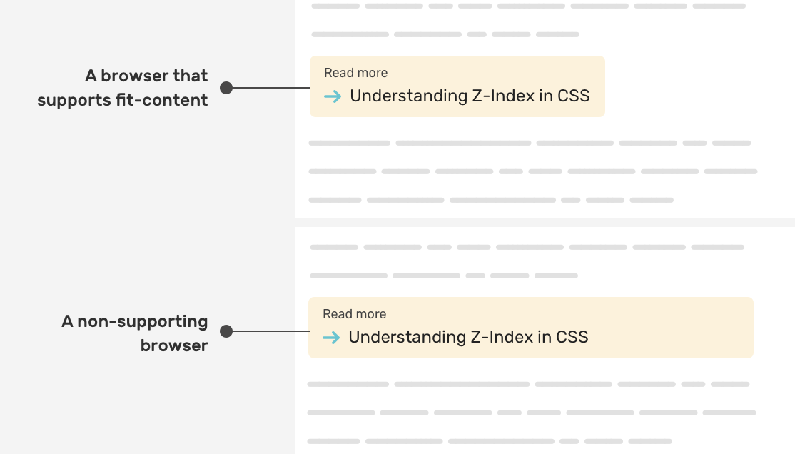
While the width: fit-content is not supported, there is no harm to the user experience. The widget is working as expected.

Learn more about intrinsic sizing in CSS.

Clip Path

I love working on 404 page designs that are aligned with the brand and the tone of voice of a product. In this example, we have a 404 shape, and the “0” character has eyes that should roll to the left and right.

<div class="eyes">
  <div class="eyes__item"></div>
  <div class="eyes__item"></div>
</div>

I needed a way to use clip-path in the following way:

  • If it’s supported, there will be rolling eyes.
  • If not, the eyes will be solid without animation.

To do that, I need to create base eyes and then add the rolling eyes above each as a duplicate. The rolling will take effect on the duplicate ones.

.eyes__item {
  position: relative;
  width: calc(10px + 0.75vw);
  height: calc(20px + 0.75vw);
  background-color: #4b4d65;
  border-radius: 50%;

  &:after {
    content: "";
    clip-path: ellipse(12px 12px at 58% 100%);
    animation: rollingEye 4s infinite;
    /* Other styles */
  }
}
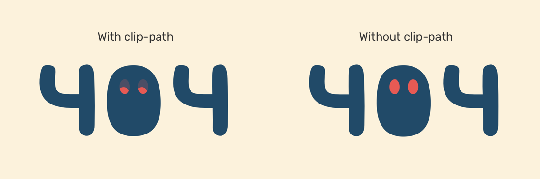
This is a simple usage of a CSS property, and how it will look on a non-supporting browser.

Learn more about CSS clip-path in this article.

CSS Marker

The CSS ::marker pseudo-element can help us to change the color and size of a list bullet or number. We can use it as an enhancement, and if not supported, it’s fine.

.list li::marker {
  color: #fcf2db;
  font-size: 1.2em;
}
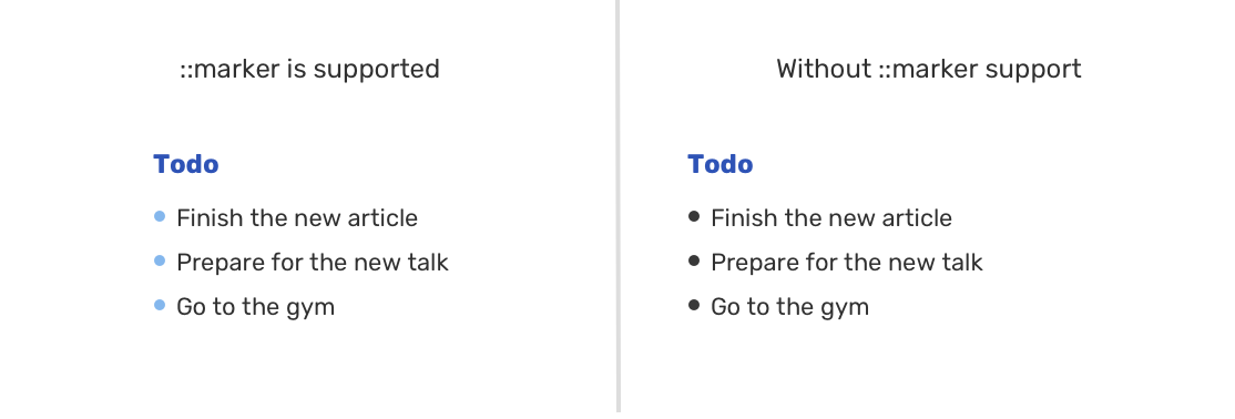
Read more about the marker pseudo-element.

Tiny enhancements don’t work for all CSS properties

Not all CSS properties can fallback to an acceptable solution. Let’s take flexbox gap as an example.

The CSS gap is useful to add spacing between flexbox child items. If you use gap without a fallback, you will get something like the following.
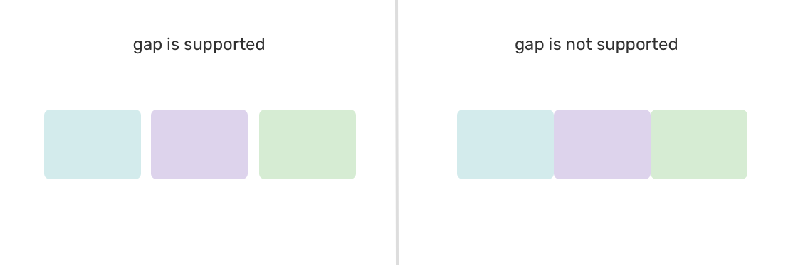
We can use JavaScript to detect support for gap and to provide a fallback using margins.

.flex-wrapper {
  display: flex;
  flex-wrap: wrap;
}

.flex-wrapper .item {
  flex: 0 0 calc(33.33% - 1rem);
  margin-left: 1rem;
  margin-bottom: 1rem;
}

/* If flexbox gap is supported, do the following */
.flexbox-gap .flex-wrapper {
  gap: 1rem;
}

.flexbox-gap .flex-item {
  margin-left: 0;
  margin-bottom: 0;
}

In closing

As you’ve seen, we can use modern CSS features and if they’re not supported, the browser will do the job. However, this doesn’t work for all use-cases, so you need to be careful of the CSS property you’re using.

I wrote an ebook

I’m excited to let you know that I wrote an ebook about Debugging CSS.
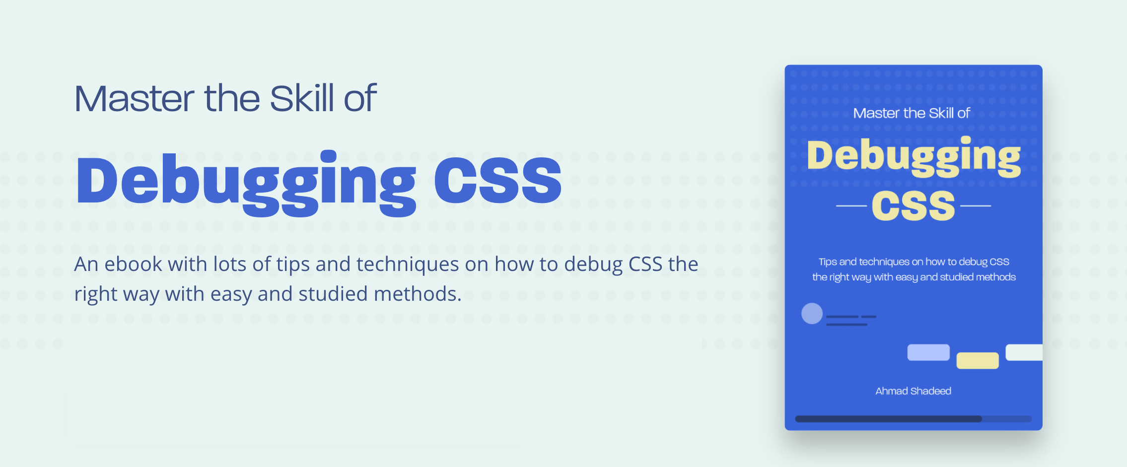
If you’re interested, head over to debuggingcss.com for a free preview.