


I spent years teaching CSS layout on this blog. I put everything I know into The Layout Maestro course: 70+ lessons and 150+ interactive examples that teach you how to think CSS layouts, not just memorize syntax.
Two weeks ago, Jen Simmons from the Webkit team shared an article about a new layout module called Item Flow. The idea is to unify the flex-flow and grid-auto-flow into a unified system. This path will lead to CSS masonry being integrated into the new syntax.
In October 2024, I published my thoughts about whether to have masonry as part of the CSS grid or as a standalone new syntax (display: masonry).
Currently, the Item Flow is being discussed by the CSS working group. The goal of this article is to share my notes as I explore the new syntax.
First, let me give you an idea about how the new sytnax will give us masonry. Try to change between the values below and see how the CSS changes.
Just Use Grid
Display masonry
Item Flow
.layout {
display: grid;
grid-template-columns: repeat(auto-fit, minmax(180px, 1fr));
grid-template-rows: masonry;
gap: 1rem;
}
Which sytnax do you think sounds better?
Despite it being a new proposal, it integrates well with the current grid and flexbox syntax. If you look at the previously suggested display: masonry syntax, it’s clear at first glance that there is a good learning curve, even if you are a CSS expert.
.layout {
  display: masonry;
  masonry-template-tracks: repeat(auto-fit, minmax(180px, 1fr));
  masonry-direction: column;
  gap: 1rem;
}
Whereas for the Item Flow, it just feels at home. Even better, switching from a normal grid to a masonry one requires changing item-flow property.
Here is an example that switches to masonry-style if there are 10 items or more in the grid.
.layout {
  display: grid;
  grid-template-columns: 1fr 1fr 1fr;
  gap: 1rem;
}

.layout:has(.card:nth-last-child(n + 10)) {
  item-flow: row collapse;
}
If the display: masonry is used, the code will look like this. I’m not a fan.
.layout {
  display: grid;
  grid-template-columns: 1fr 1fr 1fr;
  gap: 1rem;
}

.layout:has(.card:nth-last-child(n + 10)) {
  display: masonry;
  masonry-template-tracks: repeat(auto-fit, minmax(180px, 1fr));
  masonry-direction: column;
}
Which feels better, changing a single CSS property (item-flow), or a completely new display type?
One of the discussed points is using packing for flexbox. In the CSS grid, we can apply grid-auto-flow: dense which will let the browser reorder the items where it sees fit.
In the following example, we have a CSS grid. When the dense is applied, the items are moved around to fill the extra space.
.layout {
  display: grid;
  grid-template-columns: 1fr 1fr 1fr 1fr;
  grid-auto-flow: dense;
}
It’s worth noting that using dense will reorder the items. It’s confusing and might cause a11y issues, but that’s how it works.
With the Item Flow, there is a suggestion to bring this to Flexbox. To achieve that, we need to use item-pack.
According to the Webkit illustrations, introducing packing to flowbox could be one of the two options:
In the following figure, the browser will shrink the flex item just a bit in order to allow more space for the smaller ones.

In the following example, I imagined having a list of tags, where each tag hugs its content with padding on the left and right sides.
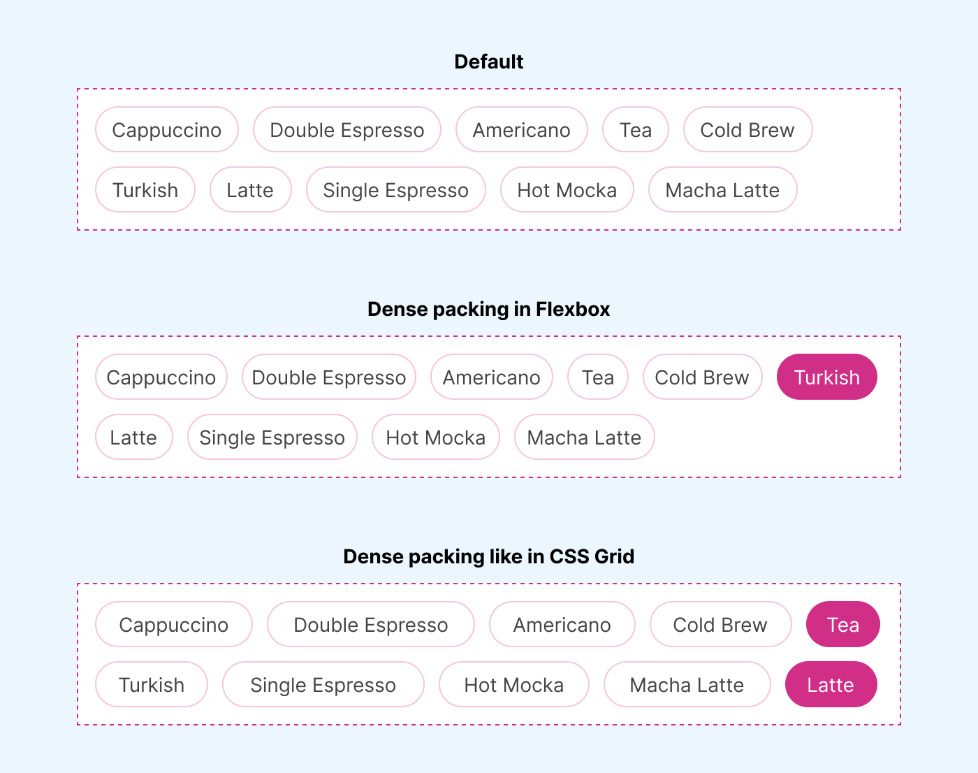
I’m not 100% sure if I like this or not as the use-case above doesn’t make it click to me. Maybe this concept can be useful for another use case.
Upon reading the Webkit article, there is a suggestion for item-pack: balance. In short, it will balance the flex items and attempt to do a similar thing to text-wrap: balance, but for flex items.
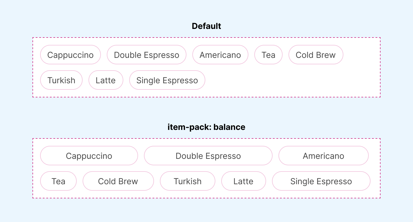
Sounds interesting.
I have second thoughts on this. Why would we need nowrap in Grid? By default, grid wrap except for one case. When using grid-auto-flow: column, it doesn’t.
Here is an example where I placed some items in a small container.
.layout {
  display: grid;
  grid-auto-flow: column;
  gap: 0.5rem;
}
Quick Start
Get up and running in minutes
Easy Setup
Simple configuration process
Customizable
Tailor to your needs
Fast & Light
Optimized performance
In the Webkit’s post, the suggested code is the following:
.container {
  display: grid;
  grid-auto-columns: 1fr;
  item-wrap: nowrap;
}
..which should give each item the same amount of space without wrapping. Even if this works, I’m not exactly sure about the problem (or the use case) it solves.
What do you think?
I thought it would be a good idea to imagine using item flow in some of the common CSS that we write in some projects.
I’m trying to imagine how the new syntax will look like in the wild. Here, I have a flexbox container. See the following:
.layout {
  flex: 1;
  align-self: start;
  display: flex;
  align-items: center;
  item-wrap: wrap;
  item-pack: balance;
}
I’m not sure about items vs item. Why do we have a plural in align-items but not in item-pack, for example? Even though both target the flexbox child items.
Say we have a grid of two columns. Currently, in CSS grid, there is no direct way of centering the last item. What if we can do this with the new syntax?
Here is an example CSS:
.layout {
  display: grid;
  grid-template-columns: 1fr 1fr;
  item-wrap: balance;
  gap: 1rem;
}
See the following figure for how it looks like before and after:
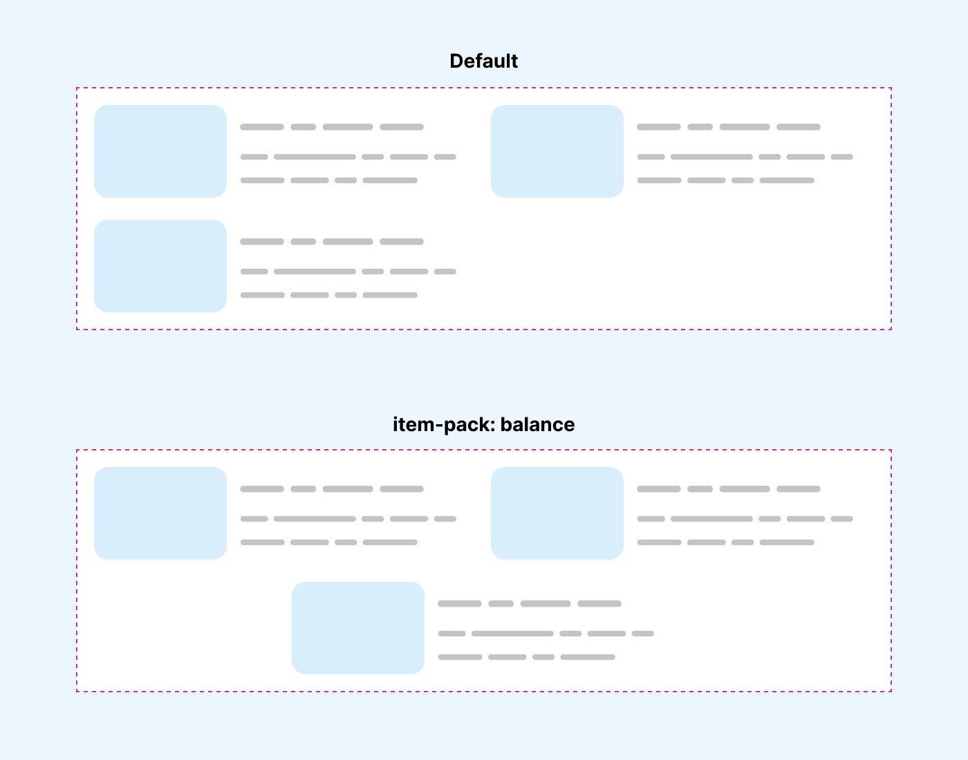
I’m a big believer in getting wrap detection. I wrote about it in 2023. Just imagine if this new syntax could allow this or something around it.
.list {
  display: flex;
 item-wrap: wrap;

 @container wrap-state(wrap) {
 // do something
 }
}
Just a thought.
My answers for the questions raised at the end of Webkit’s article.
Is this a good idea to combine flex-flow and grid-auto-flow into a unified system?
Yes. Sounds good to me.
As a developer would you use the new syntax to accomplish the things you do today with flex-flow and grid-auto-flow?
My usage of the shorthand flex-flow and the grid-auto-flow is rare. However, I will use the new syntax if I need it.
What other ideas might you have for combining existing functionality in Flexbox and Grid into a unified system?
Maybe consider adding a border between items (In both flexbox and grid).
Are you excited about the possibilities of adding new capabilities to Grid and Flexbox? Which ones have the most potential to help you do your work, and unlock new designs?
I’m excited about a few things:
What other new ideas might you want to add to this unified system?
Flexbox wrap detection.
I thought that it would be better to share my thoughts in a blog post. I’m glad I did that and hope that this new syntax will get more attention. It’s great!
此内容由惯性聚合(RSS阅读器)自动聚合整理,仅供阅读参考。 原文来自 — 版权归原作者所有。