


I spent years teaching CSS layout on this blog. I put everything I know into The Layout Maestro course: 70+ lessons and 150+ interactive examples that teach you how to think CSS layouts, not just memorize syntax.
A few days ago, I saw a tweet by Miriam Suzanne about CSS query units being supported. This was originally proposed by Una Kravets on Github. I couldn’t resist experimenting with them and see how we can get even more benefit from CSS container queries.
I will try my best to explain how each unit works, and where we can use a unit(s) to enhance how a component should react to its parent width. If you don’t know about CSS container queries yet, I wrote an intro with lots of examples and also how container queries can affect a designer work. I recommend reading them before reading this article.
A kind reminder: CSS container queries are only supported in Chrome Canary under an experiment flag. To play with it, go to
chrome://flagsand search for “Enable CSS Container Queries” and enable the feature.
Let’s dive in.
In CSS, we have a lot of units that can be used for different purposes. The most used ones are px, rem, and em. If there is something close to how CSS container query units work, then I would say viewport units.
CSS viewport units work in a way that responds to the browser viewport size (width or/and height). That’s great, but we don’t always want to use a unit that is related to the viewport size. What if we want to query against a container width? That’s what query units are for.
To make it more clear, I want to highlight the difference between the viewport units and query units. Consider the following figure:
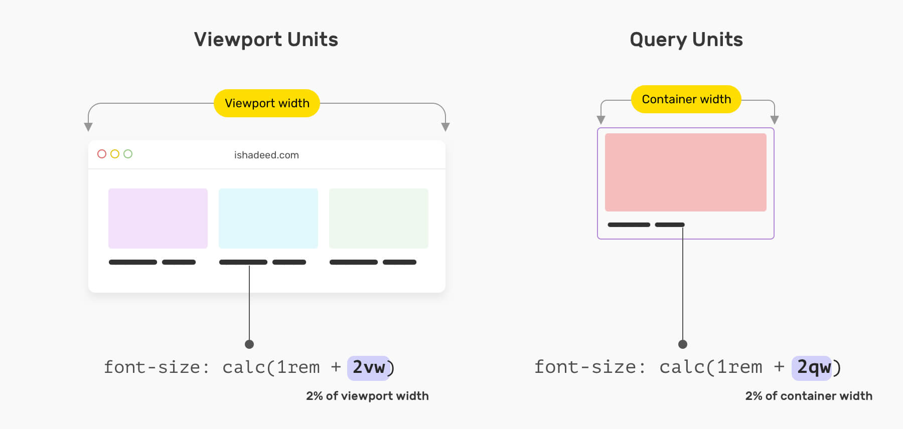
On the left, the font-size is being controlled by rem and vw and that will be relative to the viewport width. In some cases, this might work, but it can cause unexpected issues because it’s relative to the viewport size.
Query units can save us effort and time when dealing with things like font-size, padding, and margin within a component. Instead of manually increasing the font size, we can use query units instead.
Consider the following example.
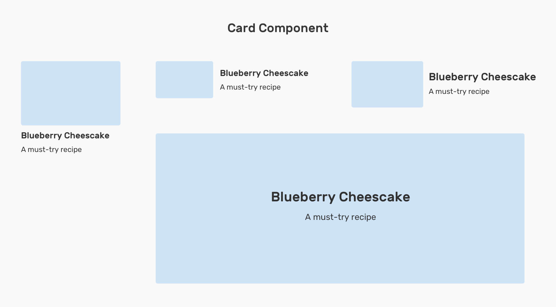
We have a card component that starts with a stacked style, all the way to the hero-like style when the container is large. For such a component, we might need to alter these things:
Without CSS query units, we need to manually alter the above.
.card {
  /* The stacked, base style */
}

.card__title {
  font-size: 1rem;
}

/* The horizontal style, v1 */
@container (min-width: 400px) {
  .card__title {
    font-size: 1.15rem;
  }
}

/* The horizontal style, v2 */
@container (min-width: 600px) {
  .card__title {
    font-size: 1.25rem;
  }
}

/* The hero style */
@container (min-width: 800px) {
  .card__title {
    font-size: 2rem;
  }
}
Notice how the .card__title font size is being changed with different container queries. We can enhance that and avoid duplicating font-size by using query units along with CSS clamp() function.
.card__title {
  font-size: clamp(1rem, 3qw, 2rem);
}
With that, we need to define the font-size only once. If we want to compare this visually, here is how it looks:
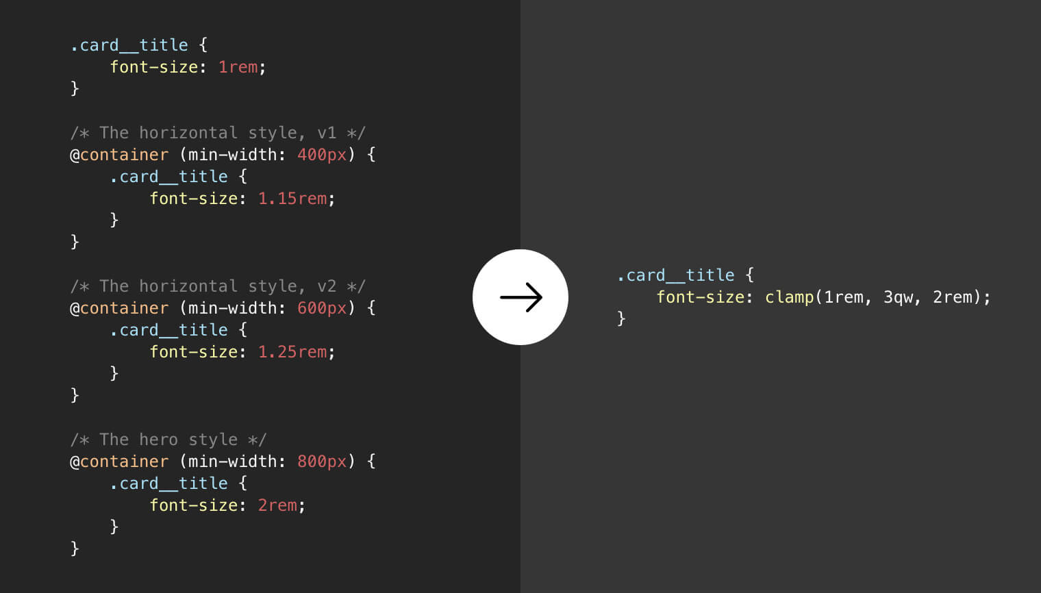
If you’re familiar with CSS viewport units, this isn’t new for you. It’s just like querying against the container rather than the browser’s viewport. Neat, no?
Now that we have an idea about the problems query units are supposed to solve, let’s get the units. According to the CSS spec:
qw or Query Height qh.qw or qh.We also have two other units: qi and qb and they mean Query Inline and Query Block, respectively. They can be used for cases where we have different writing modes.
In addition to the previously explained example about cards, we can use query units for a stacked card where we want the font size to be slightly bigger based on the container width.
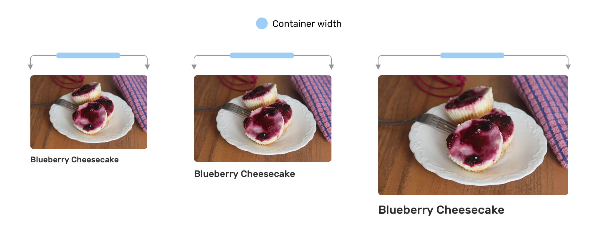
Notice that the font size is slighter getting bigger based on the container size. This can be useful for creating a stacked card component that works no matter where it’s placed.
font-size based on the importanceWhen an element is bigger than another, it’s more likely an indicator that it’s more important. A good example of this is aside and main. The headline size in an <aside> should be smaller than the headline in a <main> section.
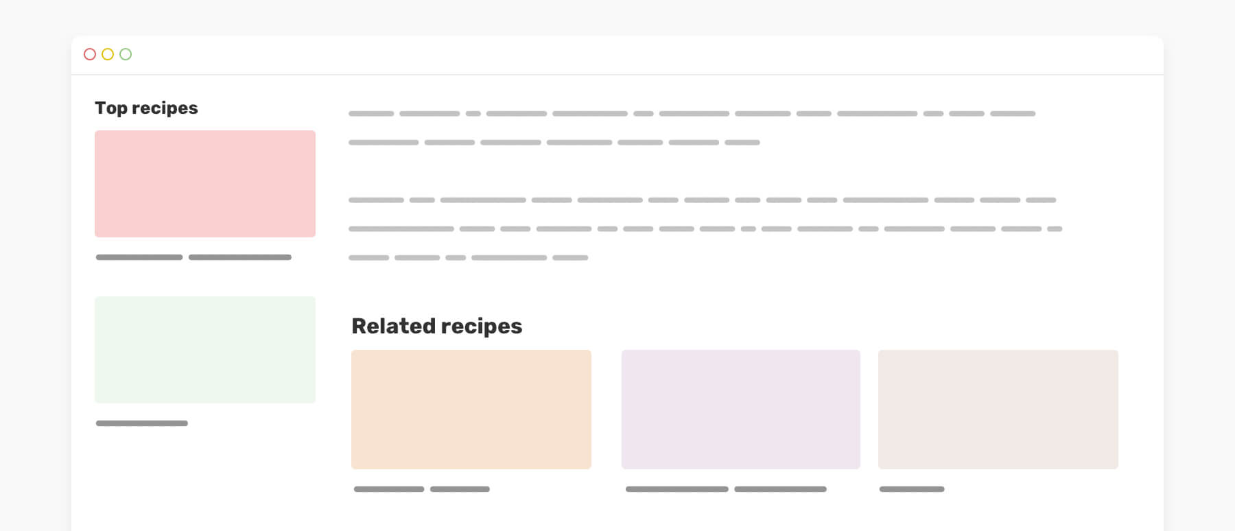
Notice how the headline in the <aside> is smaller than the one in <main>. We can easily do that thanks to query units.
First, we need to define <aside> and <main> as inline-size containers.
aside,
main {
  container: inline-size;
}
Then, we will use a query unit for the section title. We can also use query units for the bottom margin.
.section-title {
  font-size: clamp(1.25rem, 3qw, 2rem);
  margin-bottom: clamp(0.5rem, 1.5qw, 1rem);
}
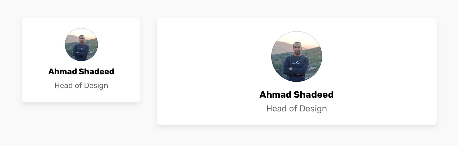
A bio can live within a smaller container (e.g: sidebar) or be shown on a mobile viewport, or a large container like a page header.
We can build a component that can adapt to its container width. In the example, the user avatar and font sizes change based on their container width.
.bio {
  container: inline-size;
}

.c-avatar {
  --size: calc(60px + 10qw);
  width: var(--size, 100px);
  height: var(--size, 100px);
  margin-bottom: clamp(0.5rem, 3qmin, 2rem);
}
In some cases, we need to show a counter next to a heading with an article body. This is a perfect use case for query units.
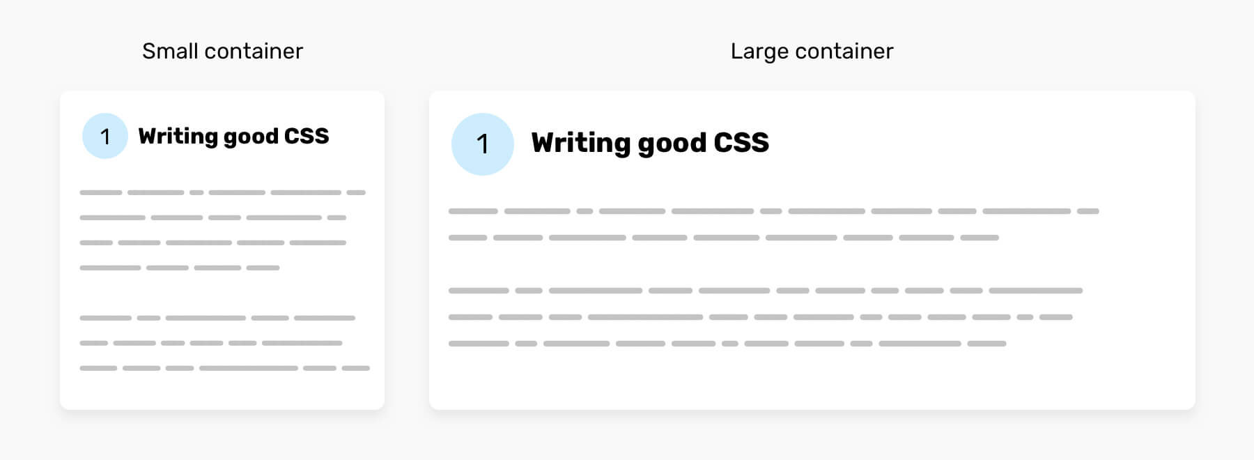
.article-body {
  counter-reset: heading;
}

h2 {
  container: inline-size;
  font-size: clamp(1.25rem, 3qw, 2rem);
  margin-bottom: clamp(0.5rem, 1.5qw, 1rem);
}

h2:before {
  --size: calc(1.25rem + 3qw);
  content: counter(heading);
  counter-increment: heading;
  width: var(--size);
  height: var(--size);
  font-size: calc(0.85rem + 1qw);
  margin-right: calc(var(--size) / 4);
}
We’ve been using viewport units to create dynamic gaps with CSS grid. It’s something like:
.wrapper {
  gap: calc(1rem + 2vw);
}
That’s cool, but what about components within specific wrappers? Using viewport units won’t work. That’s why using query units is a good solution for such a case.
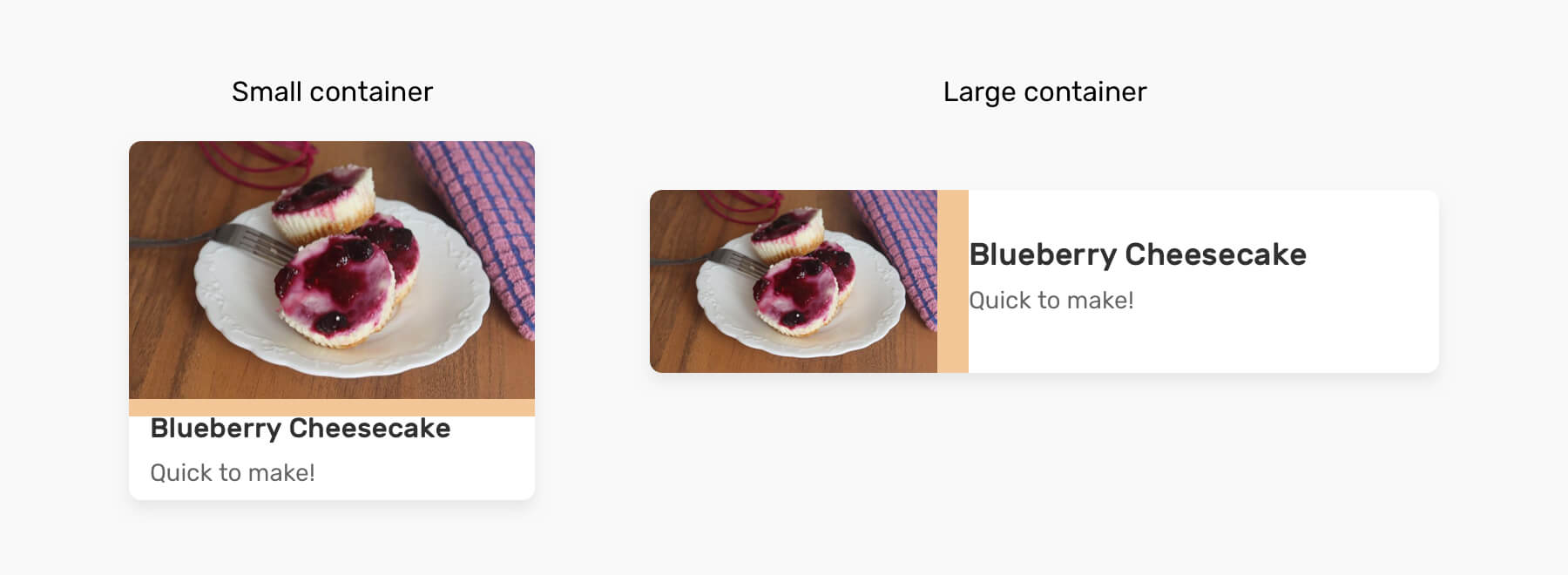
.card {
  display: flex;
  flex-direction: column;
  gap: calc(0.5rem + 1qmin);
}
The gap will be a bit bigger when the component switch to the horizontal style.
According to the spec:
If no eligible query container is available, then use the small viewport size for that axis.
The browser will deal with query units as if they were viewport units. Consider the following example:
h2 {
  font-size: clamp(1.25rem, 3qw, 2rem);
}
If there is no container that is defined for the <h2>, the browser will consider 3qw as if it was 3% of the viewport width. That means, using query units without defining containers can lead to unexpected results.
I hope you enjoyed the article. Thanks for reading!
此内容由惯性聚合(RSS阅读器)自动聚合整理,仅供阅读参考。 原文来自 — 版权归原作者所有。