


I spent years teaching CSS layout on this blog. I put everything I know into The Layout Maestro course: 70+ lessons and 150+ interactive examples that teach you how to think CSS layouts, not just memorize syntax.
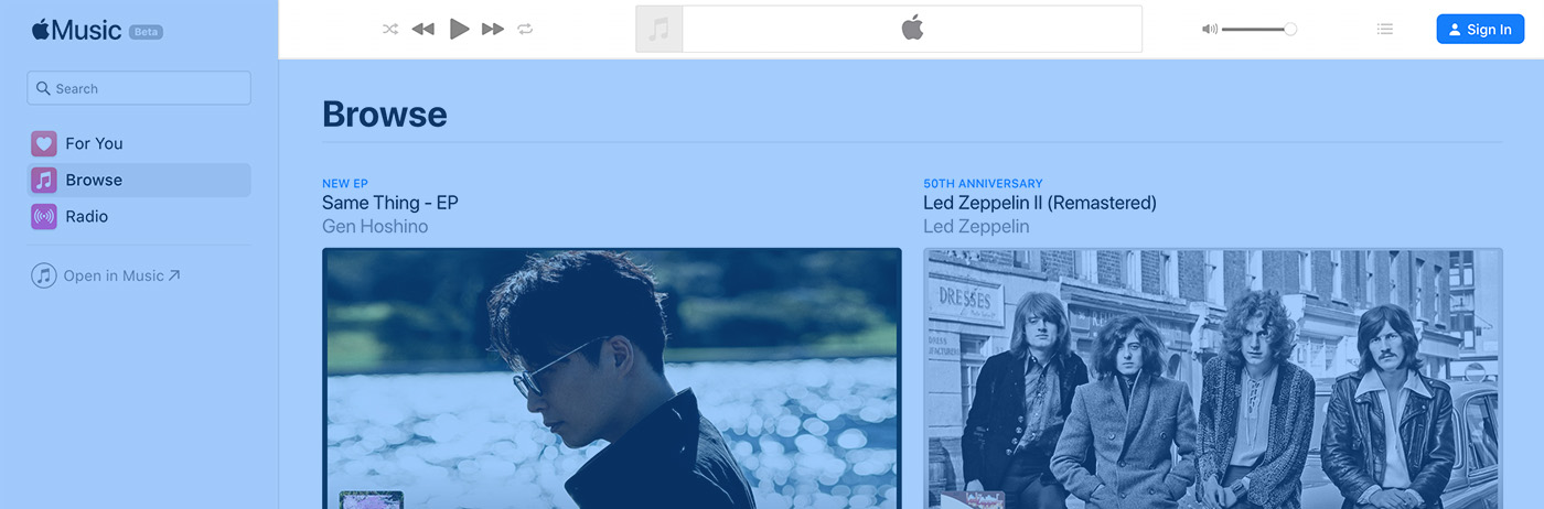
In this article, you’ll learn how to build an Apple Music playback header in CSS. I will go through the non-logged state of it. Please note that basic knowledge in Flexbox and CSS Grid is required to follow along. However, I will try to make the concepts as simple as possible.

From a layout perspective, it appears that there are three sections in the header.
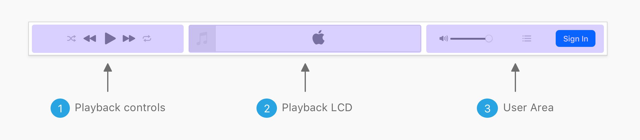
The following should be taken into consideration:
I created an empty div for each section, so I can test the layout before working on the inner components.
<div class="c-playback">
  <div class="c-playback__controls">Playback controls</div>
  <div class="c-playback__lcd">Playback LCD</div>
  <div class="c-playback__user">User Area</div>
</div>
I added padding and background colors to distinguish them from each other.
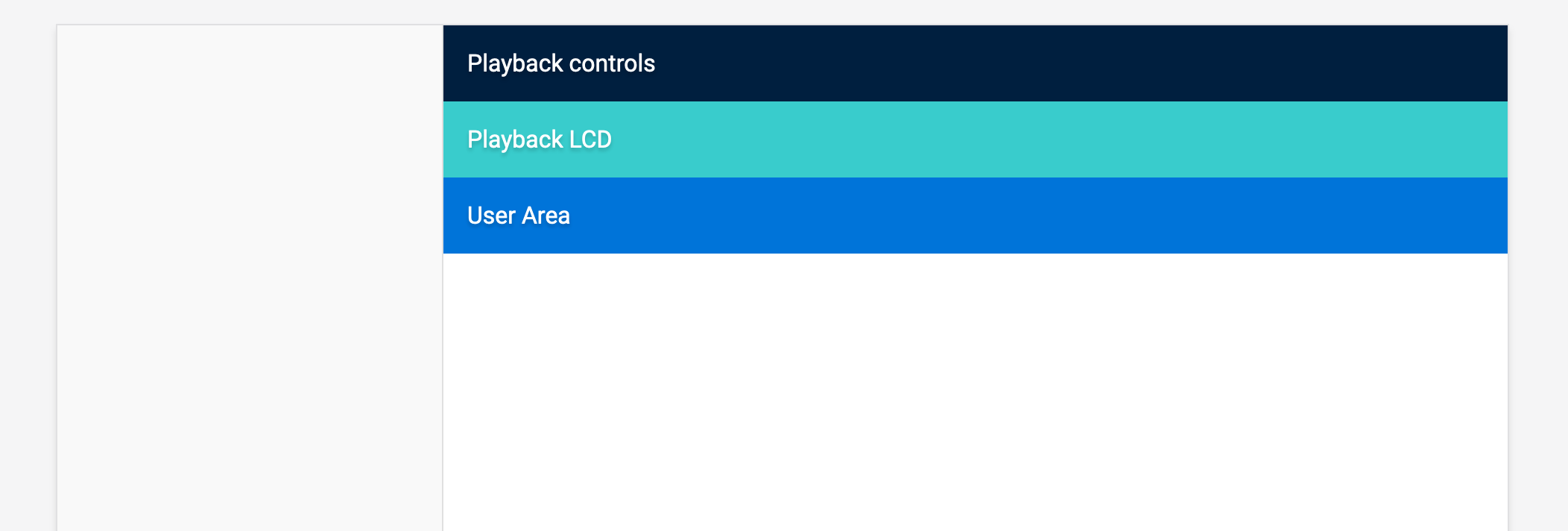
Now that we have the outlining sections, let’s dig into the possibilities of laying them out!
To ensure that we’re on the same page, the middle section is the biggest of them, so its width has to be bigger than the siblings.
.c-playback__controls,
.c-playback__user {
  flex-grow: 1;
}

.c-playback__lcd {
  flex-grow: 2;
}
Notice that I added flex-grow: 2 for the LCD section. Here is the current result:
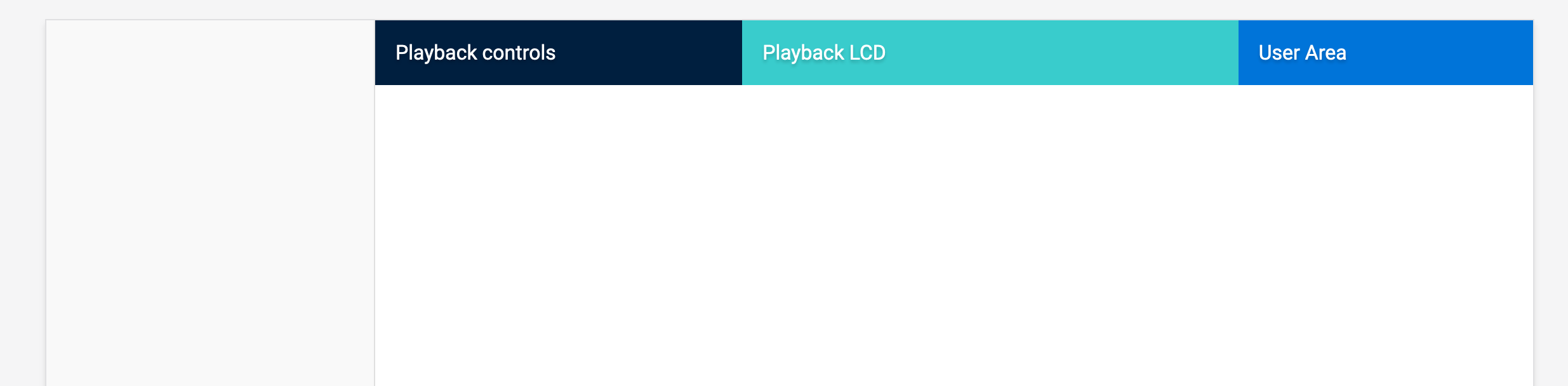
The above might seems right, but it’s not the best solution. I believe that CSS Grid will do a better job there, as it’s more suitable for the following reasons:
The first thought that I got is to divide them into percentages. The first and last one takes 30%, and the middle one is 40%.
.c-playback {
  display: grid;
  grid-template-columns: 30% 40% 30%;
}
Now, I want to add a 10px gap between each section. I added the following:
.c-playback {
  display: grid;
  grid-template-columns: 30% 40% 30%;
  grid-gap: 10px;
}
And this happened! There is an unexpected horizontal scrolling.
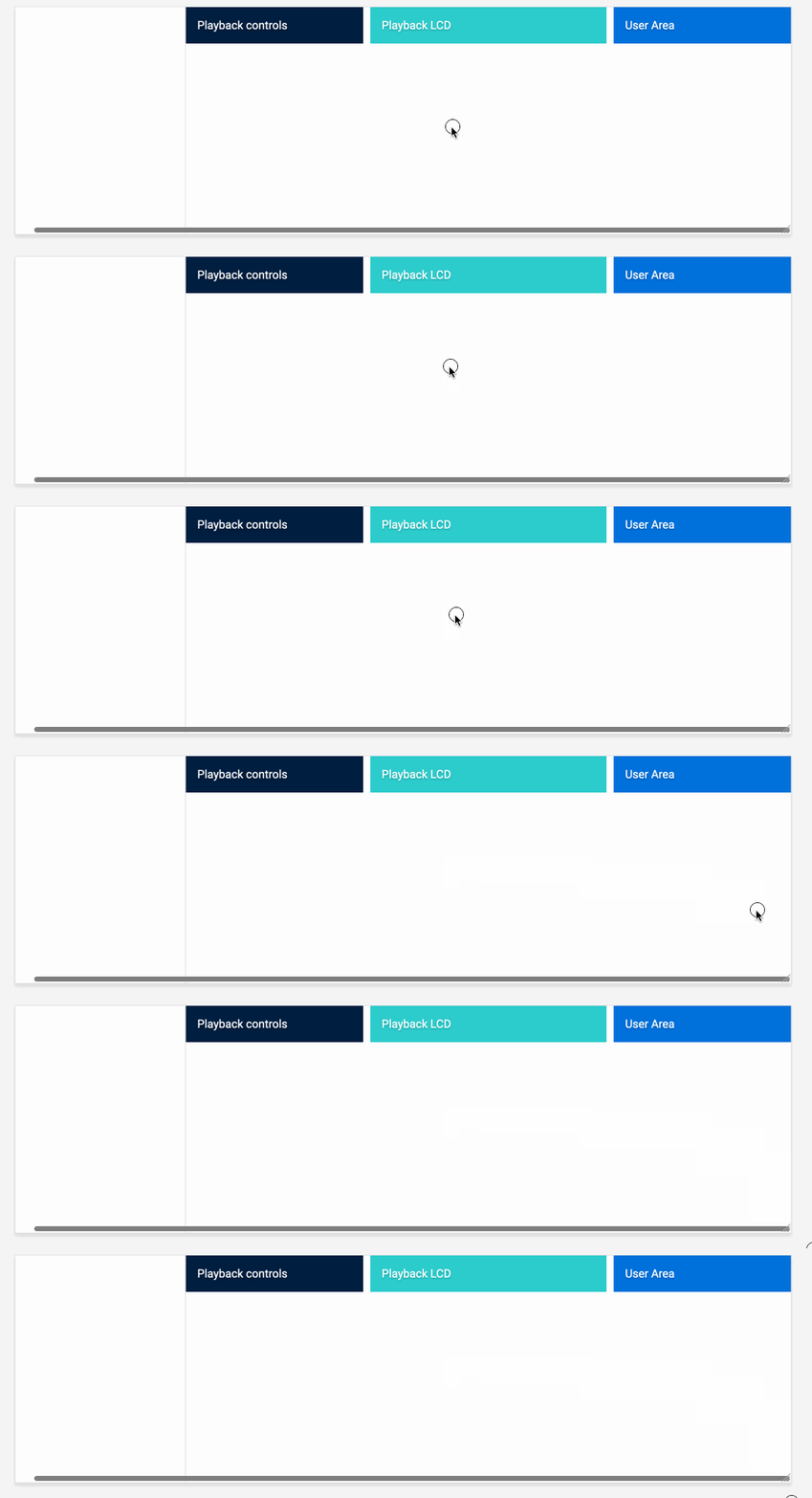
The reason behind this is that when using percentages with CSS Grid, a gap will be added to the total sum of the column percentages. In our case, the width of .c-playback become 100% + 20px. This caused horizontal scrolling.
There is a solution to this issue, which is using CSS calc() like this:
.c-playback {
  display: grid;
  grid-template-columns: calc(30% - 10px) 40% calc(30% - 10px);
  grid-gap: 10px;
}
However, that solution is not future-proof and could result in unexpected issues again. Though, the CSS on Apple website is in percentages.
It’s recommended to use CSS Grid fr unit to avoid dealing with the issue of the percentages.
.c-playback {
  display: grid;
  grid-template-columns: 1fr 1.5fr 1fr;
  grid-gap: 10px;
}
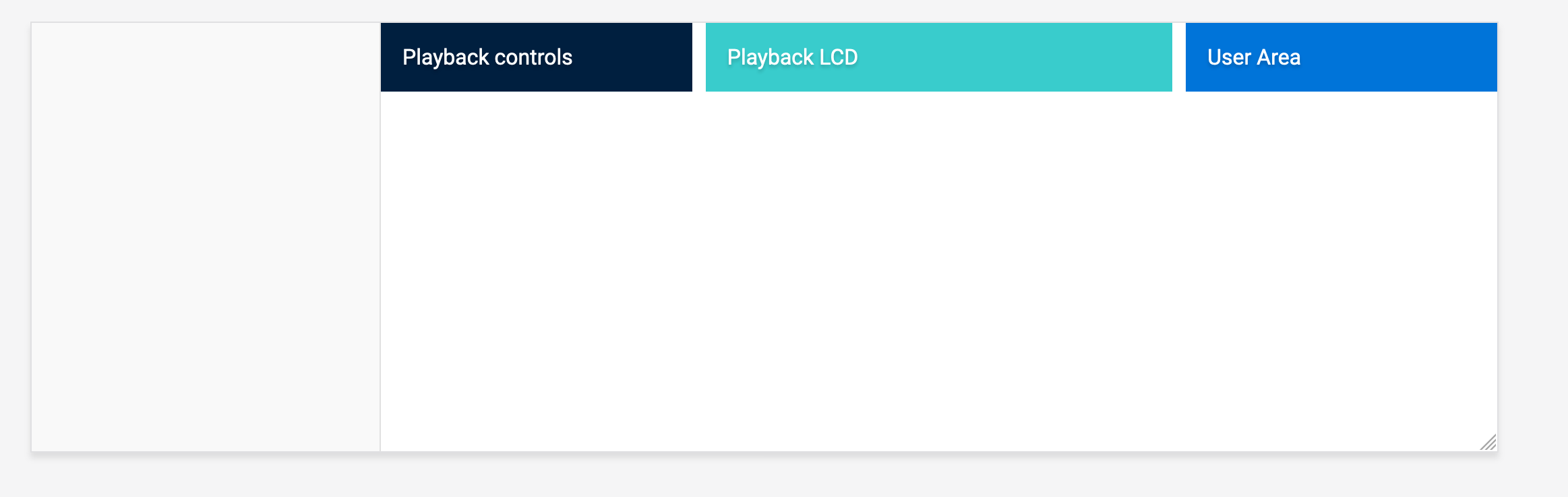
Here is a tip to see how a design will look on a large screen while using a laptop or a small screen. Ctrl + - or Zoom out in the browser window. By doing this, you will get an idea about how a website is looking on a large screen.
I zoomed out to almost ~2200px width and this is what I got:

Not cool. Right? It’s better to account for the minimum and maximum width of a layout. To solve that, I will use max-width along with centering the playback container.
.c-playback {
  /*Other styles*/
  max-width: 1500px;
  margin-left: auto;
  margin-right: auto;
}
Here is how it looks after adding a maximum width.
 Ok. Let’s get to the real work!

The first section is the playback control. I imagined that the layout is divided into three groups. The first one and two are separated buttons for randomizing and repeating songs. The middle one is for playing and pausing.. etc
Here is the initial HTML:
<div class="c-playback__controls">
  <button class="c-playback__control">
    <!--SVG-->
  </button>
  <div class="c-playback__controls__group">
    <button class="c-playback__control">
      <!--SVG-->
    </button>
    <button class="c-playback__control">
      <!--SVG-->
    </button>
    <button class="c-playback__control">
      <!--SVG-->
    </button>
  </div>
  <button class="c-playback__control">
    <!--SVG-->
  </button>
</div>
Please brace for impact :D Here is the current look with the above code.
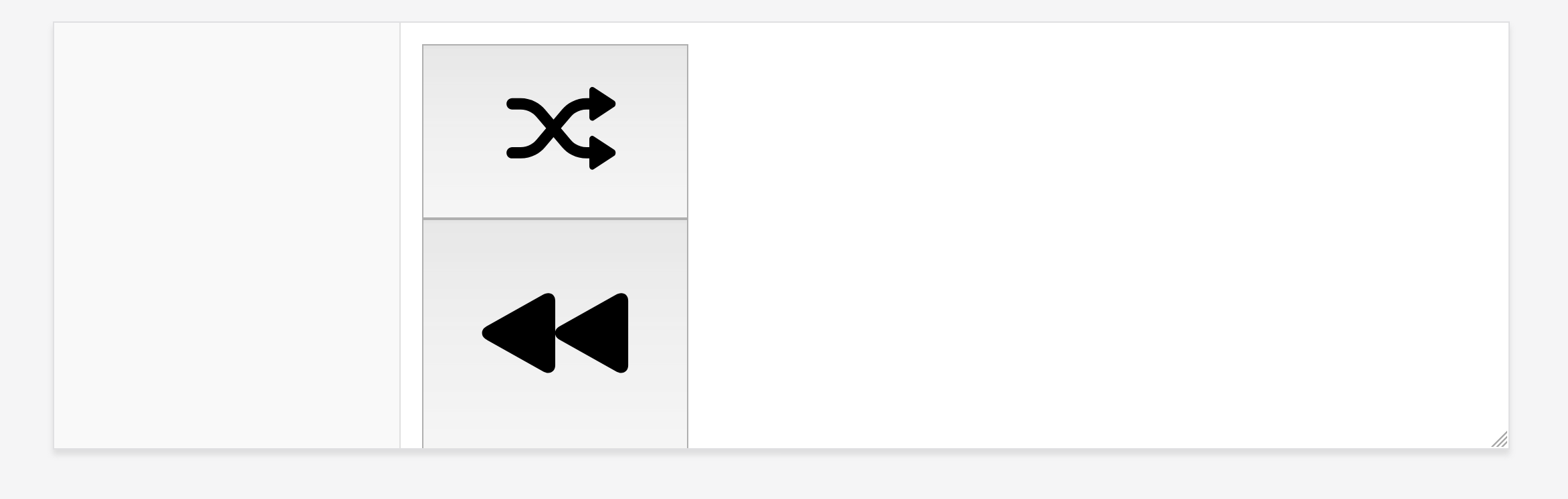
The first step to do when icons are huge like this is to give them a specific size. I added the below CSS and things got better:
.c-playback__controls svg {
  width: 24px;
  height: 24px;
}
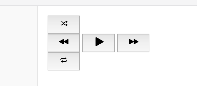
I added some styles to reset the buttons:
.c-playback__controls button {
  appearance: none;
  border: 0;
  background: transparent;
  padding: 0;
}
How to layout the controls? CSS Grid to the rescue.
.c-playback__controls {
  display: grid;
  grid-template-columns: 1fr auto 1fr;
}
I added auto for the group since it doesn’t have a specific width and needs to be dynamic (depending on its content).
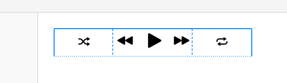
The next step is to add proper sizing to randomize and repeat buttons.
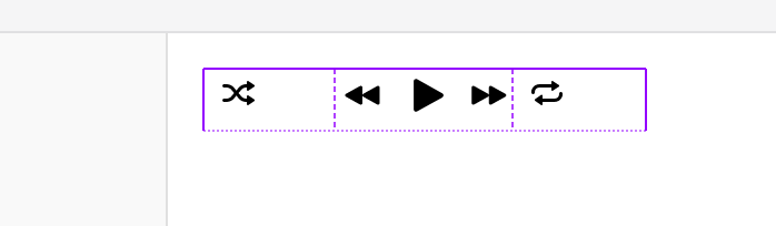
After adding width and height to each of the side buttons, I noticed that they are not aligned correctly. Since the wrapper has Grid, it’s possible to use the following:
.c-playback__controls {
  display: grid;
  grid-template-columns: 1fr auto 1fr;
  justify-items: center;
  align-items: center;
}
And now, the control buttons in the center needs to be bigger, so I added a bigger width and height for them. Here is the current result:

If you notice, the left and right buttons are not closed to the center group. Below is a figure that shows that:
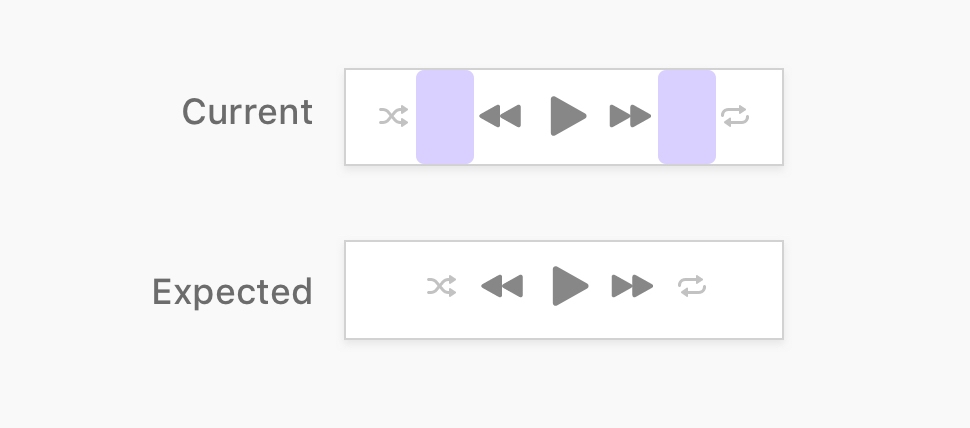
The solution to this issue is the following:
display: inline-grid instead of display: grid.text-align: center to controls wrapper.<div class="c-playback__controls">
<!-- Inner wrapper -->
<div class="c-playback__controls__wrapper">
<!-- Playback buttons -->
</div>
</div>
.c-playback__controls__wrapper {
  text-align: center;
}

.c-playback__controls {
  display: inline-grid;
  grid-template-columns: 1fr auto 1fr;
  justify-items: center;
  align-items: center;
}
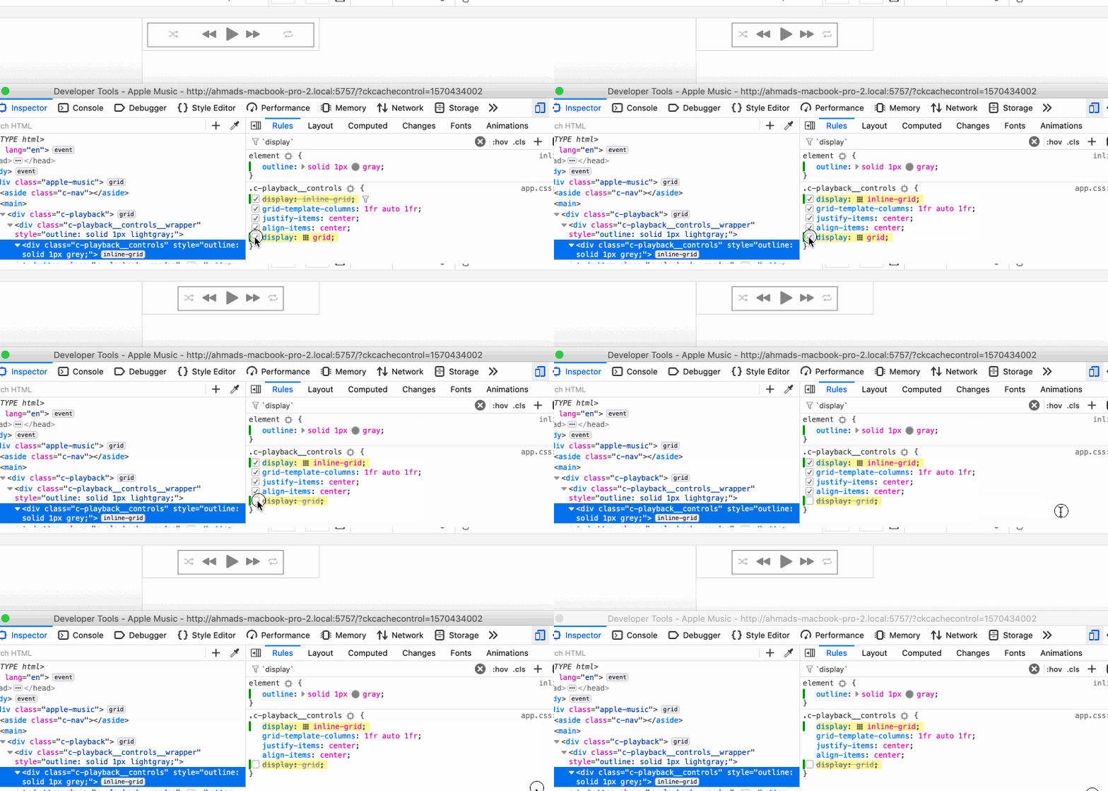
When the element .c-playback__controls has a display type of Grid, it will take the full width of its parent. As a result, the inner items will expand to that width.
However, Inline Grid keeps the element inline, while being a Grid wrapper at the same time. Once the element has display: inline-grid, it’s possible to center it by adding text-align to its parent.

The LCD component consists of the music icon on the left and Apple logo in the center.
<div class="c-playback__lcd">
  <!-- SVG Icon -->
</div>
.c-playback__lcd {
  position: relative;
  height: 44px;
  border: 0.5px solid #dedede;
  border-radius: 3px;
  overflow: hidden;
  text-align: center;
  /* Flexbox for centering the SVG */
  display: flex;
  justify-content: center;
  align-items: center;
}

.c-playback__lcd:before {
  content: "";
  position: absolute;
  left: 0;
  top: 0;
  width: 44px;
  height: 44px;
  background: url("...") center/100% no-repeat;
}
I used Flexbox to center the logo, and for the music icon, it’s a background image borrowed from Apple music website.
Here is the current result:

Next, I will work on the last section of the playback header. For this one, there are 3 different components to be built:
I added an empty wrapper for each component, and added a basic styling to place them:

Placing the elements like this gives you an early thought or idea on how to properly place the elements. So it’s a kind of thinking that prioritizes the layout first and then the inner components. Imagine this as an outline for research or a document you need to write.
This component consists of the volume icon and the slider input. To start, I added the icon and input as below:
<div class="c-slider-input">
  <svg>..</svg>
  <input type="range" name="" id="" value="0" />
</div>
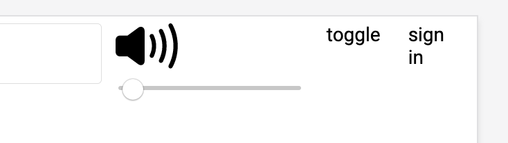
Here is the default look without styling. I need to do the following:
I added the below styling to handle the above.
.c-input-slider {
  display: flex;
  align-items: center;

  input {
    width: 70px;
  }

  svg {
    width: 16px;
    height: 16px;
    fill: #999;
  }
}
If you notice, the volume slider for Apple music is customized a bit, so I need to do that. Customizing input sliders in CSS is tricky to make it consistent across different browsers. In order not to go out of the scope of this article, I won’t go into the details of styling the range slider. Instead, I’ll be using this Sass component to get a custom and consistent styling.
I continued and added the markup for the toggle and sign in buttons. Here is the current look (I love this stage of every component):
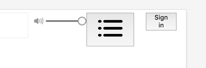
I added the following styles:
.c-playback__toggle {
  appearance: none;
  border: 0;
  background: transparent;

  svg {
    width: 24px;
    height: 18px;
    fill: #c4c4c6;
  }
}
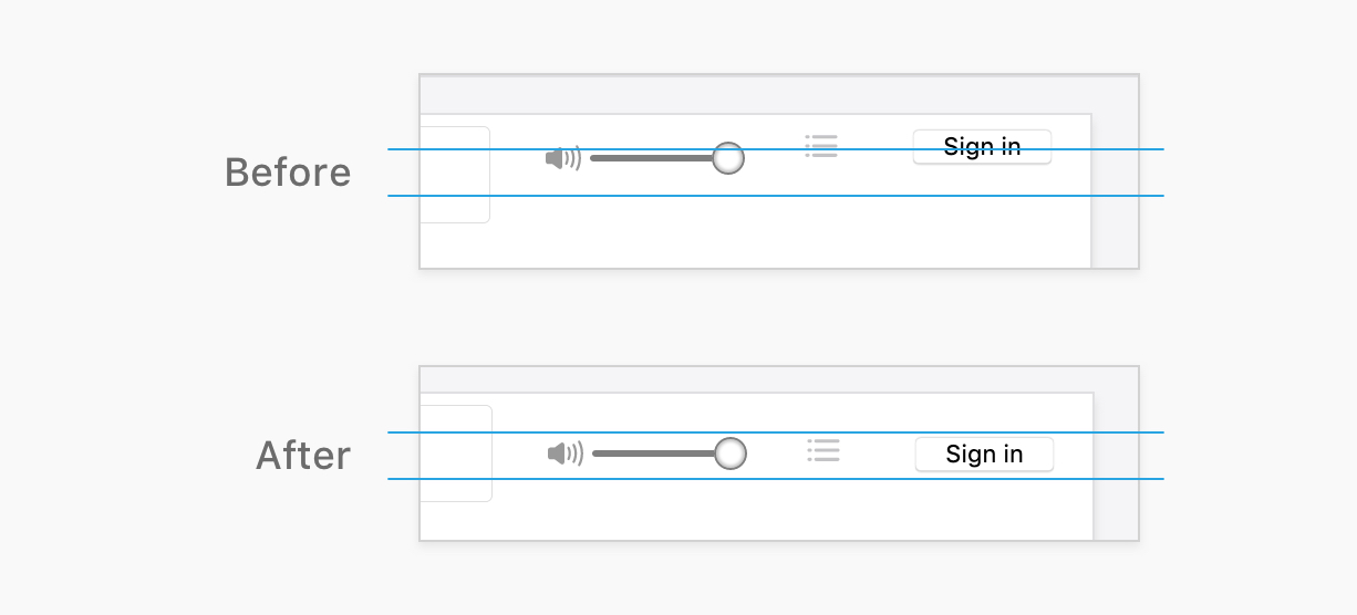
Notice that the components are not centered vertically, so I added align-items: center to their Flex parent .c-playback__user to center them.
Next, are the toggle and sign in button. I applied the below styling for them:
.c-playback__toggle {
  appearance: none;
  border: 0;
  background: transparent;

  svg {
    width: 24px;
    height: 18px;
    fill: #c4c4c6;
  }
}

.c-button {
  appearance: none;
  border: 0;
  border-radius: 6px;
  color: #fff;
  font-size: 13px;
  background-color: #0076ff;
  padding: 6px 12px;

  svg {
    fill: #fff;
    width: 10px;
    height: 11px;
    margin-right: 4px;
  }
}
I liked how the sound volume is centered on the CSS from the Apple website. Since the wrapper is a Flexbox item, it’s possible to use auto margins to center an element horizontally, even if there other elements next to it.
I’ve never thought about using an auto margin for an element that is not alone in its wrapper!
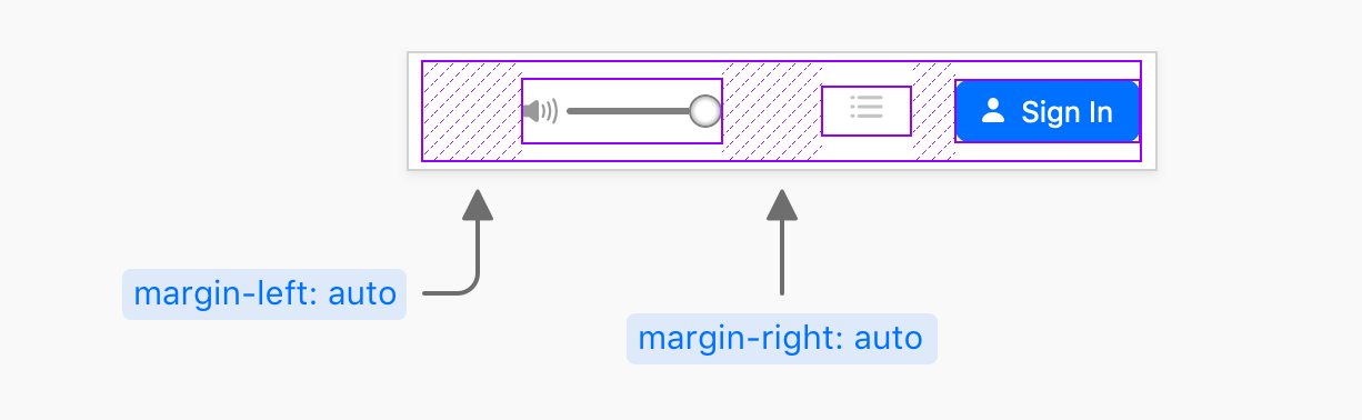
To put things in context, here is the general HTML for the last section of the playback header.
<div class="c-playback__user">
  <div class="c-playback__user__vol">
    <div class="c-input-slider">
      <svg>..</svg>
      <input type="range" name="" id="" value="100" />
    </div>
  </div>
  <div class="c-playback__user__toggle">
    <button class="c-playback__toggle">
      <svg>..</svg>
    </button>
  </div>
  <div class="c-playback__user__signin">
    <button class="c-button">
      <svg>..</svg>
      Sign In
    </button>
  </div>
</div>
.c-playback__user {
  display: flex;
  justify-content: flex-end;
  align-items: center;
}

.c-playback__user__vol {
  margin-left: auto;
  margin-right: auto;
}
Quite interesting, no?

If you noticed, the first section is not centered vertically. To make it so, I need to add align-items: center to the playback header wrapper.
.c-playback {
  /* other styles */
  align-items: center;
}
The logo doesn’t look 100% centered. The easiest fix will be by using negative margin, or CSS positioning. I would use the latter for no specific reason. Both are fine.
.c-playback__lcd svg {
  position: relative;
  top: -1px;
}
Even though I couldn’t see how this is working on mobile since I’m not interested to subscribe to Apple music. I’ll show you how I made it responsive as Apple did.
To get enough space, I reduced the width of the first and middle sections.
.c-playback {
  display: grid;
  grid-template-columns: 0.7fr 1.1fr 1fr;
  grid-gap: 6px;
}

@media (min-width: 1135px) {
  .c-playback {
    grid-gap: 16px;
    grid-template-columns: 1fr 1.5fr 1fr;
  }
}

@media (max-width: 970px) {
  position: relative;
  display: block;

  .c-playback__controls,
  .c-playback__toggle,
  .c-input-slider {
    display: none;
  }

  .c-playback__user__signin {
    position: absolute;
    right: 24px;
    top: 12px;
  }
}
Here is a GIF of the responsive result:
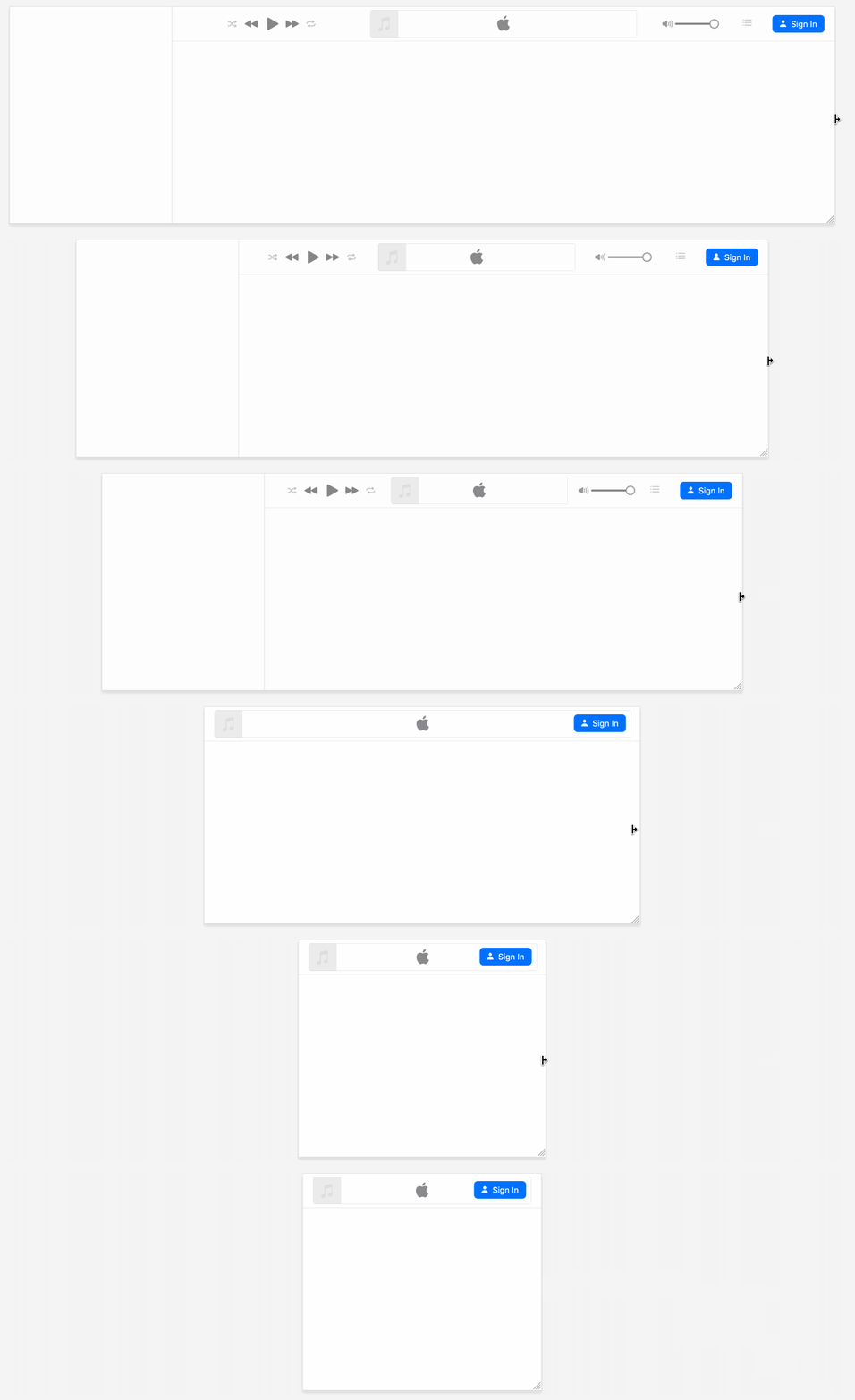
See the Pen Apple Music Header by Ahmad Shadeed (@shadeed) on CodePen.
And that’s a wrap. Do you have a comment or a suggestion? Please feel free to ping me on @shadeed9.
Thank you for reading.
此内容由惯性聚合(RSS阅读器)自动聚合整理,仅供阅读参考。 原文来自 — 版权归原作者所有。