


I spent years teaching CSS layout on this blog. I put everything I know into The Layout Maestro course: 70+ lessons and 150+ interactive examples that teach you how to think CSS layouts, not just memorize syntax.
While working on a demo for an article, I needed an easy way to create a grid layout. For example, laying out a grid of five columns without touching CSS every time I change my mind. Throughout this article, I will explore some use cases and think out loud with you on how to do them.
Before diving into the concept, let me explain CSS Variables basics. You might know them as Custom Properties as well.
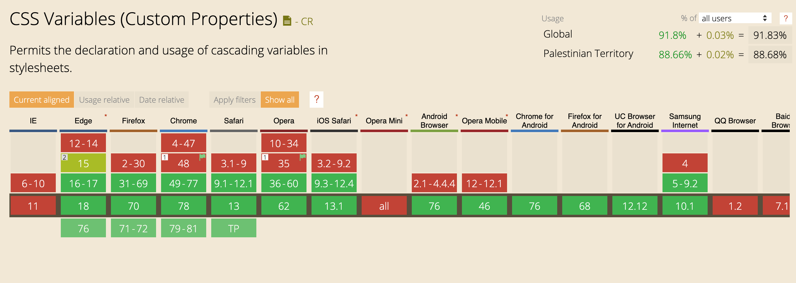
CSS Variables are supported natively in all major browsers. They allow us to use real variables in the browser. Here is brief of the support table:
To define a CSS Variable, it needs to be added to the :root declaration if it’s global (:root is equivalent to <html> except that :root has a higher specificity). If the variable is specific to a component, it can be defined inside its declaration.
In the below example, I defined a global variable --size which will be used for the width and height of a square element.
:root {
  --size: 50px;
}

.square {
  width: var(--size);
  height: var(--size);
}
What if --size is not defined at all? It’s possible to define a default or fallback variable, in case the passed one is not valid.
In the example below, I added var(--size, 10px). In case --size wasn’t valid, the width and height values will fallback to 10px.
.square {
  width: var(--size, 10px);
  height: var(--size, 10px);
}
Adding on that, it’s possibe to use a CSS variable inside an inline CSS style. For example:
<div class="elem" style="--background: red;"></div>
.elem {
  background: var(--background);
}
All of the examples in this article will be based on the above concept. Now that you understood the basic idea let’s explore some real-life examples.
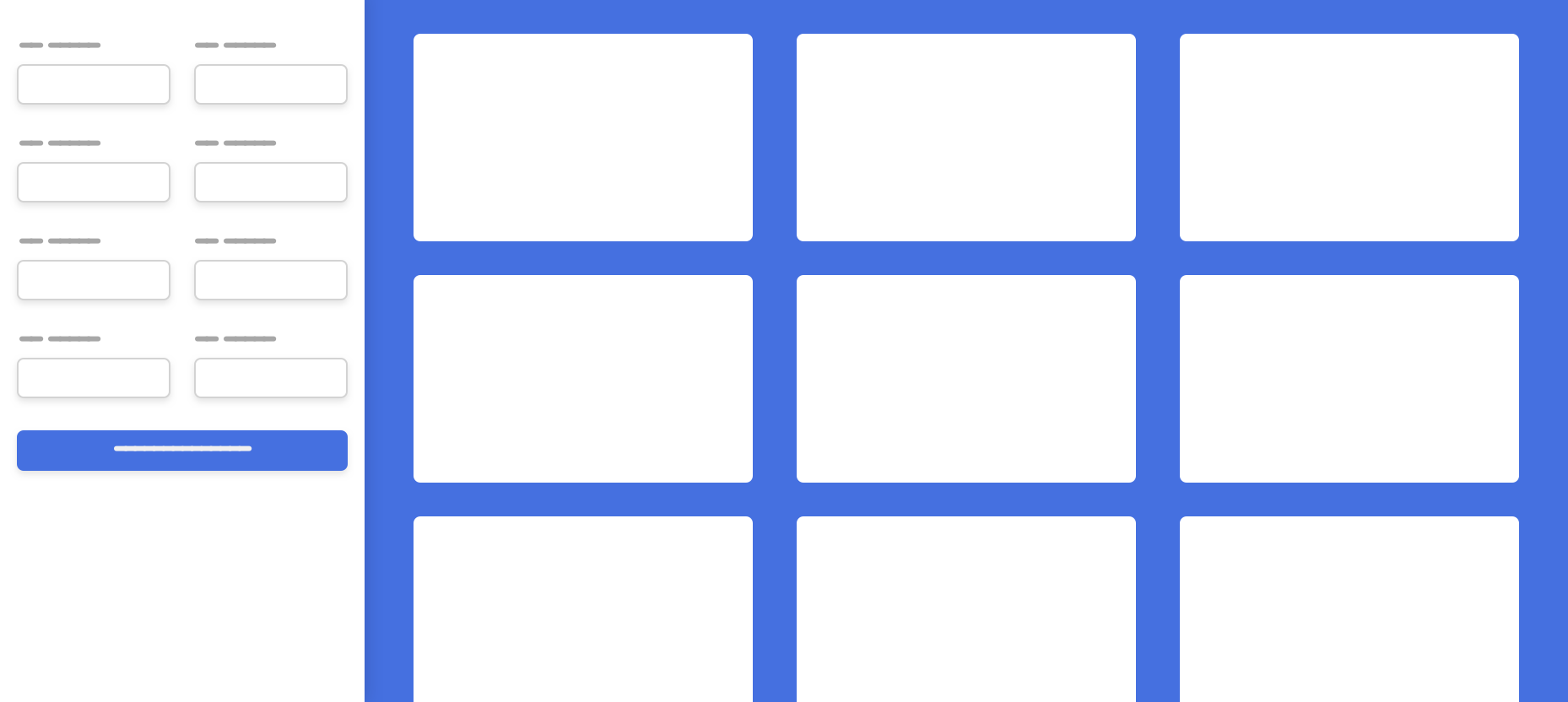
In this design, I will use CSS grid for the following: 1- Sidebar and Main 2- Form Items 3- Three Column Layout
The sidebar will take a fixed width, and the main will be fluid. Let’s suppose that the sidebar width is 240px.
<div class="o-grid" style="--columns: 240px 1fr">
  <aside></aside>
  <main></main>
</div>
.o-grid {
  display: grid;
  grid-template-columns: var(--columns);
}
As per the design, there are two columns per each row. Here is a sample from the HTML.
<div class="o-grid" style="--columns: 1fr 1fr">
  <div class="form-group"></div>
  <div class="form-group"></div>
  <div class="form-group"></div>
  <div class="form-group"></div>
</div>
.o-grid {
  display: grid;
  grid-template-columns: var(--columns);
}
In the below example, I added --repeat-number: 3 and --gap: 8px as inline CSS. Those variables are added to the o-grid class. The result of the grid will be based on those variables.
<div class="o-grid" style="--repeat-number: 3; --gap: 8px;">
  <div></div>
  <div></div>
  <div></div>
</div>
.o-grid {
  display: grid;
  grid-template-columns: repeat(var(--repeat-number), 1fr);
  grid-gap: var(--gap, 0);
}
I like that in CSS Variables, it’s possible to add a default value, in case the variable hasn’t been set. In the above code, I used var(--gap, 0). In case the author didn’t provide the --gap variable, the default will be zero.
minmaxFor me, this is a widespread use case and is essential. I use Grid minmax a lot, but I face an issue while using it on multiple pages.
Let’s take a basic example without CSS variables.
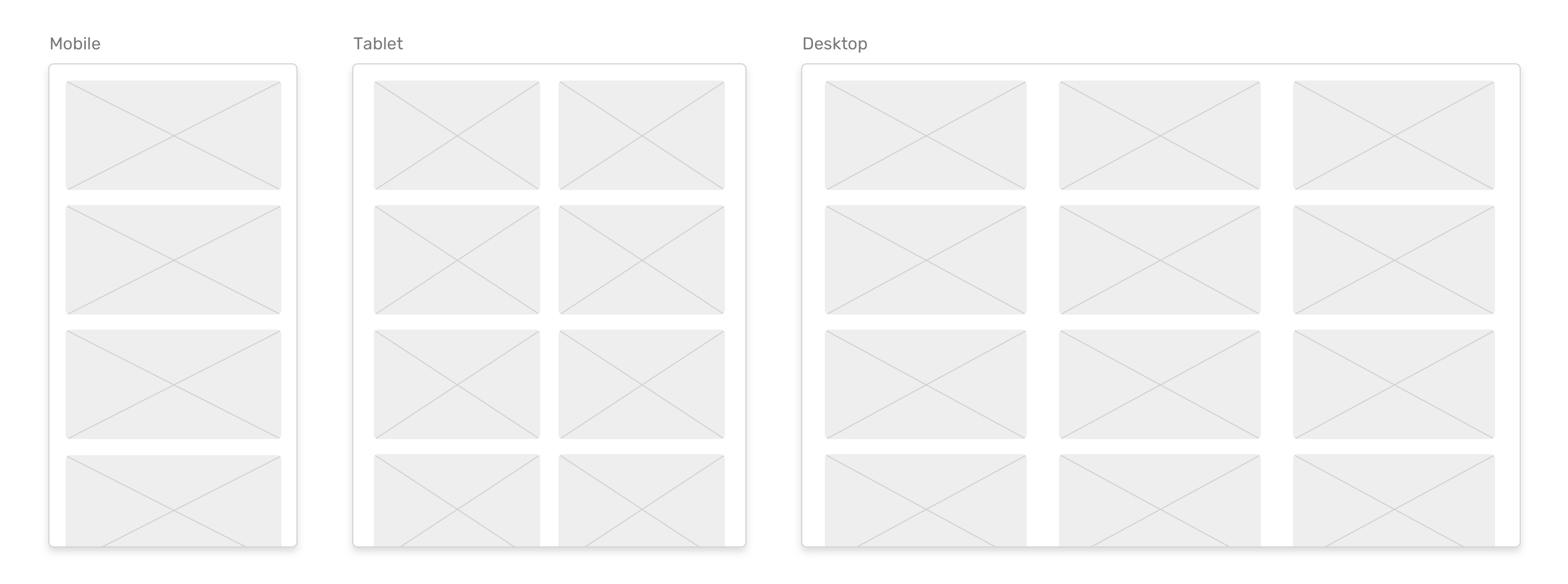
In CSS, I used minmax to define a minimum width of 250px for each grid item.
.o-grid {
    display: grid;
    grid-template-columns: repeat(auto-fit, minmax(250px, 1fr);
    grid-gap: 16px;
}
Now, what should I do in case there a design that requires the grid item width to be at least 300px. Do I need to create a class variation like the below?
.o-grid--2 {
  grid-template-columns: repeat(auto-fit, minmax(350px, 1fr));
}
Imagine having five different grids, each with a varying width of the item. The above won’t be the right solution.
With CSS Variables, I can do the following:
.o-grid { display: grid; grid-template-columns: repeat(auto-fit,
minmax(var(--item-width), 1fr); grid-gap: var(--gap); }
And in HTML, I can set any width and gap I want.
<!-- Example 1 -->
<div class="o-grid" style="--item-width: 250px;">
  <div></div>
  <div></div>
  <div></div>
</div>

<!-- Example 2 -->
<div class="o-grid" style="--item-width: 350px;">
  <div></div>
  <div></div>
  <div></div>
</div>

<!-- Example 3 -->
<div class="o-grid" style="--item-width: 150px;">
  <div></div>
  <div></div>
  <div></div>
</div>
Isn’t that much better than creating a class variation whenever the width is changed?
See the Pen CSS Variables and Inline Styles by Ahmad Shadeed (@shadeed) on CodePen.
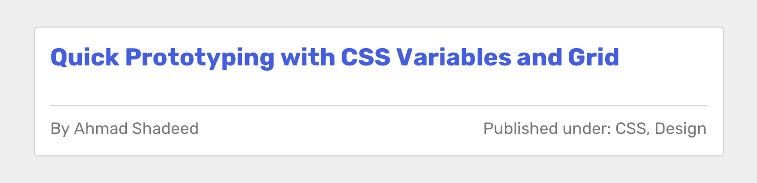
In the example, there is an article header with a row containing the author’s name and tags. I was experimenting in a layout while designing in the browser and needed a quick way to toggle between how those items are placed.
<div class="article-header">
  <h2>Article title</h2>
  <div class="article-header__meta" style="--justify: space-between;">
    <p>By Ahmad Shadeed</p>
    <p>Published under: CSS, Design</p>
  </div>
</div>
.article-header__meta {
  display: flex;
  justify-content: var(--justify);
}
With that in hand, I can tweak the inline style to change the value to another keyword. I found this to be useful while doing quick prototyping or even production websites.
I found that the technique also works for button elements. Let’s suppose that there is a form with two input fields and a button.
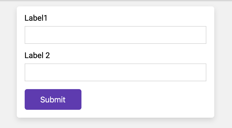
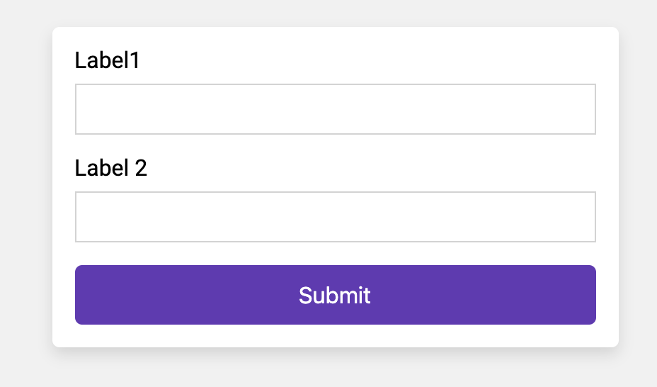
What I’m aiming to do is to control the button’s width by using an inline CSS Variable. Sometimes, a button should take 100% width of its parent.
<button class="c-button" style="--width: 100%;">Submit</button>
.c-button {
  /* Other styles */
  width: var(--width, initial);
}
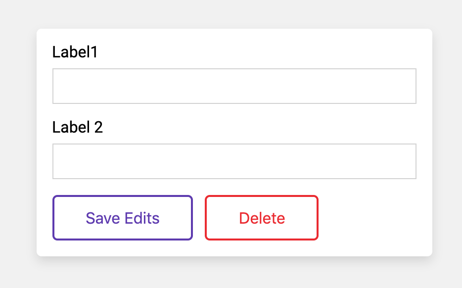
Another useful use for that is when there is a ghost button (outline button). The button color could be anything and by using a CSS Variable for it, changing the color would be easy.
<button class="c-button c-button--ghost" style="--color: #5e35b1;">
  Save Edits
</button>
<button class="c-button c-button--ghost" style="--color: #ec2828;">
  Delete
</button>
.c-button--ghost {
  /* Other styles */
  background: transparent;
  color: var(--color, #000);
  border-color: currentColor;
}
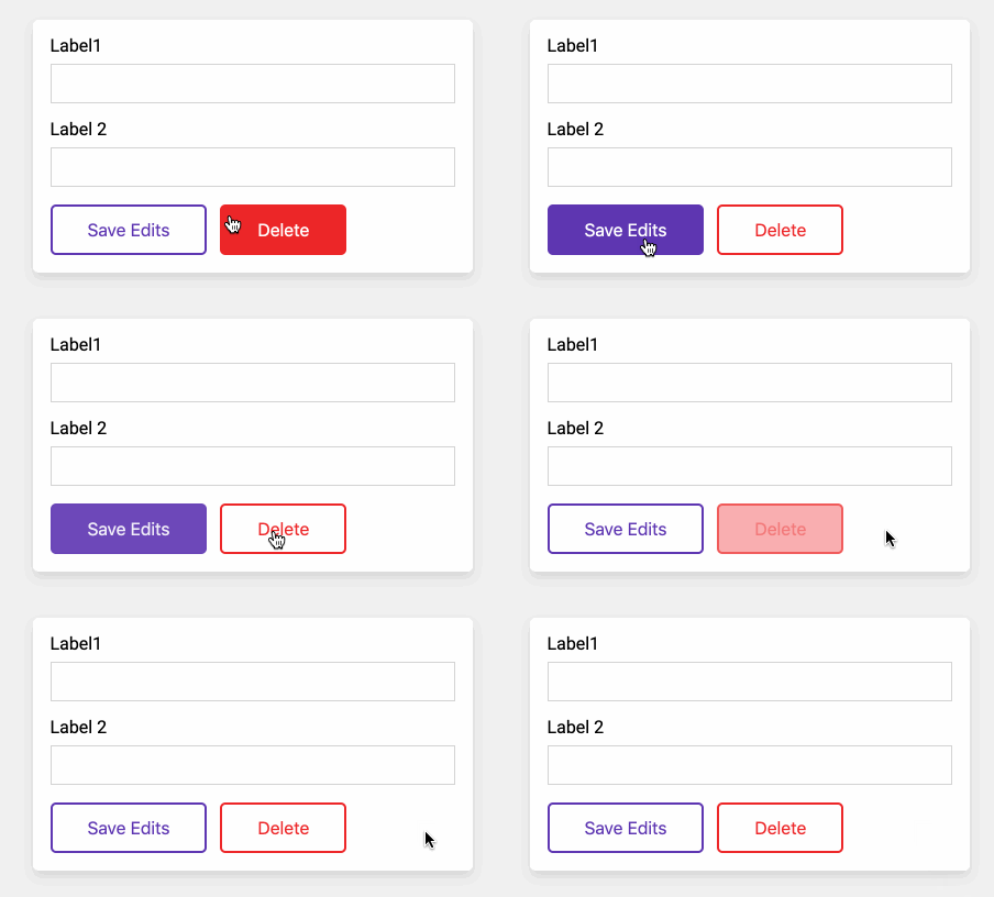
What about hover effects? I will use the same concept for them. When hovered, the button background will become solid, and the font color is white.
.c-button--ghost {
  background: transparent;
  color: var(--color, #000);
  border-color: currentColor;
  transition: 0.3s ease-out;

  &:hover {
    background: var(--color);
    border-color: var(--color);
    color: #fff;
  }
}
See the Pen CSS Variables and Inline Styles - 2 by Ahmad Shadeed (@shadeed) on CodePen.
With a varying size for each avatar, this is a good fit for the concept. Let’s suppose that there are four different sizes of a user’s avatar.

In CSS, I defined the below styles:
.c-avatar {
  display: inline-block;
  margin-right: 2rem;
  width: calc(var(--size, 1) * 30px);
  height: calc(var(--size, 1) * 30px);
  object-fit: cover;
  border-radius: 50%;
  box-shadow: 0 3px 10px 0 rgba(#000, 0.2);
}
By using Calc() function, I can pass a size modifier, which will be multiplied by a base width value. The size modifier will be used in HTML.
<img src="user.jpg" alt="" class="c-avatar" style="--size: 1" />
<img src="user.jpg" alt="" class="c-avatar" style="--size: 2" />
<img src="user.jpg" alt="" class="c-avatar" style="--size: 3" />
<img src="user.jpg" alt="" class="c-avatar" style="--size: 4" />
See the Pen CSS Variables and Inline Styles - 3 by Ahmad Shadeed (@shadeed) on CodePen.
And that’s a wrap. Do you have a comment or a suggestion? Please feel free to ping me on @shadeed9.
此内容由惯性聚合(RSS阅读器)自动聚合整理,仅供阅读参考。 原文来自 — 版权归原作者所有。