


I spent years teaching CSS layout on this blog. I put everything I know into The Layout Maestro course: 70+ lessons and 150+ interactive examples that teach you how to think CSS layouts, not just memorize syntax.
Ah, container queries - a topic I explored three years ago. It’s truly satisfying to revisit it once more, this time with a deeper and more comprehensive approach.
In this interactive guide to container queries, I will explain the problems they solve, how they work, and how we can use them today in our workflows.
While building layouts in CSS, we always wanted a way to change a specific UI based on the width of its container, not the viewport. As a result, we tend to use media queries for stuff that is related to the container, not the viewport.
In the following example, we have a page header that contains:
When there is no space, I want to hide the label from the search and filter actions. In media queries, we can do it like so:
@media (min-width: 580px) {
  /* Show the search and filter labels only *
  * if the screen width is 580px or more. */
  .search {
    width: 32px;
    height: 32px;
  }

  .search-label,
  .filter-label {
    display: block;
  }
}
Try to resize the browser below and notice how the search and filter label is hidden when the viewport width is less than 580px.
The downside of using a media query is that the container will get bigger when the sidebar is hidden. In this case, it’s more logical to show the search and filter in their larger size.
See the following, there is enough space, but the search and filter are collapsed due to the use of a media query.
When using a container query, we can fine-tune such details and give the components the ability to expand based on their container width, not the viewport.
To use container queries, we need to define the container type. The container name is optional.
.main {
  container-name: main;
  container-type: inline-size;
}
Once defined, we can use the container query just like a media query. Here, I’m showing the <span> only if the width is 370px or more.
@container main (min-width: 370px) {
  .search-label,
  .filter-label {
    display: block;
  }
}
First, we need to define a container in the main section. Second, we can use @container with the child elements we need (search and filter actions).
Play with it yourself in the following demo by resizing the browser window.
@media (min-width: 580px) {
.search-label,
.filter-label {
display: block;
}
.search {
flex: 1;
}
}
@container card (min-width: 200px) {
.search-label,
.filter-label {
display: block;
}
.search {
flex: 1;
}
}
Interesting, right? Let’s explore another example to make sure the problem container queries solve is clear.
We have a list of cards that change based on the viewport width. To make it change based on the viewport size, I used CSS grid minmax() function.
.layout {
  display: grid;
  grid-template-columns: repeat(auto-fit, minmax(130px, 1fr));
  gap: 1rem;
}
Play with the demo (resize the browser window).
The first issue I see is that the cards are too big when the viewport size is large. Notice the ratio between the thumbnail and title sizes.
We can fix that by using auto-fill in the CSS grid minmax() function, but it will leave us with empty columns.
Not the best. Now we have empty columns. What if, we want to change the card layout to horizontal? We can do that.
@media (min-width: 800px) {
  .card {
    display: flex;
    align-items: start;
  }
}
Try to change the viewport size. The card will change from a stacked style to a horizontal one.
It works as expected. Now, when the viewport size is above 800px, the card style will change to horizontal.
But.. there is a problem! What if we added more cards? The horizontal style will look too condensed. This is not good.
Play with the following demo:
Notice that the horizontal style became too condensed, this is because we used a media query. When using a media query, the browser doesn’t care about what will happen to the components if the available space isn’t enough.
CSS container queries allow us to query against the container of an element. In the context of the previous example, we can change the style to horizontal only if the card’s container is large enough.
Here is the card’s markup:
<div class="layout__item">
  <div class="card">
    <div class="card-thumb">
      <img src="thumb.jpg" alt="" />
    </div>
    <div class="card-content">
      <h3>Card title in here</h3>
    </div>
  </div>
</div>
In CSS, we need to define the container type. We can also define the name (not mandatory but recommended).
.layout__item {
  container-type: inline-size;
  container-name: card;
}
We can use it like this:
@container card (min-width: 180px) {
  .card {
    display: flex;
    gap: 1rem;
    outline: dotted 2px deeppink;
  }
}
In the following interactive demo, you can try the following:
@media (min-width: 800px) {
.card {
display: flex;
}
}
@container card (min-width: 200px) {
.card {
display: flex;
}
}
As you’ve seen using a media query to change the card style isn’t logical in this case. The number of cards can increase or decrease and that will affect the card’s content.
CSS container queries will help us to solve that problem by providing us with a way to query against the container.
The default value for container-type is normal. To use a container query, we need to use inline-size as a value.
.main {
  container-type: inline-size;
}
We can then query elements that are within the .main container, here is an example:
.section {
  @container (min-width: 700px) {
    /* Custom styling */
  }
}
Every container is a style container by default unless we change the container-type to inline-size.
What happens if we have more than one container, how do we target them? Well, that’s why we have container-name. We can name a container and call it when used.
.main {
  container-type: inline-size;
  container-name: main;
}

.section {
  @container main (min-width: 700px) {
    /* Custom styling */
  }
}
We can use the shorthand version to add the container name and type. It’s useful if you prefer an easier scanning of the name and type.
.main {
  container: main / inline-size;
}
CSS style container queries allow us to query a CSS variable and do custom styling based on that. It’s currently supported in Chrome and Safari Technology Preview only, but it’s worth mentioning and explaining in this guide.
By default, every element is a style query. To use it, we can query a CSS variable on a parent element and write custom CSS that will apply to its child elements.
.article-wrapper {
  --featured: true;
}

.article {
  @container style(--featured: true) {
    /* Custom CSS */
  }
}
I will share a few use cases later in the guide.
Now that you know what the problem container queries solve and how the syntax works, let’s move to their common pitfalls.
The container size should either be explicit or come from a flex or a grid layout. What does that mean? Let me show you an example.
In the following demo, we have a website header with a navigation.
<div class="header">
  <nav class="nav">
    <ul>
      <!-- Navigation items -->
    </ul>
  </nav>
</div>
In CSS, I added the following:
.nav {
  container: nav / inline-size;
  display: flex;
  gap: 1rem;
  outline: solid 1px;
}
Notice how the outline is collapsed. When using the inline-size containment, this will prevent the container from getting size information from its content. As a result, it will collapse to zero.
Try to toggle the “Stretch nav” button to see the fix.
To fix that, we need to force the element to fill the available space in header.
.nav {
  flex: 1;
}
Let’s suppose that we have a size container on an element. At some point, we wanted to style the container by querying the container itself.
.main {
  container: main / inline-size;
}

@container main (min-width: 700px) {
  background-color: #fefefe;
}
The background-color property won’t apply. This is not possible.
Since we can’t query a container against itself, the container should be in a separate element. In some cases, the additional element is already there.
<div class="o-grid">
  <div class="o-grid__item">
    <article class="c-article">
      <!-- content -->
    </article>
  </div>
</div>
.o-grid__item {
  container: card / inline-size;
}

.c-article {
  @container card (min-width: 500px) {
    /* Styling */
  }
}
We used to use CSS viewport units to have a fluid typography, but the issue is, you guessed it, that it’s limited to the viewport only.
With CSS container queries, we can finally use units that are scoped to the container itself.
In the following example, I used query units to have a dynamic font size.
.author-name {
  font-size: clamp(14px, 10px + 1.33cqw, 20px);
}
font-size: clamp(14px, 10px + 1.33cqw, 20px);
Font size: 20
Ahmad Shadeed
Author of Debugging CSS
As you’ve seen, we can use query units for font sizes. However, the use cases aren’t limited to that only. We can use them for spacing (padding or margin) and more.
According to MDN, here are all the query units we can use:
For me, I care about the cqw unit. I will use them in the upcoming use-cases section.
Container query demos are supported in all major browsers (Chrome 106+, Safari 16.0+, Firefox 110+).
One of the most common use cases for container queries is the card component. That can become handy when building featured news sections, for example.
In the following example, we have a news section with two main sections:
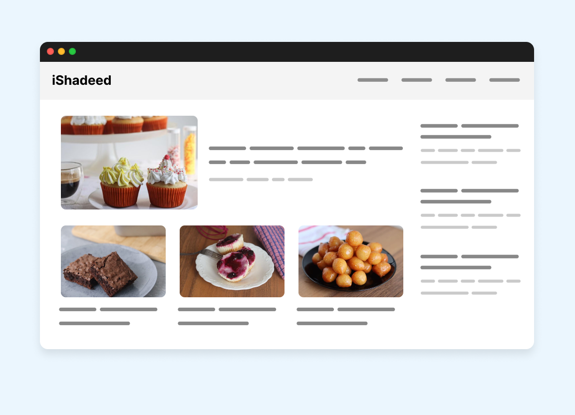
We can use container queries for that:
With that, we can create a new component that adapts nicely to the changes in its wrapper width.
See the following figure:
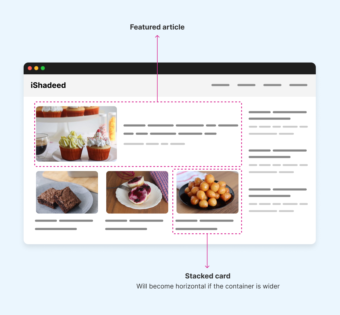
To make it more clear, I created a simulation for breakpoints that you can see in the following interactive demo.
Play with the next and previous buttons, or click on the rectangles and see the explanation.
Default view.
Card title in here
A bit of desc text in here. A bit of desc text in here.
Card title in here
A bit of desc text in here. A bit of desc text in here.
Card title in here
A bit of desc text in here. A bit of desc text in here.
Card title in here
A bit of desc text in here. A bit of desc text in here.
Here is a video for you that shows the demo above, just in case.
As you’ve seen, there are seven different breakpoints for this section. If we want to use a media query for this, things can get dirty quickly.
@media (min-width: 411px) {
  .card {
    /* Horizontal style */
    flex-direction: row;
    gap: 1rem;
  }
}

@media (min-width: 431px) {
  .card--featured {
    /* Horizontal style */
    flex-direction: row;
    gap: 1rem;
  }

  .card--featured .card-thumb {
    /* Make it larger */
  }
}

@media (min-width: 499px) {
  .card--featured {
    /* Horizontal style */
    flex-direction: row;
    gap: 1rem;
  }

  .cards-list .card {
    /* Stacked style */
  }
}

@media (min-width: 554px) {
  .card--featured .card-thumb {
    /* Make it smaller */
  }

  .cards-list .card {
    /* Horizontal style */
  }
}

@media (min-width: 581px) {
  .card--featured .card-thumb {
    /* Make it larger */
  }
}

@media (min-width: 700px) {
  .cards-list .card {
    /* Stacked style */
  }
}
This is complex and I didn’t even write all the CSS, I just added a pseudo-style code. With container queries, this is fairly easy. Let’s see how!
The card component has two states: stacked and horizontal. It will become horizontal if its container is wider by a specific number.
First, the card should be wrapped in a container:
<div class="card-wrapper">
  <div class="card">
    <!-- Card content -->
  </div>
</div>
Then, in CSS we write the following.
.card-wrapper {
  container: card / inline-size;
}

.card {
  /* Default styles */
  display: flex;
  flex-direction: column;
  gap: 1rem;

  @container card (min-width: 250px) {
    flex-direction: row;

    .card-thumb {
      flex: 0 0 calc(2cqw + 80px);
    }
  }
}
As simple as that. We can add a few spices in CSS, too.
For example, I used a query unit in the calc() function for the card thumbnail. This is equal to “2 container query width”, which is 2% of the container’s width.
A bit of desc text in here.
A bit of desc text in here.
Here is the card component in an isolated demo. Try to resize the handle in between the two variations.
This is a variation of the card but with a larger thumbnail and font sizes. I added the class card--featured to style it.
<div class="card-wrapper">
  <div class="card card--featured">
    <!-- Card content -->
  </div>
</div>
In CSS:
.card--featured .card-thumb {
  @container card (min-width: 400px) {
    .cardThumb {
      flex: 0 0 calc(10cqw + 200px);
    }
  }
}
It’s worth mentioning that in style container queries, we can add a CSS variable instead of a CSS class.
<div class="card-wrapper">
  <div class="card " style="--featured: true;">
    <!-- Card content -->
  </div>
</div>
@container card (min-width: 400px) and style(--featured: true) {
  .cardThumb {
    flex: 0 0 calc(10cqw + 200px);
  }
}
At the time of writing this guide, style queries work in Google Chrome, Safari TP, and Safari 18 beta.
Here is the final demo below. You can try the following:
Card title in here
A bit of desc text in here. A bit of desc text in here.
Card title in here
A bit of desc text in here. A bit of desc text in here.
Card title in here
A bit of desc text in here. A bit of desc text in here.
Card title in here
A bit of desc text in here. A bit of desc text in here.
In this example, we have a steps component that needs to look differently based on its container size. If the container is wide, each step will look like an arrow. If not, they will stack on top of each other.
Resize the window below and see how the component changes.
Overview
Overview
In order to finish the guide, you need to go through the following steps.
Container queries make that straightforward.
.content {
  container: steps / inline-size;
}

.steps__item {
  @container steps (min-width: 450px) {
    padding: 12px 8px 12px 18px;

    &:before {
      --size: 2rem;
      font-size: 16px;
    }

    &:first-child {
      clip-path: polygon(/* path */);
    }

    /* And so on.. */
  }
}
I spotted this pattern on Linkedin. When the viewport size is small, the action buttons label is hidden on smaller sizes. It works but is not ideal.
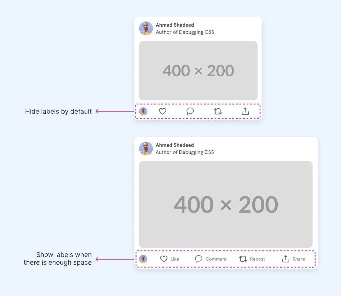
With media queries, this can be done but it will still be a hack.
.action-label {
  display: none;
}

@media (min-width: 500px) {
  .action-label {
    display: inline-flex;
  }
}
This will work, but the simplest change to the markup or the UI can cause it to fail. The reason is obvious because we’re querying the viewport.
See the following demo:
People you may know
😃The Happy
🤩The Excited
🧐The Curious
When the viewport width is less than 630px, the label is hidden.
However, in the following case, the sidebar is hidden and the feed wrapper gets wider, but the label is still hidden.
People you may know
😃The Happy
🤩The Excited
🧐The Curious
This is where container queries shine.
.action-label {
  @container content (min-width: 470px) {
    display: block;
  }
}
Here is the demo with container queries. Notice the state in the top left corner and see how it changes based on the container’s width. It’s magic, isn’t it?
People you may know
😃The Happy
🤩The Excited
🧐The Curious
Oh, dashboard widgets. I guess this is a top-use example for CSS container queries. In a dashboard, the user might have the ability to customize the width or the size of the columns.
In the following example, all the widgets are the same component but they change differently based on their container width.
Try to toggle between the grid and see it yourself.
Cool, right? There is no magic in here. I just wrote three different styles for the same widget using @container.
.widget {
  /* Default styling - Style 1 */
  display: flex;
  align-items: center;
  justify-content: space-between;

  /* Style 2 */
  @container column (max-width: 150px) {
    flex-direction: column;
    gap: 4px;
    background-color: #fff;
    padding: 5px;
    border-radius: 8px;
  }

  /* Style 3 */
  @container column (min-width: 250px) {
    flex-direction: column;
    align-items: start;

    .icon {
      display: block;
      /* Other styles */
    }
  }
}
Feel free to inspect the demo above in case you want to see all the CSS details.
In this example, we have a list of stats that represent some data from a system. If a stats item got a wider container, I want to change its design.
Here is the CSS:
.widget {
  @container column (min-width: 280px) {
    flex-direction: row;
    align-items: center;
    justify-content: space-between;
    background-color: #fff;

    h3 {
      font-size: 1.5rem;
    }

    p {
      font-size: 1.2rem;
    }
  }
}
Another example in a dashboard is a progress component. The component should adapt based on its container width.
Try to toggle between “Grid 1” and “Grid 2”.
.progress {
  /* Default styles */

  @container column (min-width: 250px) {
    flex-direction: column;
    align-items: start;
    gap: 0.5rem;

    .percentage {
      display: block;
    }

    .progressWrapper {
      flex: auto;
      width: 100%;
      max-width: none;
    }

    .progress {
      height: 10px;
    }

    .percentage {
      font-size: 16px;
    }
  }
}
In this example, we have a list of options that the user can choose from. By default, both the icon and the label are in a new line. If there is enough space, the icon and label will be next to each other.
Play with the demo below:
What's your favorite meal?
Feel free to select multiple items.
Here is the CSS. As simple as that.
.option-wrapper {
  container: option / inline-size;
}

.option {
  @container option (min-width: 150px) {
    flex-direction: row;
    align-items: center;
  }
}
You might be considering using flex-wrap. While it will work, we can’t control exactly when it will wrap, resulting in some items being wrapped while others are not.
In this example, the form inputs have a custom grid layout that should be added if there is enough space. Without container queries, this isn’t possible unless we write multiple media queries.
See the breakpoints by clicking on the previous and next buttons.
Here is the CSS needed. By default, we have a 1-col grid. If the container width is more than 250px, the grid is changed.
.start {
  display: grid;
  grid-template-columns: 1fr;
  gap: 1rem;

  @container section (min-width: 250px) {
    grid-template-columns: 1.55fr 1fr;
  }
}
Here is a video of the previous demo, in case you’re on mobile:
In this example, we have a thread component that needs to show differently based on the container size. We can’t do it with media queries as it won’t work for all the cases.
See the following figure:
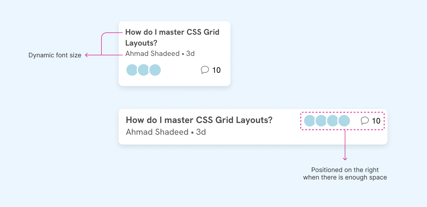
To achieve that, we can use container queries as below:
flex-direction to row when there was enough space.threadTitle {
font-size: clamp(14px, 1cqw + 12px, 16px);
font-weight: bold;
}
.threadMeta {
font-size: clamp(13px, 1cqw + 11px, 15px);
color: #5b5b5b;
}
.thread {
@container thread (min-width: 320px) {
flex-direction: row;
align-items: flex-start;
}
}
Each query unit represents 1% of the container width.
Here is the final demo:
A newsletter can be displayed in a small or a large space. We can accommodate that using container queries.
<div class="newsletter-wrapper">
  <div class="newsletter">
    <!-- Heading and form -->
  </div>
</div>
@container newsletter (inline-size < 250px) {
  h2 {
    /* The blue line */
    &:before {
      content: "";
      display: block;
      height: 4px;
      width: 60px;
      background-color: var(--brand-1);
    }
  }
}

/* If the container width is smaller than 250, move the button out of the flow and show an icon. */
@container newsletter (inline-size < 250px) {
  .form-group {
    position: relative;

    input {
      padding-right: 32px;
    }

    button {
      position: absolute;
      right: 4px;
      top: 8px;
      /* Other styles */
    }

    svg {
      display: block;
    }
  }
}
In the following demo, the newsletter has two variations based on the container width. Try to resize the handle between the two variations.
Get the latest tech news.
Get the latest tech news.
In this example, the timeline component changes its layout based on the available space. The timeline can work in narrow and wide containers.
What you see below is the same component in different containers. On the left, we have the simple version. On the right, is the full version.
Try to resize the demo below.
⚠️
Your browser doesn't support CSS style queries. You can test the demo in Chrome or Safari Technology Preview.
Have you noticed another in-between variation? I created three variations for this component to work with different containers.
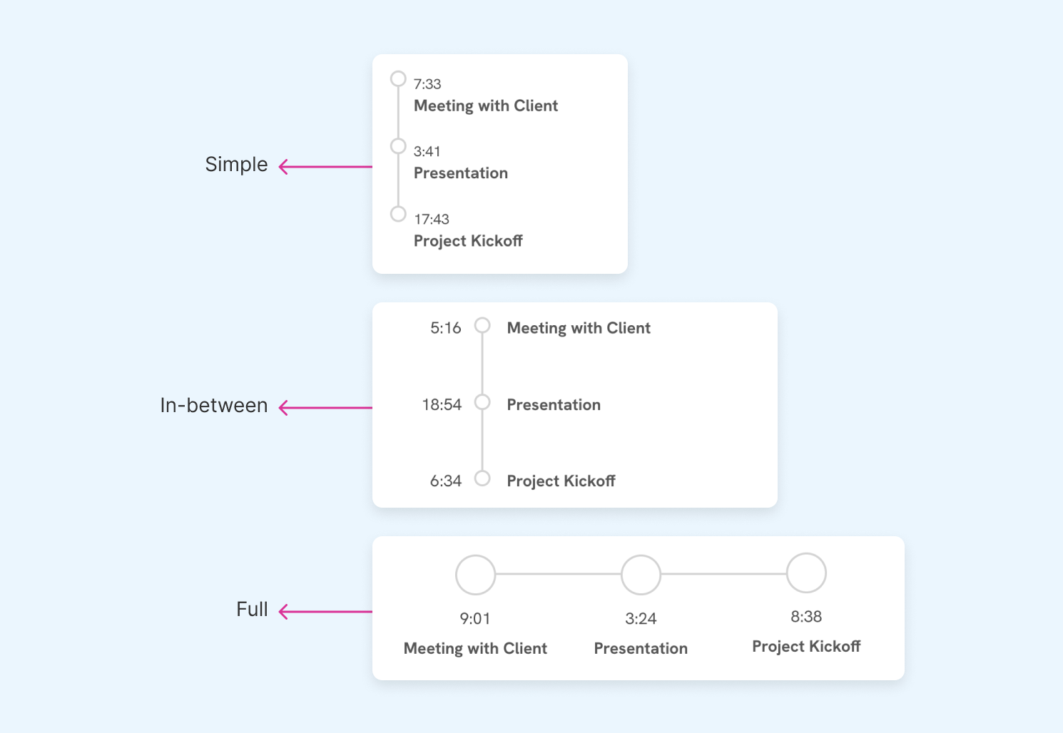
Here is a simplified CSS:
@container timeline (inline-size > 300px) {
  .c-timeline__item {
    .c-timeline__content {
      padding-bottom: 3rem;
    }

    .c-timeline__content:after {
      left: calc(var(--size) / 2 * -1);
      width: var(--size);
      height: var(--size);
    }
  }
}

@container timeline (inline-size > 430px) {
  .c-timeline {
    display: flex;
    justify-content: center;
  }

  .c-timeline__item {
    --size: 40px;
    gap: 0;
    flex: 1;
    padding-left: 0;
    flex-direction: column;
    align-items: center;
  }
}

/* And a lot more CSS. Feel free to inspect the element in case you want to see the full CSS. */
A common pattern on the web is to expand or collapse a sidebar via a toggle button. We can use container queries to change the layout of the sidebar items.
See the following example and try to collapse the sidebar.
This is mostly done with CSS container queries and Javascript was used to change the sidebar width.
.aside {
  container: sidebar / inline-size;
}

.aside.collapsed {
  width: 50px;
}

.nav-item .label {
  opacity: 0;
  transform: translateX(-5px);
  transition: 0.3s ease-out;

  @container sidebar (min-width: 100px) {
    opacity: 1;
    transform: translateX(0);
  }
}
This might not be the perfect usage for complex sidebars, but it works well for this simple usage.
While checking TechCrunch, I noticed their implementation for the event card. It’s buggy and weird looking so I thought about why not giving it a chance with container queries.
Here is a video of their design:
As you see, there are a couple of issues:
I honestly don’t know how this is still on TechCrunch. It’s full of bugs!
Let’s look at the HTML.
<div class="event-card">
  <div class="meta">
    <p>Apr 25, 2024</p>
    <p>TechCrunch Early Stage 2024</p>
    <p>Boston</p>
  </div>
  <div class="actions">
    <a href="#" class="btn"> Buy Tickets </a>
    <a href="#" class="btn ghost"> Be a sponsor </a>
  </div>
</div>
Each event card is wrapped inside an <li> which will be used as a container for each card.
<ul>
  <li class="card-wrapper">
    <div class="event-card">
      <!-- Event card -->
    </div>
  </li>
  <li class="card-wrapper"></li>
  <!-- And so on.. -->
</ul>
For the basic styling, the elements are stacked like the following example:
We can use flexbox dynamic wrapping to show the buttons next to each other when there is enough space.
.btn {
  flex: 1 0 110px;
}
That means each button’s minimum width is 110px. If there is not enough space, it will grow to fill its container.
In the following variation, the viewport width is slightly bigger, and as a result, the buttons are displayed next to each other.
Next, I used @container to check if the container size is larger than a specific value. If yes, the card’s content will be displayed next to each other.
.card-wrapper {
  container: event / inline-size;
}

@container event (min-width: 430px) {
  .event-card {
    display: flex;
    align-items: center;
    gap: 1rem;
  }

  .meta {
    flex: 1;
  }
}
Cool. The next variation is the final one, where all the content is on the same row. Think of it as a table style. I did the following:
.meta to flex-direction: rowflex property for the buttons@container event (min-width: 620px) {
.meta {
flex-direction: row;
gap: 1.5rem;
.title {
flex: 1;
}
.date,
.location {
flex: 0 0 100px;
}
}
.btn {
flex: initial;
}
}
See the result below and try to resize the window or play with the auto-resize button.
The story doesn’t end here. We used container queries to build the card component and now it works regardless of its container size.
In Github, the header section in the repository page contains buttons and menus that change based on the viewport width.
See the following video.
If you look at 0:11, notice how the aside is hidden and there is more space, but some of the details are hidden. In this specific case, container queries can fix that.
I tried to recreate a mockup of the Github header so you can play with it yourself. Here is the demo:
When the aside is hidden, the UI still has the same view even though their container is now bigger.
Here is the CSS for the prototype above.
.meta {
  @container main (min-width: 330px) {
    display: flex;
  }
}

.menuButton {
  &.add {
    @container main (min-width: 330px) {
      display: flex;
    }

    @container main (max-width: 539px) {
      svg:first-of-type,
      span {
        display: none;
      }
    }

    @container main (min-width: 540px) {
      svg:last-of-type {
        display: none;
      }
    }
  }

  &.dots {
    @container main (min-width: 330px) {
      display: none;
    }
  }
}

.metaItem {
  span {
    @container main (min-width: 540px) {
      display: block;
    }
  }
}

.search {
  @container main (min-width: 330px) {
    display: flex;
  }

  @container main (max-width: 539px) {
    padding: 4px 10px;
    background: #f6f8fa;
    border: 1px solid #d0d7de;
    box-shadow:
      0px 1px 0px rgba(31, 35, 40, 0.04),
      inset 0px 1px 0px 1px rgba(255, 255, 255, 0.25);

    svg {
      display: none;
    }
  }

  @container main (min-width: 540px) {
    min-width: 160px;
    background: #fff;
    border: 2px solid #ececec;
  }
}
Please keep in mind that style queries are supported only in Google Chrome and Safari Technology Preview at the time of writing this guide.
I explored an example in the container queries where we have a timeline that changes based on the container size. It works, but there is one problem. When the number of timeline items is 4 or more, the full variation will become weird-looking.
See the demo below:
How we can fix that? We can check with CSS :has() if the number of timeline items is 5 or more. If yes, we set a CSS variable --force-vertical: true.
.timelineWrapper {
  container: timeline / inline-size;
  --force-vertical: false;

  &:has(.c-timeline__item:nth-last-child(n + 5)) {
    --force-vertical: true;
  }
}
Then, we can combine the size and style queries together to show the full variation only if the number of items is less than 5 and have the minimum size needed.
@container timeline (inline-size > 430px) and style(--force-vertical: false) {
  /* Apply the full variation. */
}
Test it out below. Try to add more items and see what happens. This demo works on the latest Chrome.
⚠️
Your browser doesn't support CSS style queries. You can test the demo in Chrome or Safari Technology Preview.
If the browser you’re using doesn’t support style queries, see the video below.
A blockquote can live in different places on a web page. For example, it can be in a sidebar, article body, full-width section, and more.
We can change its style based on the container width, but that might not be enough. We need to style it based on the context, too.
To do that, we can set a custom CSS variable on the outer container.
<div class="content" style="--context: article">
  <blockquote>
    <!-- Blockquote content here -->
  </blockquote>
</div>
And in CSS, we can do the following:
@container style(--context: article) {
  blockquote {
    /* Custom CSS */
  }
}
Let’s take a closer look.
This style is boxed, centered and designed to catch the user’s eye.
@container style(--context: article) {
  .articleQuote {
    background-color: lightcyan;
    padding: 1rem 0.5rem;
    text-align: center;
    border-radius: 12px;
    max-width: 370px;
    margin: auto;

    &:before {
      /* Quote icon */
    }
  }
}
⚠️
Your browser doesn't support CSS style queries. You can test the demo in Chrome or Safari Technology Preview.
CSS is awesome
some desc in here
A blockquote can live in different places on a web page. For example, it can be in a sidebar, article body, full-width section, and more.
CSS container queries is great. I recommend to give it a try. It's useful!
Ahmad Shadeed
A blockquote can live in different places on a web page. For example, it can be in a sidebar, article body, full-width section, and more.
We can change its style based on the container width, but that might not be enough. We need to style it based on the context, too.
A secondary content that should be catchy, a simple one.
@container style(--context: aside) {
  .articleQuote {
    p {
      font-size: 15px;
    }

    cite {
      font-weight: bold;
      font-size: 13px;
    }
  }
}
⚠️
Your browser doesn't support CSS style queries. You can test the demo in Chrome or Safari Technology Preview.
CSS container queries is great. I recommend to give it a try. It's useful!
Ahmad Shadeed
This is a random paragraph just for the sake of this demo.
A different background color and larger font size. This is an important quote and its style should reflect that.
.section:has(blockquote) {
  min-height: 180px;
  background-color: var(--brand-1);
}

@container style(--context: full) {
  .articleQuote {
    p,
    cite {
      color: #fff;
    }

    p {
      font-size: clamp(1rem, 1rem + 2cqw, 1.35rem);
    }
  }
}
⚠️
Your browser doesn't support CSS style queries. You can test the demo in Chrome or Safari Technology Preview.
This is a section in a website.
CSS container queries is great. I recommend to give it a try. It's useful!
Ahmad Shadeed
This is a section in a website.
In case your browser doesn’t support style queries, here is a video for reference.
An example of where style queries can be useful is the ability to change a component based on the context, not only the container size.
See the following example. We have an aside with the section “Popular articles”. If there is a CSS variable --context: aside, I want the card to turn into the horizontal style if it’s within the size range.
⚠️
Your browser doesn't support CSS style queries. You can test the demo in Chrome or Safari Technology Preview.
Main news
Popular articles
<div class="section" style="--context: aside">
<div class="article">
</div>
</div>
To do the above, we can nest the size query inside the style query. That way, the CSS will be applied only if
--context: aside170px and 485px@container style(--context: aside) {
@container (min-width: 170px) and (max-width: 485px) {
.card {
display: flex;
align-items: center;
gap: 0.5rem;
img {
aspect-ratio: 4 /3;
flex: 0 0 clamp(60px, 60px + 10cqw, 120px);
}
}
}
}
In this example, we have an article body with a section that contains related articles. I want to change the card style from stacked to horizontal only if it’s inside the related section.
⚠️
Your browser doesn't support CSS style queries. You can test the demo in Chrome or Safari Technology Preview.
A blockquote can live in different places on a web page. For example, it can be in a sidebar, article body, full-width section, and more.
CSS container queries is great. I recommend to give it a try. It's useful!
Ahmad Shadeed
A blockquote can live in different places on a web page. For example, it can be in a sidebar, article body, full-width section, and more.
We can change its style based on the container width, but that might not be enough. We need to style it based on the context, too.
<div class="section" style="--context: related">
<div class="article">
</div>
</div>
Here is the CSS:
--horizontal: true is added to the nearest parent.--context: related CSS variable. If it’s there, we switch the --horizontal: true one./* Horizontal style */
@container style(--horizontal: true) {
.card {
display: flex;
align-items: center;
gap: 0.5rem;
/* Other styles */
img {
flex: 0 0 clamp(60px, 60px + 10cqw, 120px);
}
}
}
/* Toggle the horizontal style if the cards
* are within the related section */
@container style(--context: related) {
--horizontal: true;
}
Interesting, right? I found this usage very useful.
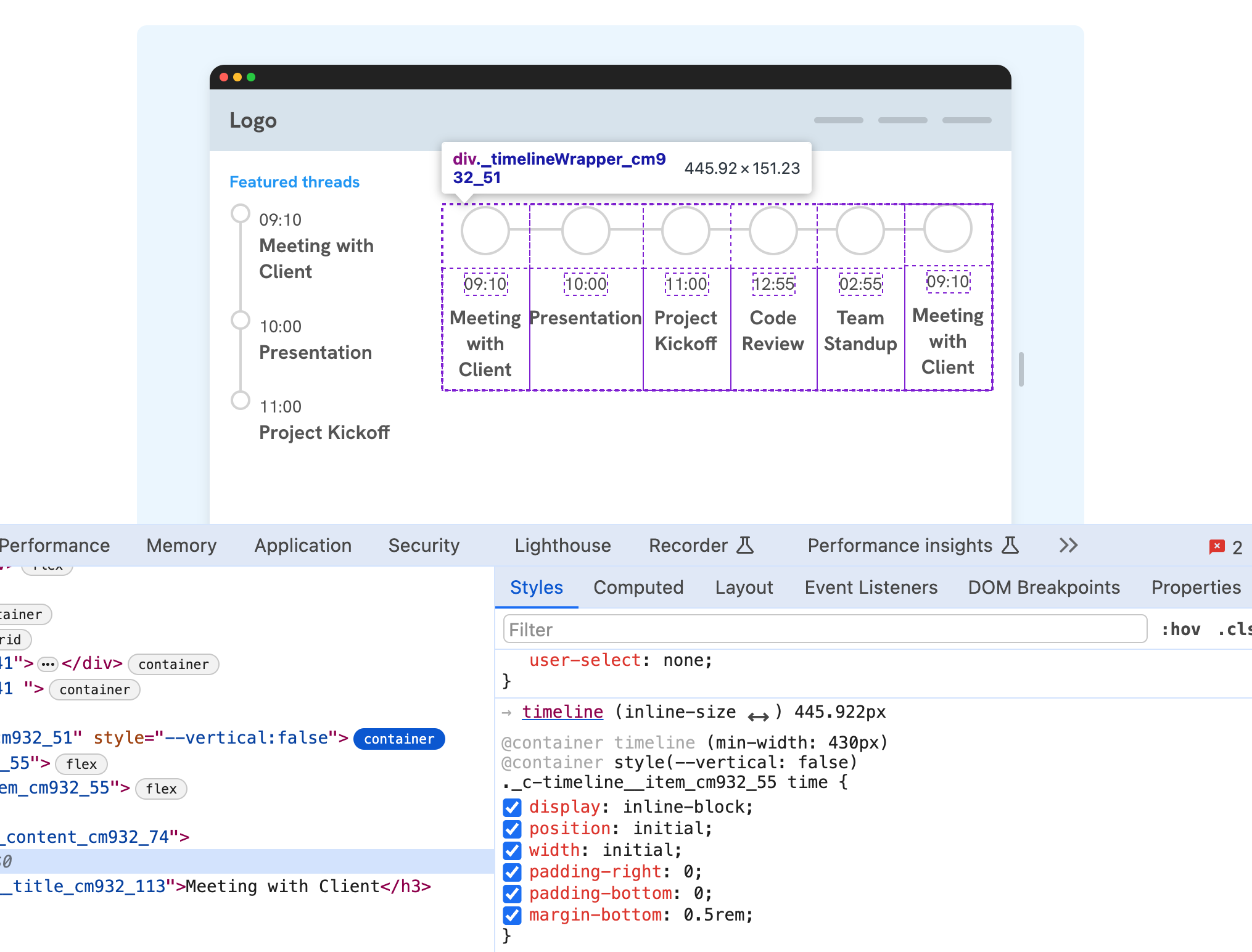
It’s worth mentioning that Chrome supports container queries in DevTools. In the following figure, I’m hovering over an element that is displayed via a container query.
I would have liked this more if the double arrow icon is properly aligned.
CSS container queries help us to write a truly fluid components that change based on their container size. In the next few years, we’ll see less media queries and more container queries. Of course, using media queries will still be useful for general layout stuff.
I hope you learned something new in the guide. Thank you for reading.
Enjoyed the read? If you'd like to support my work, consider buying me a coffee. This interactive guide took 6 weeks, which translates to 54 coffee cups. Thanks a latte!

此内容由惯性聚合(RSS阅读器)自动聚合整理,仅供阅读参考。 原文来自 — 版权归原作者所有。