


I spent years teaching CSS layout on this blog. I put everything I know into The Layout Maestro course: 70+ lessons and 150+ interactive examples that teach you how to think CSS layouts, not just memorize syntax.
{% include note.html content = “This is Part 3 of the article: The Process of Implementing A UI Design From Scratch. If you haven’t read the previous parts, it’s fine, but I recommend at least to skim them to get a general idea.” %}
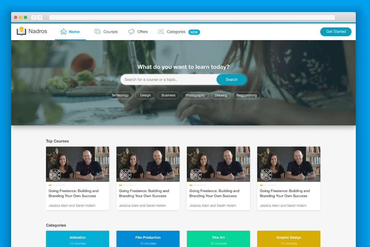
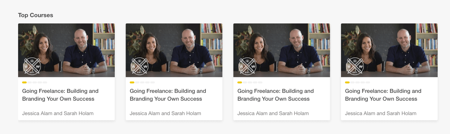
It sounds easy and straightforward, but it’s really tricky if at some point we decided to add a “View more” link on the far right, or to add a short description paragraph below the title.
Here are some possible scenarios for the section title:
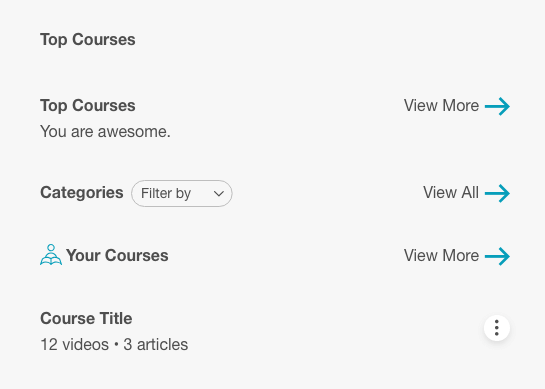
As a result, the HTML should account for two columns in that case. It’s more future proof and can help us scale the design without changing the HTML structure.
<section class="section">
  <div class="wrapper">
    <header class="section-header">
      <div class="section-header__start">
        <h2>Top Courses</h2>
      </div>
      <div class="section-header__end">
        <a href="#">
          <span>View All</span>
          <svg width="18" height="13">
            <use xlink:href="#arrow-right"></use>
          </svg>
        </a>
      </div>
    </header>
    <ol>
      <!-- List of courses -->
    </ol>
  </div>
</section>
Notice that the classes names are section-header__start and section-header__end. I used start and end instead of left and right to account for right-to-left designs. In RTL, the start and end will be flipped, so adding section-header__right and section-header__left will be confusing.
I added the below baseline CSS for the section header:
.section-header {
  display: flex;
  flex-wrap: wrap;
  justify-content: space-between;
}
This could handle the start & end wrappers and will distribute them nicely. With that in hand, it’s easy to scale the section header if we decided to add more content on the start or end sides.

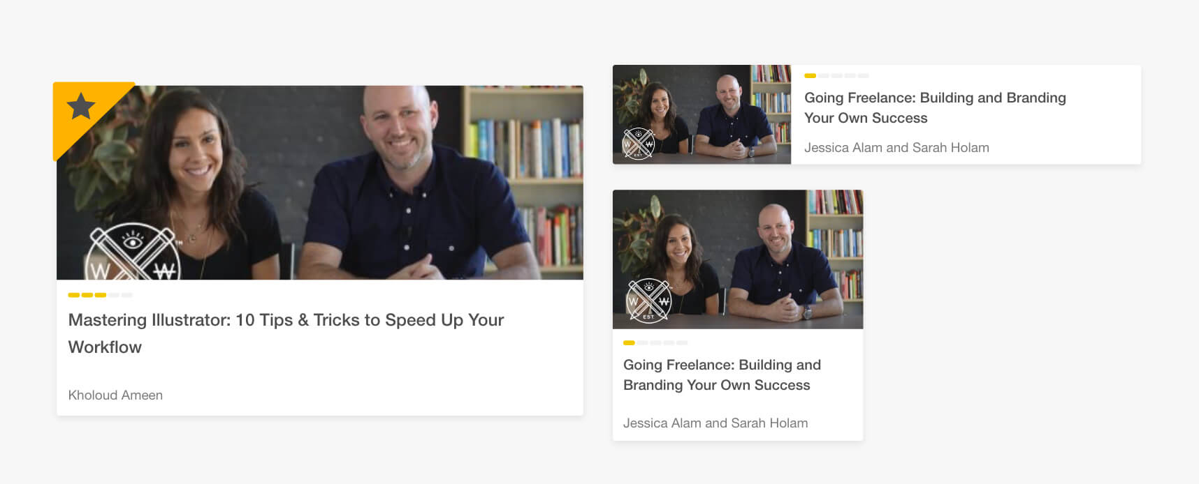
There are multiple variations of it and the code need to account for all of them.
<ol>
  <li>
    <article class="course">
      <a href="#">
        <div class="course__thumb">
          <img src="img/course-thumb.jpg" alt="" />
        </div>
        <div class="course__details">
          <h2>
            The Process of Implementing a UI Design From Scratch
          </h2>
          <div>course progress</div>
          <p>Ahmad Shadeed</p>
        </div>
      </a>
    </article>
  </li>
  <li>...</li>
  <li>...</li>
  <li>...</li>
</ol>
<article> element since it’s suitable to use for that case.This is the initial look for now:
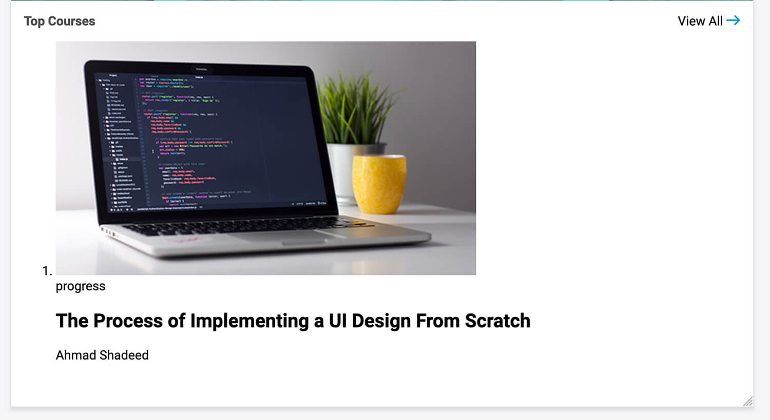
If you notice, the course thumbnail is large and taking a lot of space. I will add a temporarily inline CSS for the <li>. This will act as a limit so I can focus on building the course component.
Some baseline CSS for the course component:
.course {
  background: #fff;
}

.course img {
  max-width: 100%;
}

.course__details {
  padding: 8px;
}

.course__details > * + * {
  margin-top: 0.5rem;
}

.course__title {
  margin: 0;
  font-size: 16px;
  font-weight: normal;
  color: #4e4e4e;
}

.course__author {
  color: #7b7b7b;
  font-size: 14px;
}
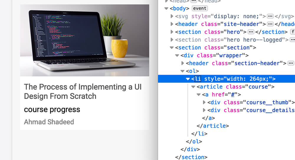
Maybe you’ve noticed that the progress item is placed below the title, while in the design it’s the first one. Why? Because it’s better to write HTML as per importance and not the visual order.
By using Flexbox order property, it’s possible to move the progress item visually above the title.
.course__details {
  /* Other styles */
  display: flex;
  flex-direction: column;
}

.course__progress {
  order: -1;
}

It works, but the spacing is not behaving as expected. Since I used course__details > * + *, it will add margin-top to an item that is followed by another item. In my case, the course progress item is followed by the author. When I moved it visually, the spacing is still there.
I got two solutions for that particular case:
Adding top and bottom margin for the course title.
This can work, but it’s not a future proof solution. What if the progress was removed? There will be an unneeded space then.
Using CSS :not pseudo class.
.course__details > *:not(:last-child) {
  margin-bottom: 0.5rem;
}
This solution is better is it’s not tied to a specific element and will work no matter how many elements are there.

Ok, we’re done with placing it and adding the perfect spacing. Let’s dive into building the progress.
How to represent it? Well, let me write down all the possible scenarios in my head:
<meter> or <progress> elements.<span>I wondered about the possibility of using border images to accomplish the design. It didn’t work, as far as I know, there is no way to divide the gradient and make the progress items rounded
.course__progress {
  width: 70px;
  border-top: 5px dashed orange;
  border-image: linear-gradient(to right, #f6b73c, #4d9f0c) 1;
}

I wished that there is away to customize the gradient as well. I didn’t want to waste time on this, so I’m stepping away from it.
It’s possible to use gradients and control the width, height of the progress bar items. Let’s try that!
.course__progress {
  width: 100px;
  height: 4px;
  background-image: linear-gradient(
    90deg,
    #000,
    #000 75%,
    transparent 75%,
    transparent 100%
  );
  background-size: 20px 100%;
}

It works! But the one downside that the design have rounded corners for the progress bar items, also coloring them won’t be straightforward.
By taking the benefit of using stroke-dasharray and stroke-dashoffset, it’s possible to get something similar to the original design.
<div class="course__progress">
  <svg width="87px" height="5px" viewBox="0 0 87 1">
    <line
      class="st0"
      x1="0"
      y1="0.5"
      x2="87"
      y2="0.5"
      stroke="#F0C808"
      stroke-width="4px"
      stroke-dasharray="9"
      stroke-dashoffset="16"
      stroke-linecap="round"
    />
  </svg>
</div>
Notice that I added the attribute stroke-linecap, it will help in making the dashed items rounded.

However, if we want to color the first and second bar items, it’s not possible to color them in SVG unless we duplicate it in HTML which is a downside for me.
This is similar to the above option, I will use an SVG as a background image. Then, I will duplicate the same SVG with a different color to place it above the original one. Let’s see how it goes.
.course__progress {
  position: relative;
  width: 86px;
  height: 5px;
  order: -1;
  background-image: url("data:image/svg+xml,%3Csvg xmlns='http://www.w3.org/2000/svg' width='87px' height='5px' viewBox='0 0 87 1'%3E%3Cline class='st0' x1='0' y1='0.5' x2='87' y2='0.5' stroke='%23000' stroke-width='4px' stroke-dasharray='9' stroke-dashoffset='16' stroke-linecap='round'/%3E%3C/svg%3E");
}

.course__progress:after {
  content: "";
  position: absolute;
  left: 0;
  top: -6px; /*It should be 0 but I made it -6px to demonstrate how it works*/
  width: 100%;
  height: 100%;
  background-image: url("data:image/svg+xml..."); /*Same as the parent background image but with a different stroke color.*/
}
I added a pseudo element to the progress <div> and now we can control the actual progress by increasing or decreasing the width value which can be controlled by Javascript if needed.
Another option is to use CSS Masks and pseudo elements. One of them will act as the base grey and the other is the colored one.
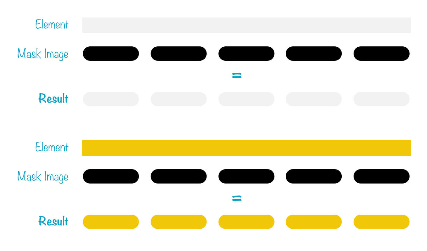
.course__progress {
  position: relative;
  /*Other styles*/

  &:before,
  &:after {
    position: absolute;
    left: 0;
    top: 0;
    height: 100%;
    width: 100%;
  }

  /*The light grey progress*/
  &:before {
    content: "";
    background: #f2f2f2;
    mask-image: url("data:image/svg+xml...");
  }

  /*The orange progress*/
  &:after {
    content: "";
    width: 70%;
    background: #f0c808;
    mask-image: url("data:image/svg+xml..."); /*Same as the previous mask but with a different stroke color.*/
  }
}

What I like about this solution that it fallback really well. Here is how the progress will look in case mask-image is not supported.

<meter> or <progress> elements.I rarely see someone talking about those two elements. I thought that they could be a good use case for the progress bar we have.
But, which one is the most appropriate? <meter> is good to be used for representing a value that is a scalar value within a known range. While the <progress> shows the completion progress of a task for example.
For our case, <meter> is more appropriate. Here is how it looks by default:

What if I customized the background of the bar and the meter background? I tried that by using CSS Gradients for the background, and end up with this:
meter {
  position: absolute;
  left: 0;
  top: 0;
  background-image: linear-gradient(
    90deg,
    #efefef,
    #efefef 75%,
    transparent 75%,
    transparent 100%
  );
  background-size: 20px 100%;
}

meter::-webkit-meter-bar {
  background-image: linear-gradient(
    90deg,
    #efefef,
    #efefef 75%,
    transparent 75%,
    transparent 100%
  );
  background-size: 20px 100%;
}
Note that the above is not the complete styling. I grabbed a reset CSS from this demo by Scott O’Hara and worked based on it. In the below video, I’m changing the value attribute of the <meter> and it’s dynamically updates the result.
<span>There will be 5 <span>s in the HTML. Each one will act as a progress bar item. I will add .active class to the ones that needs to be in orange.
<div class="course__progress">
  <span></span>
  <span></span>
  <span></span>
  <span></span>
  <span></span>
</div>
.course__progress span {
  display: inline-block;
  width: 13px;
  height: 5px;
  background: #f2f2f2;
  border-radius: 10px;
}

.course__progress span.active {
  background: #f0c808;
}

The moment of truth. I would go with the CSS Masks option as this one is the most appropriate and it fallbacks well. However, you might pick a different option depending on your project.
As a friendly reminder, don’t forget to make the progress accessible. I will add aria-label to account for that.
<div class="course__progress" aria-label="50% done"></div>

I added a box-shadow and border-radius for the course thumbnail and details elements.
.course img {
  border-top-left-radius: 3px;
  border-top-right-radius: 3px;
}

.course__details {
  background: #fff;
  border-bottom-left-radius: 3px;
  border-bottom-right-radius: 3px;
  box-shadow: 0 3px 7px 0 rgba(0, 0, 0, 0.08);
}
You might thought about why I didn’t add border-radius: 3px and overflow: hidden to the course wrapper itself instead of adding the radius for the course thumbnail and details elements? Well, that’s a good question.
The reason is that using overflow will prevent us from adding elements that needs to go outside the course wrapper. For example, we have a featured course with a ribbon that is placed at the top-left corner.
I didn’t touched this yet. In short, it needs to be fluid and its height is dynamic and proportional to the width of the course component.
I’m using the aspect ratio technique which you can read about here in more details.
.course__thumb {
  position: relative;
  height: 0;
  padding-bottom: 50%;
}

.course__thumb img {
  position: absolute;
  left: 0;
  top: 0;
  width: 100%;
  height: 100%;
  object-fit: cover;
}
Having that, the image will act dynamically depending on the width of the course component. See below video:
Now that the course component is initially ready, I can go further and work on the grid that will contain all courses.
The first thing I did is that I added the following CSS:
.l-grid-4 {
  display: grid;
  grid-template-columns: repeat(auto-fit, minmax(200px, 1fr));
  grid-gap: 24px;
}

@media (min-width: 1180px) {
  .l-grid-4 {
    grid-gap: 30px;
  }
}
l- for the class name l-grid-4. It stands for Layout and I named it like that so I can reuse it with other grids in the design. It’s borrowed from Smacss though I’m not using any CSS naming convention as it’s out of the scope of this article.minmax function and told it to make the column width at least 200px and the maximum width is 1fr. See below video:I need to test and ensure that all course components height will be equal in case one of them has a long title. Sorry to say that it failed.
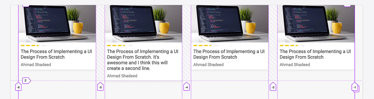
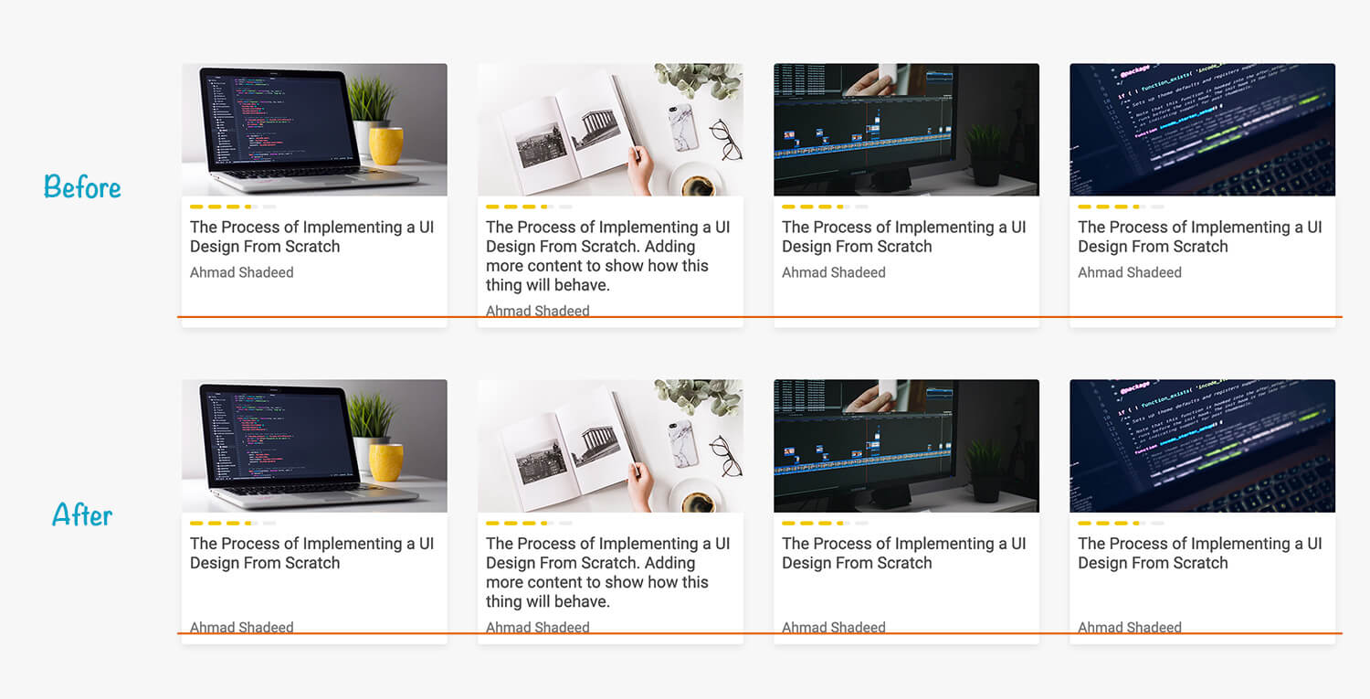
Well, CSS Grid has done it’s job. Notice that all the columns are aligned to the bottom and their height is equal. However, I need to do more work in order to achieve the result I want.
.course {
  height: 100%; /* [1] */
}

.course > a {
  height: 100%;
  display: flex;
  flex-direction: column; /* [2] */
}

.course__details {
  flex-grow: 1; /* [3] */
}
.course component take 100% height.<a> takes 100% height and also changing it to a flex container..course__details fill the available space.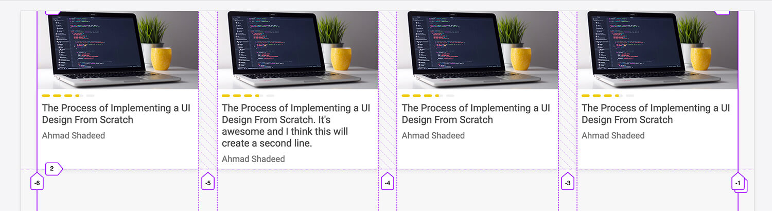
It’s working as expected. But in mobile, it will list course components one below the other and this could take a lot from the screen size. What to do in that case?
I’m thinking about the below possible solutions:

This is meant to make the section behave as a slider in mobile. What’s good about it?
@media (max-width: 780px) {
  .top-courses {
    display: flex;
    grid-gap: 12px;
    overflow-y: auto;
    padding-bottom: 16px; /* To avoid cutting off the box-shadow of the corurse when adding overflow. */
    -webkit-overflow-scrolling: touch; /* Smooths the scrolling on iOS Safari */
  }

  .top-courses li {
    min-width: 200px;
  }

  .course__title {
    font-size: 14px;
  }
}

What I like about that solution is:
@media (max-width: 450px) {
  .top-courses {
    grid-gap: 16px;
  }

  .course.course a {
    display: flex;
    flex-direction: row;
  }

  .course__details {
    border-bottom-left-radius: 0;
    border-top-right-radius: 3px;
  }

  .course__thumb {
    flex: 0 0 120px;
    height: 120px;
    padding-bottom: 0;
  }

  .course__thumb img {
    border-top-right-radius: 0;
    border-bottom-left-radius: 3px;
  }

  .course__title {
    font-size: 14px;
  }
}
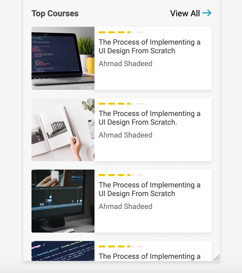
With CSS Grid at hand, it’s easy to change the minimum width of the column to allow for two columns per row.
For me, it looks good and we can even see more courses at without scrolling.
@media (max-width: 780px) {
  .top-courses {
    grid-template-columns: repeat(auto-fit, minmax(110px, 1fr));
  }
}

What should I go for? I think the 3rd solution is the most appropriate for the case I have. That doesn’t mean that the rest of solutions are not good. Actually, they’re great. But it’s more of a personal preference for now.
In case one of the courses title was long, the author names are not aligned at the same line. In order to fix that, I will add margin-top: auto to the .course__details element (The one that contains the title, progress and author).
It works because the course details is a Flex wrapper using margin-top: auto will push the instructor name to the end.
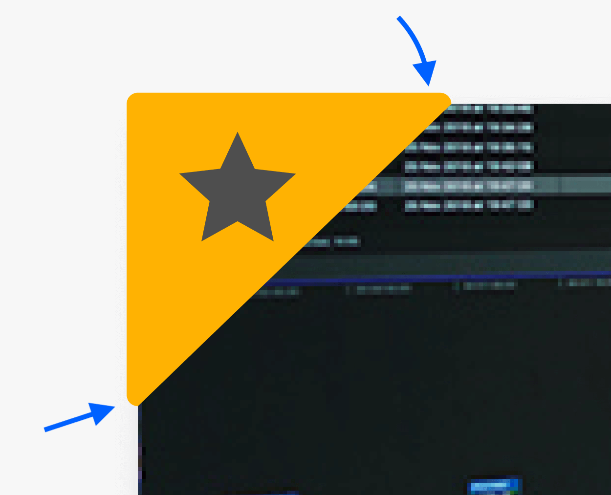
A course component might be featured. To show that to the user, there should be a ribbon placed at the top left corner. Below is a close up of the ribbon. Notice the rounded corners!
I got a couple of ideas for doing it:
It’s a bit tricky in our case because the ribbon corners are all rounded except the top-right and bottom-left ones, they are clipped from the edges.
In order to accomplish this, I will need to shift the clipping path so it’s only clip half of the rounded corner. See below for an explanation:
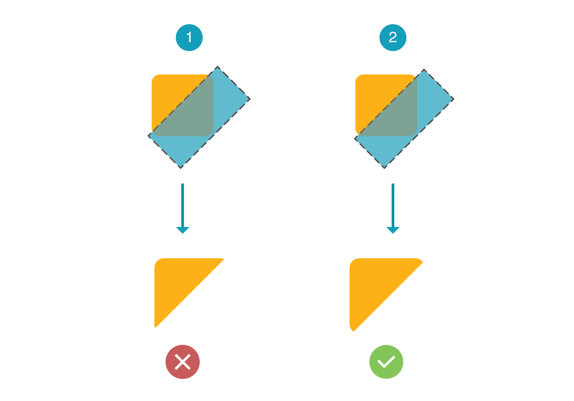
First Option
.element {
  clip-path: polygon(0 0, 100% 0, 100% 0, 0% 100%);
}
Second Option
.element {
  clip-path: polygon(0 0, 100% 0, 104% 0, 0% 104%);
}
And here is the final result:

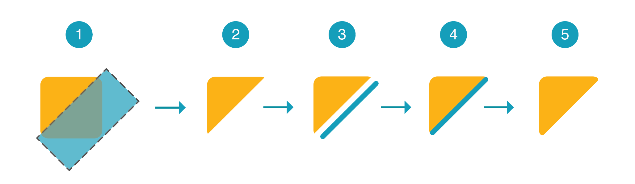
This concept is similar to the previous one, but without shifting the clip path. I added a pseudo element to act as a rectangle, then rotated and scaled it with CSS Transforms.
.course.is-featured {
  position: relative;
}

.course.is-featured:after {
  content: "";
  position: absolute;
  left: -6px;
  top: -6px;
  width: 100px;
  height: 100px;
  background: #ffb202;
  border-radius: 10px;
  clip-path: polygon(0 0, 100% 0, 100% 0, 0% 100%);
}

/* The rotated rectangle */
.course.is-featured:before {
  content: "";
  position: absolute;
  z-index: 1;
  top: 28px;
  left: 3px;
  width: 100px;
  height: 6px;
  border-top-right-radius: 5px;
  border-top-left-radius: 5px;
  background: #ffb202;
  transform: rotate(-45deg) scaleX(1.32) translateX(-12px);
}
Here is an explanation:
I added a pseudo element and used the border hack to create a triangle. In brief, I made the right and bottom border colors transparent, which will hide them. After that, I added border-radius and it works like a charm!
.course.is-featured {
  position: relative;
}

.course.is-featured:after {
  content: "";
  position: absolute;
  left: -4px;
  top: -4px;
  border: 50px solid #ffb202;
  border-right-color: transparent;
  border-bottom-color: transparent;
  border-radius: 13px;
}
It’s easy, straight to the point and exactly I want.
I will choose the clip path option as it doesn’t feel as a hack for me. For the star icon, I will add it using the content property for the pseudo element.
Hope you enjoyed it and thanks for reading! Do you have any feedback? Please ping me on Twitter @shadeed9
See the Pen Nadros - Part 3 by Ahmad Shadeed (@shadeed) on CodePen.
此内容由惯性聚合(RSS阅读器)自动聚合整理,仅供阅读参考。 原文来自 — 版权归原作者所有。