I spent years teaching CSS layout on this blog. I put
everything I know into The Layout Maestro course: 70+ lessons and 150+ interactive examples that teach
you how to think CSS layouts, not just memorize syntax.
The examples in this article work only in Firefox with experimental features enabled (Go to about:config and enable grid-template-masonry-value) or the latest Safari Technology Preview. I've included videos below each interactive demo for easy viewing on browsers without support.
Currently, the CSS Working Group (CSSWG) is discussing whether to include masonry as part of CSS grid, or as a new layout module?
In this article, I will share my thoughts and examples about whether it should be part of the CSS grid or not.
What is a masonry layout?
First of all, a few details in case you are not aware of what masonry is.
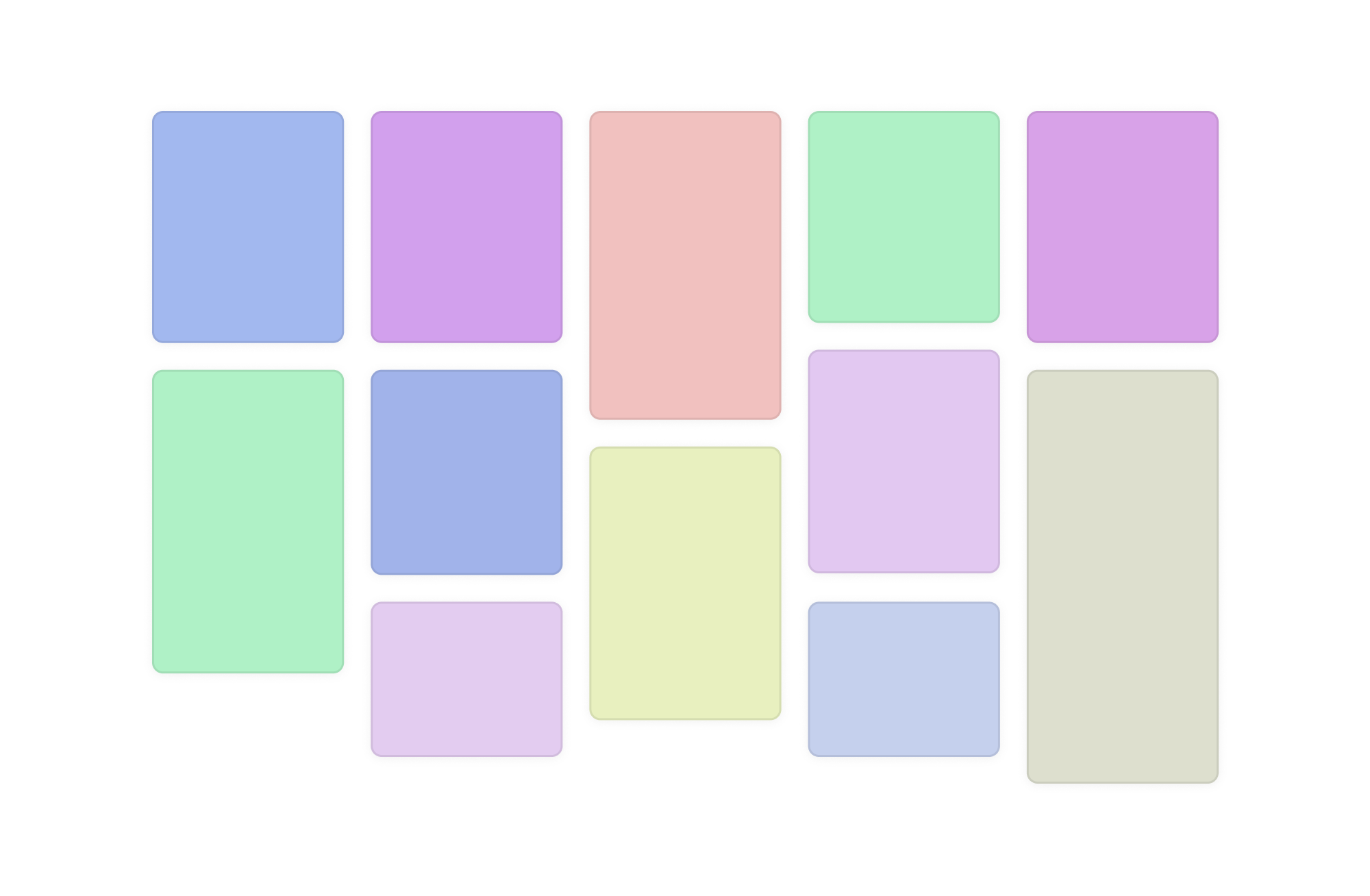
A layout type is also called the “waterfall”, where elements with different widths or height stack horizontally or vertically.
Here is an example of vertically stacked elements. This has been known as the “Pinterest” layout for years.
In this article, I will go through examples that don’t look like the Pinterest layout. In particular, examples that might use CSS masonry on demand.
The debate on the syntax
Currently, there is a debate on whether to make masonry part of the CSS grid, or as a separate layout module. You can look at the following blog posts for more info.
Imagine if display: flexbox were named display: rubberband, or if CSS display: grid is named display: chessboard. That feels the same to me when I read display: masonry.
My thoughts on the debate
If the new syntax is supported now, how we should use it?
If we go with the new syntax (display: masonry), it will need a few years to become supported in all major browsers. Let’s be honest, a layout is a major part of a web page that makes it hard to apply progressive enhancement. You either have a masonry or not, right?
Making it part of CSS grid will at least guarantee that the layout will work, but without the masonry stuff.
Responsive design
In practical CSS applications, it’s rare to find a grid like this:
At the end of the day, masonry is a grid. If we go with the new syntax, then changing a layout will require changing the whole layout module (grid, masonry, or flex). This is too much work.
Masonry is a grid, right? Introducing a new layout module would require a significant learning curve to fully understand and memorize new properties.
Fun fact: I still can’t memorize some grid properties or values, let alone get a new layout module for masonry.
Consider the following example. We have a typical grid where all the grid items have the same size.
If some of the grid items have a larger height than the others, the layout will look like this if we’re using CSS grid. Try to toggle between “Same size” and “Dynamic size”.
At this point, it doesn’t make sense to have a new layout module (i.e.: display: masonry) only because a few items have a larger height (At least for me).
In a real-life case, I might need:
have a normal grid on small viewport sizes, then switch to masonry on larger ones.
or apply masonry if there are 10+ items in the grid
or apply masonry if items have the class dynamic-size
and so on.. the options are endless
A masonry layout doesn’t necessarily imply that a layout is always masonry. It can be a mix of flexbox, normal grid, and masonry grid. It might be needed to be applied to an already defined grid.
Try to switch between the options below. Note: the masonry option works in Firefox and Safari Technology Preview at the time of writing this article.
Same size
Dynamic size
Masonry
Here is a video version:
Examples of the new vs the grid-integrated syntax
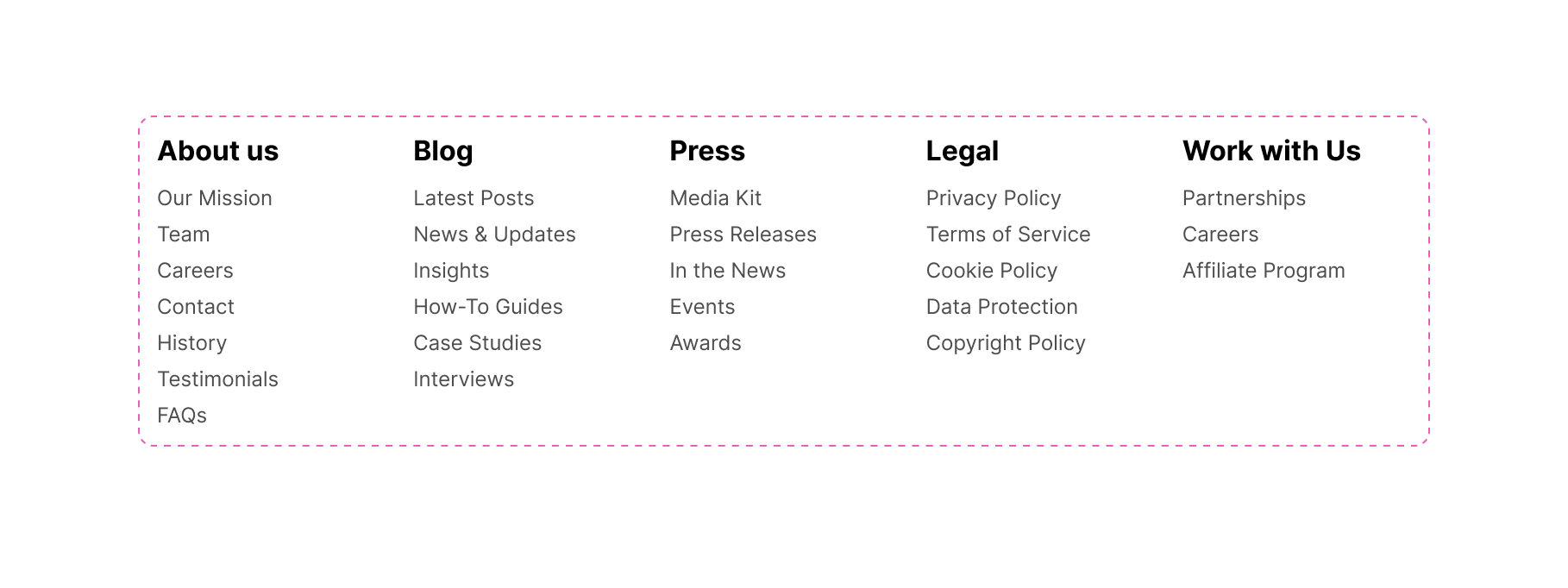
We have a footer layout where sections are displayed next to each other. Here is the design:
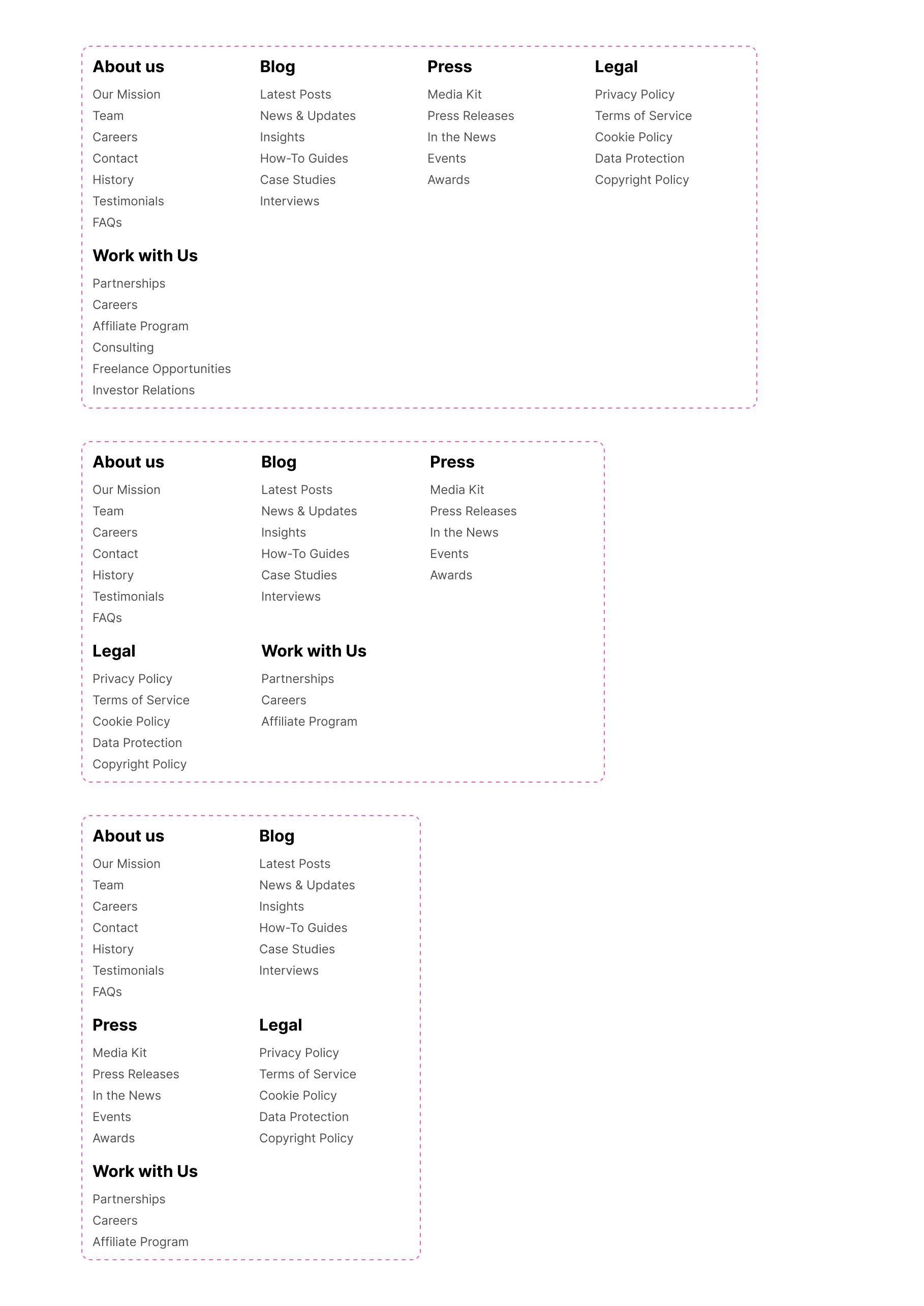
When there is no enough space, the footer groups will wrap. This is a default behaviour in CSS grid.
How would you build this layout? Let’s assume that we’ll use a CSS grid.
As a developer, if I want masonry to be applied to a grid under certain cases, I will be forced to use display:masonry. For me, that doesn’t make sense because:
It will fail in browsers that don’t support display: masonry. I can write fallback, but why write more CSS when we can avoid it upfront by integrating it into the CSS grid?
It’s a duplication of the CSS grid syntax.
News layout
In this example, we have a news section. It contains a featured news item on a large viewport and a grid with 3 columns.
Try to resize the layout and see how it behaves.
Mastering Palestinian Ma’amoul: A Step-by-Step Guide
Discover the secrets behind Ma’amoul, the stuffed pastry filled with dates, nuts, or figs, that holds a special place in Palestinian celebrations. From dough preparation to perfecting the fillings, this guide covers it all.
The Art of Perfectly Flaky Palestinian Baklava
Baklava is more than just a dessert.
Zalabia: Palestinian Sweet Fritters for Festive Occasions
Zalabia, crispy fritters drenched in syrup, are perfect for special occasions. This article shares a traditional recipe and tips for achieving the right texture.
Exploring the Origins and Recipes of Knafeh Nabulsiyeh
Knafeh Nabulsiyeh is a beloved cheese-based dessert with roots in Nablus.
Palestinian Barazek: Sesame and Pistachio Cookies
Learn to make Barazek, a crunchy cookie coated with sesame and pistachios that pairs perfectly with tea.
Jerusalem Bagels: A Palestinian Street Food Staple
A deep dive into the history and recipe of Jerusalem bagels. These oval-shaped, sesame-crusted bagels are sold.
Sweet and Savory Palestinian Pastries
Palestinian cuisine boasts a variety of pastries, both sweet and savory, each with its own regional twist.
Did you notice the white space within each card? This is a default behaviour in CSS grid. Let’s explore how it will look when enabling masonry.
Mastering Palestinian Ma’amoul: A Step-by-Step Guide
Discover the secrets behind Ma’amoul, the stuffed pastry filled with dates, nuts, or figs, that holds a special place in Palestinian celebrations. From dough preparation to perfecting the fillings, this guide covers it all.
The Art of Perfectly Flaky Palestinian Baklava
Baklava is more than just a dessert.
Zalabia: Palestinian Sweet Fritters for Festive Occasions
Zalabia, crispy fritters drenched in syrup, are perfect for special occasions. This article shares a traditional recipe and tips for achieving the right texture.
Exploring the Origins and Recipes of Knafeh Nabulsiyeh
Knafeh Nabulsiyeh is a beloved cheese-based dessert with roots in Nablus.
Palestinian Barazek: Sesame and Pistachio Cookies
Learn to make Barazek, a crunchy cookie coated with sesame and pistachios that pairs perfectly with tea.
Jerusalem Bagels: A Palestinian Street Food Staple
A deep dive into the history and recipe of Jerusalem bagels. These oval-shaped, sesame-crusted bagels are sold.
Sweet and Savory Palestinian Pastries
Palestinian cuisine boasts a variety of pastries, both sweet and savory, each with its own regional twist.
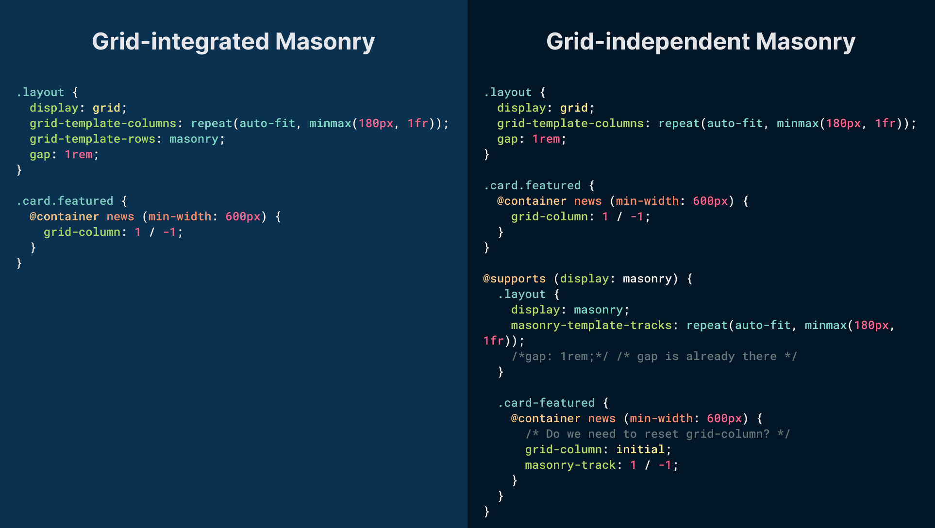
For the featured card, I want to place it from the start to the end column with 1 / -1. According to the css-grid-3 spec:
Item placement in the grid axis of a masonry container is established with the masonry-track-start and masonry-track-end properties (and their masonry-track shorthand), whose syntax and interpretation are analogous to the grid-column-start and grid-column-end properties (and their grid-column shorthand).
That means I need to replace grid-column with masonry-track.
Let’s assume that I want to use display: masonry as an enhancement.
.layout{display: grid;grid-template-columns:repeat(auto-fit,minmax(180px, 1fr));gap: 1rem;}.card.featured{@container news (min-width: 600px){grid-column: 1 / -1;display: grid;grid-template-columns: max-content 1fr;}}@supports(display: masonry){.layout{display: masonry;masonry-template-tracks:repeat(auto-fit,minmax(180px, 1fr));/*gap: 1rem;*//* gap is already there */}.card-featured{@container news (min-width: 600px){/* Do we need to reset grid-column,
or masonry-track will override it? */grid-column: initial;masonry-track: 1 / -1;}}}
If we compare the above to the grid-integrated option, the most obvious difference is that grid-template-rows: masonry will work on supported browsers. If not, it will simply show the default behavior.
Another example that shows how masonry can be useful on top of CSS grid, not a separate layout module.
Section Layout
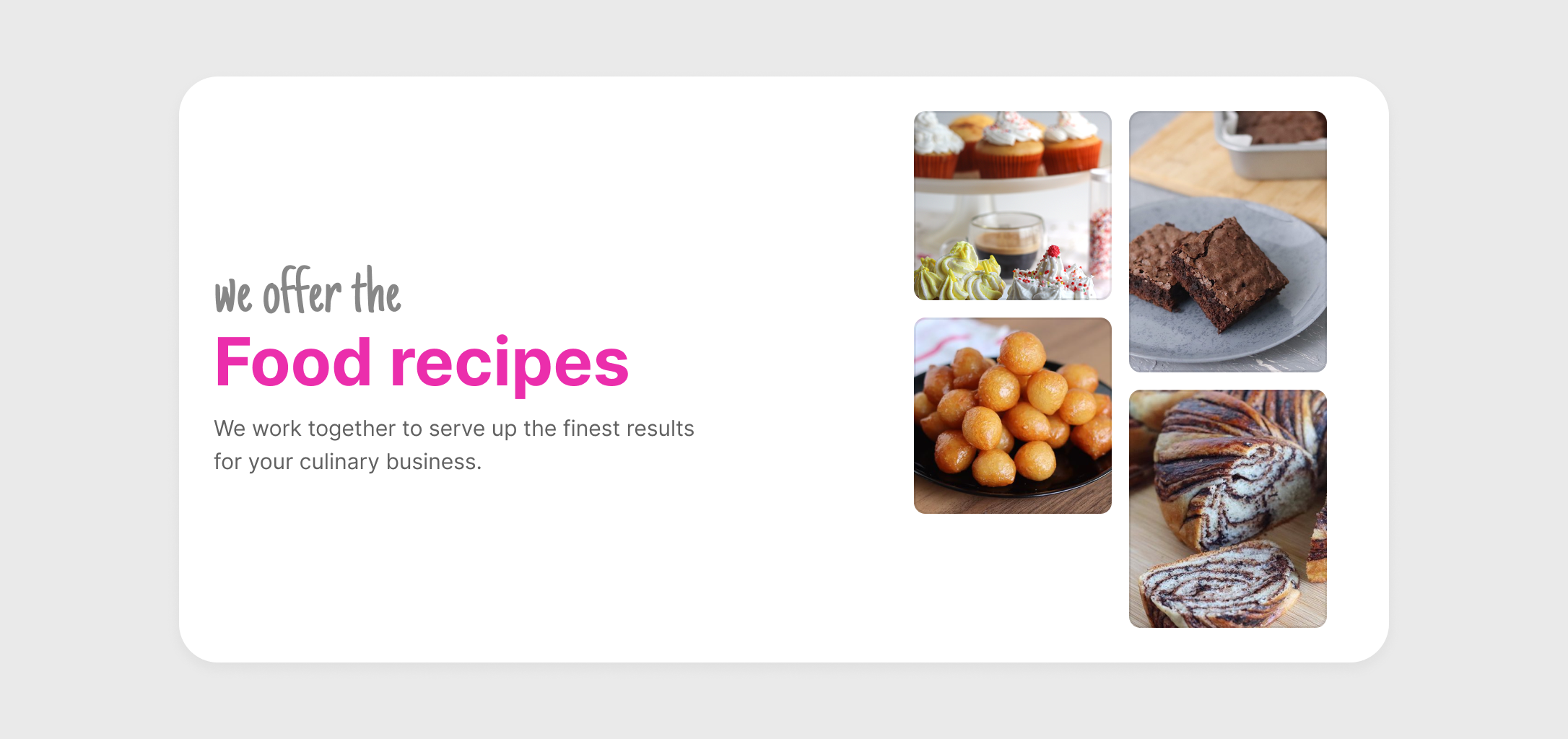
In this design, we have a section that consists of:
Headline and description
Gallery of images
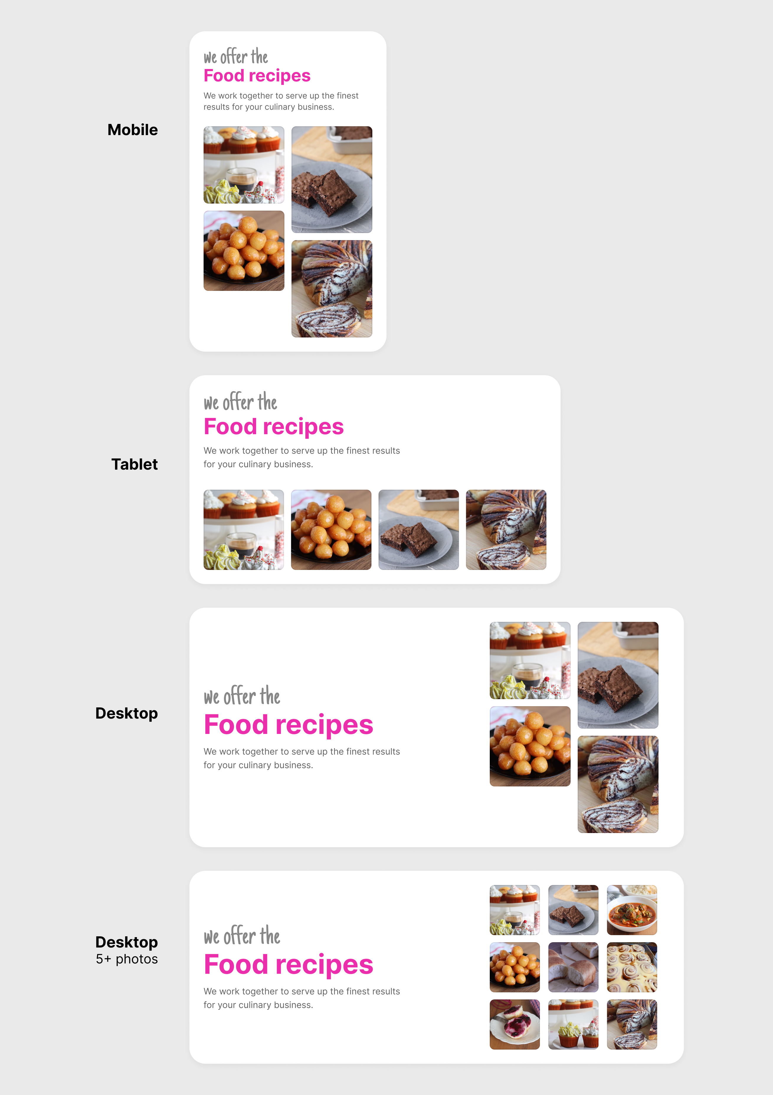
We need to build the image gallery dynamically:
On small sizes, the images will get a masonry style, but when the image container is wider (around tablet size), the images should be squared
If there are 5+ photos, the layout will change (e.g: square look)
See the following figure:
As you’ve seen, we are switching from masonry style frequently based on:
For the images gallery, I need to do the following:
The default aspect ratio for the images is 1 / 1
If the container is large enough, change to a 2-col layout
If the number of images is 5+, change the image aspect ratio to 1 / 1 and the dynamic columns grid
.gallery{--dynamic:repeat(auto-fit,minmax(100px, 1fr));--cols:var(--dynamic);display: grid;grid-template-columns:var(--cols);grid-template-rows: masonry;gap: 1rem;/* Change the image aspect ratio on tablet-y size */@container(min-width: 450px){img{aspect-ratio: 1;}}/* Switch to a 2-col layout */@container(min-width: 535px){--cols: 1fr 1fr;img{aspect-ratio: initial;}/* If 5+ images, use the dynamic grid and change aspect ratio to 1. */&:has(img:nth-last-child(n + 5)){--cols:var(--dynamic);img{aspect-ratio: 1;}}}}
See the interactive demo below and try to add or remove items.
Food recipes
We work together to serve up the finest results for your culinary business.
Here is a video version:
Grid-independent option
To implement the masonry style, we first need to use the default grid. If display: masonry is supported, we can enhance further and change the columns.
.gallery{--dynamic:repeat(auto-fit,minmax(100px, 1fr));--cols:var(--dynamic);display: grid;grid-template-columns:var(--cols);gap: 1rem;@supports(display: masonry){display: masonry;masonry-template-tracks:var(--cols);@container(min-width: 535px){--cols: 1fr 1fr;}/* Here, the layout is a normal grid. */&:has(img:nth-last-child(n + 5)){--cols:var(--dynamic);}}}
Even though having display: masonry sounds like a super power, I can’t see it work well with the dynamic examples shown.
Arranging elements in a grid
An uneven grid is something that the human eye will spot quickly. We can make it better with CSS grid and masonry.
By using CSS masonry, the browser can decide on its own where to place the orphan item in the grid based on the size of its siblings.
In the following demo, play with the range slider to increase the highlighted item height.
Food recipes
We work together to serve up the finest results for your culinary business.
Here is a video version:
Notice how the orphan item moves around. The browser is trying to balance the layout.
Considering that this layout might contain two items with the same aspect ratio, using masonry might be needed on demand only.
Food recipes
We work together to serve up the finest results for your culinary business.
Grid-integrated option
We can use CSS grid and keep masonry there just in case.
As you’ve seen, CSS grid is used by default. If display: masonry is supported, the code is duplicated.
FAQs layout
In this example, we have a list of questions. I saw this example multiple times in the past. A design that requires each question height to be equal to its content.
The current solution for this is to group each column in its element in HTML, and it will work, but that is not an optimal solution, right?
What is CSS Grid?
How is CSS Grid different from Flexbox?
How do I create a basic CSS Grid?
What does 1fr mean in CSS Grid?
How can I create responsive layouts with CSS Grid? And do I need to use CSS media queries or it's not needed?
What is a grid area, and how can I define one?
How can I control spacing between grid items?
Can I nest CSS Grids within one another?
Grid-integrated option
By design, this is a grid by default, so we can use CSS grid and keep masonry here just in case.
You can switch between the default grid and the masonry style below.
What is CSS Grid?
How is CSS Grid different from Flexbox?
How do I create a basic CSS Grid?
What does 1fr mean in CSS Grid?
How can I create responsive layouts with CSS Grid? And do I need to use CSS media queries or it's not needed?
What is a grid area, and how can I define one?
How can I control spacing between grid items?
Can I nest CSS Grids within one another?
Here is a video version:
Once masonry is easy to do, it will become less popular
The masonry style isn’t very common. You might say, but that’s because we don’t have the right tools to do it in CSS. Well, once something is easy to do by everyone, it will become less popular.
Conclusion
I’m a strong believer that making masonry part of CSS grid is better as making a new display value sounds like a duplication to CSS grid. Also, I’m not convinced that if we went with making it part of grid, adding new features to CSS grid will require us to think of masonry. What else do we need to add to CSS grid? It’s been there since 2017 and I can only remember changing grid-gap to gap.