


I spent years teaching CSS layout on this blog. I put everything I know into The Layout Maestro course: 70+ lessons and 150+ interactive examples that teach you how to think CSS layouts, not just memorize syntax.
Variable fonts are an evolution of OpenType font specification that allows us to have different font variations (width, weight or style) in a single file. That means, we can load only one font that can have many variations, instead of having multiple fonts loaded for each weight or style.
In this article, I will walk you through into the details of variable fonts and how to get benefit from them in your projects. Also, I will explain about creating a custom variable font.
Like a regular font, @font-face should be used to define a new variable font.
@font-face {
  src:
    url("Estedad-VF.woff2") format("woff2-variations"),
    url("Estedad-VF.woff") format("woff");
  font-family: "Estedad";
  font-style: normal;
}
Notice that in the src value, there is format('woff2-variations') which tells the browser that this is a variable font file that should be downloaded. In case the browser doesn’t support variable fonts or failed to download it for some reason, it will fall back to the woff font version define.
This is like the core of variable fonts. Each axis does a specific job related to its use case. For example, the weight axis changes the font-weight, and the width axis controls how narrow or wide the font letters are.
To use the variation axis, you should use the font-variation-settings CSS property. It can have one or multiple axes based on the registered axis in the font. Note that each axis should be separated by a comma. See the below example:
.title {
  font-variation-settings: "wght" 300;
}
In the above, wght stands for the font-weight and 300 is the value associated with it. Note that the axis name is case sensitive and the value is unitless. Let’s take an example to demonstrate the above concept.
See the Pen Variable Font - Example 1 by Ahmad Shadeed (@shadeed) on CodePen.
You can play with the range slider and see the value of wght changing dynamically. For that font, the value range is 100-900 and it could be different in other fonts.
The width axis control how wide or narrow the letters are. It’s similar to stretching a text in a design app. Here is a GIF from Photoshop transform. I create two additional copies to the original, one is stretched and the other is compressed. That’s what the width axis does.
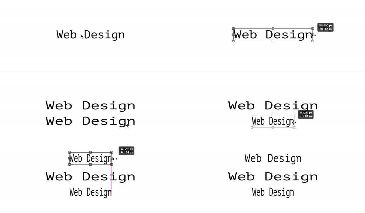
To control the width access, the value wdth should be used in font variation settings.
.title {
  font-variation-settings:
    "wght" 100,
    "wdth" 100;
}
See the Pen Variable Font - Example 2 by Ahmad Shadeed (@shadeed) on CodePen.
Italic works in a way that it makes the letters italic or not. There is no in-between or any kind of variation. Whereas Slant can vary based on the value of it. Here is an example that shows the difference between the two:
See the Pen Variable Font - Example 3 by Ahmad Shadeed (@shadeed) on CodePen.
While researching for the article, I found little but no resources for variable fonts that support Arabic. Luckily, I found a font that I would like to showcase and explain based on it.
See the Pen Variable Font - Arabic by Ahmad Shadeed (@shadeed) on CodePen.
Just like an English font, the weight change for the letter changes based on the value. However, the interesting bit for Arabic is changing the font width. In Arabic, it’s not possible to stretch the letters since for each word, its letters are connected and thus it’s not possible to change their width.
The solution for that lies in using Arabic Tatweel technique, which is about elongating characters at specific points. Consider the below example:
See the Pen Variable Font - Arabic - Tatweel by Ahmad Shadeed (@shadeed) on CodePen.
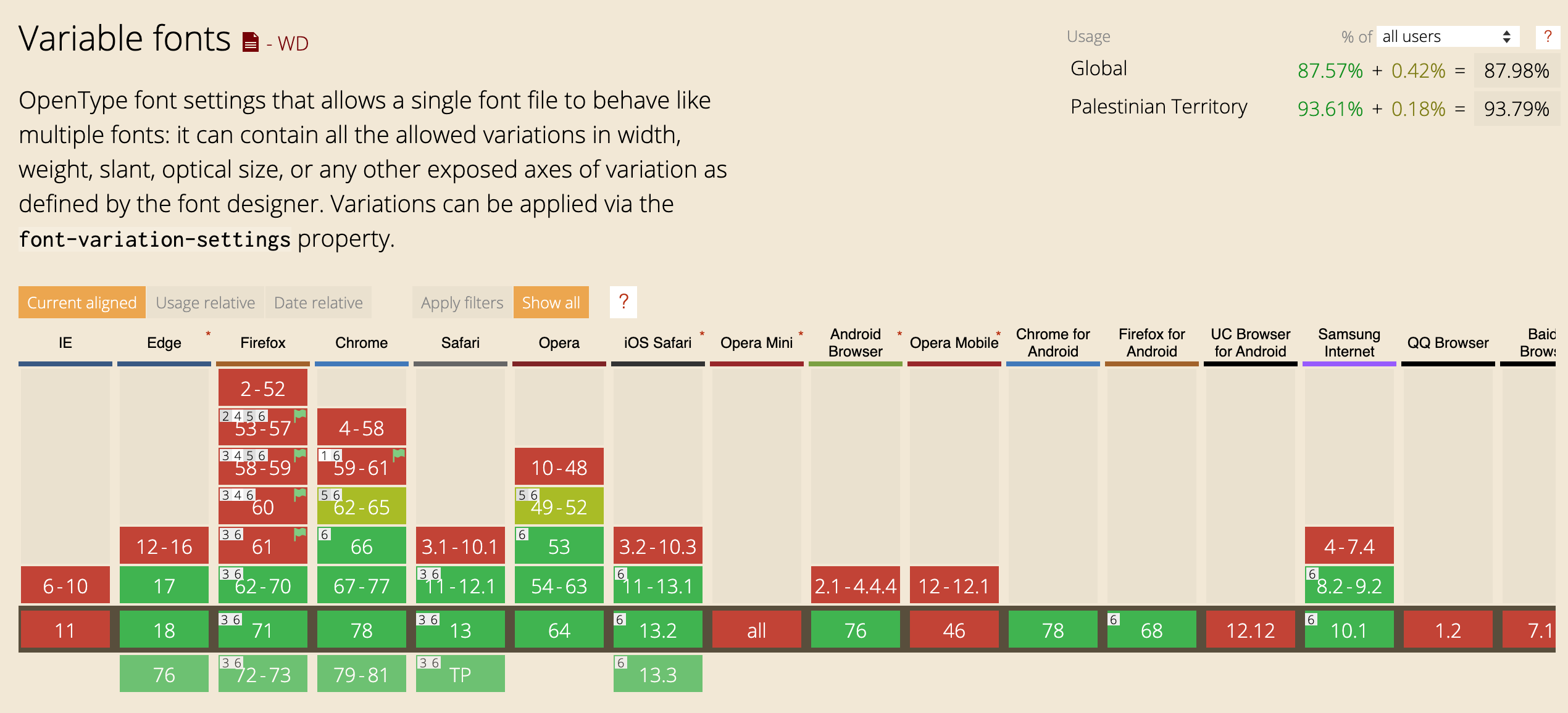
To ensure that there is a proper fallback for non-supporting browsers, it’s recommended to use CSS @supports media query.
.elem {
  font-family: "Static Font Name";
  font-weight: 200;
}

@supports (font-variation-settings: normal) {
  /* Add variable fonts declarations there.. */
  .elem {
    font-family: "Variable Font Name";
    font-variation-settings: "wght" 200;
  }
}
That way, we can leverage from Progressive Enhancement and use Variable Fonts with a proper fallback.
To be honest, this thing has caught my attention the first time I saw it. I will try to explain how to make a variable font in the easiest way I can.
A custom-made font with a colored shape or icon. In its simplest examples, it can be a colored icon. However, we can take leverage from variable fonts and do amazing things with this technique. Consider the below example:
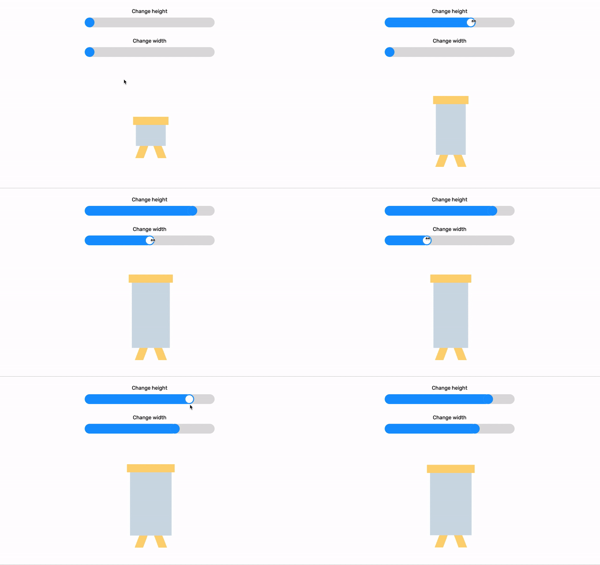
Cool, right? Let’s learn how to create something similar. But first, the example will be basic and then we will move to a more advanced one.
Prerequisites
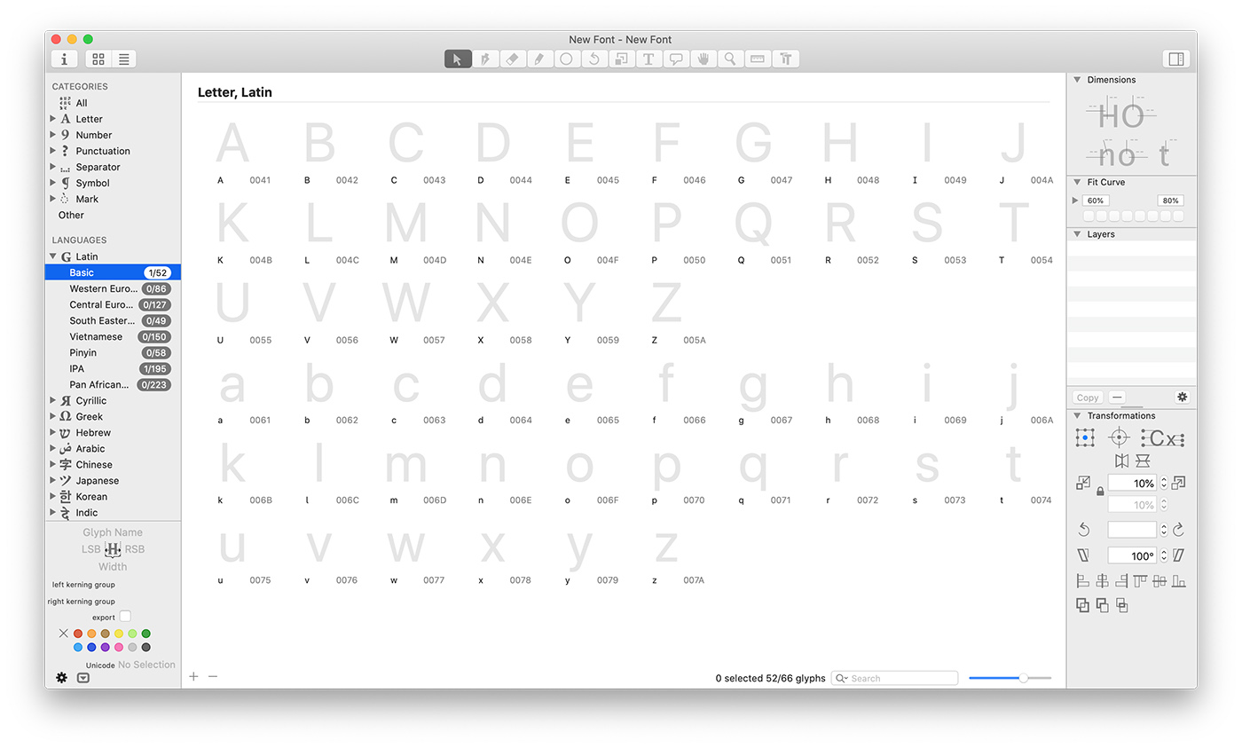
After creating a new document, you will see all things related to a font like letters, numbers, punctuation.. etc. We don’t need all of that. Select “Latin -> Basic” from the left menu, then select all the letters except the “A” and remove them with the keyboard shortcut CMD + Backspace.
Now that only one letter left, which is our goal, we will create multiple font weights and name each one of them.
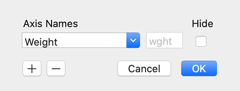
Go to File -> Font Info -> Font, then add a custom parameter called “Axes”. Please consider that it’s case sensitive. Once added, double click its value field and select it from the pre-defined axes. In our case, let’s select “Weight”.
At first, I was confused about the word “Masters” since I have zero knowledge of making fonts. It turned out that it means a version of a font that has a different variation/style. For example: “Light, Regular, Bold”. Each one of those font weights is called a Master, so keep that in mind since we will use the word in the next steps.
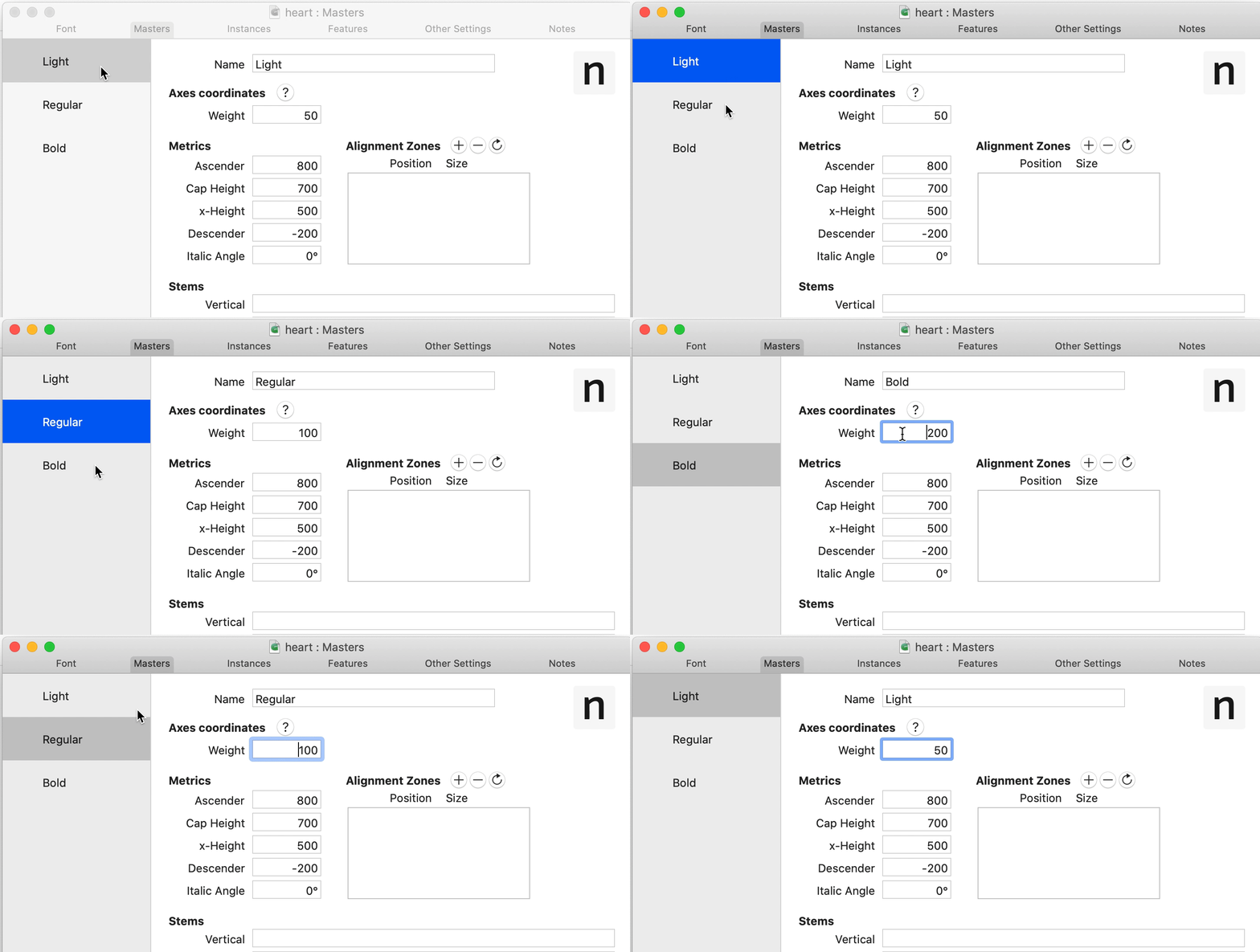
Let’s add our font masters! Go to File -> File Info -> Masters. By default, there will be only one and it’s called “Regular”.
For each master, the following is important:
I added two more weights now I have the following masters:
The next step is important. I will add a flagpole icon and our goal is to make a font that raises or lower the flag by changing the weight value.
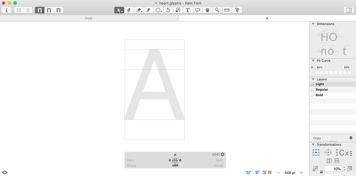
Double click on the “A” letter in the Font tab. You will notice a page that has a drawing canvas with all the font masters on the right side as layers. It should be something like this:
I downloaded an SVG icon and opened it in Illustrator. After selecting all, I copied the icon to the drawing canvas in Glyphs app.
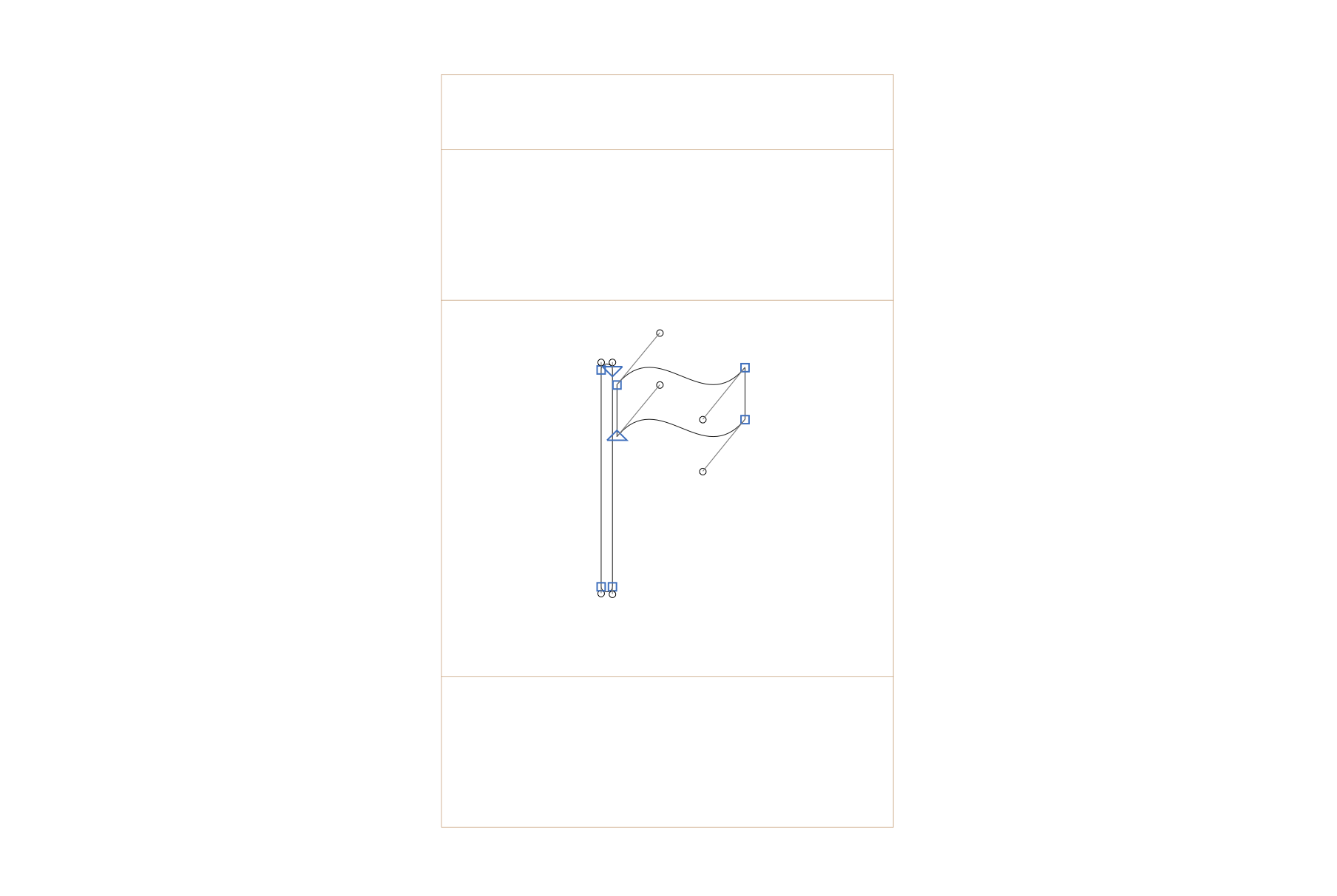
As you see, the icon is there and it’s outlined. For now, it’s only available in the Light master. I will copy and paste it in each master in the layers panel.
Useful tip; you can tab the space key to see what’s the icon look like when it’s filled.
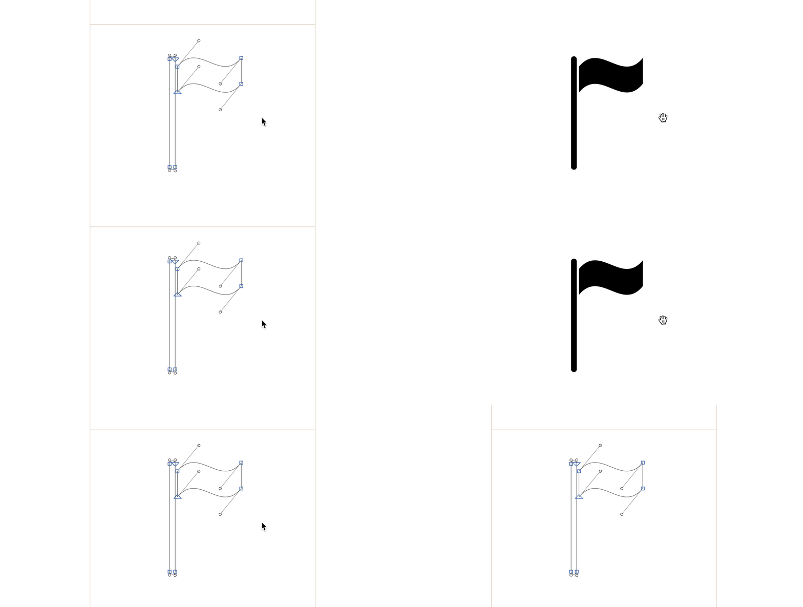
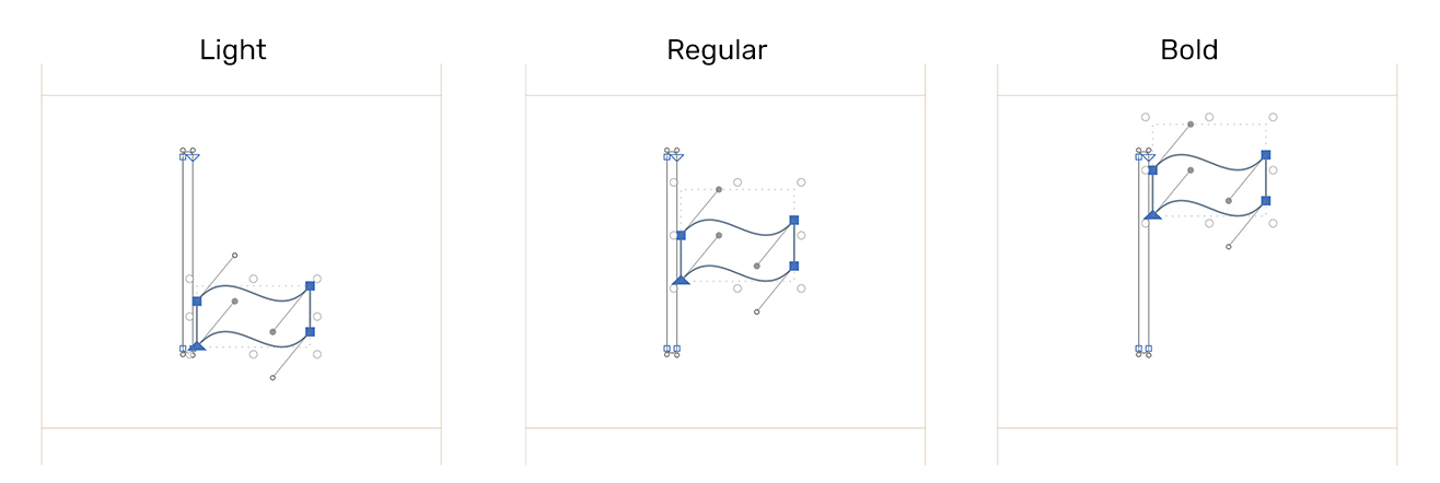
Now, for each master layer, I changed the position of the flag as the following:
And now it’s the time to export our first variable font! Go to File -> Export -> Variable Fonts. I will show you that in a live example:
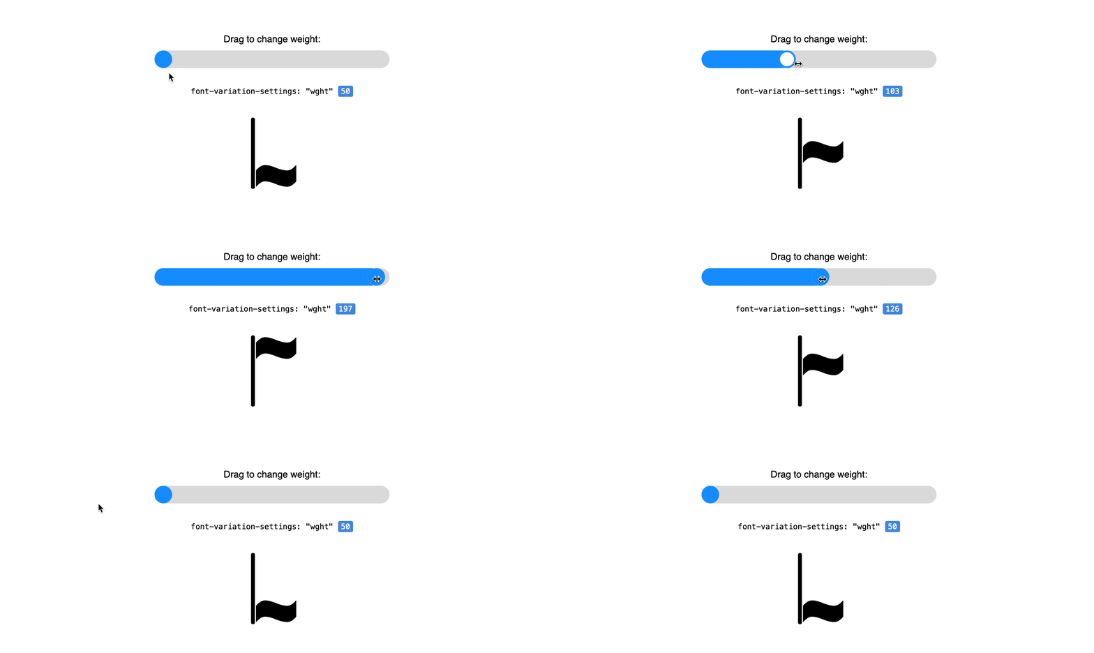
Notice how the flag is raised or lowered based on the value of wght. Isn’t that amazing? Variable fonts did the job and interpolated the values between the font masters we added.
Moreover, it’s possible to add animation on hover by changing the weight value.
.flagpole {
  /* 50 is the minimum value I set in the font masters (For the Light one) */
  font-variation-settings: "wght" 50;
  transition: 0.3s ease-out;
}

.flagpole:hover {
  /* 200 is the maximum value I set in the font masters (For the Bold one) */
  font-variation-settings: "wght" 200;
}
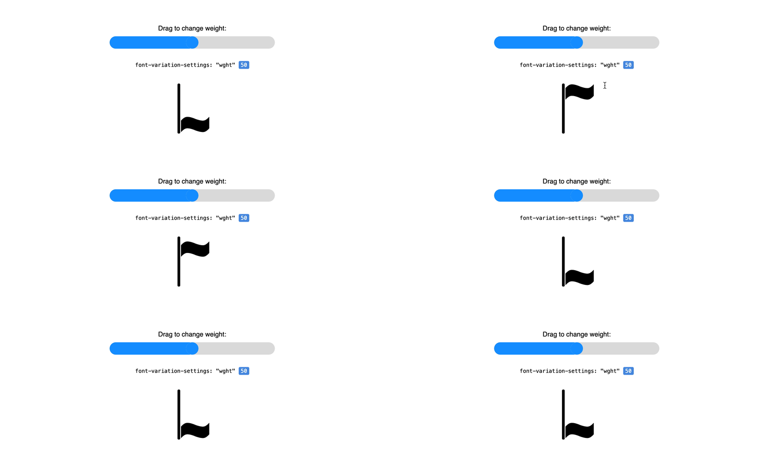
Check out the demo on Codepen. At the time of writing this article, Safari has the best support. Other browsers don’t support that and Chrome has no intention of supporting it.
Now that you learned the basics of creating a variable font, let’s take a deeper example that have a colored shape. For this time, we’ll recreate the colored demo that you saw at the beginning of the article.

I created a new font and did the following:
The idea of having a colored shape lies in adding sub color layers to each font master. To do that, we need to define a color palette with the shape color. The shape I picked has two colors.
Go to File -> File Info -> Masters and in the custom parameter, add “Color Palettes” property. Then, double click its value property to start adding colors.
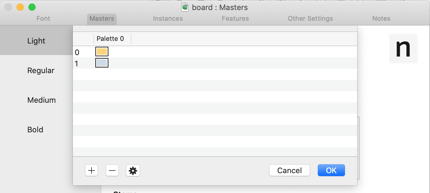
Once done, copy the custom parameter and make sure to add it to every font master. Now, Let’s explore how to add sub color layers for each font master.
Go to the letter drawing canvas and on the right side, there is a copy button in the layers panel. We’ll need that to create the sub color layers. While the light master is selected, click on Copy, then rename the layer to “Color 0”. The name is important, you will notice a color tag. Copy again, and rename to “Color 1”.
You have your first color layers ready! Just one thing left, redo copying and renaming for all font masters. Once done, it should look like this:
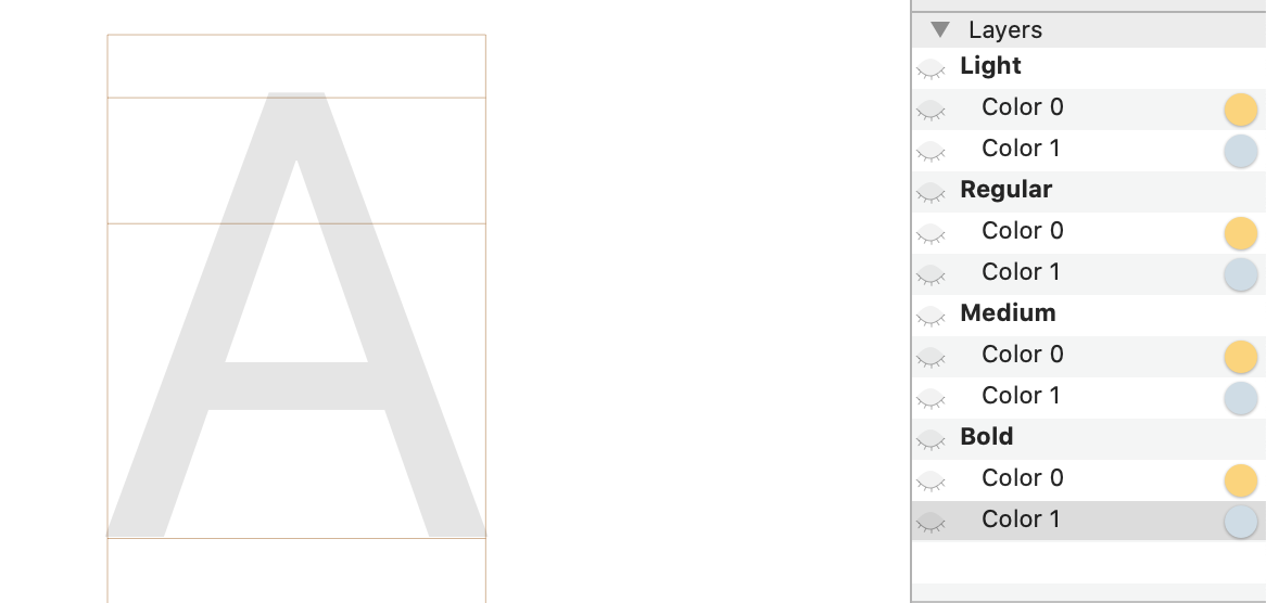
Next, we’ll copy the shape into each font master, but there is an interesting bit you should know before that. Since we copied each font master and renamed them to Color 0 and Color 1, those copies will be used to have the shapes. In Illustrator, I selected the yellow shapes and copied them.
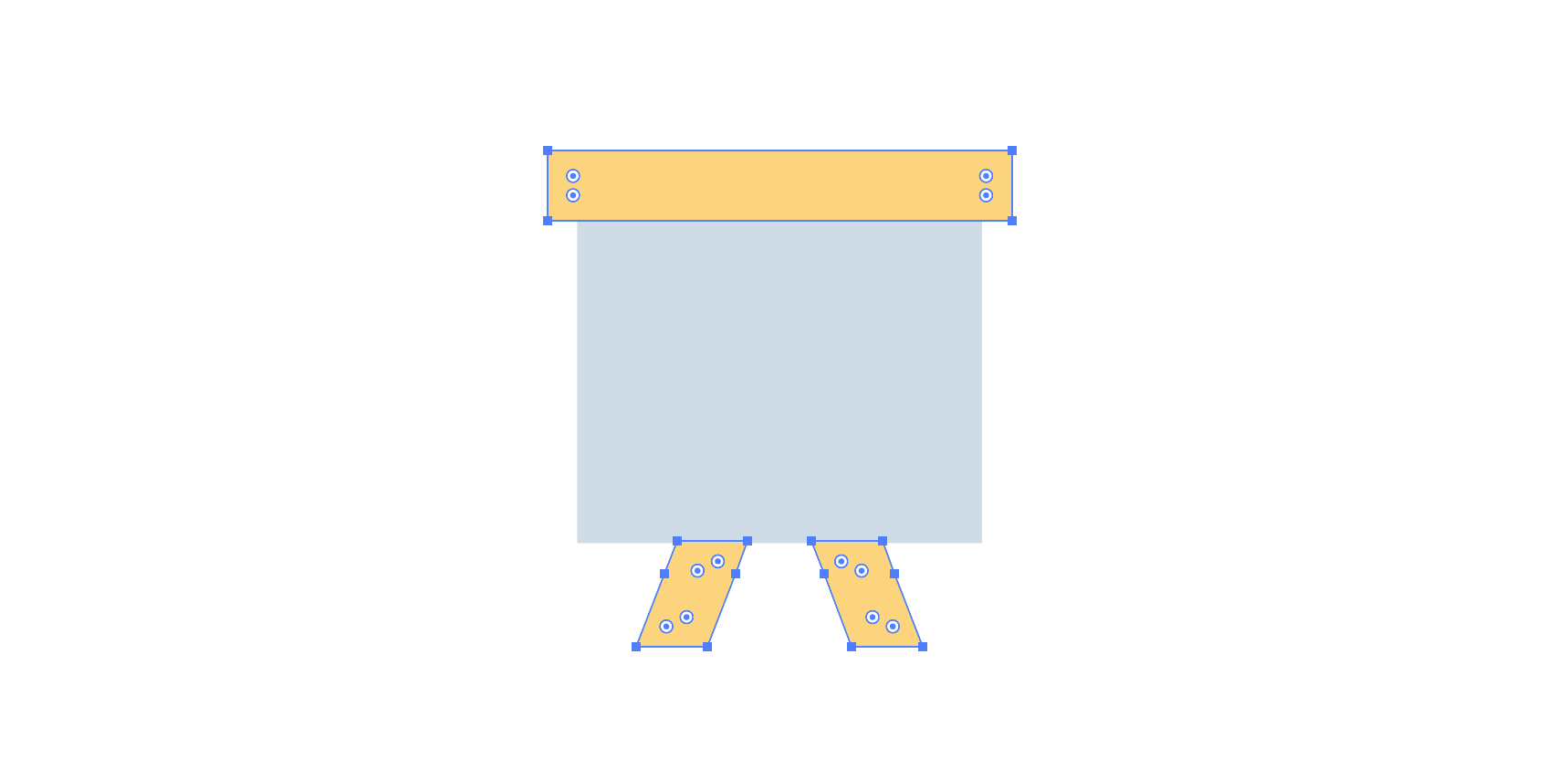
Go to the drawing canvas, and make sure Color 0 of the first font master is selected, then paste the paths. Then, select Color 1 and copy the grey path into the canvas. Once done, the result should be like the original colored board in Illustrator. Redo this process for every font master, but for this time, copy them from the Light master so they can be in the same position.
Go to File -> Font Info -> Font and in the Custom Parameter panel, double click on the value of Axes. Add a new one and give it a custom name “Height”. This will be used to control the height of the board in the next steps.
The light master represents the initial state of the shape. I will start editing from the Regular master.
To pair the font width and height values with the shape in the drawing canvas, I will need to do the following:
0 towards 200.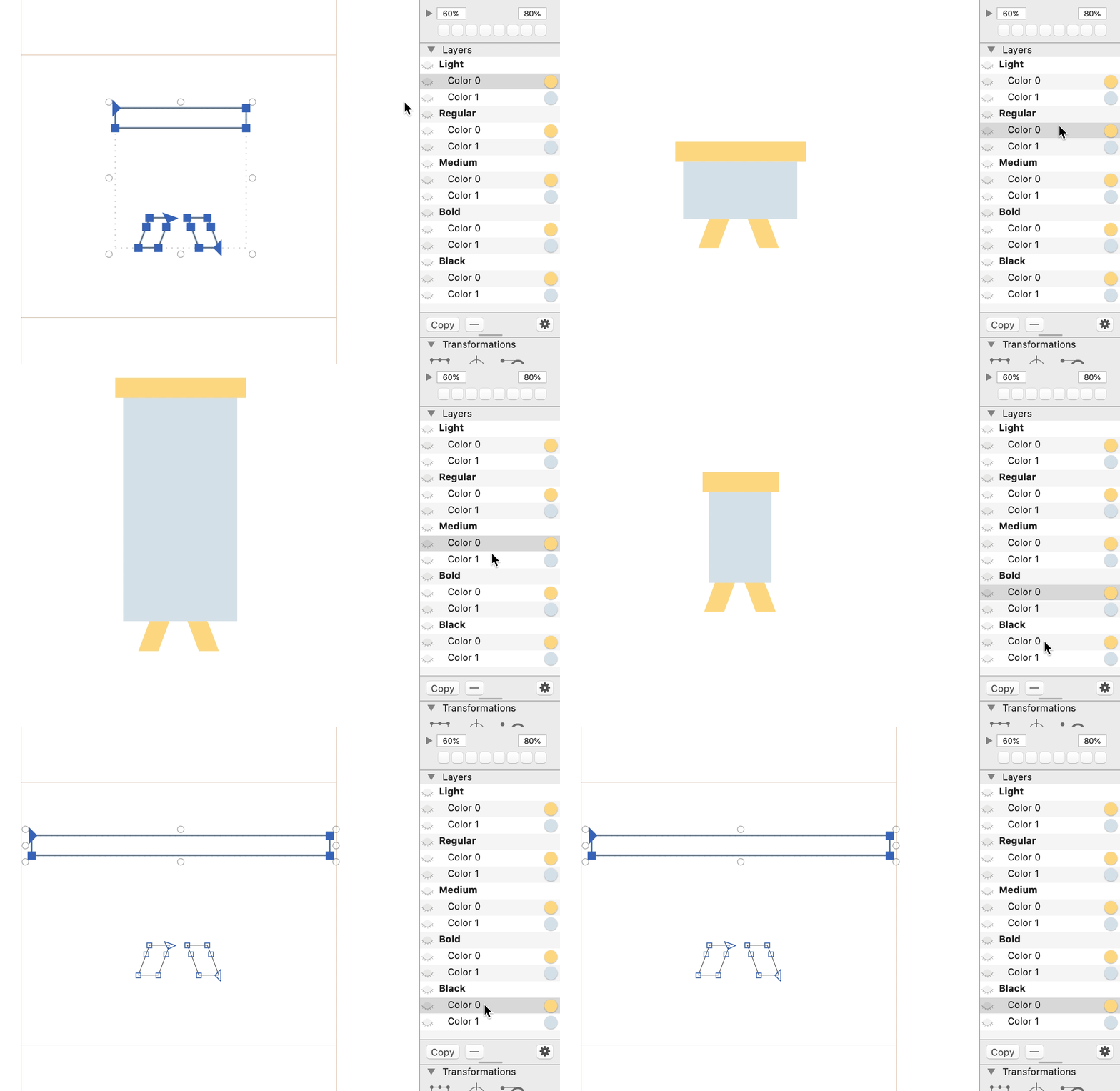
I made an illustration that shows how each font master shape looks, in addition to the values of width and height for each. Just a reminder, those values are in File -> Font Info -> Masters.
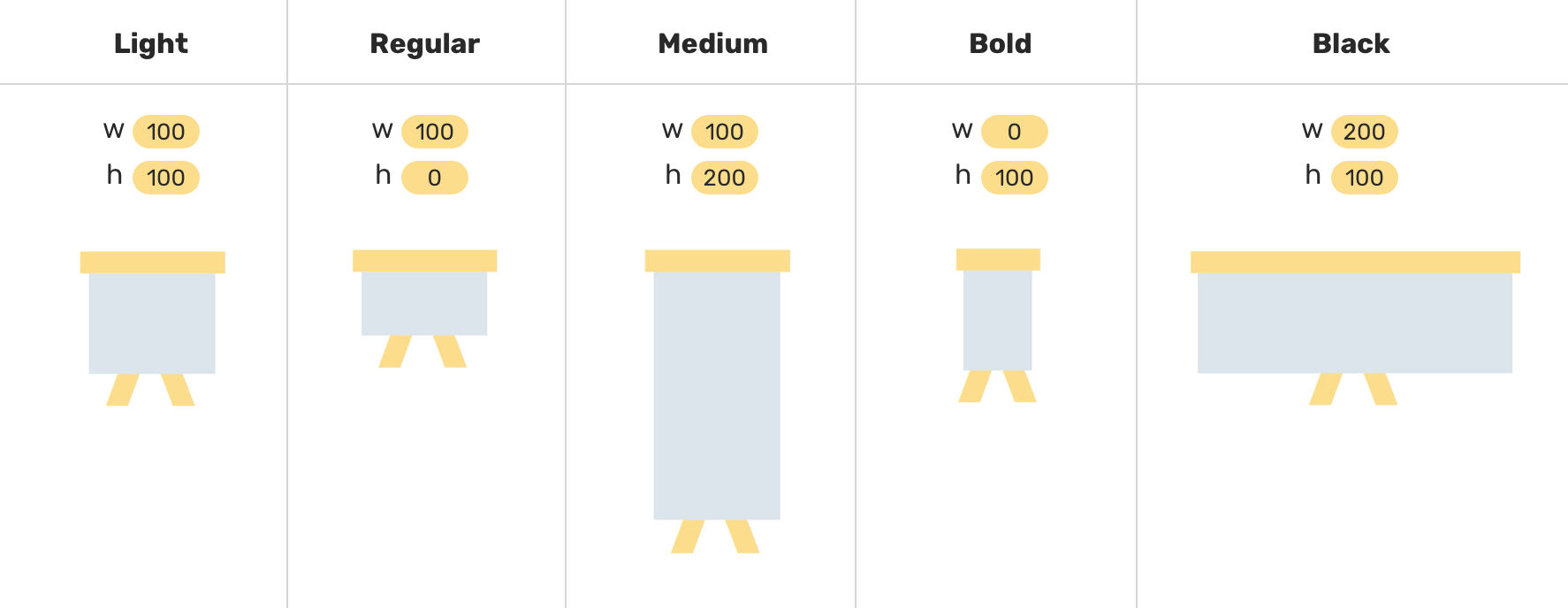
Now that I’m done with that final step, I exported the font and it’s ready!
And that’s a wrap. Do you have a comment or a suggestion? Please feel free to ping me on @shadeed9.
此内容由惯性聚合(RSS阅读器)自动聚合整理,仅供阅读参考。 原文来自 — 版权归原作者所有。