


The z-index property defines the order of the
elements on the z-axis. Basically, it works on elements with a
position value other than static.
The duck and the ring are within the same parent (the water). Can you guess which will come in front of the other?
<div class="water">
  <div class="duck"></div>
  <div class="ring"></div>
</div>


The ring has moved a bit. Notice how it’s in top of the duck. This is because latter elements in the HTML are displayed in front of former ones.
.ring {
  margin-top: -28px;
}
To make the duck appear in front of the ring, we need to apply
position: relative to it.
.duck {
    position: relative;
}
Positioned elements appear in front of non-positioned ones.
Let’s imagine that we have a scene represented in the following HTML markup.
<div class="pool">
    <img class="kid" src="kid.svg"/>
    <img class="ring" src="ring.svg"/>
    <img class="water" src="water.svg"/>
</div>
How can we make them stack on top of each other like a real-life scene?
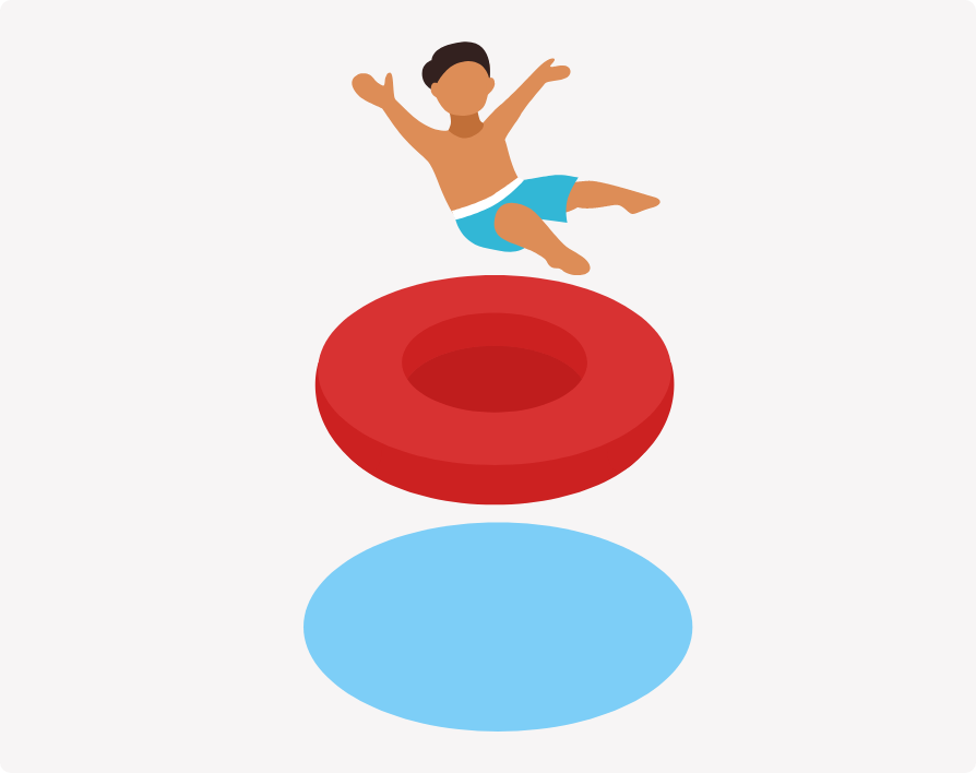
I want to make the images overlap with each other, so I added a negative margin.
img {
    margin-top: -40px;
}
Notice that the water is on top of the ring, and the ring is on top of the boy. Why is that happening?
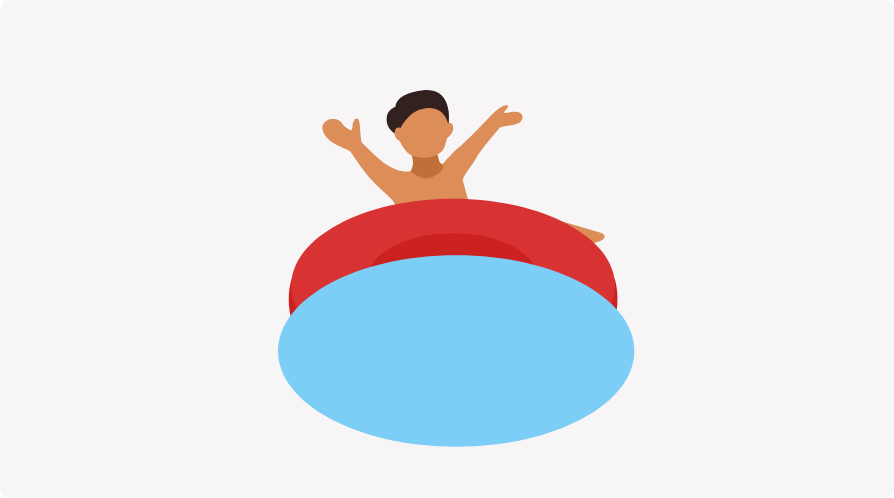
By default, latter elements in the HTML code will appear in front of former elements.
To arrange them, we need to add position:relative and
z-index to the first two items (The kid and the
ring).
img {
    margin-top: -75px;
}

.kid {
    position: relative;
    z-index: 2;
}

.ring {
    position: relative;
    z-index: 1;
}
Elements with a higher z-index will be in front of an element that has a smaller one.
It’s possible to use a negative value for z-index. Let’s learn how it works.
<div class="water">
    <div class="duck"></div>
    <div class="ring"></div>
</div>
The duck was able to add z-index: -1 to itself, and
it’s hidden. Can you guess where?
.duck {
    position: relative;
    z-index: -1;
}
In our case, it’s below the parent (the water).
Based on how the source order works an element with a negative z-index should be above the background of its parent.
Adding position: relative and a
z-index other than auto will prevent the duck from
going under its parent.
.water {
    position: relative;
    z-index: 1;
}

.duck {
    position: relative;
    z-index: -1;
}
Now, the duck can’t go behind its parent even if you add
z-index: -9999 to it. Why? Because the duck is a part
of the water stacking context.
Let’s learn about stacking contexts.
It’s a parent that contains one or multiple elements. Those elements will be stacked according to the source order rules, and their z-index values only have meaning within their parent.
<div class="water">
  <div class="ring"></div>
</div>
To create a stacking context for the water and the ring, you
should use a
position value other than static, and a
z-index value other than auto.
.water {
  position: relative;
  z-index: 1;
}

.ring {
  position: relative;
  z-index: 1;
}
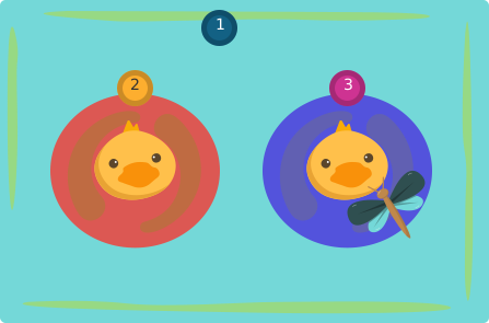
I like to imagine stacking context as a folder directory.
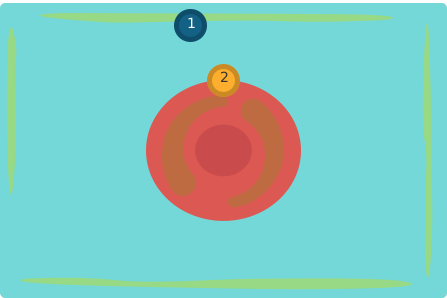
Note that a stacking context can contian other stacking contexts (AKA nesting).
Water
Ring
Duck
Ring
Duck
Mosquito
It’s not necessary to use z-index and positioning to create a stacking contexts. Here is a list of what triggers a stacking context.
Let’s explore a few examples on triggering a new stacking context(s).
An element with a position value other than static and z-index other than auto.
An element that is a child of a flex container with z-index other than auto.
An element that has a transform other than none. And more. View the full list on MDN.
In the following example, we have a ring, and we want the duck to be in front of it.
<div class="water">
  <div class="duck"></div>
  <div class="ring ring-purple"></div>
</div>

Adding an opacity other than 1 creates a new stacking context.
.duck {
  opacity: 0.999;
}
I added an opacity that is less than 1 to the duck, and it’s done. The duck is in front of the two rings.
I want to move the duck in front of the purple ring. How can I do this?
<div class="water">
  <div class="ring ring-red"></div>
  <div class="duck"></div>
  <div class="ring ring-purple"></div>
</div>
By rotating the duck, the brower will create a new stacking context for the duck. As a result, it will appear in front of the purple ring.
.duck {
  transform: rotate(10deg);
}
Applying clip-path to an element will create a new stacking context.
<div class="water">
  <div class="ring ring-purple"></div>
  <div class="duck"></div>
</div>
Adding a clip-path created a new stacking context. As a result, the purple ring is in front of the duck.
.ring-purple {
  clip-path: polygon(
    50% 0%,
    100% 50%,
    50% 100%,
    0% 50%
  );
}
Learn more about CSS clip path in this article.
To make the duck appear in front of the ring, we need to add a
stacking context to it with a z-index other than
auto.
.ring-purple {
  clip-path: polygon(
    50% 0%,
    100% 50%,
    50% 100%,
    0% 50%
  );
}

.duck {
  position: relative;
  z-index: 1;
}
Since the duck is a positioned element with
z-index other than auto, it will be in front of the
ring.
Let’s learn about how the default source order works.
The children of a stacking context are stacked from bottom to top in the following order.
The list has been edited For simplicity’s sake. If you’re looking for the full stack order, please read the spec.
In the following figure, we have three elements. The water, the red ring, and the purple ring.
We want to position the duck above the mosquito.
<div class="water">
  <div class="ring ring-red">
    <div class="duck"></div>
    <div class="mosquito"></div>
  </div>
  <div class="ring ring-purple"></div>
</div>
Consider that the water has a stacking context.
.water {
  position: relative;
  z-index: 1;
}
I added z-index: 1 to the duck to make it above the
mosquito.
.duck {
  position: relative;
  z-index: 1;
}
The duck is now above the mosquito and its happy. However, it appears above the purple ring. Why did that happen?
Since the purple ring is in the same stacking context as the red ring, but has no z-index, it appears below the duck.
To solve this, we need to introduce a stacking context to the red ring.
To create a stacking context for the red ring, I will add a CSS
position and z-index: 1 to it.
.ring-red {
  position: relative;
  z-index: 1;
}
Another solution would be to add a z-index: -1 to the
purple ring. This will make it behind the red ring.
The duck is very hungry and it’s stuck inside the red ring since the red ring has a stacking context.
How can we make the fish closer to the duck, so it can eat?
<div class="water">
  <div class="ring ring-red">
    <div class="duck"></div>
  </div>
  <div class="fish fish-small"></div>
  <div class="fish fish-large"></div>
</div>
.water {
  position: relative;
  z-index: 1;
}

.ring-red {
  transform: rotate(90deg);
}
By removing the stacking context from the ring, the fish will be in front of the ring. That way, the duck can eat.
Based on the source order, the fish should come first since it’s the last element in the HTML.
.water {
  position: relative;
  z-index: 1;
}

.ring-red {
  transform: none;
}
In this example, the fish has a higher z-index than
the red ring.
<div class="water">
  <div class="ring ring-red">
    <div class="duck"></div>
  </div>
  <div class="fish fish-large"></div>
</div>
.water {
  position: relative;
  z-index: 1;
}

.fish {
  position: relative;
  z-index: 2;
}

.ring-red {
  position: relative;
  z-index: 1;
}
How can we move the duck in front of the fish? It’s impossible. If
we apply a z-index to the duck, it will only have
meaning within its stacking context (the red ring). Even with a
z-index: 9999, it won’t do anything.
.duck {
  position: relative;
  z-index: 9999;
}

What’s tricky about z-index is that it only works
within an element’s stacking context. In our case, we want the
duck, which is a part of the red ring stacking context, to be in
front of the fish (Another stacking context). This isn’t
possible.
To make the duck appear in front of the fish, we need to remove the stacking context from the red ring.
.fish {
  position: relative;
  z-index: 2;
}

.duck {
  position: relative;
  z-index: 1;
}

.ring-red {
  position: static;
  z-index: auto;
}
By doing this, the current stacking context for the duck and the fish is the water element.
An ebook that will help you improve your debugging CSS skills and reduce the time you spend on bugs by showing proven methods and techniques.
If you’re interested, head over to debuggingcss.com for a free preview.
此内容由惯性聚合(RSS阅读器)自动聚合整理,仅供阅读参考。 原文来自 — 版权归原作者所有。