


I spent years teaching CSS layout on this blog. I put everything I know into The Layout Maestro course: 70+ lessons and 150+ interactive examples that teach you how to think CSS layouts, not just memorize syntax.
As a front-end developer, you have faced lots of CSS bugs that might prevent the user from completing or achieving his need successfully. A CSS bug could be visual or technical, and both of those types can affect the user experience. Sometimes, you’re in a hurry and don’t have enough time to fully debug and fix a bug, so you go and work on a quick solution that only solves the bug from the outside.
While solving a bug without digging into its details might seams okay for you, it can accidentally produce other bugs. Instead of solving a bug from the ground up, you create more and more bugs rather than reducing them.
While working on my Debugging CSS book, I learned a lot about debugging and fixing CSS bugs. In this article, I will go through the process of fixing a bug from the root and explore some common CSS issues and how fixing them from the outside can result in more issues.
Before I dive into some thinking and use-cases of different bugs, I want to give an introductory and visual example that sheds the light on the problem.
Let’s suppose that we have a grid of cards, which is a common pattern on the web. You have an image that should have an equal width of its parent element (The card). To do that, you added the following CSS rule to the image:
.card__img {
  width: 100%;
}
You only defined the width and supposed that the image will always be rectangular.
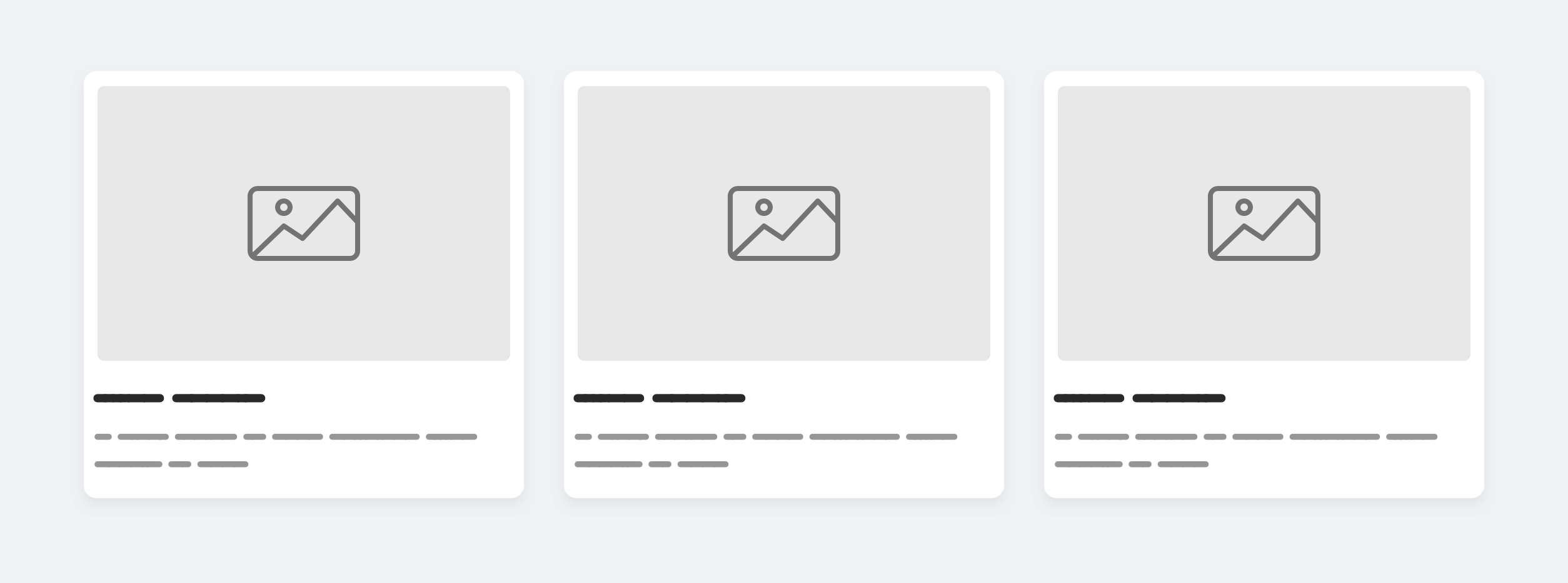
Everything looks fine because the image sizes are equal. However, this can easily break if we added an image with a different aspect ratio.
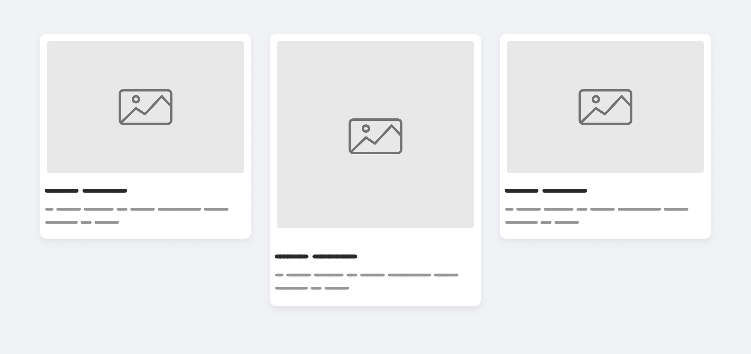
Do we really want that? This is similar to a Mansory layout, but the purpose of this layout is to constraint the card components within a specific size. A card shouldn’t be taller than one another.
Here is a quick solution to this problem:
.card__img {
  width: 100%;
  height: 200px;
}
Adding a fixed height makes the images look equal in size, but unfortunately, this will introduce another issue. If the image is very tall, it will look compressed.
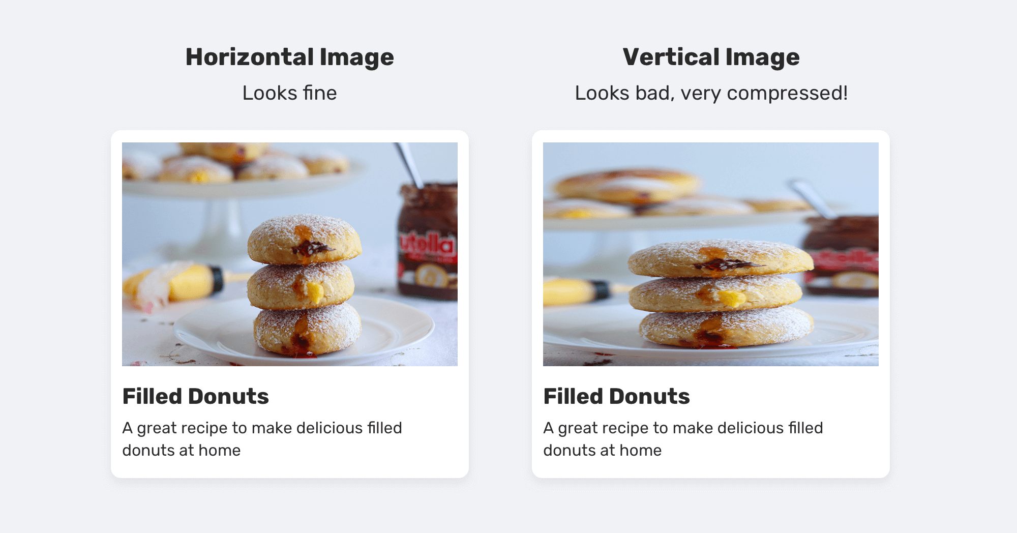
As you see, adding height solved the issue partially and resulted in making the card components height identical. However, it caused an even worse issue, which is compressing the vertical image. As a front-end developer, you’re responsible for asking lots of questions that will make you understand exactly how a component should work and behave.
Here are some questions to ask and think about:
The answers to those questions can change from a project to another. I want to make this feels like a real project, so I will answer them for you.
And now, let’s see the proper fix for the issue. By applying object-fit: cover on the image, we can guarantee that the image won’t be compressed.
.card__img {
  width: 100%;
  height: 220px;
  object-fit: cover;
}
I know that the image dimensions are expected to be equal, but adding object-fit can prevent unwanted issues in the future. And finally, a question that I got to think about is: is it fine to hide some parts of an image? Using object-fit won’t make the image compressed, but on the other hand, it will resize the image to make it fit in the specified width and height, and that might hide some parts of it.
Here is how the tall image will appear with object-fit: cover added.
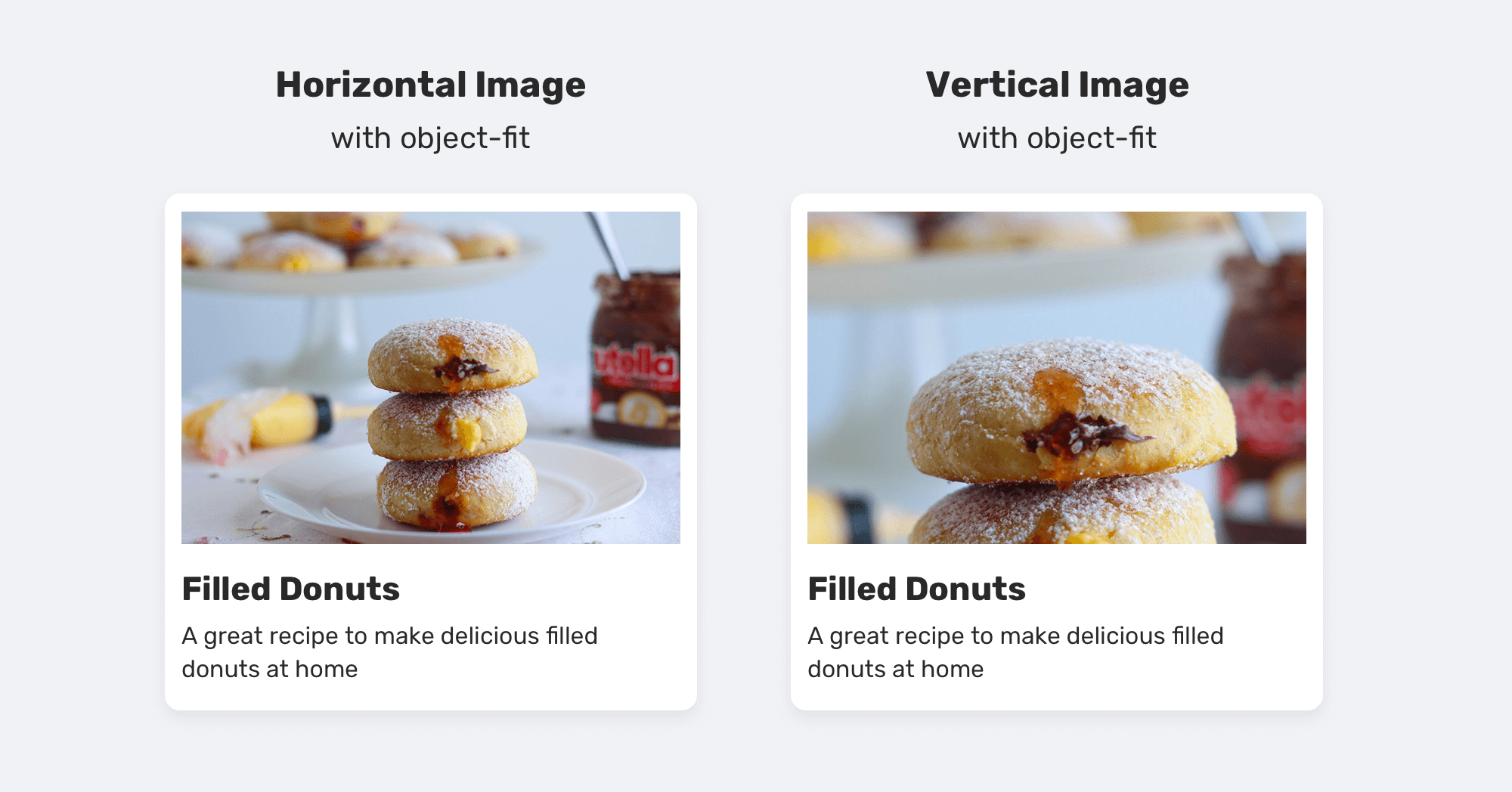
Notice how some parts of the second images are hidden. That’s expected, and it can be solved by altering the object-position property like so:
.card__img {
  width: 100%;
  height: 220px;
  object-fit: cover;
  object-position: center 75%;
}
While the above solves the issue, it’s not practical. We can’t add a specific object-position to each thumbnail in the project.
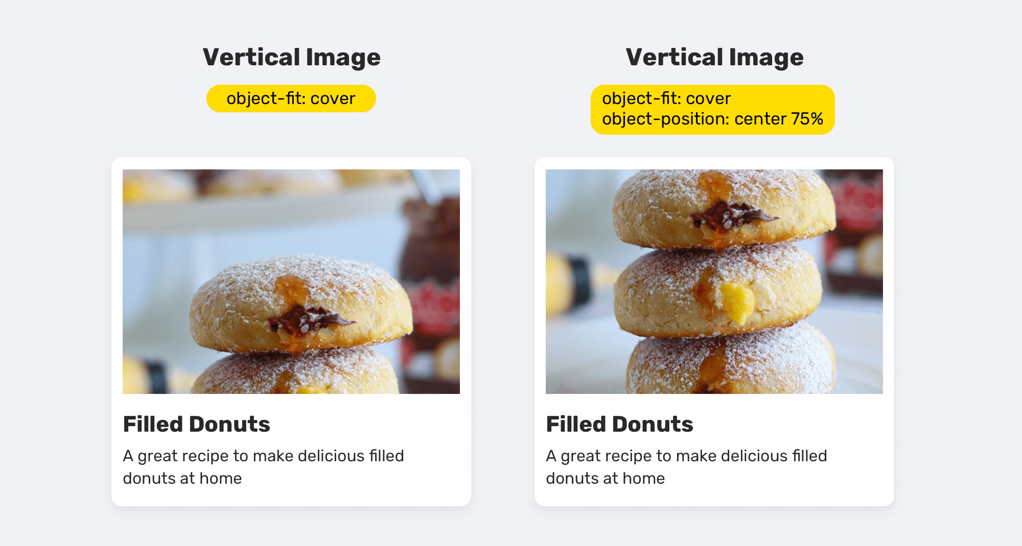
Some would argue that we shouldn’t hide parts of the imagery as we pay a lot of money on shooting and editing them. In such a case, the only thing you can do is to explain that this is not your problem, and the image dimensions should be all consistent.
Now that I explained a basic example, let’s get into more examples to make the concept of finding the root cause even clearer.
How many times did you need to incorporate a custom dropdown menu to the header component? I think you’ve done this before.
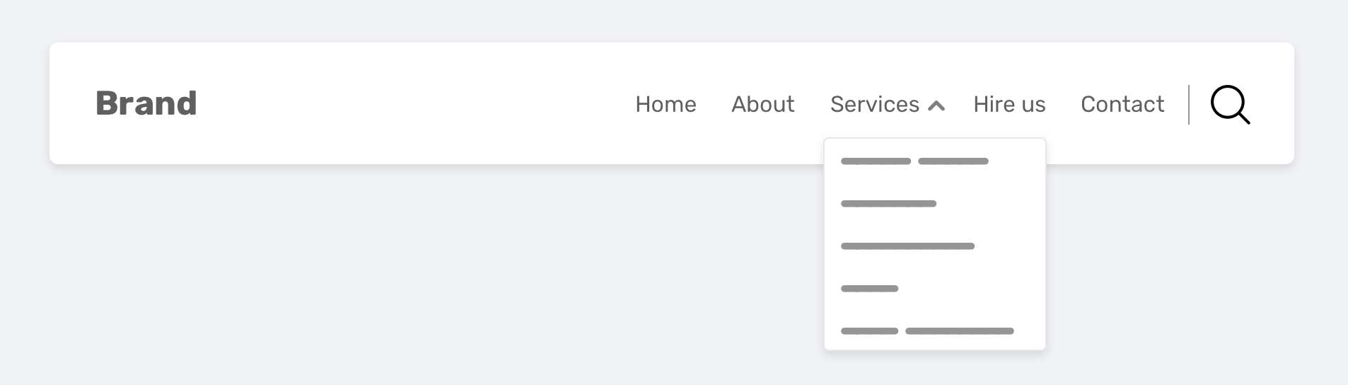
A dropdown menu is positioned below its parent element. Since the dropdown is an absolutely positioned element, we can do that by altering the top property.
.nav__item {
  position: relative;
}

.nav__dropdown {
  position: absolute;
  left: 0;
  top: 40px;
}
The dropdown is positioned 40px from the top edge of its parent nav item. While there are no problems with this, it can cause side effects in the future. Let’s suppose that you got a request to make the header height smaller. Depending on how you implemented the navigation, you either need to decrease the vertical padding of the navigation item or decrease the header height.
You did exactly that, but forget to test if the dropdown menu is working as expected or not. Unfortunately, it’s not.
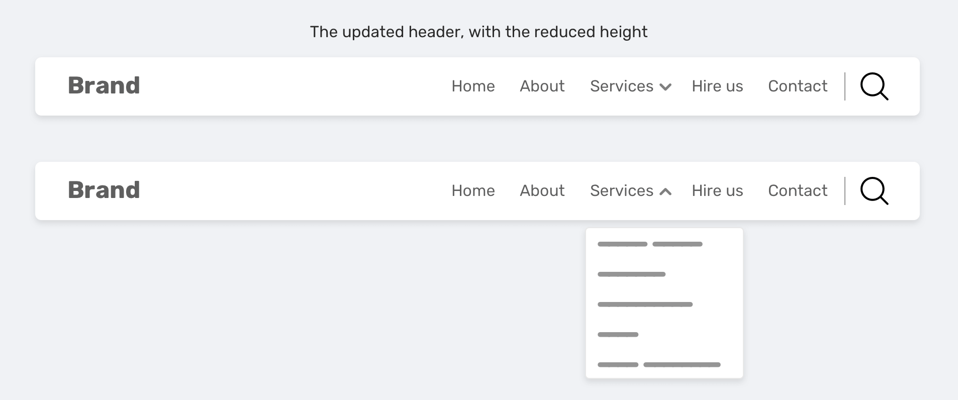
That’s because the top property has a fixed value. A better way to do this is by using a percentage value. That way, the dropdown will stay in its place no matter the navigation height.
.nav__dropdown {
  position: absolute;
  left: 0;
  top: 100%;
}
Understanding CSS basics very well can help in avoiding such a situation. Using a fixed value for the top property is a mistake and not something that you can rely on.
According to MDN:
Replaced elements are whose contents are not affected by the current document’s styles. The position of the replaced element can be affected using CSS, but not the contents of the replaced element itself.
An example of a replaced element is the HTML <img>. I want to explore less-known facts about it. Let’s suppose that we have an image that is absolutely positioned to its container, but without setting the width and height.
If you’re lucky and the image size is the same as the wrapper, then you won’t notice the issue I’m gonna show you.
.card__image {
  position: absolute;
  left: 0;
  top: 0;
  right: 0;
  bottom: 0;
}
You might guess that the image will fill its parent element because it’s positioned with a 0 value from the four sides of the wrapper. Nope, that’s not the case!
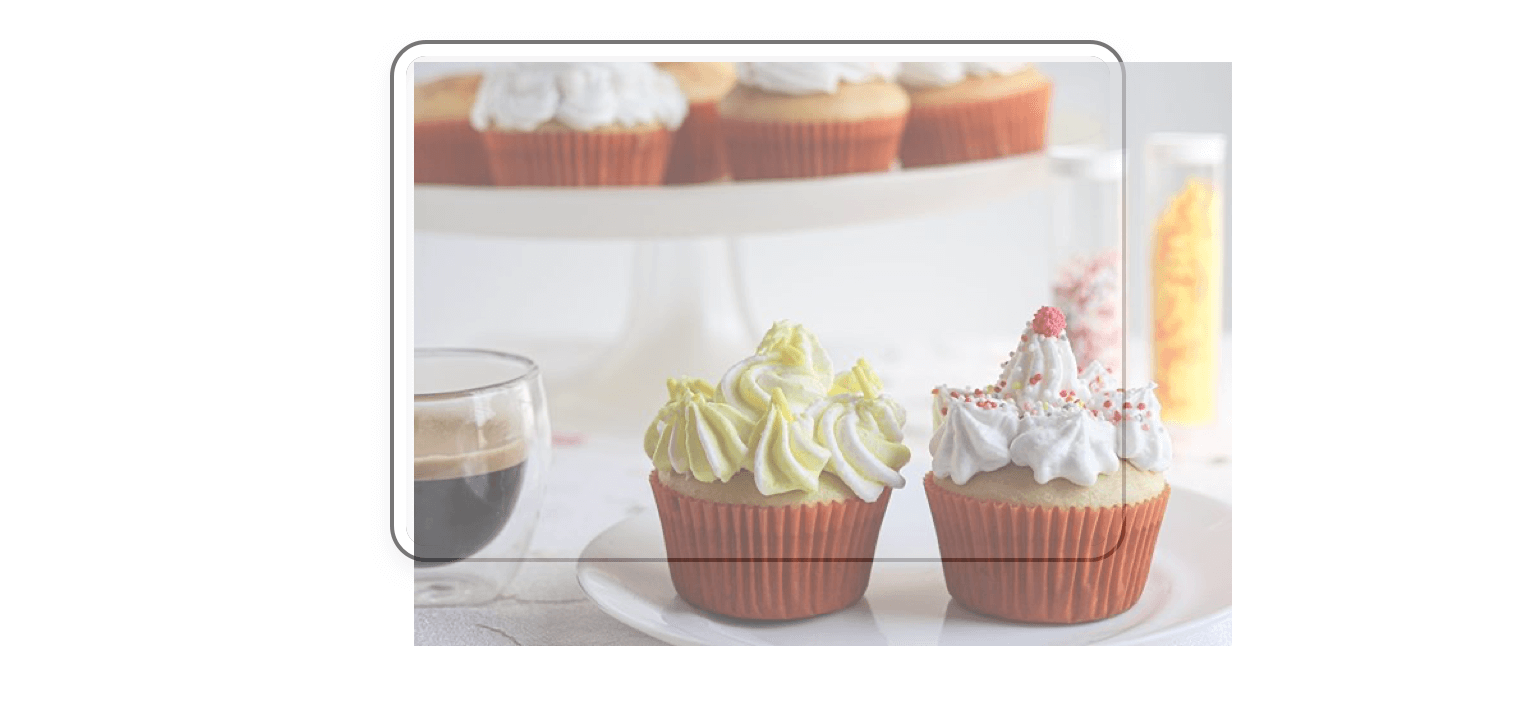
Notice how the image is going outside its parent. The reason is that the image is a replaced element, and its default width is as per the content size. For that reason, you must include the width and height properties.
.card__image {
  position: absolute;
  left: 0;
  top: 0;
  width: 100%;
  height: 100%;
}
It’s not the most complex issue in the world, but it can easily trip a developer if she is not focused enough.
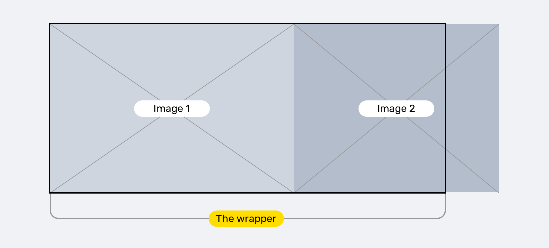
If you want to have a wrapper that contains multiple images, then it can also be tricky to handle this with Flexbox. Let’s suppose the following HTML and CSS:
<div class="wrapper">
  <img src="image-1.jpg" alt="" />
  <img src="image-2.jpg" alt="" />
</div>
.wrapper {
  display: flex;
}

.wrapper img {
  flex: 1;
}
The above can work just fine in case the images are smaller than their wrapper or parent element. You can try all sorts of things to fix this problem and you won’t guess the real reason until you read the CSS spec.
By default, flex items won’t shrink below their minimum content size (the length of the longest word or fixed-size element). To change this, set the min-width or min-height property.
That means, we need to force the flex item to shrink below their minimum content size by using min-width (Because the flex-direction is row, in our case).
.wrapper {
  display: flex;
}

.wrapper img {
  flex: 1;
  min-width: 0;
}
That’s it. We knew the root cause of the issue by just reading the CSS spec and learning about how things work behind the scenes.
You can learn more about the flex property in this detailed article by yours truly.
inline-block ElementsI explained about this concept in my Overflow in CSS article.
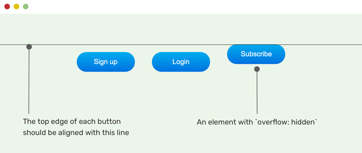
We have three inline-block elements, and one of them has overflow: hidden. You will notice that the button with overflow hidden is not aligned with the baseline of other siblings.
According to the CSS spec:
The baseline of an ‘inline-block’ is the baseline of its last line box in the normal flow unless it has either no in-flow line boxes or if its ‘overflow’ property has a computed value other than ‘visible’, in which case the baseline is the bottom margin edge.
I’m lucky that Gaël Poupard mentioned me in this github issue in the Bootstrap repository. I got to see the above issue in real-life!
In a search results page, the query string could range from one word to a sentence. For some reason, the design below should have the string constrained with a specific width. To do that, the author added the following CSS
.search-results span {
  display: inline-block;
  max-width: 150px;
  overflow: hidden;
  text-overflow: ellipsis;
  white-space: nowrap;
}
With that, we have an issue. The query string is not aligned with its siblings. See the figure below:
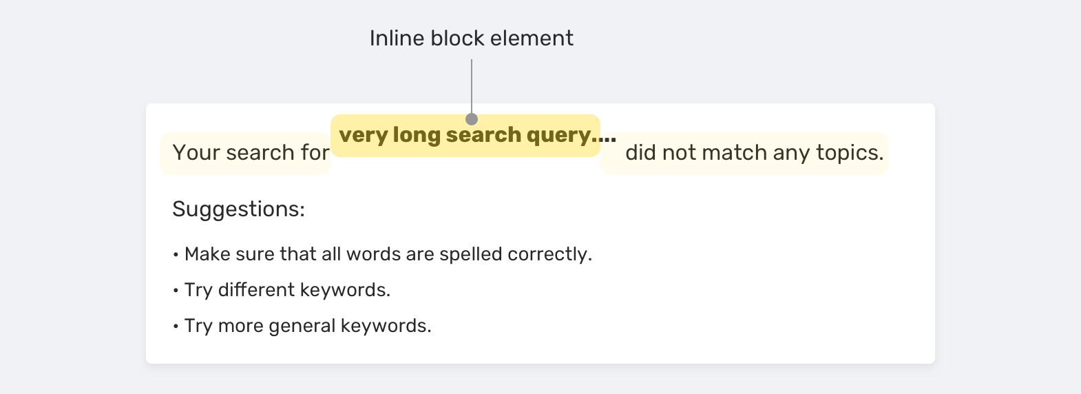
Without a good understanding of CSS, and doing proper research, you might think that this is a browser-related issue or something. In reality, it’s the natural thing to happen. Here is a quick comparison between three major browsers:
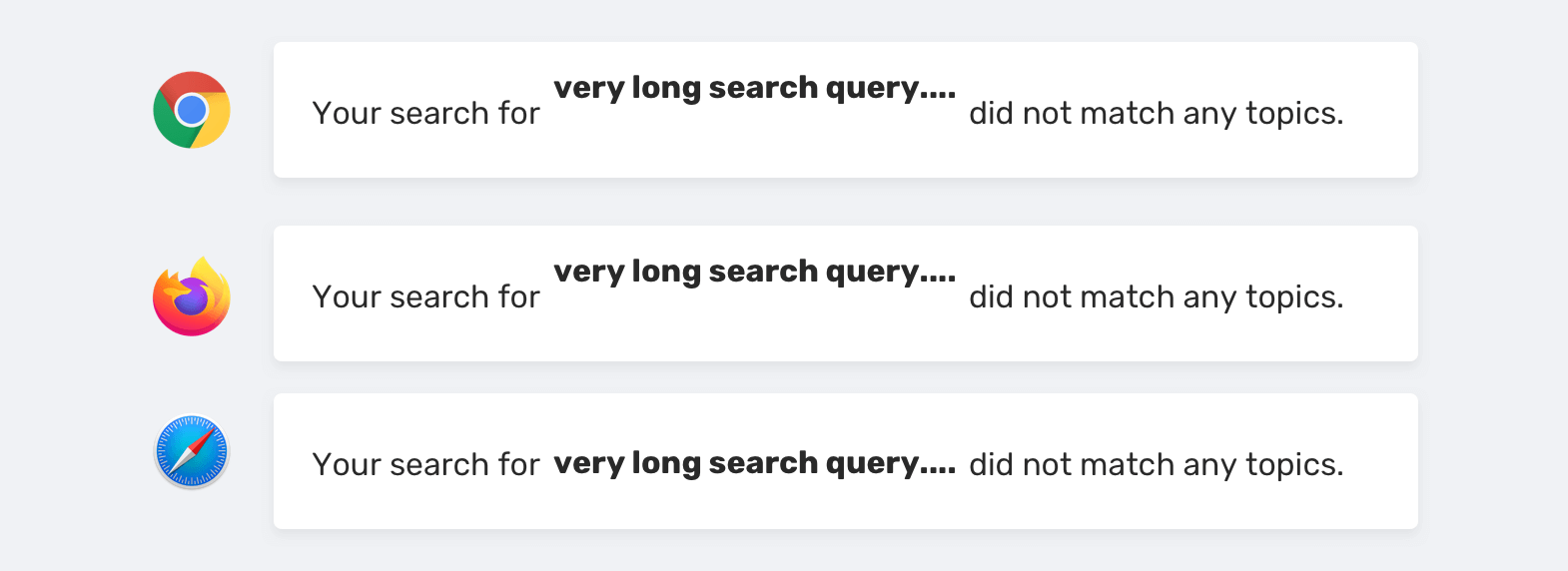
As you notice, Chrome and Firefox have the same result. Safari, on the other hand, is showing a different result. You might think aloud like this: “Oh, it works in Safari. Then the issue is in Chrome and Firefox”, and you then spend hours on research to finally find that Safari is implementing the behavior incorrectly.
Adding on that, a lazy developer who wants to finish his job quickly might just add a margin and call it a day. Here is an example of a bad solution:
.search-results span {
  position: relative;
  top: 3px;
  display: inline-block;
  max-width: 150px;
  overflow: hidden;
  text-overflow: ellipsis;
  white-space: nowrap;
}
Now that we knew the root cause, here is the proper solution for it:
.search-results span {
  display: inline-block;
  max-width: 150px;
  overflow: hidden;
  text-overflow: ellipsis;
  white-space: nowrap;
  vertical-align: top;
}
I only added vertical-align: top and the issue is fixed instantly.
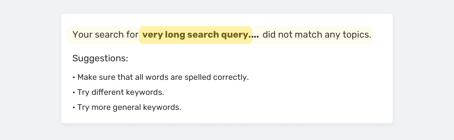
inline-block siblings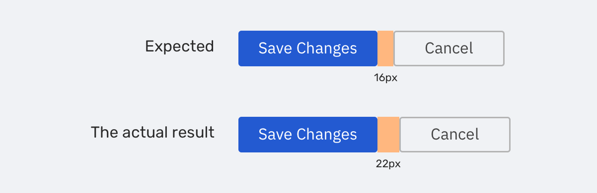
You’ve worked on implementing a website, and you got feedback from the lead designer saying that the spacing between the buttons is inconsistent. It’s 22px instead of 16px. When checking the CSS, it’s like the following:
<div class="wrapper">
  <a class="button" href="">Save changes</a>
  <a class="button" href="">Cancel</a>
</div>
.button {
  display: inline-block;
  margin-right: 16px;
  /* Other button styles */
}
You have defined that the spacing is 16px, but if you measure it in the browser, it’s more than that. In case you are in hurry, you might just decrease the margin and make it 10px in CSS, and in the browser, it will become 16px. If you’re lucky, the designer might not notice what you did here, but it’s a bad solution.
That is happening because the buttons are inline elements, and the browser is dealing with them as text characters. Between text characters, we have spacing. There is no direct way to fix that and most of the solutions are hacks. You can read about them in this article on CSS Tricks website.
If I want to solve this, I will make the buttons parent as a flex wrapper, and then the spacing will work as expected without any hacks.
.wrapper {
  display: flex;
  flex-wrap: wrap;
}

.button {
  margin-right: 16px;
  /* Other button styles */
}
Finding the root cause of a CSS bug is important to you as a front-end developer. Here are what you get when you solve an issue from the ground up:
I hope that I can mention all the ways to find and solve CSS bugs, but I can’t fit them all into an article. Oh, I’m writing a book about Debugging CSS. If you’re interested, please sign up in the newsletter to get the latest news!
此内容由惯性聚合(RSS阅读器)自动聚合整理,仅供阅读参考。 原文来自 — 版权归原作者所有。