


I spent years teaching CSS layout on this blog. I put everything I know into The Layout Maestro course: 70+ lessons and 150+ interactive examples that teach you how to think CSS layouts, not just memorize syntax.
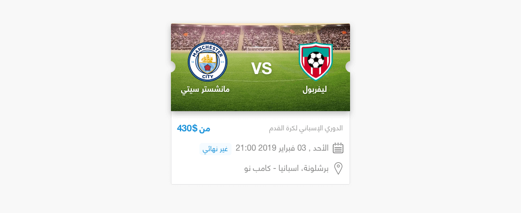
While working on a design project, I needed to build a football ticket with cut-out edges on the right and left sides. Initially, I thought that it would be simple and won’t take much time. It turned out to be an exciting challenge that I’ve decided to document and share with you.
In this article, I will explore all the various ways to build this card.
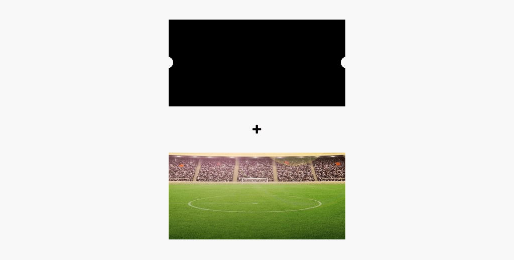
I thought about using clip-path since it’s the most obvious solution for that kind of thing. In Sketch, I made a black shape with cut-out edges as in the figure. The goal now is to get that as an SVG and try to use it with Clip Path.
<div class="ticket"></div>

<svg xmlns="http://www.w3.org/2000/svg">
  <clipPath id="my-clip-path" clipPathUnits="objectBoundingBox">
    <path d="..."></path>
  </clipPath>
</svg>
.ticket {
  /* Other Styles */
  clip-path: url("#my-clip-path");
}
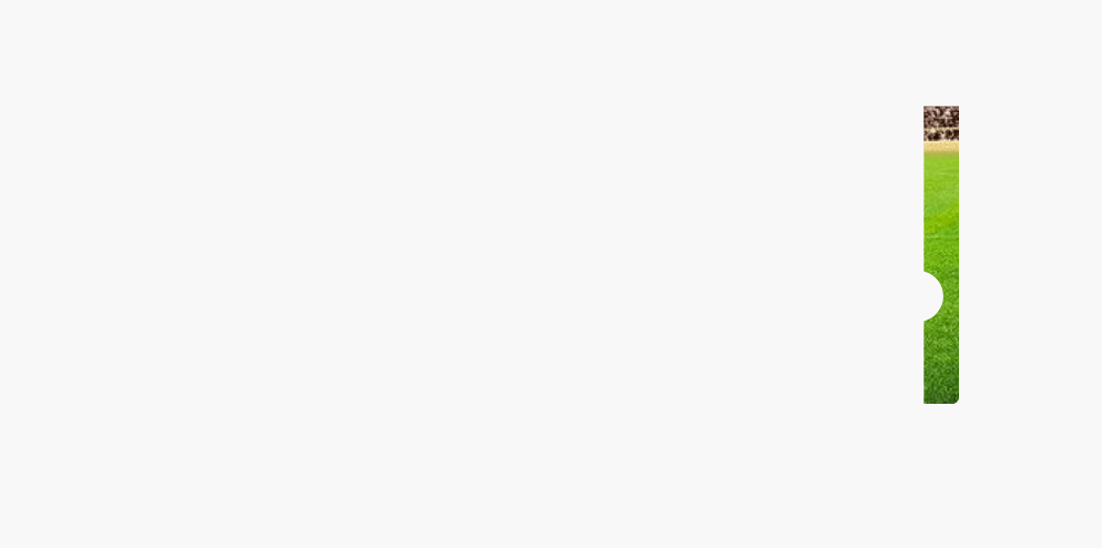
That was weird! It’s kind of like the image and the clipped paths are shifted to the far right. I made the below GIF to clarify what I mean:
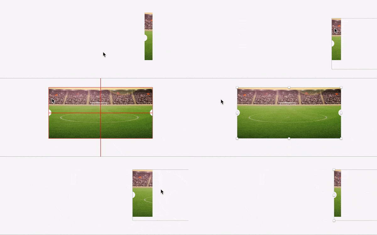
The reason behind that bug is that the exported path values are absolute. That means that they only work if I made the size as per the Sketch document, which is not practical in real-life projects. To fix that, I need to clean the SVG with SVGOMG tool. With that done, the path values should be converted from absolute to relative using this tool.
Final SVG after cleaning it and converting the path values to relative
<svg width="352" height="173" xmlns="http://www.w3.org/2000/svg">
  <path
    d="M1,0 l0,0.429 c-0.015,0.007,-0.026,0.033,-0.026,0.065 s0.011,0.058,0.026,0.065 V1 H0 V0.559 c0.015,-0.007,0.026,-0.033,0.026,-0.065 S0.015,0.436,0,0.429 V0 h1"
    fill="#000"
    fill-rule="nonzero"
  />
</svg>
I used url(#my-clip-path) to call the inline SVG. It works in Chrome, Safari, but not Firefox.

See the Pen Football Ticket - Take 1 by Ahmad Shadeed (@shadeed) on CodePen.
And here we go with the journey of finding a solution that works across all these browsers.
At first, I thought that Firefox is not showing it as expected due to security reasons. However, it turned out to be weird. When I remove box-shadow from the element, it works!
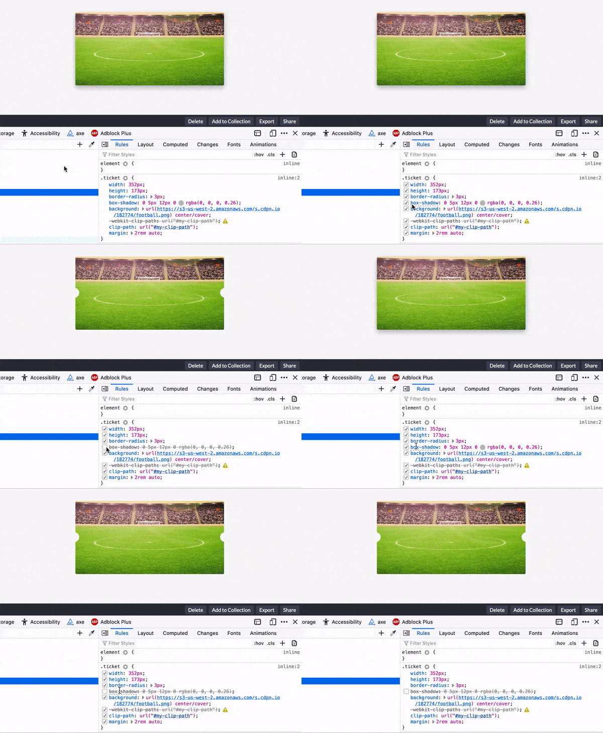
See the Pen Football Ticket - Take 2 by Ahmad Shadeed (@shadeed) on CodePen.
Instead of using CSS Box Shadow for the filter, I will use a CSS filter for that purpose. I added the following, and it didn’t work:
.ticket {
  filter: drop-shadow(0 3px 10px #000);
}
After some research, I got that this should be applied to the parent element instead, so I went and added a parent with the shadow filter applied to it.
It’s possible to add it to the body! But this is not good for sure, even for testing purposes. I wrapped the ticket in an element and added the following:
.ticket-wrapper {
  filter: drop-shadow(0 3px 10px #000);
}
Here is the result. Notice how the shadow is following the clipped shape nicely.
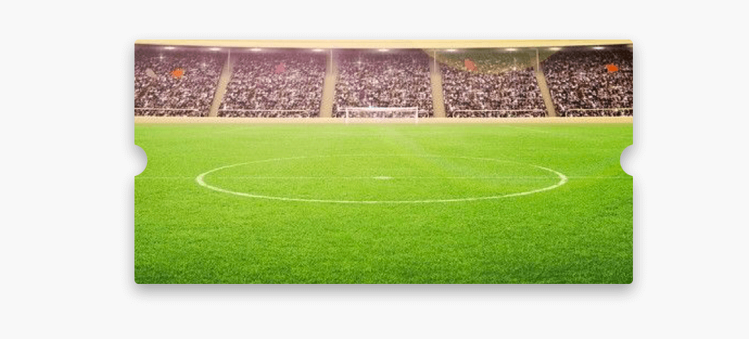
See the Pen Football Ticket - Take 3 by Ahmad Shadeed (@shadeed) on CodePen.
I wanted to test what would happen if the ticket size becomes bigger. I noticed something weird.
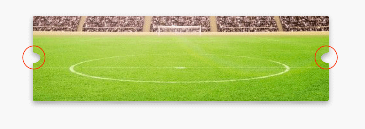
The half-circles at the left and right are stretched weirdly, which is not the desired result. I want the clipPath to be dynamic and fluid as its content.
I tried a lot to draw custom paths and did research about that. I learned how to manually draw an SVG path by using the arc path command.
<svg>
  <clipPath id="my-clip-path" clipPathUnits="userSpaceOnUse">
    <path
      d="M 0 0 H 352 V 75 a 1 1 0 0 0 0 25 V 173 H 0 V 95 a 1 1 0 0 0 0 -25 V 0"
    ></path>
  </clipPath>
</svg>
The above only works when the ticket size is fixed since I entered the width 352 and height 173 as fixed values in the path. When the size is fluid, the clipPath doesn’t expand with the ticket width. To fix that, the path values should be converted from absolute to relative again using this tool.
Before
<svg>
  <clipPath id="my-clip-path" clipPathUnits="userSpaceOnUse">
    <path
      d="M 0 0 H 352 V 75 a 1 1 0 0 0 0 25 V 173 H 0 V 95 a 1 1 0 0 0 0 -25 V 0"
    ></path>
  </clipPath>
</svg>
After
<svg>
  <clipPath id="my-clip-path" clipPathUnits="objectBoundingBox">
    <path
      d="M0,0 H1 V0.434 a0.003,0.006,0,0,0,0,0.145 V1 H0 V0.549 a0.003,0.006,0,0,0,0,-0.145 V0"
    ></path>
  </clipPath>
</svg>
Since the issue is related to resizing, I thought about having two paths. Each path will be used based on the ticket size.

Here is how the SVG looks after converting the above path values to relative. I saw the need for another path so I added a third one.
<svg>
  <clipPath id="my-clip-path" clipPathUnits="objectBoundingBox">
    <path
      class="path-big"
      d="M0,0 H1 V0.434 a0.001,0.006,0,0,0,0,0.145 V1 H0 V0.549 a0.001,0.006,0,0,0,0,-0.145 V0"
    ></path>
    <path
      class="path-middle"
      d="M0,0 H1 V0.434 a0.002,0.006,0,0,0,0,0.145 V1 H0 V0.549 a0.002,0.006,0,0,0,0,-0.145 V0"
    ></path>
    <path
      class="path-small"
      d="M0,0 H1 V0.434 a0.003,0.006,0,0,0,0,0.145 V1 H0 V0.549 a0.003,0.006,0,0,0,0,-0.145 V0"
    ></path>
  </clipPath>
</svg>
/*The middle and big paths are hidden by default*/
.path-big,
.path-middle {
  display: none;
}

/*Show the middle path and hide the small*/
@media (min-width: 550px) {
  .path-middle {
    display: block;
  }

  .path-small {
    display: none;
  }
}

/*Show the big path and hide the small and middle*/
@media (min-width: 750px) {
  .path-big {
    display: block;
  }

  .path-middle {
    display: none;
  }
}
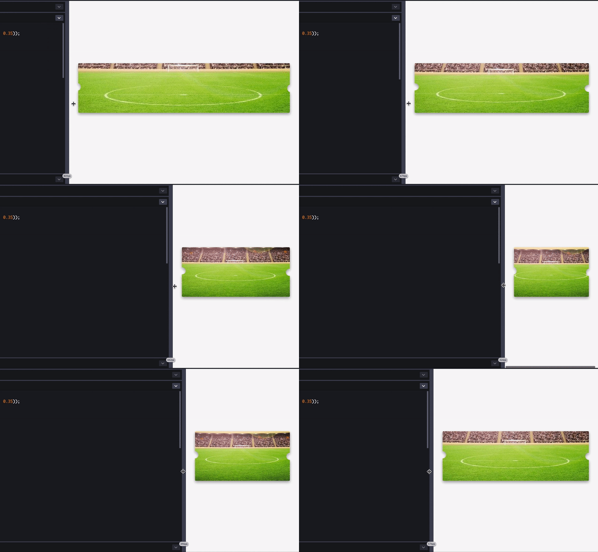
It works, but there is another issue. I’m showing and hiding the paths based on the screen size, not the ticket or its container. That means, if the ticket were placed in a grid of three columns, the big path will be shown! This is not the desired result.
See the Pen Football Ticket - Take 4 by Ahmad Shadeed (@shadeed) on CodePen.
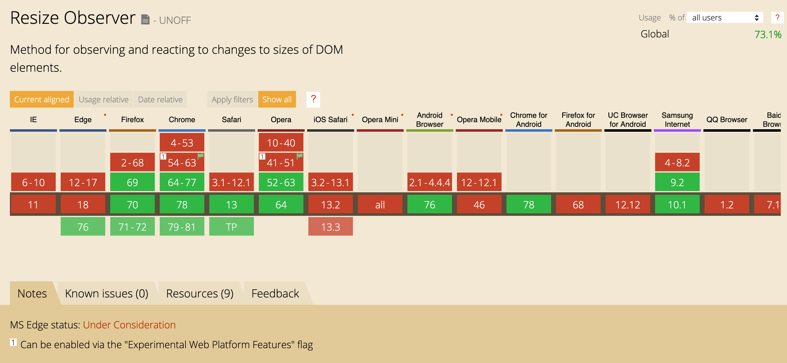
Since the issue is in making the SVG path stretch as per the ticket width, I thought about using the ResizeObserver API. The idea is to get the ticket width and substitute that value in the d attribute of the SVG path.
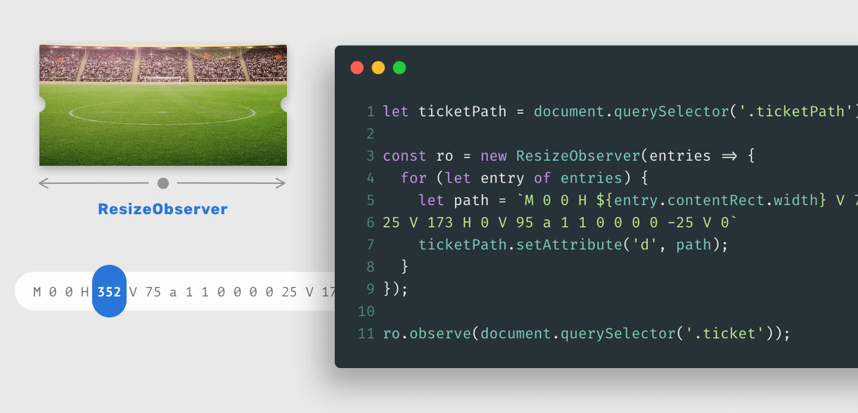
<svg>
  <clipPath id="my-clip-path" clipPathUnits="userSpaceOnUse">
    <path
      class="ticketPath"
      d="M 0 0 H 352 V 75 a 1 1 0 0 0 0 25 V 173 H 0 V 95 a 1 1 0 0 0 0 -25 V 0"
    ></path>
  </clipPath>
</svg>

<div class="ticket-wrapper">
  <div class="ticket"></div>
</div>
let ticketPath = document.querySelector(".ticketPath")

const ro = new ResizeObserver((entries) => {
  for (let entry of entries) {
    let path = `M 0 0 H ${entry.contentRect.width} V 75 a 1 1 0 0 0 0 25 V 173 H 0 V 95 a 1 1 0 0 0 0 -25 V 0`
    ticketPath.setAttribute("d", path)
  }
})

ro.observe(document.querySelector(".ticket"))
Now when the ticket is resized, the path will be modified based on its width. ResizeObserver is powerful!
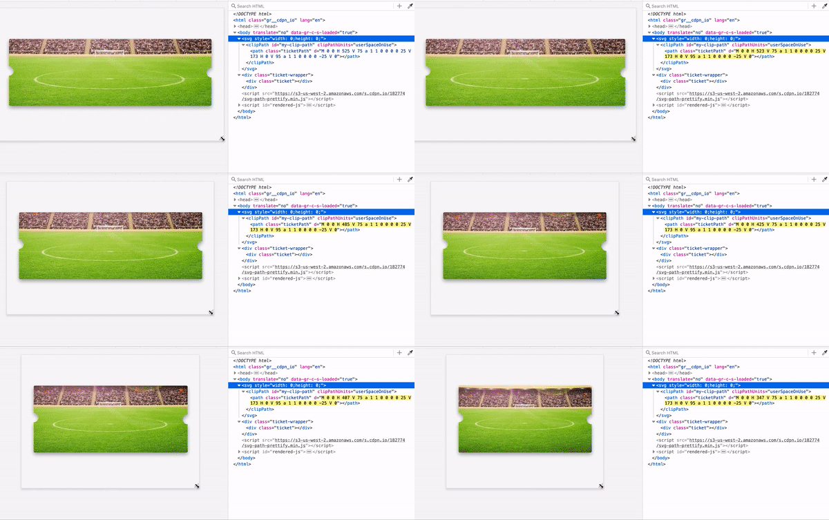
See the Pen Football Ticket - Resize Observer by Ahmad Shadeed (@shadeed) on CodePen.
I thought about combining CSS Masks and Radial Gradients. Let’s explore that. I want to create a gradient with a transparent circle, and the rest will be solid.
.elem {
  background: radial-gradient(
    circle at left center,
    transparent 10px,
    black 11px,
    black 55%,
    transparent 0
  );
}
The result will be as the following:

For our case, I need to have two transparent cut-out circles, so I will duplicate the gradient and make them two.
.elem {
  background: radial-gradient(
      circle at left center,
      transparent 10px,
      black 11px,
      black 55%,
      transparent 0
    ), radial-gradient(circle at right center, transparent 10px, black
        11px, black 55%, transparent 0);
}
Below is a GIF that explains how the above works.
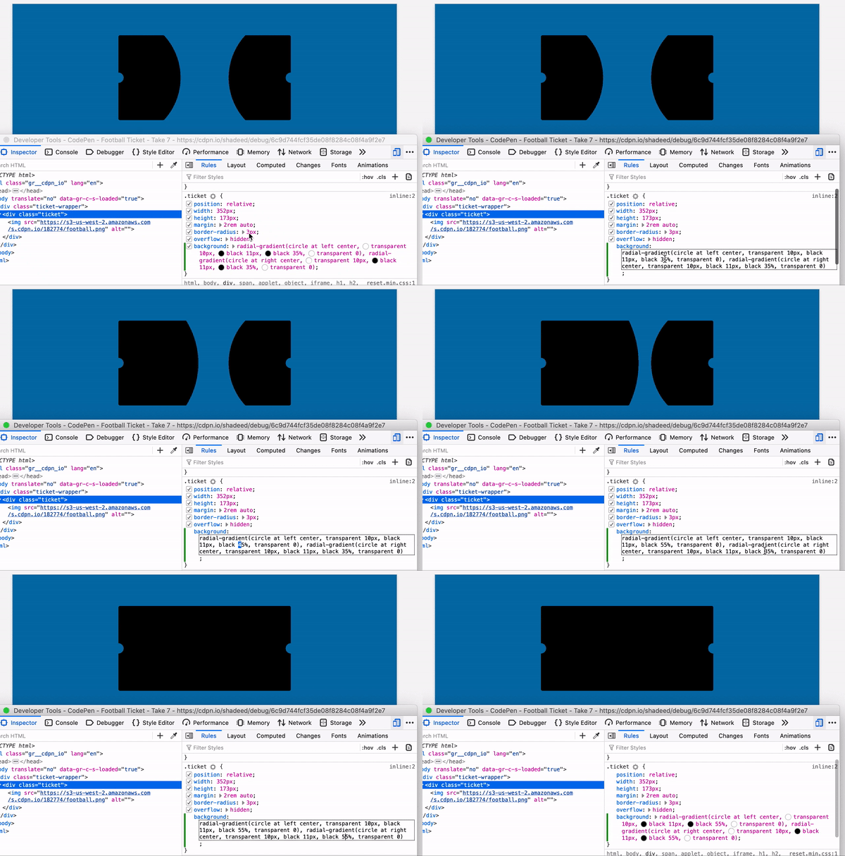
Now that the gradient is explained let’s use that as a mask image.
.ticket {
  /* Other styles */
  mask-image: radial-gradient(
      circle at left center,
      transparent 10px,
      black 11px,
      black 55%,
      transparent 0
    ), radial-gradient(circle at right center, transparent 10px, black
        11px, black 55%, transparent 0);
}
It works! By far, this solution is good for me. I can control the size of the cut-out circles, and they don’t stretch on resizing.
See the Pen Football Ticket - Take 8 by Ahmad Shadeed (@shadeed) on CodePen.
The idea is to add two pseudo-elements; each one will be on either left or right sides. I added the following CSS:
.ticket {
  position: relative;
}

.ticket:after,
.ticket:before {
  content: "";
  position: absolute;
  top: calc(50% - 10px);
  width: 20px;
  height: 20px;
  background: #f8f8f8;
  border-radius: 50%;
}

.ticket:before {
  left: -10px;
}

.ticket:after {
  right: -10px;
}

.ticket:before,
.ticket:after {
  background: #000;
}
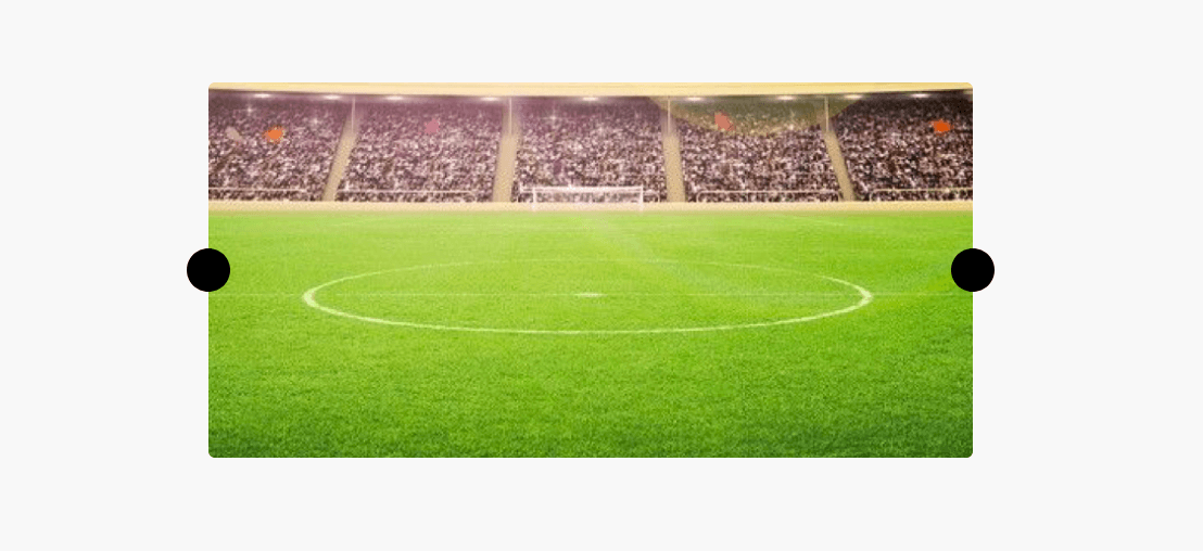
Now, I will hide the outer half of each circle by adding overflow: hidden to the ticket element.
.ticket {
  /* Other styles */
  overflow: hidden;
}
The one downside for this technique is that it’s doesn’t work when the background color change.

See the Pen Football Ticket - Take 7 by Ahmad Shadeed (@shadeed) on CodePen.
My favorite solutions are CSS Masks and ResizeObserver. That doesn’t mean that the rest are bad. I enjoyed learning and exploring all of the above techniques.
And that’s a wrap. Do you have a comment or a suggestion? Please feel free to ping me on @shadeed9.
此内容由惯性聚合(RSS阅读器)自动聚合整理,仅供阅读参考。 原文来自 — 版权归原作者所有。