


I spent years teaching CSS layout on this blog. I put everything I know into The Layout Maestro course: 70+ lessons and 150+ interactive examples that teach you how to think CSS layouts, not just memorize syntax.
👋 This article has been expanded into a new project called Defensive CSS. Due to the fact that the content here will not be updated, I recommend you to read defensivecss.dev instead.
Oftentimes, we wish that there was a way to avoid a certain CSS issue or behaviors from happening. You know, content is dynamic, and things can change on a web page, thus increasing the possibility of a CSS issue or a weird behavior.
Defensive CSS is a collection of snippets that can help you in writing CSS that is protected. In other words, you will have fewer issues in the future. If you follow my blog, you might read an article I wrote a while back which is called “The just in case mindset”. This is built upon it, and will be an ongoing list of snippets. If you have any suggestions, please feel free to let me know about it.
background-repeatjustify-content: space-between
CSS flexbox is one of the most useful CSS layout features nowadays. It’s tempting to add display: flex to a wrapper and have the child items ordered next to each other.
The thing is when there is not enough space, those child items won’t wrap into a new line by default. We need to change that behavior with flex-wrap: wrap.
Here is a typical example. We have a group of options that should be displayed next to each other.
.options-list {
  display: flex;
}
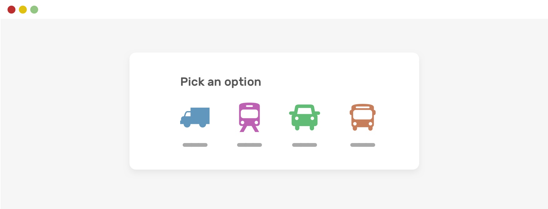
When there is less space, horizontal scrolling will occur. That’s should be expected and isn’t actually a “problem”.
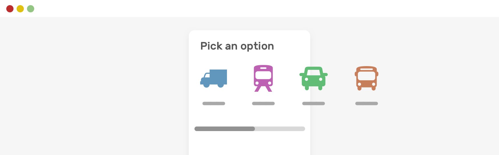
Notice how the items are still next to each other. To fix that, we need to allow flex wrapping.
.options-list {
  display: flex;
  flex-wrap: wrap;
}

A general rule of thumb when using flexbox is to allow wrapping unless you want a scrolling wrapper. That’s another thing, but try to use flex-wrap to avoid unexpected layout behaviors (horizontal scrolling, in our case).
We developers need to account for different content lengths. That means, spacing should be added to a component, even though it seems like not needed.
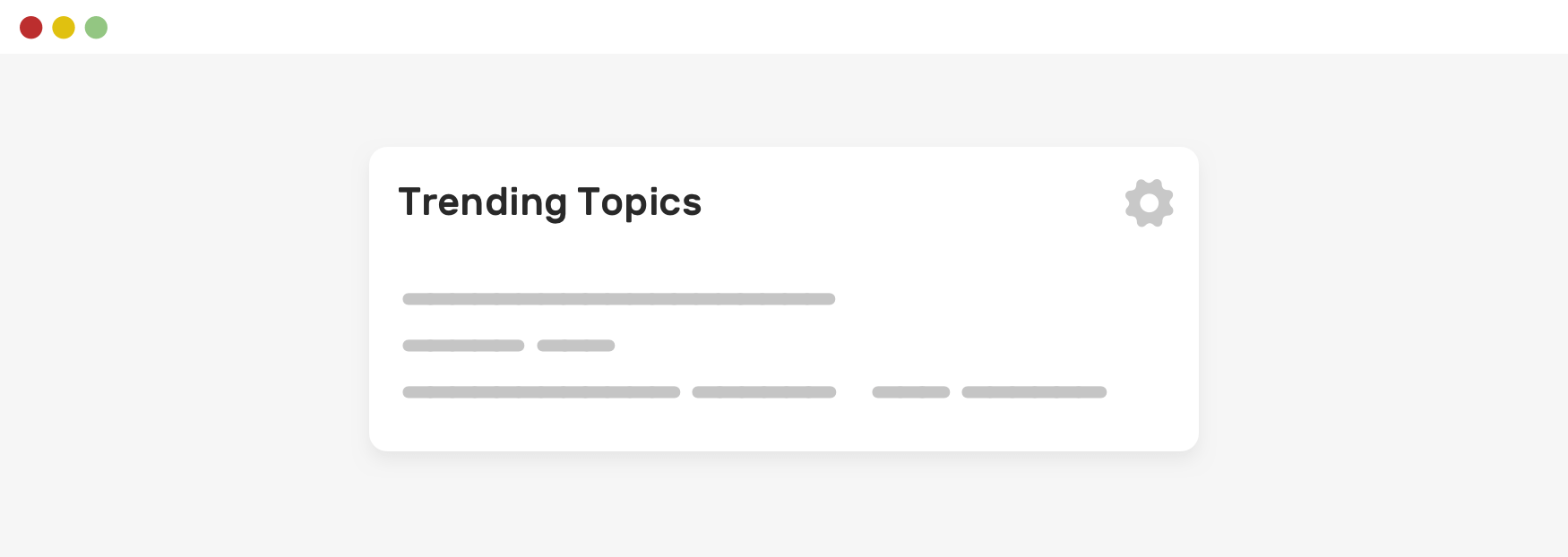
In this example, we have a section title and an action button on the right side. Currently, it looks okay. But let’s see what happens when the title is longer.
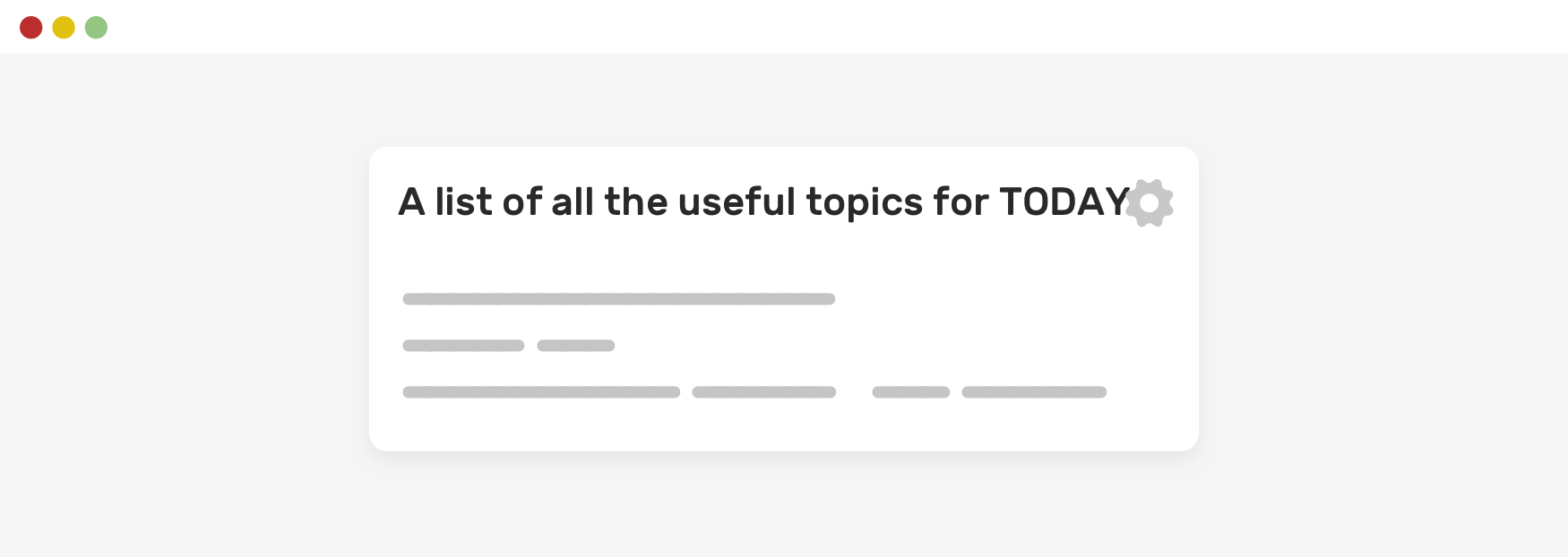
Notice how the text is too close to the action button? You might be thinking about multi-line wrapping, but I will come to that in another section. For now, let’s focus on the spacing.
If the title has spacing and text truncation, we won’t see such an issue.
.section__title {
  margin-right: 1rem;
}
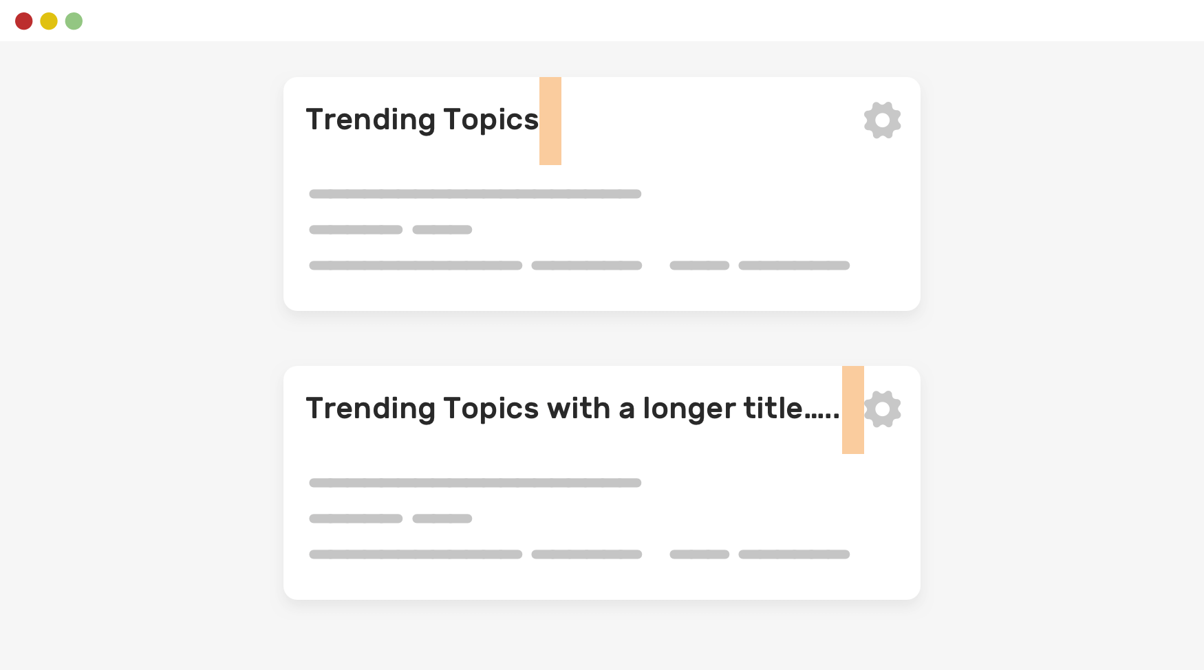
Accounting for long content is important when building layout. As you might saw in the previous, the section title is truncated when it’s too long. That is optional, but for some UIs it’s important to account for that.
For me, this is a defensive CSS approach. It’s nice to get to fix the “problem” before it actually happens.
Here is a list of people’s names and it looks perfect for now.
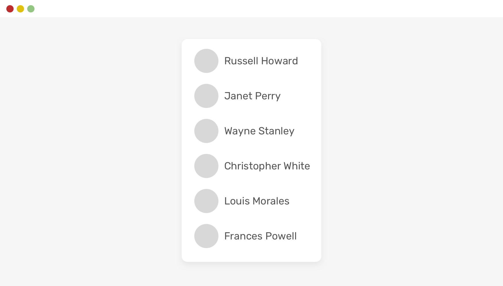
However, since this is user-generated content, we need to be careful about how to defense the layout in case of something too long.
See the following figure:
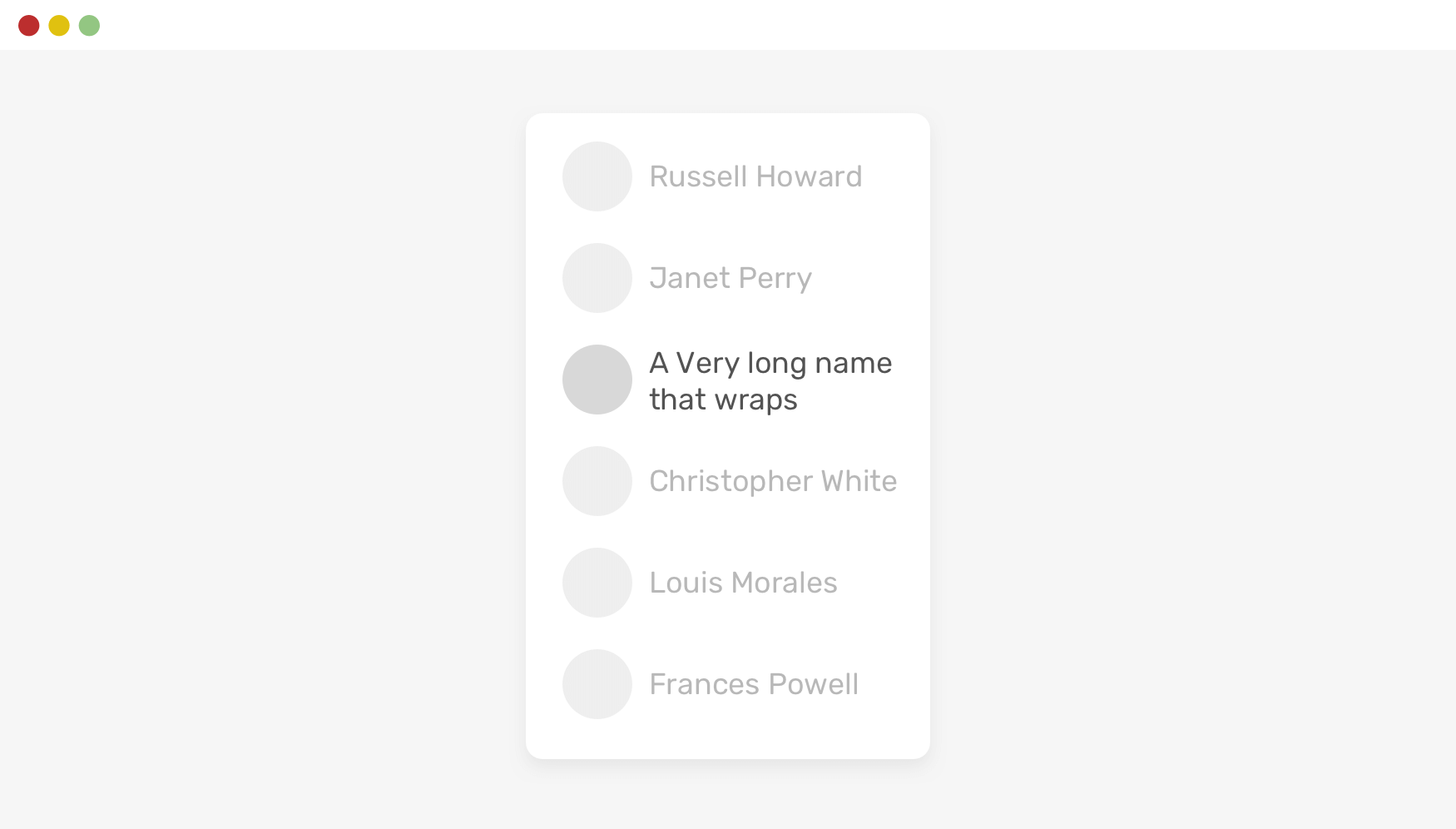
In such layouts, consistency is important. To achieve that, we can simply truncate the name by using text-overflow and its friends.
.username {
  white-space: nowrap;
  overflow: hidden;
  text-overflow: ellipsis;
}
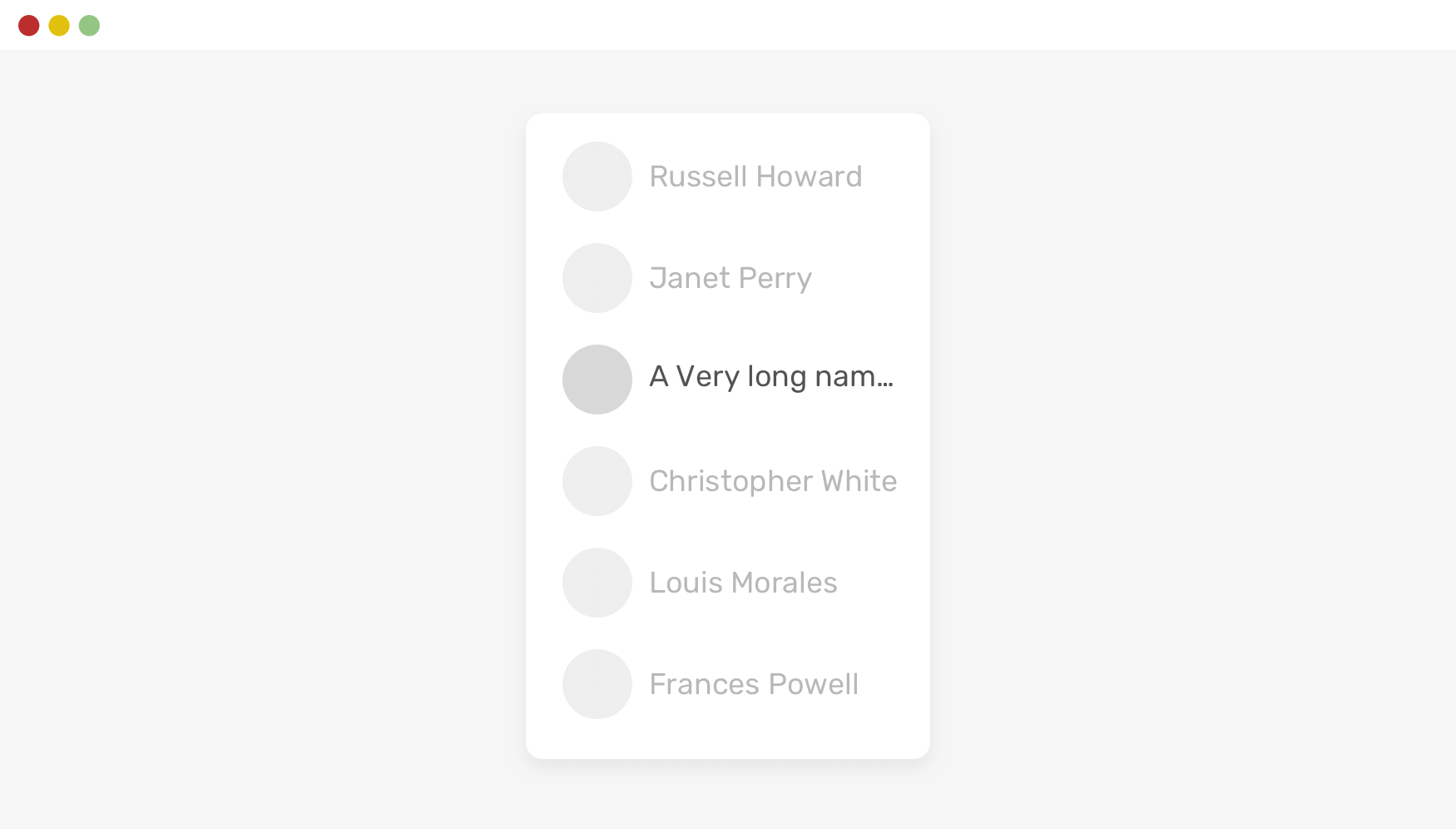
If you’re interested to sharpen your skills in handling long content in CSS, I wrote a detailed article on that topic.
When we don’t have control over an image’s aspect ratio on a web page, it’s better to think ahead and provide a solution when a user uploads an image that isn’t aligned with the aspect ratio.
In the following example, we have a card component with a photo. It looks good.

When the user uploads an image of a different size, it will be stretched. This isn’t good. Look at how the image is stretched!
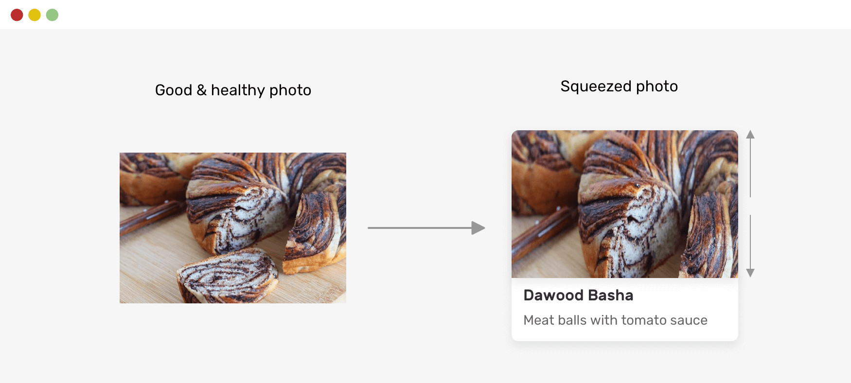
The simplest fix for that is to use CSS object-fit.
.card__thumb {
  object-fit: cover;
}
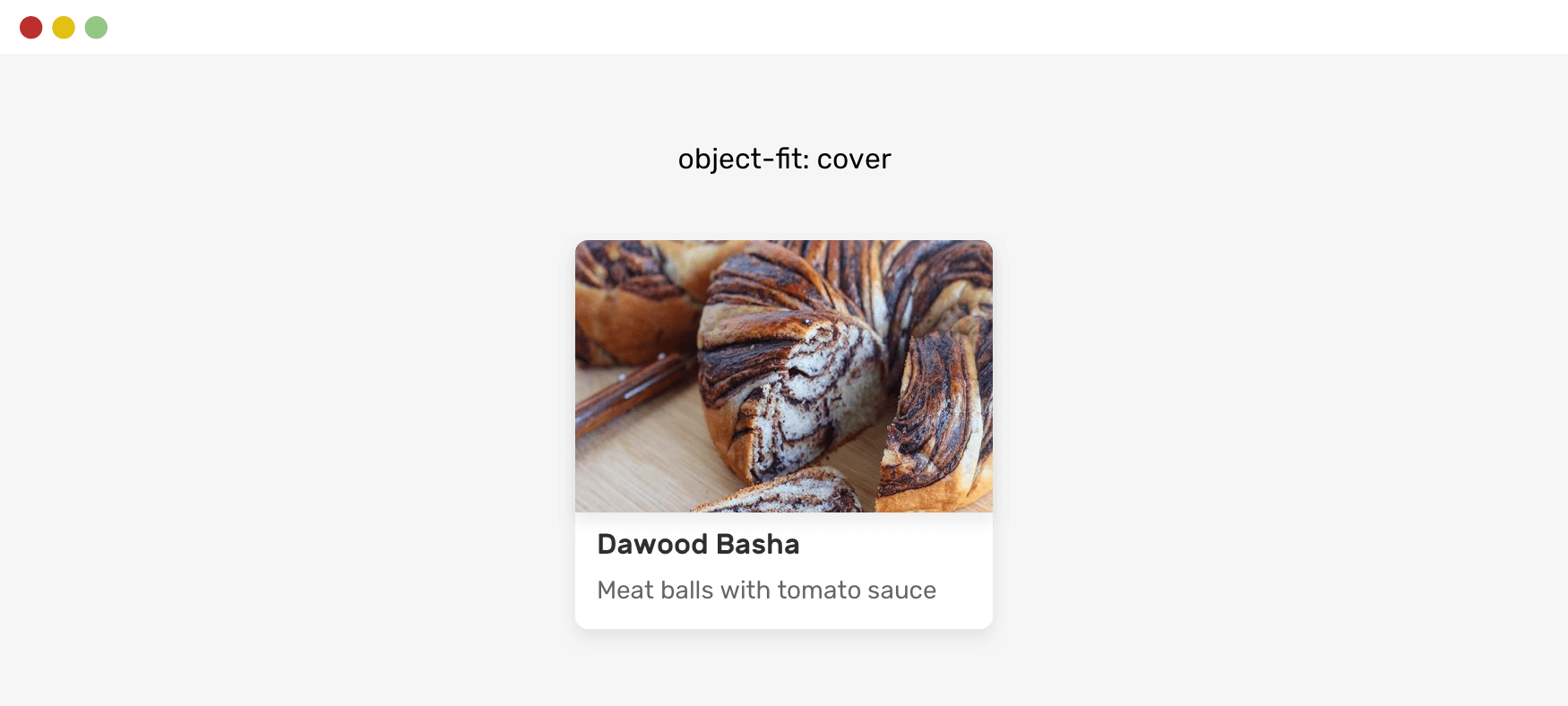
On a project level, I prefer to add object-fit to all images to avoid unexpected image results.
img {
  object-fit: cover;
}
Learn more about object-fit in this article on Smashing Magazine.
Have you ever opened a modal and started scrolling, and then when you reach the end and keep scrolling, the content underneath the modal (the body element) will scroll? This is called scroll chaining.
There have been a few hacks to make this work in the past years, but now, we can do that with CSS only, thanks to the overscroll-behavior CSS property.
In the following figure, you see the default scroll chaining behavior.
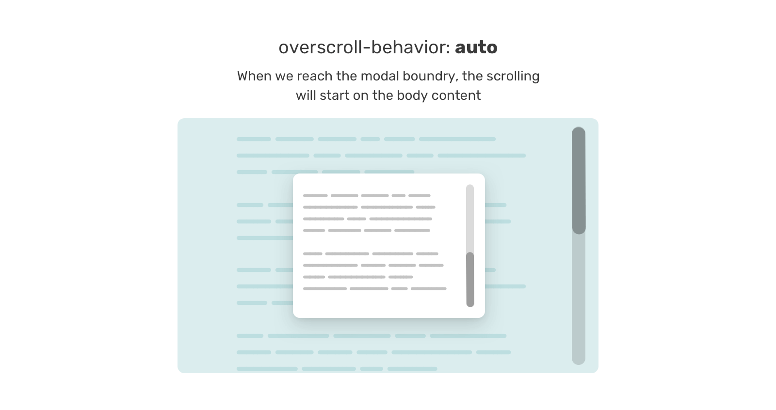
To avoid that ahead of time, we can add that to any component that needs to scroll (e.g: chat component, mobile menu.. etc). The nice thing about this property is that it won’t have an effect until there is scrolling.
.modal__content {
  overscroll-behavior-y: contain;
  overflow-y: auto;
}
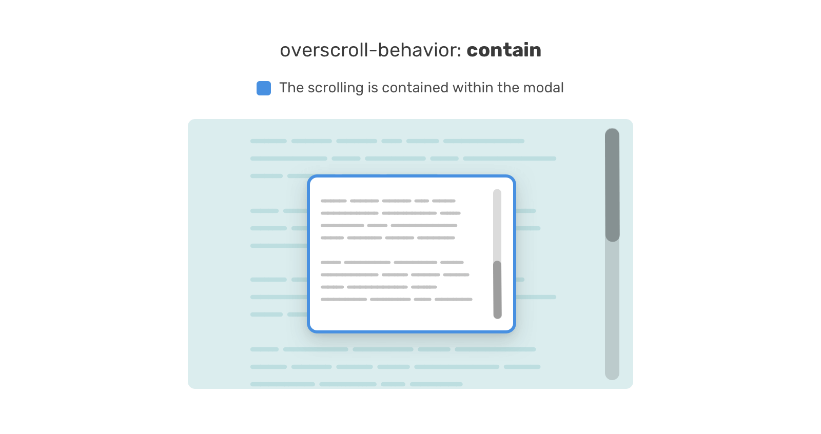
In case you want to learn more about it, I wrote a detailed article on that.
CSS variables are gaining more and more usage in web design. There is a method that we can apply to use them in a way that doesn’t break the experience, in case the CSS variable value was empty for some reason.
This is particularly useful when feeding the value of a CSS variable via Javascript. Here is an example:
.message__bubble {
  max-width: calc(100% - var(--actions-width));
}
The variable --actions-width is being used within the calc() function and its value is coming from Javascript. Let’s suppose that Javascript failed for some reason, what will happen? The max-width will compute to none.
We can avoid that ahead of time and add a fallback value to the var().
.message__bubble {
  max-width: calc(100% - var(--actions-width, 70px));
}
That way, if the variable isn’t defined, the fallback (70px) will be used. This approach can be used in case there is a possibility that the variable might fail (e.g: coming from Javascript). Otherwise, it’s not needed.
One of the common things that break a layout is using a fixed width or height with an element that has content in different lengths.
I often see a hero section with a fixed height and content that is larger than that height, which results in a broken layout. Not sure how that looks? Here it is.
.hero {
  height: 350px;
}
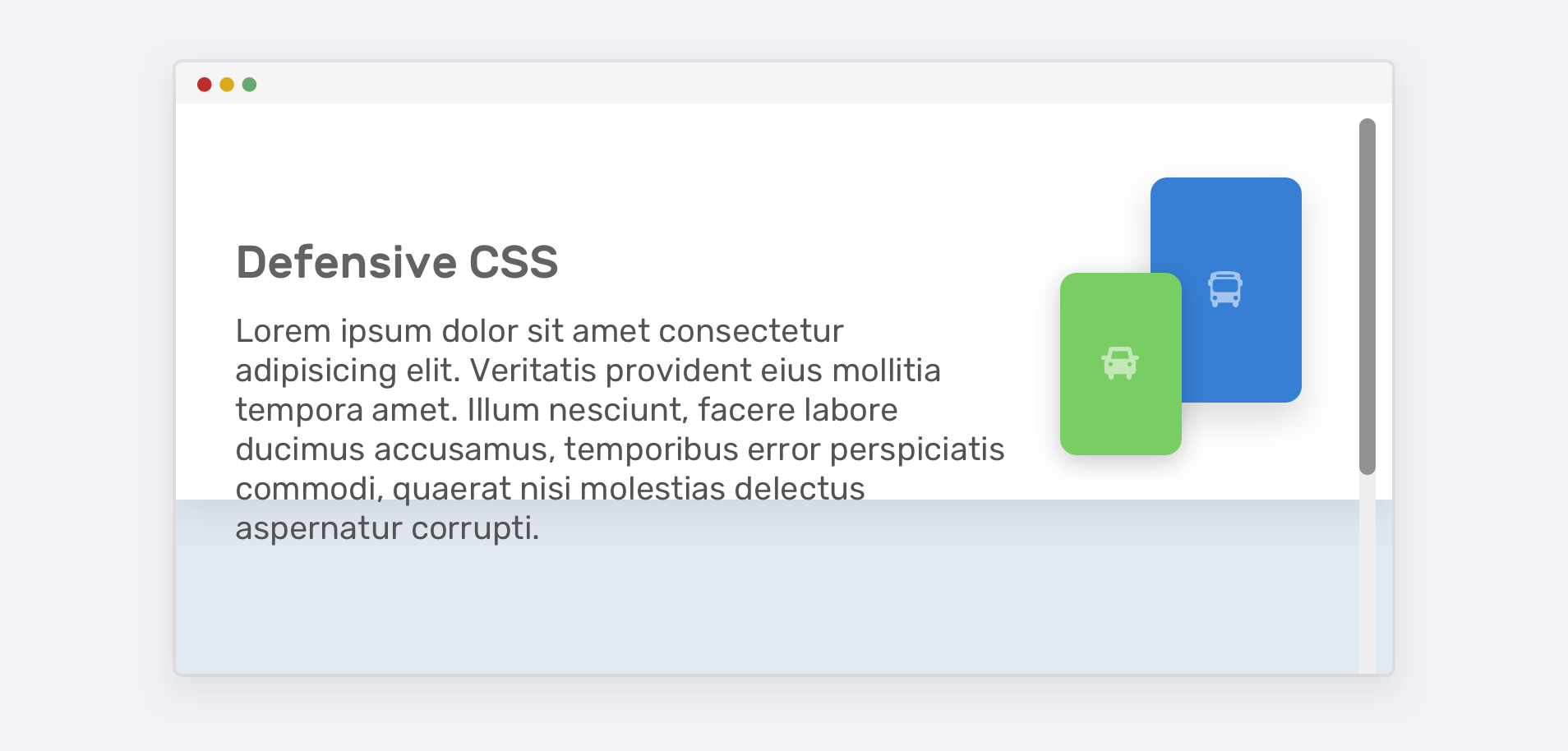
To avoid the content leaking out of the hero, we need to use min-height instead of height.
.hero {
  min-height: 350px;
}
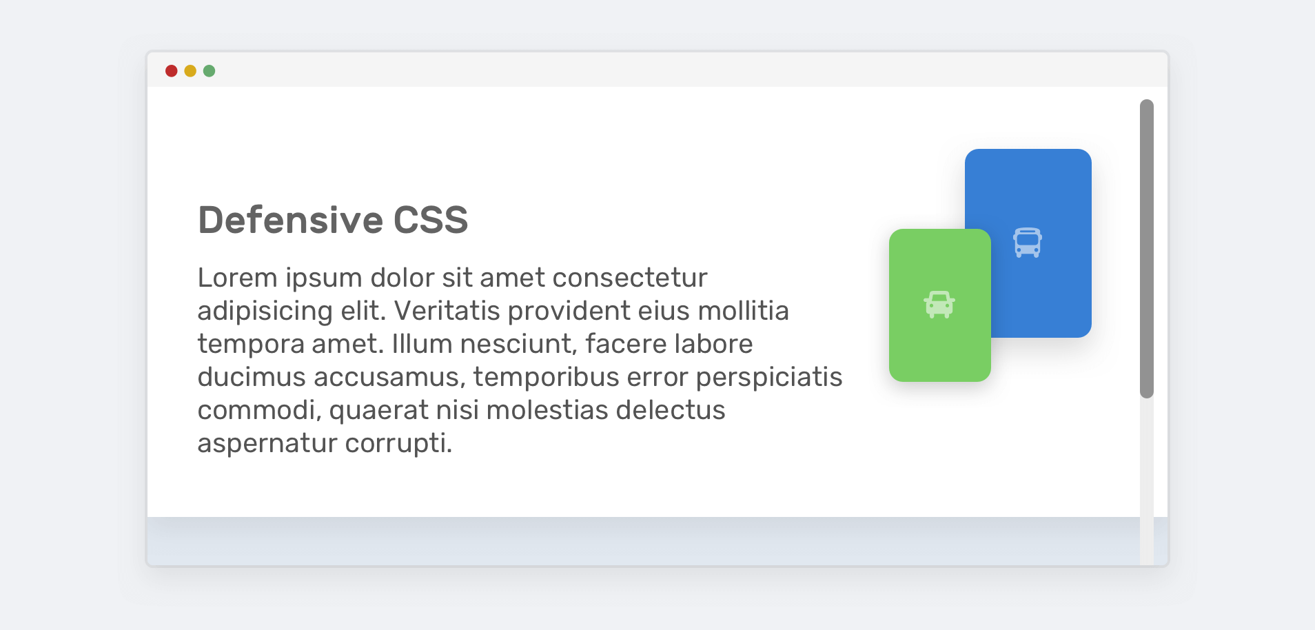
That way, if the content gets larger, the layout won’t break.
Have you ever seen a button that has its label too close to the left and right edges? This is due to using a fixed width.
.button {
  width: 100px;
}
If the button’s label is longer than 100px, it will be close to the edges. If it’s too long, the text will leak out of it. This isn’t good!
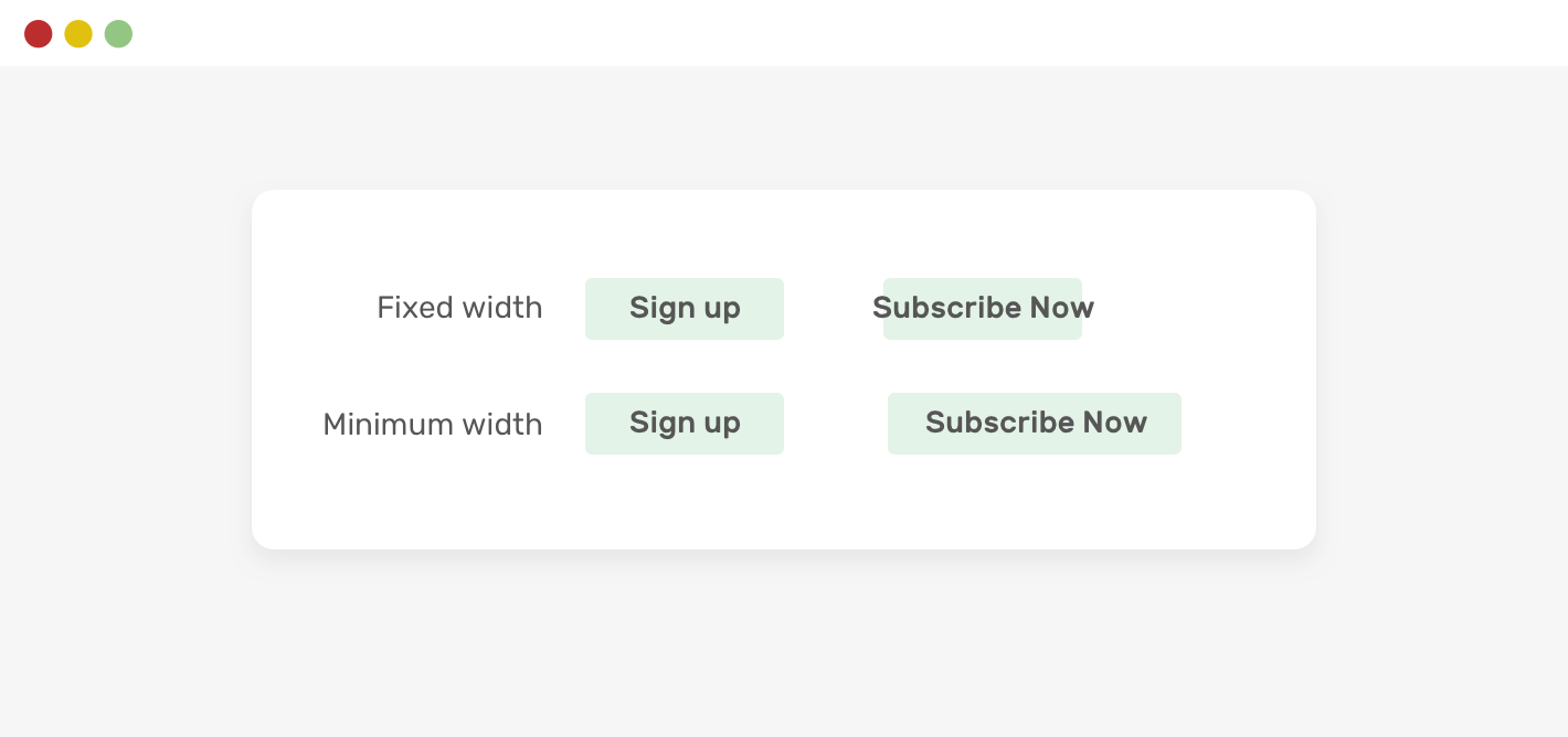
To fix that, we can simply replace width with min-width.
.button {
  min-width: 100px;
}
background-repeatOftentimes, when using a large image as a background, we tend to forget to account for the case when the design is viewed on a large screen. That background will repeat by default.
This mostly won’t be visible on a laptop screen, but it can be seen clearly on larger screens.
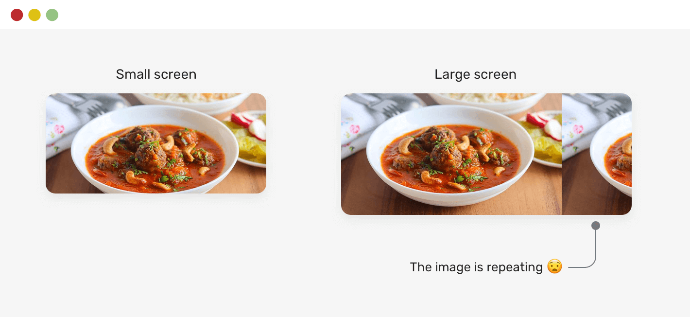
To avoid that behavior in advance, make sure to reset background-repeat.
.hero {
  background-image: url("..");
  background-repeat: no-repeat;
}
Sometimes, it’s so tempting to build a component and only test by resizing the browser’s width. Testing against the browser’s height can reveal some interesting problems.
Here is one that I’ve seen multiple times. We have an aside component with main and secondary links. The secondary links should be positioned at the very bottom of the aside section.
Consider the following example. The main and secondary navigation looks okay. In the example that I saw, the developer added position: sticky to the secondary navigation so that it can stick to the bottom.
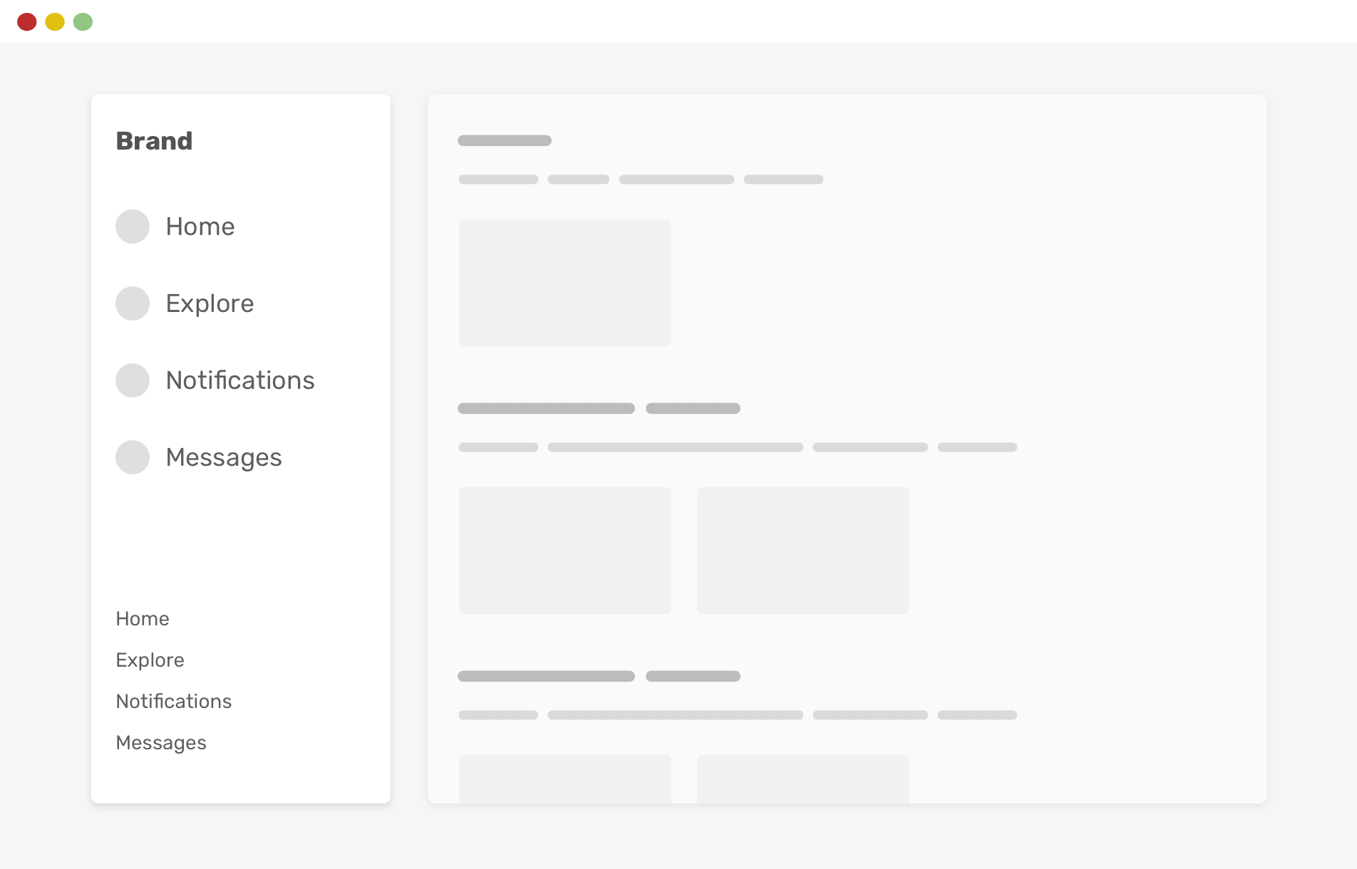
However, if the browser height is smaller, things will break. Notice how the two navigations are overlapped.
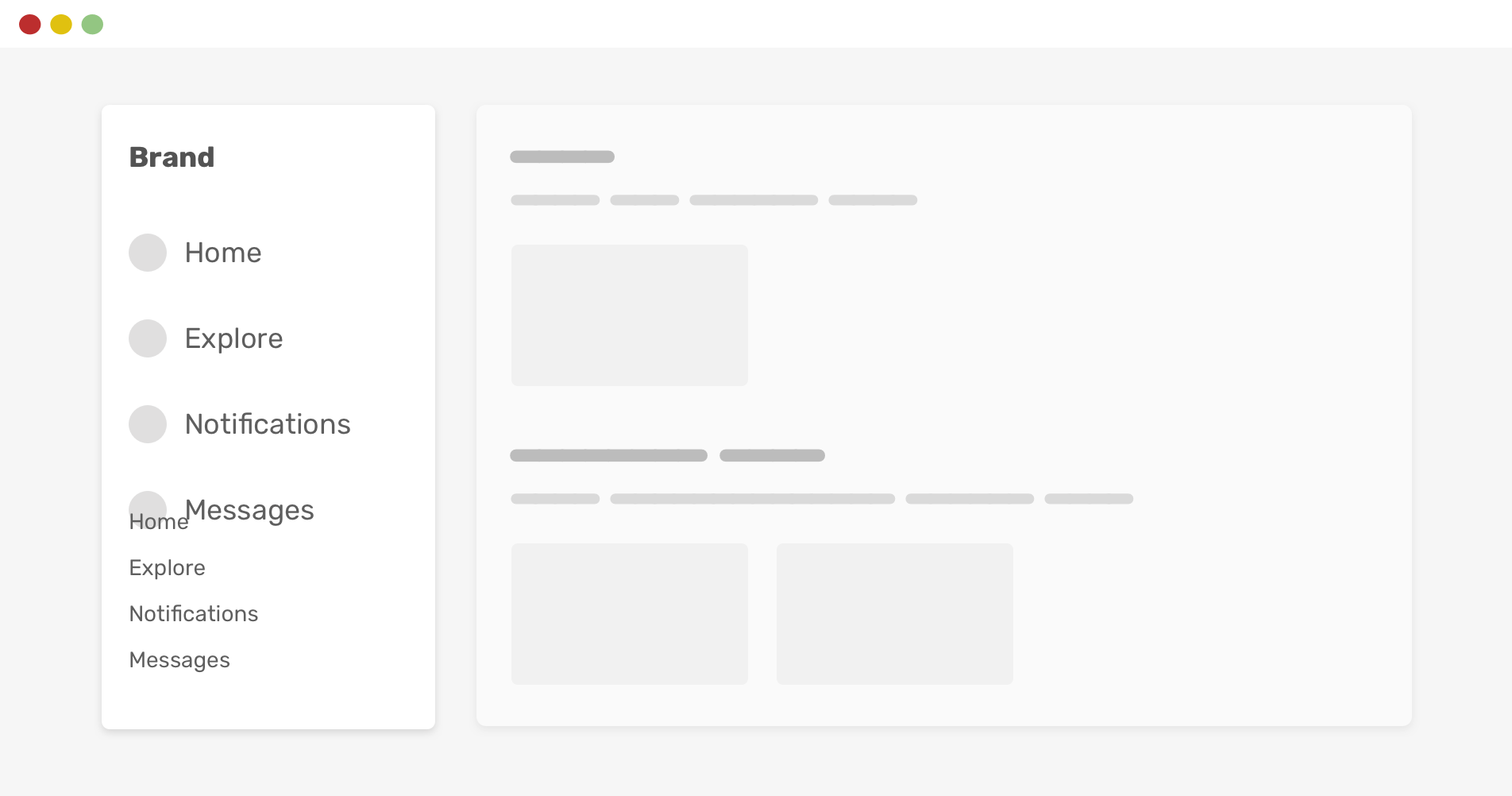
By using CSS vertical media queries, we can avoid that issue.
@media (min-height: 600px) {
  .aside__secondary {
    position: sticky;
    bottom: 0;
  }
}
That way, the secondary navigation will only be sticked to the bottom if the viewport height is larger than or equals 600px. Much better, right?
There are probably better ways to implement that behavior (like using margin-auto) but I’m focusing on the vertical query for this example.
If I want to explain using CSS vertical media query, I need to write a full article about it. The good news is that I already wrote one, in case you’re interested.
justify-content: space-betweenIn a flex container, you might use justify-content to space the child items from each other. With a certain number of child items, the layout will look okay. However, when they increase or decrease, the layout will look odd.
Consider the following example.
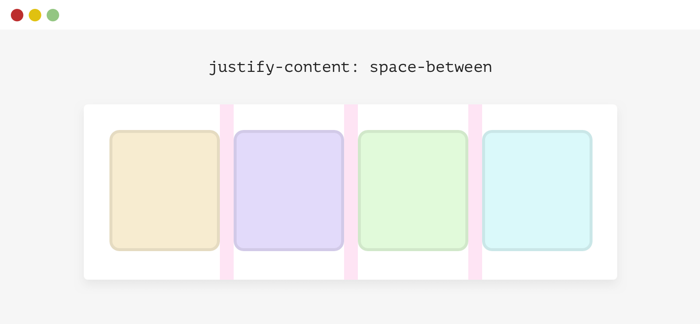
We have a flex container with four items. The spacing between each item isn’t a gap or margin, it’s there because the container has justify-content: space-between.
.wrapper {
  display: flex;
  flex-wrap: wrap;
  justify-content: space-between;
}
When the number of items is less than four, here is what will happen.
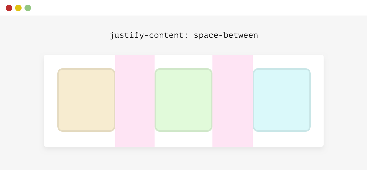
This isn’t good. There are different solutions to this:
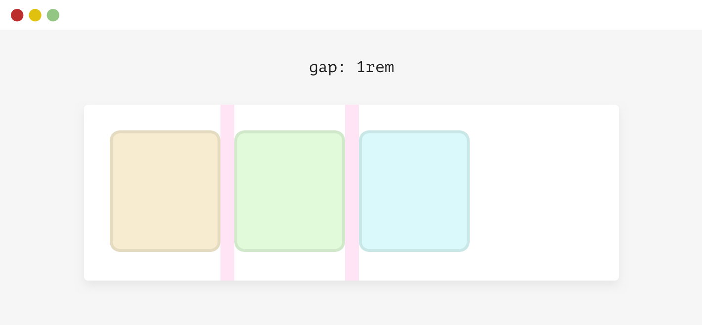
For simplicity, I will use gap.
.wrapper {
  display: flex;
  flex-wrap: wrap;
  gap: 1rem;
}
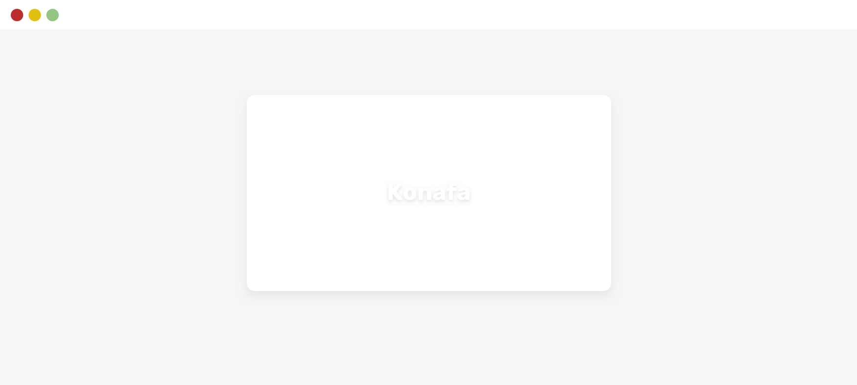
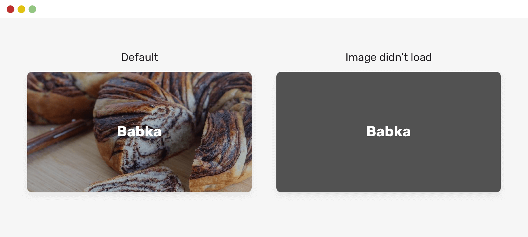
When using the text over an imaging approach, it’s important to account for the case where the image fails to load. How the text will look like?
Here is an example.

The text looks readable, but when the image fails to load, it won’t.
We fix that easily by adding a background color to the <img> element. This background will only be visible if the image fails to load. Isn’t that cool?
.card__img {
  background-color: grey;
}
Say we have a grid that contains an aside and main. The CSS looks like this:
.wrapper {
  display: grid;
  grid-template-columns: 250px 1fr;
  gap: 1rem;
}
This will break on small viewport sizes due to the lack of space. To avoid such an issue, always use a media query when using CSS grid like the above.
@media (min-width: 600px) {
  .wrapper {
    display: grid;
    grid-template-columns: 250px 1fr;
    gap: 1rem;
  }
}
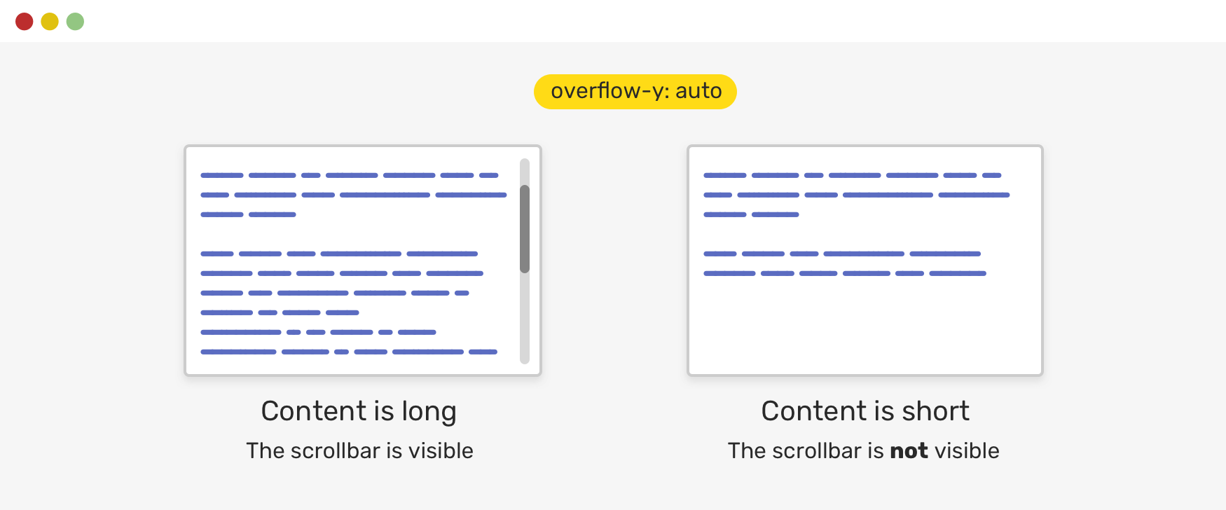
Luckily, we can control to show a scrollbar or not only in the case of having a long content. That being said, it’s highly recommended to use auto as a value for overflow.
Consider the following example.
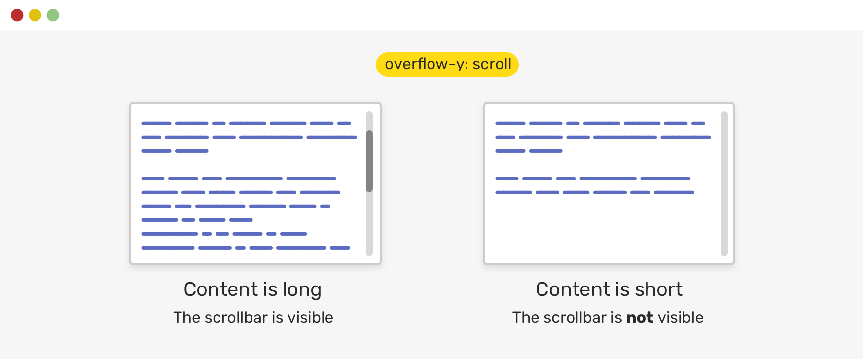
Notice how even if the content is short, there is a scrollbar visible. This isn’t good for a UI. As a designer, it’s just confusing to see a scrollbar when it’s not needed.
.element {
  overflow-y: auto;
}
With overflow-y: auto, the scrollbar will only be visible if the content is long. Otherwise, it won’t be there. Here is an updated figure.
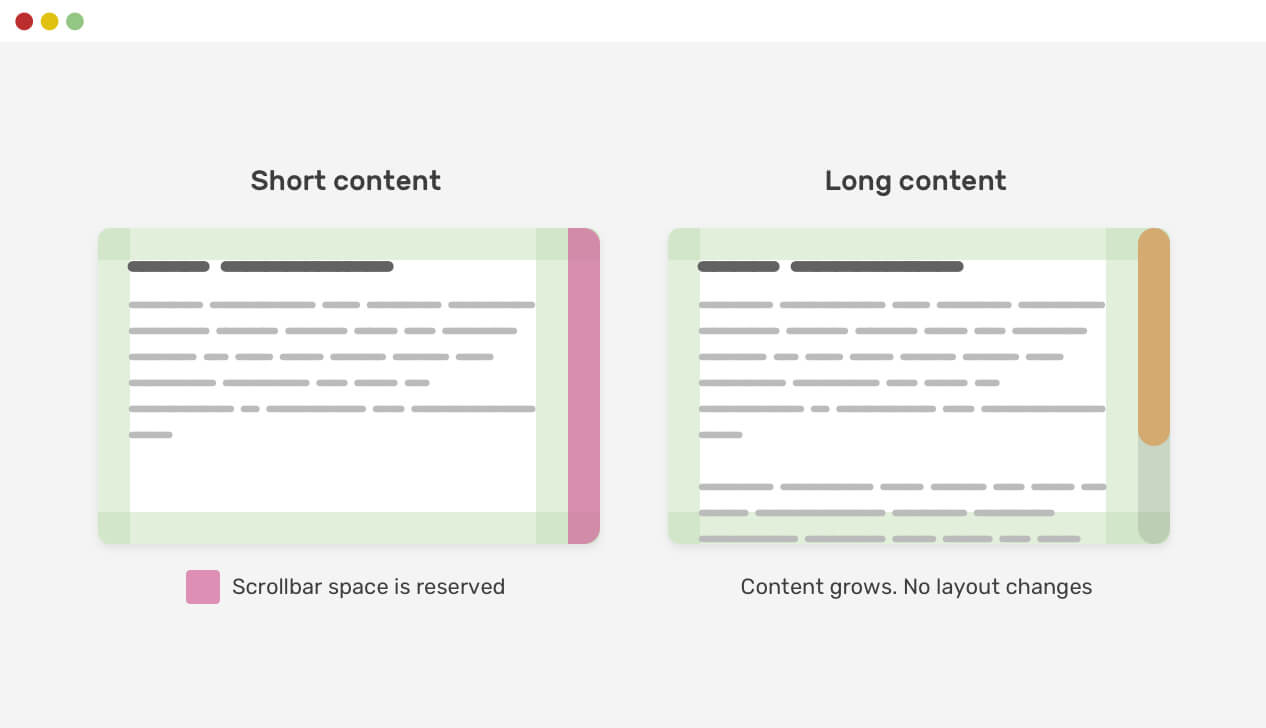
Another thing that is related to scrolling is the scrollbar gutter. Taking the previous example, when the content gets longer, adding a scrollbar will cause a layout shift. The reason the layout shift happens is to reserve a space for the scrollbar.
Consider the following figure.
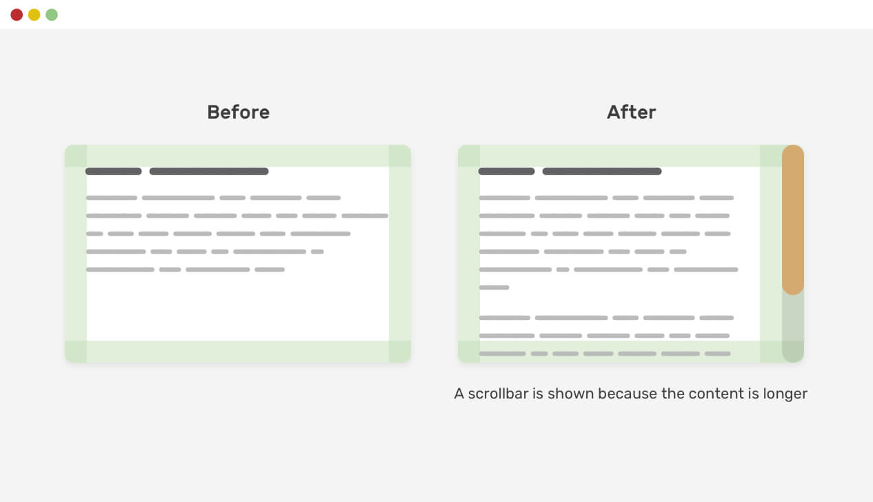
Notice how the content shifted when it became longer as a result of showing a scrollbar. We can avoid that behavior by using the scrollbar-gutter property.
.element {
  scrollbar-gutter: stable;
}
If a flex item has a text element or an image that is bigger than is longer than the item itself, the browser won’t shrink them. That is the default behavior for flexbox.
Consider the following example.
.card {
  display: flex;
}
When the title has a very long word, it won’t wrap into a new line.
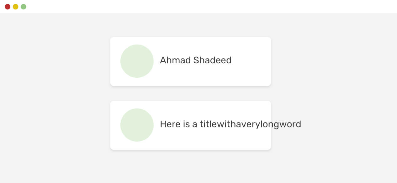
Even if we use overflow-wrap: break-word, it won’t work.
.card__title {
  overflow-wrap: break-word;
}
To change that default behavior, we need to set the min-width of the flex item to 0. That’s because the min-width default value is auto, the overflow happens.
.card__title {
  overflow-wrap: break-word;
  min-width: 0;
}
The same thing applies to a column flex wrapper, but we will use min-height: 0 instead.

Similar to flexbox, CSS grid has a default minimum content size for its child items which is auto. That means, if there is an element that is larger than the grid item, it will overflow.
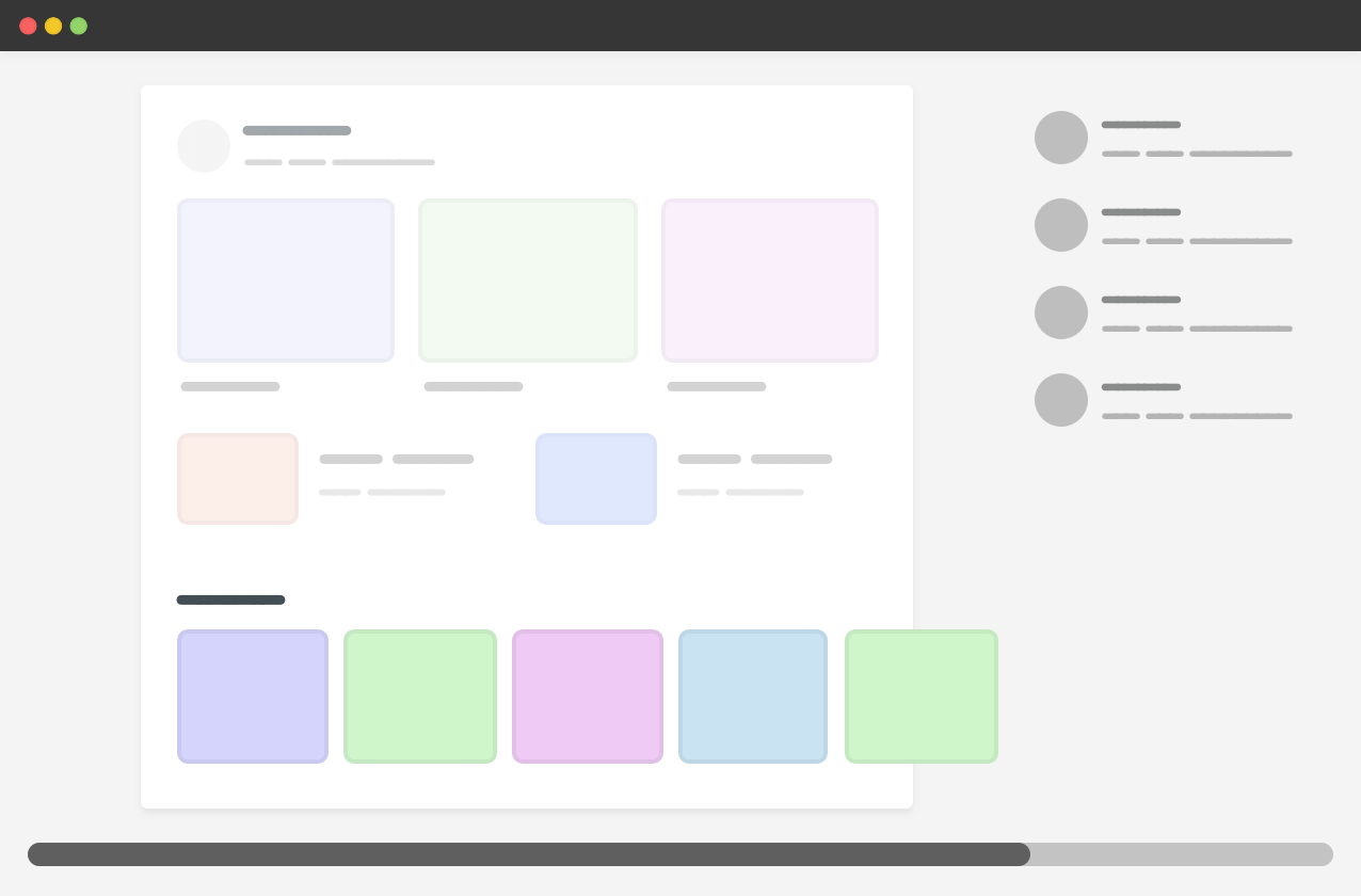
In the example above, we have a carousel within the main section. For context, here is the HTML and CSS.
<div class="wrapper">
  <main>
    <section class="carousel"></section>
  </main>
  <aside></aside>
</div>
@media (min-width: 1020px) {
  .wrapper {
    display: grid;
    grid-template-columns: 1fr 248px;
    grid-gap: 40px;
  }
}

.carousel {
  display: flex;
  overflow-x: auto;
}
Since the carousel is a flex container that doesn’t wrap, its width is larger than the main section, and thus the grid item respected that. As a result, there is horizontal scrolling.
To fix that, we have three different solutions:
minmax()min-width to the grid itemoverflow: hidden to the grid itemAs a defensive CSS mechanism, I would go for the first one which is using the minmax() function.
@media (min-width: 1020px) {
  .wrapper {
    display: grid;
    grid-template-columns: minmax(0, 1fr) 248px;
    grid-gap: 40px;
  }
}
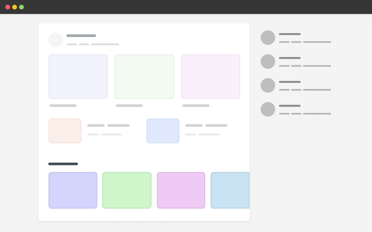
I wrote about that early this year. I also highly recommend checking “Preventing a Grid Blowout” and “You want minmax(10px, 1fr) not 1fr” by Chris Coyier.
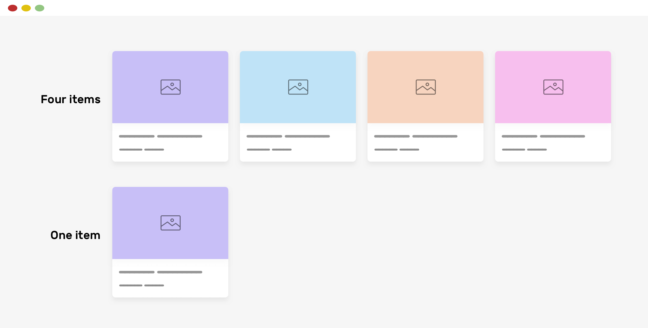
When using CSS grid minmax() function, it’s important to decide between using the auto-fit or auto-fill keywords. When used incorrectly, it can lead to unexpected results.
When using minmax() function, the auto-fit keyword will expand the grid items to fill the available space. While auto-fill will keep the available space reserved without altering the grid items width.
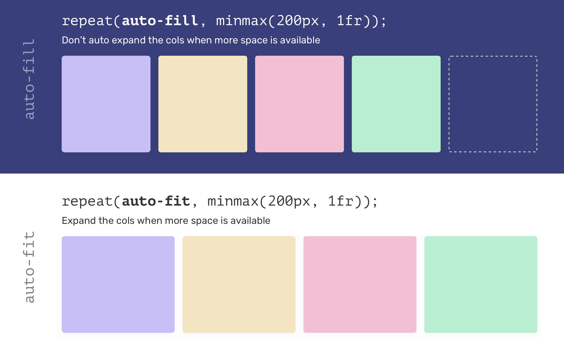
That being said, using auto-fit might lead to grid items being too wide, especially when they are less than expected. Consider the following example.
.wrapper {
  display: grid;
  grid-template-columns: repeat(auto-fit, minmax(250px, 1fr));
  grid-gap: 1rem;
}
If there is only one grid item and auto-fit is used, the item will expand to fill the container width.
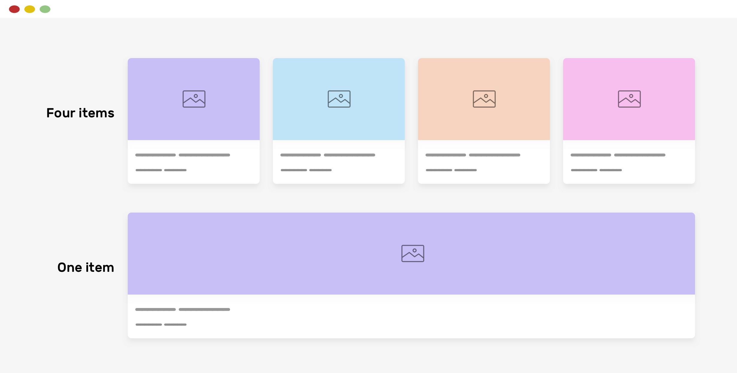
Most of the time, such behavior isn’t needed, so using auto-fill is better in my opinion.
.wrapper {
  display: grid;
  grid-template-columns: repeat(auto-fill, minmax(250px, 1fr));
  grid-gap: 1rem;
}
As a general rule them, don’t forget to set max-width: 100% to all images. This can be added to the CSS reset that you use.
img {
  max-width: 100%;
  object-fit: cover;
}
Have you ever tried using position: sticky with a child of a grid container? The default behavior for grid items is to stretch. As a result, the aside element in the example below is equal to the main section height.
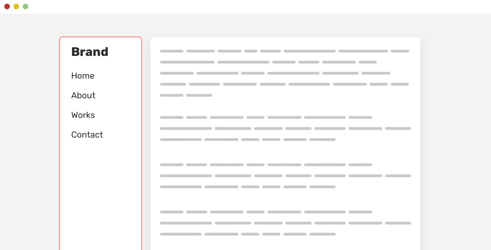
To make it work as expected, you need to reset align-self property.
aside {
  align-self: start;
  position: sticky;
  top: 1rem;
}

I wrote about that topic in detail on my blog, if you’re interested.
It’s not recommended to group selectors that are meant to work with different browsers. For example, styling an input’s placeholder needs multiple selectors per the browser. If we group the selectors, the entire rule will be invalid, according to w3c.
/* Don't do this, please */
input::-webkit-input-placeholder,
input:-moz-placeholder {
  color: #222;
}
Instead, do this.
input::-webkit-input-placeholder {
  color: #222;
}

input:-moz-placeholder {
  color: #222;
}
That’s not the end, but I really enjoyed documenting all these techniques. This is an ongoing list of defensive CSS techniques that I personally use depending on the project I’m working on. If you have anything to suggest, please get in touch via Twitter @shadeed9.
I wrote an ebook on everything about Debugging CSS.
If you’re interested, head over to debuggingcss.com for a free preview.
此内容由惯性聚合(RSS阅读器)自动聚合整理,仅供阅读参考。 原文来自 — 版权归原作者所有。