


I spent years teaching CSS layout on this blog. I put everything I know into The Layout Maestro course: 70+ lessons and 150+ interactive examples that teach you how to think CSS layouts, not just memorize syntax.
Not long ago, when managing spacing on the web, our first thought would often be to use margin. Consider a card component, for instance, which includes an image, title, and description. In such a layout, margin was the go-to solution for controlling the spacing between these elements.
In the following snippet, margin is used to add spacing below the image and title.
.card-thumb {
  margin-bottom: 12px;
}

.card-title {
  margin-bottom: 12px;
}
See the following example:

The best in class cookies at the comfort of your home.
While this works, it’s tricky to manage the spacing if an element is not displayed. Here is an example assuming that the description isn’t available.
In this case, the margin on the card title is still there, causing an inconsistency in the layout we are building. There are a lot of ways to overcome that, but for the sake of simplicity, we can add a variation class to the card.
<div class="card no-desc">
  <!-- Card content -->
</div>
.card.no-desc .card-title {
  margin-bottom: 0;
}
The problem is solved, but this isn’t an optimal solution. What if we decided to add a link? We need to add spacing again.
See the following demo and notice how there is no spacing between the description and the link.
The best in class cookies at the comfort of your home.
View the recipe
Again, we need to add spacing to the card’s description element.
.card-thumb {
  margin-bottom: 12px;
}

.card-title {
  margin-bottom: 12px;
}

.card-desc {
  margin-bottom: 12px;
}
It’s better now.
The best in class cookies at the comfort of your home.
View the recipe
As you just saw, managing spacing with CSS margin requires more work. I don’t say that it’s complex or something, but it needs more time and effort.
The thing with margins is that you need to change them if the component layout changes. In this example, let’s explore the horizontal variation of the card.
The best in class cookies at the comfort of your home.
View the recipe
Notice how the card still has the bottom margin. We need to reset that.
.card--horizontal .card-thumb {
  margin-bottom: 0;
}
Or even better, to use container queries.
@container card (min-width: 300px) {
  .card-thumb {
    margin-bottom: 0;
    margin-right: 12px;
  }
}
The best in class cookies at the comfort of your home.
View the recipe
It works but takes more time and effort.
When using margin, we need to make sure that the last item has a margin of zero. This can be simple for a one-direction layout.
li:last-child {
  margin-bottom: 0;
}
For multi-direction lists, we need to add a negative margin for both sides.
In the following example, we have a list of chips. To add the spacing, I used margins on the right and bottom for each.
.chip-item {
  margin-right: 0.5rem;
  margin-bottom: 0.5rem;
}
Toggle the checkbox to see the margins in action.
UI/UX
JavaScript
Frontend
React
HTML
Web Design
Defensive CSS
Web Development
UX Design
CSS Grid
We need to reset the bottom margin and remove the right margin from the last chip.
.chip-item:last-child {
  margin-right: 0;
}
UI/UX
JavaScript
Frontend
React
HTML
Web Design
Defensive CSS
Web Development
UX Design
CSS Grid
Next, the bottom margin. To remove it from the last row, we need to add a negative margin on the parent.
.chips-wrapper {
  margin-bottom: -0.5rem;
}
I added a line of text below the chips list to make it easier to see the difference. Try to toggle the “negative margin” checkbox.
UI/UX
JavaScript
Frontend
React
HTML
Web Design
Defensive CSS
Web Development
UX Design
CSS Grid
Notice the distance between myself and the list above.
When toggled, the bottom margin is reset.
I know that the line of text and the chips wrapper are overlapping, but that's the point. If you see that, that means we've successfully reset the bottom margin on the parent.
One of the main challenges of using margins in CSS is that we can’t predict when to add or remove a space. Oftentimes, we’ll end up with multiple CSS breakpoints to manage spacing when the content wraps into a new line.
We can use flexbox wrapping to achieve that. Let’s try it with margins.
In the following example, we have a page header that consists of:
<div class="header">
  <div class="headerStart">
    <!-- Title and description -->
  </div>
  <div class="headerEnd">
    <!-- Action button -->
  </div>
</div>
To add a margin between them, I used the following:
.headerStart {
  margin-right: 1rem;
}
Try to resize me and see how the margin is still on the right side.
It works, but when we resize the component, we need to switch the margin to be on the bottom side.
It’s possible to use a media query to check for when the item wraps, but it will still be a guess and might not work for all cases.
.headerStart {
  margin-bottom: 1rem;
}

@media (min-width: 500px) {
  .headerStart {
    margin-right: 1rem;
    margin-bottom: 0;
  }
}
Try to resize the container below.
Another solution is to add padding for both the start and end elements, then use a negative margin. It will work, but again, it’s still a hack and not ideal for all use cases.
.header {
  --space: 8px;
  padding: var(--space);
}

.headerStart,
.headerEnd {
  padding: var(--space);
}
Here it is in action.
I will explore later on solving this with a gap.
When building a layout that needs to work with both left-to-right (LTR) and right-to-left (RTL) layouts, the margin should be flipped.
Toggle the “RTL layout” in the following demo. Notice how the margin is still on the right side.
The fix is to flip the margin if the page direction is rtl.
.item {
  margin-right: 1rem;
}

html[dir="rtl"] .item {
  margin-right: 0;
  margin-left: 1rem;
}
It’s recommended to use CSS logical properties as it will make the layout work without manually flipping it.
.item {
  margin-inline-end: 1rem;
}
If you want to learn more about styling for RTL layouts, I recommend reading the RTL Styling 101 guide by yours truly.
When flexbox first came out, I learned about a concept from Harry Roberts to mock gutters between flex items. Flexbox gap wasn’t there at the time of using this technique.
The concept is to add a margin on the left and bottom side of each child, then reset that with a negative margin on the parent.
.wrapper {
  --gutter: 1rem;
  display: flex;
  flex-wrap: wrap;
  margin-left: calc(var(--gutter) * -1);
}

.wrapper > * {
  flex: 0 0 calc((100% / 3) - var(--gutter));
  margin-bottom: var(--gutter);
  margin-left: var(--gutter);
}
Here is an example of it in action. Toggle the “Outline” or the “Negative margin” checkbox and see what happens.
Did you notice that by default, the grid isn’t aligned? The left spacing is larger than the right one. When the negative margin is toggled, it’s fixed.
I used this technique because flexbox support was very good and we didn’t have a proper way to add gutters. Meet the gap property!
In simple words, the gap property is used to add gutters between flexbox or grid items. Let’s take the previous example. It’s a shorthand for column-gap and row-gap.
.wrapper {
  --gutter: 1rem;
  display: flex;
  flex-wrap: wrap;
  gap: var(--gutter);
}
See it in action.
At first, the gap property worked only in CSS grid. This was in early 2017. Three years later, gap became supported for both grid and flexbox and Safari followed in 2021.
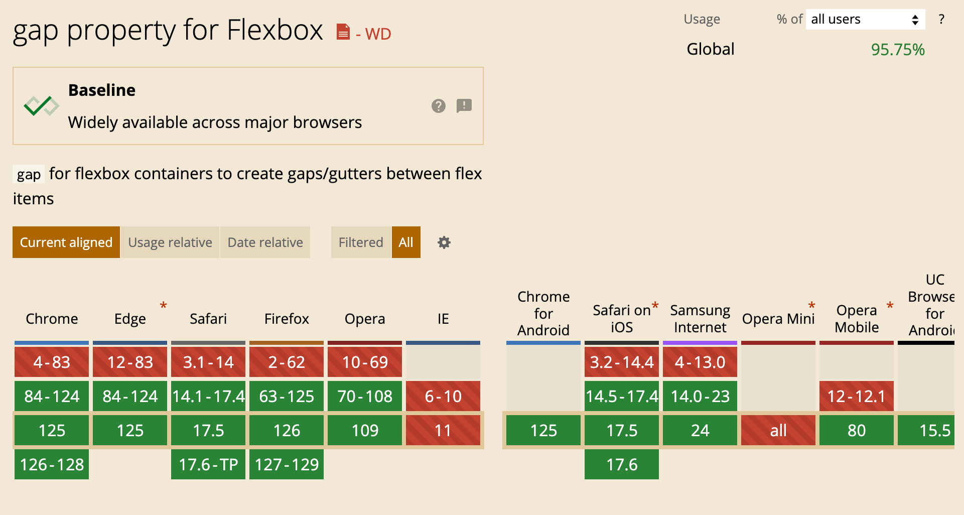
Unfortunately, we can’t detect support for gap when used with flexbox.
@supports (gap: 1rem) {
  /* This will always work */
}
The browser doesn’t know if gap: 1rem is meant for flexbox or grid. We can detect gap support for flexbox via Javascript. I wrote about this if you want to learn more.
When using flexbox or grid, it’s expected to allow the child items to wrap into a new line. When that happens, the CSS gap just works.
Let’s take the example of a page header.
.header {
  display: flex;
  flex-wrap: wrap;
  gap: 1rem;
}
The gap works conditionally. It will dynamically apply column-gap or row-gap based on the context.
If we want to flip the layout to RTL, we can do that without worrying about flipping anything. CSS gap will flip the spacing itself based on the layout direction.
.header {
  display: flex;
  flex-wrap: wrap;
  gap: 1rem;
}
As simple as that.
What I also like about CSS gap is that it works for both flexbox and grid. For example, if we have a flex container, changing it to a grid will maintain the same gap.
.page-header {
  display: flex;
  flex-wrap: wrap;
  gap: 1rem;
}

/* Variation of the page header */
.page-header--full {
  display: grid;
  grid-template-columns: 1fr 1fr;
  /* No need to add gap again */
}
Using the gap property doesn’t mean that we can’t use margins or padding. We can mix them and use whatever we want.
See the following example:
I used gap to add a space between the logo and the navigation. Within the navigation, I want the “Contact” link to be on the far right.
.nav {
  flex: 1;
  display: flex;
  flex-wrap: wrap;
  gap: 1rem;
}

.nav-item:last-child {
  margin-inline-start: auto;
}
Neat, right?
It’s common to add a margin for a specific child, then find out later that it will be removed in specific variations.
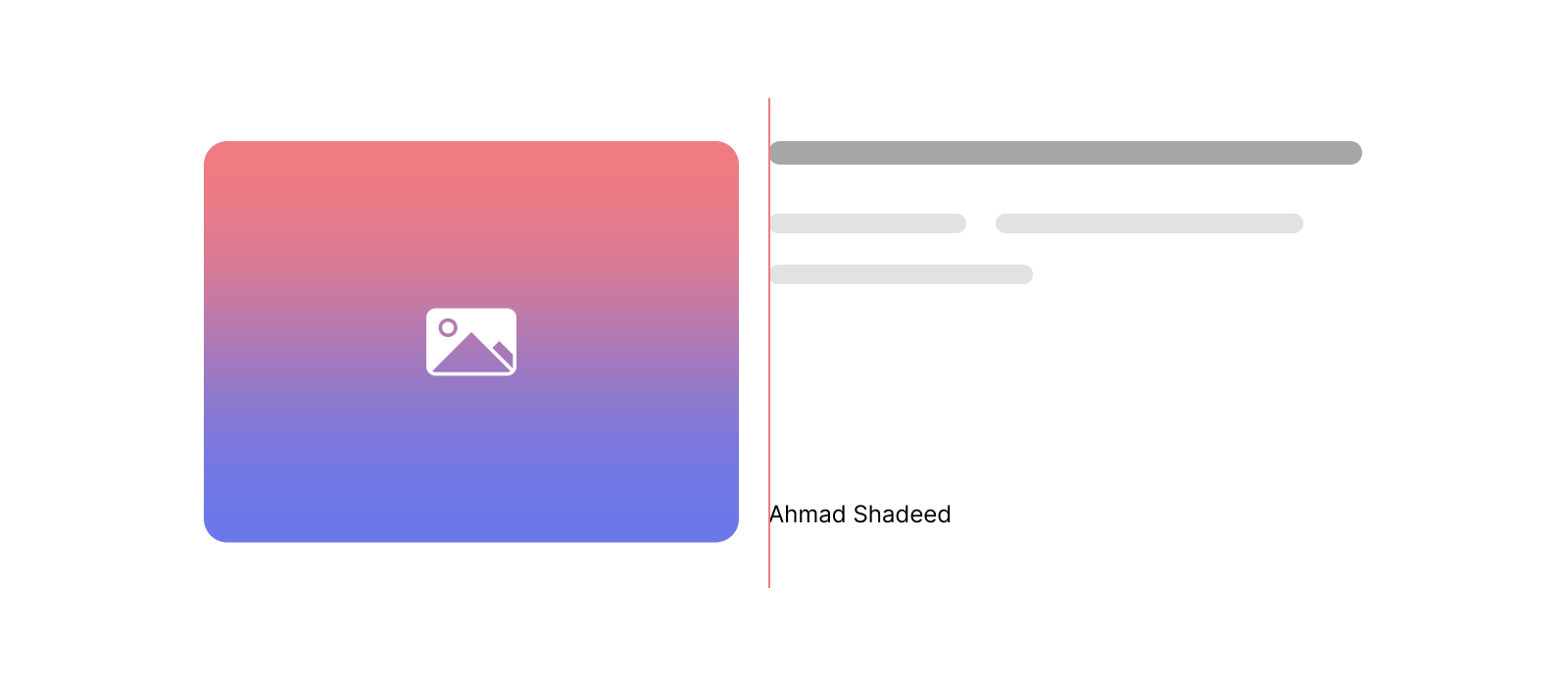
In the following figure, I added a margin-left to the author’s name.
.name {
  margin-left: 0.5rem;
}

For some reason, the designer decided to remove the author’s avatar, and now we ended up with a space because the margin was added to the name.

We can avoid that by adding the margin to the author’s avatar instead.
.avatar {
  margin-right: 0.5rem;
}
The support for CSS logical properties is getting better. Use them so your margins and paddings can work regardless of the page direction.
Building a UI that doesn’t break is impossible, but at least, you can reduce the issues that might happen:
I’m a fan of Threads app CSS. I got their new layout design at the time of writing this article.
In the following figure, we have the main layout which consists of three columns.
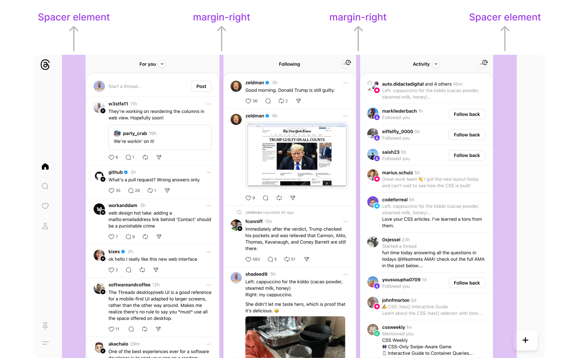
The spacing between them is a margin. Something like:
.col {
  margin-right: 12px;
}

.col:last-child {
  margin-right: 0;
}
Interesting, right? You might be thinking: “Why I should use gap if it’s not supported well?” or “If Meta isn’t using it, why should I?”
The answer is simple: just use what works for your case. There is no zero or ones.
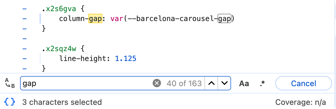
A quick search in the CSS revealed over 100 uses of the column-gap or the row-gap properties.
Cool.
I hope that I convinced you to use gap more than often. At the end of the day, use whatever works for your case. The most important thing is to build the experience for a user to complete the job they need.
Thank you.
Enjoyed the read? If you'd like to support my work, consider buying me a coffee. This interactive guide took 6 weeks, which translates to 54 coffee cups. Thanks a latte!

此内容由惯性聚合(RSS阅读器)自动聚合整理,仅供阅读参考。 原文来自 — 版权归原作者所有。