


I spent years teaching CSS layout on this blog. I put everything I know into The Layout Maestro course: 70+ lessons and 150+ interactive examples that teach you how to think CSS layouts, not just memorize syntax.
In CSS, we have two ways of sizing, intrinsic and extrinsic. The latter is the most common one which means using fixed values for the width or height of an element. The first one means that the sizing of an element depends on its content size.
Through this article, I will explore each of the intrinsic values and see how we can get the benefit of them. Also, I will explain how to use those intrinsic values in combination with CSS grid, and other CSS properties.
The extrinsic sizing simply means sizing elements (using width or height) with explicit values. Consider the following example:
.c-button {
  width: 100px;
}
The button has a width of 100px, this is called extrinsic sizing because we set it. Another example is the <div> element. By default, it’s a block element, and it means that the width of it will be 100% of its parent.
Sometimes, we want to size elements based on its content, and in that case, using extrinsic sizing doesn’t help. Let’s explore how to size with intrinsic values!
The min-content value is the intrinsic minimum width, which means that it’s equal to the width of the element’s content longest word.
According to the CSS Working Group (CSSWG):
The inline size that would fit around its contents if all soft wrap opportunities within the box were taken.
To be honest, I didn’t understand the CSSWG’s definition well, but I think it means that if we placed a box around an element, all of its content (words) should wrap, and the width of the box will be the longest word in that element. Please correct me if I’m wrong.
Consider the following example, where we have a heading.
<h2>A title for an awesome article</h2>
h2 {
  width: min-content;
}
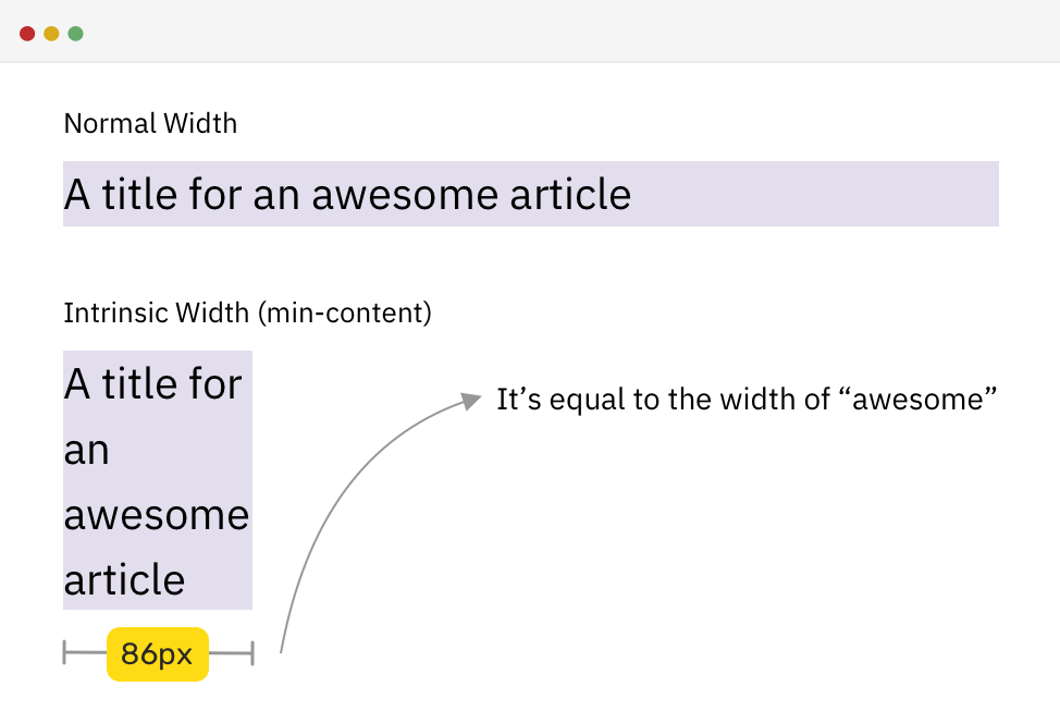
As you notice, the width of the element when min-content is used as a value for width is equal to the width of the longest word, which is “awesome” for that example.
See the Pen Intrinsic Sizing by Ahmad Shadeed (@shadeed) on CodePen.
The max-content value represents the intrinsic preferred width, which means that it’s equal to the width of the content.
Consider the same example for the heading, but with max-content used this time.
h2 {
  width: max-content;
}
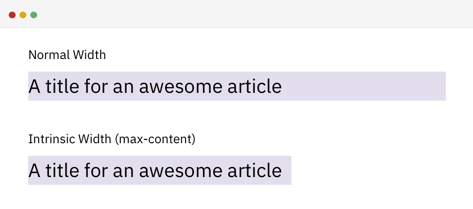
Notice how the element width became equal to the title. That’s width is dynamic, so when the title changes, it will change accordingly.
It’s a combination of using min-content and max-content. While researching, I liked this answer on Stackoverflow:
fit-content uses max-content, unless available < max-content, then it uses available. Unless available < min-content, then it uses min-content.
Let’s visualize this.
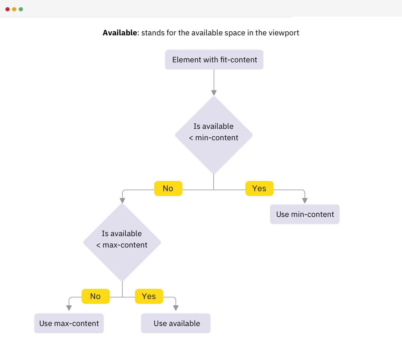
Note that available stands for the available space in the viewport. Let’s take an example to see how it works in action.
Based on the same example previously, I added the following CSS:
h2 {
  width: fit-content;
}
See the below video with captions for what is happening on viewport resize.
To recap about fit-content, it checks if the available is more than max-content, then the width is equal to max-content. If the available space is less than max-content, then the width will be equal to the available space. Finally, if the available space is less than min-content, then the width will be equal to min-content.
Now that I explained the basics of each intrinsic value, let’s move to real-life examples and use cases.
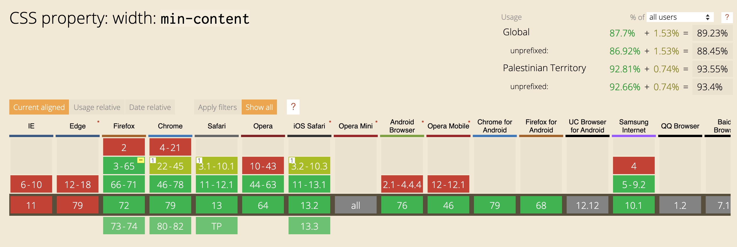
According to Can I Use, the support is good as all the major browsers support intrinsic values, except Microsoft Edge.
The intrinsic values are supported in Edge (Edgium), which is chromium based.
When we have a figure with a caption, its width will be 100% of its parent because it’s a block element.
<figure>
  <img src="blueberry-cheesecake-x.png" alt="" />
  <figcaption>..</figcaption>
</figure>
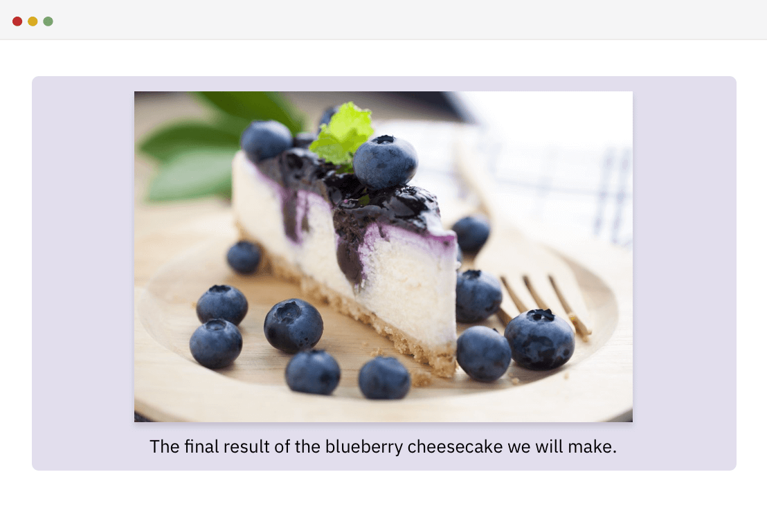
The desired behavior is that the figure should wrap to the width of the image, which will keep the text wrapped below the image. max-content to the rescue! By adding it to the figure element, it will make the figure width equal to its content.
figure {
  width: max-content;
  margin-left: auto;
  margin-right: auto;
}
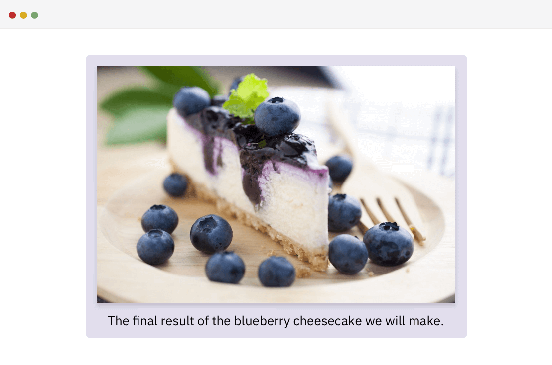
However, everything is cool until the image width is larger than the viewport. In that case, the width of the figure will be as large as the image, which will cause horizontal scrolling.
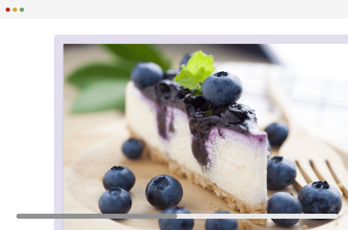
To solve that, fit-content should be used instead. The reason is that it won’t make the image go beyond the viewport width, in case its width is very large.
figure {
  width: fit-content;
}
See the Pen Figure Caption - 2 by Ahmad Shadeed (@shadeed) on CodePen.
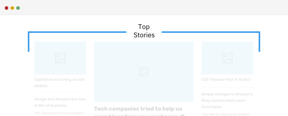
In this example, there is the title “Top Stories” that needs to wrap into two lines. The width of it should be dynamic, so whatever the title is, it should wrap. To achieve that, we can use min-content.
span {
  width: min-content;
}
See the Pen Separator With Text by Ahmad Shadeed (@shadeed) on CodePen.
Another interesting use case for intrinsic values is a heading, with a border that’s only the same width as its content. Consider the following figure:
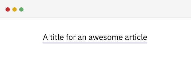
Note that the heading is a block-level element. To achieve that, we can use the solution which wraps the content in a <span> element, and then the border can be applied to the <span>.
<h2><span>A title for an awesome article</span></h2>
h2 span {
  border-bottom: 2px solid #e2deed;
}
To do that better, we can use fit-content and it will make the title width as long as its content. See the below CSS:
h2 {
  width: fit-content;
  margin-left: auto; /* For centering */
  margin-right: auto; /* For centering */
  border-bottom: 2px solid #e2deed;
}
See the Pen Title With Underline by Ahmad Shadeed (@shadeed) on CodePen.
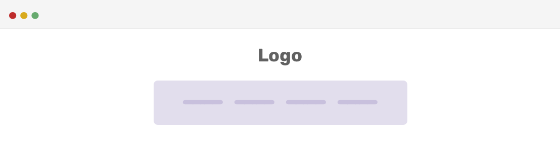
You might need page navigation that has a width based on its content. By using max-content, we can achieve that easily:
.c-nav {
  width: max-content;
}
One of the things that caught my eyes while trying to research and come up with practical use cases for intrinsic values, is this article.
Consider the following example.
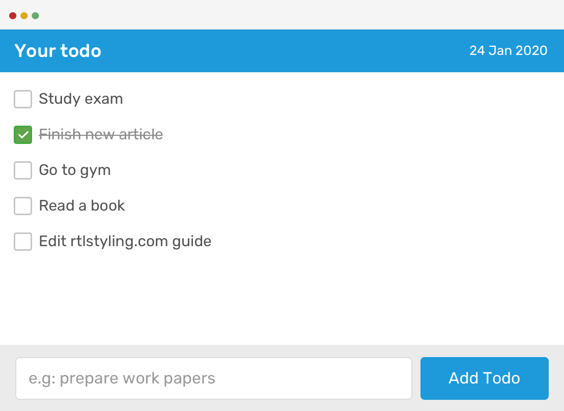
We have a todo list with the following elements: header, list, and footer.
The middle section height should be 100% - header - footer, no matter how many todo items it has. To accomplish that, we can use CSS grid and min-content for the wrapper.
.c-todo {
  display: grid;
  grid-template-rows: min-content auto min-content;
  height: 100vh;
}

You might be wondering that what would happen in case we didn’t use min-content for the rows? Well, here you go:
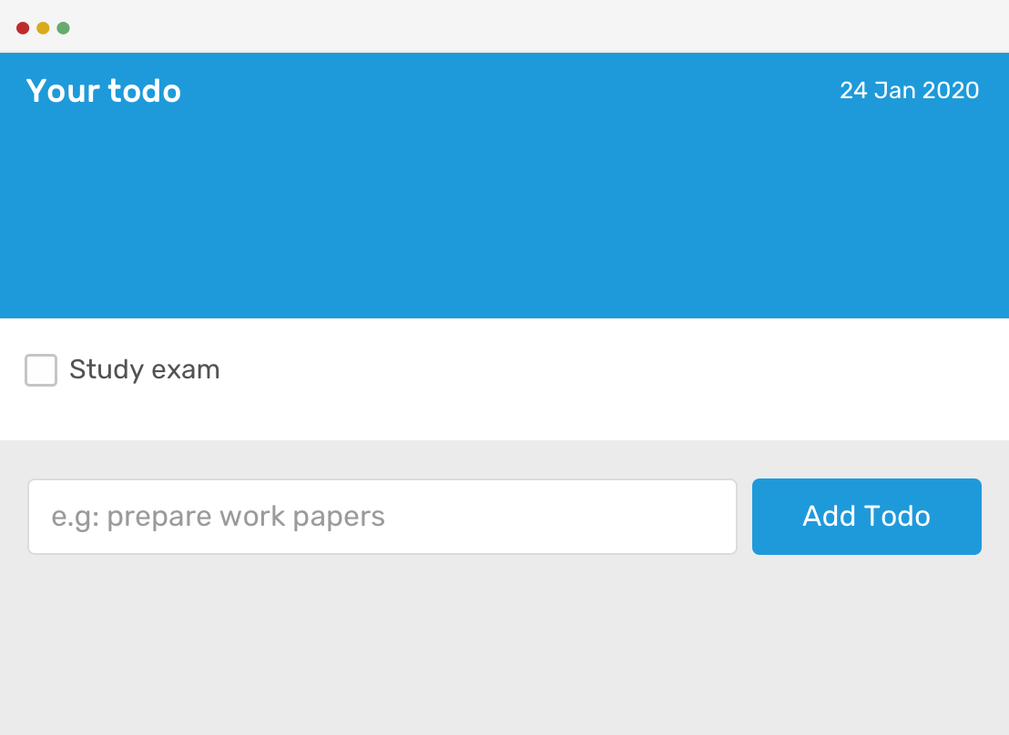
The rows extend to the available space without considering its content. However, when min-content is added to the header and footer, their height won’t exceed more than the content in each one.
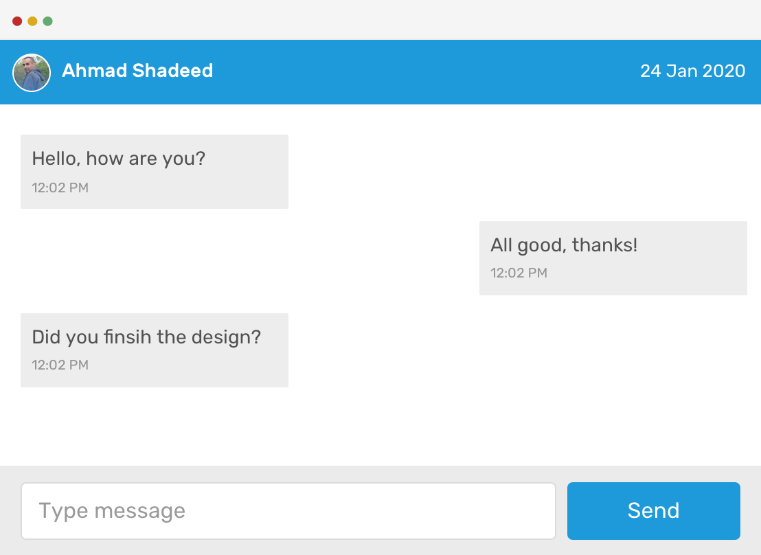
Imagine building an application that has a messaging system. In the example below, the layout structure if very similar to the todo list. When no chats are available and min-content is not used, expect the layout to break.
Consider having a header that is placed inside a hero section. The goal is to have a dynamic layout that makes the hero content take the full available space.
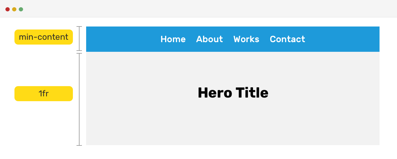
.c-section {
  display: grid;
  grid-template-rows: min-content 1fr;
}
By having two rows, the first one is taking a height based on its minimum content, and the second row can extend to fill the available space.
See the Pen Intrinsic - Hero by Ahmad Shadeed (@shadeed) on CodePen.
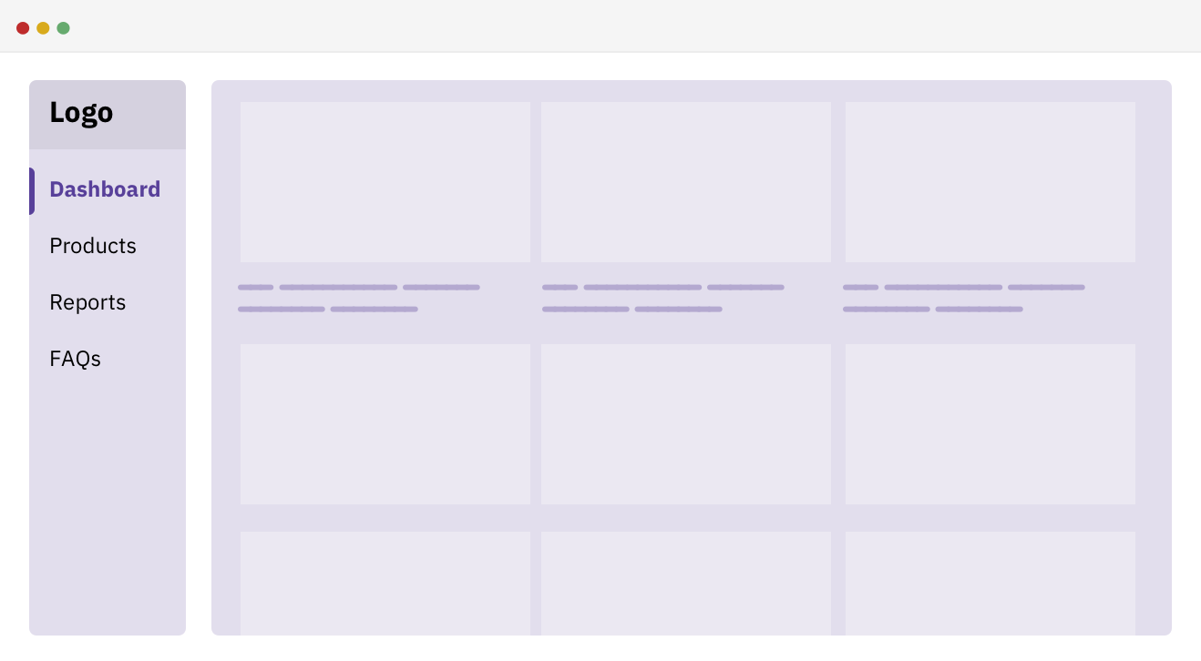
I always wonder why we have a sidebar with a fixed width. What if the width of it was content-based? Say, for example, that it has a minimum width based on its content and a maximum width? Let’s try that.
<div class="wrapper">
  <aside></aside>
  <main></main>
</div>
.wrapper {
  grid-template-columns: fit-content(150px) 1fr;
  grid-gap: 1rem;
}
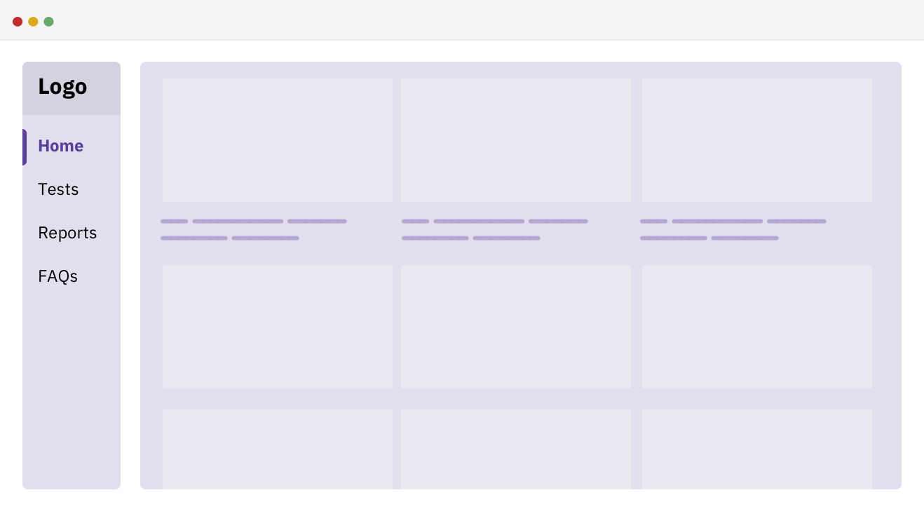
By using CSS grid fit-content function, we can ensure that the sidebar width won’t go above 150px, and it can shrink below that in case the content is short.
And when the content of the sidebar is short, it will shrink a bit. See below:
We have a heading and a description text. The description text width shouldn’t go beyond the main heading width. For me, this is an interesting use case that I didn’t think it was possible to do in CSS only.
Consider the following mockup.
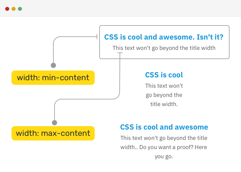
To implement the above, we need to add min-content as a width for the wrapping section, and max-content as a width for the heading element.
section {
  width: min-content;
  margin: 0 auto;
  text-align: center;
}

h2 {
  width: max-content;
}
Please note the above needs some tweaking on mobile, as it will cause horizontal scrolling.
See the Pen Intrinsic - Test... by Ahmad Shadeed (@shadeed) on CodePen.
And that’s a wrap. Do you have a comment or a suggestion? Please feel free to ping me on @shadeed9.
此内容由惯性聚合(RSS阅读器)自动聚合整理,仅供阅读参考。 原文来自 — 版权归原作者所有。