


I spent years teaching CSS layout on this blog. I put everything I know into The Layout Maestro course: 70+ lessons and 150+ interactive examples that teach you how to think CSS layouts, not just memorize syntax.
I like to think of CSS as a conditional design language. Over the years, CSS was known as a way to style web pages. Now, however, CSS has evolved a lot to the point you can see conditional rules. The interesting bit is that those CSS rules aren’t direct (i.e: there is still no if/else in CSS), but the way features in CSS work is conditional.
Design tools like Figma, Sketch, and Adobe XD made a huge improvement for us designers, but they still lack a lot of the flexibility that CSS has.
In this article, I will go over a few CSS features that we use every day, and show you how conditional they are. In addition to that, I will compare a few examples where CSS is much more powerful than design tools.
{{TOC}}
In simple words, it’s about design that has certain conditions. When one or more conditions are met, the design is subject to change due to that.
For example, adding a new section to a design must push the other elements underneath it. In the following figure, we have a stack of items on the left. When adding a new one, the other items below it must move down.
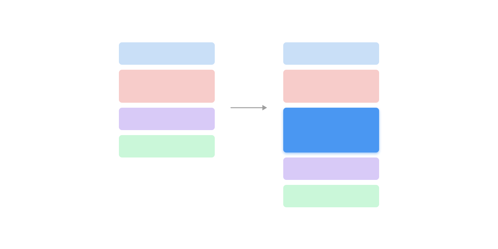
Logically, that sounds expected and normal. In design tools, we got this a few years ago. In Figma, we have “Auto Layout” features that do the above. On the web, we have had that from day 1, even without CSS at all.
You might be thinking about what the heck conditional CSS is. Is that even a thing? No, there hasn’t been a direct “if” statement in CSS.
The main thing to distinguish is that some CSS properties work in specific conditions or scenarios. For example, when using the CSS :emtpy selector to check if an element is empty or not, it’s a conditional pseudo selector.
.alert p:empty {
  display: none;
}
If I want to explain the above to my 2 years old daughter, I will do it like this:
If there is nothing here, it will disappear.
Did you notice the if statement here? This is conditional design indirectly. In the following section, I’m going to explore a few CSS features which work similarly to an if/else statement.
The goal? To have a stronger idea and expectation about the CSS you wrote. I mean, you will be able to spot conditional CSS by just looking at the CSS for a component, a section, or a page.
Why Figma? Well, I consider it as the standard for UX design these days, I thought it’s a good idea to do my comparison based on it. I want to share a simple example. There is list of tags that are displayed horizontally.
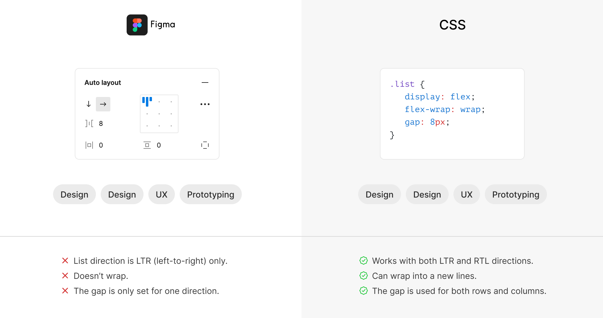
When you think deeply about it, you will spot some major differences. For example, the CSS version:
gap will be used for rows when the items wrap.Figma doesn’t have any of the above.
In CSS, there are three conditional rules happening:
flex-wrap is set to wrap, then the items can wrap when there is no available space.gap will work for the horizontal and vertical spaces.This is just one example, and I can write a book like that. Let’s explore a few cases where CSS can be conditional.
We can’t talk about conditional CSS without mentioning CSS media queries. The CSS spec is named CSS Conditional Rules Module. To be honest, this is the first time that I learn about that title.
When I did my research about who asks or mentions “Conditional CSS”, I found more than one time that media queries are the closest thing to an “if” statement in CSS.
.section {
  display: flex;
  flex-direction: column;
}

@media (min-width: 700px) {
  .section {
    flex-direction: row;
  }
}
If the viewport width is 700px or larger, change the
flex-directionof.sectiontorow. That’s explicit if statement, isn’t it?
The same thing can apply to media queries like @media (hover: hover). In the following CSS, the hover style will be applied only if the user is using a mouse or a trackpad.
@media (hover: hover) {
  .card:hover {
    /* Add hover styles.. */
  }
}
With container queries, we can check if the parent of a component has a specific size and style the child component accordingly.
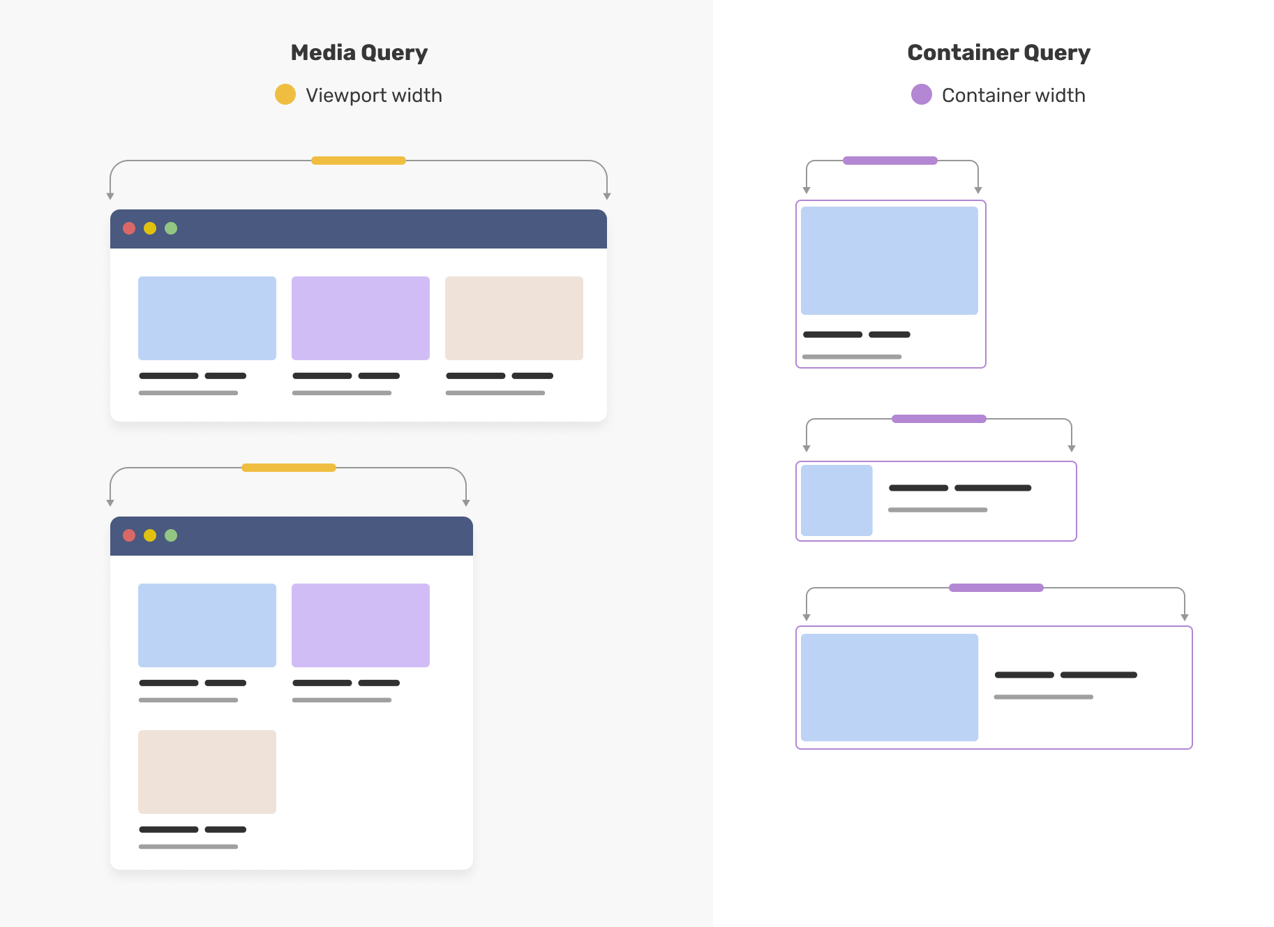
.card-wrapper {
  container-type: inline-size;
}

@container (min-width: 400px) {
  .card {
    display: flex;
    align-items: center;
  }
}
I have written about container queries multiple times, and have a place where I share demos about it.
At the time of writing this article, this is behind a flag in Chrome Canary and is intended to ship in Chrome stable.
With a style query, we can check if a component is placed within a wrapper that has a specific CSS variable and if yes, we style it accordingly.
In the following figure, we have an article body that is coming from a CMS. We have a default style for the figure and another style that looks featured.
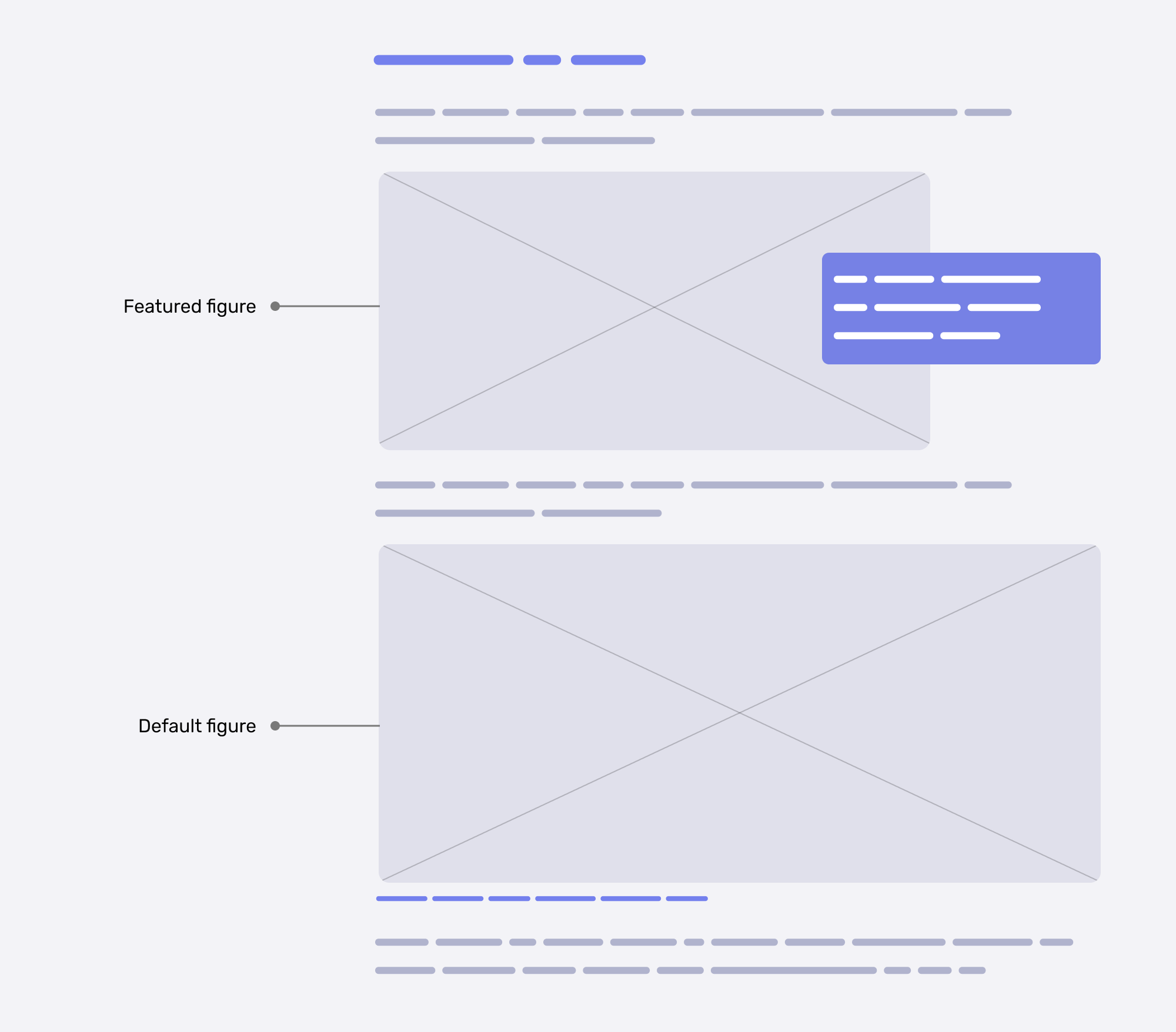
To implement that with style queries, we can style the default one, and then check if the figure has a special CSS variable to allow the custom styling.
figure {
  container-name: figure;
  --featured: true;
}

/* Featured figure style. */
@container figure style(--featured: true) {
  img {
    /* Custom styling */
  }

  figcaption {
    /* Custom styling */
  }
}
And if --featured: true isn’t there, we will default to the base figure design. We can use the not keyword to check when the figure doesn’t have that CSS variable.
/* Default figure style. */
@container figure not style(--featured: true) {
  figcaption {
    /* Custom styling */
  }
}
That’s an if statement, but it’s implicit.
Another example is having a component styled differently based on its parent. Consider the following figure:
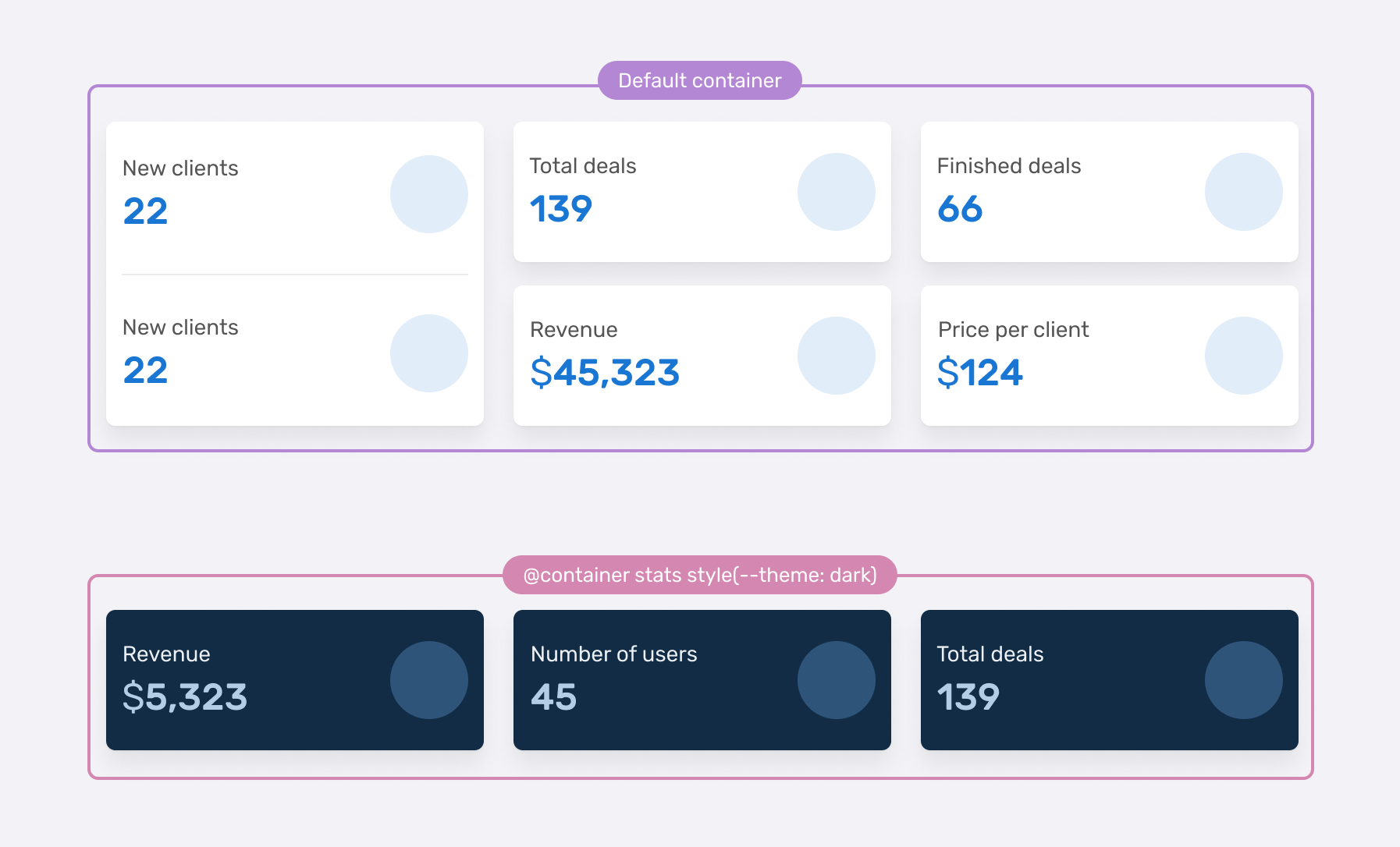
The card style can switch to dark if it’s placed within a container that has the --theme: dark CSS variable.
.special-wrapper {
  --theme: dark;
  container-name: stats;
}

@container stats style(--theme: dark) {
  .stat {
    /* Add the dark styles. */
  }
}
If we read the above, it feels like:
If the container stats have the variable
--theme: dark, add the following CSS.
The @supports feature lets us test if a certain CSS feature is supported in a browser or not.
@supports (aspect-ratio: 1) {
  .card-thumb {
    aspect-ratio: 1;
  }
}
We can also test for the support of a selector, like :has.
@supports selector(:has(p)) {
  .card-thumb {
    aspect-ratio: 1;
  }
}
According to MDN:
The flex-wrap CSS property sets whether flex items are forced onto one line or can wrap onto multiple lines. If wrapping is allowed, it sets the direction in that lines are stacked.
The flex-wrap property allows flex items to wrap into a new line in case there is not enough space available.
Consider the following example. We have a card that contains a title and a link. When the space is small, each child item should wrap into a new line.
.card {
  display: flex;
  flex-wrap: wrap;
  align-items: center;
}

.card__title {
  margin-right: 12px;
}
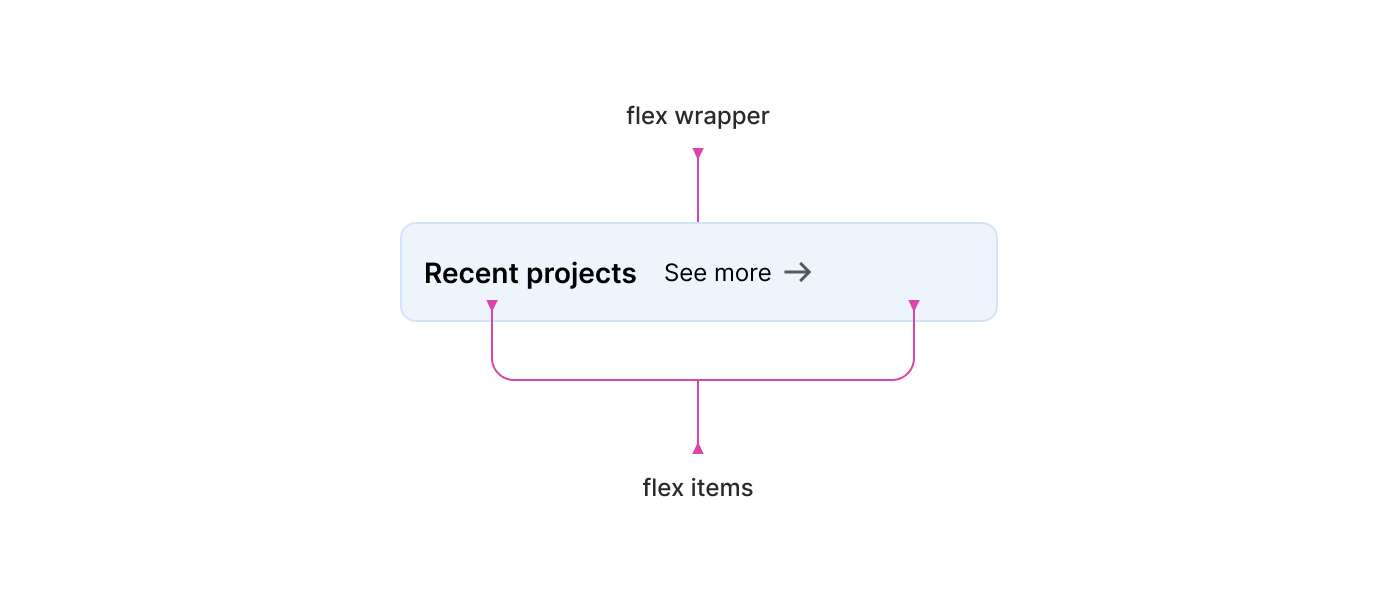
That sounds like a conditional thing to me. If no available space, wrap into a new line(s).
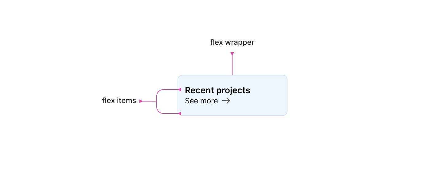
When each flex item wraps into a line, how do I manage the spacing between the flex items, you asked? Currently, there is a margin-right on the heading, and when they are stacked, that should be replaced by margin-bottom. The problem is we don’t know when the items will wrap because it depends on the content.
The good thing is that the spacing can be conditional with the gap property. When they are in the same line, the spacing is horizontal, and with multiple, the spacing is vertical.
.card {
  display: flex;
  flex-wrap: wrap;
  align-items: center;
  gap: 1rem;
}
This is one of my favorite flexbox features. Here is a visual of how gap switches the spacing.
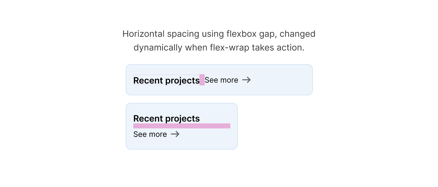
By the way, I consider flex-wrap as defensive CSS. I almost add it to any flex container to avoid any unexpected issues.
flex propertyEven more, the flex property can work conditionally, too. Considering the following example. I added flex: 1 to the card title to make it fill the available space.
.card__title {
  flex-grow: 1;
}
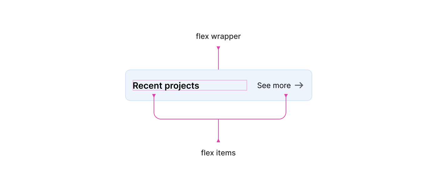
That works fine, but when the width of the card is too small, the card title will wrap into a new line.

Nothing too bad, but can we do better? For example, I want to tell the title: “Hey, if your width is less than X, then wrap into a new line”. We can do that by setting the flex-basis property.
In the following CSS, I set the maximum width of the title to 190px. If it’s less than that, it will wrap into a new line.
.card__title {
  flex-grow: 1;
  flex-basis: 190px;
}
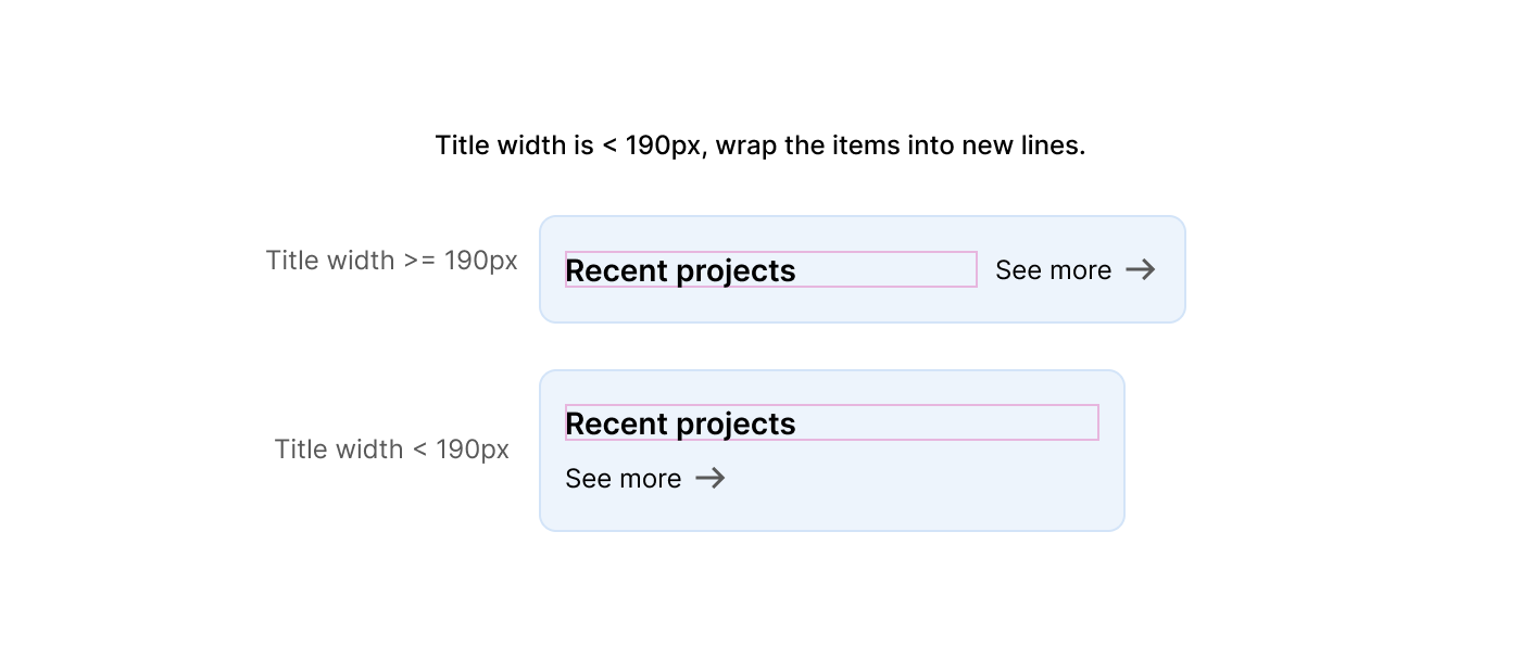
To learn more about the flex property in CSS, I wrote a detailed article on that.
Take things further, and explain about adding flex-grow, string.. etc along the way.
:has selectorFor me, this is the closest thing to an “if” statement in CSS right now. It works in a way that mimics an if/else statement.
In this example, we need to have two different styles, depending on if the card has an image or not.
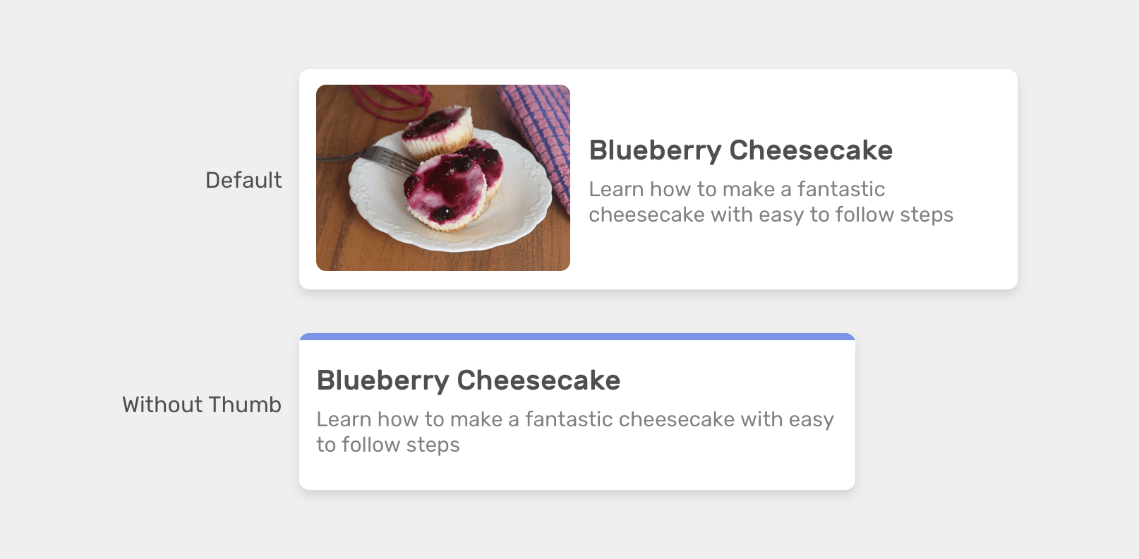
If the card has an image:
.card:has(.card__image) {
  display: flex;
  align-items: center;
}
And if it doesn’t have an image:
.card:not(:has(.card__image)) {
  border-top: 3px solid #7c93e9;
}
That’s an if statement, and I strongly think so. Sorry, I got too excited.
In forms, it’s common to have an input field or a group of inputs hidden by default, and it will be shown once the user activates an option from a <select> menu.
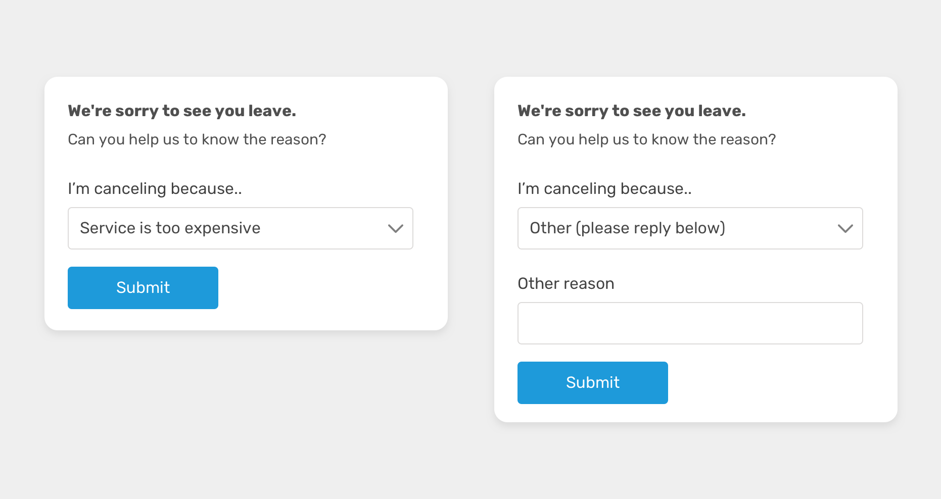
With CSS :has, we can check if the other option is selected and if yes, show the input field.
.other-field {
  display: none;
}

form:has(option[value="other"]:checked) .other-field {
  display: block;
}
When there is an alert message on a page, like for example a major warning of something wrong in the system, we might need to make it even more obvious.
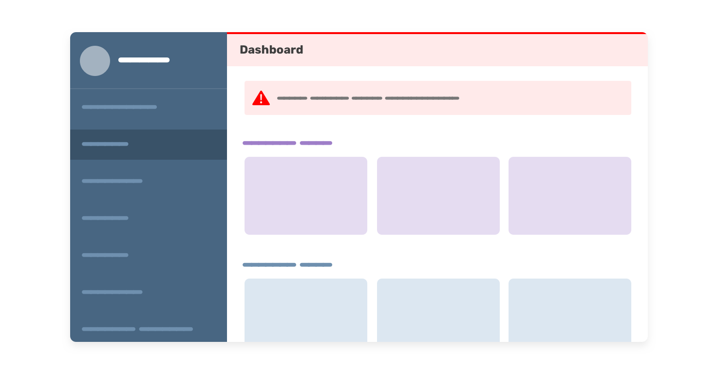
In this example, we have an alert within the page, and with CSS :has, we can check if the dashboard has an alert, and if yes, style accordingly.
.main:has(.alert) .header {
  border-top: 2px solid red;
  background-color: #fff4f4;
}
So useful.
Have you ever needed to display and change the width of a column in a grid based on the number of child items?
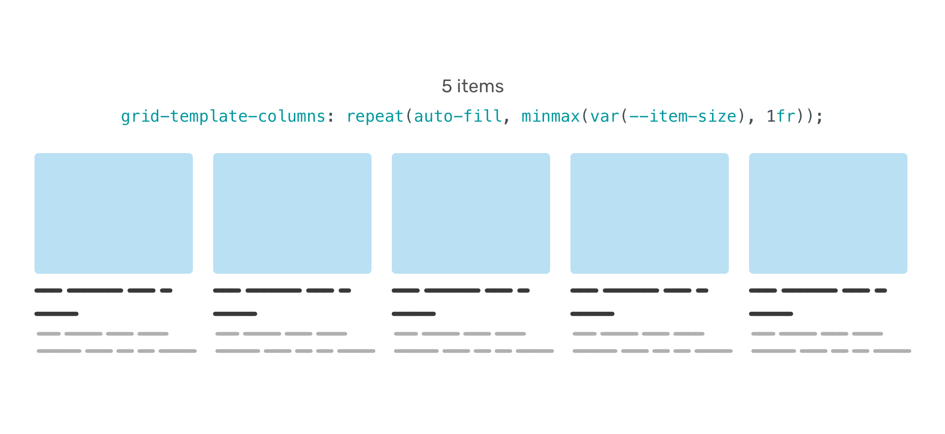
CSS :has can do that, conditionally.
.wrapper {
  --item-size: 200px;
  display: grid;
  grid-template-columns: repeat(
    auto-fill,
    minmax(var(--item-size), 1fr)
  );
  gap: 1rem;
}

.wrapper:has(.item:nth-last-child(n + 5)) {
  --item-size: 120px;
}
In the example, it says that if the .wrapper has five items, then the --item-size variable will change to 120px.
To learn more about the CSS :has selector, I wrote an article on it with plenty of examples.
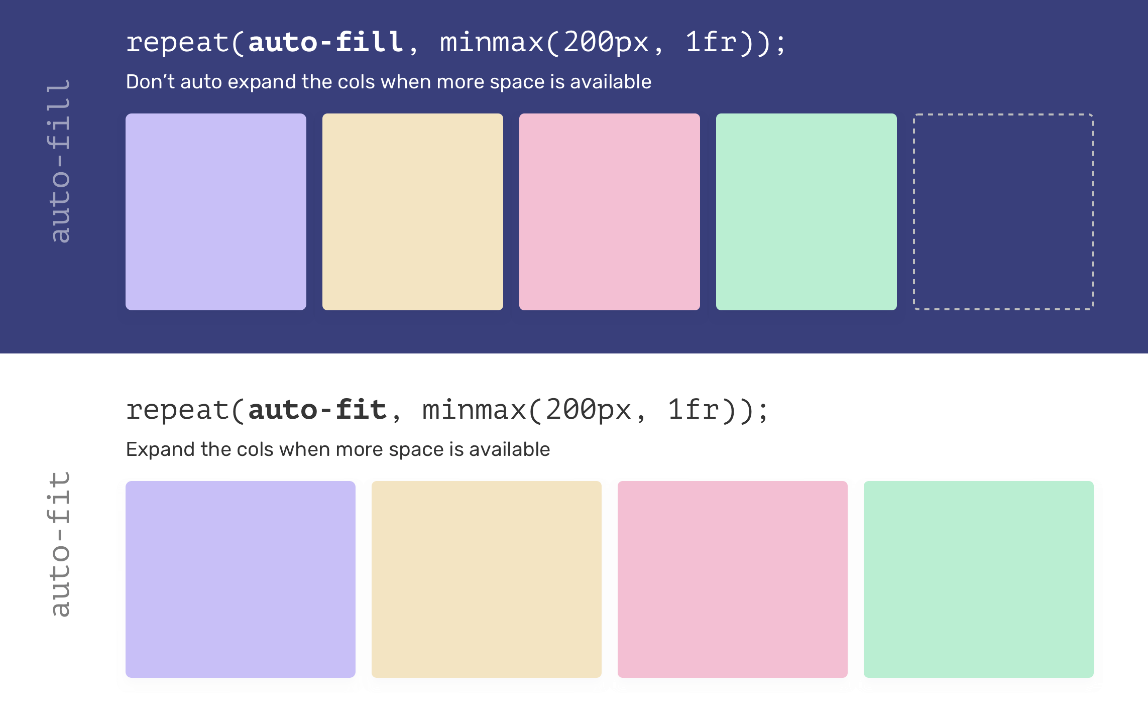
minmax() functionThe way minmax() works in CSS grid is conditional. When we use auto-fit keyword, we’re telling the browser: “if there is an available space, make the grid items fill the space”.
That combinator matches the second element that comes directly after an element.
In the following example, if an <h3> element is followed by a <p>, the <p> will get custom styles.
h3 + p {
  margin-top: 8px;
}
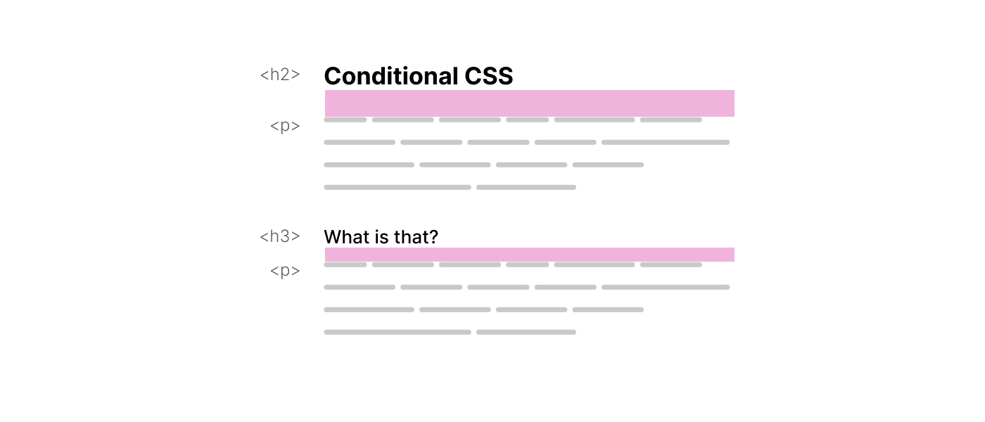
The <p> top margin has been modified conditionally.
:focus-within pseudo-classAnother interesting feature in CSS is :focus-within. Say that you want to check whether an input is focused, and if yes, add a border to its parent.
Consider the following example:
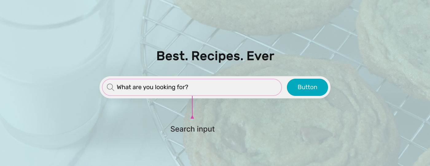
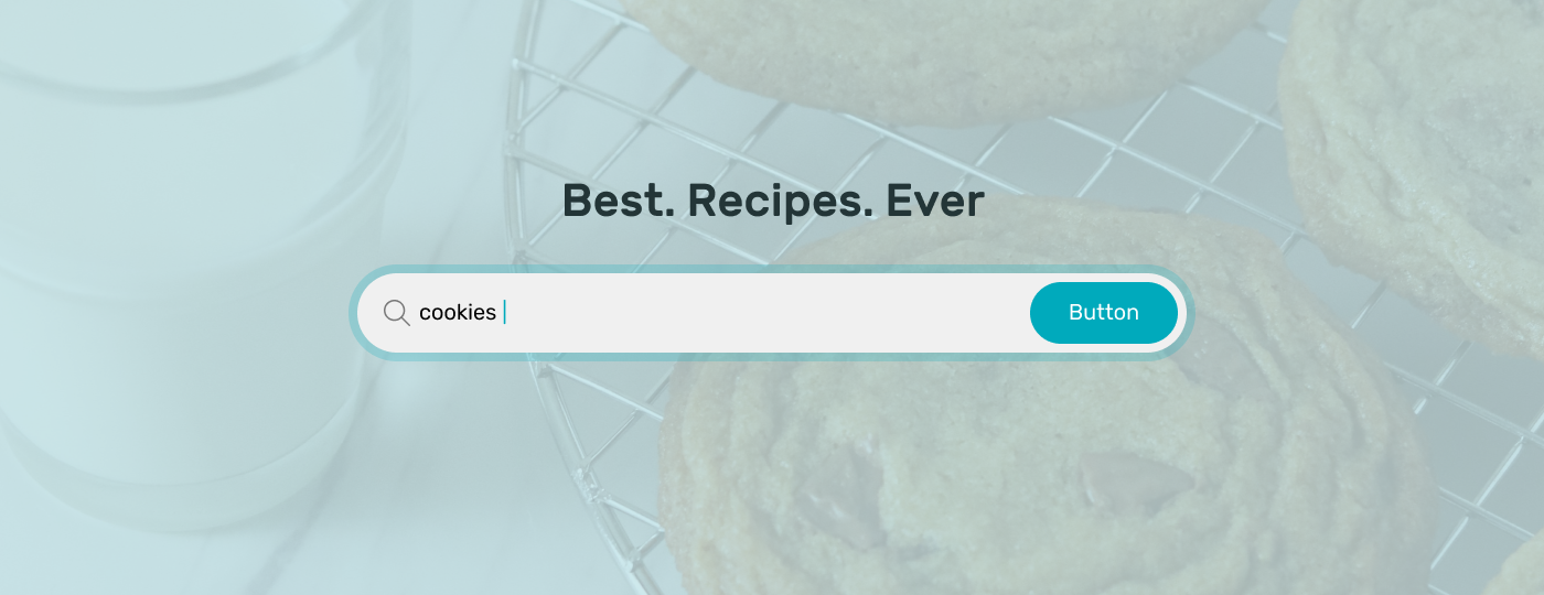
We have a search component. When the input is focused, the whole wrapper should have an outline. With :focus-within, we can check if the input is focused, and style accordingly.
.hero-form:focus-within {
  box-shadow: 0 0 0 5px rgb(28 147 218 / 35%);
}
:not selectorThis pseudo-class excludes elements that don’t match a certain selector. For example, it can be useful to check if an item is the last one, and if yes, remove the border.
.item:not(:last-child) {
  border-bottom: 1px solid lightgrey;
}

A while ago, I wrote about how I spotted an interesting conditional approach to add border-radius for a card on the Facebook website.
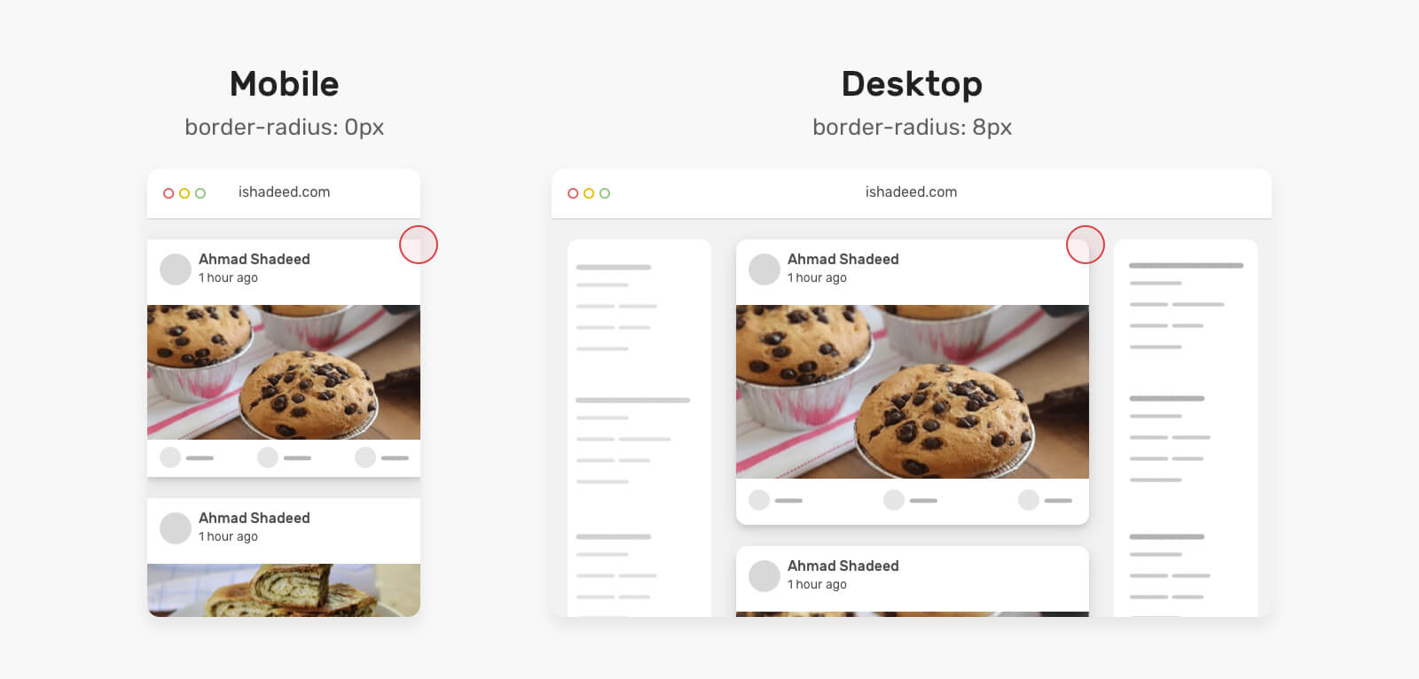
The idea is that when the card is equal to or larger than the viewport, the radius should be 8px, if not, then it’s 0px.
.card {
  border-radius: max(
    0px,
    min(8px, calc((100vw - 4px - 100%) * 9999))
  );
}
You can read the article here.
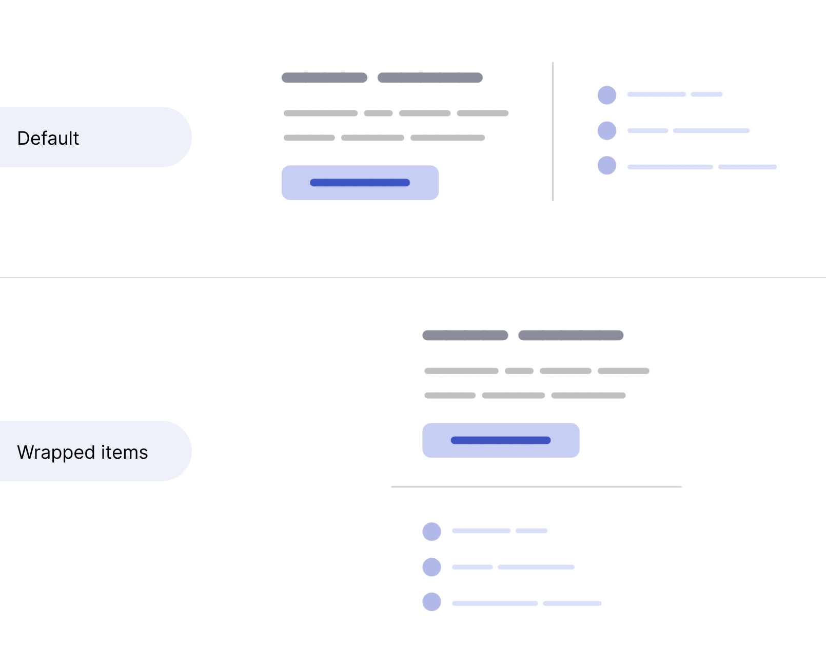
Another interesting use case where CSS works conditionally is having a line separator that switches its direction and size based on whether the items are wrapped or not.
In the following figure, notice the line separator between the two sections.

I want that line to switch horizontally when the flex items are stacked. By using flex-wrap and clamp comparison, we can achieve that.
.section {
  --: 400px;
  display: flex;
  flex-wrap: wrap;
  gap: 1rem;
}

.section:before {
  content: "";
  border: 2px solid lightgrey;
  width: clamp(0px, (var(--breakpoint) - 100%) * 999, 100%);
}
This has been written on my blog, and the clamp() solution is a suggestion by Temani Afif.
The fit-content keyword is a combination of min-content and max-content. I know, it’s not clear. Let’s take a look at the following flowchart.
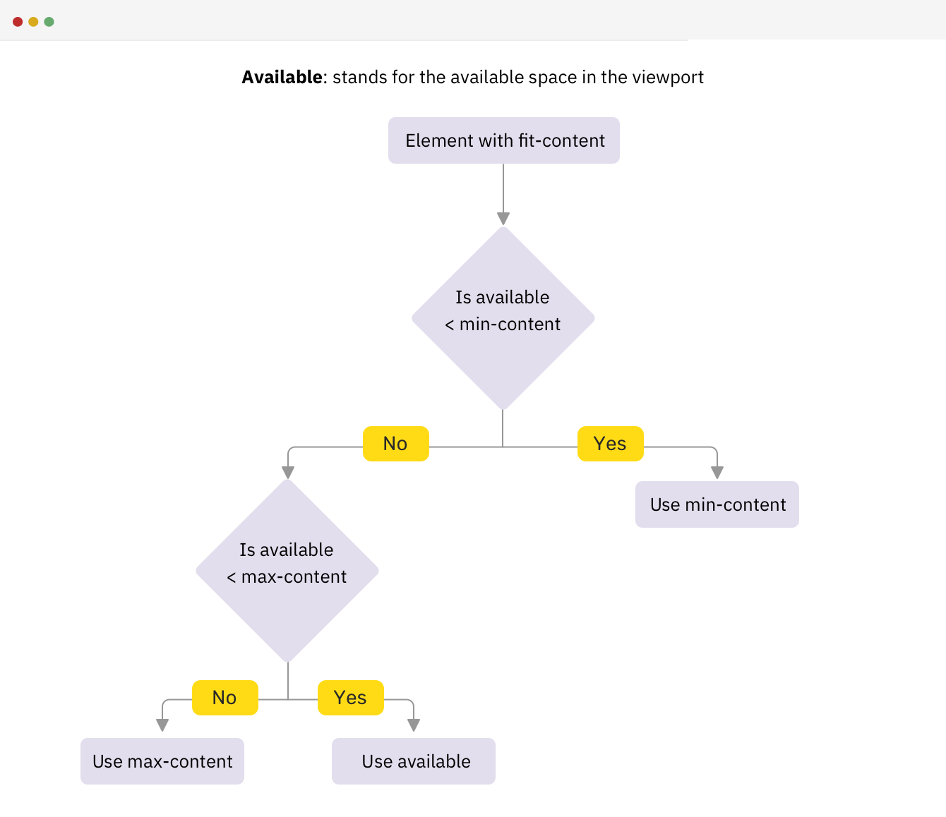
If we have an element with width: fit-content, it will work conditionally as per the flowchart above.
h2 {
  width: fit-content;
}
Here is a video of what’s happening on resize:
I wrote about intrinsic sizing on my blog if you’re interested.
CSS comparison functions are min(), max(), and clamp(). One particular example that feels conditional for me is something that I stumbled upon in a recent article I wrote.
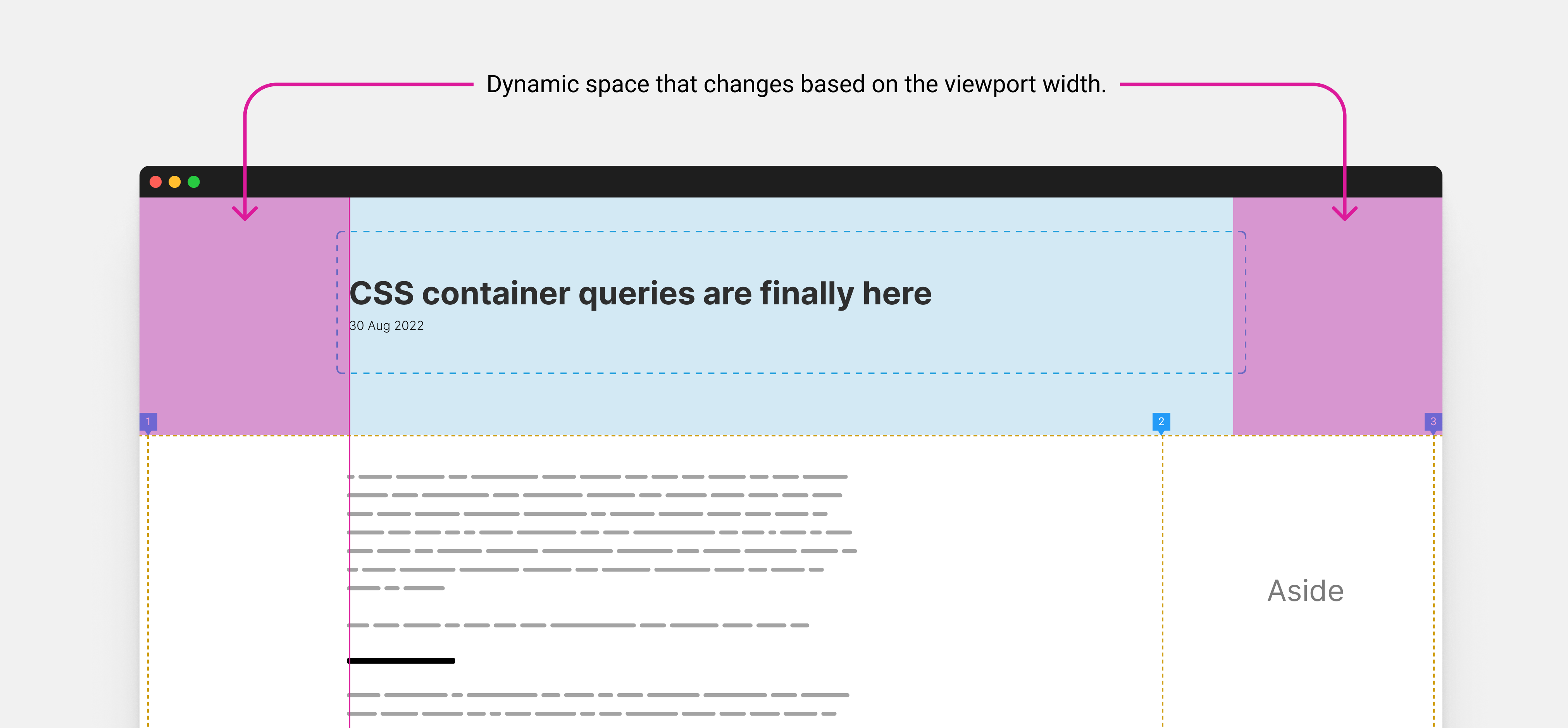
The idea is I have two different containers, one of the article header (title and date), and a container for the main content plus the aside.
I want to align the edge of the header content with the body content.
On mobile, I want the padding from the left to be 1rem, but on larger viewports, it will be dynamic as per the viewport width.
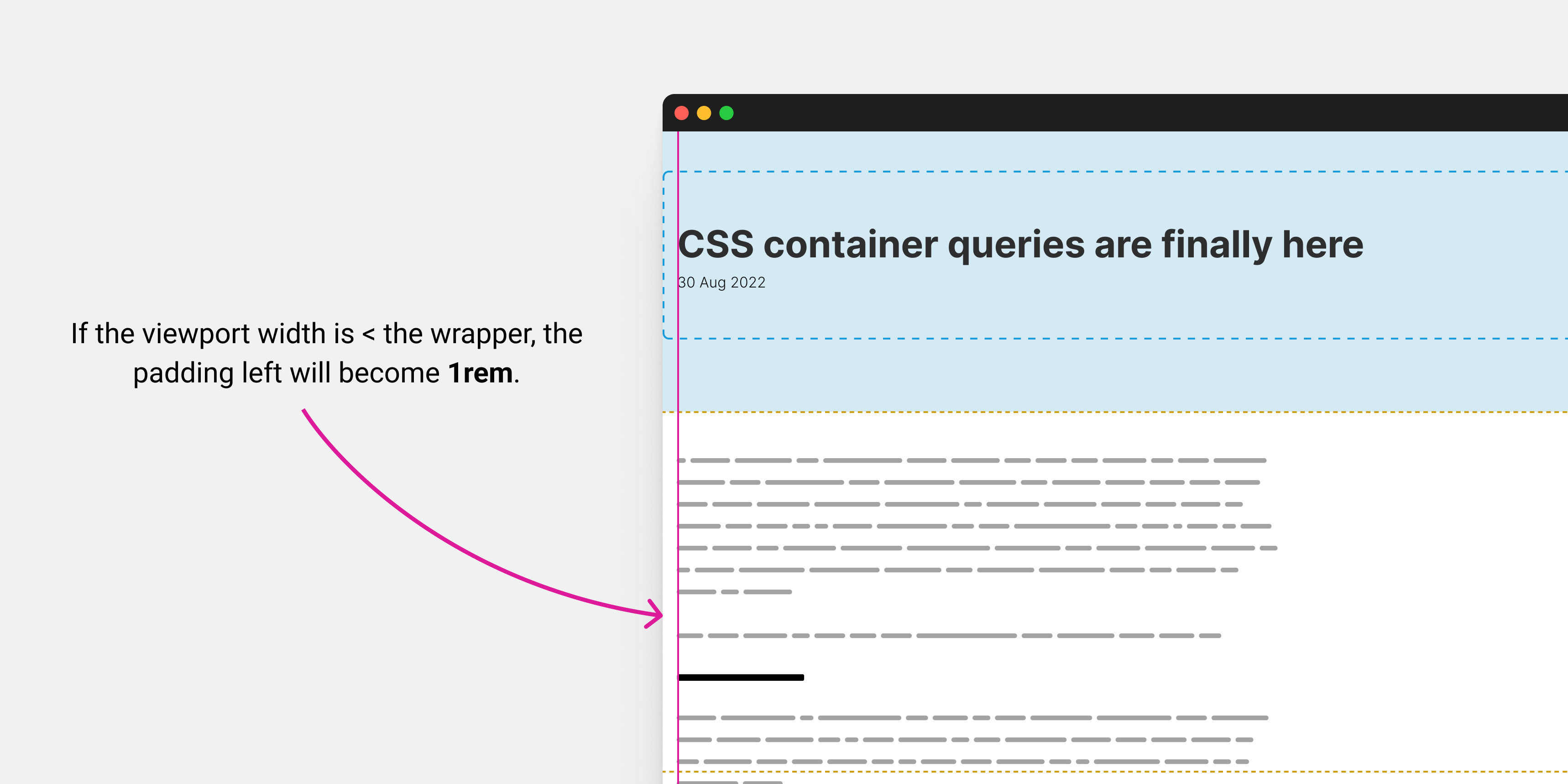
To do that, I can use the max() function to choose one of the two values (1rem or dynamic value) conditionally.
.prose {
  padding-left: max(1rem, (100vw - var(--wrapper-width)) / 2);
}
You can learn more about this technique in my article Inside the mind of a frontend developer: Article layout.
There are a lot of pseudo-classes in CSS, but the ones that came to mind are :focused and :checked.
input:checked + label {
  /* Custom styling */
}

input:focus {
  outline: 2px solid #222;
}
If the input is checked, add those styles to the <label>. If the input is focused..and so on.
I know, thanks for letting me know. This is argument that I hear a lot. I personally don’t have a strong opinion on that, but CSS is conditional in many ways.
In fact, most of the examples above can’t be implemented in Javascript without using a conditional statement.
I enjoyed writing this article because it reminded me of why I love using CSS. To me, CSS is like a superpower because it allows me to make so many design decisions through its conditional features. Working with design tools can sometimes feel limiting because I feel like I’m constrained within certain walls. I think that the ability to create conditional rules with CSS is what sets it apart and makes it powerful for web design.
That doesn’t mean that I design in the browser. I consider design tools as an open canvas to try and experiment with design ideas, and building polished UI products.
I like to use the browser to tweak designs, instead of designing them completely.
And you, what do you think? I would love to hear your thoughts and ideas.
Thank you for reading.
此内容由惯性聚合(RSS阅读器)自动聚合整理,仅供阅读参考。 原文来自 — 版权归原作者所有。