


I spent years teaching CSS layout on this blog. I put everything I know into The Layout Maestro course: 70+ lessons and 150+ interactive examples that teach you how to think CSS layouts, not just memorize syntax.
My brother is a fresh computer engineering graduate and he is currently finishing his internship in front-end development. He learned about both CSS grid and flexbox, but I noticed a pattern that I see a lot on the web. He can’t decide when to use grid or flexbox. For example, he used CSS grid to layout a website header and mentioned that the process wasn’t smooth as he played with grid-column and tried to fine-tune it until it looks like the design.
To be honest, I don’t like that, and I also researched about a resource that he can use to learn the differences between grid and flexbox, with examples on both, but I couldn’t find any. I decided to write an in-depth article that covers everything about that topic. I hope you found it clear!
Before diving into concepts and examples, I want to make sure that you understand the main difference between CSS grid and flexbox. CSS Grid is a multi-dimension layout module, which means that it has columns and rows. Flexbox can lay out its child items either as columns or rows, but not both.
If you don’t know about CSS grid and flexbox, I recommend reading this visual article by yours truly. If you know them, that’s cool, let’s dive into differentiating between them, and when to use each one and why.
Let me be clear about that, there is no direct way to decide between CSS grid and flexbox. Adding on that, there is no correct or incorrect way to use them. This article is a kind of guide that recommends using a technique for a specific use-case. I will explain the general concept, and then go into examples, and the rest is on you to explore and experiment more.
/* Flexbox wrapper */
.wrapper {
  display: flex;
}

/* Grid wrapper */
.wrapper {
  display: grid;
  grid-template-columns: 2fr 1fr;
  grid-gap: 16px;
}
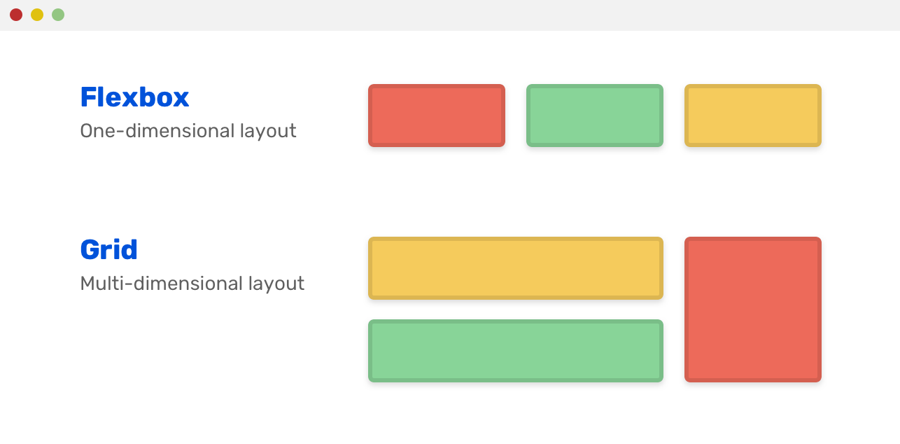
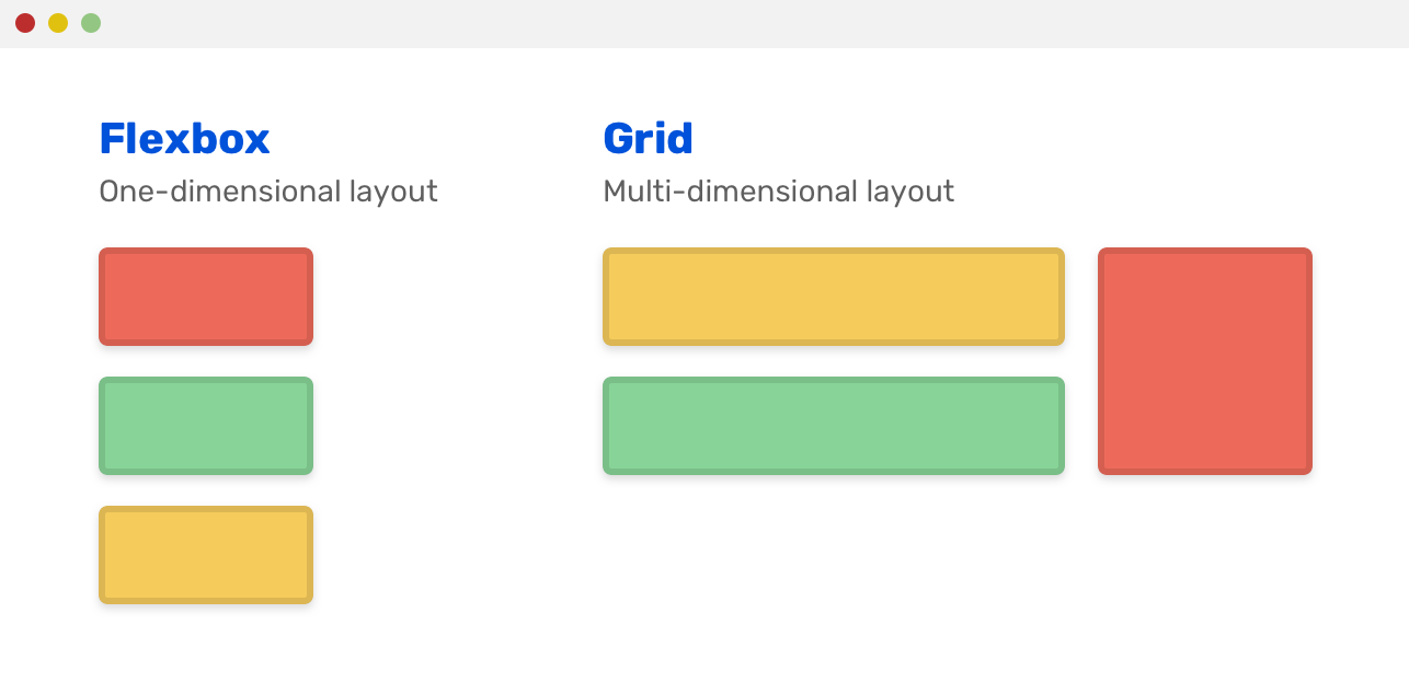
Did you notice something? Flexbox is laying out an inline list of elements, while CSS grid made them a grid of columns and rows. Flexbox is aligning the alignment in a row. That can be a column if we want.
/* Flexbox wrapper */
.wrapper {
  display: flex;
  flex-direction: column;
}
Deciding between CSS grid and flexbox can be a bit hard (sometimes), especially if you are new to CSS. I can hear you! Here are some initial kick-off questions that I ask myself when choosing between them:
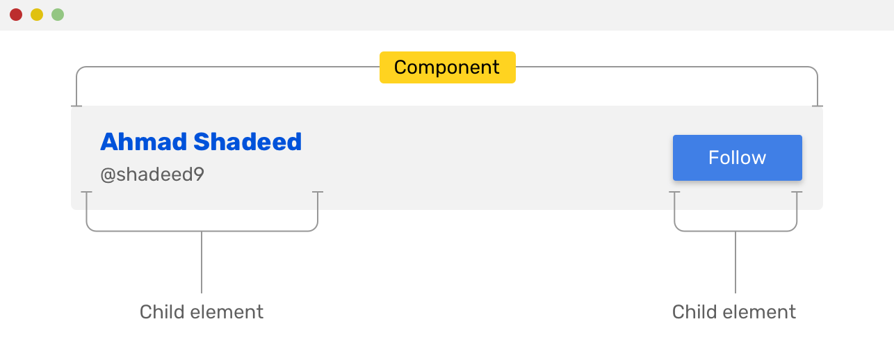
Most of the time, if the component you are viewing has all of its child items displayed inline, then most probably flexbox is the best solution here. Consider the following example:
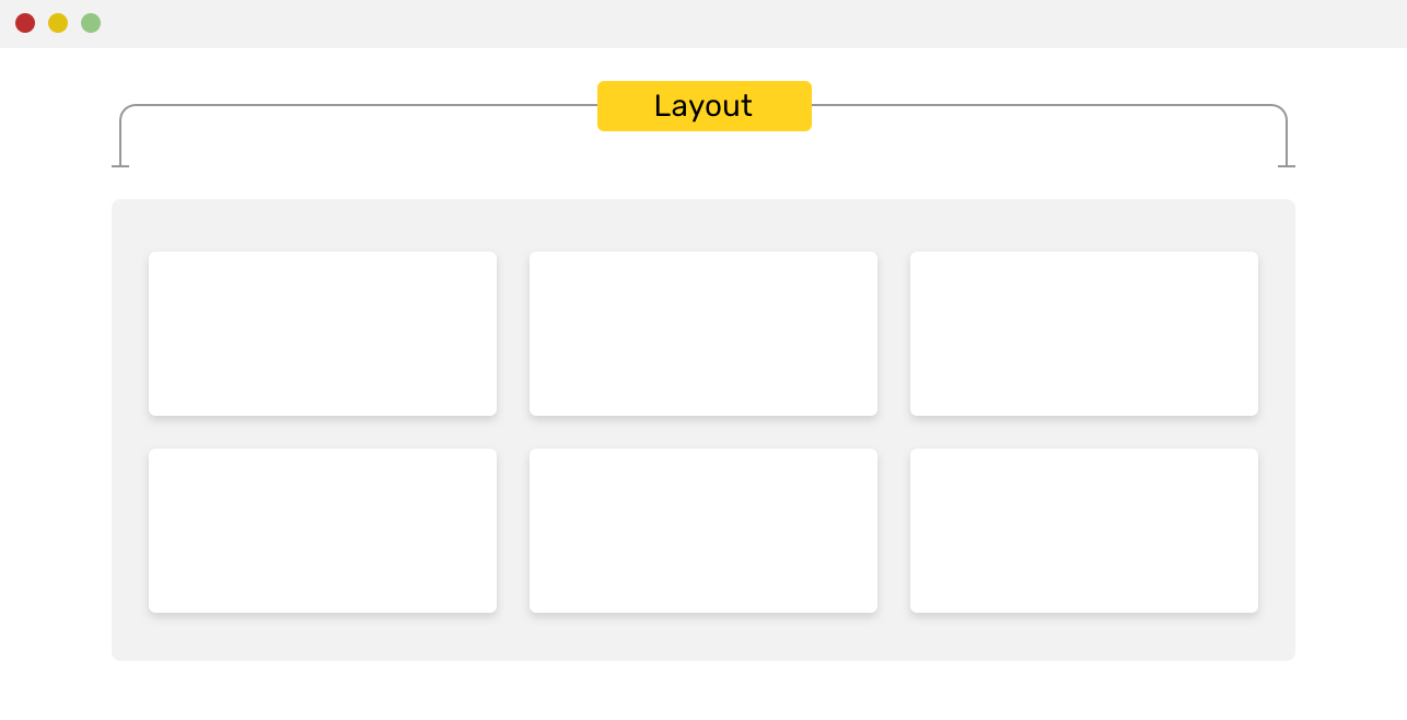
However, if you see columns and rows, then CSS grid is the solution for your case.
Now that I explained the main difference between them, let’s move on to more specific examples and learn how to decide.
In the following section, I will discuss in detail about different use-cases for both flexbox and grid.
When you have a sidebar and main, CSS grid is a perfect solution for building them. Consider the following mockup:
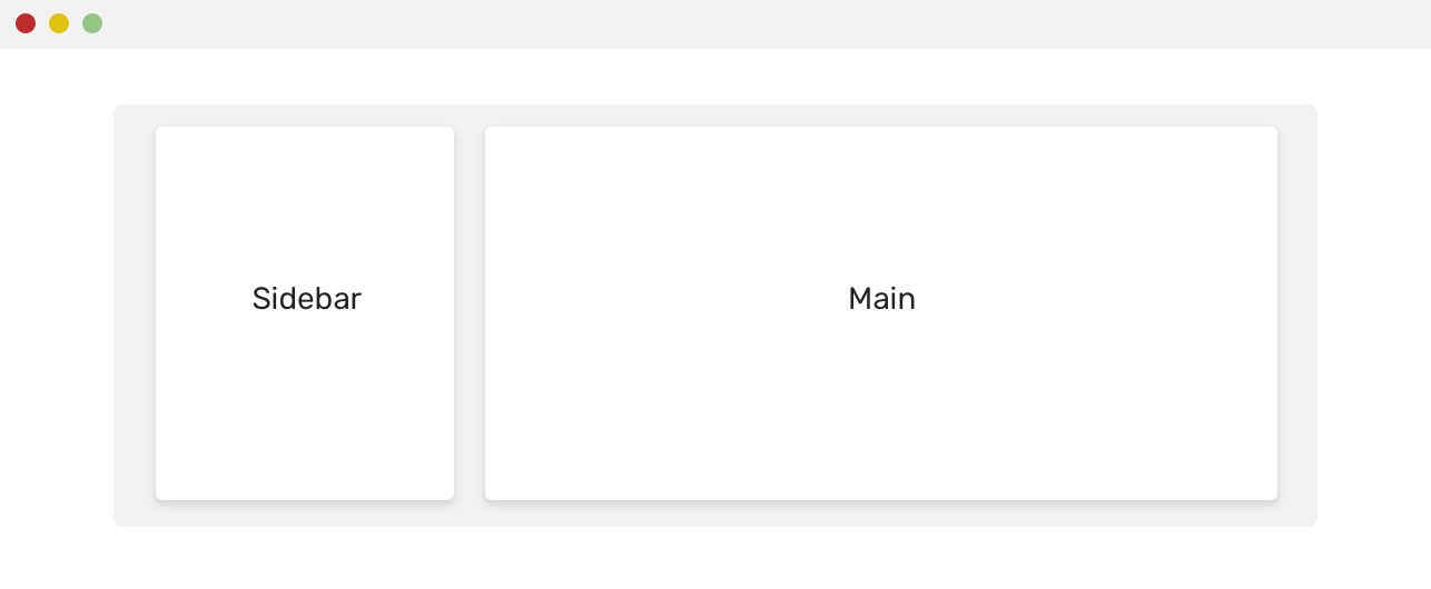
Here is how I would do this in CSS:
<div class="wrapper">
  <aside>Sidebar</aside>
  <main>Main</main>
</div>
@media (min-width: 800px) {
  .wrapper {
    display: grid;
    grid-template-columns: 200px 1fr;
    grid-gap: 16px;
  }

  aside {
    align-self: start;
  }
}
If align-self weren’t used for the <aside> element, the height of it will be as equal to the main element, no matter the content length.
As discussed at the beginning of the article, CSS grid is self-explanatory from its name, so using it for laying out a cards grid is a perfect usage of it.
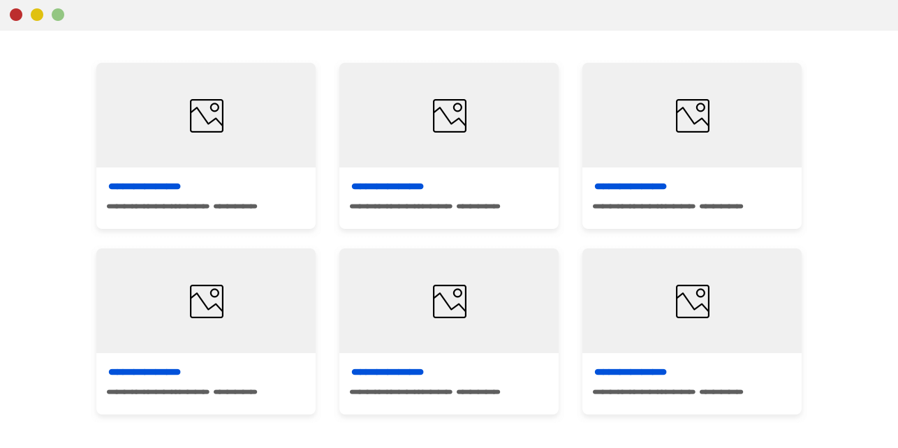
Here is how I would implement the layout:
.wrapper {
  display: grid;
  grid-template-columns: repeat(auto-fit, minmax(200px, 1fr));
  grid-gap: 16px;
}
The column width will be at least 200px, and if space is not enough, it will wrap cards into a new line. It’s worth mentioning that the above can cause horizontal scrolling if the viewport width is less than 200px.
A simple solution is to add the grid definition only when the viewport width is enough. See below:
@media (min-width: 800px) {
  .wrapper {
    display: grid;
    grid-template-columns: repeat(auto-fit, minmax(200px, 1fr));
    grid-gap: 16px;
  }
}
In the following design, we can use grid twice, the first use is to divide the area into two areas (the contact us sidebar, the form), and the second use is to the form grid itself.
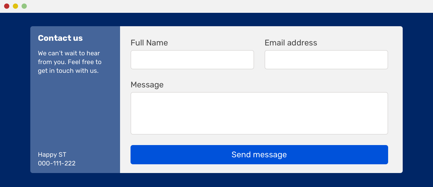
I can’t emphasis how CSS grid is perfect for that. Here is how to do this in CSS:
@media (min-width: 800px) {
  .wrapper {
    display: grid;
    grid-template-columns: 200px 1fr;
  }

  .form-wrapper {
    display: grid;
    grid-template-columns: 1fr 1fr;
    grid-gap: 16px;
  }

  .form-message,
  .form-button {
    grid-column: 1 / 3; /* let them take the full width */
  }
}
This example is borrowed from my article on Envato about building web form layouts with CSS grid. I recommend giving it a read.
For 90% of the time, website navigation should be built with CSS flexbox. The most common pattern is having the logo on the left, and the navigation on the right. That is perfect for flexbox.
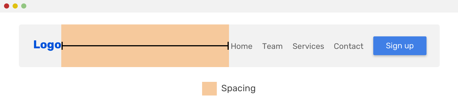
In the example above, all you need to set if the following:
.site-header {
  display: flex;
  flex-wrap: wrap;
  justify-content: space-between;
}
The same concept can work on the following design as well.
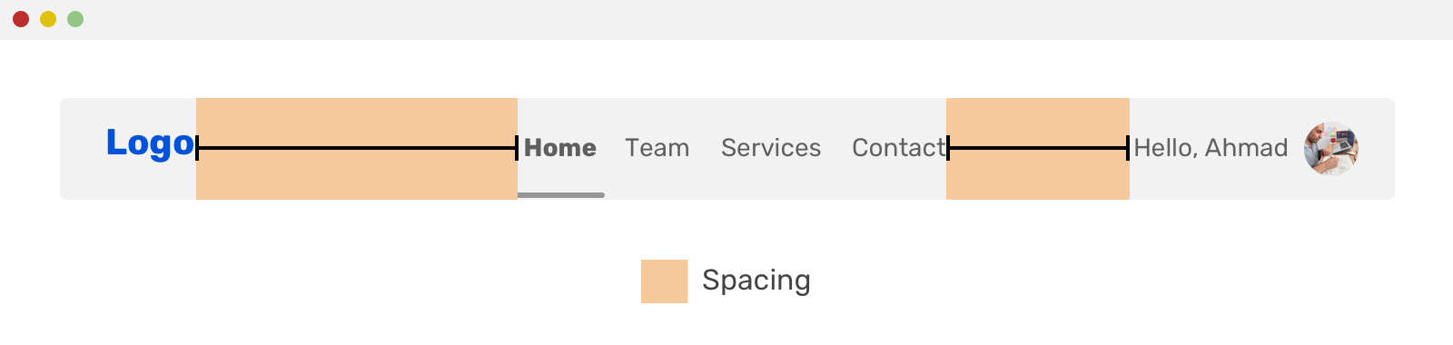
Notice how the navigation structure got a bit different, but the spacing between the items is still done with the justify-content property.
When you hear a list, the first thing that you might think about is a vertical list. However, a list could be displayed inline, so I just wanted to make sure that this is clear.
An example of an action list is something that we can borrow from Facebook or Twitter. The action list consists of action buttons that the user can take. See the screenshots below:
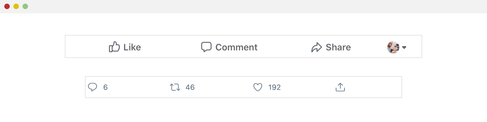
As you see, the items are displayed next to each other, and they are distributed horizontally. Flexbox is perfect for that! That’s one of the core uses of it.
.actions-list {
  display: flex;
}

.actions-list__item {
  flex: 1; /* expand the items to take the available space equally between them */
}
Another variation of this is a modal action button or a modal header.
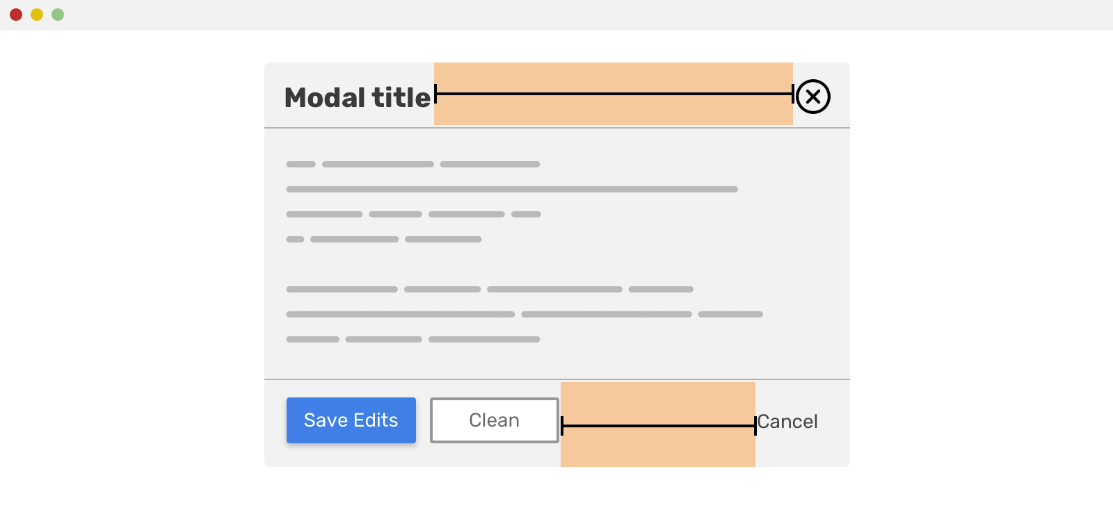
Both of the modal header and footer have child elements that are displayed inline. As you see, the spacing between them is done as below.
For the modal header, it looks like this:
.modal-header {
  display: flex;
  justify-content: space-between;
}
And for the footer, it’s a bit different. The “Cancel” action uses an auto margin to push itself to the right. I wrote a detailed article about that.
.cancel__action {
  margin-left: auto;
}
The naming of the .cancel__action might not be perfect here, but I don’t want to get into CSS naming conventions for this article.
A combination of an input field with a button next to it is a perfect use-case for Flexbox. Consider the figure below:
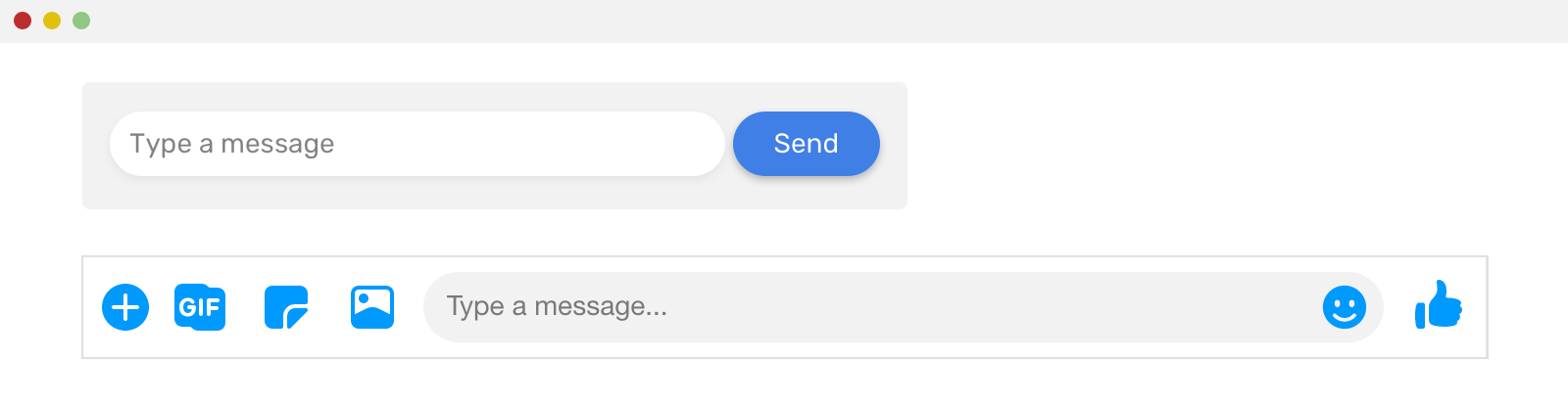
In the first form, the input is taking all the remaining space, making it take a dynamic width. The same thing applies to the second form (Facebook messenger), the text field is taking all the remaining space. Let’s take a closer look.
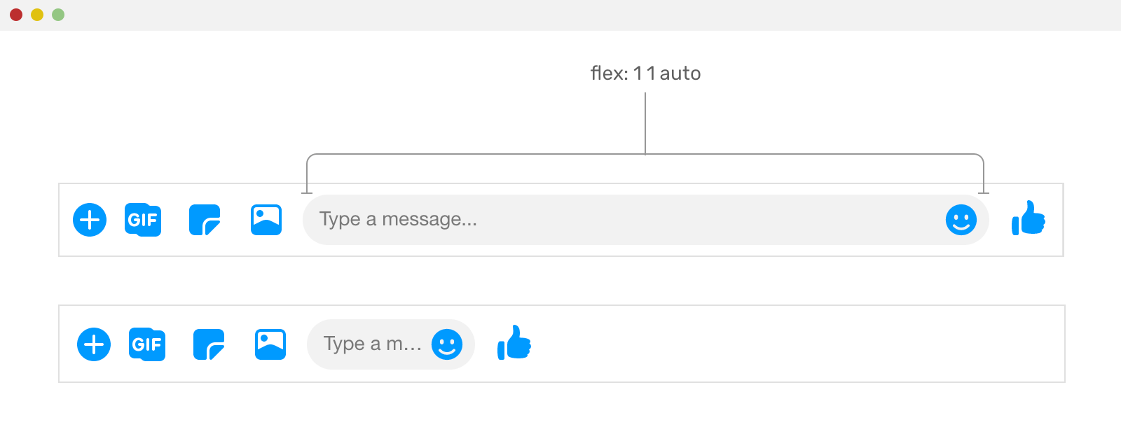
.input {
  flex: 1 1 auto;
}
Notice how without using flex: 1 1 auto on the text field, it won’t expand and fill the remaining space.
Another common use-case for flexbox is comment threads. Consider the following example.
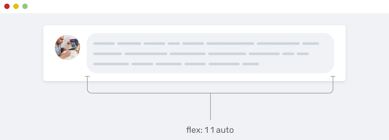
We have the user photo, and the comment itself. The comment is taking the remaining space from its parent element. That’s a perfect use for flexbox.
A card component has many variations, but the most common design is something like the mockup below.
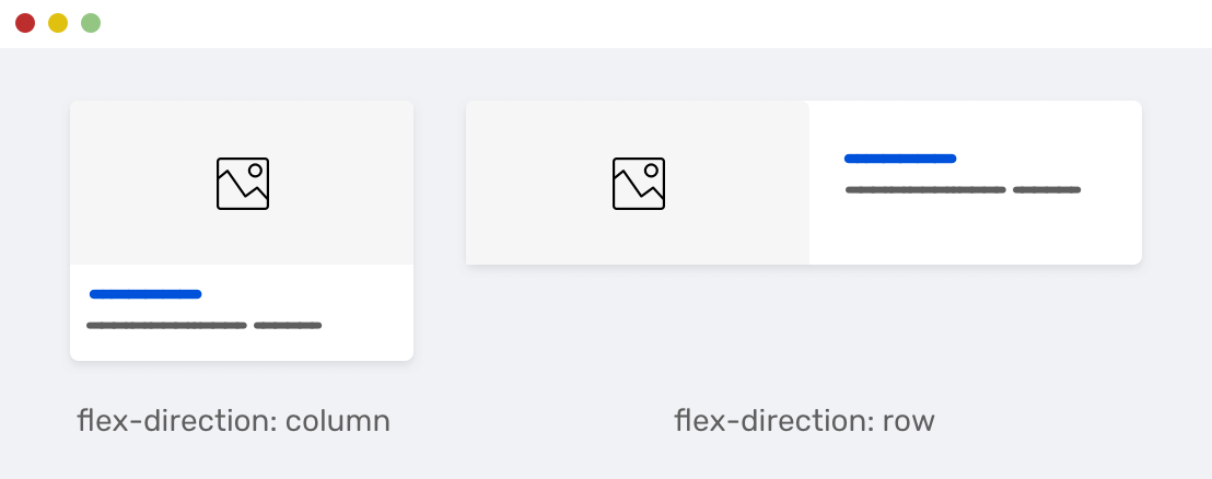
On the left, the card child items are stacked because the direction of the flex wrapper is column. While on the right, it’s the opposite. The direction used is row, and keep in mind that the row is the default for flexbox.
.card {
  display: flex;
  flex-direction: column;
}

@media (min-width: 800px) {
  .card {
    flex-direction: row;
  }
}
Another common variation for a card is having an icon with a text label below it. It could be a button, link, or just for decoration. Consider the following mockup:
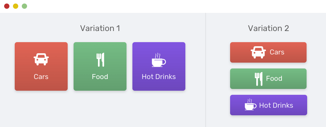
Notice how the icon and text label is centered horizontally and vertically. Thanks to flexbox, this is easy to do.
.card {
  display: flex;
  flex-direction: column;
  align-items: center;
}
The inline style will be by default, we just need to remove the flex-direction: column and leave it to the default value (row).
When it comes to elements that take the full width of screen and have items that should fill all the available space, then flexbox is the perfect tool here.

In the example above, each item should fill the available space, and they should be equal in width. By setting the wrapper display to flex, this can be easily done.
.tabs__item {
  flex-grow: 1;
}
That technique is used in React Native framework to build the tab bar for mobile applications. Here is a code example that does the same as above in React Native. The code is borrowed from this resource.
import React from "react"
import { View } from "react-native"

export default FlexDirectionBasics = () => {
  return (
    <View style={{ flex: 1, flexDirection: "row" }}>
      <View
        style={{
          flex: 1,
          width: 50,
          height: 50,
          backgroundColor: "powderblue",
        }}
      />
      <View
        style={{
          flex: 1,
          width: 50,
          height: 50,
          backgroundColor: "skyblue",
        }}
      />
      <View
        style={{
          flex: 1,
          width: 50,
          height: 50,
          backgroundColor: "steelblue",
        }}
      />
    </View>
  )
}
What I like the most about flexbox is the ability to reverse the direction of the elements. The default flexbox direction is row, but we can reverse it as below.
.item {
  flex-direction: row-reverse;
}
In the mockup below, notice how the even item is reversed, this is done with the technique above. It’s very useful.
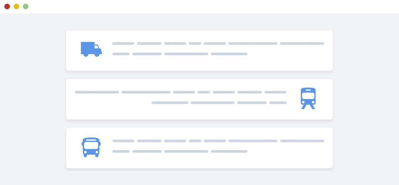
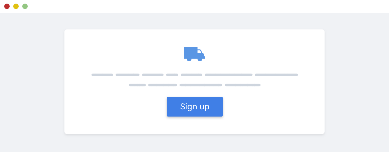
Let’s consider that we have a hero section, and the content needs to be centered horizontally and vertically. The horizontal centering might be easy as it could be done with text alignment.
.hero {
  text-align: center;
}
But how to use flexbox to center the elements vertically? Here is what’s needed.
.hero {
  display: flex;
  flex-direction: column;
  align-items: center; /* centers items horizontally */
  justify-content: center; /* centers items vertically */
  text-align: center;
}
Not only each layout module has its use-cases, but we can use both of them. When I think about combining them, the first use-case I got is a list of cards. Grid is used to lay out the cards, and flexbox is used for the card component itself.
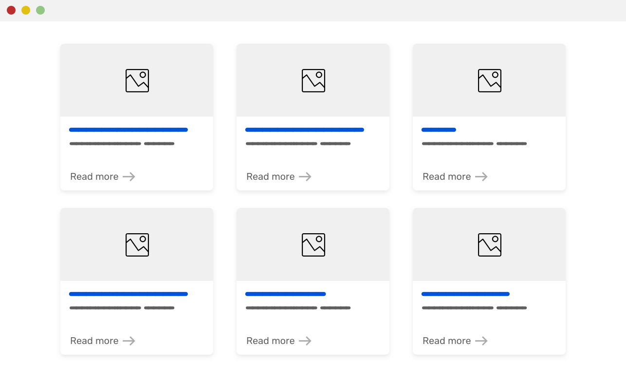
Here are the requirements for the layout:
minmax() function<div class="wrapper">
<article class="card">
<img src="sunrise.jpg" alt="" />
<div class="card__content">
<h2><!-- Title --></h2>
<p><!-- Desc --></p>
<p class="card_link"><a href="#">Read more</a></p>
</div>
</article>
</div>
@media (min-width: 500px) {
  .wrapper {
    display: grid;
    grid-template-columns: repeat(auto-fill, minmax(200px, 1fr));
    grid-gap: 16px;
  }
}

.card {
  display: flex; /* [1] */
  flex-direction: column; /* [2] */
}

.card__content {
  flex-grow: 1; /* [3] */
  display: flex; /* [4] */
  flex-direction: column;
}

.card__link {
  margin-top: auto; /* [5] */
}
Let me explain the CSS above.
margin-top: auto to push the link down. This will keep it positioned at the end regardless of the card height.As you saw, combining CSS grid and flexbox isn’t hard. These two tools can give us many ways to implement layouts on the web. Let’s use them correctly, and combine them only when needed as above.
@supportsA couple of months ago, I got a tweet saying that my website is broken in IE11. After checking it, I noticed a very weird behavior. All the website content is collapsed into the top left area. My website wasn’t usable!
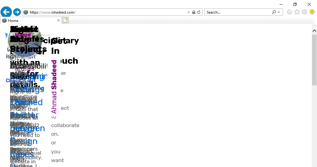
Yes, this is my website - a front-end developer website, on IE11. At first, I was confused, why is that happening? I remembered that CSS grid is supported in IE11, but that’s the old version of it that was released by Microsoft. The solution is very simple, which is to use @supports to only use CSS grid for new browsers.
@supports (grid-area: auto) {
  body {
    display: grid;
  }
}
Let me explain it. I used grid-area because it’s supported only in the new CSS grid spec, from March 2017 till today. Since IE doesn’t support @supports query, the whole rule will be ignored. As a result, the new CSS grid will be used for supporting browsers only.
If flexbox is not suitable for displaying a grid of items, that doesn’t mean it’s not good for fallback. You can use flexbox as a fallback for CSS grid for non-supporting browsers. I worked on a tool that does exactly that.
@mixin grid() {
  display: flex;
  flex-wrap: wrap;

  @supports (grid-area: auto) {
    display: grid;
    grid-gap: 16px 16px;
  }
}

@mixin gridAuto() {
  margin-left: -16px;

  > * {
    margin-bottom: 16px;
    margin-left: 16px;
  }

  @media (min-width: 320px) {
    > * {
      width: calc((99% / #{2}) - 16px);
      flex: 0 0 calc((99% / #{2}) - 16px);
    }
  }

  @media (min-width: 768px) {
    > * {
      width: calc((99% / #{3}) - 16px);
      flex: 0 0 calc((99% / #{3}) - 16px);
    }
  }

  @supports (grid-area: auto) {
    grid-template-columns: repeat(auto-fit, minmax(200px, 1fr));
    margin-left: 0;

    > * {
      width: auto;
      margin-left: 0;
      margin-bottom: 0;
    }
  }
}
The fallback code above works as below:
display: flex and flex-wrap: wrap to the wrapper element.display: grid will be used instead.> *, we can select the direct child elements of the wrapper. Upon selecting them, we can add a specific width or size to each one.grid-gap in case CSS grid is supported.Here is an example of how to use the Sass mixin.
.wrapper {
  @include grid();
  @include gridAuto();
}
As I was doing a code review for my brother, I noticed a couple of incorrect uses for either CSS grid or flexbox and I thought that it might be useful if I highlighted some of them.
One of the motivations for this article was this mistake. I noticed that my brother is using CSS grid to implement a website header.
He mentioned things like “it was complex, css grid is hard.. etc”. As a result of using an incorrect layout method, he got an idea that CSS grid is complex. It’s not, and all of his confusion came from the fact of using it for something that is not suitable.
Consider the following example that I noticed.
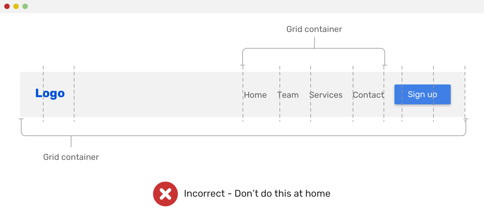
.site-header {
  display: grid;
  grid-template-columns: 1fr 1fr 1fr 1fr 1fr 1fr;
}

.site-nav {
  display: grid;
  grid-template-columns: 1fr 1fr 1fr 1fr;
}
CSS grid was used twice, the first time is for the whole header, and the second one is for the navigation. He used grid-column to fine-tune the spacing between the elements, and other weird things that I can’t remember, but you got the point!
Another incorrect usage for CSS grid is applying it on a tabs component. Consider the following mockup.
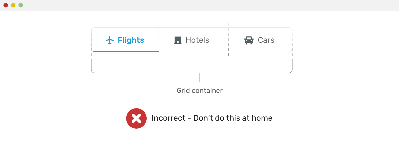
The incorrect CSS code looks like this:
.tabs-wrapper {
  display: grid;
  grid-template-columns: 1fr 1fr 1fr;
}
From the code above, I can see that the developer assumed the tabs count is only three. As a result, he used 1fr 1fr 1fr for laying out the columns. This can easily break if the columns count changed.
Remember that old layout method might be perfect for the job. Overusing flexbox or grid can increase the complexity of your CSS by time. I don’t mean they are complex, but using them correctly and in the right context as explained from the examples in this article is much better.
For example, you have the following hero section with a request to horizontal center all the content of it.
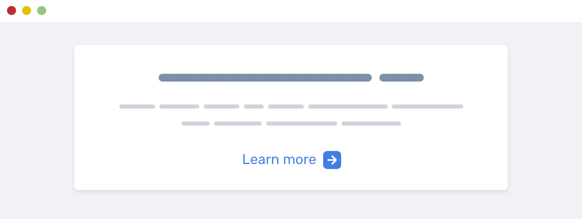
This can be done by using text-align: center. Why using flexbox when there is an easier solution?
Phew, that was a lot about the differences between using CSS grid and flexbox. That topic was in mind for a long time, and I’m glad that I got the chance to write about it. Please don’t hesitate to provide feedback either by email or twitter @shadeed9!
Thank you for reading.
I’m excited to let you know that I’m writing an ebook about Debugging CSS.
If you’re interested, head over to debuggingcss.com and subscribe for updates about the book.
此内容由惯性聚合(RSS阅读器)自动聚合整理,仅供阅读参考。 原文来自 — 版权归原作者所有。