惯性聚合 高效追踪和阅读你感兴趣的博客、新闻、科技资讯
阅读原文 在惯性聚合中打开

推荐订阅源

T
Tenable Blog
博客园_首页
Vercel News
Vercel News
WordPress大学
WordPress大学
美团技术团队
G
Google Developers Blog
大猫的无限游戏
大猫的无限游戏
小众软件
小众软件
Y
Y Combinator Blog
博客园 - 【当耐特】
量子位
酷 壳 – CoolShell
酷 壳 – CoolShell
The Cloudflare Blog
T
The Blog of Author Tim Ferriss
奇客Solidot–传递最新科技情报
奇客Solidot–传递最新科技情报
Google DeepMind News
云风的 BLOG
云风的 BLOG
腾讯CDC
M
MIT News - Artificial intelligence
爱范儿
爱范儿
Recent Announcements
雷峰网
雷峰网
Last Week in AI
Last Week in AI
宝玉的分享
宝玉的分享
The Register - Security
Jina AI
Jina AI
CTFtime.org: upcoming CTF events
cs.CL updates on arXiv.org
Hugging Face - Blog
Hugging Face - Blog
P
Privacy & Cybersecurity Law Blog
Recorded Future
Recorded Future
Help Net Security
Help Net Security
N
News and Events Feed by Topic
博客园 - Franky
P
Proofpoint News Feed
L
LINUX DO - 热门话题
S
SegmentFault 最新的问题
The GitHub Blog
The GitHub Blog
K
KPMG report finds enterprise disconnect between AI and its ROI | CIO
钛媒体:引领未来商业与生活新知
钛媒体:引领未来商业与生活新知
月光博客
月光博客
D
Docker
Google DeepMind News
有赞技术团队
有赞技术团队
IT之家
IT之家
Security Latest
Security Latest
L
LangChain Blog
V
V2EX
阮一峰的网络日志
阮一峰的网络日志
J
Java Code Geeks

Ahmad Shadeed

Better fluid sizing with round() Use Cases for Field Sizing The Basics of Anchor Positioning Item Flow CSS Relative Colors Balancing Text In CSS Should masonry be part of CSS grid? CSS display contents CSS Grid Areas CSS Cap Unit An Interactive Guide to CSS Container Queries CSS :has() Interactive Guide CSS Nesting UX in DevTools CSS Nesting Future CSS: State Container Queries Rebuilding a comment component with modern CSS Conditional CSS with :has and :nth-last-child CSS Text balancing with text-wrap:balance CSS Masking Do we need CSS flex-wrap detection? My CSS Wishlist Conditional CSS CSS Style Queries Inside the mind of a frontend developer: Article layout Inside the mind of a frontend developer: Hero section CSS container queries are finally here The CSS behind Figma First Look At The CSS object-view-box Property Learn CSS Subgrid CSS :has Parent Selector Aligning Content In Different Wrappers Flexbox Dynamic Line Separator Hello, CSS Cascade Layers Building UI Components With SVG and CSS A Deep CSS Dive Into Radial And Conic Gradients Defensive CSS Building Real-life Components: Facebook Messenger Conditional Border Radius In CSS CSS Container Query Units Aligning a Button Label Vertically Comparing Design Mockups To Code Result Using HSL Colors In CSS Custom Scrollbars In CSS Let CSS Container Queries For Designers The State of CSS Cross-Browser Development Overflow Issues In CSS Inspect Element As A Way To Increase Your Curiosity Handling Text Over Images in CSS Digging Into CSS Logical Properties Clipping Scrollable Areas On The inline-start Side Understanding Clip Path in CSS The Art of Building Real-life Components Handling Short And Long Content In CSS CSS Scroll Snap A Deep Dive Into CSS Grid minmax() CSS Variables 101 Finding The Root Cause of a CSS Bug Learn CSS centering How to detect browser support for Flexbox Gap CSS Mistakes While On Autopilot Digging Into the Flex Property Understanding CSS Multiple Backgrounds Aligning Logo Images in CSS Grid for layout, Flexbox for components Colors in CSS Thinking About The In-between Design Cases min(), max(), and clamp() CSS Functions Image Techniques On The Web Everything About Auto in CSS Learn Box Alignment Let Learn CSS Positioning Intrinsic Sizing In CSS CSS Grid Template Areas In Action Hiding Elements On The Web Creating a Variable Color Font From Scratch Building a Football Ticket With CSS and SVG Blending Modes in CSS CSS Variables With Inline Styles Implementing Dark Mode For My Website Rebuilding Apple Music Header in HTML & CSS Accessible Checkbox Layout Flickering On Browser Resize Enhancing The Clickable Area Size Custom Underlines with SVG Part 3: The Process of Implementing A UI Design From Scratch Part 2: The Process of Implementing A UI Design From Scratch Building An Old Nav Design CSS Flexbox: 5 Real World Use Cases I Used CSS Inline Flex For The First Time The Process of Implementing A UI Design From Scratch Common CSS Issues For Front-End Projects Handling Long and Unexpected Content in CSS How to Build Web Form Layouts With CSS Grid Grid Layout Ah-ha Moment Enhancing Our Components with CSS :empty Building Resizeable Components with Relative CSS Units CSS Writing Mode The Journey of Learning Front End Web Development on a Daily Basis
The Too Early Breakpoint
Ahmad Shadeed · 2026-01-31 · via Ahmad Shadeed

I like to call this too early responsive design because that’s what it literally means. It’s too early to switch from a good looking design, to a design variation that doesn’t make sense.

If I see that, I’d assume you either don’t care, or don’t have the CSS skills to build a responsive design that is truly responsive.

What does “Too Early Breakpoint” even mean?

Let’s take an example of a real design. We have a hero section with content and an image. When I resize the viewport a bit, the design instantly switch to the mobile design.

While that sounds that the developer/designer who built this care about responsive web design, it implies that they don’t care that much, too, about the details.

Hot chocolate at home.

A detailed guide into making the best hot chocolate at home.

Too Early RWD

We can do better than that.

Why switch when we have too much space? In this scenario, we can change the design, and then switch to the smallest design that covers the full width when we really have to.

Let’s look at a few examples.

Examples from around the web

Time.com

In the hero section, the switch from the grid to full-width design happens too early, causing the design to look weird.

Take a look at the video below:

See the below interactive demo and reaction video. Note that you’ve to wait till the video at the bottom right plays to move to the next breakpoint.

This is not good, isn’t it? If you want to see how I rebuilt it from scratch, I have a complete article about that.

Switching too early isn’t good, for many, many reasons.

TechCrunch

In TechCrunch layout, it’s almost the same as Time’s. See the following video:

You might be thinking that this might be intentional? I’m not sure, but either ways it’s incorrect and can be better.

I rebuilt TechCrunch-like home layout in my upcoming course, The Layout Maestro!

Why to account for those edge cases

I might resize the browser

It’s common to resize the browser window to do a task on the computer, like taking notes, or maybe opening a documentation, or whatever.

Here is an example of resizing a browser window on macOS.

I might split screens

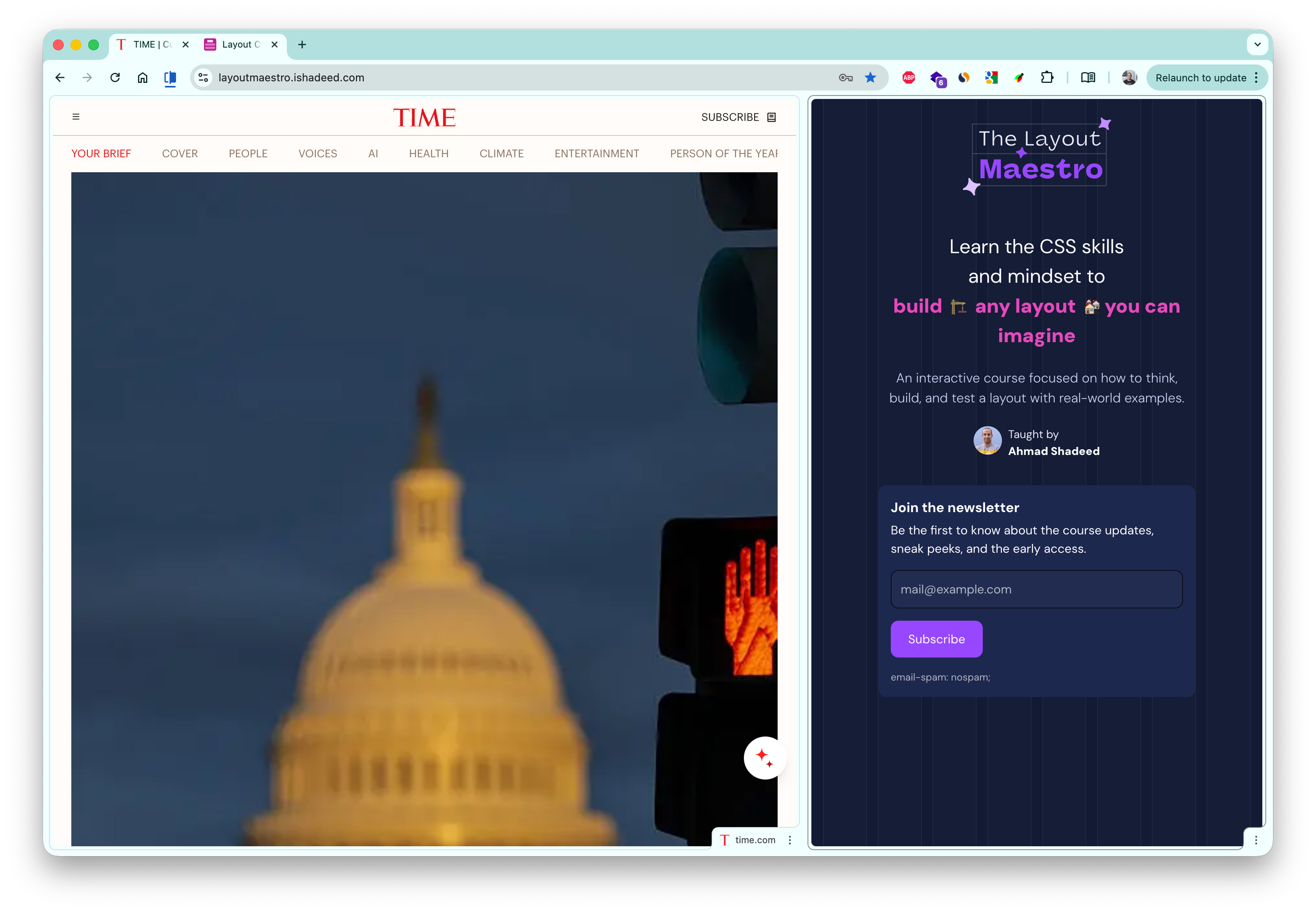
The user might open the page in a split view. Here is an example from Google Chrome.

I might browse on a tablet

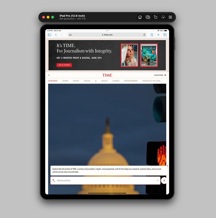
Simply, I might open the website on an iPad.

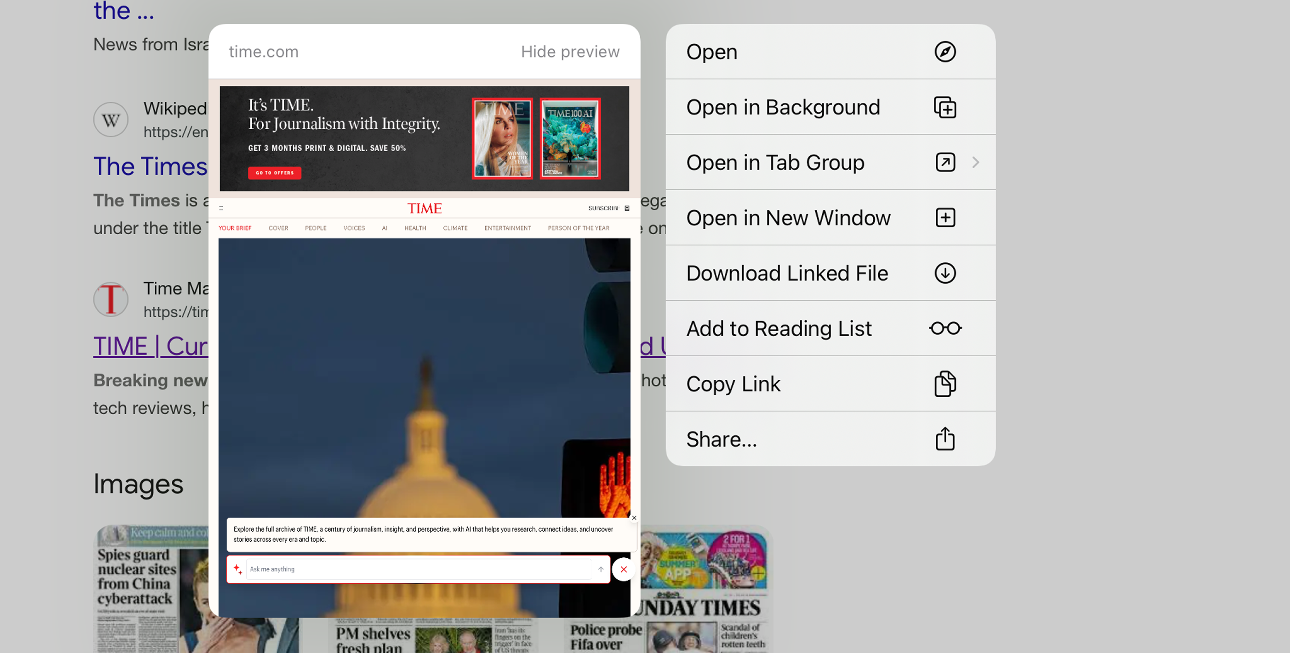
On iOS, we can tap and hold to preview link, this is a use-case where the viewport size might make the design look odd.

How we can do better?

  • Talk with the designer about having more breakpoints in between
  • Design with container queries in mind
  • Make the design dynamic at its core, meaning that it can change based on the number of items
  • Leverage well supported features like Grid and Flex

Here is an example of how I would build the Time.com hero section layout.

New Study Reveals Benefits of Morning Exercise

By Michael Chen

Tech Companies Announce Major AI Breakthrough

By Emily Rodriguez

Health Officials Urge Caution as Heat Wave Intensifies

A new study finds that late-night screen time is linked to sleep problems.

By Sarah Johnson

Empty grid area

Please don’t switch to the smallest layout too early, you can do better.

The Layout Maestro

Building layouts can be a challenging task, specially if you don’t know the core mental model of CSS layouts. You don’t have to worry about that anymore. I’m building a complete CSS course, and I called it, The Layout Maestro.

You can sign up in the link below.

It’s a fully interactive course that explains modern CSS layout. This very article that you just read is just a small taste of what the course will offer. If you are interested, you can sign up below for updates.

Thank you for reading!