


I spent years teaching CSS layout on this blog. I put everything I know into The Layout Maestro course: 70+ lessons and 150+ interactive examples that teach you how to think CSS layouts, not just memorize syntax.
For me, 2022 is the best year ever for CSS. We got a lot of new stuff supported in stable browsers and it’s just like living a dream. From CSS subgrid, :has selector, container queries, and the new viewport units. So many things to grasp, I understand - but I’m sure we agree that this is exciting, isn’t it?
Recently, the Chrome team released experimental support for a new proposed CSS spec, style queries. In short, they let us query the style of a container, rather than the size only. This can be helpful in cases where querying the container size isn’t enough.
Let’s dig in.
Before going into the details of style queries, I would like to have a quick reminder of container size queries first. Instead of relying on the viewport size to change the style of a component, we can simply query against the container size instead.
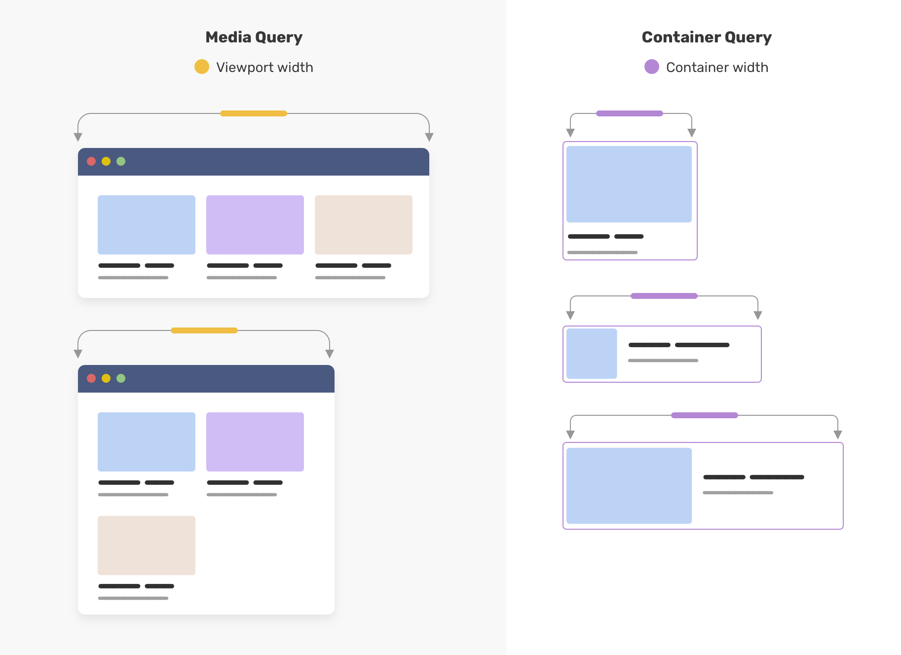
Let’s take a look at an example.
.o-grid__item {
  container-type: inline-size;
}

.c-article {
  /* The default style */
}

@container (min-width: 400px) {
  .c-article {
    /* The styles that will make the article horizontal**
	** instead of a card style.. */
  }
}
First, we need to define container-type on the container itself. Then, we can use @container and start querying. Once that condition is met, the CSS will apply to the component within that container.
In simple words, style queries let us query a CSS property or CSS variable for a container.
Style queries are still experimental and currently are implemented only in Chrome Canary. To test them, go to chrome://flags and activate the “Experimental Web Platform features” toggle.
For instance, we can check if the container has display: flex and style the child based on that.
.page-header {
  display: flex;
}

@container style(display: flex) {
  .page-header__start {
    flex: 1;
    display: flex;
    align-items: center;
    border-right: 1px solid lightgrey;
  }
}
Ideally, the above should work, but the current style queries prototype in Chrome Canary is limited to CSS variables only. Style queries are expected to ship in Chrome M111.
For now, we can check if the variable --boxed: true is added to the container and if yes, we can change the child element style based on that.
Consider the following figure.
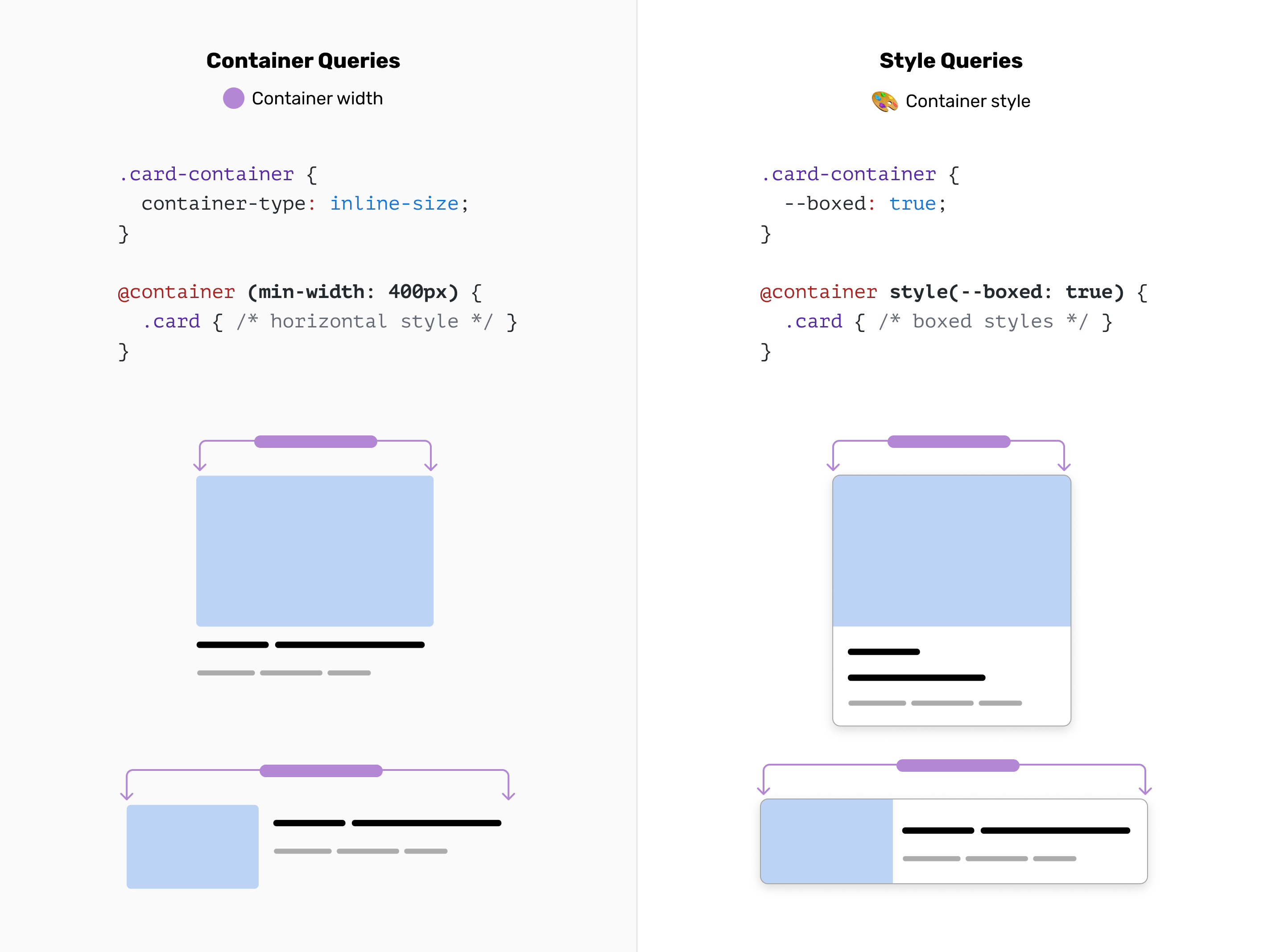
Notice that the main difference between container queries and style queries is that the first query is for the size and the latter query is for the style.
.card-container {
  --boxed: true;
}

@container style(--boxed: true) {
  .card {
    /* boxed styles */
  }
}
Before diving into where we can use style queries, I want to emphasize the question: what do style queries solve? Aren’t size queries enough already?
That’s a good question to start with. In size queries, we can control the styling of a component based on its parent width, and that’s very useful. In some cases, we might not need to query the size at all. Instead, we want to query the computed style of a container.
To give you a better idea, let’s look at the following figure.

This is an article body that is coming from a CMS. We have a default style for the figure and another style that looks featured.
Here is the HTML markup.
<figure>
  <img src="cheesecake.jpg" alt="" />
  <figcaption>....</figcaption>
</figure>
figcaption {
  font-size: 13px;
  padding: 4px 8px;
  background: lightgrey;
}
When we start styling the featured one, we need to override the above and have a CSS class that we can style with.
.featured-figure {
  display: flex;
  flex-wrap: wrap;
}

.featured-figure figcaption {
  font-size: 16px;
  padding: 16px;
  border-left: 3px solid;
  margin-left: -6rem;
  align-self: center;
}
Cool, that works. Can we do better? Yes! With style queries, we can add display: flex or a CSS variable --featured: true to the figure, and style based on that.
<figure>
  <img src="cheesecake.jpg" alt="" />
  <figcaption>....</figcaption>
</figure>
figure {
  container-name: figure;
  --featured: true;
}

/* Featured figure style. */
@container figure style(--featured: true) {
  img {
    /* Custom styling */
  }

  figcaption {
    /* Custom styling */
  }
}
And if --featured: true isn’t there, we will default to the base figure design. We can use the not keyword to check when the figure doesn’t have display: flex.
/* Default figure style. */
@container figure not style(--featured: true) {
  figcaption {
    /* Custom styling */
  }
}
So there is no need to define a style container at all. It’s there for you by default.
Yes, we can. The point of style queries is to make CSS more readable and easier to modify. The above logic can be written as one component CSS without adding all those styles to a conditional class.
What I like about using style queries is that it will reduce CSS specificity because we will rely less on CSS variation classes or HTML data attributes to style a component variation.
In the following CSS, we have a basic styling for a section. Nothing fancy.
.section {
  background-color: lightgrey;
}

.section__title,
.section__desc {
  color: #222;
}
We need a way to have a different theme for it, so we used a variation class.
.section--dark {
  background-color: #222;
}

.section--dark .section__title,
.section--dark .section__desc {
  color: #fff;
}
With style queries, we can use a container around the .section component, and then we tag the title and description without creating more specificity in CSS.
@container style(--theme: dark) {
  .section {
    background-color: #222;
  }

  .section__title,
  .section__desc {
    color: #fff;
  }
}
That looks much cleaner to me.
Let’s explore a few use cases where style queries can be helpful.
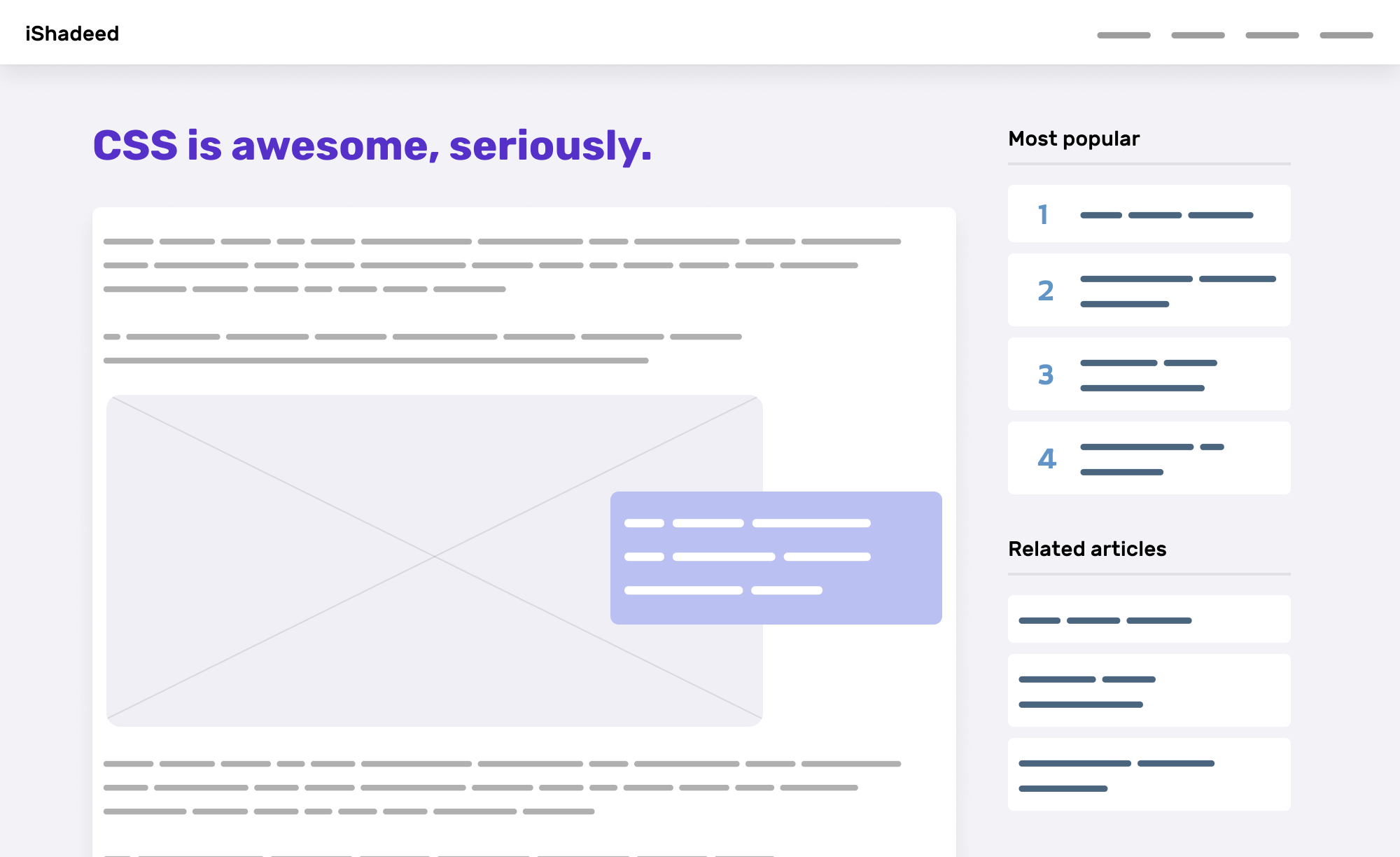
This is a common use case where we have the same component used differently in the same wrapper. In the aside, we have an article component that might include a number or not.
Currently, we might use a new CSS class to address the styling, or maybe a variation class on the article component itself.
.most-popular {
  counter-reset: list;
}

.most-popular article {
  /* custom styling */
}
Or we might use data attributes in the HTML.
.most-popular[data-counter="true"] {
  counter-reset: list;
}

.most-popular[data-counter="true"] .article {
  /* custom styling */
}
With CSS style queries, we can add a CSS variable to the parent element, and style the article accordingly. Look at that:
.most-popular {
  --counter: true;
}

@container style(--counter: true) {
  .articles-list {
    counter-reset: list;
  }

  .article {
    display: flex;
    align-items: flex-start;
  }

  .article:before {
    counter-increment: list;
    content: counter(list);
  }
}
We don’t even need to have a variation class on the article component. CSS nesting isn’t needed, too.
Some components we built need a different theme based on specific conditions. In the following example, we have a dashboard with different stats components.
Based on the wrapper, we need to switch the theme of the component.

Currently, we can style the custom stats component based on their container with a special class.
.special-wrapper .stat {
  background-color: #122c46;
}

.special-wrapper .stat__icon {
  background-color: #2e547a;
}

.special-wrapper .stat__title {
  background-color: #b3cde7;
}
The above isn’t wrong or bad at all, but it increases the specificity because we nested the CSS. Let’s explore how we can implement the above with style queries.
First, we need to define a toggle on the special wrapper. Then, we can check if that toggle is active, and style the stat component accordingly.
.special-wrapper {
  --theme: dark;
  container-name: stats;
}

@container stats style(--theme: dark) {
  .stat {
    /* Add the dark styles. */
  }
}
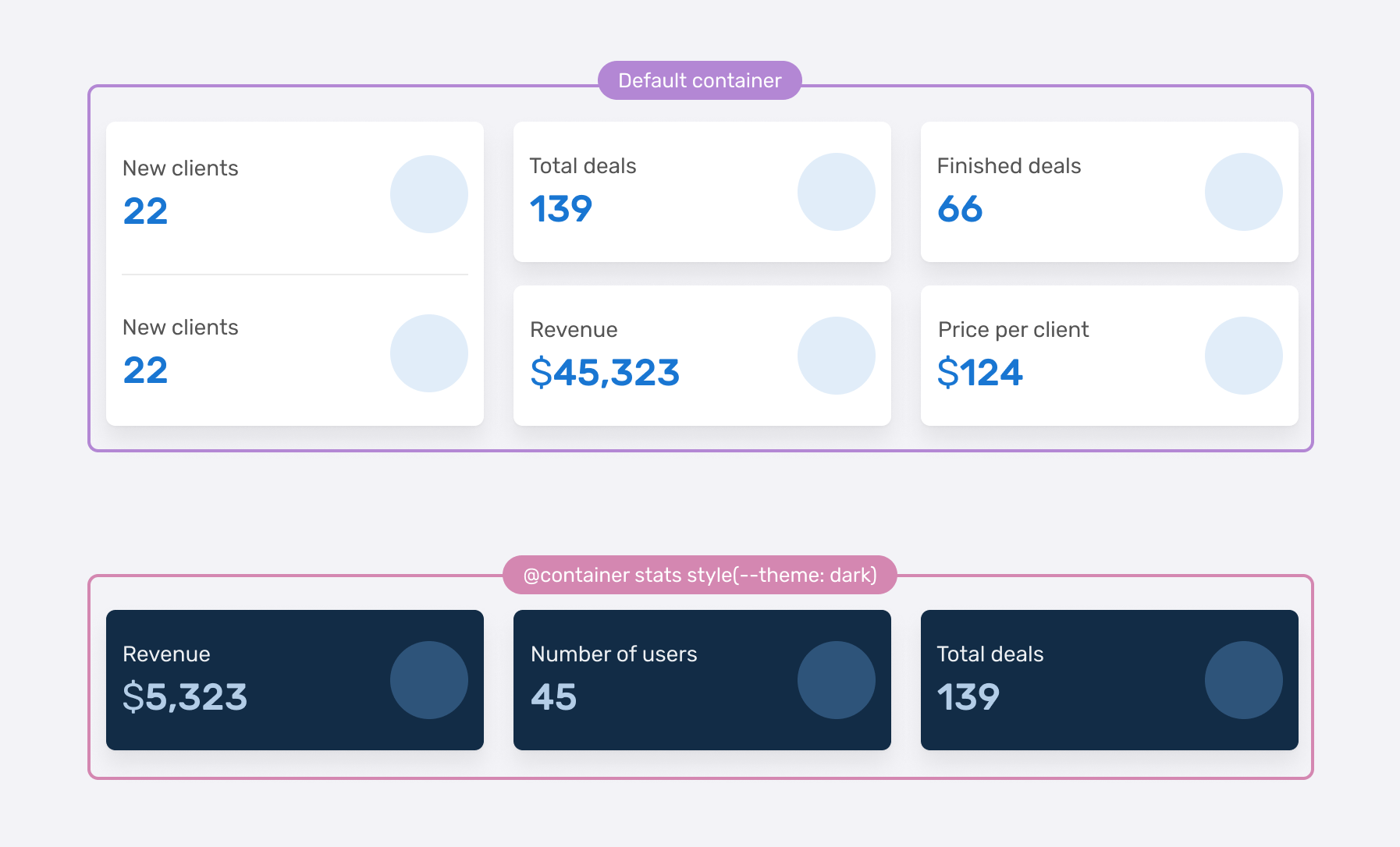
What’s useful about style queries in that context is that it will make sense to have the above style in one place in the CSS.
/* stat.css */
.stat {
  /* default styling */
}

@container stats style(--theme: dark) {
  .stat {
    /* custom styling */
  }
}
Size container queries are so powerful, they provided us with a way to query a component against its container. Here is a popular example from my article on container queries.
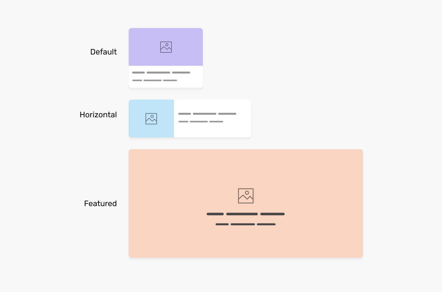
In CSS, we need to define a size container, and then query the article component based on that.
.o-grid__item {
  container-type: inline-size;
}

.c-article {
  /* Default card style */
}

/* Horizontal style */
@container (min-width: 400px) {
  .c-article {
    display: flex;
    flex-wrap: wrap;
  }
}
And the featured or hero style.
/* Featured/Hero style */
@container (min-width: 700px) {
  .c-article {
    display: flex;
    justify-content: center;
    align-items: center;
    min-height: 350px;
  }

  .card__thumb {
    position: absolute;
    inset: 0;
    object-fit: cover;
  }
}
That’s very useful. Where style queries can help us? That’s a very good question. In some cases, we might be interested only in applying one style based on the container size, and other styles might be conditional, or as per our need.
This is where style queries become beneficial. We can combine a size and style query for that purpose.
Consider the following CSS.
.o-grid__item {
  container-type: inline-size;
  --horizontal: true;
}

@container (min-width: 400px) and style(--horizontal: true) {
  /* Horizontal style */
}
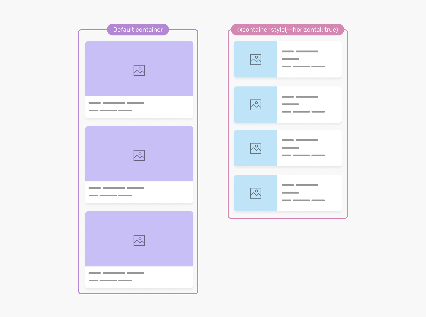
That way, the horizontal style will only work if the --horizontal variable is set to true on the container. You can name the variable and the value as you wish, for example --horizontal: please.
In the figure, the container size is the same, but what differentiates them is that the one on the right has --horizontal: true
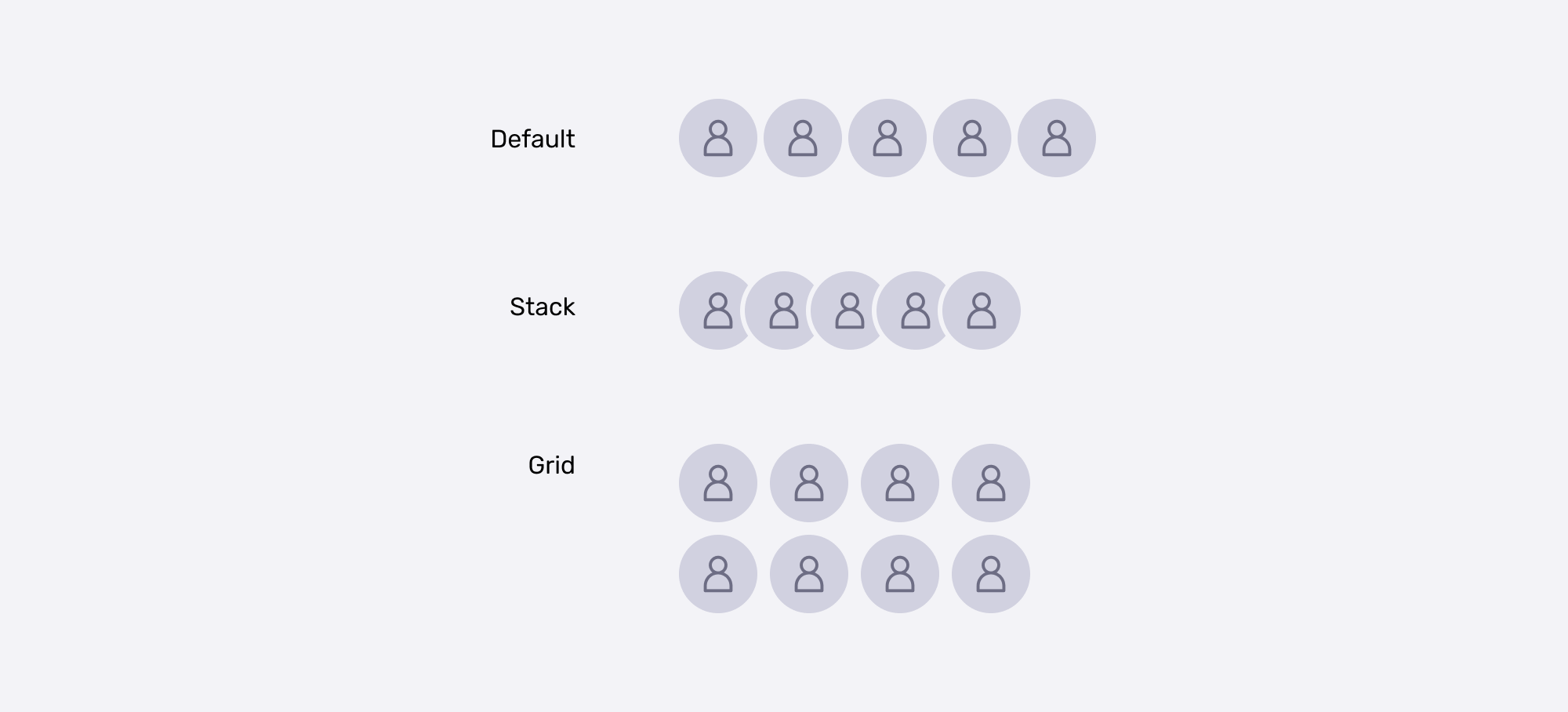
In this example, we have a group of user avatars. We need to lay them out differently based on a CSS variable that is set on the parent. I picked that example from the Atlassian design system.
Consider the following figure.
<div class="avatars-wrapper">
  <div class="avatars-list">
    <div class="avatar"></div>
    <!-- more avatars -->
  </div>
</div>
In CSS, I added a name to the container and defined the --appearance: default variable;
.avatars-wrapper {
  container-name: avatars;
}

.avatars-list {
  display: flex;
  flex-wrap: wrap;
  gap: 0.25rem;
}
With that, we can use style queries to change the layout based on the --appearance variable.
@container avatars style(--appearance: stack) {
  .avatar {
    box-shadow: 0 0 0 2px #fff;
  }

  .avatar + .avatar {
    margin-inline-start: -0.5rem;
  }
}

@container avatars style(--appearance: grid) {
  .avatars-list {
    gap: 0.5rem;
    max-width: 200px;
  }
}
I imagine this kind of logic within a design system. So helpful and clear (my opinion, just saying).
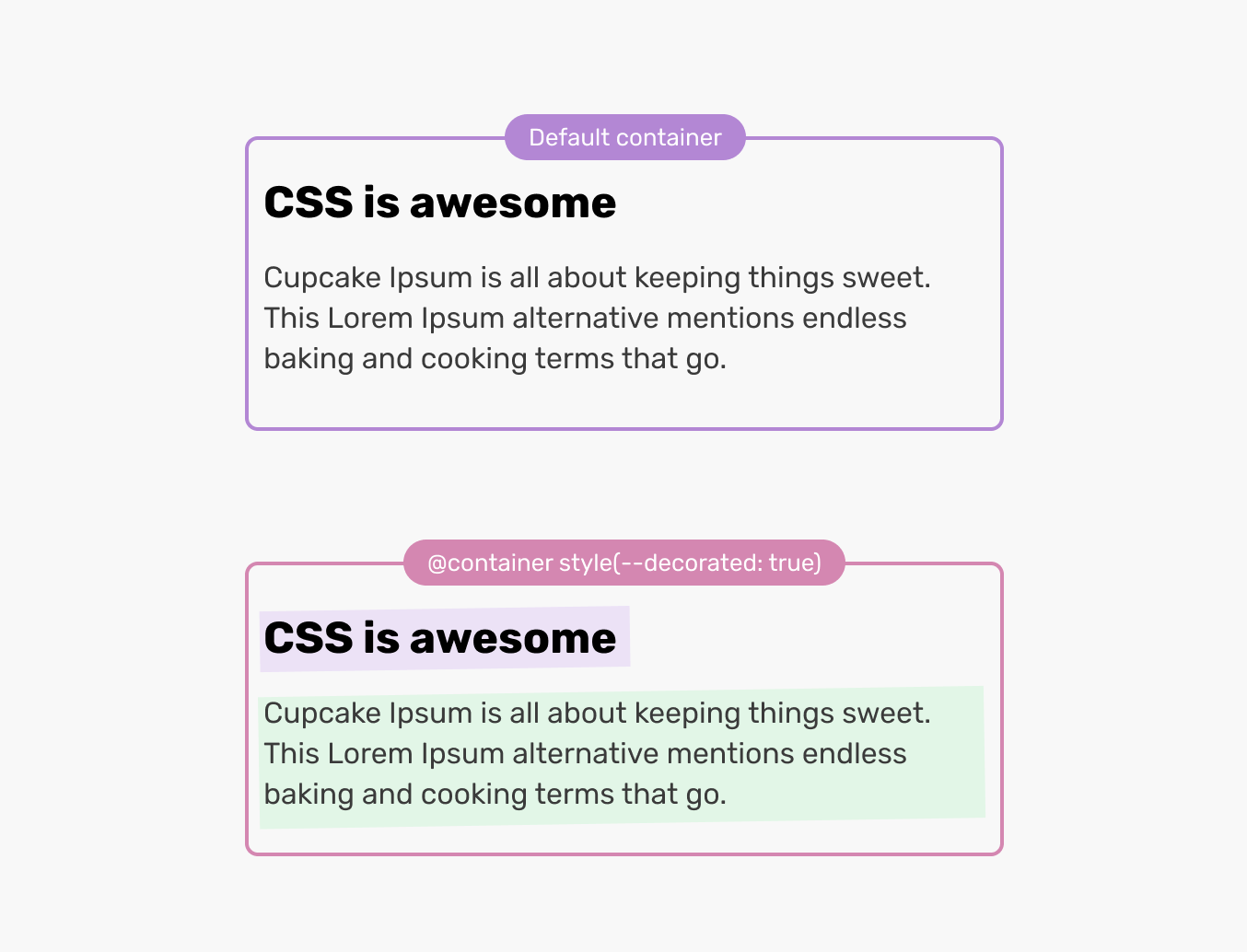
In some scenarios, we might need to add a conditional decorative style to text elements, based on where they are in the HTML.
Consider the following figure:
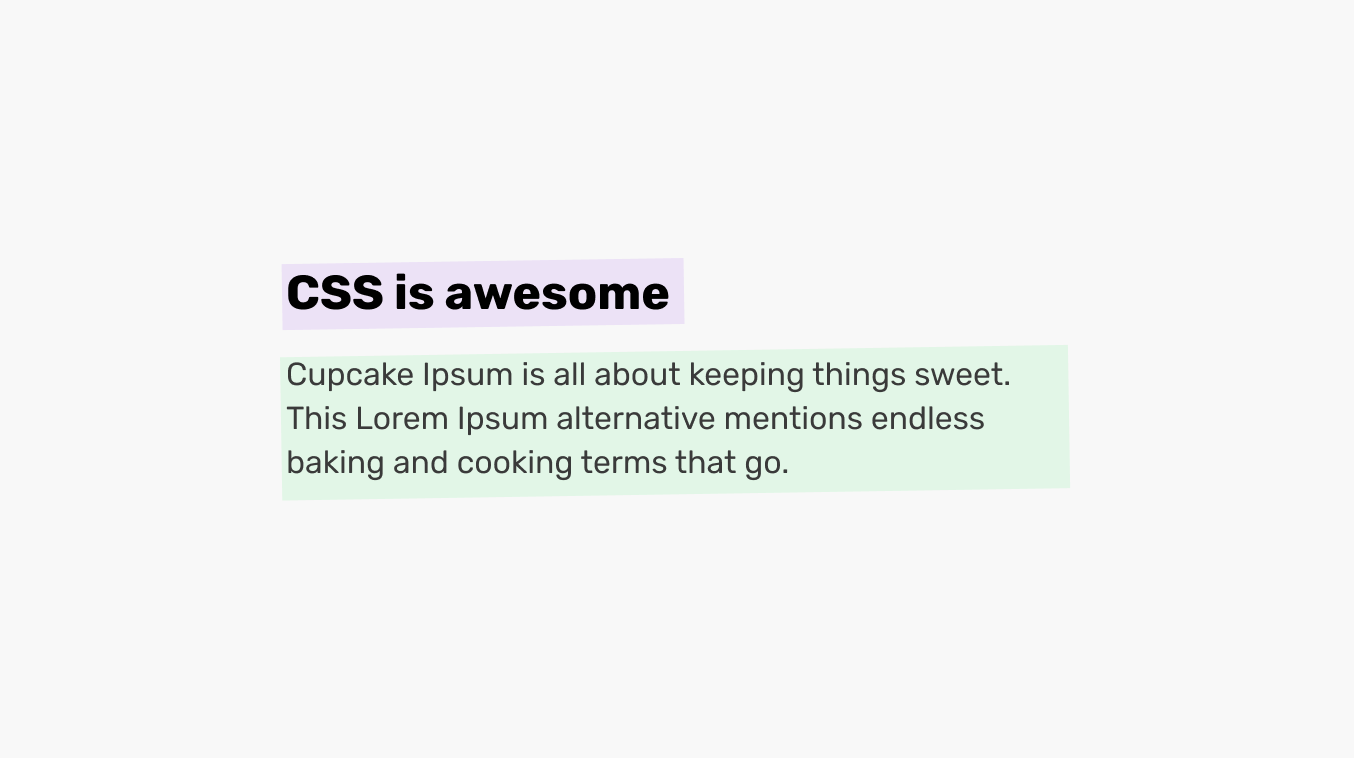
The heading and paragraph have a rotated background effect underneath them. This is done via a pseudo-element.
<div class="content">
  <h2><!-- Title here --></h2>
  <p><!-- Description --></p>
</div>
To style them, we can use a CSS variable and check if it’s toggled or not, and add the styles accordingly. In the example, the :after pseudo-element is added to every child of the .content container.
.content {
  --decorated: true;
}

@container style(--decorated: true) {
  :after {
    content: "";
    position: absolute;
    inset: 0;
    background-color: var(--dec-color, green);
    opacity: 0.1;
    z-index: -1;
    transform: rotate(-1.5deg);
  }
}
When writing RTL styles, the first step is to add dir=rtl to the <html> element. Once that is added, the direction CSS property for every element will become direction: rtl.
With the rise of logical properties, we don’t need to do a complete rewrite of the CSS. Consider the following example:
.item {
  margin-inline-start: 1rem;
}
For left-to-right layouts, the above will compute to margin-left. And for right-to-left layouts, it will be margin-right. Cool, right? But we still don’t have the logical CSS that will check a gradient direction.
Style queries can become handy for that problem. Consider the following example:
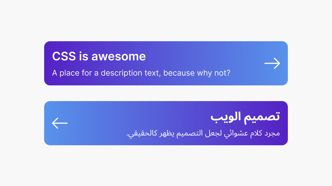
We have a component that consists of two elements, both of which should change direction based on the document:
The above can’t be controlled with logical CSS. Currently, we do something like this:
html[dir="rtl"] .card {
  background: linear-gradient(to left, ...);
}

html[dir="rtl"] .card__cta {
  transform: scaleX(-1);
}
With style queries, we can query the container and check if the direction is equal to rtl, and change the styles accordingly.
.card {
  --bg-angle: to right;
  background: linear-gradient(var(--bg-angle), #5521c3, #5893eb);
}

@container card style(direction: rtl) {
  .card {
    --bg-angle: to left;
  }

  .card__cta {
    transform: scaleX(-1);
  }
}
Please keep in mind that the current prototype of style queries doesn’t support CSS properties within the style() query. As a result, I used a CSS variable in my demo instead.
I wrote an in-depth guide about RTL styling in CSS, in case you are interested.
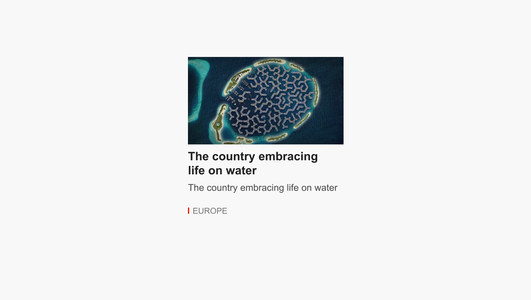
What makes me excited about exploring this use case is that it’s a real problem that I spotted on bbc.com. Initially, we have the following news component.
Based on its container, the styling should change a bit. Consider the following figure:
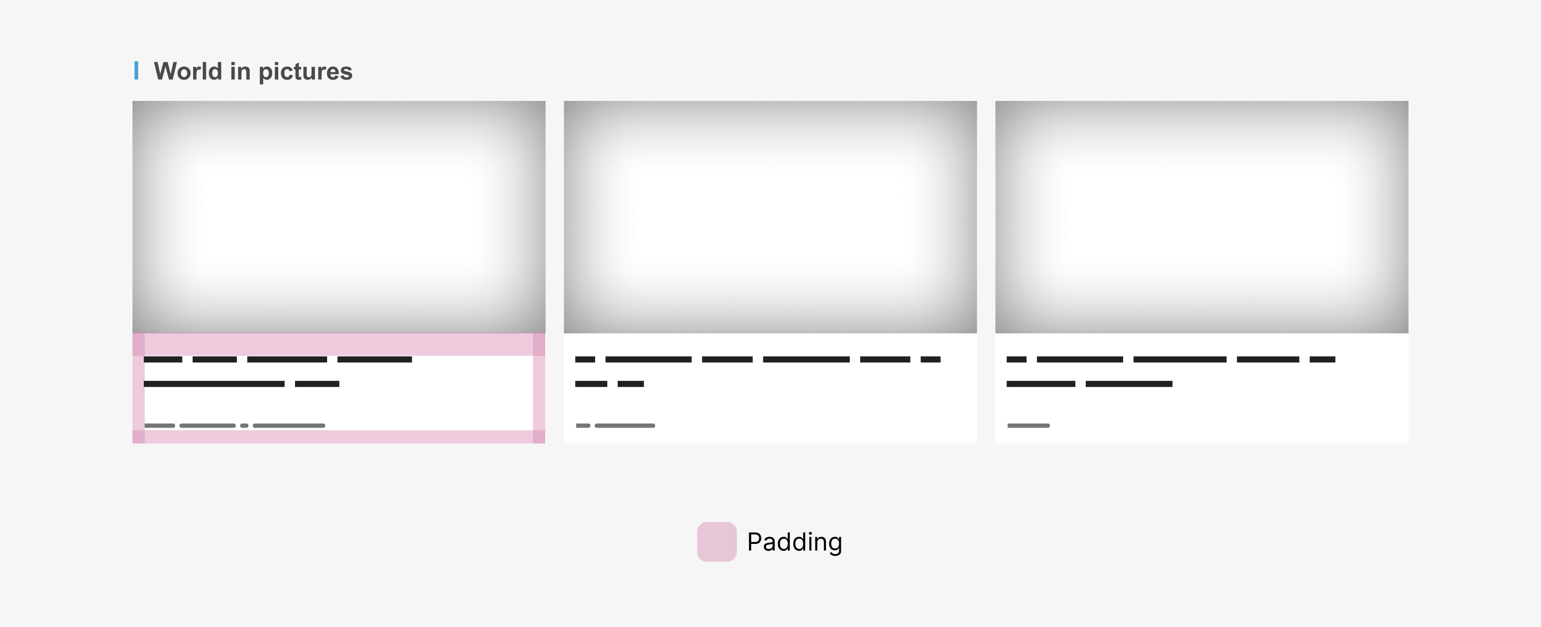
Notice how the component now has two modifications:
Here is how the CSS looks on BBC.com.
.media--padded {
  background: #fff;
}

.media--padded .media__content {
  padding: 0.75rem 0.75rem 3rem 0.75rem;
}
How we can solve that via style queries? Simply, we need a way to tell the component that if you live within this container, the card style should be padded.
.special-container {
  --card--padded: true;
}

@container style (--card-padded: true) {
  .media {
    background: #fff;
  }

  .media__content {
    padding: 0.75rem 0.75rem 3rem 0.75rem;
  }
}
From the same website, I spotted another potential use case. See the following figure:
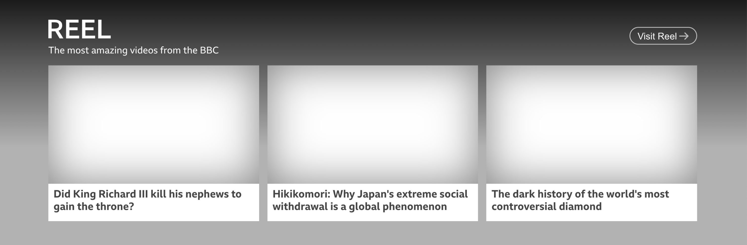
There are two differences:
The current CSS looks like this:
.module--reel p {
  color: white;
  font-size: 18px;
  margin-top: 10px;
  margin-bottom: 20px;
}
With style queries, it’s a different story. No need to duplicate any CSS. We just need to turn on the CSS variables that we need.
.module--reel {
  /* The previous style query will work just fine. */
  --card--padded: true;
  --light-on-dark: true;
}

@container style (--card-padded: true) {
}

@container style (--light-on-dark: true) {
  p {
    color: white;
    font-size: 18px;
    margin-top: 10px;
    margin-bottom: 20px;
  }
}
That’s neat, right?
In Sass pre-processor, we used to have a mixin that we inject into any CSS component or page, and it will add CSS outline to all child elements.
@mixin debug {
  * {
    outline: solid 1px red;
  }
}
And then we can use the mixin like the following:
.some-element {
  @include debug;
}
With style queries, we can use a CSS variable for that which allow us to debug any component we need.
@container style(--debug: true) {
  * {
    outline: solid 1px red;
  }
}

.site-header {
  --debug: true;
}

Block links is the way of forcing a link to fill its parent, even if the actual link is a simple title.
Consider the following example.

“The “Read more” link in the card component is clickable, but we can improve the user experience by making the entire parent element clickable as well.”
The downside of a block link is that the text won’t be selectable, and in case we have other links (e.g: author name), it won’t work.
So why not toggle them based on the card container? This is where style queries come in handy.
.card {
  position: relative;
  container-name: card;
  --block-link: true;
}

@container card style(--block-link: true) {
  a:after {
    content: "";
    position: absolute;
    inset: 0;
    outline: solid 2px;
  }
}
Useful, isn’t it?
In my container queries lab, I published an example of a download card that changes based on the container size. With style queries, we can make it even better.
For example, I want to change the card style if the maximum width is 220px and the --card: true variable is available.
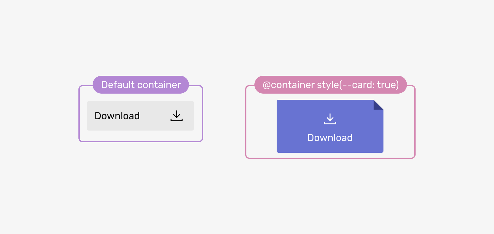
.download-wrapper {
  /* Defining the container name and size */
  container: download / inline-size;
  --card: true;
}

@container download style(--card: true) and (max-width: 220px) {
  .c-download {
    flex-direction: column;
    align-items: center;
    text-align: center;
  }

  svg {
    order: -1;
  }
}
It was nice to work on this article. I enjoy this kind of work where there is a new CSS feature and my job is purely doing intensive research on how we can use it.
CSS style queries are a powerful addition to CSS. I can’t wait to see what others from the web community will do with them, too. Oh, and I also can’t resist the urge to create a new directory in iShadeed lab for style queries. Stay tuned!
If you have any feedback or question, I’m on Mastodon on front-end.social/@shadeed9, and Twitter (@shadeed9) if you’re still around.
此内容由惯性聚合(RSS阅读器)自动聚合整理,仅供阅读参考。 原文来自 — 版权归原作者所有。