


I spent years teaching CSS layout on this blog. I put everything I know into The Layout Maestro course: 70+ lessons and 150+ interactive examples that teach you how to think CSS layouts, not just memorize syntax.
When you build a layout in CSS, it’s important to account for and test short and long text content. Having a clear idea of what to do when the text varies in length can prevent a lot of unwanted issues.
There are many situations where adding or removing one word can change how a design looks, or even worse, it can break it and make it inaccessible. In my early days of learning CSS, I underestimated what adding or removing a word can do. In this article, I will go through the different techniques that you can use right away to handle different text lengths in CSS.
Before going into the techniques to handle text content, let me shed the light on the problem first. Let’s suppose that we have a vertical navigation.
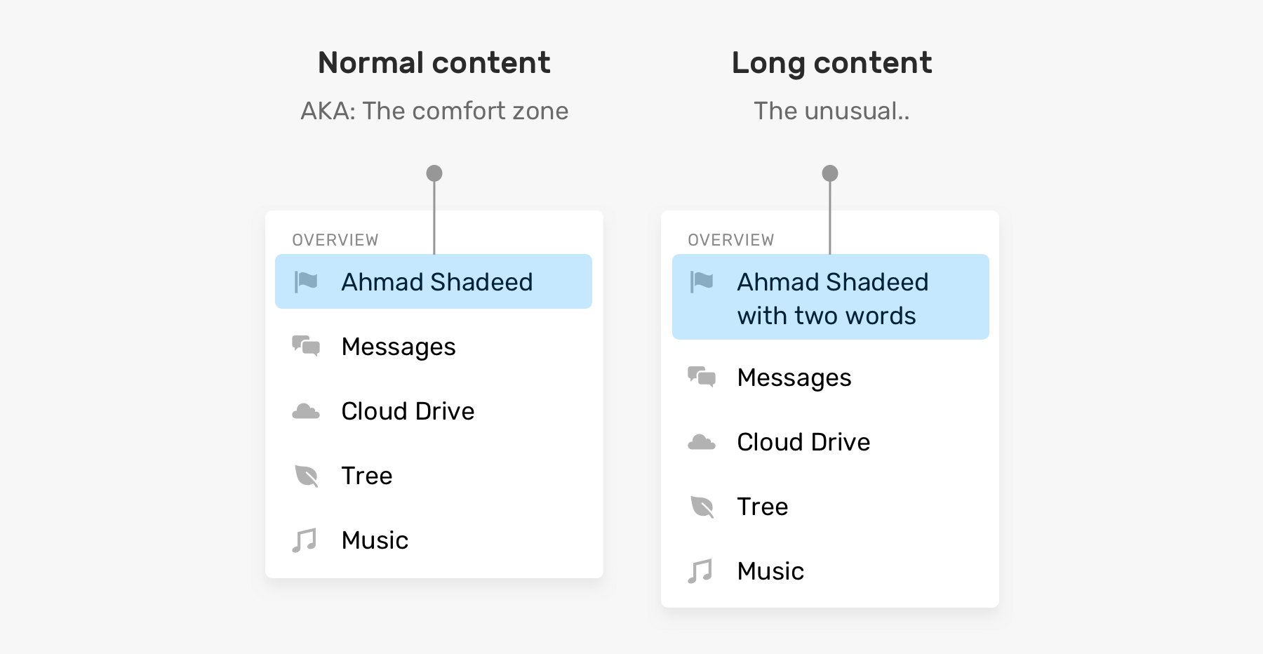
Names length can vary, especially if you are working on a multilingual website. In the example above, the name is wrapped into a second line as it becomes longer. Here are some questions:
That’s the case with more words than expected, but what happens when a word is too long? By default, it will overflow its container.
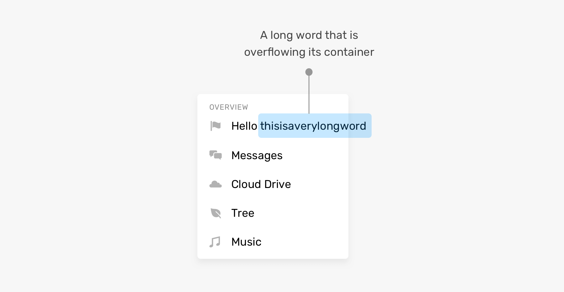
As a front-end developer, it’s important to decide on what should happen in such cases. Luckily, there are some CSS properties that were designed just for solving such problems.
Adding on that, the problem is not only about long content, but also short content can break a UI, or make it look weird, at least. See the example below:
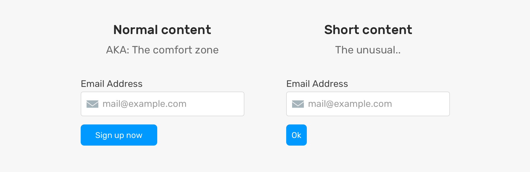
The button with the text “ok” is very small in width. I’m not saying that this is a fatal problem, but it can make the button look weak or hard to be noticed.
What we should do in such a case? Maybe set a min-width on the button? That can provide a safe width regardless of the content length.
As you just read, it’s not about the long content. Also, short content can cause problems. By using some CSS techniques, we can at least reduce the issues of long or short content.
Now that you have an idea about the problems, let’s dig into the CSS techniques that provide a solution for dealing with long content.
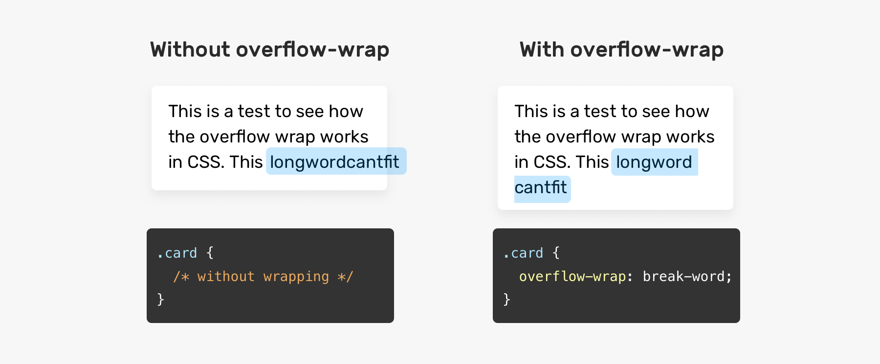
The overflow-wrap property guides the browser into setting a break in case a word can’t fit its container.
.card {
  overflow-wrap: break-word;
}
A CSS property that lets the bowser decide on how words should be hyphenated when text content wraps across multiple lines. The hyphenation can either be done manually by inserting an HTML symbol that guides the browser if it needs to hyphenate a word.
.element {
  hyphens: auto;
}
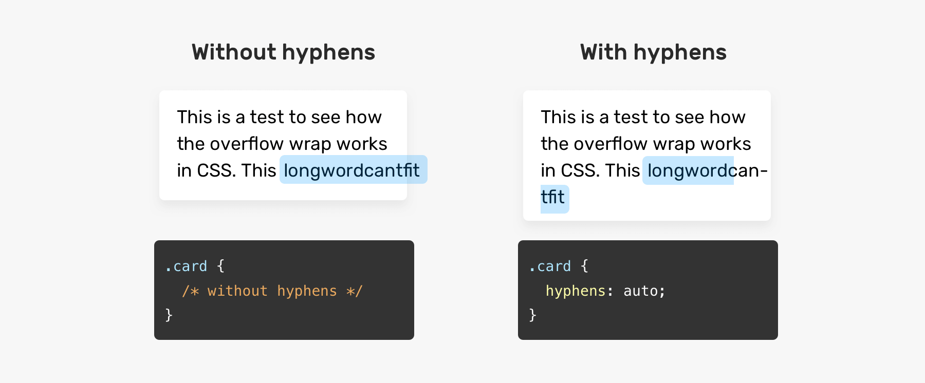
Though, it’s important to keep in mind that hyphens: auto will hyphenate any word that can’t fit in a line. What does that mean? See the below figure.
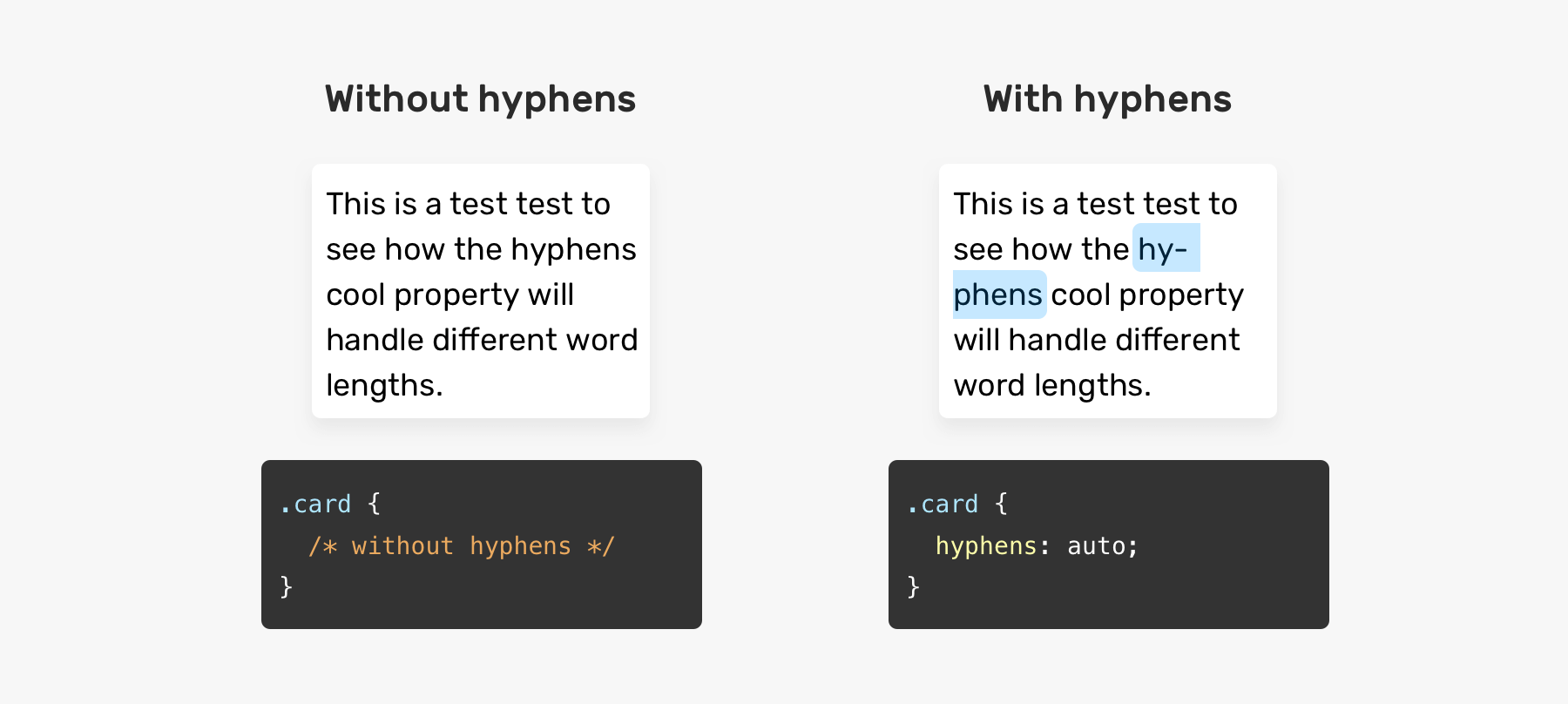
Notice how the browser hyphenated a word while it can be simply moved to the next line. When using hyphens: auto, it doesn’t matter if a word can’t fit in its container or not.
Truncation means adding dots at the end of a sentence to give an indication that there is more text content.
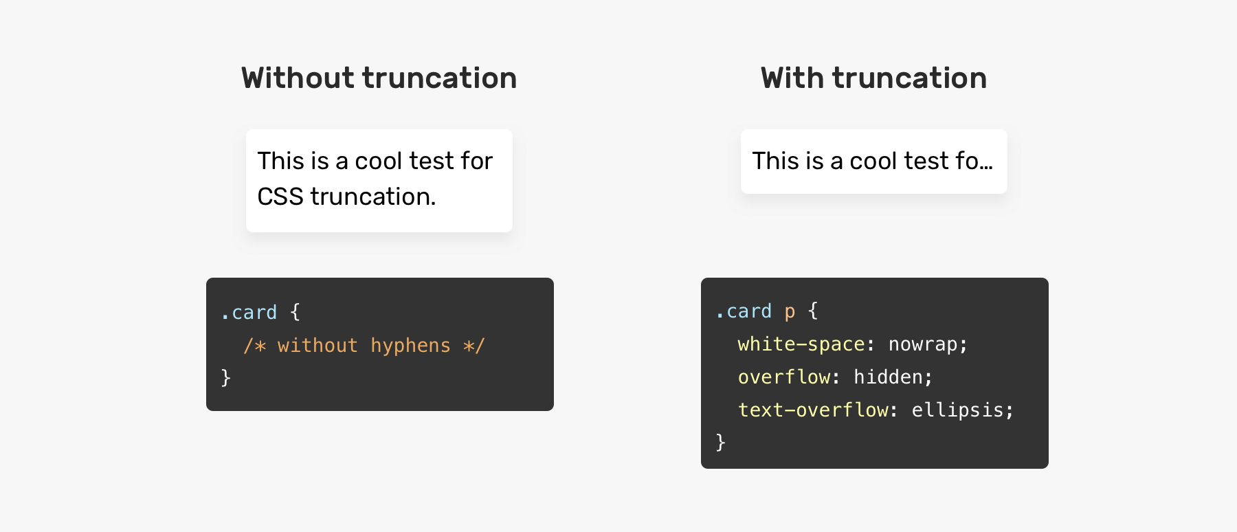
There is no text-truncation property or something, but it’s a mix of some CSS properties that do the job for us.
.element {
  white-space: nowrap;
  overflow: hidden;
  text-overflow: ellipsis;
}
If you want multiple line truncation, you should use line-clamp property.
.element {
  display: -webkit-box;
  -webkit-line-clamp: 3;
  -webkit-box-orient: vertical;
  overflow: hidden;
}
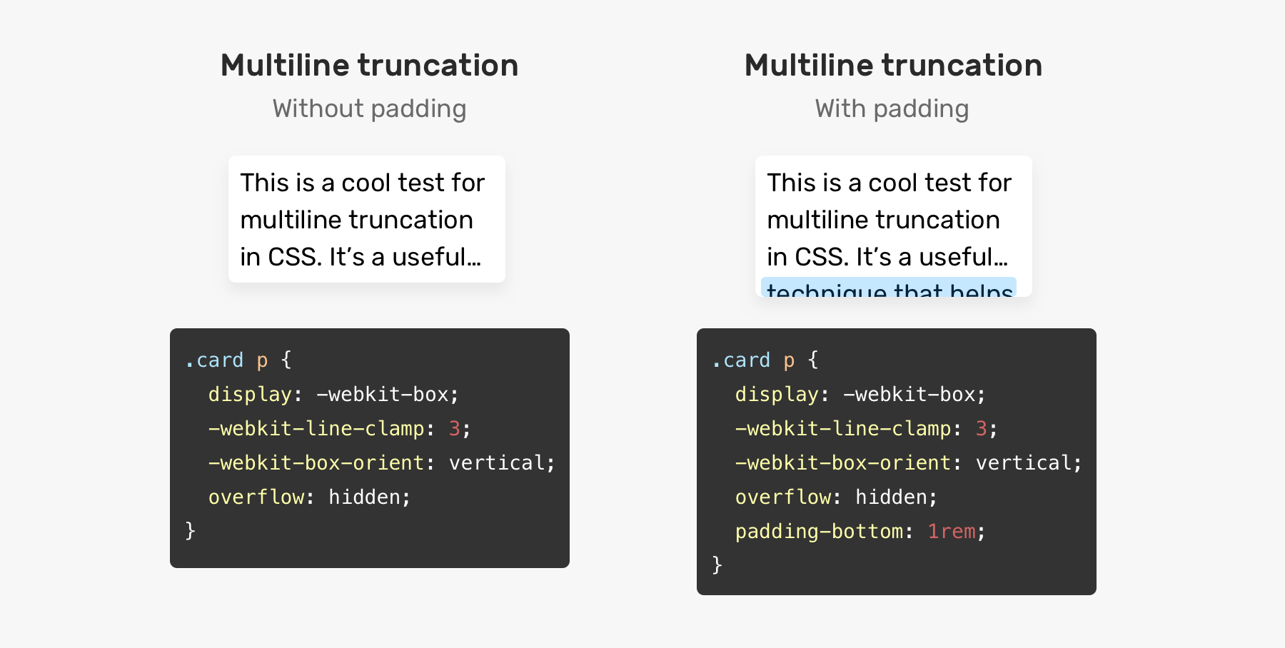
For this technique to work, display: -webkit-box must be used. The -webkit-line-clamp specifies the maximum number of lines for the truncation to work.
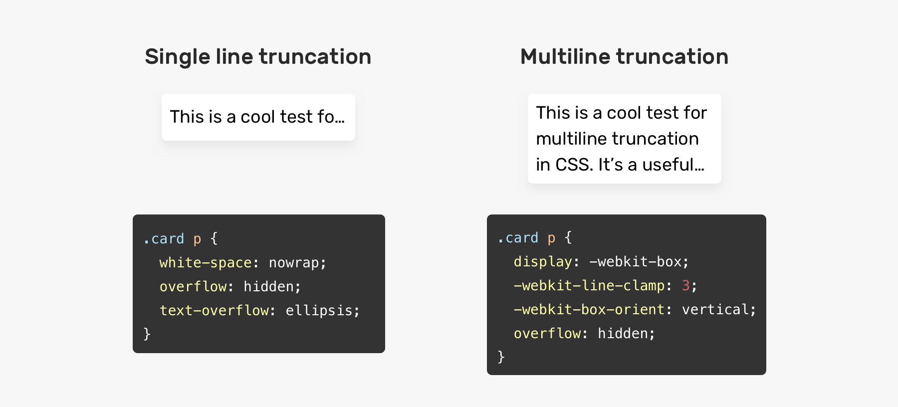
The downside to this technique is that it can easily fail if you want to add padding for the element. When you add padding, this will result in showing a part of the next line, which is supposed to be truncated. See the figure below:
Sometimes, it’s not always practical to break or hyphenate a word. For example, a javascript code might become hard to read when a long word is broken into a new line. In such a case, allowing horizontal scrolling will make the reading experience better.
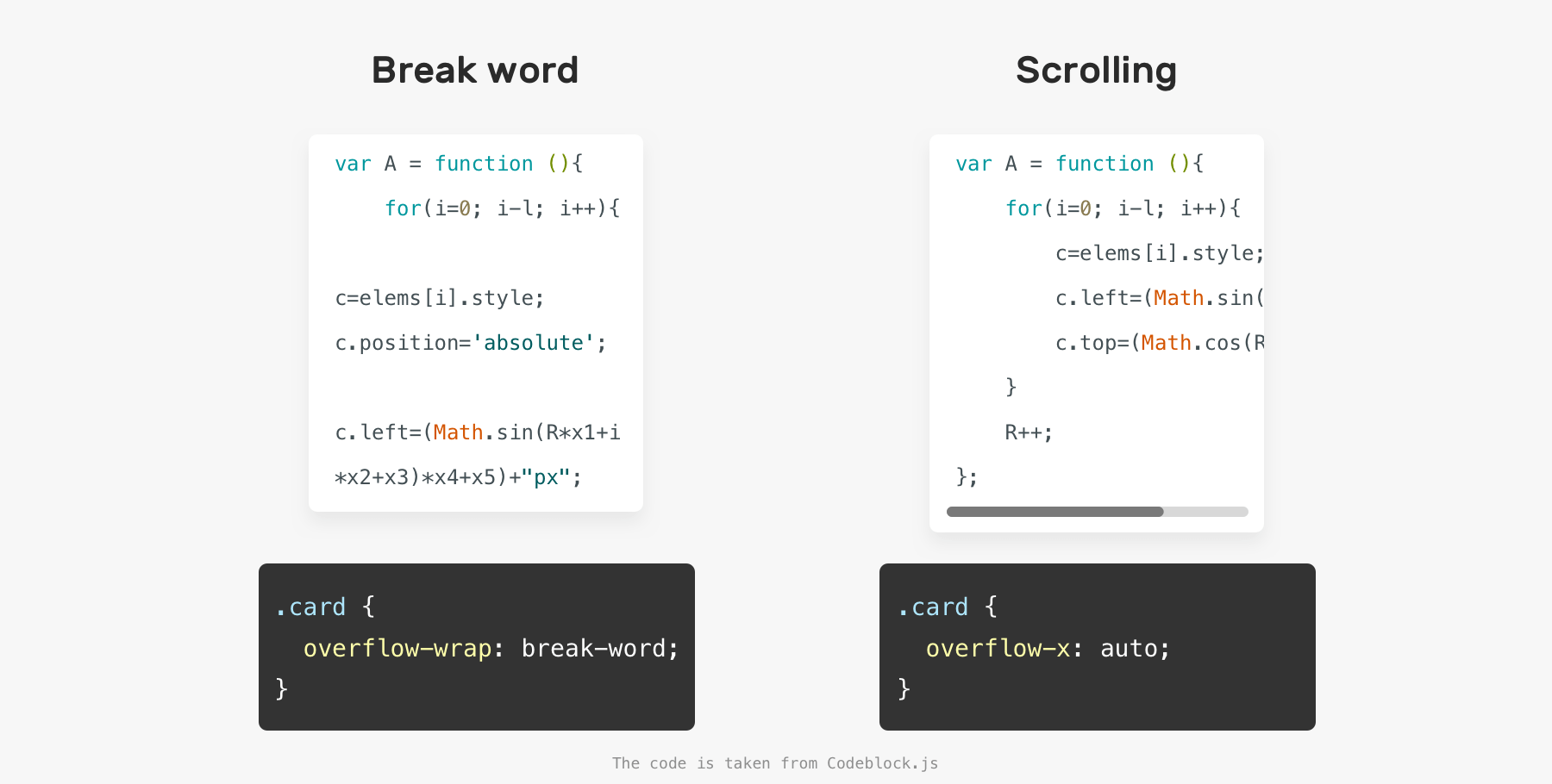
.code {
  overflow-x: auto;
}
In some cases, you might forget to add padding until you notice a visual issue. Consider the following:
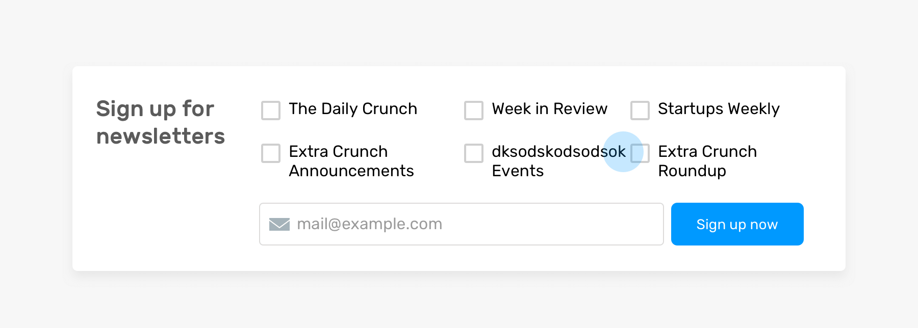
We have a list of checkboxes, and one of them is very close to its sibling item. The reason that this happened is that there is no gutter on the grid. This is a real-life example from Techcrunch website.
I know that this might not be that common for you, but it’s an important thing to consider when designing and building a UI.
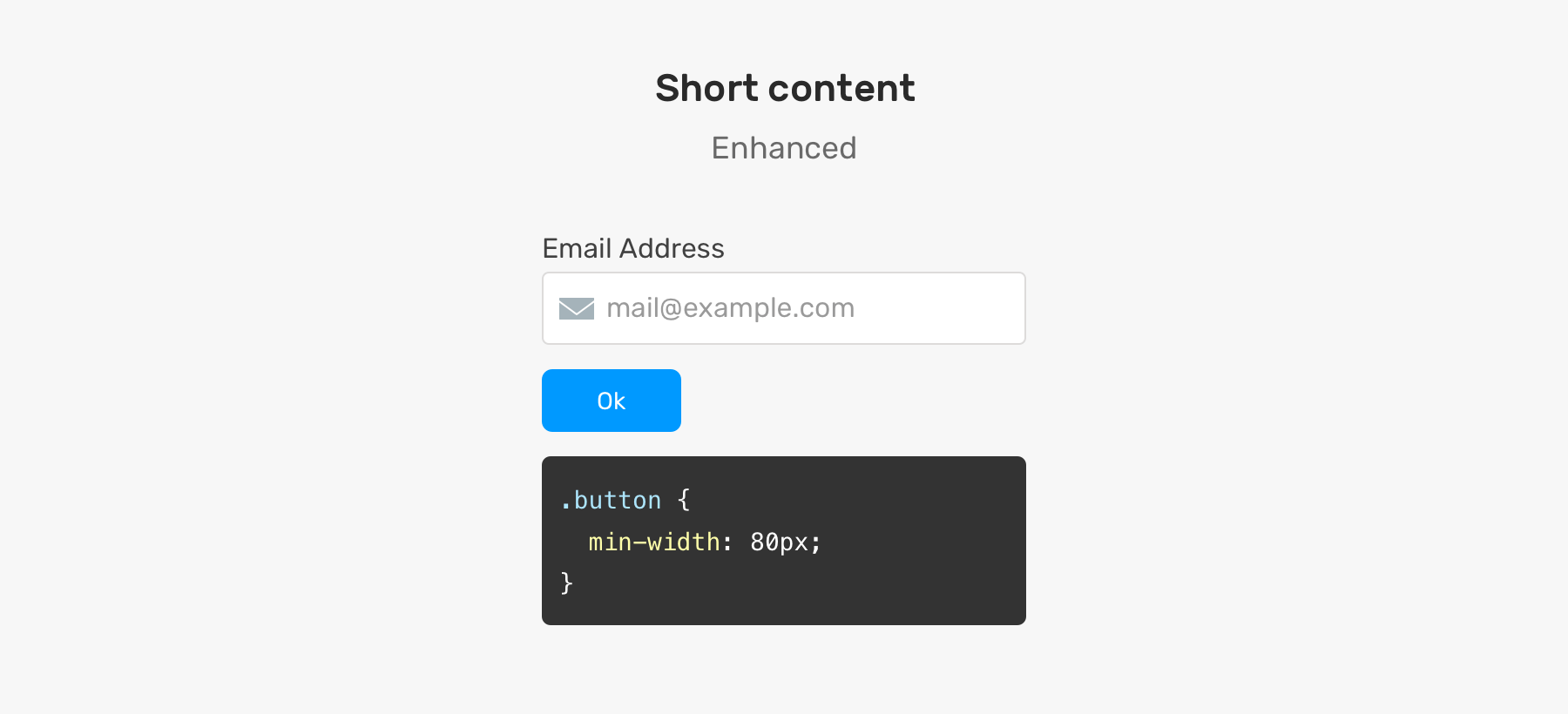
Let’s get back to the example that I showed you at the beginning of the article. How can we enhance this and make the button look better?
We can solve this by simply adding a min-width to the button. That way, it won’t go below that width.
Now that you have an idea about the problem and its solutions, let’s explore some use cases and examples from around the web.
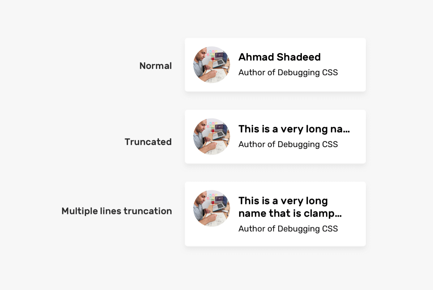
This is a common example of long content. It’s hard to predict the length of a name. How we should deal with it?
/* Solution 1 */
.card__title {
  text-overflow: ellipsis;
  white-space: nowrap;
  overflow: hidden;
}

/* Solution 2 */
.card__title {
  display: -webkit-box;
  -webkit-line-clamp: 2;
  -webkit-box-orient: vertical;
  overflow: hidden;
}
You can either truncate the text with a single line or do the truncation only when the text is two lines long.
When dealing with a multilingual layout, the content length will change. Consider the following example:
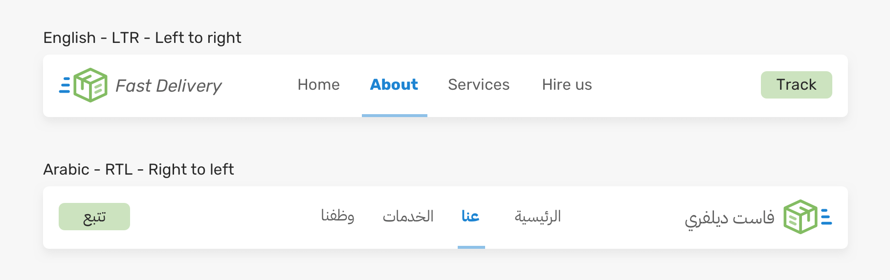
The navigation item “About” is larger in LTR (left-to-right) compared to RTL (right-to-left). In RTL, the item looks too small. Having a small clickable area is not good for UX. What we can do? In such a case, it will be a good idea to set a minimum width for the navigation item.
.nav__item {
  min-width: 50px;
}
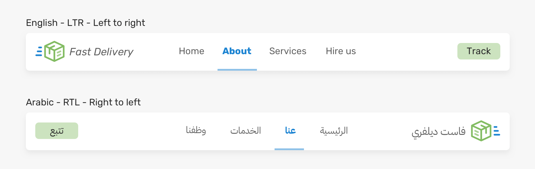
For more details about the difference between words, I wrote about this in detail in my RTL styling 101 guide.
Having a long word or a link is common, especially on mobile. Consider the following:
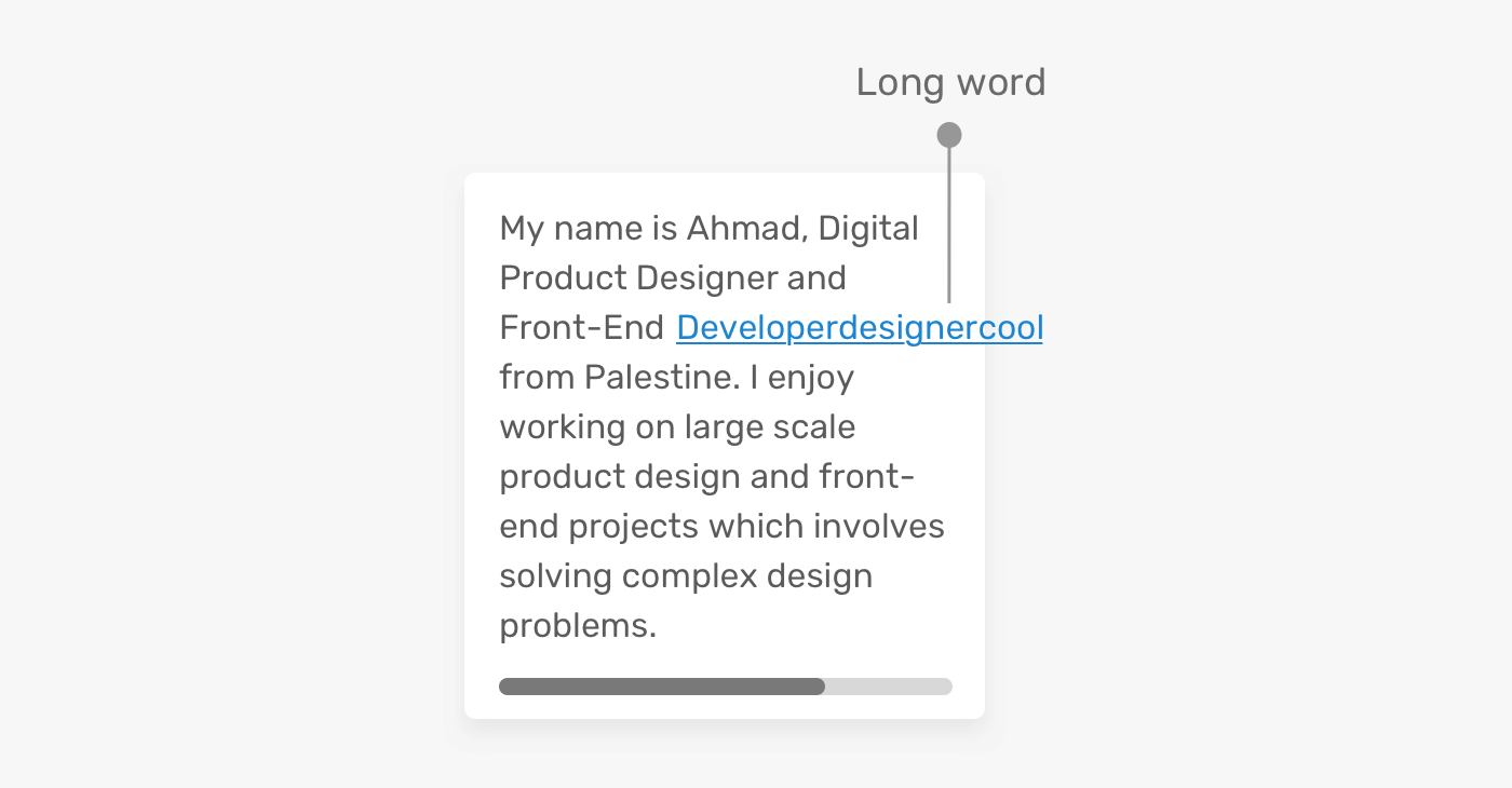
We have a long word that is overflowing its container and causing horizontal scrolling. As you learned, you can solve this by either using overflow-wrap or hyphens.
.article-content p {
  overflow-wrap: break-word;
}
A product name can vary from one word to multiple lines. In this example, the product name is too close to the delete button as a result of not adding enough spacing between them.
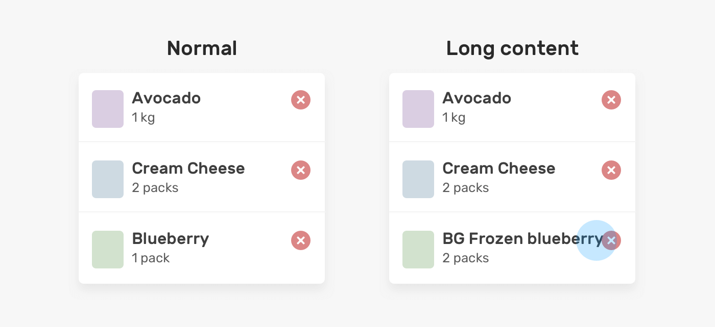
The solution can be done by either adding padding or margin. It’s up to you and the context, but for simplicity reason, I will show you the margin solution.
.product__name {
  margin-right: 1rem;
}
There is a behavior that happens with flexbox and long content that causes an element to overflow its parent. Consider the following example:

<div class="user">
  <div class="user__meta">
    <h3 class="user__name">Ahmad Shadeed</h3>
  </div>
  <button class="btn">Follow</button>
</div>
.user {
  display: flex;
  align-items: flex-start;
}

.user__name {
  text-overflow: ellipsis;
  white-space: nowrap;
  overflow: hidden;
}
However, when the content is long, this won’t work. The text will overflow its parent.

The reason is that flex items won’t shrink below their minimum content size. To solve this, we need to set min-width: 0 on the flex item .user__meta.
.user__meta {
  /* other styles */
  min-width: 0;
}

For me details, you can read about this in the Min and Max Width/Height in CSS article on my blog.
I hope that you learned about the different techniques to deal with short and long content in CSS. I enjoyed working on this article as it refreshed some little details, and will be a good reminder for me in some upcoming projects.
I’m excited to let you know that I wrote an ebook about Debugging CSS.
If you’re interested, head over to debuggingcss.com for a free preview.
此内容由惯性聚合(RSS阅读器)自动聚合整理,仅供阅读参考。 原文来自 — 版权归原作者所有。