


I spent years teaching CSS layout on this blog. I put everything I know into The Layout Maestro course: 70+ lessons and 150+ interactive examples that teach you how to think CSS layouts, not just memorize syntax.
This year, I saw a lot of hype about the popular CSS framework, TailwindCSS. I thought that I would share some thoughts and concerns regarding this UI framework.
I have a bit of experience writing utility-first CSS when I started my career in the front-end a few years ago. In this article, I will share with you what I think about it.
The main headline on Tailwind official website says the following:
Rapidly build modern websites without ever leaving your HTML.
I agree that writing code in one place can be faster than jumping between different files. However, leaving my HTML isn’t a problem for me. It can help to switch contexts between markup and styles. When I think about it, having a separated HTML and CSS files can help me to focus more on the task at hand. Though, when the markup and styles are mixed, things can get messy if you work on a complex multilingual, responsive, and themeable UI.
When I work with Tailwind, it’s similar to holding two pens, one for sketching, and the other for coloring. Writing markup and CSS at the same time reminds me of those two pens. The powerful difference in Tailwind is that the colored pen has limitations or constraints. In other words, you are allowed to only use the pre-defined colors.
For me, it’s better to focus on writing accessible, semantic markup, and then to handle the styling separately somewhere.
In a design system, we usually define the color, spacing, sizing, and other variants. A developer job will be much easier when there is a limit to what they can do. Tailwind CSS does that well. The idea of defining custom config files is very useful.
You don’t need to think about naming CSS classes. That can make it faster to implement web layouts.
I found this useful when your boss emails you that there is an urgent landing page that should be done today, and you only got 3 hours to build it. Tailwind can help you in achieving that very quickly. However, if you stick to writing separate markup and styles, it will take much more time.
Another useful usage is a competition or a hackathon. The most important thing in such events is to build and get something to work. No one will care about how you wrote the CSS, right?
The secondary text in their website says:
A utility-first CSS framework packed with classes like…
From what I’ve seen, it’s a utility-only framework. Maybe naming it utility-only will affect how newcomers understand it? It’s rare for me to see a website using Tailwind, and is applying the utility-first concept.
Heads up: I’m aware of the @apply method.
Let’s take this example from Tailwind docs.
<input
  class="block appearance-none bg-white placeholder-gray-600 border border-indigo-200 rounded w-full py-3 px-4 text-gray-700 leading-5 focus:outline-none focus:border-indigo-400 focus:placeholder-gray-400 focus:ring-2 focus:ring-indigo-200"
  placeholder="[email protected]"
/>
This is an input with 17 CSS classes. Which is easier, to read through the classes horizontally one by one, or to scan them vertically? Here is how the above will look in a CSS file.
.c-input {
  display: block;
  appearance: none;
  background-color: #fff;
  @include placeholder(grey);
  border: 1px solid rgba(199, 210, 254, var(--tw-border-opacity));
  border-radius: 0.25rem;
  padding: 0.75rem 1rem;
  line-height: 1.25rem;
  color: rgba(55, 65, 81, var(--tw-text-opacity));
}

.c-input:focus {
  /* Focus styles.. */
}
I can read and understand that this input contains these styles much faster than scanning the HTML. There might be plugins for code editors that can auto-format the HTML classes to have each on a separate, but you can’t achieve that in the browser DevTools.
I’m aware of the @apply method, but every time I think about it, I find that it’s against the core concept of Tailwind. Here is the same previous example (the input).
.c-input {
  @apply block appearance-none bg-white placeholder-gray-600 border border-indigo-200 rounded w-full py-3 px-4 text-gray-700 leading-5 focus:outline-none focus:border-indigo-400 focus:placeholder-gray-400 focus:ring-2 focus:ring-indigo-200;
}
Look at the length of this list of classes.
If the point of Tailwind is utility-first, then why it’s rare to see a usage of @apply in their official docs or Tailwind UI product? Again, I see it as a utility-only CSS framework.
In a design system, it’s hard to discuss a specific component without agreeing on a name for it. The point is, you won’t send a message like this to your colleague:
Hey mate, do we have an update about “bg-white w-full py-3 px-4” yet?
Instead, a conversation will be like this:
Hey mate, do we have an update about the polarized card design?
At the end of the day, you will need to set and think about a unique and meaningful name for every single component of the project you’re trying to build. That applies, of course, when you want to scale and maintain the project for a long time.
I was joking with a friend a while ago about what if we put the “traditional naming” on the side, and instead call ourselves like this instead of unique names:
<person class="hair-brown length-[175] face-rounded"></person>
It doesn’t make sense. This is much better.
<person class="ahmad"></person>
When I first started using Tailwind, I needed to add the class that is responsible for align-items: center. My first thought was to use align-center, but it didn’t work. I looked up at the docs and I was confused.
The class items-center will add the CSS property align-items: center, where the class align-middle will be for vertical-align: middle. It needs a bit of muscle memory to memorize them.
For an experienced web developer, they can adapt easily to this and it won’t be a big deal for them. The interesting thing though is for a new CSS comer. Learning Tailwind without having a solid knowledge of CSS can lead to misunderstanding in the future. For example, a developer started their career by only using Tailwind, when they are requested to write CSS from the scratch, they won’t be able to do so. I don’t say it’s impossible, but it needs time and effort.
I do both design and front-end development so editing in the browser DevTools is extremely important for me. When Tailwind is used, this can get harder. Say for example, that I want to edit the padding for a component. When I edit the value of the class py-3, it will affect every element on the page that is using it.
The only way to remove it is by opening the .cls menu in the DevTools, and then it’s possible to toggle the class. However, this didn’t solve the problem. What I can do in such a case is adding an inline style via DevTools, which I don’t like.
This problem will be solved by simply naming things.
Adding on that, the total file size of the full Tailwind build is 12MB. Editing CSS in the DevTools will be very slow. That means, designing in the browser is not efficient.
Recently, the Tailwind team release JIT (just in time) compiler that removes the CSS that is not being used. This will prevent the whole idea of designing in the browser.
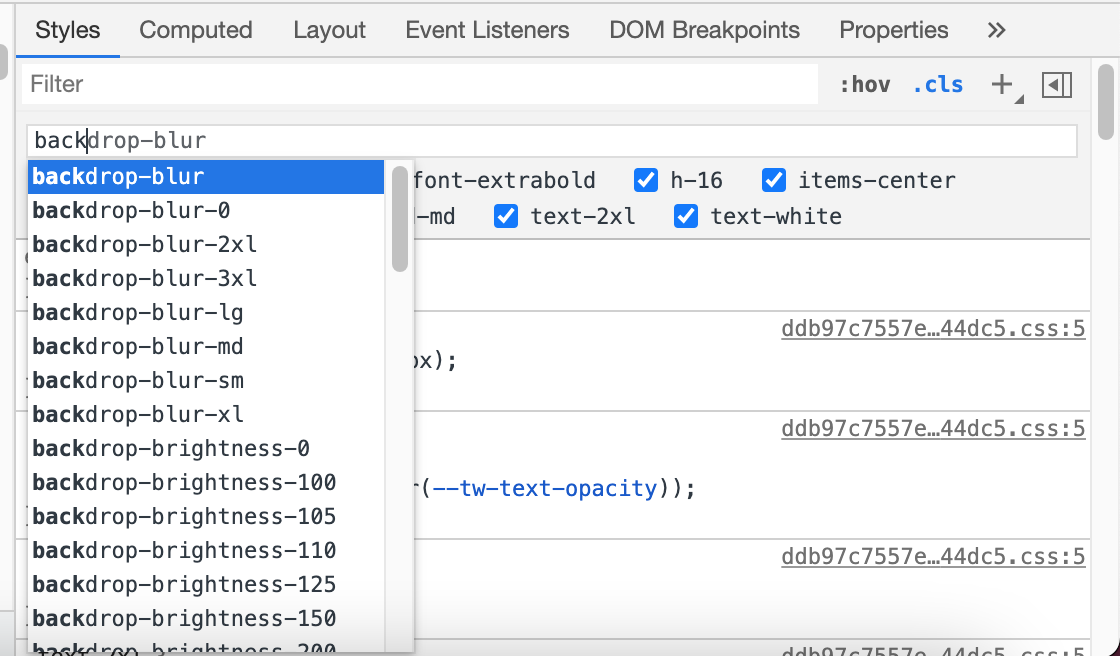
In the figure above, I typed back and got a long list of all the CSS classes available. With JIT, we won’t have that.
To give you a bit of context, I work on websites that should work in both English (LTR) and Arabic (RTL). Consider the following:
/* LTR: left to right */
.c-input {
  padding-left: 2rem;
}
In a separated CSS file for RTL, the style will look like this:
/* RTL: Right to left */
.c-input {
  padding-left: 0;
  padding-right: 2rem;
}
In the example above, the padding should be flipped based on the page direction (left-to-right or right-to-left). There are already plugins for that, but they solve the problem from the outside only.
The first plugin I found is doing the following:
html[dir="rtl"] .ml-2 { margin-right: 1rem; }
This isn’t a good solution for me. The second plugins was a bit different:
[dir="rtl"] .rtl\:text-2xl {
  font-size: 1.5rem;
  line-height: 2rem;
}
This can get out of control very quickly. Recently, I was inspecting a website and noticed over 30 CSS classes.
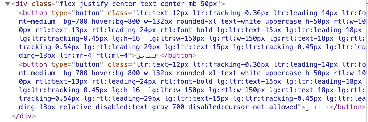
It’s an example of how Tailwind can get out of control, especially for newcomers. Having to write 30+ classes for a button component is too much. In such a case, I would better go with inline styles instead.
Currently, I use Bi-App Sass to help in building a multilingual website. Here is a sample:
.elem {
  display: flex;
  @include margin-left(10px);
  @include border-right(2px solid #000);
}
This will compile to two different CSS files. The LTR file:
/* LTR Styles */
.elem {
  display: flex;
  margin-left: 10px;
  border-right: 2px solid #000;
}
..and the RTL:
/* RTL Styles */
.elem {
  display: flex;
  margin-right: 10px;
  border-left: 2px solid #000;
}
Read more about RTL styling in this guide by yours truly.
One of the problems of Tailwind CSS is that if you have a list of cards, and you want to change a specific set of classes, you will need to manually go over them in the code editor. This won’t be a problem if you use partials or components in your product. You can write the HTML once, and any edit will reflect anywhere that component is used.
That’s not always the case. I work on simple index.html pages that don’t deserve to be divided into partials or components. In such a case, working with Tailwind and editing CSS can be an error-prone process, because you can’t even use “Find & Replace” as it can miss up some other elements on the page.
The Tailwind team created a set of well-crafted components called Tailwind UI that are easy to be customized, and ready for usage in your project.
The look & feel of the components are nice, and I like it. Though there’s a problem, if a website is using Tailwind UI, there is a high possibility that I will predict that.
Usually, when you use Tailwind UI, it means that you don’t have the time to build a custom-made design, thus you need something to get up and running quickly, right? This is a good use case except that it will make a lot of websites look similar to each other, similar to what we Bootstrap was years ago.
For example, the clip-path property is not included, and I totally understand the reason. Let’s suppose that we want to include it as a component. Where we should include the CSS?
<article
  class="block appearance-none bg-white placeholder-gray-600 border border-indigo-200 rounded w-full py-3"
></article>
Either we can include it in the Tailwind config like this:
// tailwind.config.js
module.exports = {
  theme: {
    clipPath: {
      // Configure your clip-path values here
    },
  },
}
Or we can do the following:
.card {
  @apply block appearance-none bg-white placeholder-gray-600 border border-indigo-200 rounded w-full py-3;
  clip-path: inset(20px 20px 50px 20px);
}
Imagine if Tailwind happens only at the compile time? That means you write normal CSS with naming and everything, and a smart compiler will convert your CSS into utility classes? That would be a dream coming true.
In my current projects, I use a combination of utility classes and normal CSS. It’s a perfect combination for me. I don’t lose the power of utility classes, and at the same time, I use them without cluttering the HTML.
Thank you for reading.
此内容由惯性聚合(RSS阅读器)自动聚合整理,仅供阅读参考。 原文来自 — 版权归原作者所有。