


I spent years teaching CSS layout on this blog. I put everything I know into The Layout Maestro course: 70+ lessons and 150+ interactive examples that teach you how to think CSS layouts, not just memorize syntax.
One of the most common causes of confusion in CSS is facing specificity while writing styles. For example, changing the display value for an element never works because another element in the cascade overrides it due to having a higher specificity. Or when another element has !important That usually happens when the codebase is growing and we’re not organizing CSS in a way that prevents (or reduces) such problems.
To overcome the fights with the cascade and specificity issues, we need to be careful about where to write a specific CSS block. In small projects, this can be okay, but for large ones, it’s a time-consuming task. As a result, we started to see different methods to help us organize our CSS better and thus reducing the cascade issues. The first three that came to my mind are the BEM (Block, Element, Modifier), Smacss by Jonathan Snook and Inverted Triangle CSS by Harry Roberts.
In this article, we’ll explore how cascade layers work, and how they will help us write CSS with more confidence, along with use-cases and examples.
Are you ready? Let’s dive in!
The main problem cascade layers solve is providing a guaranteed way to write CSS without worrying about specificity and source order. Let’s take an example to illustrate the problem.
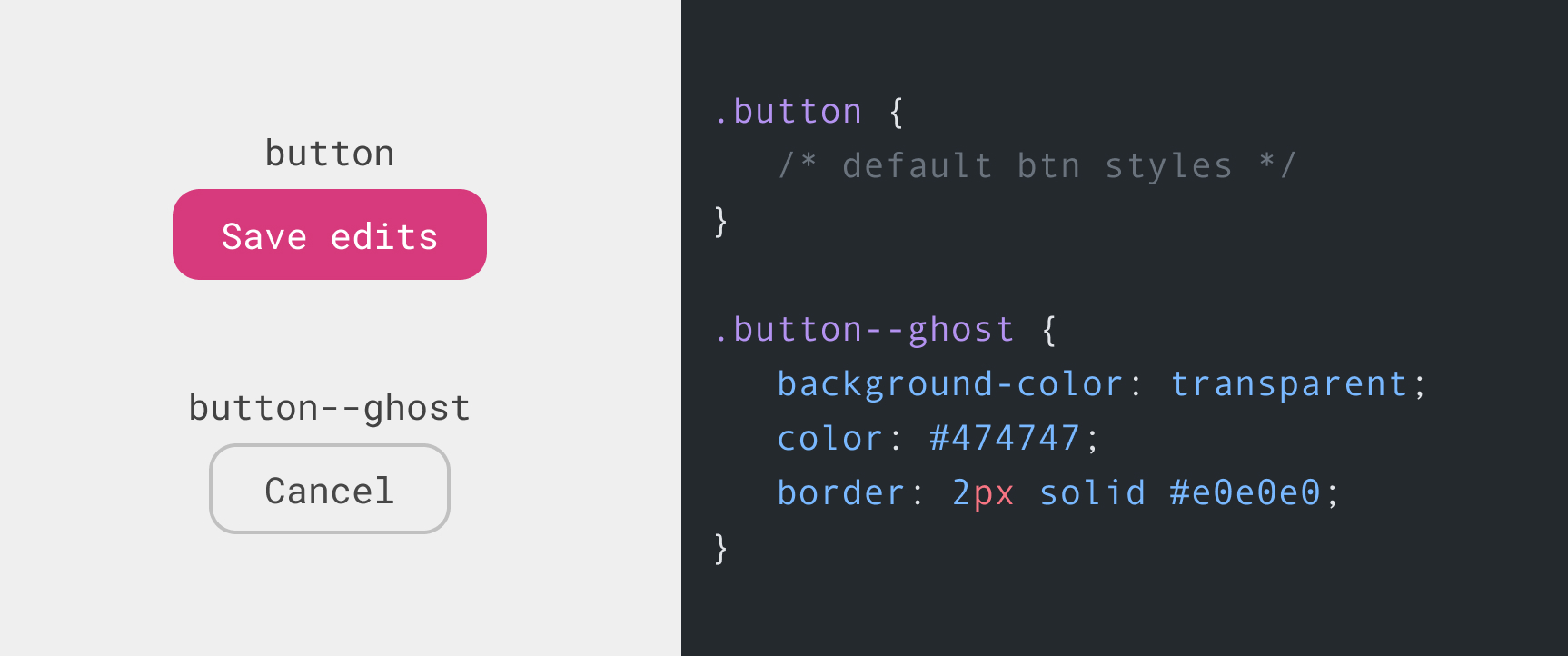
We have a button with two styles, the default and the ghost ones. In HTML, here how we will use them:
<footer class="form-actions">
  <button class="button">Save edits</button>
  <button class="button button--ghost">Cancel</button>
</footer>
The above work great in that case. But what if we need to have a third variation for the button but we can’t write it right after the .button declaration?
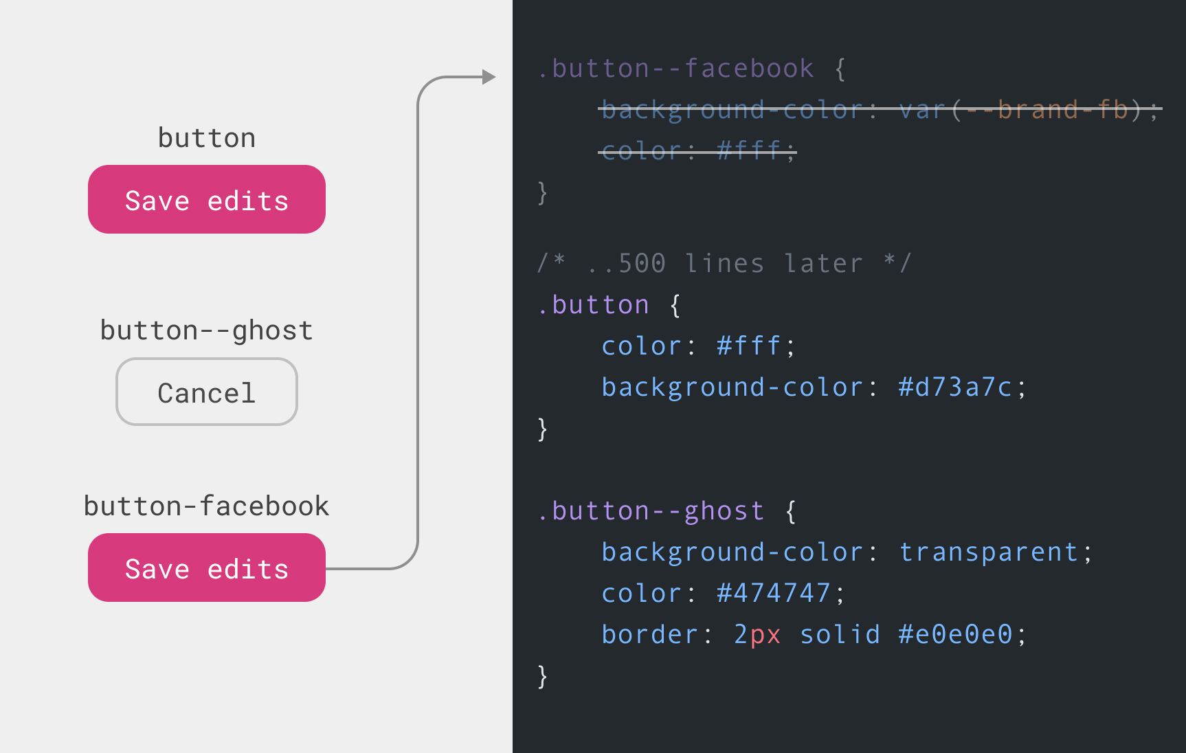
The .button is coming after the .button--facebook. As a result, it will override it. In that case, we might workaround this by increasing the specificity for .button-facebook like:
.some-parent .button--facebook {
  background-color: var(--brand-fb);
  color: #fff;
}
Or we can do this (don’t do this at home!)
.button--facebook {
  background-color: var(--brand-fb) !important;
  color: #fff !important;
}
Either solution isn’t that good. The best one is to write them in the correct place, right after the .button declaration. It’s not an easy job to do that without getting help from a CSS pre-processor (like Sass, for example) to help in dividing the CSS files into partials and components.
Cascade layers is a new CSS feature that will help us developers gain more control when we write CSS for large projects. According to the the spec author, Miriam Suzanne:
Cascade Layers will allow authors to manage their internal cascade logic, without relying entirely on the specificity heuristic or source order.
Let’s apply cascade layers to the previous example.
The first thing to do is to define a layer. To do that, we write @ followed by the layer name.
@layer components {
}
I defined a layer called components. Within that layer, I need to add the default button styles.
@layer components {
  .button {
    color: #fff;
    background-color: #d73a7c;
  }
}
Cool. Next, we need to add another layer for the variations.
@layer components {
  .button {
    color: #fff;
    background-color: #d73a7c;
  }
}

@layer variations {
  .button--ghost {
    background-color: transparent;
    color: #474747;
    border: 2px solid #e0e0e0;
  }
}
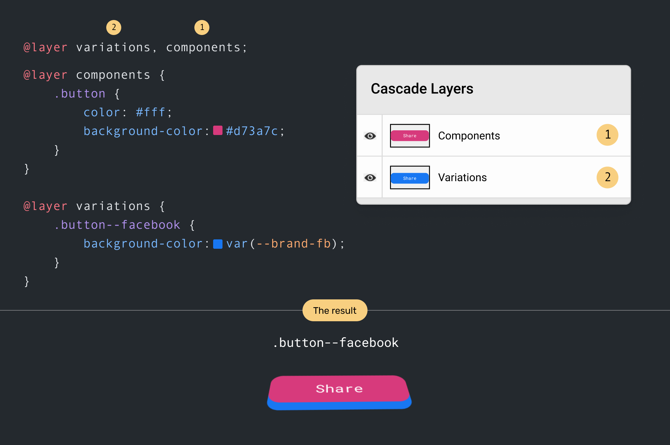
Here is a visualization of the layers. There are similar to Photoshop layers since what’s defined last in CSS, will be the first in the list of layers in the visual.
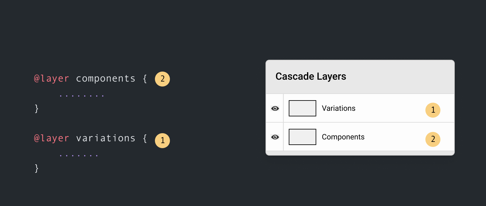
In our example, the variation layer is the last defined one, so it will have more priority over the components layer.
There is also another way to organize which layer override another, which is by defining the layers at once.
@layer components, variations;
Back to our example. The initial problem was that we needed to create another variation of the button but we added it in a place that makes the variation button have less specificity. With Cascade layers, we can add the CSS in the variations layer.
@layer components, variations;

@layer components {
  .button {
    color: #fff;
    background-color: #d73a7c;
  }
}

@layer variations {
  .button--ghost {
    background-color: transparent;
    color: #474747;
    border: 2px solid #e0e0e0;
  }

  .button--facebook {
    background-color: var(--brand-fb);
  }
}
That way, we can always ensure that the component variation will always take priority over the base styles. Let’s explore the explanation above visually.
In the layers panel, notice how each button lives in a layer. The order is per the @layer definition at the top.
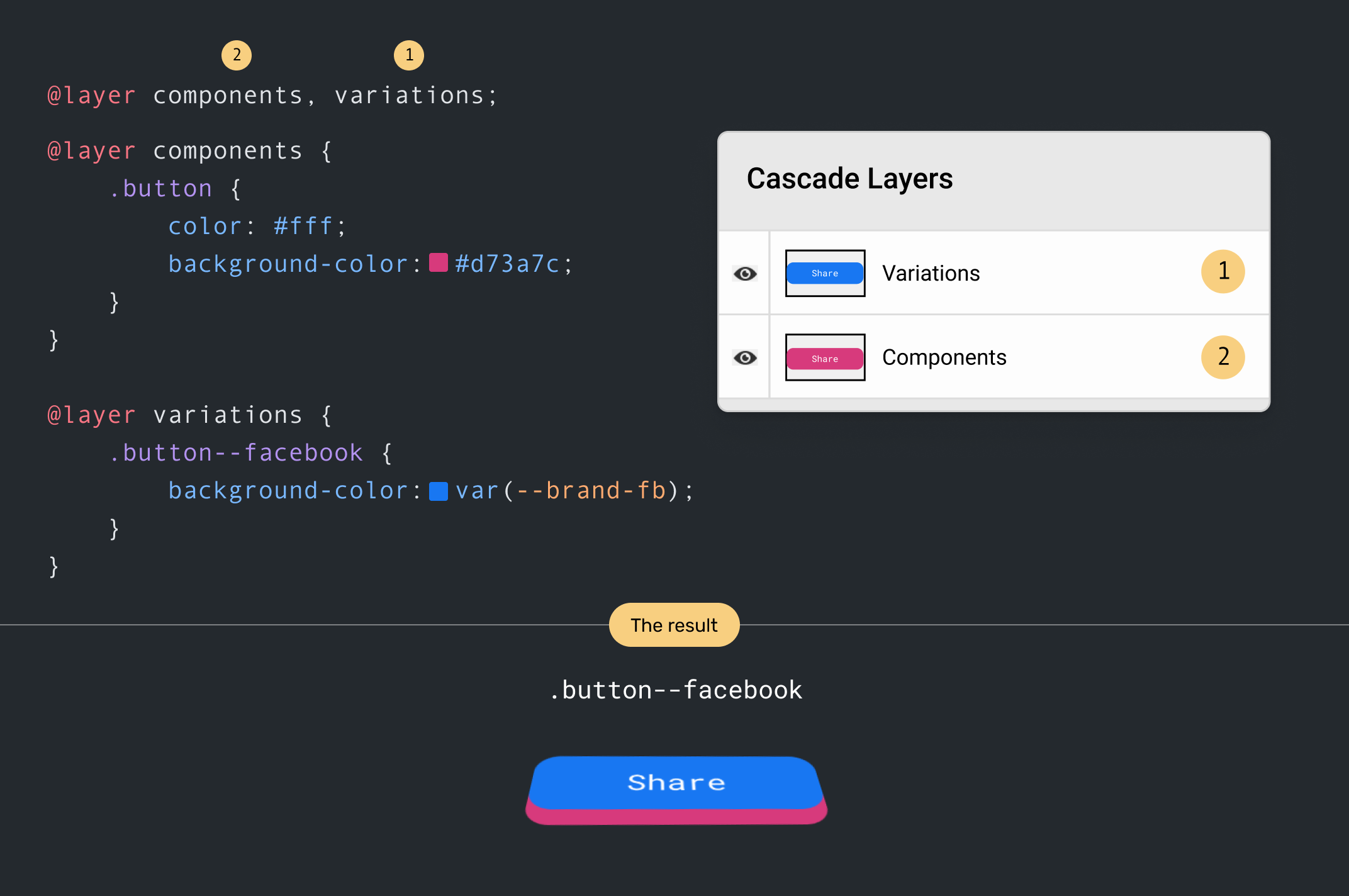
When the order of layers is changed, the components layer will override the variations one. As a result, the default button style will win.
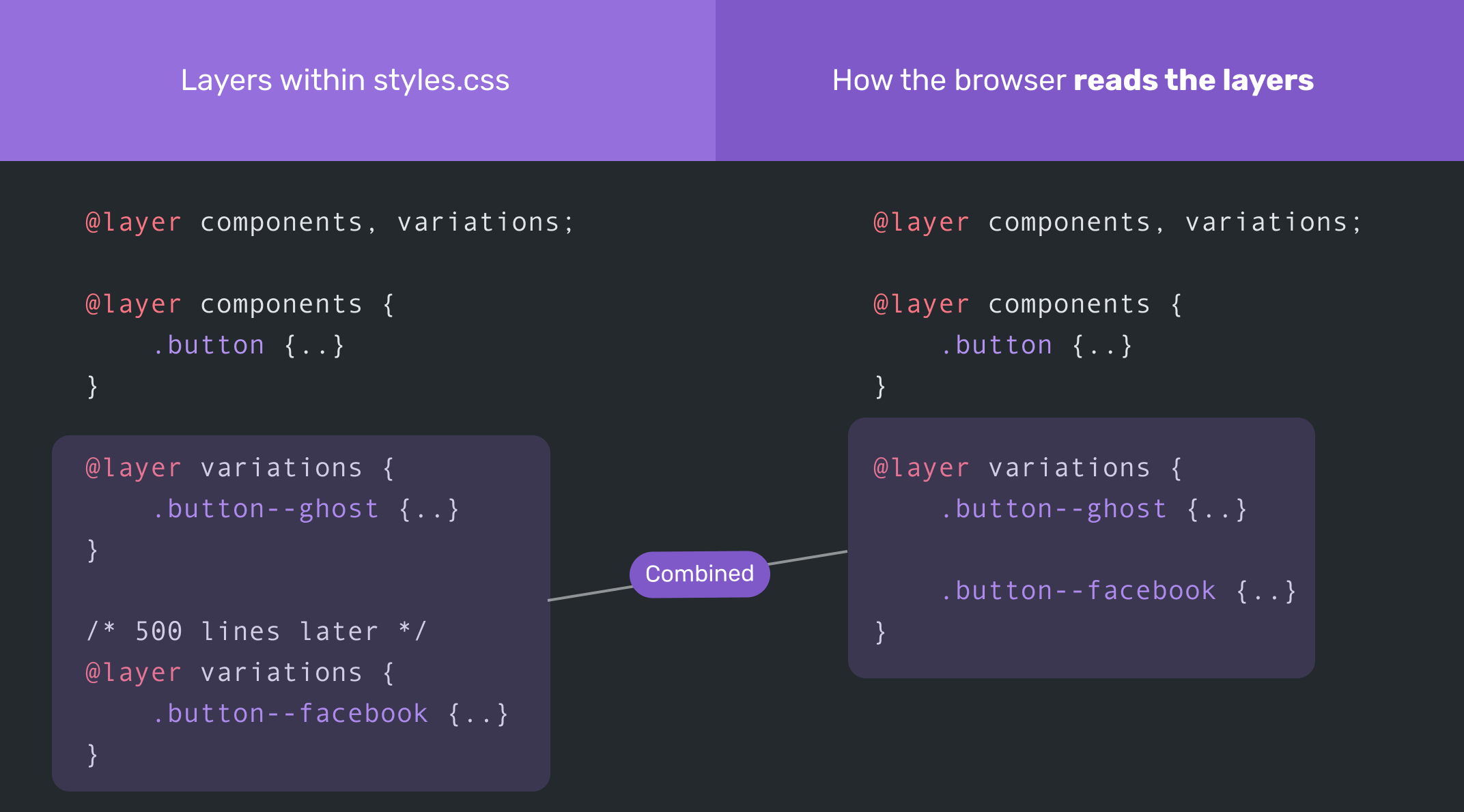
In cascade layers, the browser combines styles from the same @layer definitions and reads them at once, as per their order.
Consider the following:
@layer components, variations;

@layer components {
  .button {
    ..;
  }
}

@layer variations {
  .button--ghost {
    ..;
  }
}

/* 500 lines later */
@layer variations {
  .button--facebook {
    ..;
  }
}
The browser will add the .button--facebook right after the .button--ghost in the variations layer. Here is a visual for more clarity:
This is the most important question to think about for a new CSS feature. As per Can I Use and at the time of writing this article, it’s supported in Firefox, Chrome, Safari TP.
Can we use them as an enhancement? No, we can’t. Unless we use a Javascript polyfill (which isn’t there yet).
To answer that question, let’s take an overview of the CSS cascade.
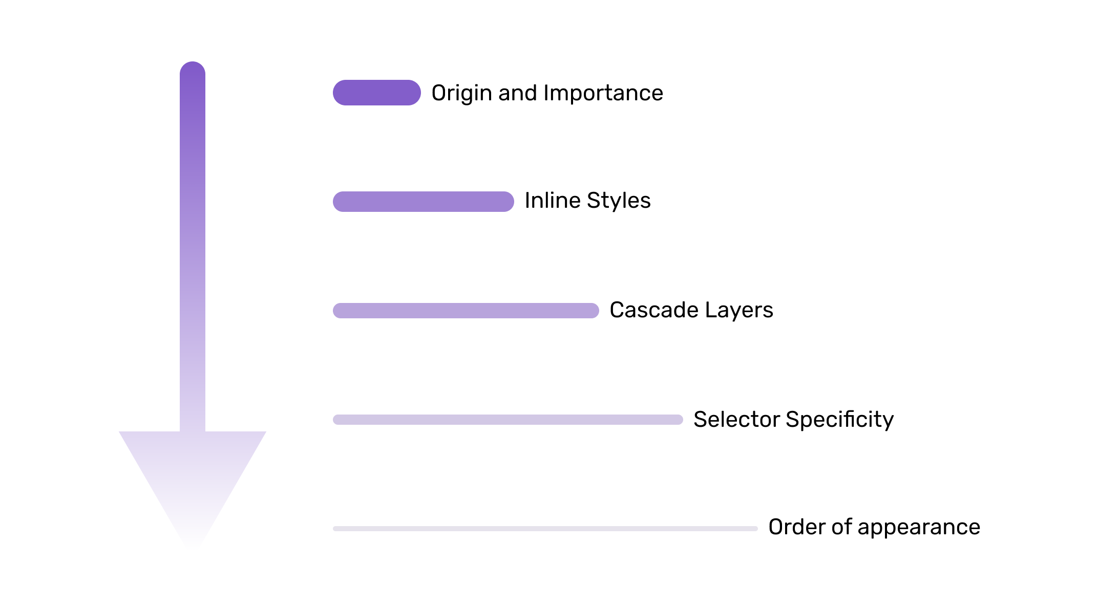
The CSS cascade is ordered as below (Higher ones have more priority):
Consider the following figure. The thicker the line, the more priority the style has in the cascade.
The origin and importance of a style rule are two different (but related) things, so I will explain each one below.
A style rule origin can come from one of the following, in descending order of priority:
That means the CSS that a developer wrote will always win over the user and browser styles.
Let’s take for example.
html {
  font-size: 16px;
}
If a user tried to change their browser’s default font size, the above CSS rule will override the user’s preference (since developer styles win over the user’s one).
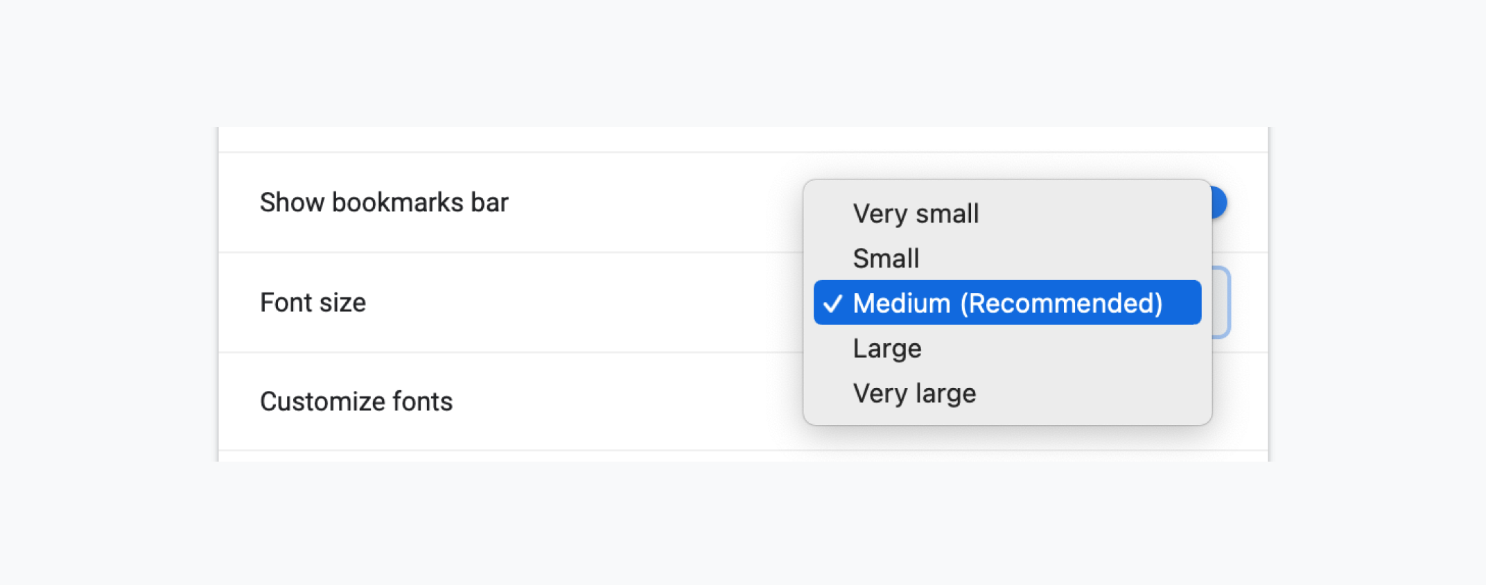
That’s a bad practice for accessibility. Please don’t do this in real-life projects. I just added it for the sake of explaining the origin of styles.
Regarding browser styles, they are for the user agent stylesheets. For example, the default <button> style differs from one browser to another. We can override the default style, you guessed it because the developer styles wins over the browser ones.
If you inspect the default button, you will notice user agent stylesheet, which shows all the default styles that the button has.
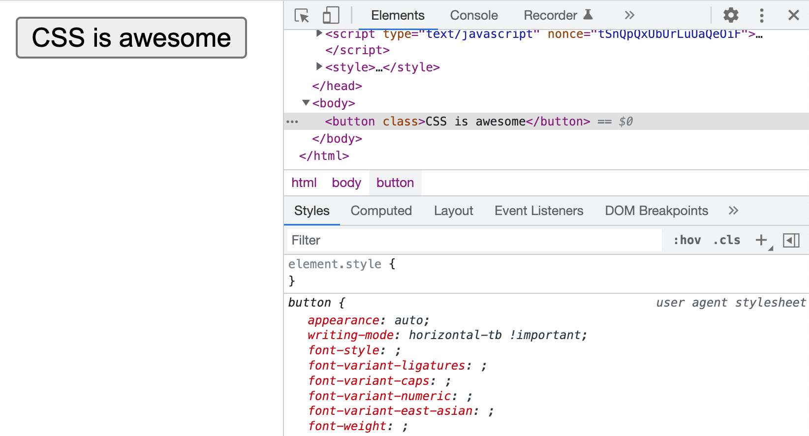
All the above was normal rules. This means they don’t have the !important keyword. In case it’s there, then the order will be:
If an element has an inline style, then it will have the highest specificity among its siblings with the same importance.
In the following example, the <button> color will be #fff since inline styles take precedence.
<button style="color: #fff;">Send</button>
button {
  color: #222;
}
Oh, hello layers! This is the new guest in the cascade. Cascade layers have more priority over the specificity of a selector. In the following example, can you guess the font size of the p element in the custom layer?
@layer base, custom;

@layer base {
  #page .prose p {
    font-size: 1rem;
  }
}

@layer custom {
  p {
    font-size: 2rem;
  }
}
The font size is 2rem. In cascade layers, no matter the element specificity, it will be ignored if the element is being overridden in the next layer.
After layers, the browser looks at the CSS rules and decides which one wins over the other based on its selector specificity.
Here is a simple example. The button within a newsletter has a higher specificity than the .button. As a result, the first rule will be overridden.
.button {
  padding: 1rem 1.5rem;
}

/* This wins */
.newsletter .button {
  padding: 0.5rem 1rem;
}
Finally, the order of appearance takes action. When two elements have the same specificity, then their order in the CSS document will determine which one wins.
Consider the following example:
.newsletter .button {
  padding: 1rem 1.5rem;
}

/* This wins */
.newsletter .button {
  padding: 0.5rem 1rem;
}
Both of the above rules have the same specificity. The latter wins because it came after the first rule.
Now that you have an idea about where layers live in the cascade, let’s get into some use cases.
I tried to look at current projects and see where cascade layers will shine, and I came up with the following use uses.
For a project I’m working on, using cascade layers for theming the UI will be the perfect solution. The problem it solves here is to allow me as a developer to switch between themes without changing the CSS or reorder it in one way or another.
@layer base, elements, objects, components, pages, themes;
I have different layers, and the last one is themes. The layer themes can contain multiple layers (Yes, cascade layers support nesting).
Notice at the top, I defined @layer custom, default. The default theme will override the custom one.
@layer base, elements, objects, components, pages, themes;

@layer themes {
  @layer custom, default;

  @layer default {
    :root {
      --color-primary: #1877f2;
    }
  }

  @layer custom {
    :root {
      --color-primary: #d73a7c;
    }
  }
}
If you want to switch themes, you can just reorder the layers in the first definition inside @layer themes.
@layer base, elements, objects, components, pages, themes;

@layer themes {
  /* Custom is active */
  @layer default, custom;

  @layer default {
    :root {
      --color-primary: #1877f2;
    }
  }

  @layer custom {
    :root {
      --color-primary: #d73a7c;
    }
  }
}
I took an example that uses flickity carousel. Look at all those! important values.
.flickity-page-dots {
  bottom: 20px !important;
}

.flickity-page-dots .dot {
  background: #fff !important;
  opacity: 0.35 !important;
}

.flickity-page-dots .dot.is-selected {
  opacity: 1 !important;
}
With the cascade layers, we can add the third-party CSS before the components layer. We can import an external CSS file and assign it to a layer.
@layer base, vendors, components;

@layer base {
  /* Base styles */
}

/* Import a .css file and assign it to a layer */
@import url(flickity.css) layer(vendors);

@layer components {
  .flickity-page-dots {
    bottom: 20px;
  }

  .dot {
    background: #fff;
    opacity: 0.35;
  }

  .dot.is-selected {
    opacity: 1;
  }
}
Say we have a listing component, and we need a variation where the list has a smaller margin.
<ul class="list">
  <li class="list__item list__item--compact">Item 1</li>
  <!-- Other items -->
</ul>
Since the :not pseudo selector gives the element more specificity, it can’t be overridden without reusing :not. Consider the following:
/* This wins */
.list__item:not(:last-child) {
  margin-bottom: 2rem;
  outline: solid 1px #222;
}

.list__item--compact {
  margin-bottom: 1rem;
}
The .list__item--compact won’t override the .list__item, because the latter has more specificity due to using :not. To make it work, we need to do the following:
.list__item:not(:last-child) {
  margin-bottom: 2rem;
  outline: solid 1px #222;
}

.list__item--compact:not(:last-child) {
  margin-bottom: 1rem;
}
Let’s explore the problem solved with cascade layers.
Consider the following where the @layer list contains base and overrides layer. In the overrides, I wrote the variation class, and it worked as expected since the overrides is the last layer.
@layer list {
  @layer base, overrides;

  @layer base {
    .list__item:not(:last-child) {
      margin-bottom: 2rem;
    }
  }

  @layer overrides {
    .list__item--compact {
      margin-bottom: 1rem;
    }
  }
}
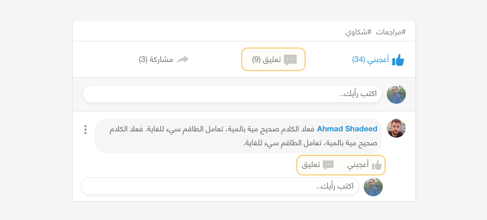
In this example, we have a list of actions (like, comment) for the main social feed item, and another list per each comment.
The icon in the feed item has a size of 24px. In the comment component, the size is smaller.
@layer feed, comments;

@layer feed {
  .feed-item .c-icon {
    width: 24px;
    height: 24px;
  }
}

@layer comments {
  .comment__icon {
    width: 18px;
    height: 18px;
  }
}
Notice that .feed-item .c-icon has more specificity than .comment__icon, but that’s the benefit of using cascade layers!
We’ve gotten used to adding !important to utility CSS classes to ensure that they will always apply to the element. With cascade layers, we can place the utility in the last year.
Consider the following example. We have a page header with a utility class p-0. We want to reset the padding to 0.
<div class="c-page-header p-0">
  <!-- Content -->
</div>
Here is how this looks with cascade layers.
@layer base, vendors, components, utils;

@layer components {
  @layer page-header {
    .c-page-header {
      padding: 1rem 2rem;
    }
  }
}

@layer utils {
  .px-0 {
    padding-left: 0;
    padding-right: 0;
  }
}
If there are CSS styles that aren’t assigned to a layer, then we will be added to an implicit final layer.
Consider the following example.
.button {
  border: 2px solid lightgrey;
}

@layer base, components;

@layer base {
  /* Base styles */
}

@layer components {
  .button {
    border: 0;
  }
}
In this example, the .button rule is defined without a @layer, but for the browser, this will place the rule in an implicit layer.
@layer base, components;

@layer base {
  /* Base styles */
}

@layer components {
  .button {
    border: 0;
  }
}

/* Implicit layer */
@layer {
  .button {
    border: 2px solid lightgrey;
  }
}
Cascade layers are an exciting CSS feature, and as you’ve seen in the examples, it can be quite useful. The only limitation for me is that we won’t be able to use it as an enhancement with CSS alone. That might slow down the adoption of layers a bit in the web community.
此内容由惯性聚合(RSS阅读器)自动聚合整理,仅供阅读参考。 原文来自 — 版权归原作者所有。