


I spent years teaching CSS layout on this blog. I put everything I know into The Layout Maestro course: 70+ lessons and 150+ interactive examples that teach you how to think CSS layouts, not just memorize syntax.
It’s fairly possible to judge a component and say that it’s easy to implement it in HTML&CSS. I agree, it’s easy when you are working for practice purposes only, but for a real-life project, it’s completely different. The perfect responsive component that you just built will fail quickly in case it was used for a real-life project with real content. Why? It’s because judging on how a component can be built without considering the edge cases.
In this article, I will show you a component that looks simple from the first glance, but there is a ton of work behind it. To make more realistic, I will take an example from Facebook Messenger.
For this article, I will take a very simple component from Facebook Messenger. See the figure below:
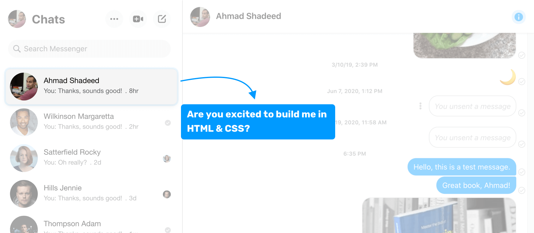
In the sidebar, there is a list of cards for people that I messaged on Facebook. For the sake of this article, I’m interested in the card component only. How would you implement this in HTML & CSS? It’s simple, right? It’s tempting to say that it consists of an image, and a <div> next to it. Here is a visual of the first thing you might think of.
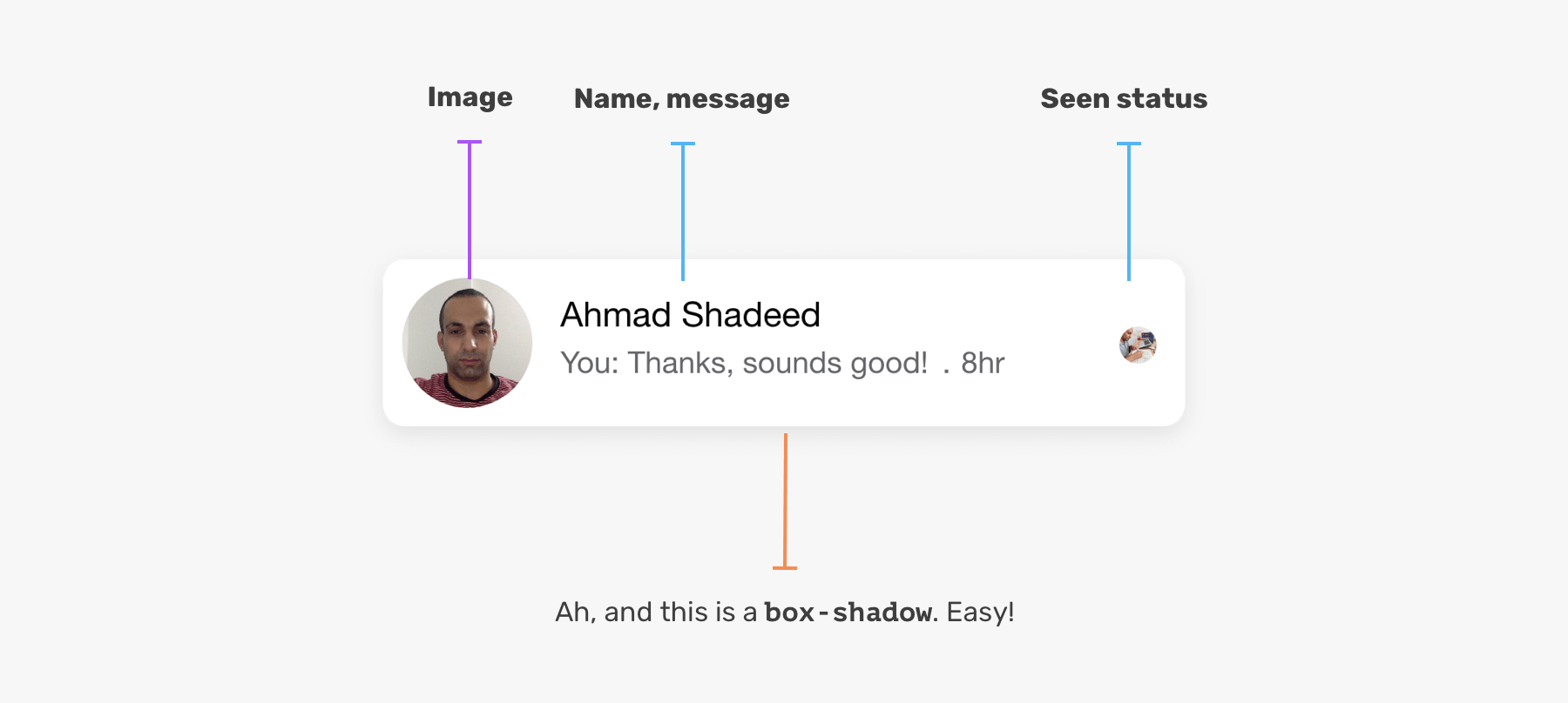
The above could be the case if this is a UI challenge or something that is for learning purposes only. However, If you want to build something that is solid and fluid, it might fail quickly. Let’s explore the basic way of implementing this in HTML & CSS.
<div class="card">
  <img class="card__image" src="assets/shadeed.jpg" alt="" />
  <div>
    <h3>Ahmad Shadeed</h3>
    <p>You: Thanks, sounds good! . 8hr</p>
    <img class="card__seen" src="assets/shadeed.jpg" alt="" />
  </div>
</div>
.card {
  position: relative;
  display: flex; /* [1] */
  align-items: center; /* [2] */
  background-color: #fff;
  padding: 8px;
  border-radius: 7px;
  box-shadow: 0 3px 15px 0 rgba(0, 0, 0, 0.05);
}

.card h3 {
  font-size: 15px;
}

.card p {
  font-size: 13px;
  color: #65676b;
}

.card__image {
  width: 56px;
  height: 56px;
  border-radius: 50%;
  margin-right: 12px;
}

.card__seen {
  position: absolute; /* [3] */
  right: 16px;
  top: 50%;
  transform: translateY(-50%);
  width: 16px;
  height: 16px;
  border-radius: 50%;
}
I highlighted some lines above, and want to explain them a bit:
The above implementation has nothing wrong, but it’s not scalable. I will show another variation for the component.
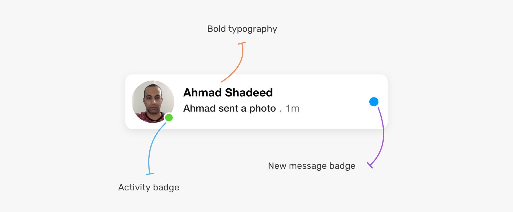
The blue badge on the right indicates that this is a new message that I didn’t open yet. While the green one on the avatar indicates that the user is currently online.
Notice how we have two new badges. What’s the best way to add them? If you refer to the CSS I wrote for the initial component, you will notice that we have the class .card__seen for the small user avatar on the right. In this variation, the .card__seen should be replaced by the blue badge.
With the HTML & CSS written, implementing this variation won’t be possible until we alter the HTML.
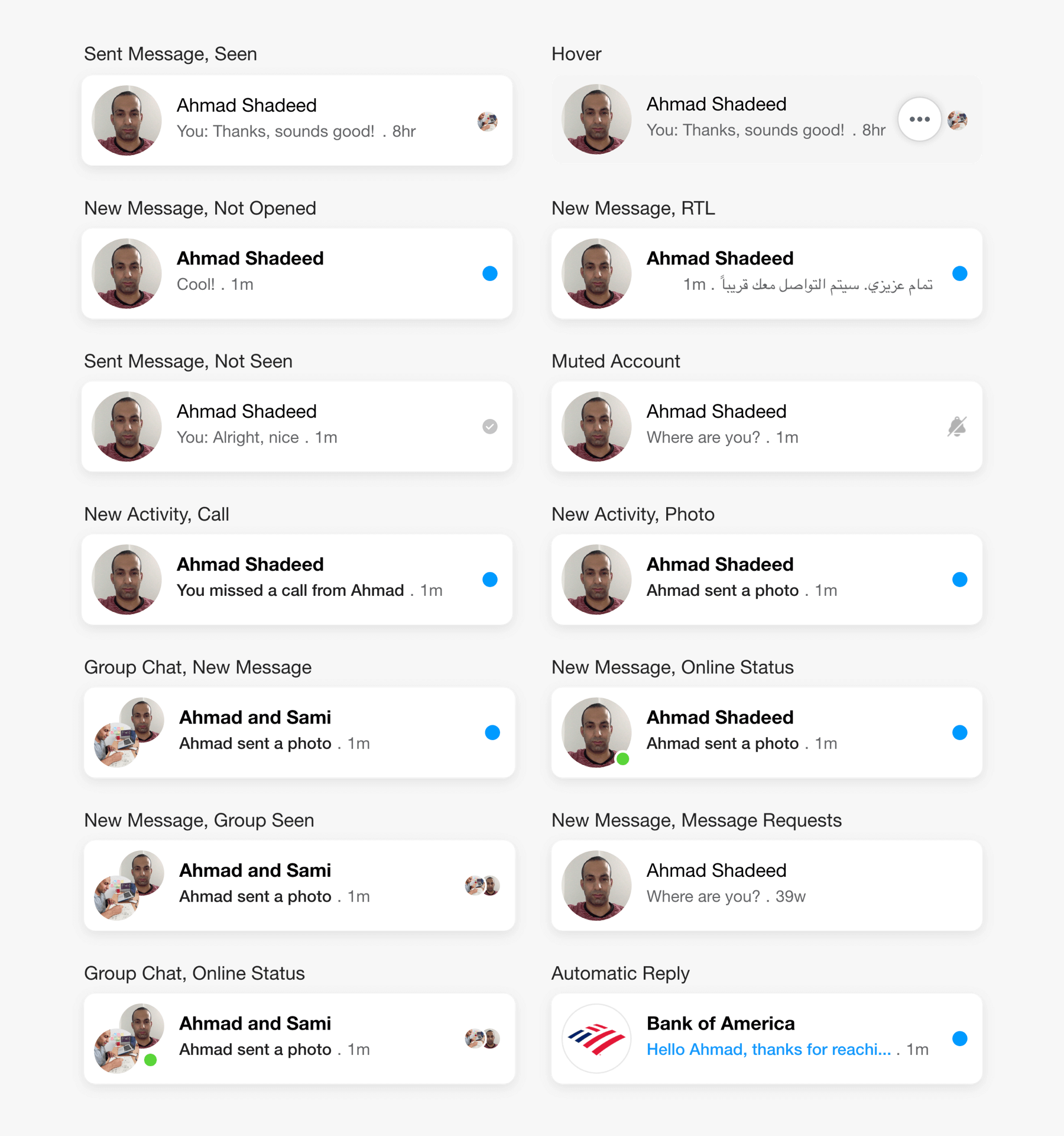
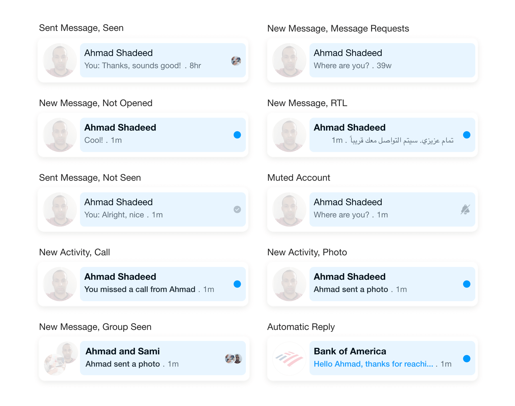
To be clear with you, the variation shown is just scratching the surface of the possibilities. This component has a lot of variation and cases.
Here is a visual for the variations of this component. I tried my best to design them all (Yes, I designed them manually).
Not only that, we also need to take care of the dark mode styles.
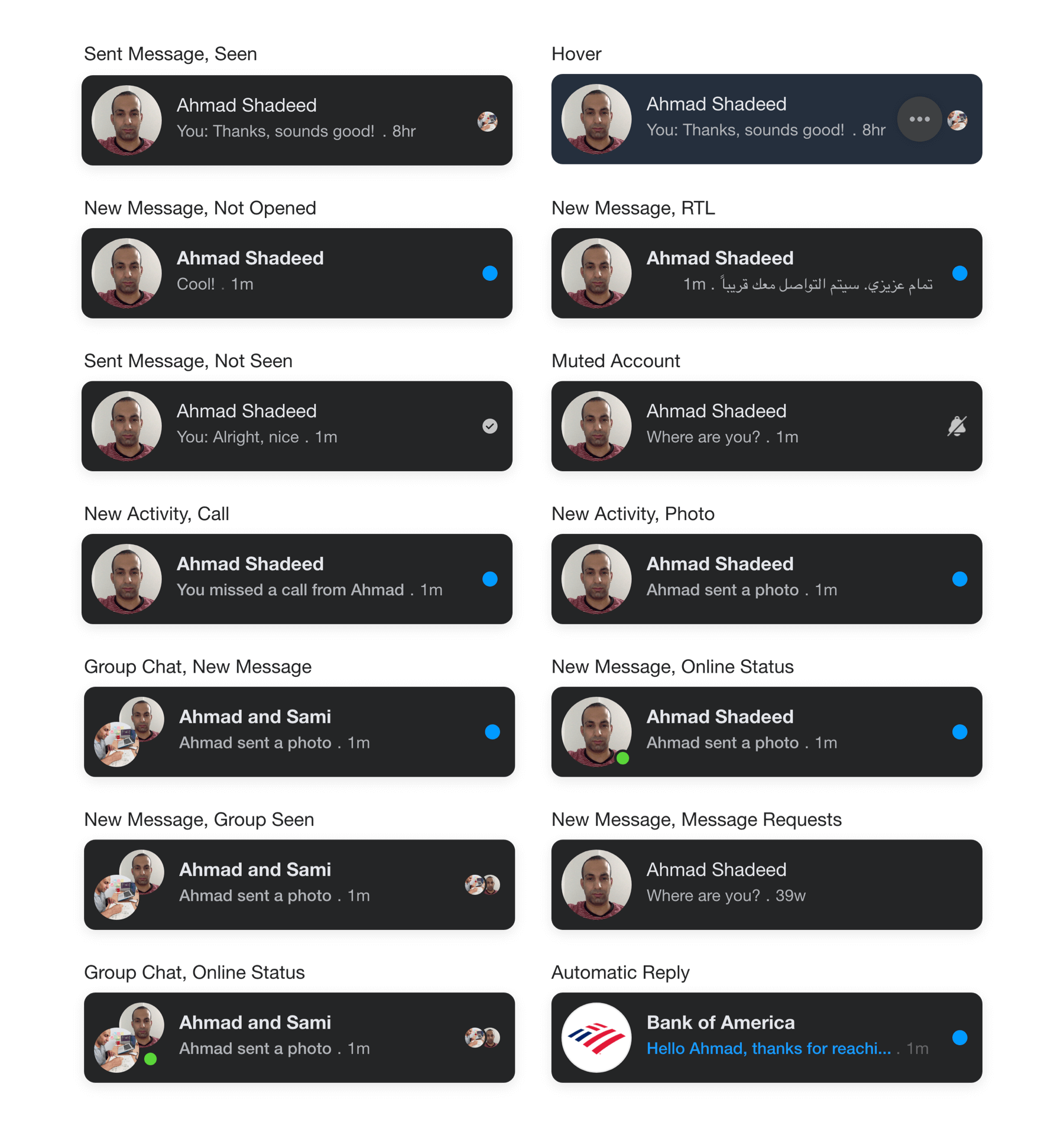
In this article, I will explore with you on the best way to implement a solid component that can handle all the variations and changes without it being broken. The article just started, let’s dive in!
Before anything else, I looked carefully at the spacing between each UI element, and worked on the following figures. Notice how there are lots of spacing and sizes in this simple component.
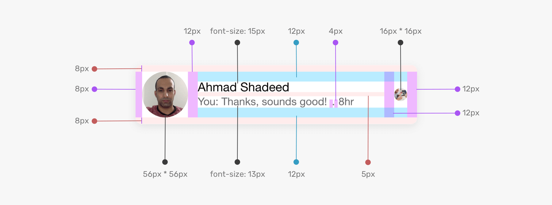
When designing a UI and implementing it in HTML & CSS, one of the key things to take care of is the spacing. Underestimating that can lead to a different UI by time.
To implement a proper component, we need to carefully think about the HTML markup first. In our case, we have two areas of the component that have multiple variations which are the avatar and the content areas.
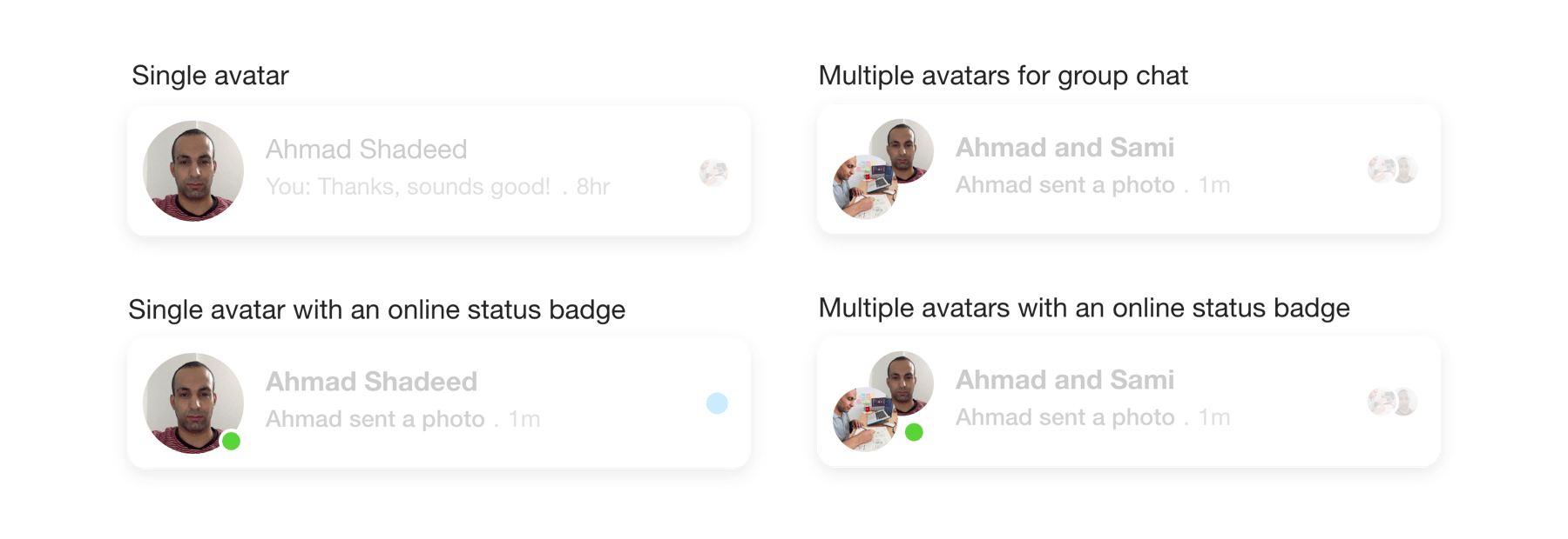
To work on the HTML for the avatar part, we need to understand its states first. Here are the possible variations:
Considering the following HTML, we want to make sure that .card__avatar can handle all the variations above.
<div class="card">
  <div class="card__avatar"></div>
  <div class="card__content">
    <!-- Name, message, badge.. -->
  </div>
</div>
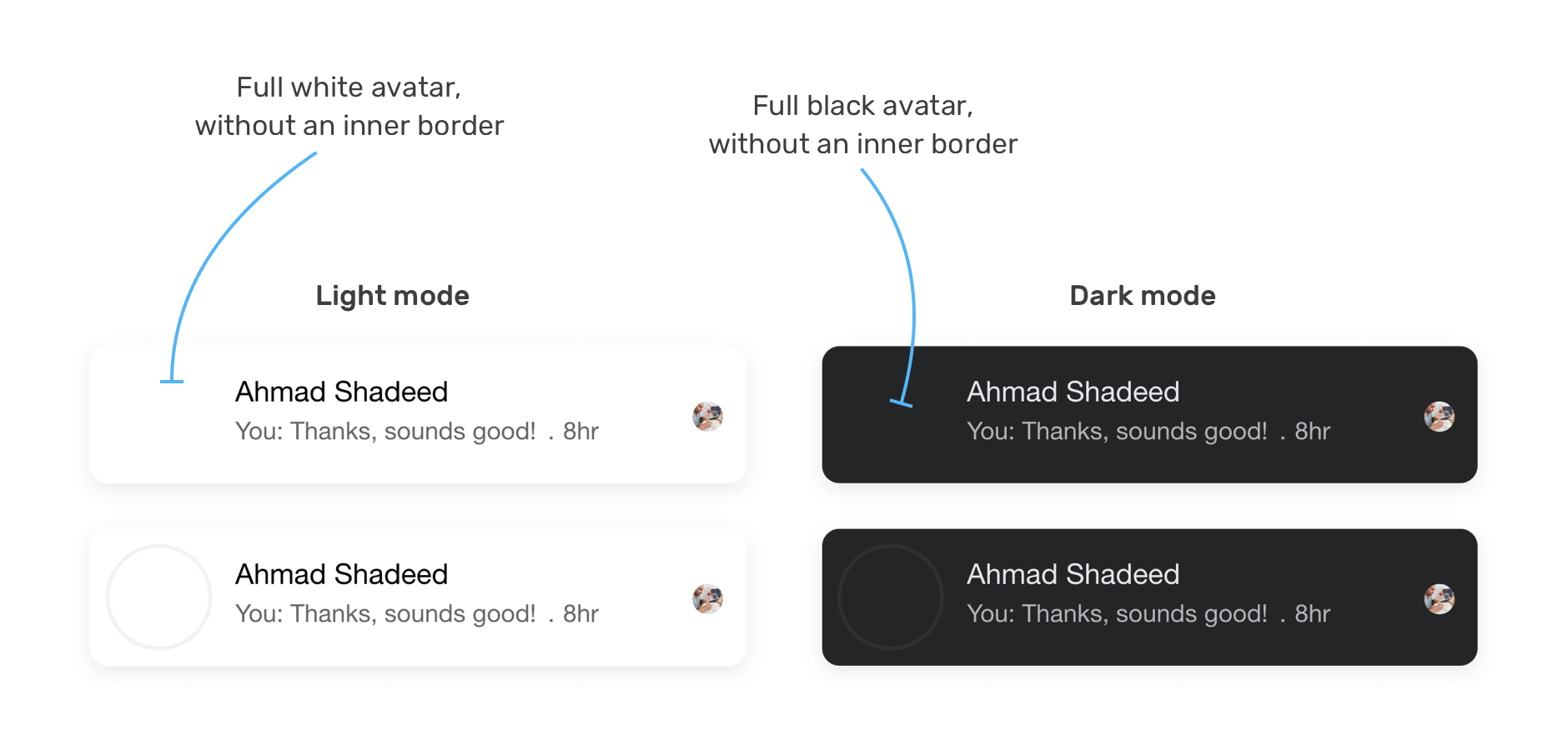
Lets zoom in to the HTML and focus on the first variation, which is a single avatar. The avatar should have in inner border (or inset shadow) to make it look like a circle even if the used avatar is full white.

In CSS, it’s not possible to apply an inset (inner) box-shadow to an <img> element. We have two options:
<div> with a transparent border.<svg>.The goal if the inner border is to show a outline around the avatar in the cases:
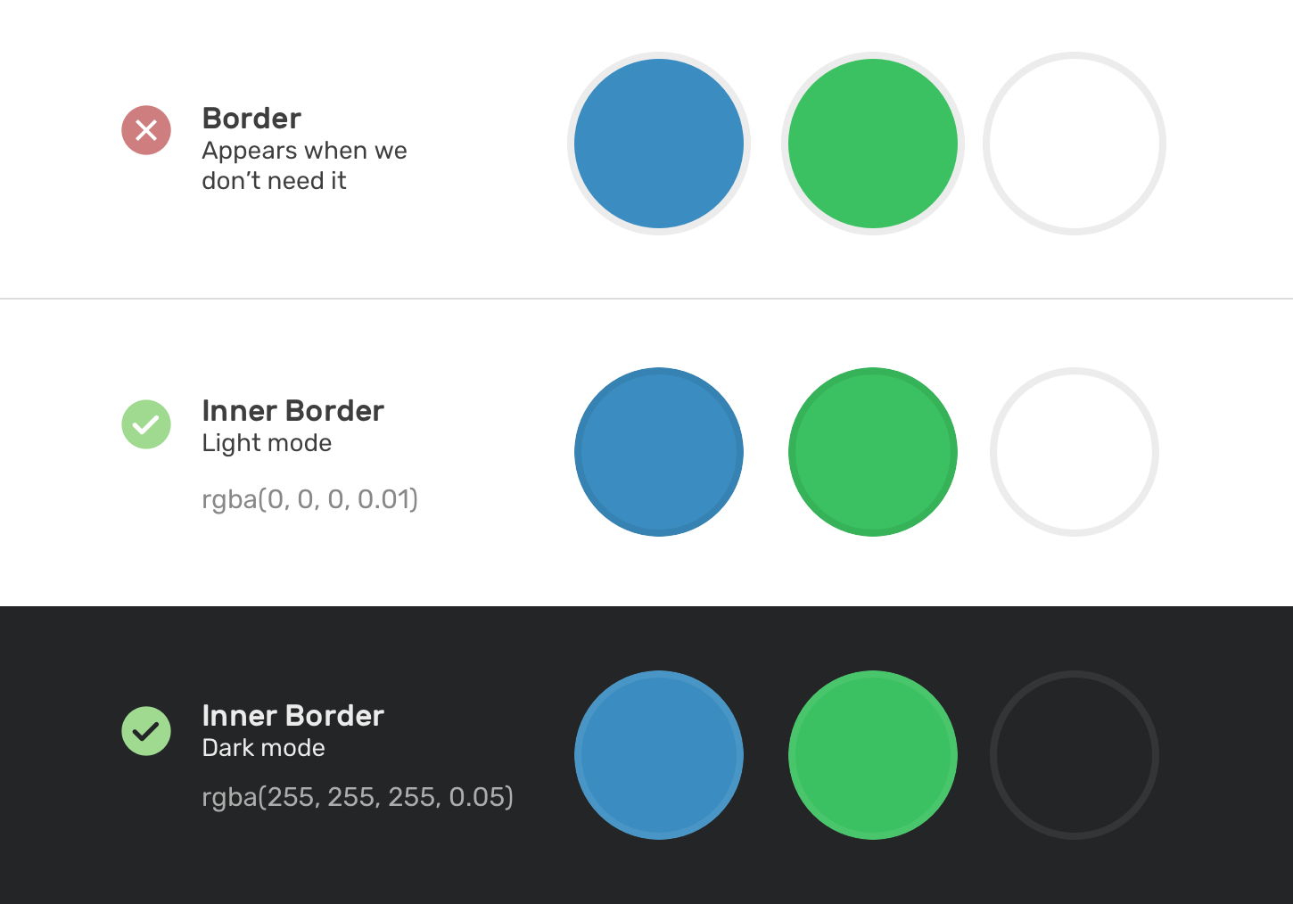
Without an inner border, using a full white avatar will make it blend with its parent background. The same applies for dark mode. Here is a visual of what will happen with and without the inner border.
<div> for the inner borderFor this solution, an additional element (a <div> in this example) is absolutely positioned above the image with an opacity of 0.1.
<div class="card__avatar">
  <img src="assets/shadeed.jpg" alt="" />
  <div class="border"></div>
</div>
.card__avatar {
  position: relative;
}

.card__avatar img {
  width: 56px;
  height: 56px;
  border-radius: 50%;
}

.border {
  position: absolute;
  width: 56px;
  height: 56px;
  border: 2px solid #000;
  border-radius: 50%;
  opacity: 0.1;
}
This solution works, but it has some limitations that I will explain in a bit.
<svg> elementFor this solution, we will use an <svg> element. The idea is to use a circle mask for the avatar, and a <circle> element for the inner border. SVG works great for this.
<svg role="none" style="height: 56px; width: 56px">
  <mask id="circle">
    <circle cx="28" cy="28" fill="white" r="28"></circle>
  </mask>
  <g mask="url(#circle)">
    <image
      x="0"
      y="0"
      height="100%"
      preserveAspectRatio="xMidYMid slice"
      width="100%"
      xlink:href="/assets/shadeed.jpg"
      style="height: 56px; width: 56px"
    ></image>
    <circle class="border" cx="28" cy="28" r="28"></circle>
  </g>
</svg>
.border {
  stroke-width: 3;
  stroke: rgba(0, 0, 0, 0.1);
  fill: none;
}
Both of the solutions are fine when building the single avatar example only. However, things start to get more interesting when we add the online badge element.
In light mode, the green badge has a white border. However, in dark mode, this should be cut from the avatar itself. In other words, a mask should be used.
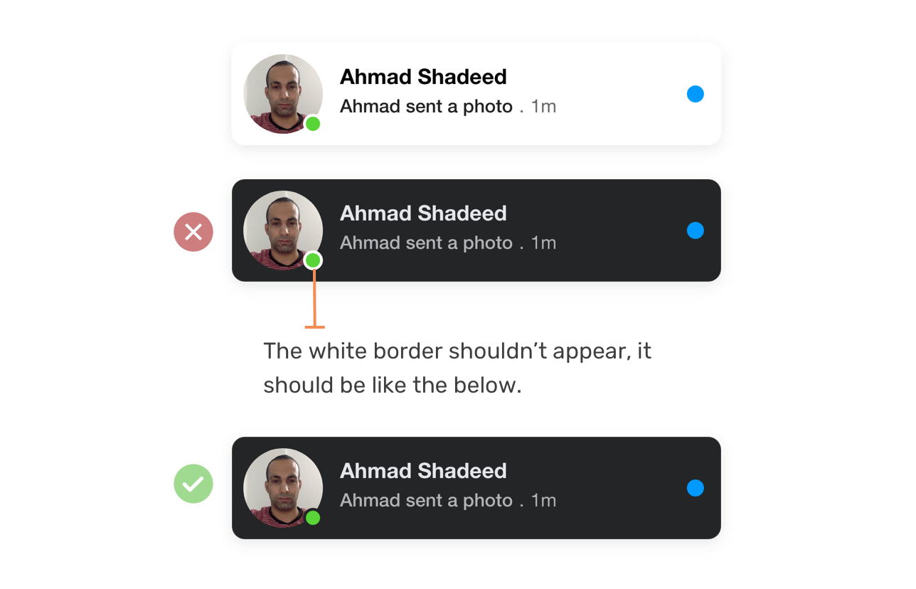
How can we do that? Well, it turns out that if we use the <svg> solution for the single avatar, this can be solved easily by using an SVG mask.
<svg role="none" style="height: 56px; width: 56px">
  <mask id="circle">
    <!-- [1] -->
    <circle cx="28" cy="28" fill="white" r="28"></circle>
    <!-- [2] -->
    <circle cx="48" cy="48" fill="black" r="7"></circle>
  </mask>
  <!-- [3] -->
  <g mask="url(#circle)">
    <image
      x="0"
      y="0"
      height="100%"
      preserveAspectRatio="xMidYMid slice"
      width="100%"
      xlink:href="/assets/shadeed.jpg"
      style="height: 56px; width: 56px"
    ></image>
    <circle class="border" cx="28" cy="28" r="28"></circle>
  </g>
</svg>
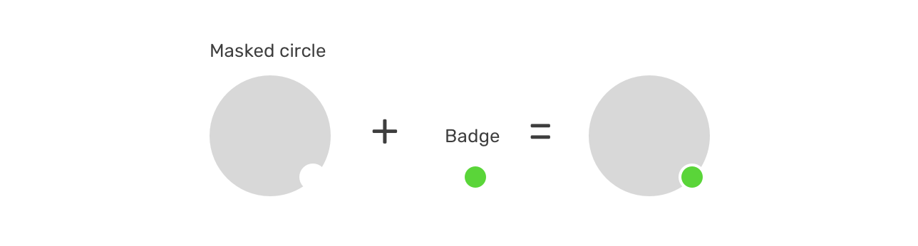
Let me break down the following SVG code:
<image> and a <circle> for the transparent inner border.Here is a visual that explains how the multiple circles works as a mask works. It’s magic, isn’t it?
With that, here is how the HTML looks for the avatar with the online badge.
<div class="card__avatar">
  <svg role="none" style="height: 56px; width: 56px">
    <mask id="circle">
      <circle cx="28" cy="28" fill="white" r="28"></circle>
      <circle cx="48" cy="48" fill="black" r="7"></circle>
    </mask>
    <g mask="url(#circle)">
      <image
        x="0"
        y="0"
        height="100%"
        preserveAspectRatio="xMidYMid slice"
        width="100%"
        xlink:href="/assets/shadeed.jpg"
        style="height: 56px; width: 56px"
      ></image>
      <circle class="border" cx="28" cy="28" r="28"></circle>
    </g>
  </svg>
  <div class="badge"></div>
</div>
.card__avatar {
  position: relative;
  display: flex;
  margin-right: 12px;
}

.badge {
  position: absolute;
  right: 3px;
  bottom: 3px;
  width: 10px;
  height: 10px;
  background: #5ad539;
  border-radius: 50%;
}
When a component like this one needs to adapt for both light and dark layouts, it’s highly recommended to use CSS variables to handle to store the values of colors that needs to change.
:root {
  --primary-text: #050505;
  --secondary-text: #65676b;
  --bg-color: #fff;
}

html.is-dark {
  --primary-text: #e4e6eb;
  --secondary-text: #b0b3b8;
  --bg-color: #242526;
}

.card {
  background-color: var(--bg-color);
}

.card__title {
  color: var(--primary-text);
}

.card__subtitle {
  color: var(--secondary-text);
}
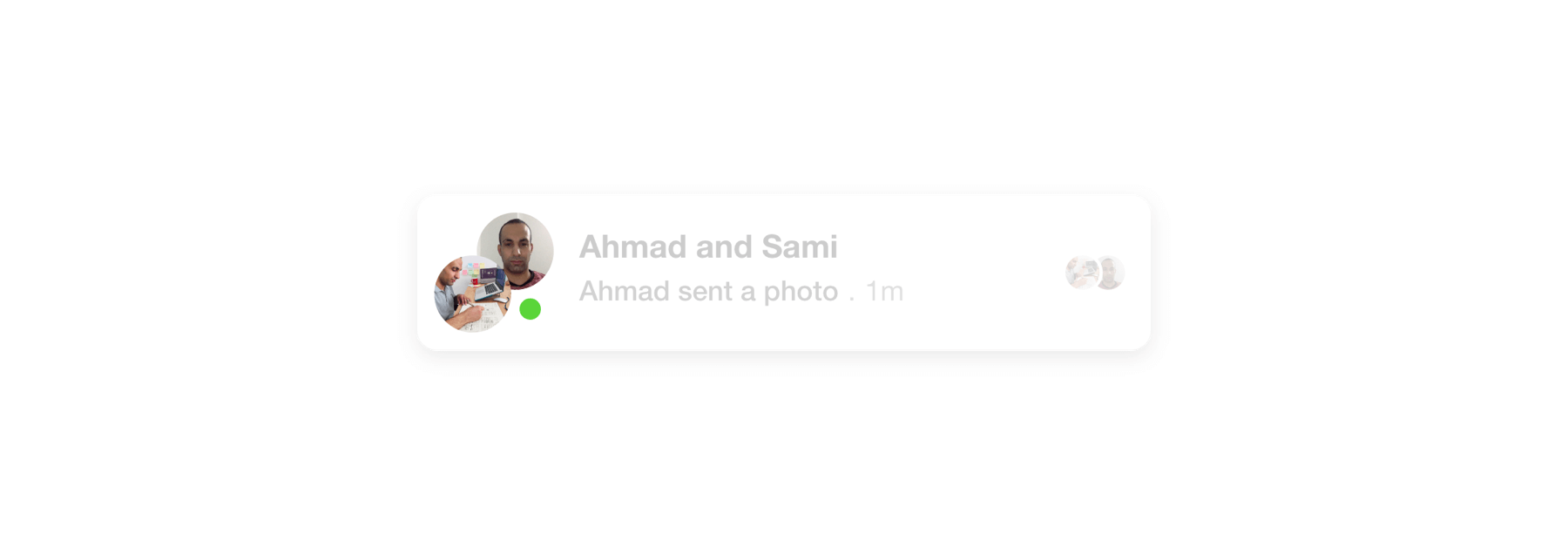
In the case of a chat with multiple persons, the avatar area will have two avatars with each one of them positioned at the top right and the bottom left, respectively.
To keep the single and multiple avatars aligned, we need to set a fixed size on the parent of the multiple avatars.
.card__avatar {
  width: 56px;
  height: 56px;
}
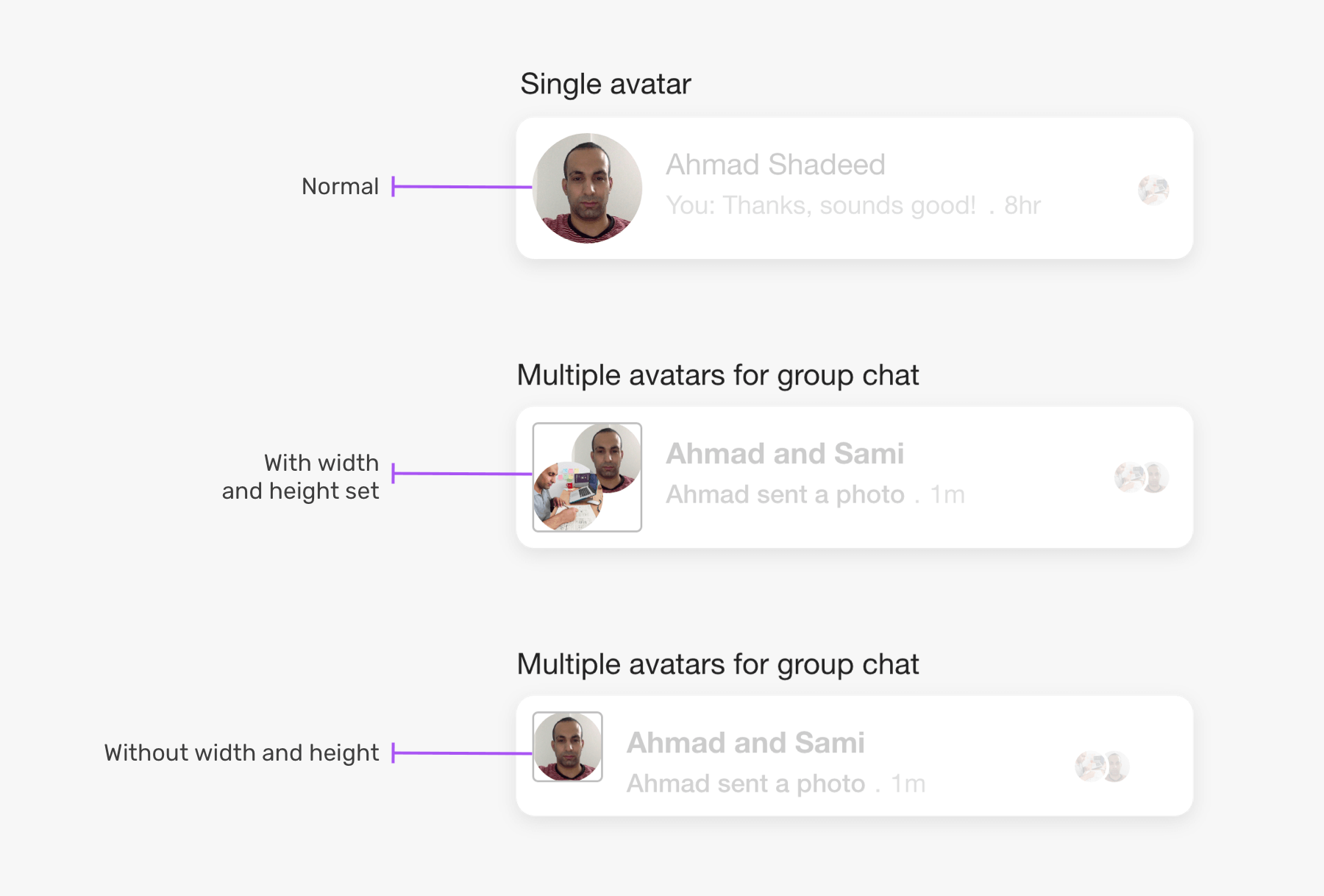
This variation requires a markup change, here is how the HTML should be.
<div class="card__avatar card__avatar--multiple">
  <svg
    class="avatar avatar-1"
    role="none"
    style="height: 36px; width: 36px"
  ></svg>
  <svg
    class="avatar avatar-2"
    role="none"
    style="height: 36px; width: 36px"
  ></svg>
  <div class="badge"></div>
</div>
.card__avatar--multiple {
  position: relative;
  width: 56px;
  height: 56px;
}

.card__avatar--multiple .avatar {
  position: absolute;
}

.card__avatar--multiple .avatar-1 {
  right: 0;
  top: 0;
}

.card__avatar--multiple .avatar-2 {
  left: 0;
  bottom: 0;
}

.card__avatar--multiple .badge {
  right: 6px;
  bottom: 6px;
}
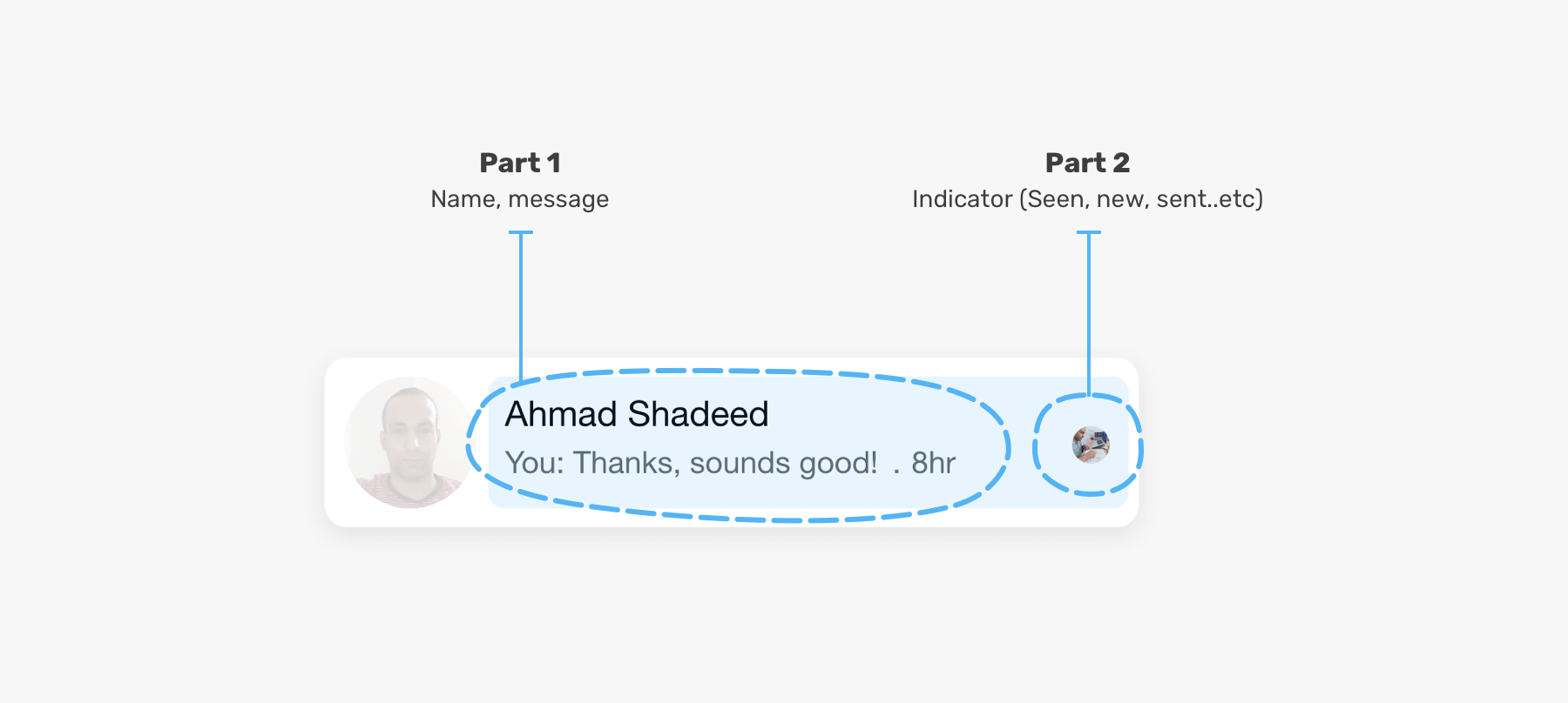
This area is where the user can see the name of the person they are chatting with, and the content of the message or the action.
I can imagine the markup of this divided into two parts, one for the text content (name, message or action) and the second for the indicator on the right side (new message, seen, muted, sent).
Let’s explore the HTML markup for the content area.
<div class="card__content">
  <div class="card__content__start">
    <h3>Ahmad Shadeed</h3>
    <div class="row">
      <p>
        You: Thanks, sounds good. What about doing a webinar, too?
      </p>
      <span class="separator">.</span>
      <time>8hr</time>
    </div>
  </div>
  <div class="card__content__end">
    <!-- The indicator (new message, seen, muted, sent) -->
  </div>
</div>
.card__content {
  display: flex;
  flex: 1;
}

.card__content__start {
  display: flex;
  flex: 1;
}

.card__content__start .row {
  display: flex;
  align-items: center;
}

.card__content__end {
  display: flex;
  justify-content: center;
  align-items: center;
  margin-left: 12px;
}

.separator {
  margin-left: 4px;
  margin-right: 4px;
}
With the above, the content area looks like the below (This is a screenshot taken from Firefox).
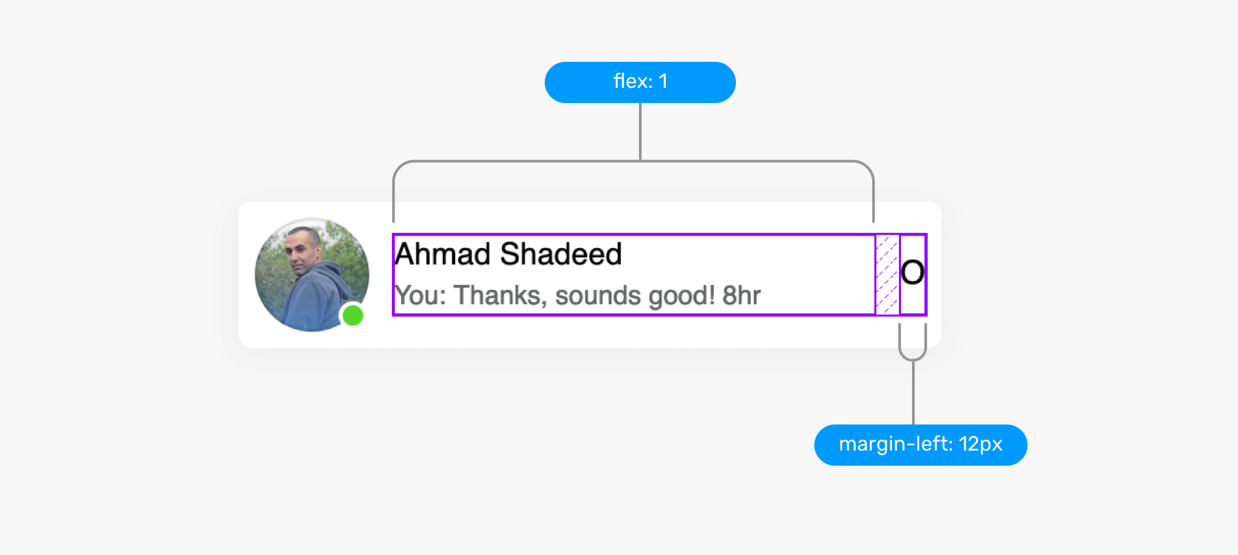
The length of the name or the message can be very long. It’s important to account for that from the very beginning. First, let’s explore the “flow as you like” approach.
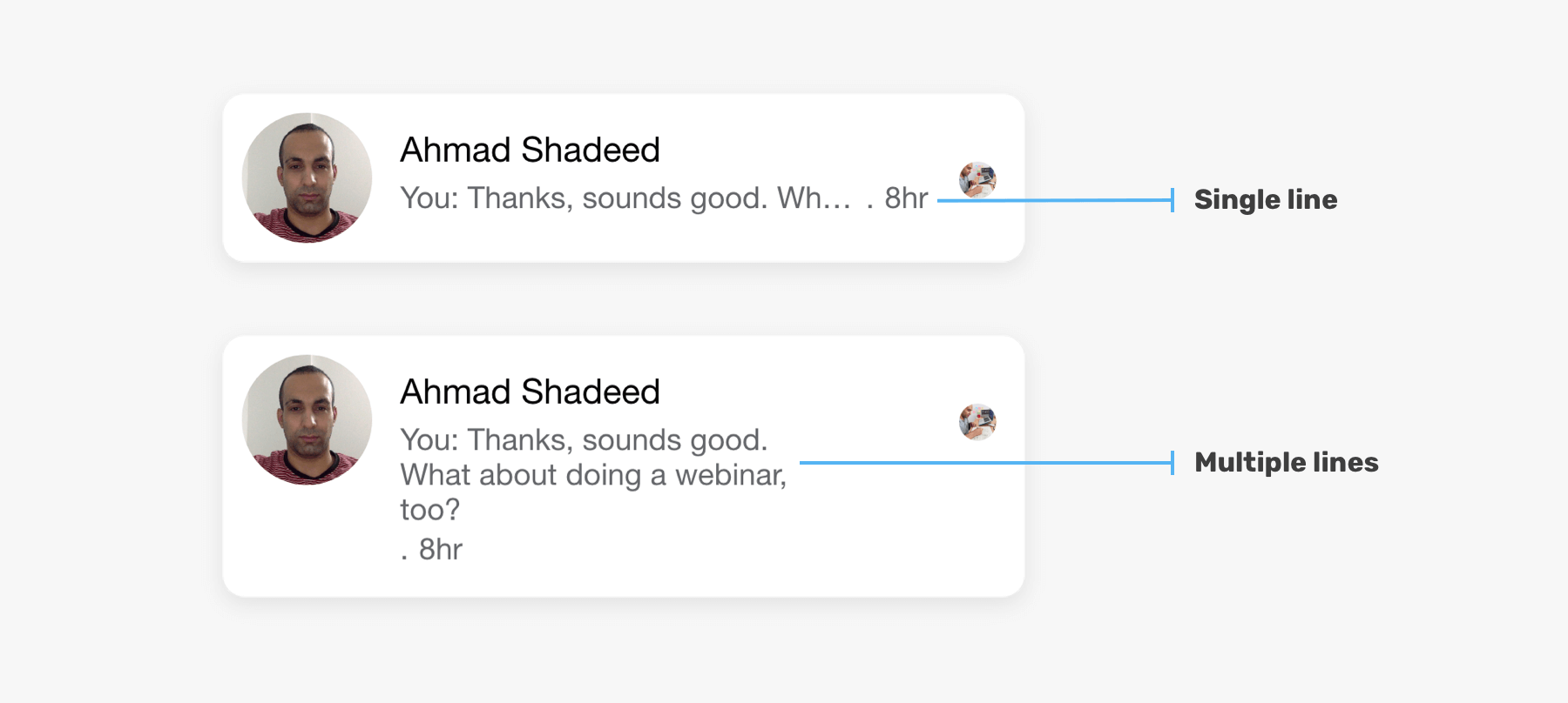
In the figure above, the second card content wrap into multiple lines. This isn’t looking good for such a component. To avoid that, here is what to do:
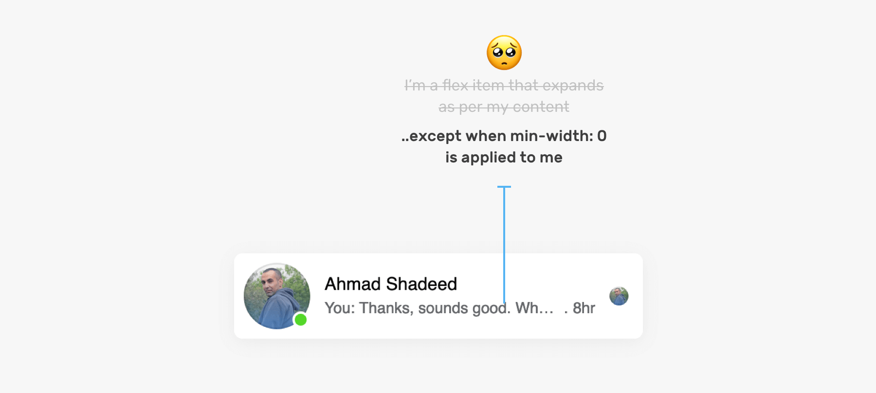
min-width: 0 on flex child items. Why? I will let you know in a few.overflow, white-space, and text-overflow properties. I wrote about handling short and long content in details.I added the following to the name and the paragraph:
.card__content__start h3,
.card__content__start p {
  overflow-x: hidden;
  white-space: nowrap;
  text-overflow: ellipsis;
}
However, this can’t magically solve our problem when we are using flexbox. Notice the result after applying the CSS above:
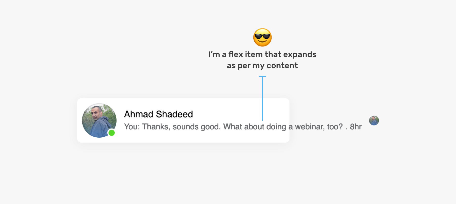
The reason is that flex items won’t shrink below their minimum content size. To solve this, we need to set min-width: 0 on .card__content and card__content__start elements.
Each message has an indicator, and we should account for all of them. Here are all the indicators that I noticed. There might be more that I’m not aware of (If yes, please let me know).
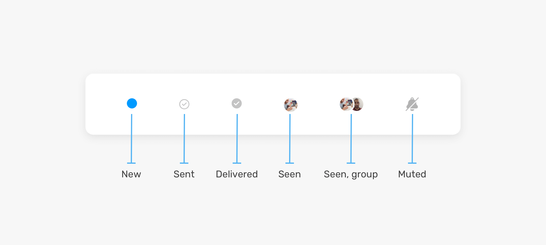
For this part, we will focus on the element .card__content__end and its inner content.
<div class="card__content">
  <div class="card__content__start">
    <!-- The name and message -->
  </div>
  <div class="card__content__end">
    <!-- The indicator (new message, seen, muted, sent) -->
  </div>
</div>
By having a generic element, any component can live within it. The element .card__content__end shouldn’t have any styles like color or font size, it will only serve as a home for a specific component.
While checking how Facebook did the new message indicator, it turned out that it’s a button with the label “Mark as read”.
<div role="button" aria-label="Mark as read" tabindex="0"></div>
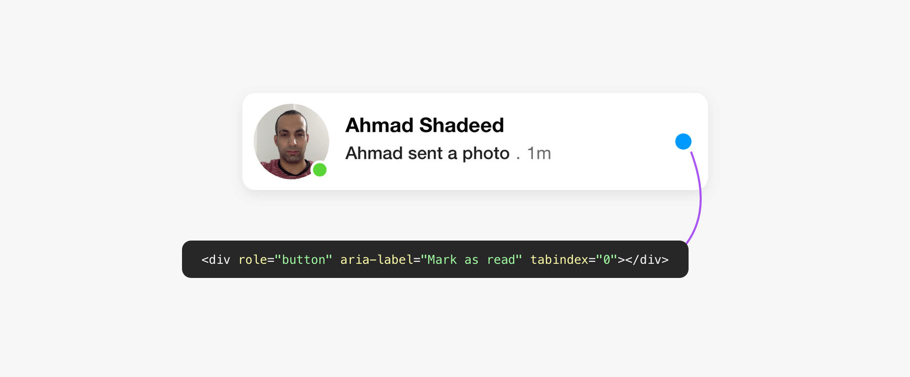
I don’t know about the context of why the team at Facebook chose a <div> instead of an actual <button> element. With the native button, we don’t need to use role, aria-label, and tabindex. Instead, all of those are available for free.
Similar to the user avatar, the seen one is no different. It uses an <svg> element for the avatar with an aria-label that shows the user’s name.
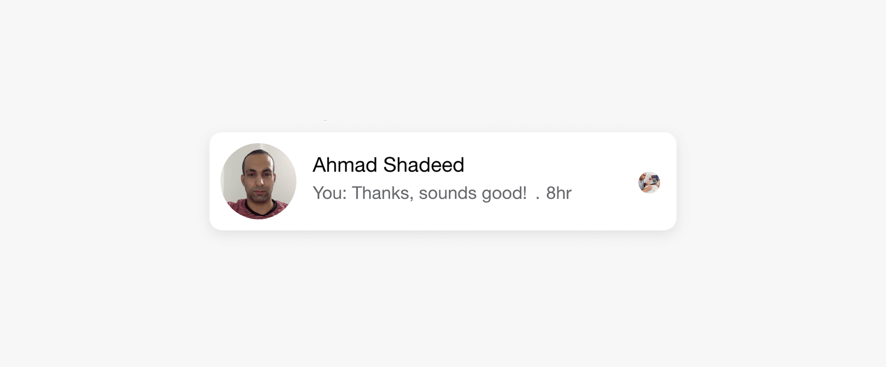
<svg aria-label="Ahmad Shadeed" role="img">
  <!-- Mask and image -->
</svg>
To be honest, this is my favorite one. I really like how the team at Facebook implemented it.
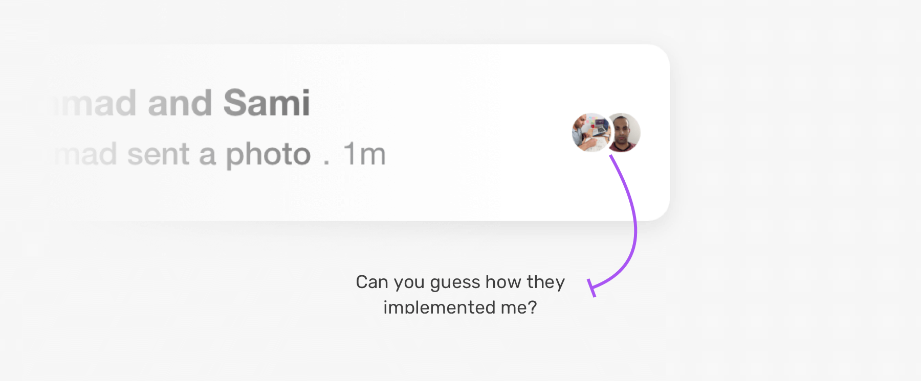
Do you notice a border between the two avatars? From a first glance, you might think that this is a CSS border to the first avatar. If you thought like this, sorry to let you know that you’re wrong (just as my first initial thought).
This is implemented as an SVG mask. Yes, you heard that right!
<svg role="none">
  <mask id="circle">
    <circle cx="8" cy="8" fill="white" r="8"></circle>
    <circle cx="-4" cy="8" fill="black" r="10"></circle>
  </mask>

  <g mask="url(#circle)">
    <image></image>
    <circle class="border" cx="28" cy="28" r="28"></circle>
  </g>
</svg>
Here is a visual of how this works.
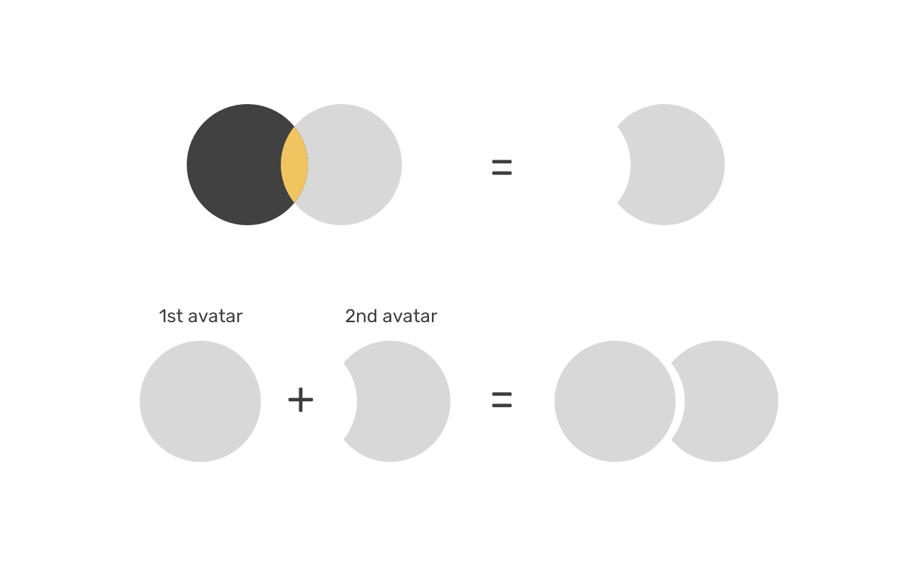
This is amazing. Isn’t it? I really like using SVG for this specific use-case.
In case that the layout is LTR (Left-to-right) and the message content is in Arabic, the direction of the message content should be RTL (Right-to-left).
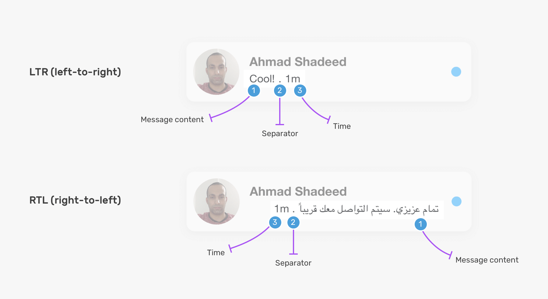
Since the element .card__content__start is a flex container, the child items will automatically flip depending on the direction of the component or the root element. This can be dynamically added depending on the content language.
<div class="card__content">
  <div class="card__content__start" style="direction: rtl"></div>
  <div class="card__content__end"></div>
</div>
If the user chose an RTL (Right-to-left) like Arabic for the whole UI, then the component should be flipped.
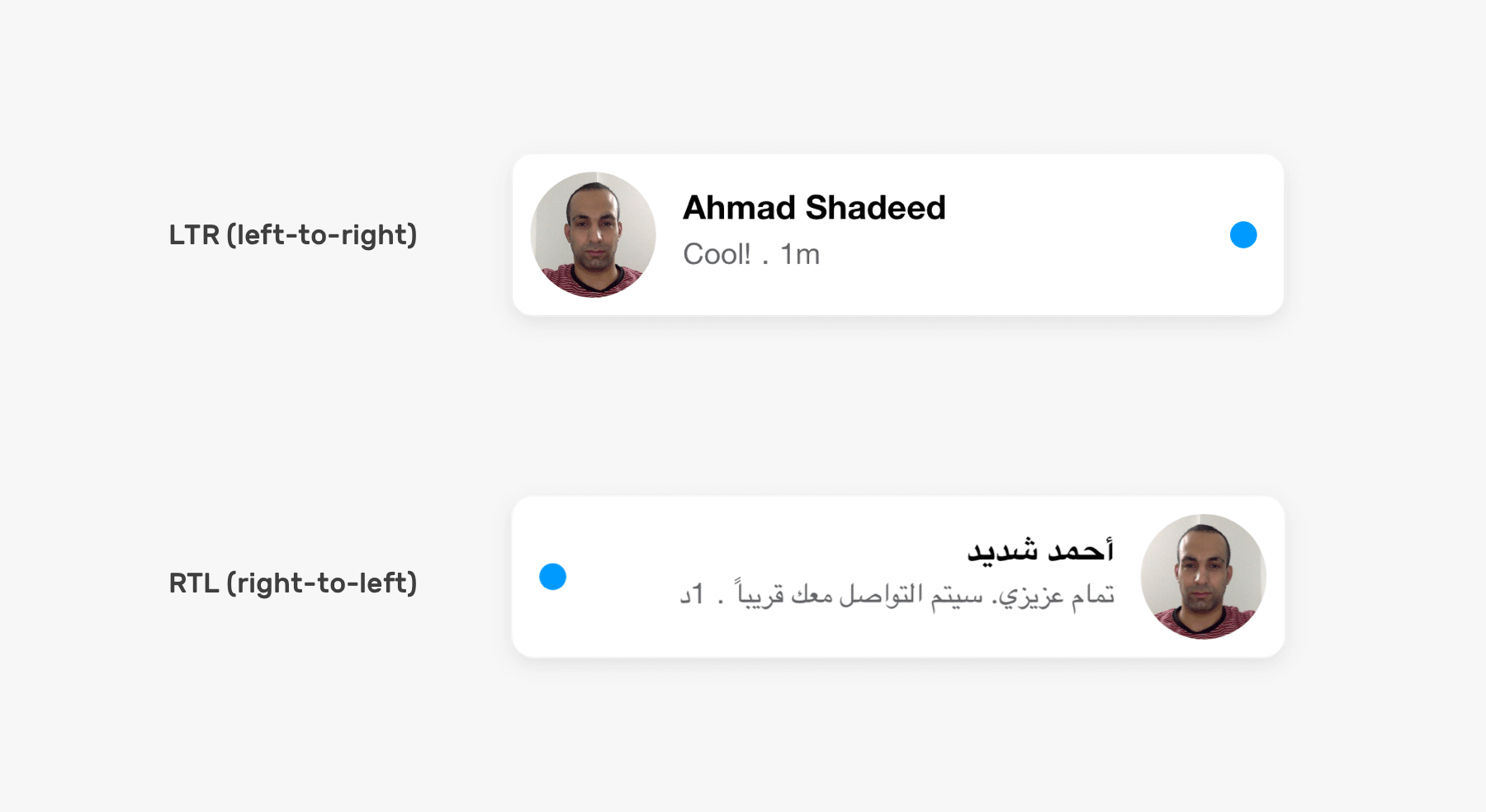
Since flexbox is used for laying out the items, there is no much work needed except to flip the margins.
/* LTR */
.card__content__end {
  margin-left: 12px;
}

/* LTR */
.card__content__end {
  margin-right: 12px;
}
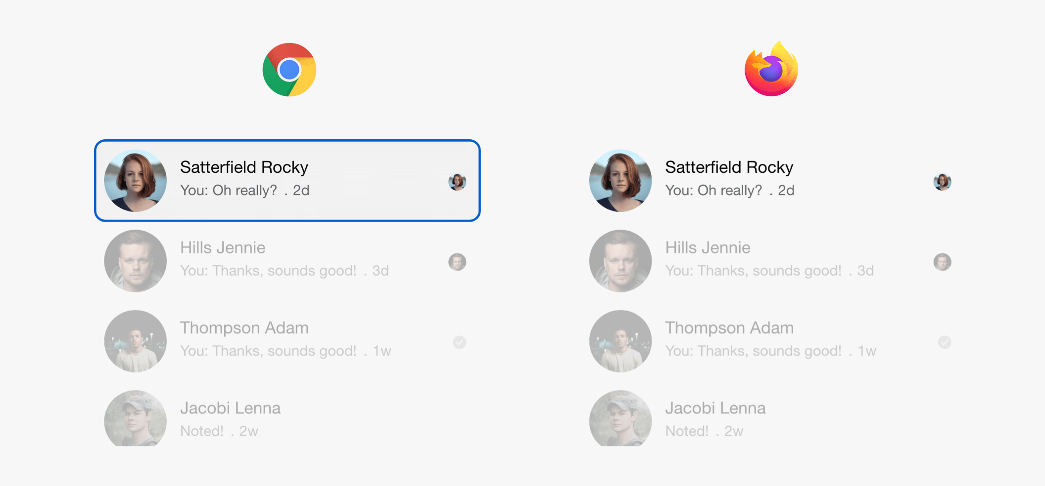
To build a product that works with billions of users, it must be fully accessible. For the component of this article, I tested in Chrome and Firefox, and noticed the following issues:
And to give you more context, the actions menu appears on hover. However, as a keyboard user, I expect to be able to access it via keyboard, too.
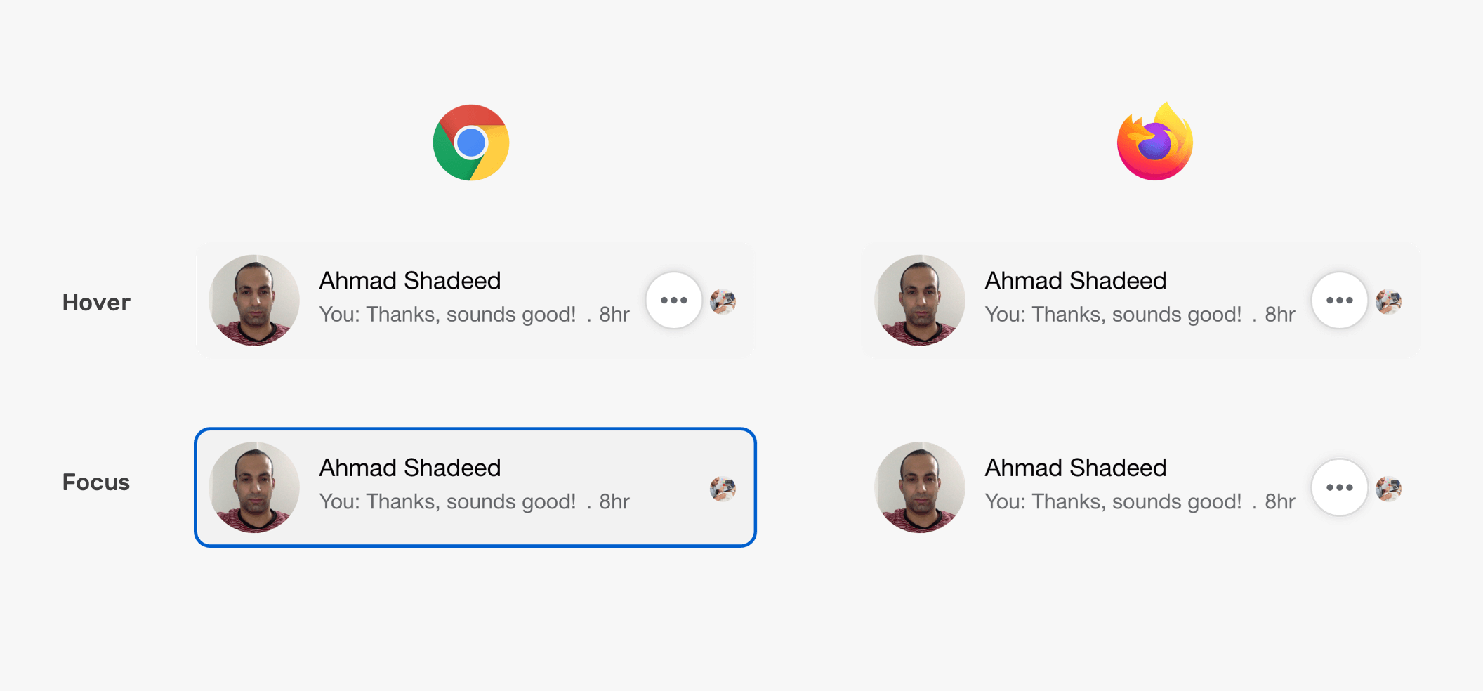
Unfortunately, in Chrome, I couldn’t access the actions menu.
In the listing of the card component, there are some ARIA roles used. The list is a grid, and it contain rows. Each row can have one or more cells.
<div role="grid">
  <div role="row">
    <div role="gridcell">
      <a href="#">
        <!-- The component lives here -->
      </a>
    </div>
  </div>
  <div role="row">
    <div role="gridcell">
      <a href="#">
        <!-- The component lives here -->
      </a>
    </div>
  </div>
</div>
For group chatting, there is a multiple avatars for the seen indicators. In this case, the avatars are laid out as cells of a row using ARIA roles.
<div role="grid">
  <div role="row">
    <!-- 1st avatar -->
    <div role="cell"></div>
    <!-- 2nd avatar -->
    <div role="cell"></div>
  </div>
</div>
Here is a demo on Codepen. It doesn’t include all the variations. I was just testing things out.
Building for the web with HTML & CSS is not an easy job, and it’s not hard either. The point I wanted to make in this article is that the simplest component involves tons of work. By the way, all the explanations above have only discussed HTML & CSS. What about JavaScript? That’s another story.
I enjoyed working and writing this article, and I will definitely work on similar ones in the future.
I’m excited to let you know that I wrote an ebook about Debugging CSS.

If you’re interested, head over to debuggingcss.com for a free preview.
此内容由惯性聚合(RSS阅读器)自动聚合整理,仅供阅读参考。 原文来自 — 版权归原作者所有。