


I spent years teaching CSS layout on this blog. I put everything I know into The Layout Maestro course: 70+ lessons and 150+ interactive examples that teach you how to think CSS layouts, not just memorize syntax.
Let’s suppose that we have an element with position: fixed. If it has scrolling, you will notice that when you reach the bottom boundary of the element, the browser will continue scrolling on the body element. It’s an unwanted and confusing effect. Thankfully, we can fix that with CSS.
In this article, we’ll go through the overscroll-behavior CSS property, what’s the problem it solves, how it works, and where we can use it.
Let’s take a very common problem. We have a modal dialog that is positioned in the center of the viewport. Underneath that modal, there is the actual web page content.

When we reach the end of the modal content, the browser will continue scrolling on the main page’s content instead. That is called scroll chaining. It’s a default behavior that can be overridden now with a new CSS property called overscroll-behavior.
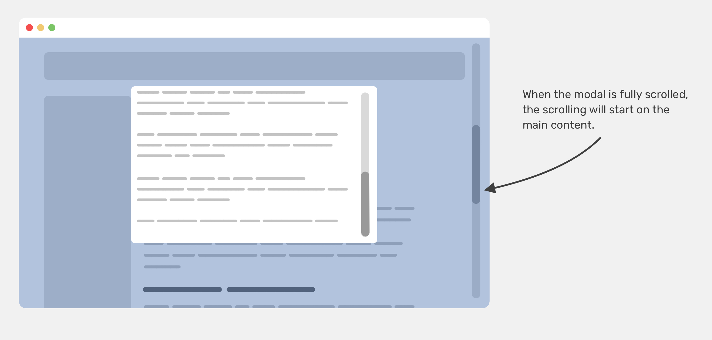
This behavior is often not needed and can distract the user from focusing on the modal content. In the figure above, notice how when we reached the end of the modal, the page continued to scroll.
We used to fix that by applying overflow: hidden on the body element via Javascript. When a modal is opened, we add a class to the body that is responsible for applying the overflow.
body.modal-open {
  overflow: hidden;
}

.modal.is-open {
  display: block;
}
This solution used to work perfectly across desktop browsers, but Safari on iOS didn’t like that. To make it work, we also need to add position: fixed to the body element.
body.modal-open {
  position: fixed;
  overflow: hidden;
}

.modal.is-open {
  display: block;
}
This works, but it will cause the browser to scroll to the top, distracting the user from the task at hand. That is a fix that introduces other problems. I’m not aware of a solution for that except for the pinned one in this article by Ben Frain.
According to the snippet in Ben’s article, the following should be added into the <body> element once the modal is active.
.bg-scrolling-element-when-modal-active {
  /* when modal active */
  touch-action: none;
  -webkit-overflow-scrolling: none;
  overflow: hidden;
  /* Other browsers */
  overscroll-behavior: none;
}
I remember working on a client project in 2018 where I told him that we can’t prevent the body scrolling for the mobile menu on iOS. He replied:
Nothing is impossible in programming. I’m sure there is a solution.
“Programming” refers to CSS in that case, in case you’re wondering. I kept trying and researching a lot, but without a perfect solution. I wish to go back in time and introduce the overscroll-behavior to the solution.
The overscroll-behavior property sets what a browser should do when we reach the boundary of a scrolling area. It’s supported in all major browsers except Safari. The property is a shorthand for overscroll-behavior-x and overscroll-behavior-y.
Note that setting overscroll-behavior will set both axes. Let’s get into the possible values.
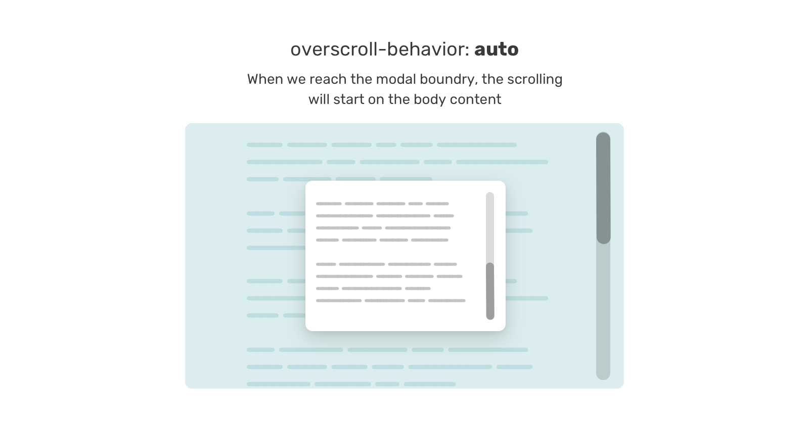
overscroll-behavior: autoThe default value is auto, which allows scroll chaining. When we have a scrolling element and we reach the boundary of it, the browser will continue scrolling on the <body> content.
And here is a video that shows it better:
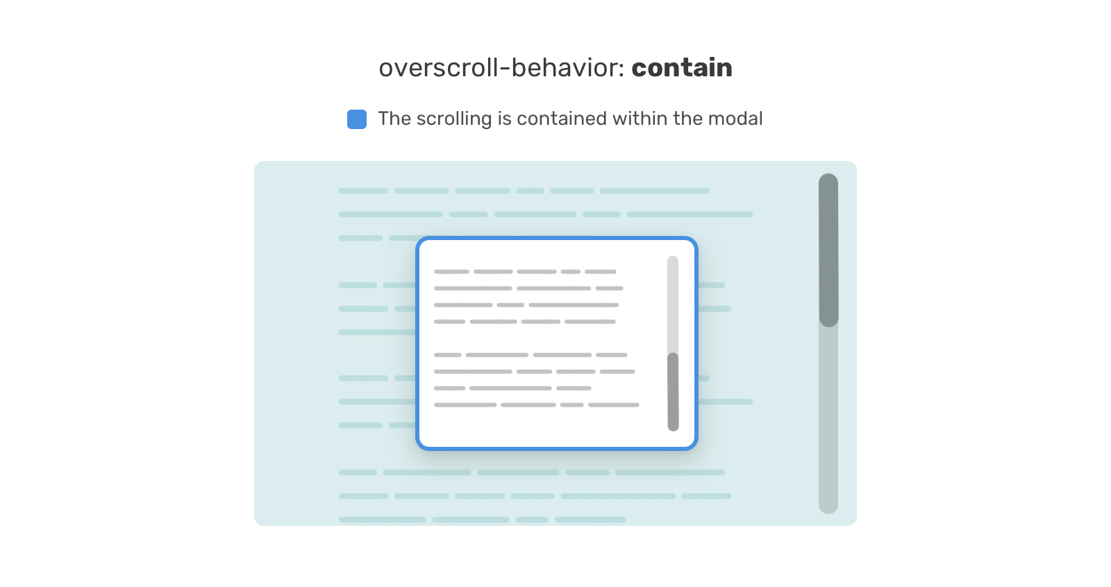
overscroll-behavior: containFrom its name, the value contain will contain the scroll within the element boundary. In the figure below, the scroll is contained within the blue outlined wrapper.
And here is a video that shows it better:
overscroll-behavior: noneWhen none is set, it has a similar effect to contain, ** in addition** to prevent the bounce effect when the top or bottom of the page is reached.
Now that you have an idea of how overscroll-behavior works, let’s get into some useful use cases.
When the mobile navigation is too long, scrolling too fast can cause the issue of scroll chaining on the body content. In the following figure, we have a long, scrollable navigation list.
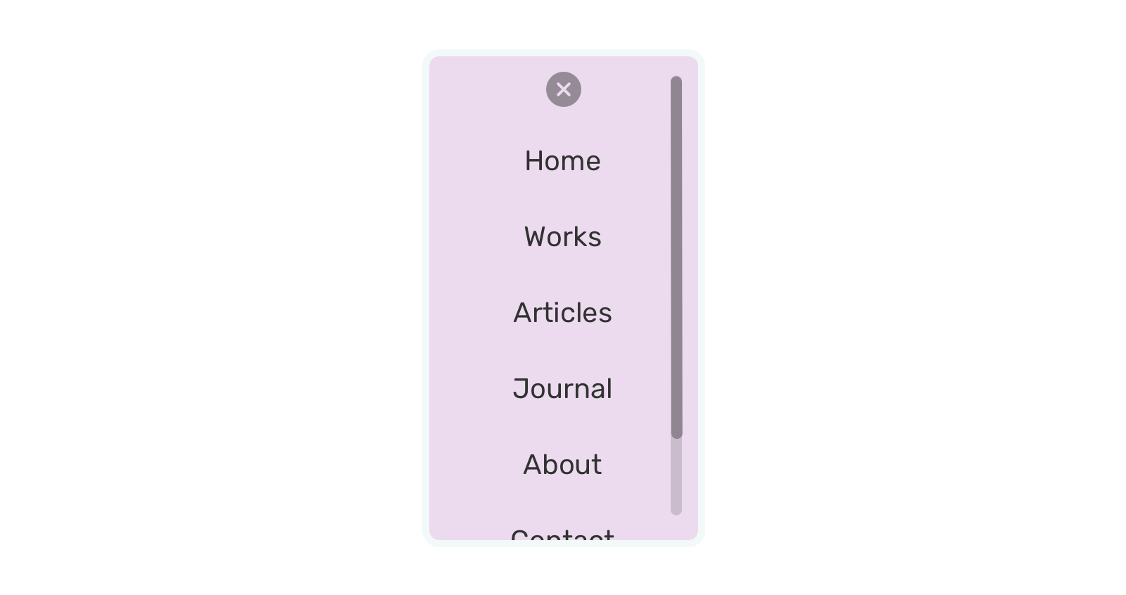
If the scroll isn’t contained, it will cause the body content to scroll too. We can avoid that
.nav {
  overscroll-behavior-y: contain;
  overflow-y: auto;
}
Let’s see it in a video. I added a semi-transparent background for the navigation to see underneath it. Notice how it behaves when I toggle off the overscroll-behavior-y property.
When toggled off, a body scroll will happen.
An interesting thing to keep in mind though is that when the navigation is short (and thus isn’t scrollable), and a user tried to scroll for no reason, the body will scroll, even if overscroll-behavior-y: contain is set.
Unfortunately, I’m not aware of a fix for that other than the “hacks” introduced at the beginning of the article.
Another useful usage for overscroll-behavior is when you have a sidebar and main. In that case, the sidebar is fixed and it might be scrollable if its content is too long.
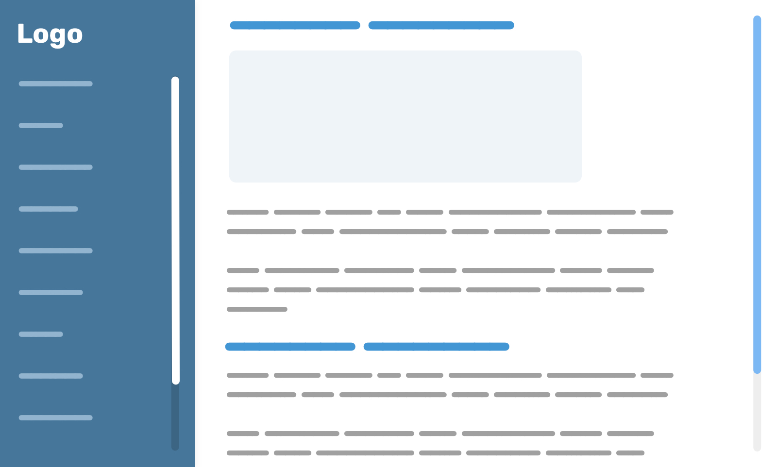
To avoid scrolling the main section when reaching the end boundary of the sidebar, we need to add the following:
.aside {
  overscroll-behavior-y: contain;
}
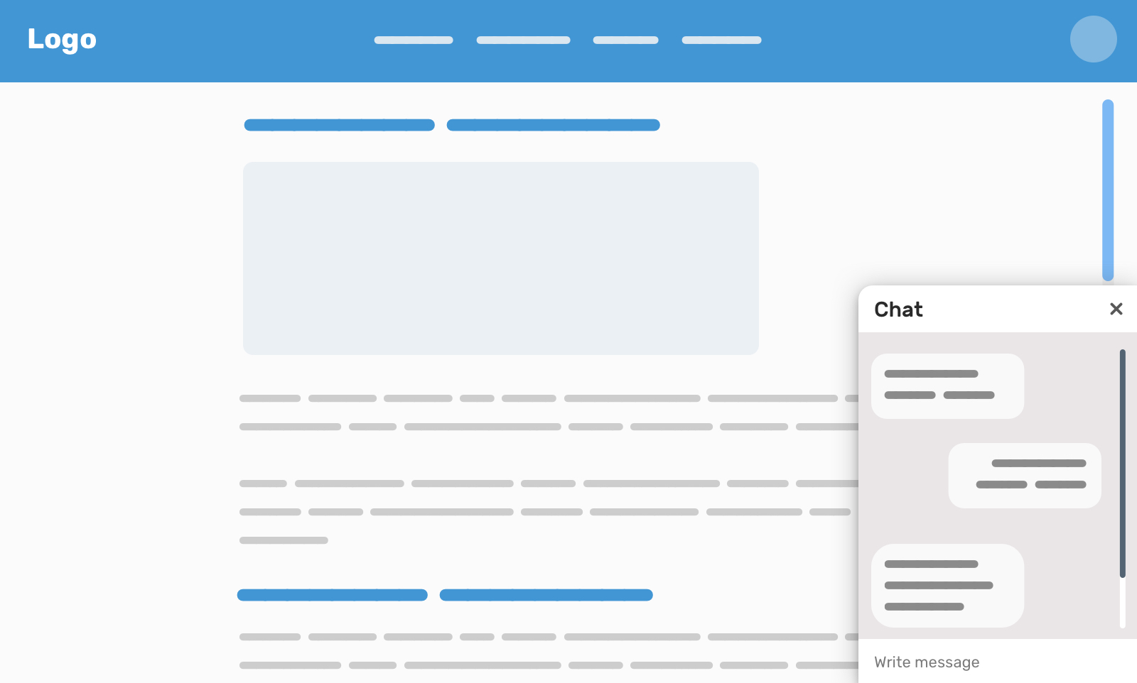
Inspired by Facebook, the chat component is a perfect use case for overscroll-behavior. We can use it to avoid the body scrolling when we reach the end of it.
.aside {
  overscroll-behavior-y: contain;
}
The first example I went within the article is modal, so I won’t repeat it. However, there are cases where we might need a list within a modal, and when that list is scrollable, we don’t want scroll chaining to happen.
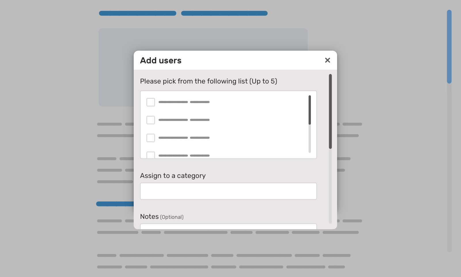
Notice the list of options in the modal. This is a scrollable list. If we reach the boundary of it, the modal content will scroll. To avoid this, we can use overscroll-behavior.
.list-wrapper {
  overscroll-behavior-y: contain;
  overflow-y: auto;
  max-height: 130px;
}
I spotted this use-case on Facebook’s home page. There is a section that has a list of users, and it scrolls horizontally as you see in the figure below.

This is a good usage for overscroll-behavior-x.
.list {
  overscroll-behavior-x: contain;
}
CSS overscroll-behavior is a useful property that solves an issue we used to hack around years ago. I hope that you learned something new from this article.
Do you know other useful use cases for it? If yes, I would love to hear from you on Twitter @shadeed9.
此内容由惯性聚合(RSS阅读器)自动聚合整理,仅供阅读参考。 原文来自 — 版权归原作者所有。