


I spent years teaching CSS layout on this blog. I put everything I know into The Layout Maestro course: 70+ lessons and 150+ interactive examples that teach you how to think CSS layouts, not just memorize syntax.
One of the best gifts we have as front-end developers is the ability to see how something is implemented by simply inspecting a website and see how the CSS works behind the scenes. Say an interesting effect that you wonder how it was done? Inspect element and the answer is waiting for you. On the other hand, this is not possible for back-end developers, since the source code is gone the moment server-side rendering happens.
For me, inspecting elements in the DevTools make me curious about learning new things and making myself a better front-end developer. In this article, I will highlight some of the interesting and useful things that I learned while being curious about other’s work.
Let’s get curious!
For this example, we will go through the single post page from Instagram. I found some interesting bits there.
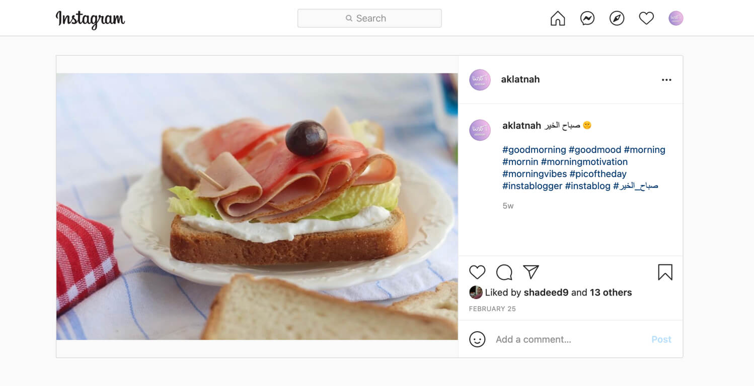
From the first glance, you might be tempted to think that the section will be divided into parts:
The short answer is no. It’s a bit more complex than dividing the section into two parts. Since this section is expected to work on multiple viewports, its content should be ordered in a specific way. Let me show you a blueprint of the design so we can focus a bit more.
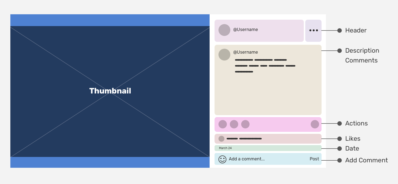
Here is the HTML for the above.
<article class="post">
  <header class="post__header"></header>
  <button class="post__menu"></button>
  <div class="post__thumb"></div>
  <div class="post__content">
    <section class="post__actions"></section>
    <section class="post__likes"></section>
    <div class="post__desc"></div>
    <time class="post__date"></time>
    <section class="post__comments"></section>
  </div>
</article>
The interesting bit is that the above is a mobile-first HTML. If you look closely, you will notice that the HTML source order matches the mobile design below.
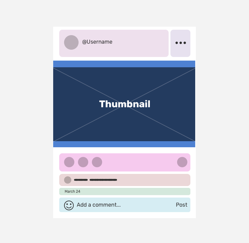
Let’s get into some things that I noticed while inspecting how the Instagram team implemented the above in CSS.
The layout was done using absolute positioning in CSS. From the first glance, you might expect something like:
.post {
  display: grid;
  grid-template-columns: minmax(10px, 1fr) 335px;
}
That wasn’t the cause as it’s not possible to do this with the HTML we have. It might be possible by using CSS grid features, but not sure why the IG team went with absolute positioning.
The thumbnail has a huge margin-right:
.post__thumb {
  margin-right: 335px;
  min-height: 450px;
}
I like that they added min-height to account for rectangle-like images.
In the figure below, I highlighted the main design elements so I can make it easier for you to understand the next.
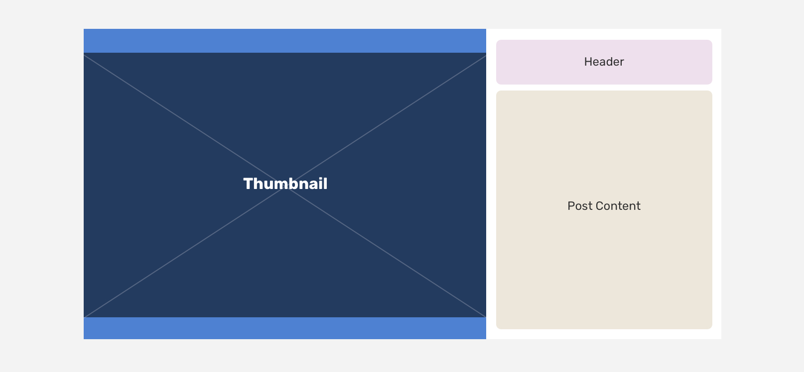
The .post__content element is absolutely positioned with a top value of 72px. This value is equal to the header height. Here is how the team did it:
.post__content {
  position: absolute;
  right: 0;
  top: 72px;
  bottom: 0;
  width: 335px;
}
Yes, you might be surprised to see “fixed-width” values like this, but that’s how it works for a website with millions of users. If it was for me, I might use CSS variables like this:
:root {
  --post-header-height: 72px;
  --post-content: 335px;
}

.post__content {
  top: var(--post-header-height);
  width: var(--post-content);
}
That way, we can get the post header height via JavaScript and feed it to the CSS variable. Though I’m not sure why they didn’t use CSS variables (Even though they’re already using them for colors).
To control the UI elements order on desktop vs mobile, the order property was used.
.post__actions {
  order: 2;
}

.post__likes {
  order: 3;
}

.post__desc {
  order: 1;
}

.post__date {
  order: 4;
}

.post__comments {
  order: 5;
}
Even though the above works, but it’s confusing when I tab via the keyboard since the visual order is not as the HTML source order. This is not good for accessibility.
Since aspect-ratio doesn’t have good support nowadays, the padding hack is used to mimic the responsive image behavior. I can’t wait for better support for aspect-ratio.
I noticed that the user avatar has fit-content like the below:
.post__avatar {
  width: fit-content;
  height: fit-content;
}
I don’t really know the reason for this, since removing them didn’t break the layout or something.
I really like the usage of viewport units for the vertical padding. Here is how it’s used:
.wrapper {
  padding: 4vh 20px 0;
}
The main wrapper has a 20px padding on the left and righ sides, so I noticed that the width is like the below:
.wrapper {
  padding: 4vh 20px 0;
  width: calc(100% - 40px);
}
This is because box-sizing is set to content-box (the default). I’m not sure about the reason for that?
This is related to the Instagram stories poll. If you don’t know it, it’s simply a UI widget that includes two answers. When the user picks one of the answers, the percentage is revealed.
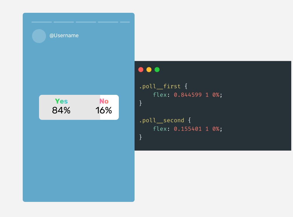
What I really liked is the usage of a precise value for the flex-grow property. Isn’t that just interesting?
.poll__first {
  flex: 0.844599 1 0%;
}

.poll__second {
  flex: 0.155401 1 0%;
}
That’s all for this article. I look forward to other parts of it where I get curious and inspect more websites.
I’m excited to let you know that I wrote an ebook about Debugging CSS.

If you’re interested, head over to debuggingcss.com for a free preview…
此内容由惯性聚合(RSS阅读器)自动聚合整理,仅供阅读参考。 原文来自 — 版权归原作者所有。