
惯性聚合 高效追踪和阅读你感兴趣的博客、新闻、科技资讯
阅读原文 在惯性聚合中打开

推荐订阅源

U
Unit 42
P
Proofpoint News Feed
The Last Watchdog
The Last Watchdog
S
Secure Thoughts
cs.AI updates on arXiv.org
N
News | PayPal Newsroom
Application and Cybersecurity Blog
O
OpenAI News
S
Security @ Cisco Blogs
宝玉的分享
宝玉的分享
Hacker News: Ask HN
Hacker News: Ask HN
T
Troy Hunt's Blog
Google Online Security Blog
WordPress大学
WordPress大学
有赞技术团队
有赞技术团队
TaoSecurity Blog
TaoSecurity Blog
Help Net Security
Help Net Security
Latest news
Latest news
NISL@THU
NISL@THU
S
Security Affairs
博客园_首页
C
CXSECURITY Database RSS Feed - CXSecurity.com
博客园 - 聂微东
AI
AI
www.infosecurity-magazine.com
Recent Announcements
P
Privacy & Cybersecurity Law Blog
小众软件
小众软件
cs.CV updates on arXiv.org
Hugging Face - Blog
Hugging Face - Blog
博客园 - 司徒正美
AWS News Blog
AWS News Blog
W
WeLiveSecurity
Google DeepMind News
I
InfoQ
Schneier on Security
Recent Commits to openclaw:main
T
The Exploit Database - CXSecurity.com
IT之家
IT之家
T
Threatpost
Scott Helme
Scott Helme
L
LINUX DO - 热门话题
腾讯CDC
CTFtime.org: upcoming CTF events
N
News and Events Feed by Topic
L
LINUX DO - 最新话题
F
Full Disclosure
大猫的无限游戏
大猫的无限游戏
H
Heimdal Security Blog
S
SegmentFault 最新的问题

Ahmad Shadeed

Better fluid sizing with round() Use Cases for Field Sizing The Basics of Anchor Positioning Item Flow CSS Relative Colors Balancing Text In CSS Should masonry be part of CSS grid? CSS display contents CSS Grid Areas CSS Cap Unit An Interactive Guide to CSS Container Queries CSS :has() Interactive Guide CSS Nesting UX in DevTools CSS Nesting Future CSS: State Container Queries Rebuilding a comment component with modern CSS Conditional CSS with :has and :nth-last-child CSS Text balancing with text-wrap:balance CSS Masking Do we need CSS flex-wrap detection? My CSS Wishlist Conditional CSS CSS Style Queries Inside the mind of a frontend developer: Article layout Inside the mind of a frontend developer: Hero section CSS container queries are finally here The CSS behind Figma First Look At The CSS object-view-box Property Learn CSS Subgrid CSS :has Parent Selector Aligning Content In Different Wrappers Hello, CSS Cascade Layers Building UI Components With SVG and CSS A Deep CSS Dive Into Radial And Conic Gradients Defensive CSS Building Real-life Components: Facebook Messenger Conditional Border Radius In CSS CSS Container Query Units Less Absolute Positioning With Modern CSS Aligning a Button Label Vertically Comparing Design Mockups To Code Result Using HSL Colors In CSS Custom Scrollbars In CSS Let CSS Container Queries For Designers The State of CSS Cross-Browser Development Overflow Issues In CSS Inspect Element As A Way To Increase Your Curiosity Handling Text Over Images in CSS Digging Into CSS Logical Properties Clipping Scrollable Areas On The inline-start Side Understanding Clip Path in CSS The Art of Building Real-life Components Handling Short And Long Content In CSS CSS Scroll Snap A Deep Dive Into CSS Grid minmax() CSS Variables 101 Finding The Root Cause of a CSS Bug Learn CSS centering How to detect browser support for Flexbox Gap CSS Mistakes While On Autopilot Digging Into the Flex Property Understanding CSS Multiple Backgrounds Aligning Logo Images in CSS Grid for layout, Flexbox for components Colors in CSS Thinking About The In-between Design Cases min(), max(), and clamp() CSS Functions Image Techniques On The Web Everything About Auto in CSS Learn Box Alignment Let Learn CSS Positioning Intrinsic Sizing In CSS CSS Grid Template Areas In Action Hiding Elements On The Web Creating a Variable Color Font From Scratch Building a Football Ticket With CSS and SVG Blending Modes in CSS CSS Variables With Inline Styles Implementing Dark Mode For My Website Rebuilding Apple Music Header in HTML & CSS Accessible Checkbox Layout Flickering On Browser Resize Enhancing The Clickable Area Size Custom Underlines with SVG Part 3: The Process of Implementing A UI Design From Scratch Part 2: The Process of Implementing A UI Design From Scratch Building An Old Nav Design CSS Flexbox: 5 Real World Use Cases I Used CSS Inline Flex For The First Time The Process of Implementing A UI Design From Scratch Common CSS Issues For Front-End Projects Handling Long and Unexpected Content in CSS How to Build Web Form Layouts With CSS Grid Grid Layout Ah-ha Moment Enhancing Our Components with CSS :empty Building Resizeable Components with Relative CSS Units CSS Writing Mode The Journey of Learning Front End Web Development on a Daily Basis
Flexbox Dynamic Line Separator
Ahmad Shadeed · 2022-02-17 · via Ahmad Shadeed

The Layout Maestro

I spent years teaching CSS layout on this blog. I put everything I know into The Layout Maestro course: 70+ lessons and 150+ interactive examples that teach you how to think CSS layouts, not just memorize syntax.

Get the course

While working on a UI, I needed to add a line separator between two sections. Here it is:

On smaller viewports, the line will become horizontal:

Let’s take a look at the HTML.

<section class="section">
  <div class="section__item section__item--start">
    <!-- Content -->
  </div>

  <div class="section__item section__item--end">
    <!-- Content -->
  </div>
</section>

We have a section, with two main child items. Between them, we will have a line separator.

In CSS, I will use flexbox to handle the layout.

.section {
  display: flex;
  gap: 1rem;
  max-width: 700px;
  margin: 2rem auto;
}

.section__item {
  flex: 1;
}

I added a 1rem gap between each one, and also each child item should fill 50% of its parent. Here is the result:

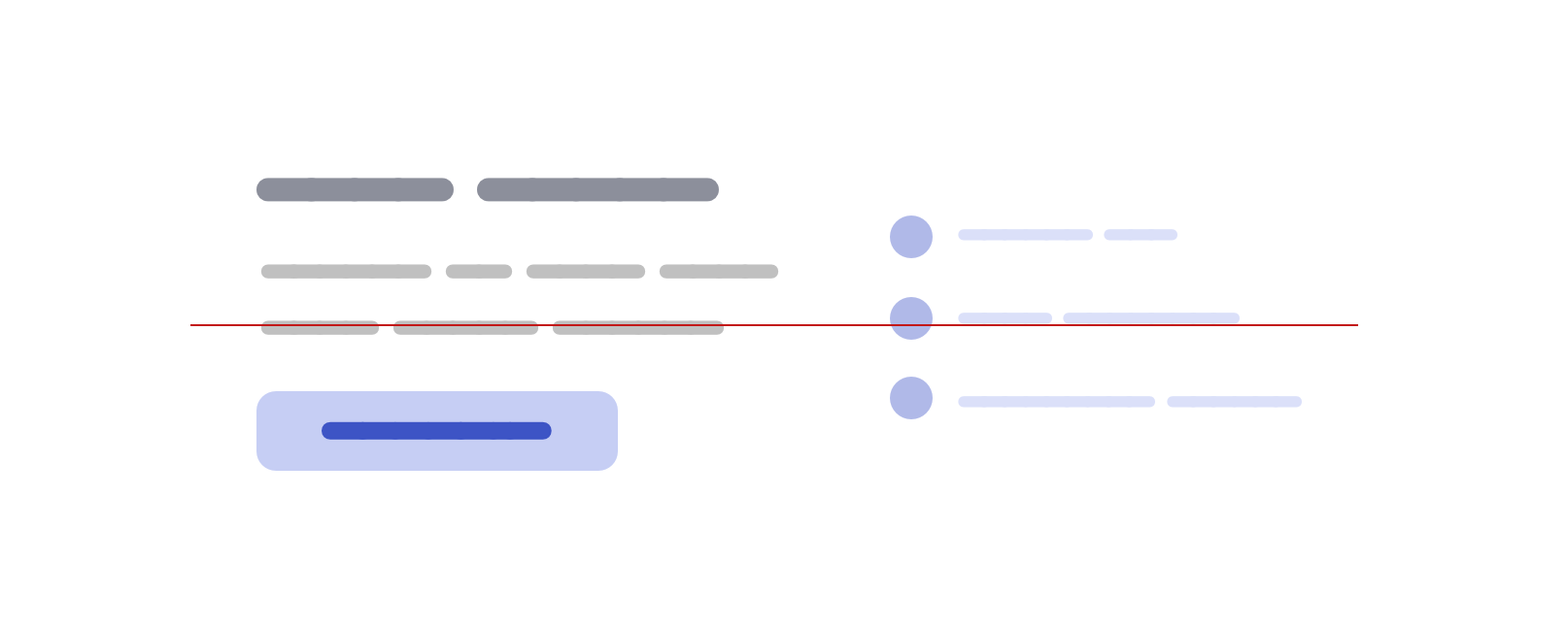
Next step, I want to center the two items vertically, so I will use align-items on the parent.

.section {
  display: flex;
  align-items: center;
  gap: 1rem;
  /* other styles */
}

.section__item {
  flex: 1;
}

Now the two items are centered (I added the red line to make it easy to spot that). You might be asking, what does that have to do with the separator? I totally understand, let’s keep going.
Adding the separator

I wanted to add this as a pseudo-element, so I wrote this CSS. Can you expect the visual result of this without scrolling down?

.section:before {
  content: "";
  border: 1px solid #d3d3d3;
}

Oh, what is that little square doing over here? Since the pseudo-element is only a 1px border from all sides, the result will be 2*2` square.
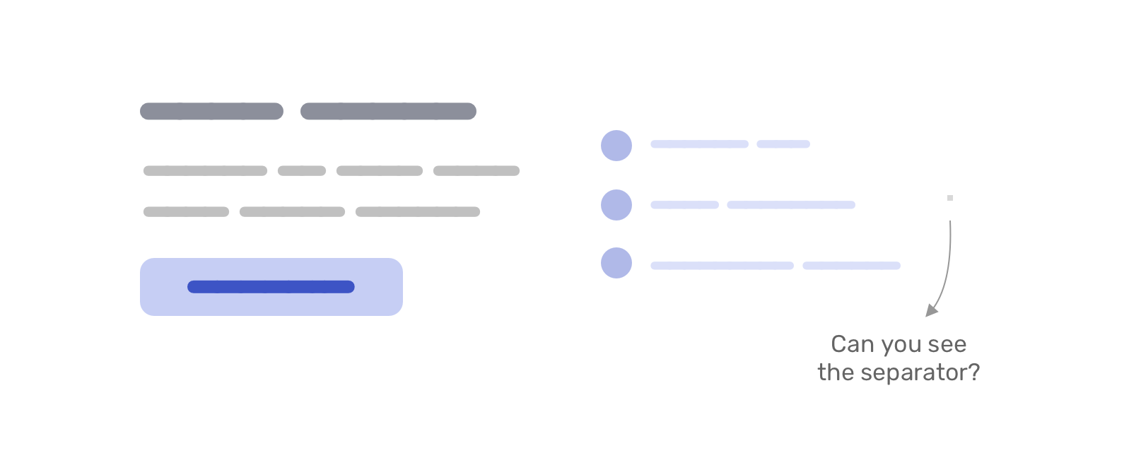
Let’s focus a bit here. This is the core of this little CSS trick.

The square comes from using the same color for each border. With different colors, it can look like this.
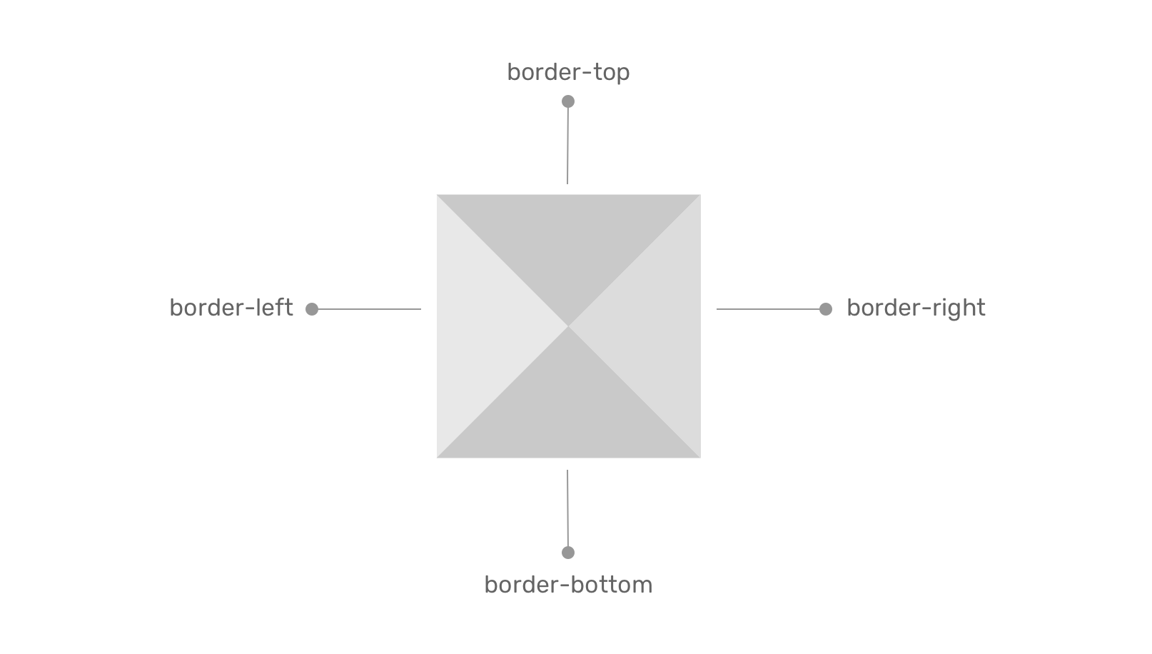
Why the separator looks like a square?

Since we added align-items: center to center the child items vertically, we removed the default behavior of flexbox stretching child items (stretching vertically, in this case).

To fix that, we need to reset the alignment of the pseudo-element to stretch.

.section:before {
  content: "";
  border: 1px solid #d3d3d3;
  align-self: stretch;
}

Now it looks like the following visual:

Next, I need to reorder the flex items to make the divider appears between them.

.section__item--start {
  order: -1;
}

And we’re done!

To make this work on all screen sizes, we need to have the flex-direction: column mobile and flex-direction: row for larger screens.

.section {
  display: flex;
  flex-direction: column;
  gap: 1rem;
}

.section:before {
  content: "";
  border: 1px solid #d3d3d3;
  align-self: stretch;
}

@media (min-width: 700px) {
  .section {
    align-items: center;
    flex-direction: row;
  }
}

Here is a video of changing the flex-direction. Notice how the separator changes!

This works like magic because it’s a flexbox behavior.

When flex-direction: row is set, the cross-axis is vertical thus the pseudo-element stretches vertically.
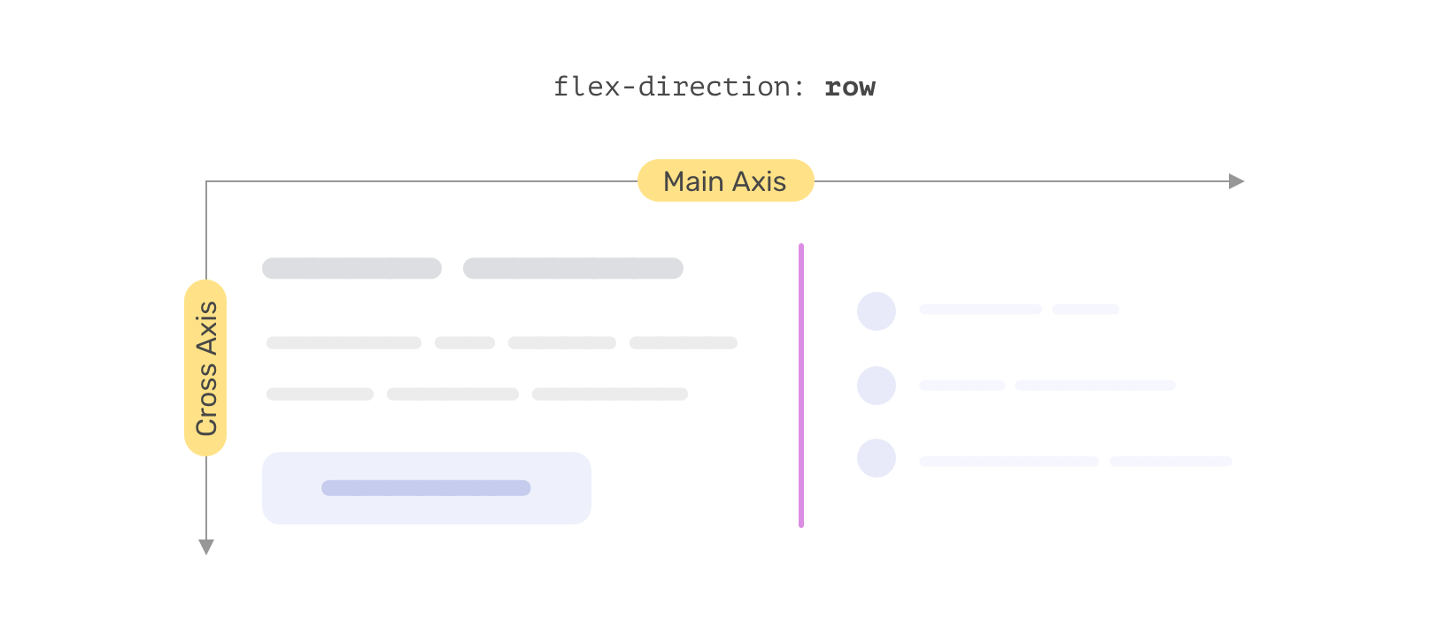
And when the cross-axis is set to flex-direction: column, it will be horizontal and so the pseudo-element stretches horizontally.
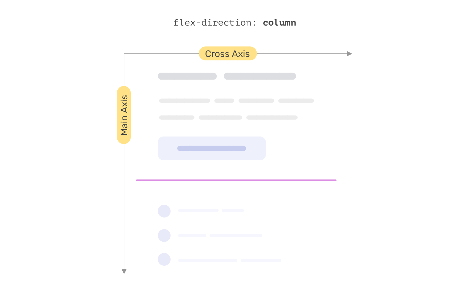
Isn’t that neat? No need to use width, height, or anything else! It’s just a border being stretching via flexbox.

The separator thickness

Since the border value contributes to the four directions, we need to use 0.5x of the thickness we want. For example, if we want a 1px separator, then the border should be like the following:

.section:before {
  content: "";
  border: 0.5px solid #d3d3d3;
  align-self: stretch;
}

Gradient separators

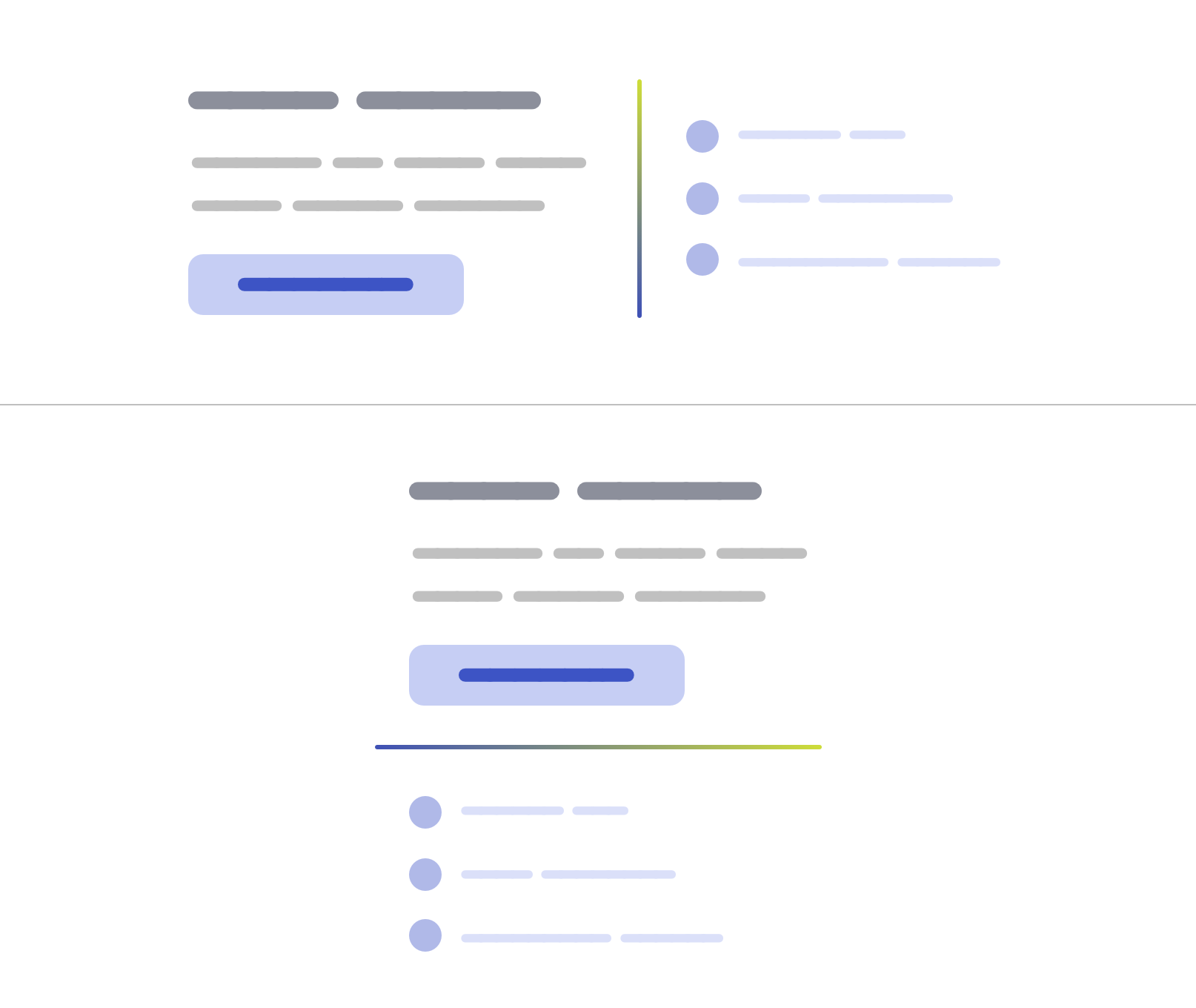
This is another reason for me to pick the border solution above others. We can use gradients via border-image.

.section:before {
  content: "";
  align-self: stretch;
  border: 1px solid #d3d3d3;
  border-image: linear-gradient(45deg, #3f51b5, #cddc39) 1;
}
Dashed separators

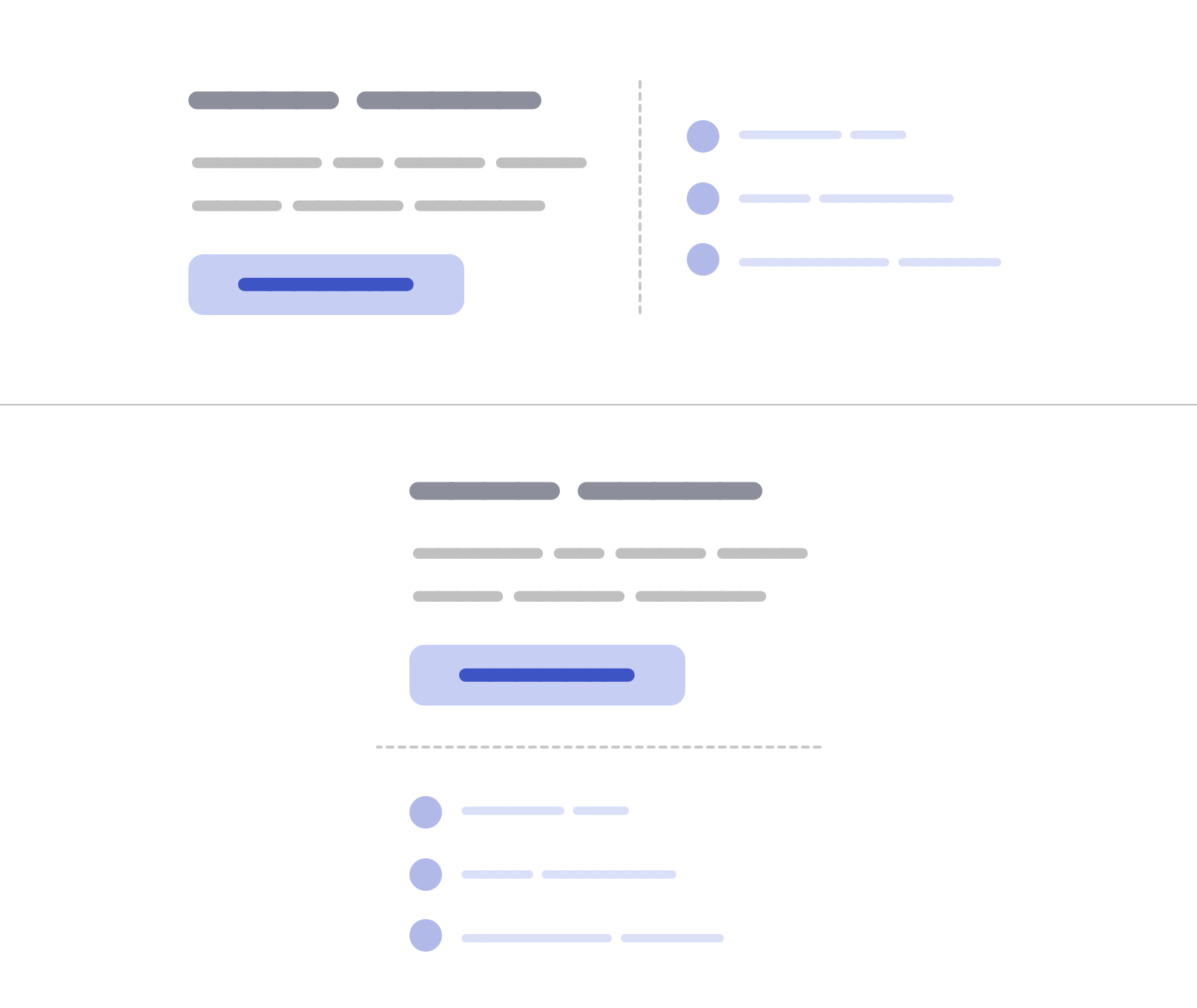
Given that we’re using borders, we can also have a dashed separator.

.section:before {
  content: "";
  border: 1px dashed #d3d3d3;
  align-self: stretch;
}
Another way of doing it

If I haven’t taken the time to think about implementing this, then I might have used width and height. I’m not saying the following is a bad solution, but it’s good to step out of solutions we took for granted and think of other ways of solving UI problems.

/* On small sizes */
.section:before {
  content: "";
  height: 2px;
  background-color: lightgrey;
}

@media (min-width: 700px) {
  .section:before {
    width: 2px;
    height: 150px;
  }
}

See the Pen Untitled by Ahmad Shadeed (@shadeed) on CodePen.

I hope you’ve learned something new. Thank you for reading!