


I spent years teaching CSS layout on this blog. I put everything I know into The Layout Maestro course: 70+ lessons and 150+ interactive examples that teach you how to think CSS layouts, not just memorize syntax.
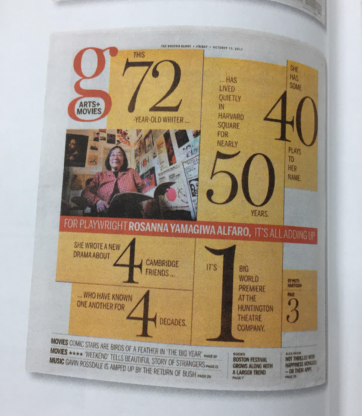
The web technologies we have at our hands today are marvelous. Every day there is something new knocking on our doors. The decision is upon us; we either accept the challenge to learn new things or not. I wanted to pick a design that I can use new CSS techniques and try to grasp them more. For today, I chose a magazine layout with some pretty interesting, challenging design details.
To mark it up correctly in HTML, the first thing I did is that I skimmed all the content. For me, it reads like an article with a title and a description paragraph. I imagined it like the below design mockup.
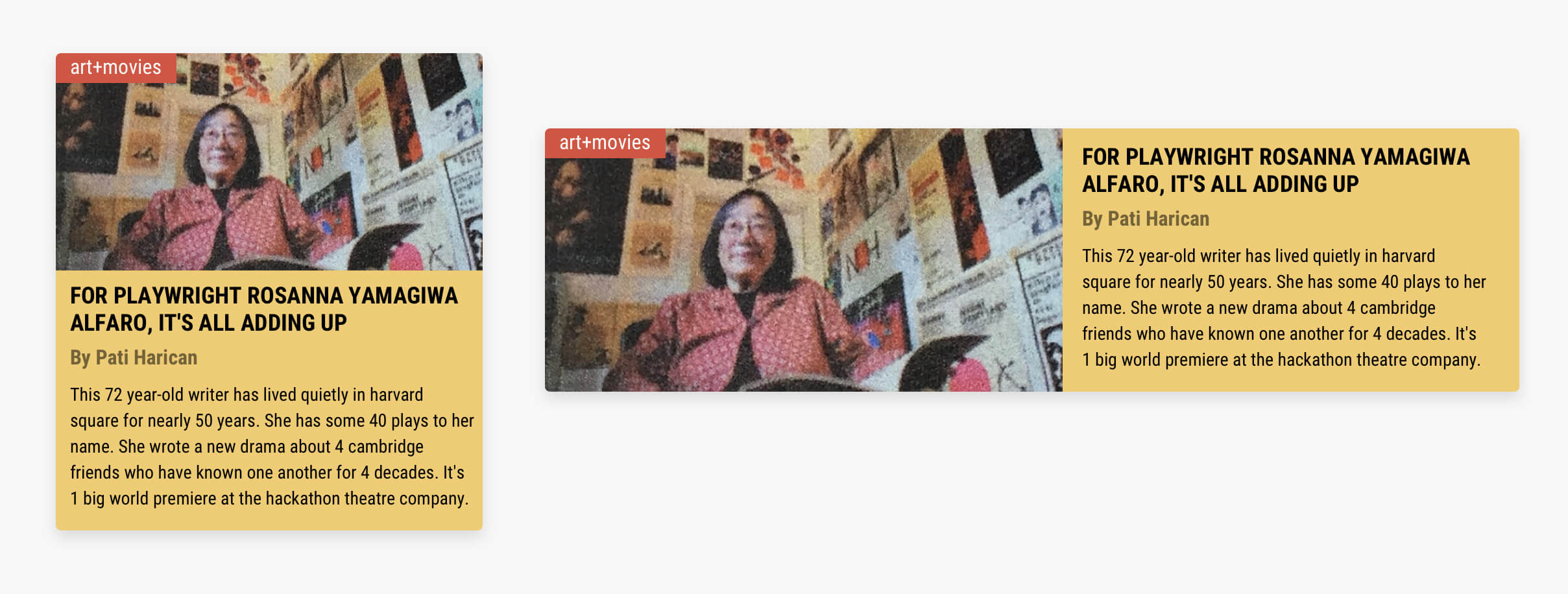
Of course, we won’t build that, but I wanted to show you how the design might look without the creative art direction in the magazine layout.
In HTML, I added the content as below:
<div class="magazine">
  <div class="item item-72"></div>
  <div class="item item-50">
    <span>...Has lived quietly in harvard square for nearly</span>
    <span class="num">50</span>
    <span>years</span>
  </div>
  <!-- Other items -->
</div>
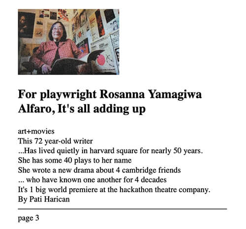
Notice that I placed the content inside <span>s so I can control that easily from CSS later. Here is how it looks with the initial HTML:
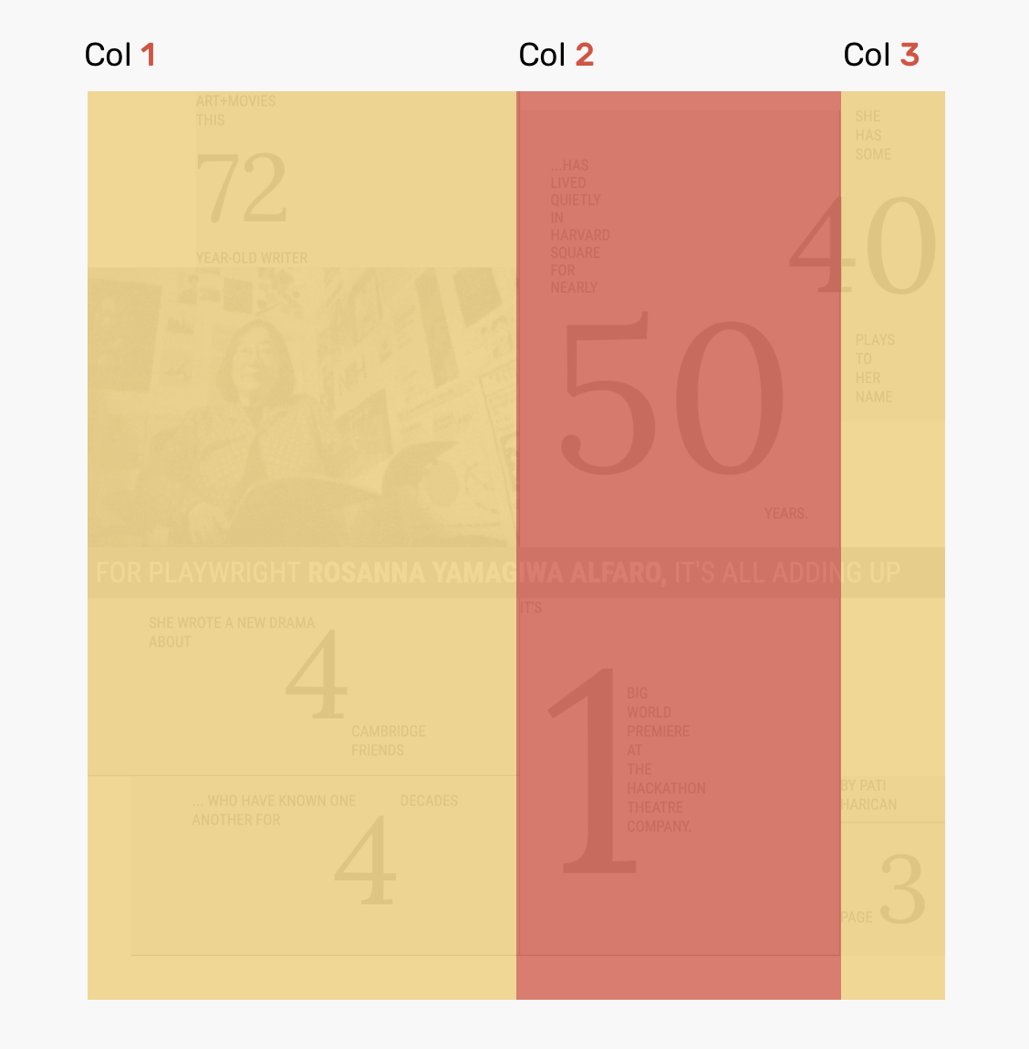
The layout grid has three columns with a unique size for each one. I think that’s why the layout looks creative in the first place.
.magazine {
  display: grid;
  grid-template-columns: 1.35fr 1fr 110px;
}
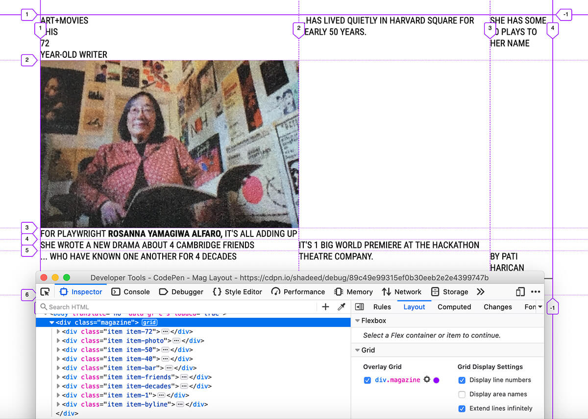
Once I defined the grid, I needed to place each element in its place using grid-column and grid-row. That was easy with the help of Firefox DevTools for the grid. Make sure to activate “Display line numbers”.
For example, the item with the number “50” is positioned like this:
.item-50 {
  grid-row: 1/3;
  grid-column: 2/3;
}
And it’s similar to the rest of the items. Once done, it should like that:
I rarely use percents as a value for margins, but for this layout, I find it suitable for some cases. I highlighted the possible items that can get the benefit of that.
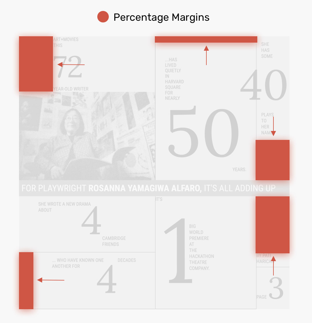
I added the following to each item:
.item-72 {
  margin-left: 25%;
}

.item-50 {
  margin-top: 6%;
}

.item-decades {
  margin-left: 10%;
}
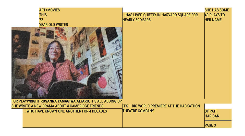
…and so on. The values were picked by trial and error so there are no specific numbers I used. Once done, it should look like this:
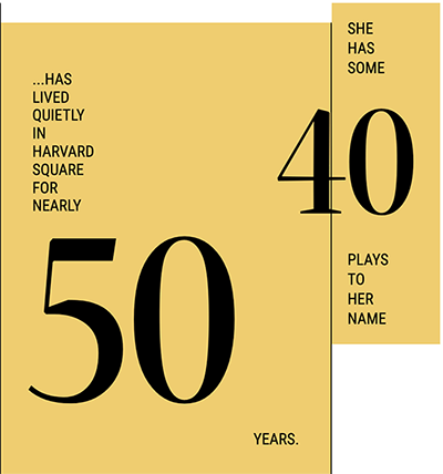
If you haven’t spotted that already, there are some items in the layout that can be done using flexbox. I will show you how I built two of the items. Needless to say, the highlighting on the items was done by Firefox DevTools.

<div class="item item-friends">
  <span>She wrote a new drama about</span>
  <span class="num">4</span>
  <span>cambridge friends</span>
</div>
.item-friends {
  display: flex;
}

.item-friends span:last-child {
  align-self: flex-end;
}
In that case, the direction of flex items is vertical (column).

<div class="item item-50">
  <span>...Has lived quietly in harvard square for nearly</span>
  <span class="num">50</span>
  <span>years.</span>
</div>
.item-50 {
  display: flex;
  flex-direction: column;
}

.item-50 span:last-child {
  align-self: flex-end;
}
As per the design, there are two items that each one has a sentence with each word in a new line. I needed a way to force line break after each word.
At first, I thought about using min-content as a value for the width of the element. It works by calculating the intrinsic minimum width based on the element content.
.elem {
    width: min-content;
}
Though that might not work in all cases. I changed the text a bit and got this:

Another more guaranteed solution is to use word-spacing with a very large pixel value, or a viewport unit.
.elem {
  word-spacing: 9999px;
  /* Or */
  word-spacing: 100vw;
}
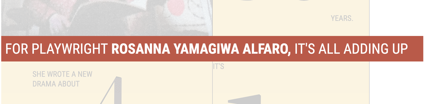
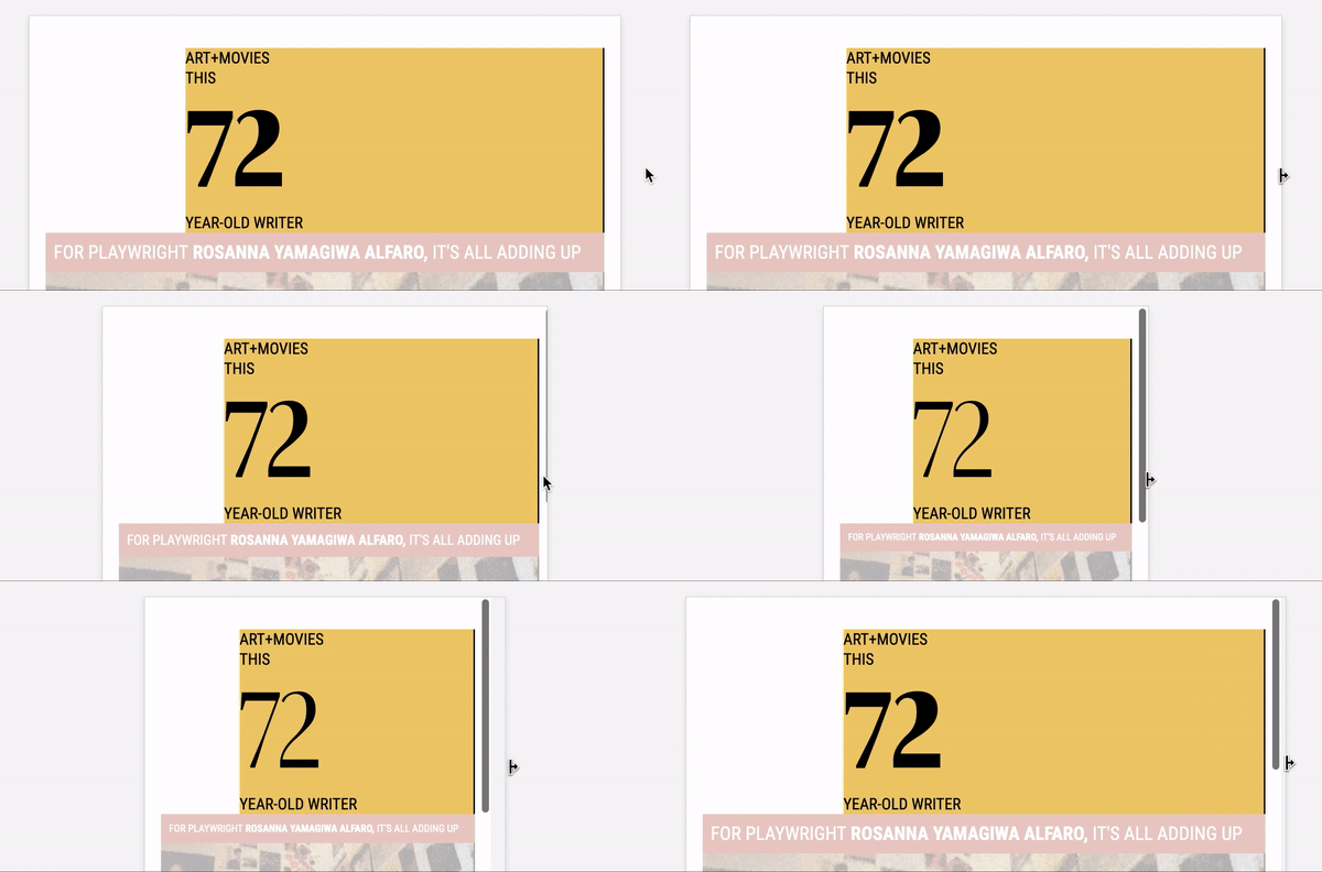
The sentence with the dark coral color needs to stay in one line no matter the screen size. I tried using viewport units but it didn’t work. After some research, I learned about a fittext.js than fit text in its parent container.
However, I thought about using ResizeObserver and it worked like a charm for my use case! I tried to find a factor number that will be divided by the width of the parent container.
let itemBar = document.querySelector(".item-bar")

const ro = new ResizeObserver((entries) => {
  for (let entry of entries) {
    let w = entry.contentRect.width /* Width of parent */
    let fz = w / 29 /* Font size */
    itemBar.style.fontSize = fz + "px"
  }
})

ro.observe(itemBar)
Isn’t that better than using a script? ResizeObserver for the win. Here is a GIF that shows that:
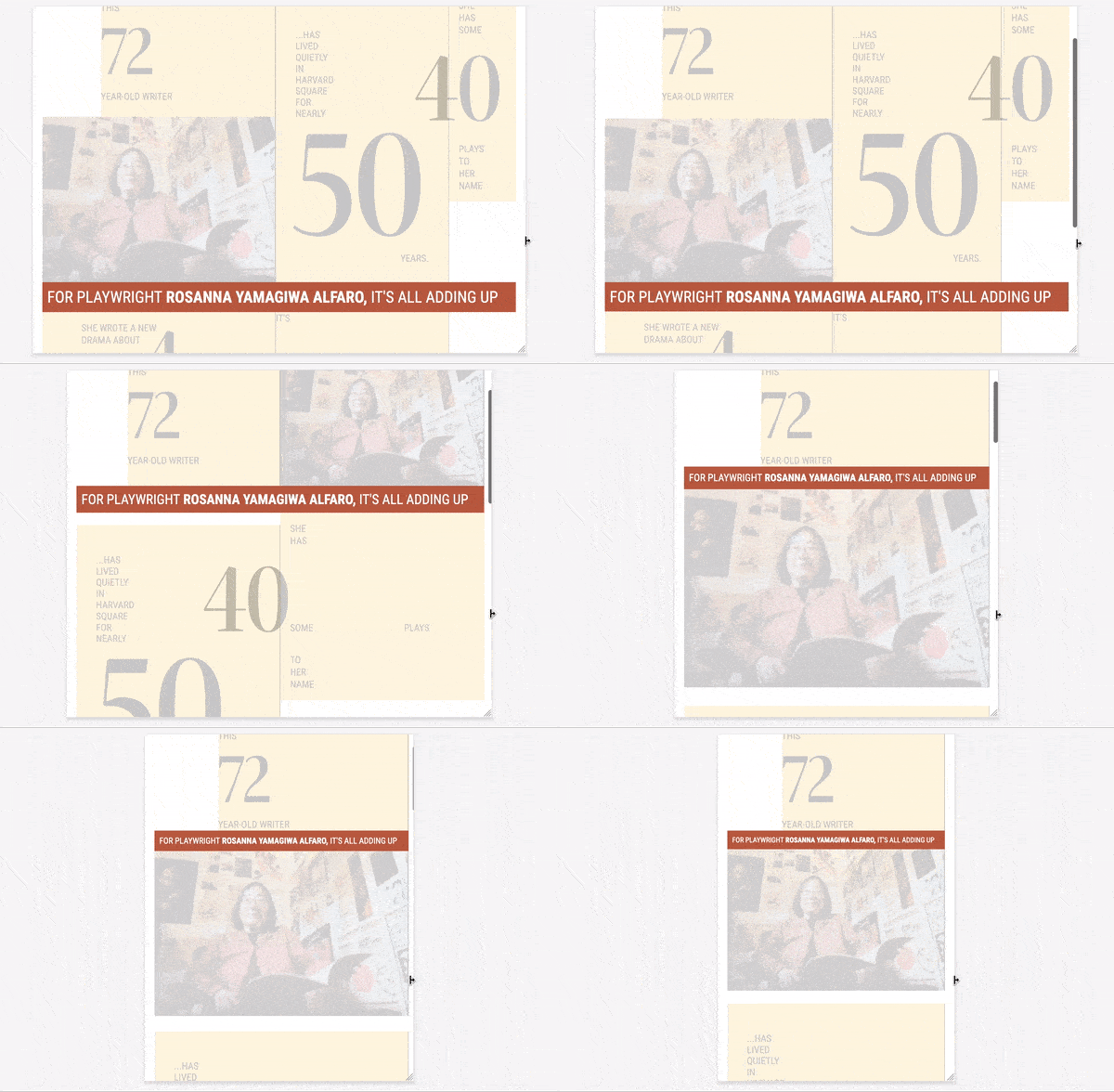
The numbers size needs to be fluid, so I used viewport units for that purpose. When using them, don’t forget to set the maximum font size to avoid becoming so huge on larger screens.
I used a tool to convert the pixel values to viewport units. It works based on the viewport width and font size in pixels.
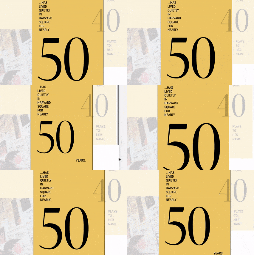
I also used them to align a text with its corresponding number. I used CSS Calc() to combine both vw and vh values as below.
.elem {
  position: relative;
  bottom: calc(-2vw - 9vh);
}
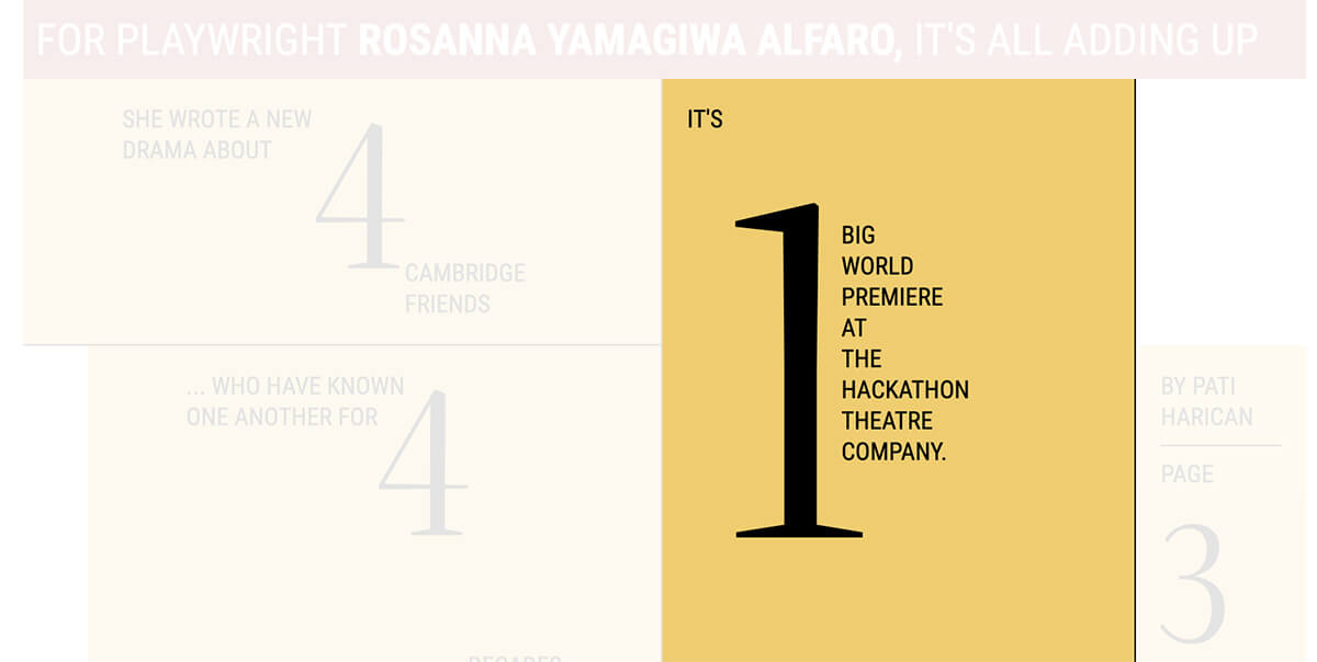
It’s one of the most exciting and useful additions to the web. In the layout, I thought about using a variable font to vary the numbers font-weight on resize.
Initially, I defined two CSS variables for the width and weight of the font. Then, I used them to define font-variation-settings for the number. Here is a great introduction about variable fonts if you are curious.
:root {
  --width: 100;
  --weight: 500;
}

.num {
  font-variation-settings:
    "wdth" var(--width),
    "wght" var(--weight);
}
To control the variables on resizing, I used ResizeObserver for that. The font-weight will be changed as per its parent element.
const ro_2 = new ResizeObserver((entries) => {
  for (let entry of entries) {
    let w = entry.contentRect.width
    let wdth = parseInt(
      getComputedStyle(document.documentElement).getPropertyValue(
        "--width"
      )
    )
    let f = wdth + w
    document.documentElement.style.setProperty("--weight", w * 1.5)
  }
})
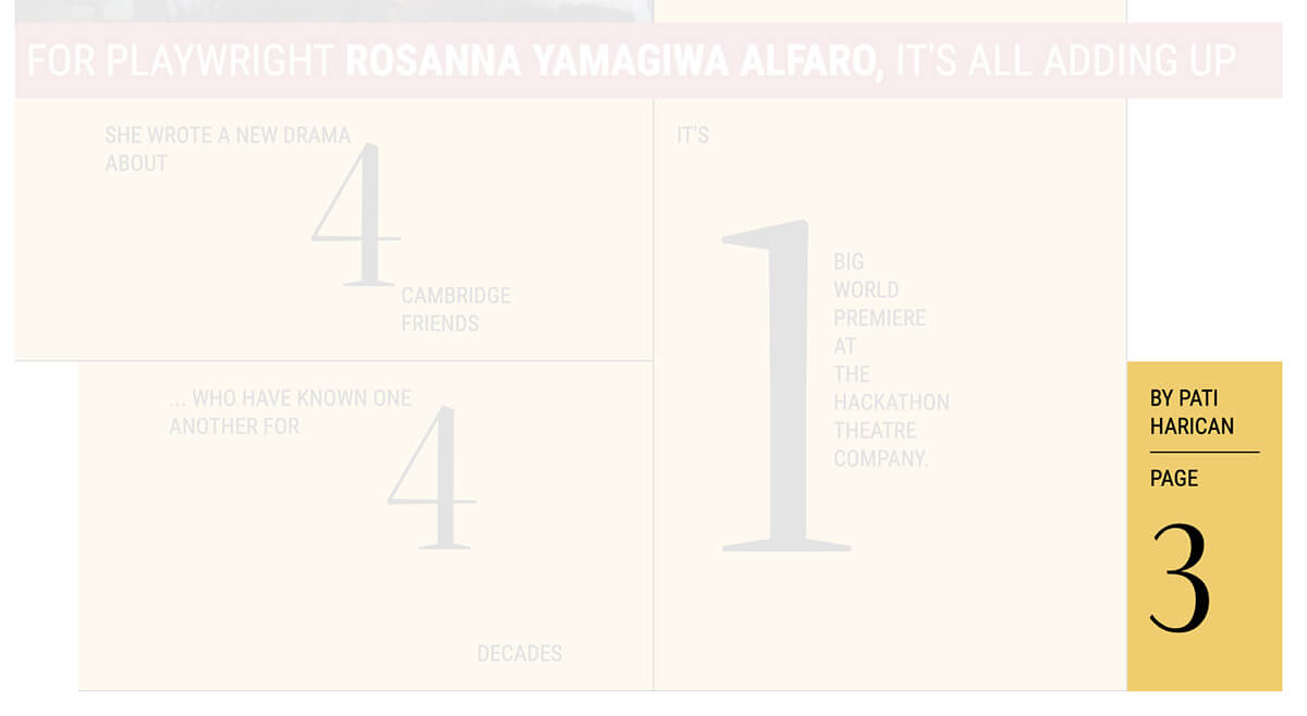
The byline item (highlighted above) should be aligned in the middle between the bar and the end of the magazine design.
At first, I thought that a simple margin will do the trick, so I added the following.
.item-byline {
  margin-top: -100%;
}
In that case, the margin is equal to the width of the item. It didn’t work! Instead of pushing the item to the top, it’s like adding padding.
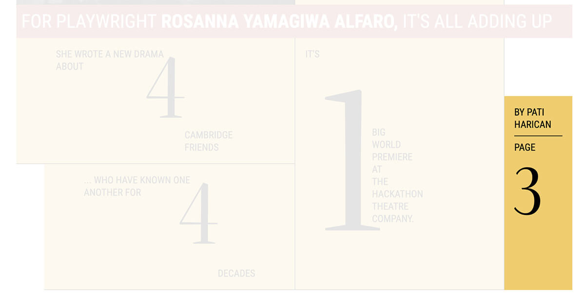
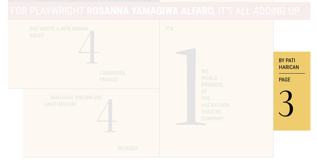
Since the byline is a grid item, I should change the alignment from default to start.
.item-byline {
  margin-top: -100%;
  align-self: start;
}
See the Pen Mag Layout - Final by Ahmad Shadeed (@shadeed) on CodePen.
And that’s a wrap. Do you have a comment or a suggestion? Please feel free to ping me on @shadeed9.
此内容由惯性聚合(RSS阅读器)自动聚合整理,仅供阅读参考。 原文来自 — 版权归原作者所有。