惯性聚合 高效追踪和阅读你感兴趣的博客、新闻、科技资讯
阅读原文 在惯性聚合中打开

推荐订阅源

Vercel News
Vercel News
O
OpenAI News
Engineering at Meta
Engineering at Meta
让小产品的独立变现更简单 - ezindie.com
月光博客
月光博客
freeCodeCamp Programming Tutorials: Python, JavaScript, Git & More
WordPress大学
WordPress大学
宝玉的分享
宝玉的分享
GbyAI
GbyAI
T
The Blog of Author Tim Ferriss
Google DeepMind News
B
Blog RSS Feed
CTFtime.org: upcoming CTF events
云风的 BLOG
云风的 BLOG
罗磊的独立博客
S
SegmentFault 最新的问题
The Register - Security
Hugging Face - Blog
Hugging Face - Blog
D
DataBreaches.Net
U
Unit 42
奇客Solidot–传递最新科技情报
奇客Solidot–传递最新科技情报
B
Blog
阮一峰的网络日志
阮一峰的网络日志
P
Proofpoint News Feed
雷峰网
雷峰网
V
Visual Studio Blog
小众软件
小众软件
aimingoo的专栏
aimingoo的专栏
N
Netflix TechBlog - Medium
酷 壳 – CoolShell
酷 壳 – CoolShell
H
Hackread – Cybersecurity News, Data Breaches, AI and More
Y
Y Combinator Blog
博客园 - 【当耐特】
G
Google Developers Blog
L
LangChain Blog
Stack Overflow Blog
Stack Overflow Blog
I
InfoQ
Martin Fowler
Martin Fowler
F
Fortinet All Blogs
钛媒体:引领未来商业与生活新知
钛媒体:引领未来商业与生活新知
The Cloudflare Blog
AI
AI
Google Online Security Blog
Hacker News - Newest:
Hacker News - Newest: "LLM"
博客园 - Franky
Blog — PlanetScale
Blog — PlanetScale
Webroot Blog
Webroot Blog
PCI Perspectives
PCI Perspectives
爱范儿
爱范儿
cs.AI updates on arXiv.org

Ahmad Shadeed

Better fluid sizing with round() Use Cases for Field Sizing The Basics of Anchor Positioning Item Flow CSS Relative Colors Balancing Text In CSS Should masonry be part of CSS grid? CSS display contents CSS Grid Areas CSS Cap Unit An Interactive Guide to CSS Container Queries CSS :has() Interactive Guide CSS Nesting UX in DevTools CSS Nesting Future CSS: State Container Queries Rebuilding a comment component with modern CSS Conditional CSS with :has and :nth-last-child CSS Text balancing with text-wrap:balance CSS Masking Do we need CSS flex-wrap detection? My CSS Wishlist Conditional CSS CSS Style Queries Inside the mind of a frontend developer: Article layout Inside the mind of a frontend developer: Hero section CSS container queries are finally here The CSS behind Figma First Look At The CSS object-view-box Property Learn CSS Subgrid CSS :has Parent Selector Aligning Content In Different Wrappers Flexbox Dynamic Line Separator Hello, CSS Cascade Layers Building UI Components With SVG and CSS A Deep CSS Dive Into Radial And Conic Gradients Defensive CSS Building Real-life Components: Facebook Messenger Conditional Border Radius In CSS CSS Container Query Units Aligning a Button Label Vertically Comparing Design Mockups To Code Result Using HSL Colors In CSS Custom Scrollbars In CSS Let CSS Container Queries For Designers The State of CSS Cross-Browser Development Overflow Issues In CSS Inspect Element As A Way To Increase Your Curiosity Handling Text Over Images in CSS Digging Into CSS Logical Properties Clipping Scrollable Areas On The inline-start Side Understanding Clip Path in CSS The Art of Building Real-life Components Handling Short And Long Content In CSS CSS Scroll Snap A Deep Dive Into CSS Grid minmax() CSS Variables 101 Finding The Root Cause of a CSS Bug Learn CSS centering How to detect browser support for Flexbox Gap CSS Mistakes While On Autopilot Digging Into the Flex Property Understanding CSS Multiple Backgrounds Aligning Logo Images in CSS Grid for layout, Flexbox for components Colors in CSS Thinking About The In-between Design Cases min(), max(), and clamp() CSS Functions Image Techniques On The Web Everything About Auto in CSS Learn Box Alignment Let Learn CSS Positioning Intrinsic Sizing In CSS CSS Grid Template Areas In Action Hiding Elements On The Web Creating a Variable Color Font From Scratch Building a Football Ticket With CSS and SVG Blending Modes in CSS CSS Variables With Inline Styles Implementing Dark Mode For My Website Rebuilding Apple Music Header in HTML & CSS Accessible Checkbox Layout Flickering On Browser Resize Enhancing The Clickable Area Size Custom Underlines with SVG Part 3: The Process of Implementing A UI Design From Scratch Part 2: The Process of Implementing A UI Design From Scratch Building An Old Nav Design CSS Flexbox: 5 Real World Use Cases I Used CSS Inline Flex For The First Time The Process of Implementing A UI Design From Scratch Common CSS Issues For Front-End Projects Handling Long and Unexpected Content in CSS How to Build Web Form Layouts With CSS Grid Grid Layout Ah-ha Moment Enhancing Our Components with CSS :empty Building Resizeable Components with Relative CSS Units CSS Writing Mode The Journey of Learning Front End Web Development on a Daily Basis
Thinking Like a Front-end Developer
Ahmad Shadeed · 2020-11-24 · via Ahmad Shadeed

The Layout Maestro

I spent years teaching CSS layout on this blog. I put everything I know into The Layout Maestro course: 70+ lessons and 150+ interactive examples that teach you how to think CSS layouts, not just memorize syntax.

Get the course

I asked on Twitter about what CSS topics I should write about? One of the suggestions that caught my eyes is about how to think about implementing a layout in CSS. That includes thinking about the possible solutions, and asking a lot of questions to get it right.

In this article, I will show you my approach to think about a new layout, and how you can apply these steps to your work. Are you ready? Let’s dive in.

Put the design details aside

The first thing that I usually do is putting the design details aside. That means, I highlight the main parts of a specific layout and then start thinking about them. I know that details are important, but this is temporary, so we can focus on the high-level details first. Consider the following UI:
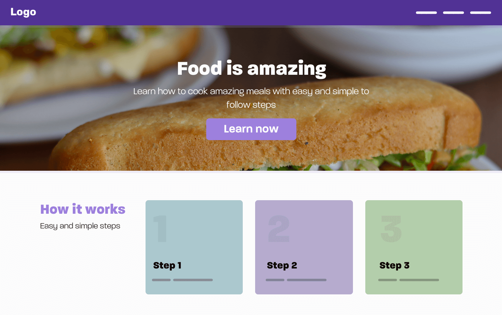
In this design, we have the following:

  • Header/Navigation
  • Hero section
  • How it works

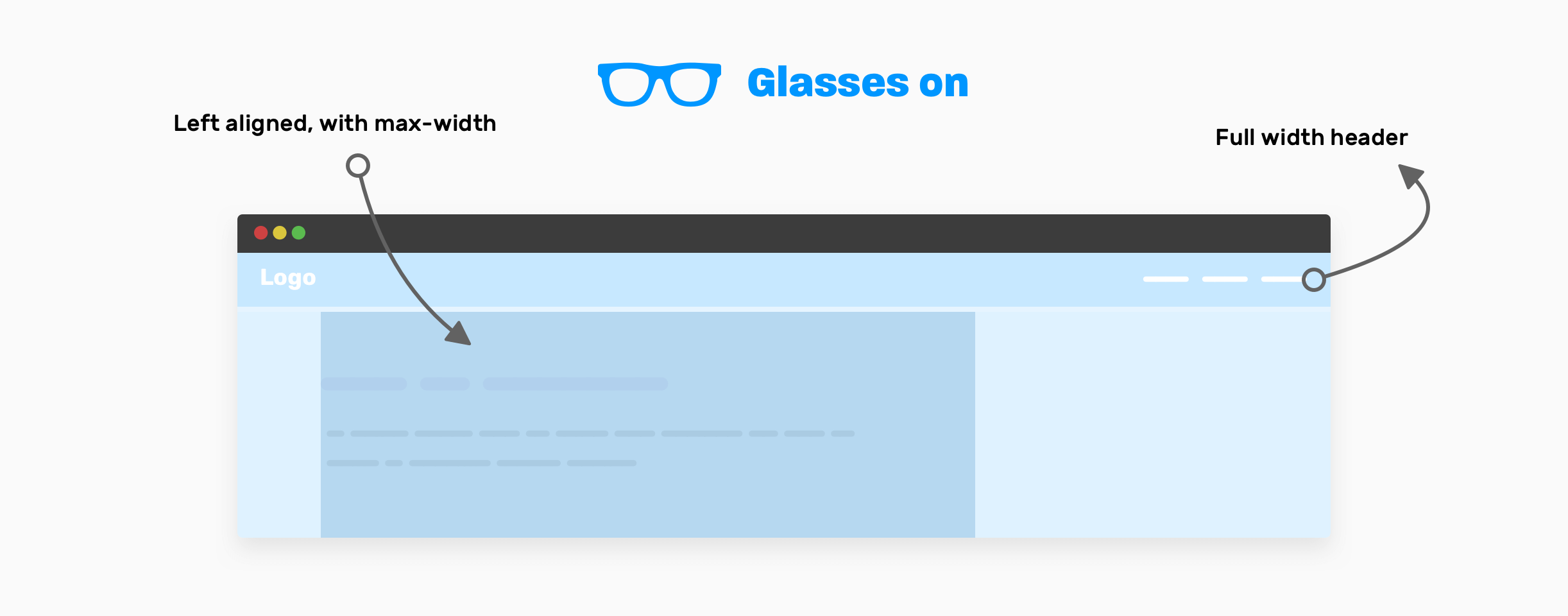
It can be tempting to start thinking about the small details first, rather than high-level thinking. If I were asked to visualize that, I will imagine that a front-end developer must wear a pair of glasses that let him/her see the high-level layout items only.
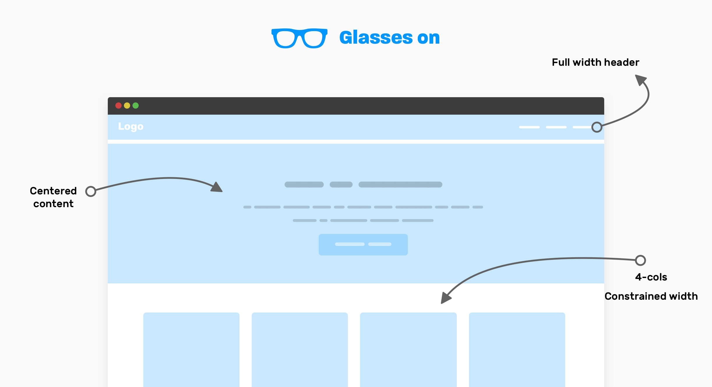
Notice that with the glasses on, you can only see the important high-level components of the UI. This can help you to think about how to layout the components, instead of thinking about the little bits for each one.

Here is how I think about it:

  • Full-width header: it looks like the header is taking the full width of the viewport, and its content is not constrained within a wrapper.
  • The content of the hero element is centered horizontally, and notice that you need to set a max-width for it (The paragraph has two lines).
  • How it works: this is a 4-columns layout, with the whole section constrained into a wrapper.

Now, when I want to work on the above in code, I will make a quick prototype like this, just to quickly see some progress.

<header></header>

<section class="hero">
  <!-- A div to constraint the content -->
  <div class="hero__content"></div>
</section>

<div class="wrapper">
  <!-- 4-columns layout -->
  <section class="grid-4"></section>
</div>

Since we have a 4-columns section, I will go with CSS grid for this. It’s a perfect use-case for it.

.wrapper {
  margin-left: auto;
  margin-right: auto;
  padding-left: 1rem;
  padding-right: 1rem;
  max-width: 1140px;
}

.hero__content {
  max-width: 700px;
  margin-left: auto;
  margin-right: auto;
}

.grid-4 {
  display: grid;
  grid-template-columns: repeat(4, 1fr);
}

This is quick high-level thinking with the glasses on. I still didn’t even think about responsive design. I have some questions regarding details of some components but I won’t dig into that for now. Stay tuned for this for the details section at the end of the article.

Now that you got the idea, I will go through more examples of high-level thinking so you can get better at it.

Article page

In this example, we have an article page layout. Here is the UI, which contains:
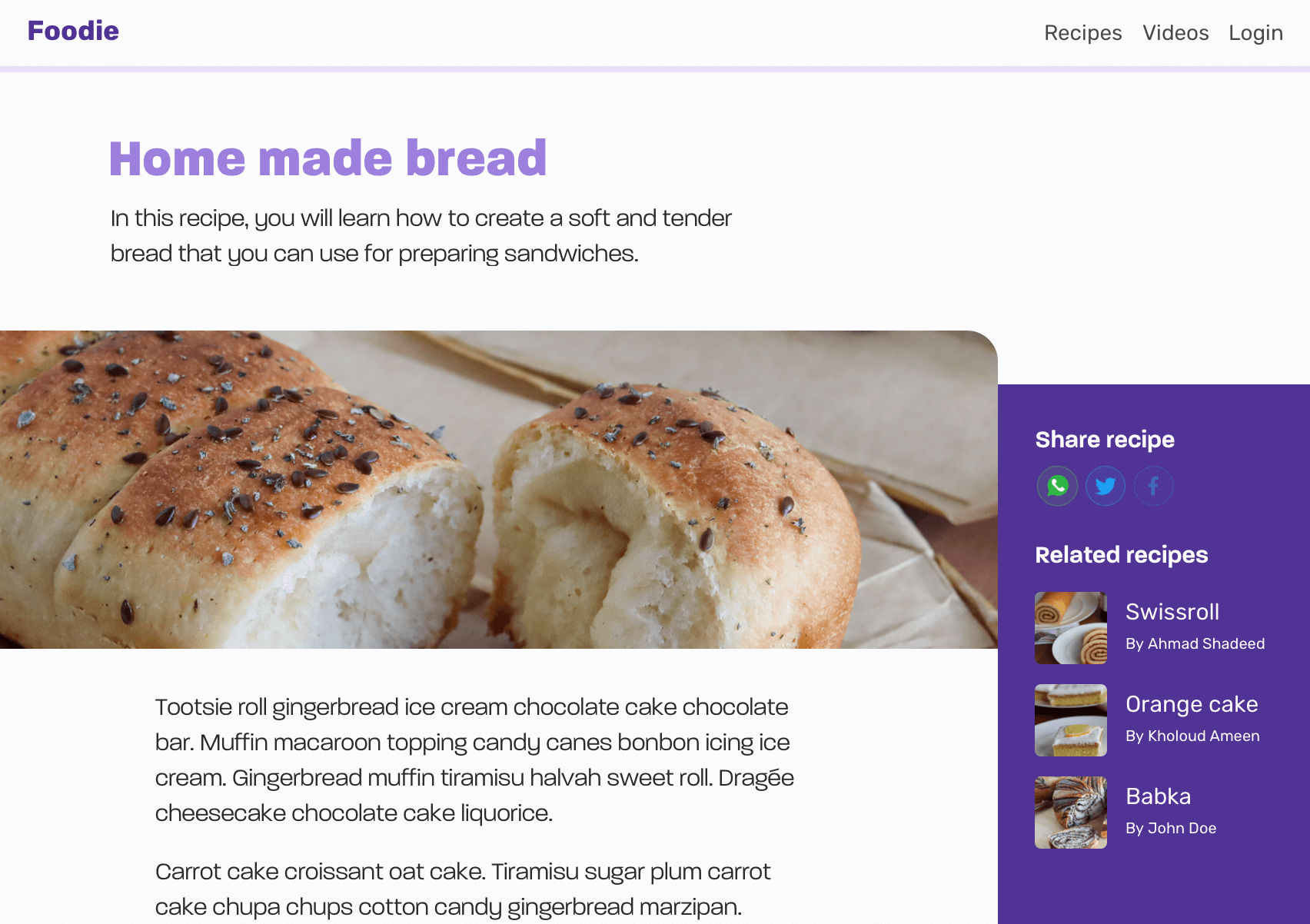
  • Header
  • Page header
  • Article thumb
  • Article content
  • Sidebar (Aside)

Now that you have an idea about how the design looks, let’s wear our glasses on to see only the high-level details.
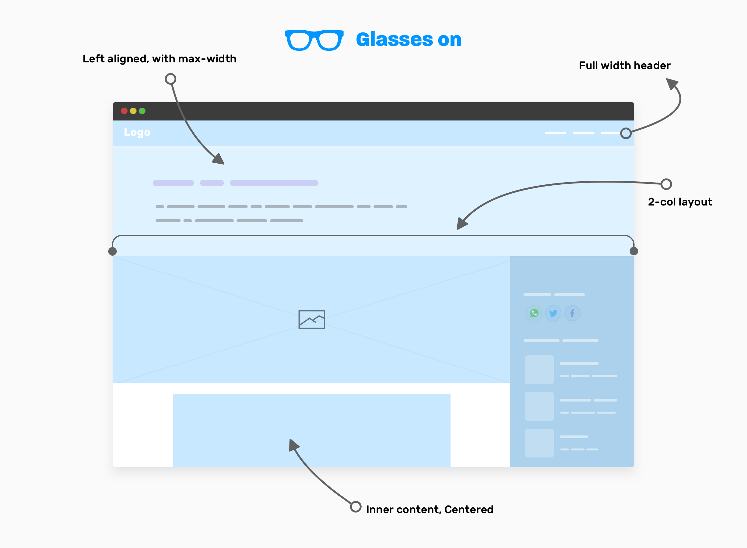
With our glasses on, here are the high-level components that we have:

  • The website header is taking the full width.
  • Page header: contains the article title and description, and its content is left-aligned, with a max-width.
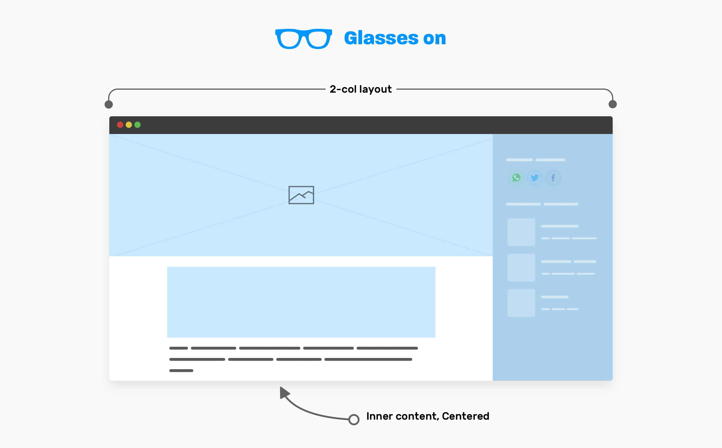
  • Two columns layout that contains the main and sidebar elements.
  • The inner content of the article, which is centered horizontally and has a max-width.

Article - Page header

There is no need to use any layout method here. A simple max-width will do the job. Make sure to add horizontal padding to avoid the edges being stick to the edges on smaller viewports.

.page-header {
  max-width: 50rem;
  padding: 2rem 1rem;
}
Article - Main and sidebar

The main element is taking the full width of the viewport minus the sidebar width. Usually, a sidebar is expected to have a fixed width. For that, using CSS grid is perfect.

.page-wrapper {
  display: grid;
  grid-template-columns: 1fr;
}

@media (min-width: 800px) {
  grid-template-columns: 1fr 250px;
}

For the inner content of the article, it should be constrained within a wrapper.

.inner-content {
  max-width: 50rem;
  margin-left: auto;
  margin-right: auto;
  padding-left: 1rem;
  padding-right: 1rem;
}

Now that you got the idea of the high-level decision that you need to take while building a layout, the next step is to think about handling each section in the design.

Digging into the details

How it works

In the first example of the article, I said that I will dig into the details of how it works section later. Here we go.
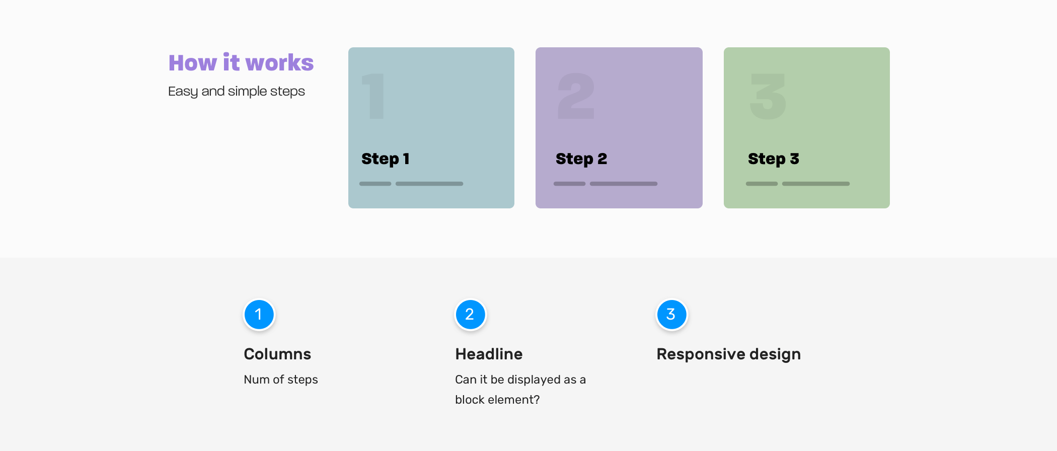
Columns

  • Do we have cases where the number of steps can be less or more? If yes, how we should handle that?
  • Do we need the columns to be equal in height, especially when a card has a very long text?

Headline

  • Do we need the section headline to stay on the side? Or there are cases where it should take the full width?

Responsive design

  • When we should stack the section child elements? Do we have a kind of trigger moment for this? If yes, what is it?

Here are some possible scenarios for the section. What do you think? As a front-end developer, you’re expected to consider such edge cases. It’s not just about creating a UI without considering such hidden bits.
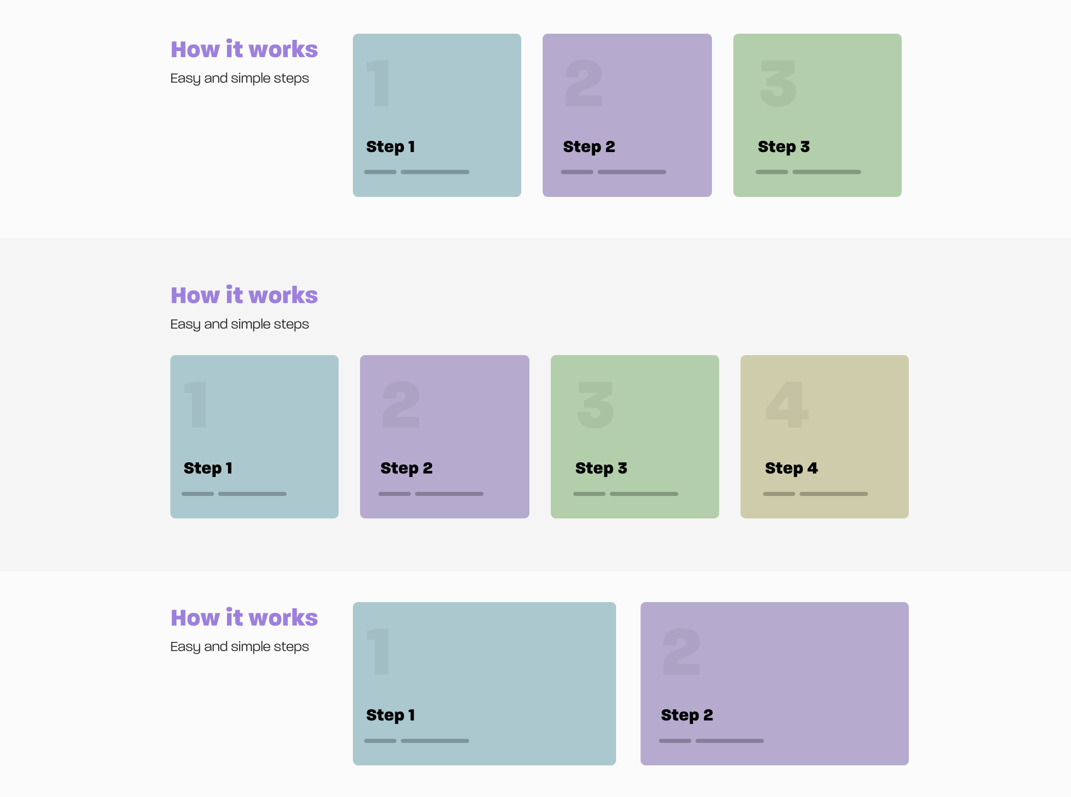
I can’t get into the specifics of how to code each variation in there, since the article is focused on the thinking process, but I’m eager to show you something cool.

Notice in the first and third variations in the previous mockup, the number of steps is 3 vs. 2. Can we make our CSS dynamic to handle that for us? I mean, to expand the items when they are only two.

<div class="wrapper">
  <section class="steps">
    <div>
      <h2>How it works</h2>
      <p>Easy and simple steps</p>
    </div>
    <div class="layout">
      <div class="layout__item">
        <article class="card"></article>
      </div>
      <div class="layout__item">
        <article class="card"></article>
      </div>
      <div class="layout__item">
        <article class="card"></article>
      </div>
    </div>
  </section>
</div>
.steps {
  display: grid;
  grid-template-columns: 1fr;
  grid-gap: 1rem;
}

@media (min-width: 700px) {
  .steps {
    grid-template-columns: 250px 1fr;
  }
}

.layout {
  display: grid;
  grid-template-columns: 1fr;
  grid-gap: 1rem;
}

@media (min-width: 200px) {
  .layout {
    grid-template-columns: repeat(auto-fit, minmax(200px, 1fr));
  }
}

I used CSS grid minmax() and the auto-fit keyword. This is helpful in such cases where the number of cards can increase or decrease. See the video below:

Hero section

The first thing I do when I want to build a new section or component is to ask lots of questions. For the hero section, here is what I’m considering.
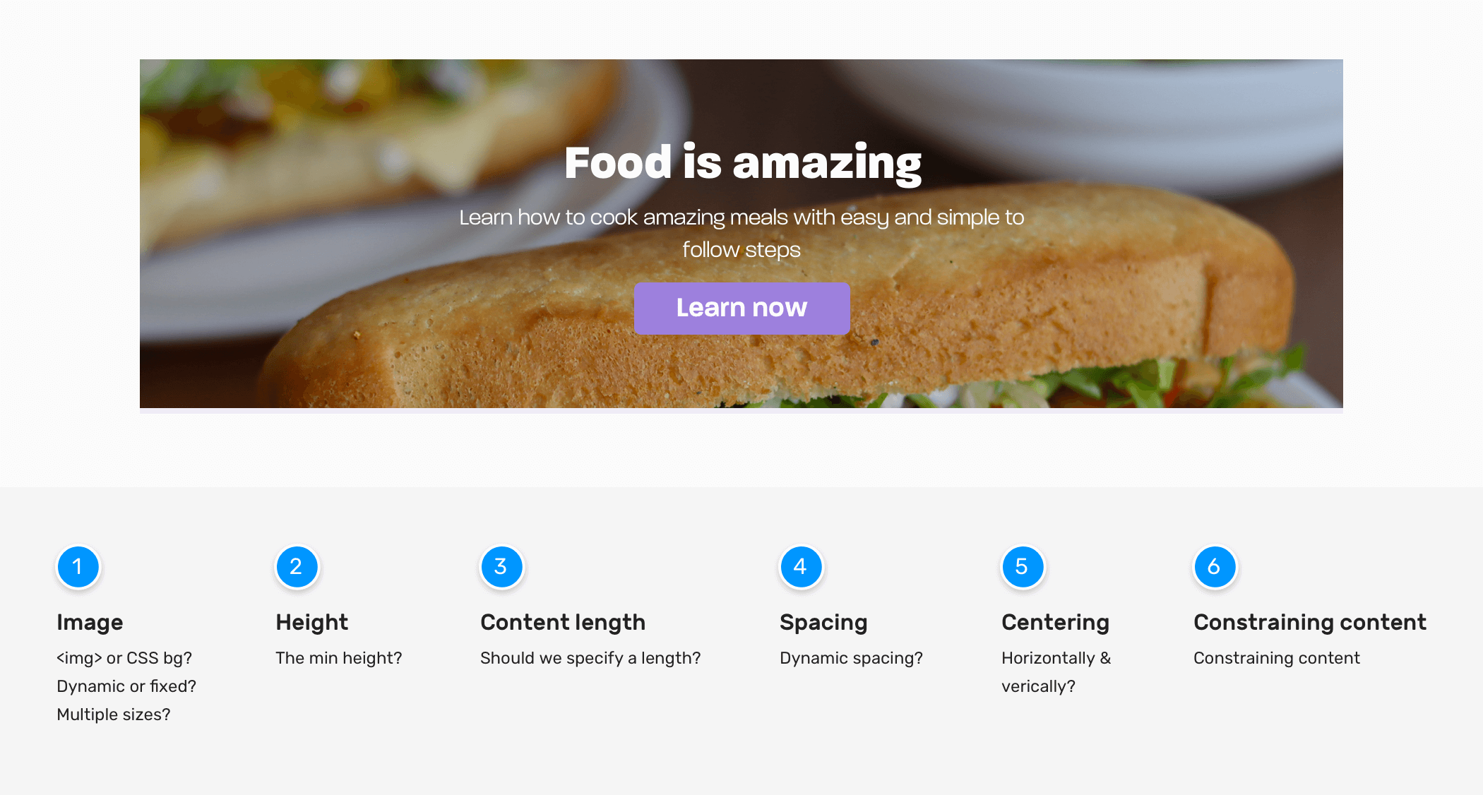
Hero Image

  • How should the image be represented? Is it something that changes every day or should it be updated from a CMS?
  • Should we use an HTML <img> or a CSS background?
  • What’s the expected aspect ratio of the image?
  • Do we need to use multiple image sizes based on the viewport size?
  • Is it possible that the hero image can be a video? I have situations where the client said we need a video instead of the image, after working on the image implementation.

Hero height

  • What’s the minimum height?

Content length

  • Do we need to set a maximum length for the title and description? If yes, what’s the minimum and maximum that the design is expected to handle?

Spacing between elements

  • How to handle the vertical spacing?

Content Centering

  • How to center the content horizontally and vertically? Given that we only know the width, and the height is unknown.

Constraining content

  • For better readability, it’s better to constraint content. What’s the ideal width for that?

Responsive design

  • Do we need to change font sizes based on the viewport width? If yes, should we go with px based units, viewport units, or CSS clamp() function?

Depending on the nature of the project you’re working on, you should find answers to these questions. This will help you to determine how the hero component needs to be built. Sometimes, it can be hard to get an answer to each question, but the more you asked, the higher the likelihood of getting a good bug-free result.

In this component, I will tackle the spacing between child elements. I like to use flow-space utility. I learned about it from Piccalil blog by Andy Bell. The goal is to provide spacing between direct sibling elements.

<section class="hero">
  <!-- A div to constraint the content -->
  <div class="hero__content flow">
    <h2>Food is amazing</h2>
    <p>
      Learn how to cook amazing meals with easy and simple to follow
      steps
    </p>
    <a href="/learn">Learn now</a>
  </div>
</section>
.flow > * + * {
  margin-top: var(--flow-space, 1em);
}

Final thoughts

As you’ve seen, the process of implementing a compoennt is not only about making it an exact match of the design, but also to ask and think about edge cases. I hope you learned at least one thing from this article.

Thank you for reading.

More resources from the blog

UppubDate: 25 Nov 2020

I just realized that the title of the article is an exact match of Chris Coyier’s talk. You can view it on Youtube. What a coincidence!

I wrote an ebook

I’m excited to let you know that I wrote an ebook about Debugging CSS.
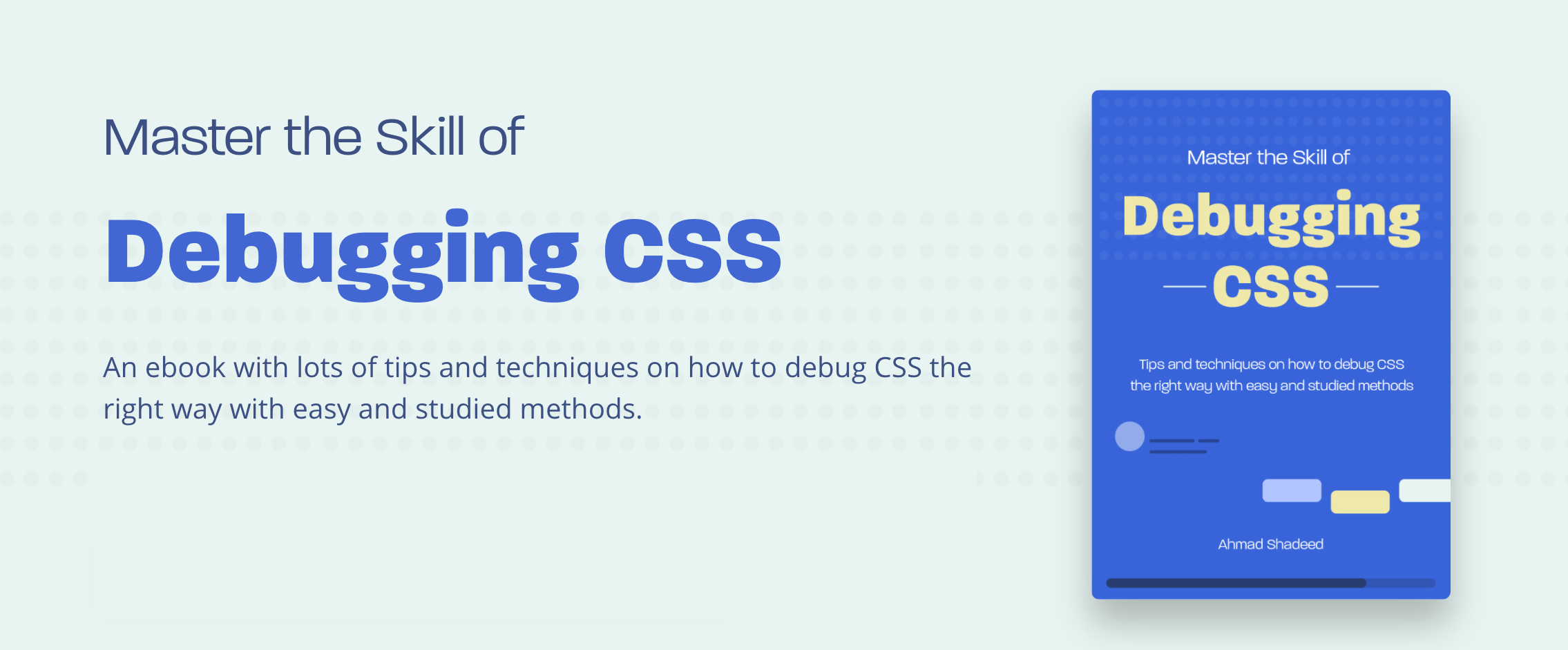
If you’re interested, head over to debuggingcss.com for a free preview.