


I spent years teaching CSS layout on this blog. I put everything I know into The Layout Maestro course: 70+ lessons and 150+ interactive examples that teach you how to think CSS layouts, not just memorize syntax.
A while ago, I was inspecting facebook.com home page feed to learn and see how they build things out. I’m always curious to see how people write CSS. I noticed a very, very interesting border-radius value for the card component in the main feed.
I shared the following tweet about this little discovery. Then, I received this reply from Miriam Suzanne:
is it always 8px? That math looks like a toggle to me, where at a certain point ((100vw - 4px) - 100%) could be negative, toggling 9999 to -9999? Which would flip the value to 0? Basically: if we’re within 4px of the full viewport size, remove the border radius.
After a few hours, Frank Yan from Facebook (Yay!) confirmed that this is a conditional statement to flip 8px to 0px when the card is taking the full viewport width.
Isn’t that just amazing?
At first, I thought that this is a kind of bug or something that was done by mistake. Thankfully, I was wrong. In this article, I will try to highlight the problem, and explain how the solutions work.
We have a card component with a border-radius of 8px. When the card doesn’t have margin or is taking the full viewport width, we want to flip the border-radius to 0.
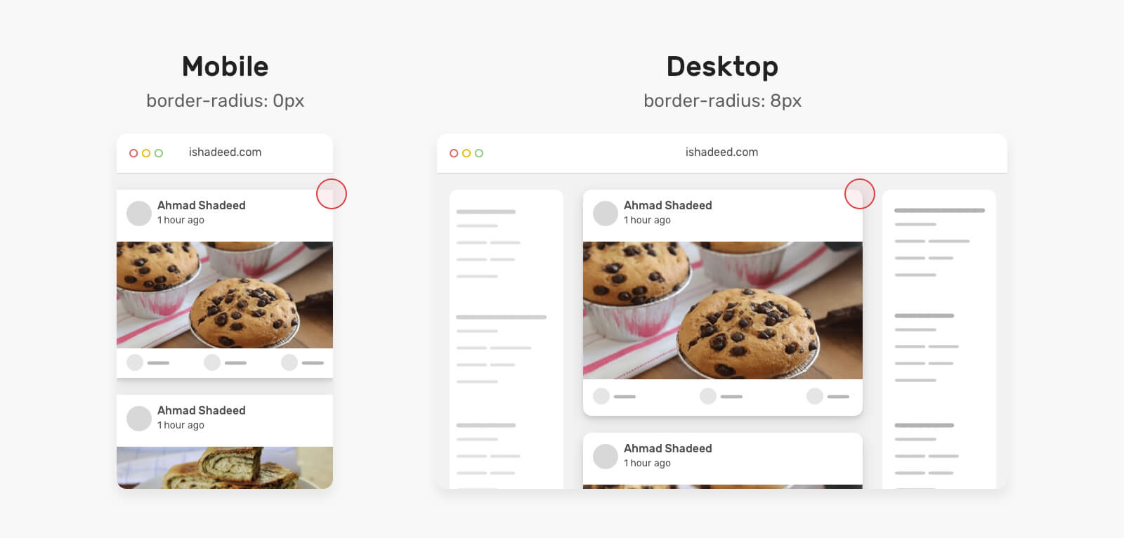
This can be done by removing the border-radius with a CSS media query like this.
@media (min-width: 700px) {
  .card {
    border-radius: 8px;
  }
}
In some cases, that is limiting. If for some reason we want to activate the border-radius when the viewport size is less than 450px, we will need to create a variation CSS class and use media query again.
@media (max-width: 450px) {
  .card--rounded {
    border-radius: 8px;
  }
}
This is a clever one that was done by the team Facebook. It mimics the following logic:
if (cardWidth >= viewportWidth) {
    radius = 0;
} else {
    radius = 8px;
}
To implement that logic in CSS, we need to compare between two values by using CSS comparison functions. If you don’t know them, I recommend reading this article by yours truly.
The solution is inspired by the article The Flexbox Holy Albatross by Heydon Pickering. It was adapted by Naman Goel from Facebook to work with border-radius.
.card {
  border-radius: max(
    0px,
    min(8px, calc((100vw - 4px - 100%) * 9999))
  );
}
Let’s walk through the above CSS in detail.
max() function that compares between 0px and the computed value of the min(). It will pick the larger value.min() function compares between 8px and a computed value from calc((100vw - 4px - 100%) * 9999). This will result with a very large positive or negative number.9999 is a large number to force the value to be either 0px or 8px.Let’s explain the calc() magic!
The magic happens in the 100% value. It can be different based on two different scenarios:
100% of its containing element (The parent/wrapper.. or whatever it’s called in your CSS).100vw, in case the card is taking the full viewport width (E.g: in mobile).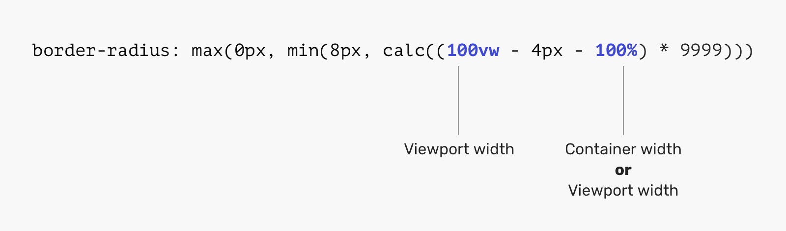
9999?It’s not because this exact number has superpower or something. It’s about avoiding an edge case. Thanks to Temani Afif for reminding me of that.
Let’s suppose that the viewport width is 375px, and the container is 365px. If we substitute these values in the equation, it will look like this.
.card {
  border-radius: max(0px, min(8px, calc(375px - 4px - 365px)));
  /* will result to */
  border-radius: max(0px, min(8px, 6px));
}
Based on the above, the value 6px will be picked by the browser. We don’t want that. Instead, the radius should be either 0px or 8px. To accomplish that, we can multiple the result by a large number that is less probably to be used in CSS, like 9999.
.card {
  border-radius: max(
    0px,
    min(8px, calc((375px - 4px - 365px) * 9999))
  );
  /* will result to */
  border-radius: max(0px, min(8px, 59994px));
}
Based on that, the browser will pick the 8px from the min function, and then the same value from the max() function.
Let’s take an example based on the first scenario. We have a viewport with a width of 1440px, and the card component lives within a 700px container.
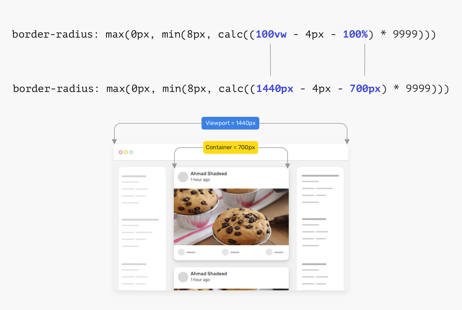
Multiplying the resulted value by 9999 will result in 7359264, which is a large random number. In that case, the CSS will look like this for the browser:
.card {
  border-radius: max(0px, min(8px, 7359264px));
}
Since we have min(), it will pick the smallest value which is 8px. When compared to the max(), the 8px will win too. That’s the first use-case of this clever CSS.
.card {
  border-radius: 8px;
}
Next, is when the card is taking the full viewport width. That can be seen in a mobile viewport. Notice that the container and viewport width are the same.
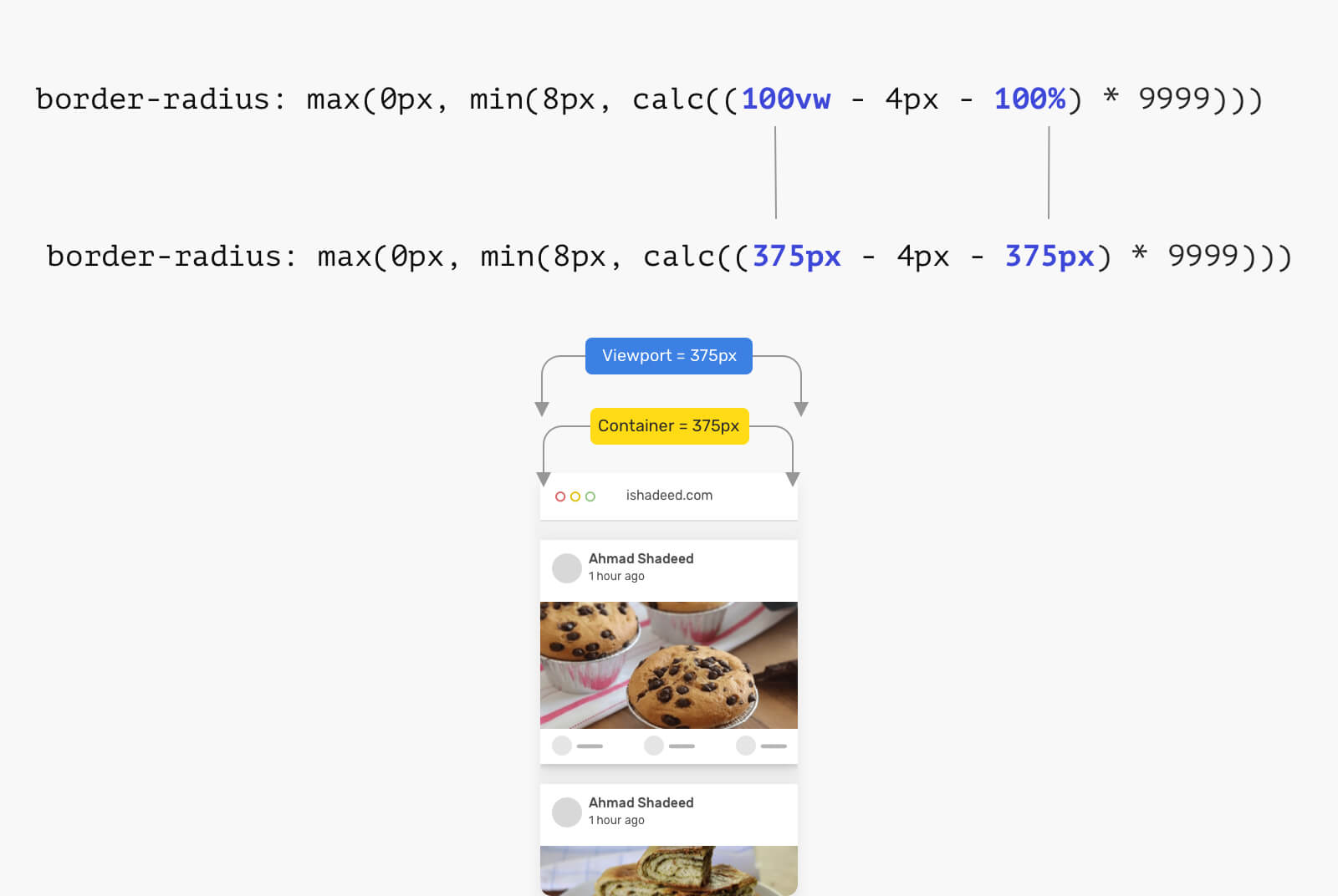
Multiplying the value with 9999 will result in -39996px, which is a negative value. The browser will read it like the following:
.card {
  border-radius: max(0px, min(8px, -39996px));
}
Now to the fun! The browser has two questions to ask:
8px or -39996px? The result is -39996px.0px or -39996px? The result is 0px..card {
border-radius: 0px;
}
Did you see how that happened? I’m still surprised by such a clever usage of CSS comparison functions.
We can also take this to the next level by using CSS clamp() as suggested by Temani Afif and Liad Yosef. I think team Facebook didn’t use it since it’s not supported in older versions of Safari (e.g: v12).
.card {
  border-radius: clamp(0px, ((100vw - 4px) - 100%) * 9999, 8px);
}
Check it out on Codepen.
I hope you enjoyed the article. Thanks for reading!
此内容由惯性聚合(RSS阅读器)自动聚合整理,仅供阅读参考。 原文来自 — 版权归原作者所有。