


The following design might be simple to create in a tool like Figma, but getting them to work fluidly in the browser is a different story. It’s not complicated, but there are a few things that we need to consider.
Take a look at the following design:
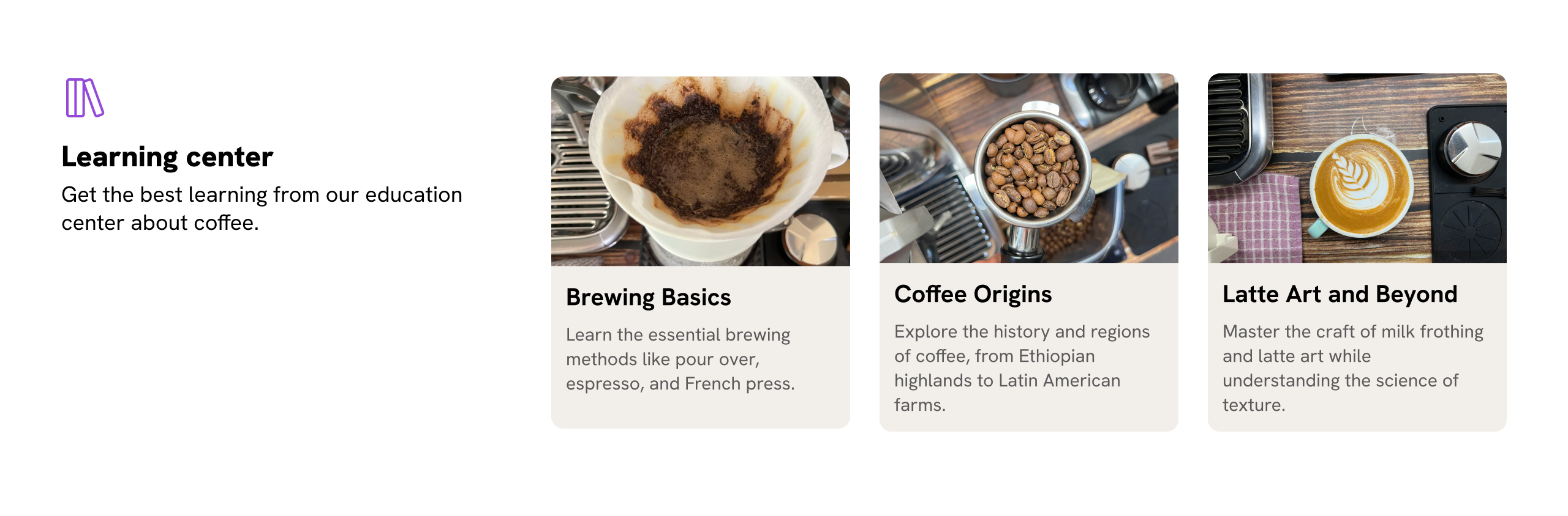
We have two main areas here to work on:
How would you build this in CSS? Let’s find out.
Let’s start with the HTML markup:
<section class="section">
  <header class="section-header">
    <!-- section header content -->
  </header>
  <div class="section-content">
    <div class="card"><!-- content --></div>
    <div class="card"><!-- content --></div>
    <div class="card"><!-- content --></div>
  </div>
</section>
And the CSS:
.section {
  display: grid;
  grid-template-columns: 1fr;
  gap: 1rem;

  @media (min-width: 600px) {
    grid-template-columns: 170px 1fr;
  }
}
Here is a working demo. Try resizing the container, items will wrap onto a new line. It works fine, but it can be improved.
Card title
Card description
Card title
Card description
Card title
Card description
When we have more than 3 items on the largest viewport size, the 4th item will wrap into a new line.
Take a look:
Card title
Card description
Card title
Card description
Card title
Card description
Card title
Card description
There’s no direct way to detect orphaned items in CSS. In our case, we can change the layout by using CSS :has().
Let’s explore the solution.
I used a simple condition combined with quantity queries and got help from this awesome quantity queries tool by Temani Afif.
.section {
  display: grid;
  grid-template-columns: 1fr;
  gap: 1rem;

  @media (min-width: 600px) {
    grid-template-columns: 170px 1fr;
  }
}

.section:has(.card:nth-last-child(n + 4)) {
  grid-template-columns: 1fr;
}
Try increasing the number of items to four and see what happens.
Card title
Card description
Card title
Card description
Card title
Card description
That’s better, right? We can take that further and make the section’s header more compact when we have more than 4 items.
.section {
  display: grid;
  grid-template-columns: 1fr;
  gap: 1rem;

  @media (min-width: 600px) {
    grid-template-columns: 170px 1fr;
  }
}

.section:has(.card:nth-last-child(n + 4)) {
  grid-template-columns: 1fr;

  .section-header {
    display: flex;
    gap: 1rem;
    border-bottom: 1px solid #ccc;
    padding-bottom: 0.5rem;
  }
}
See the following demo and try to increase the number of cards to see what happens.
Card title
Card description
Card title
Card description
Card title
Card description
Card title
Card description
Now that the layout is working as we want, let’s enhance it further with fluid typography.
We can enhance the example further using container query units and the clamp() function for fluid typography. Let’s find out how.
The highlighted section is the container.
Card title
Card description
Card title
Card description
Card title
Card description
We need to:
clamp() for the font sizecqw unitHere is the CSS:
.section-header {
  container-name: section-header;
  container-type: inline-size;
}

/* Using cqw unit with clamp() */
.section-title {
  font-size: clamp(1rem, 1rem + 2cqw, 1.75rem);
}
This is straightforward. It can’t be like that without clamp and query units. Try adding more card items and notice how the section title’s font size changes.
font-size: px
Card title
Card description
Card title
Card description
Card title
Card description
Card title
Card description
The card itself is another story. There’s a lot going on:
All those details can be handled with container queries, style queries, and CSS :has() selector.
This is one of the most common use-cases for container queries. We need to switch the card from vertical to horizontal based on the container width.
.card {
  @container (min-width: 400px) {
    flex-direction: row;
  }
}
Resize the container below to see the effect.
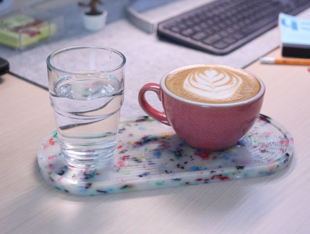
How to take photos like a pro
Lorem ipsum dolor sit amet consectetur adipisicing elit. Quisquam, quos.
By using CSS clamp() and container query units, we can make the image size relative to the container width.
.card-thumb {
  flex: 0 0 clamp(70px, 10cqw + 70px, 150px);
}
Resize the card in the following demo.
How to take photos like a pro
Lorem ipsum dolor sit amet consectetur adipisicing elit. Quisquam, quos.
The font-size of the title and description can increase or decrease based on the container width.
.card-title {
  font-size: clamp(1rem, 0.667rem + 2.67cqw, 1.5rem);
}

.card-desc {
  font-size: clamp(0.875rem, 0.708rem + 1.33cqw, 1.125rem);
}
Title font size: px
Description font size: px
How to take photos like a pro
Lorem ipsum dolor sit amet consectetur adipisicing elit. Quisquam, quos.
Tip: use this clamp calculator by 9elements.
With CSS :has(), we can detect if there is an image or not. For example, I added a visual border to make it less boring when there is no image.
.card:not(:has(.card-thumb)) {
  border-inline-start: clamp(0.063rem, -0.063rem + 1cqw, 0.25rem) solid lightgrey;
  padding-inline-start: clamp(0.25rem, -0.083rem + 2.67cqw, 0.75rem);
}
Notice that I also used clamp() with query units. Try it yourself.
Hide image
How to take photos like a pro
Lorem ipsum dolor sit amet consectetur adipisicing elit. Quisquam, quos.
This is a variation that turns the card into a featured layout. To work, we need to add --featured: true and query it with style queries.
It’s worth mentioning that style queries are not supported in Firefox at the time of writing this article.
Container style queries
Baseline 2026 newly available
Supported in Chrome: yes.
 Supported in Edge: yes.
 Supported in Firefox: yes.
 Supported in Safari: yes.

Since May 2026 this feature works across the latest devices and browser versions. This feature might not work in older devices or browsers.
@container style(--featured: true) {
  .card {
    display: grid;
    gap: 0;

    .card-content {
      background-color: var(--brand-1);
      padding: 1rem;
    }

    p {
      color: #fff;
    }
  }
}
Resize time!
How to take photos like a pro
Lorem ipsum dolor sit amet consectetur adipisicing elit. Quisquam, quos.
When there’s more space, we can stack the content on top of the card with a subtle backdrop blur effect.
(Yes, we can nest a size container query inside a style query.)
@container style(--featured: true) {
  .card {
    @container (min-width: 300px) {
      > * {
        grid-area: 1 / -1;
      }

      .card-content {
        background-color: hsla(from var(--brand-1) h s l / 0.65);
        padding: 1.25rem 1rem;
        backdrop-filter: blur(5px);
      }
    }
  }
}
How to take photos like a pro
Lorem ipsum dolor sit amet consectetur adipisicing elit. Quisquam, quos.
If the space is much larger, we can apply a featured style that works when the card spans the full width.
@container style(--featured: true) and (min-width: 500px) {
  .card {
    grid-template-columns: 1fr 1fr 1fr;

    > * {
      grid-area: initial;
    }

    .card-thumb {
      grid-column: 1 / 3;
    }

    .card-content {
      width: 120%;
      justify-self: end;
      background-color: hsla(from var(--brand-1) h s l / 1);
      backdrop-filter: initial;
    }
  }
}
Take a look and resize the container.
How to take photos like a pro
Lorem ipsum dolor sit amet consectetur adipisicing elit. Quisquam, quos.
Now that we have the card component ready, we can test it out within the section layout container.
I added real content to see what issues we might have. Yes, I’m sure we will end up with some.
You can either resize the demos, or take a look at the variations I added.
Short title
Card description
Short title
Card description
Short title
Card description
Short title
Card description
Short title
Card description
Short title
Card description
Short title
Card description
Short title
Card description
In flexbox, the minimum width of flex items equals their content size, so a flex item will grow to match it.
In the following example, notice how the image is taking much more space than the content (Try on the Shuffle button to see it better).
Short title
Card description
Short title
Card description
(Fun fact: it looks like Safari is more forgiving for this than Chrome and Firefox.)
To fix that, we need to reset the min-width on the image.
.card-thumb {
  min-width: 0;
}
Here is the result with the fix:
Short title
Card description
Short title
Card description
When the content is long, there is a space under the image. See the demo:
Short title
Card description
Here’s what we want to do:
.card-thumb {
  /* This will be the default */
  height: 100%;

  /* Kicks in when the height is 400px or more */
  max-height: 400px;

  /* If the max height is reached, this will take effect. */
  align-self: end;
}
Here is a demo with the above CSS applied. Try to change the word count and see what happens.
Word Count: 8
How to make a coffee
This is a comprehensive and detailed description that...
In this version, we will check the number of items, and if they are 6 or more, we’ll feature the first item.
The layout you see below is done with CSS :has() and container queries (size and style). Play with it (increase or decrease the number of cards).
Short title
Card description
Short title
Card description
Short title
Card description
Short title
Card description
Short title
Card description
Short title
Card description
If the items are 6 or more, the first two cards will be featured.
@media (min-width: 400px) {
  .section:has(.card-wrapper:nth-last-child(n + 6)) {
    .card-wrapper:nth-child(1) {
      --featured: true;
      grid-column: 1/ -1;
    }

    .card-wrapper:nth-child(2) {
      --featured: true;
      grid-column: span 2;
    }
  }
}
And if there are eight or more, the first card will take the full width.
@media (min-width: 400px) {
  .section:has(.card-wrapper:nth-last-child(n + 8)) {
    .card-wrapper:nth-child(1) {
      --featured: true;
      grid-column: 1 / -1;
      grid-row: span 1;
    }
  }
}
Take a look and resize, as usual.
Short title
Card description
Short title
Card description
Short title
Card description
Short title
Card description
Short title
Card description
Short title
Card description
Short title
Card description
Short title
Card description
Learn more about CSS :has() in this article:
Not only can we change the grid layout, but we can also adjust the entire section layout based on the number of cards. For example, we can make the header part of the grid.
Given this HTML markup:
<section class="section">
  <header><!-- section header content --></header>
  <div class="section-content">
    <div class="card"><!-- content --></div>
    <div class="card"><!-- content --></div>
  </div>
</section>
How to make a layout like this? Notice that the section header is part of the grid, or the card’s grid, to be specific.
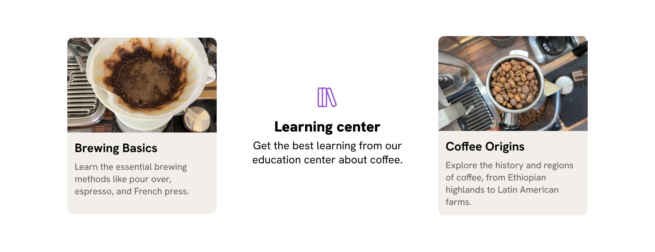
Here is what we need to do:
:has() if there are exactly 2 cards..section into a grid with 3 columns. I named the areas, but it’s optional.display: contents to the .section-content to ungroup the cards and make them part of .section layout.@media (min-width: 400px) {
.section:has(.card-wrapper:last-child:nth-child(2)) {
display: grid;
grid-template-columns: 1fr 1.25fr 1fr;
grid-template-areas: "card-1 header card-2";
.section-content {
display: contents;
}
.section-header {
grid-area: header;
/* more styles*/
}
.card-wrapper:nth-child(1) {
grid-area: card-1;
}
.card-wrapper:nth-child(2) {
grid-area: card-2;
}
}
}
Short title
Card description
To learn more about display: contents, I wrote an interactive article about it. Check it out:
This is an experimental feature that is currently supported by Safari Technology Preview only.
For example, if the card has 4 items, we can set a random border radius to the image.
.section:has(.card-wrapper:nth-last-child(n + 4)) {
  .card-thumb {
    aspect-ratio: 1;
    border-radius: random(5px, 120px) random(15px, 200px) random(8px, 80px) random(
        25px,
        160px
      ) / random(10px, 60px) random(5px, 90px) random(15px, 75px) random(8px, 140px);
  }
}
Toggle the video to see it in action if you’re not on Safari TP.
Short title
Card description
Short title
Card description
Short title
Card description
Short title
Card description
Short title
Card description
What’s nice is that this falls back nicely to a zero radius, or we can add a rounded radius as a fallback, too.
Building layouts can be a challenging task, specially if you don’t know the core mental model of CSS layouts. You don’t have to worry about that anymore. I’m building a complete CSS course, and I called it, The Layout Maestro.
It’s a fully interactive course that explains modern CSS layout. This very article that you just read is just a small taste of what the course will offer. If you are interested, you can sign up below for updates.
Thank you for reading!
In this article, I took a typical section design and made it more dynamic with container queries, has, clamp, and grid. It’s an example of the potential of modern CSS, and this was just one section.
I hope you enjoyed this article. If you have any questions, feel free to ask via BlueSky, Twitter (X), or reach out via email at [email protected].
此内容由惯性聚合(RSS阅读器)自动聚合整理,仅供阅读参考。 原文来自 — 版权归原作者所有。