


I spent years teaching CSS layout on this blog. I put everything I know into The Layout Maestro course: 70+ lessons and 150+ interactive examples that teach you how to think CSS layouts, not just memorize syntax.
I was browsing the web and an interesting effect caught my eye on a website. It’s a custom link underline effect that is using hardcoded SVG.

I asked my self: “Can I make this dynamically and randomly with SVG?” Franky, I was afraid at first, as my knowledge in Javascript is basic and I don’t know how to draw SVG <path>s in code.
I decided to read about SVG <path>s from MDN. The resource is highly recommended for anyone interested to learn more about how paths are drawn.
The type of the path I need for the effect is called Quadratic. As per MDN:
It requires one control point which determines the slope of the curve at both the start point and the end point.
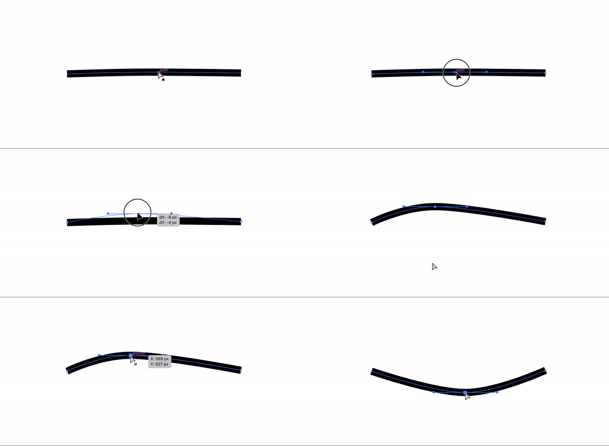
For the path design, it should behave like this:
I went to Adobe Illustrator to show you how this works. Notice how I’m dragging only one point to control the shape of the path.
With that in hand, let’s move into code and draw a path manually.
<svg width="400" height="35" xmlns="http://www.w3.org/2000/svg">
  <path
    id="pathItem"
    d="M5 5 Q 30 15 170 5"
    stroke="black"
    fill="transparent"
    stroke-width="7"
    stroke-linecap="round"
  />
</svg>
Path data: d="M5 5 Q 30 15 170 5"
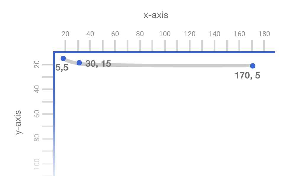
In plain English, it means: Move to point (5, 5), then add the slope point at (30, 15), Move to the point (170, 5).
Here is an illustration that shows the points, and how the path is being drawn based on them.
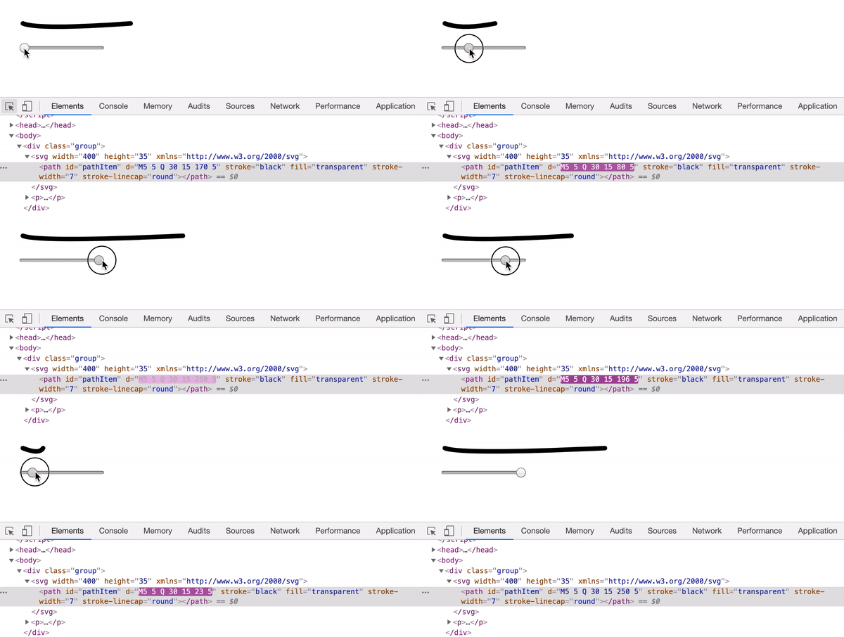
As a first test, I need to check how can I control the path length. The x value in the end point (170, 5) is responsible for the path length, so I will modify it with Javascript.
The code used is quite simple, here it is:
input.addEventListener("input", function () {
  var pathEnd = input.value
  var newPath = `M5 5 Q 30 15 ${pathEnd} 5`
  pathItem.setAttribute("d", newPath)
})
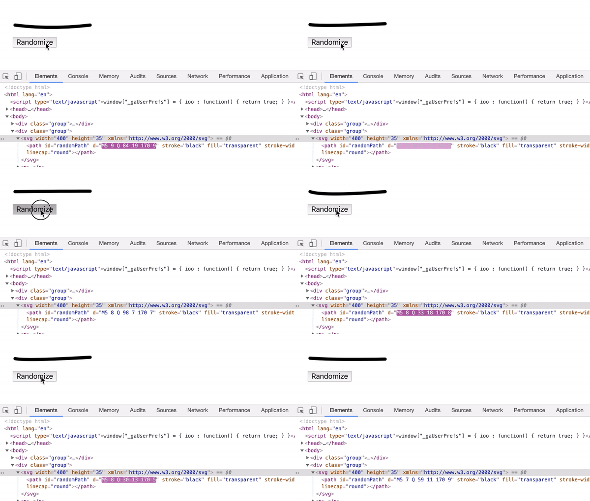
Next step is to test how to randomize a path. I thought about setting minimum and maximum values for the start, the end, and the middle points. That way, the random result will be within the limits.
var moveYMin = 5
var moveYMax = 12

var curveXMin = 20
var curveXMax = 100 /* Will be replaced with the width of the link */
var curveYMin = 5
var curveYMax = 20

var endYMin = 5
var endYMax = 10

randomize.addEventListener("click", function () {
  var moveY =
    Math.floor(Math.random() * (moveYMax - moveYMin)) + moveYMin
  var curveX =
    Math.floor(Math.random() * (curveXMax - curveXMin)) + curveXMin
  var curveY =
    Math.floor(Math.random() * (curveYMax - curveYMin)) + curveYMin
  var endY = Math.floor(Math.random() * (endYMax - endYMin)) + endYMin

  var newPath = `M5 ${moveY} Q ${curveX} ${curveY} 170 ${endY}`

  randomPath.setAttribute("d", newPath)
})

<ul class="c-nav">
  <li class="c-nav__item"><a href="#">News & Politics</a></li>
  <li class="c-nav__item"><a href="#">Culture</a></li>
  <li class="c-nav__item"><a href="#">Technology</a></li>
  <li class="c-nav__item"><a href="#">Business</a></li>
  <li class="c-nav__item"><a href="#">Human Interest</a></li>
</ul>
I need to insert an SVG under each link. Here is a summary of what I want to do:
var links = document.querySelectorAll(".c-nav__item a")

links.forEach(function (link) {
  var linkWidth = parseInt(link.offsetWidth)
  var svg = createSVG(linkWidth)
  insertAfter(svg, link)
})
function createSVG(linkWidth) {
  const svg = document.createElementNS(
    "http://www.w3.org/2000/svg",
    "svg"
  )
  svg.setAttribute("width", linkWidth)
  svg.setAttribute("height", "20")

  const path = document.createElementNS(
    "http://www.w3.org/2000/svg",
    "path"
  )
  var pathD = randomizePath(linkWidth)

  path.setAttribute("d", pathD)
  path.setAttribute("fill", "transparent")
  path.setAttribute("stroke", "lightgrey")
  path.setAttribute("stroke-width", "7")
  path.setAttribute("stroke-linecap", "round")

  svg.appendChild(path)

  return svg
}
function randomizePath(linkWidth) {
  var moveYMin = 5
  var moveYMax = 12
  var curveXMin = 20
  var curveXMax = linkWidth /* Width of the link */
  var curveYMin = 5
  var curveYMax = 20
  var endYMin = 5
  var endYMax = 10
  var moveY =
    Math.floor(Math.random() * (moveYMax - moveYMin)) + moveYMin
  var curveX =
    Math.floor(Math.random() * (curveXMax - curveXMin)) + curveXMin
  var curveY =
    Math.floor(Math.random() * (curveYMax - curveYMin)) + curveYMin
  var endY = Math.floor(Math.random() * (endYMax - endYMin)) + endYMin

  var newPath = `M5 ${moveY} Q ${curveX} ${curveY} ${
    linkWidth - 7
  } ${endY}`

  return newPath
}
<a> element.var svg = createSVG(linkWidth)
insertAfter(svg, link)
function insertAfter(el, referenceNode) {
referenceNode.parentNode.insertBefore(el, referenceNode.nextSibling)
}
And with that, we have the <svg> added below the <a> element. Let’s move to the next!

To take it further, I got an idea to insert a secondary path. So the first can act as a base with a light color, and the second will be more prominent.
In order to have the path stroke color as a gradient, I need to use SVG gradients.
<svg
  xmlns="http://www.w3.org/2000/svg"
  width="0"
  height="0"
  viewBox="0 0 100 100"
>
  <defs>
    <linearGradient id="gradient" x1="0%" y1="0%" x2="100%" y2="0%">
      <stop offset="0%" stop-color="#00bc9b" />
      <stop offset="100%" stop-color="#5eaefd" />
    </linearGradient>
    <linearGradient id="gradient2" x1="0%" y1="0%" x2="100%" y2="0%">
      <stop offset="0%" stop-color="#5eaefd" />
      <stop offset="100%" stop-color="#00bc9b" />
    </linearGradient>
  </defs>
</svg>
I created a function setPath that will handle the path creation process.
function createSVG(linkWidth) {
  // other code
  svg.appendChild(
    setPath(
      pathD,
      "transparent",
      "url(#gradient2)",
      "12",
      "round",
      "path1"
    )
  )
  svg.appendChild(
    setPath(
      pathD2,
      "transparent",
      "url(#gradient)",
      "7",
      "round",
      "path2"
    )
  )

  return svg
}
And in CSS, I can control the second path opacity like so:
.c-nav__item path:first-child {
  opacity: 0.25;
}

It’s possible to animate the paths using stroke-dasharray and stroke-dashoffset properties. Here is a great article about animating SVG paths. I won’t get into the details of it as it’s out the scope of this article.
First, I should get the path length, and then I will set that length as a value for dasharray and dashoffset like so inside the setPath function.
path.setAttribute("stroke-dasharray", path.getTotalLength())
path.setAttribute("stroke-dashoffset", path.getTotalLength())
The above will make the path invisible. I added the below CSS to show it on hover. The stroke-dashoffset is the secret here!
.c-nav__item svg {
  transition: opacity 0.5s;
}

.c-nav__item path {
  transition:
    stroke-dasharray 0.5s,
    stroke-dashoffset 0.5s;
}

.c-nav__item a:hover + svg,
.c-nav__item a:focus + svg {
  opacity: 1;
}

.c-nav__item a:hover + svg path,
.c-nav__item a:focus + svg path {
  stroke-dashoffset: 0;
}
During my design and development work, I often work on websites that support right-to-left language (Arabic), so it won’t make sense if the path was animated from the left. It should be reversed.
I stumbled upon a script that extracts the path operators and values, and used it in the code.
If I gave the functions the path M5 5 Q 30 15 170 5, I will get two arrays like below:
["M", "Q"]["5", "5", "30", "15", "170", "5"]Now that all the path operators and numbers are there, it’s possible to start working on the reverse process. Here is an illustration of what I’m going to do:
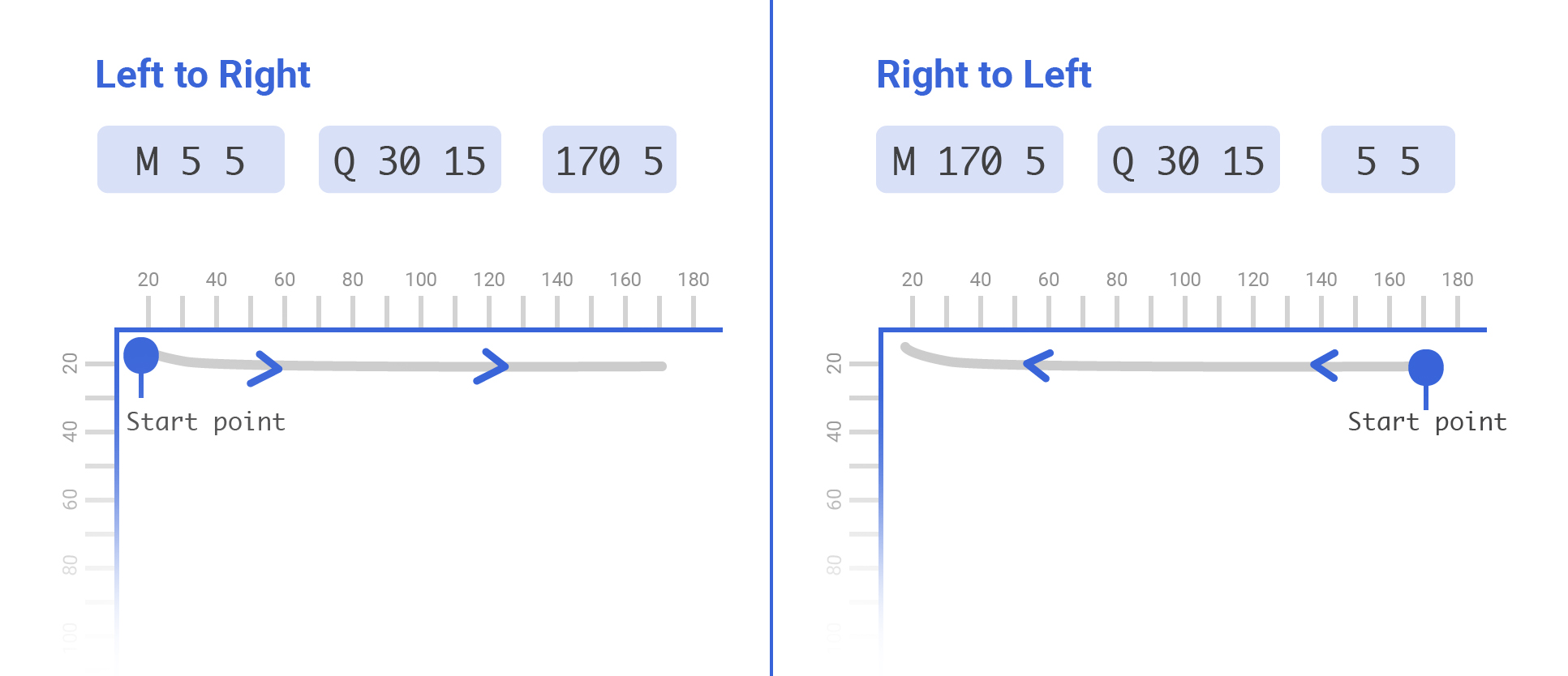
As you see, I swapped the position of the start and end points, this will change the direction of the path, and thus it’s possible to animate it from the direction of our preference.
Here is the function I added to reverse the path for me:
function reverseMe(path) {
  var pathOperators = path.replace(/[\d,\-\s]+/g, "").split("")
  var pathNums = path
    .replace(/[A-Za-z,]+/g, " ")
    .trim()
    .replace(/\s\s+/g, " ")
    .split(" ")

  return `${pathOperators[0]} ${pathNums[4]} ${pathNums[5]} ${pathOperators[1]} ${pathNums[2]} ${pathNums[3]} ${pathNums[0]} ${pathNums[1]}`
}
RTL animation result:
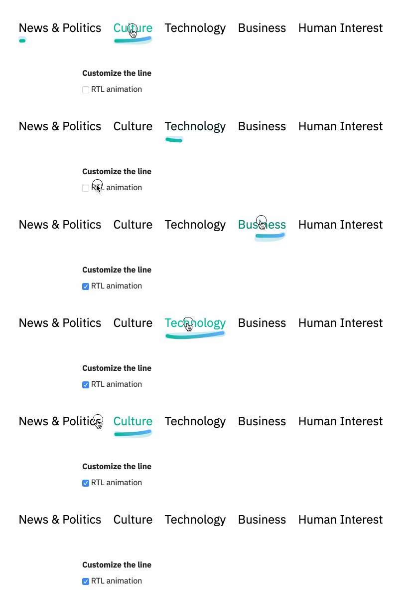
I’ve noticed that when a word is short, the path appears over-bended due to the high value used for the slope.
I thought about making curveYMax value dynamic with respect to the link’s width. If the link was long such as “Human Interest”, the value if curveYMax will be greater. If the link was short such as “Works”, the curveYMax value will be smaller.
Let me show you a visual example:

The highlighted words are short, and thus the path is kinda over-bended. Currently, the curveYMax is hardcoded.
var curveYMax = 20
Instead, I need to make it dynamic by multiplying it with the link width.
var curveYMax = linkWidth * 0.12
The 0.12 is a factor that I added by experimenting. Let’s see how the path will look for short words after that!
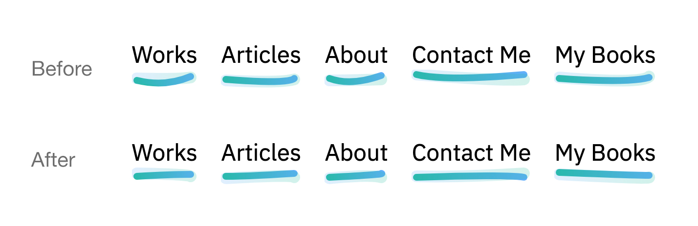
See the Pen Underline.js by Ahmad Shadeed (@shadeed) on CodePen.
To take it furthermore, I’ve worked on a tiny Javascript library that can be used to dynamically create the custom underline effect.
Check it out on Github.
npm i link-underliner
Here is an example of the usage:
var underliner = new Underliner(
  ".underliner a",
  "url(#gradient)",
  "url(#gradient2)",
  7,
  12,
  "round"
)
I hope you found the article useful. Did I miss anything? Please feel free to ping me on @shadeed9.
Thank you for reading.
此内容由惯性聚合(RSS阅读器)自动聚合整理,仅供阅读参考。 原文来自 — 版权归原作者所有。