


I spent years teaching CSS layout on this blog. I put everything I know into The Layout Maestro course: 70+ lessons and 150+ interactive examples that teach you how to think CSS layouts, not just memorize syntax.
When I first learned the basics of HTML & CSS in 2014, building a website header was one of those scary and difficult tasks for me. Flexbox was still new and we were forced to use old methods like float and the clearfix technique. Today, the scene is completely different. Flexbox is widely supported and that opens up a lot of possibilities for us.
Some might argue that it’s easy nowadays to make a website header as we have modern CSS layout techniques. That’s not the case as there are some interesting challenges to tackle. I will try to highlight some of them.
In this article, I will explain how we can use CSS flexbox to successfully build a website header, and show you some of the important tips and tricks. In the end, there will be a project that was made especially for this article. Keep reading till the end as you’re in for a treat!
This article assumes that you have basic knowledge in flexbox. If you’re interested, I wrote an introduction article about flexbox on my blog.
First, I need to make sure that we both are on the same page. A website header is one of the first things that the user sees when visiting a website. Usually, it contains the logo or website name, with the navigation links. Consider the following figure:
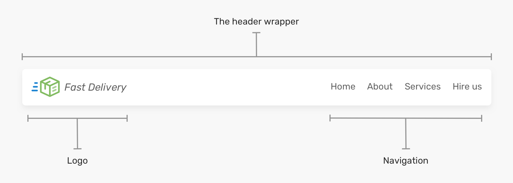
Regardless of the visual design for a header, the key elements are the logo and navigation.
When flexbox is applied to the header element, it will make all the child items in the same line. Then, all you need is to apply justify-content to distribute the spacing between them.
<header class="site-header">
  <a href="#" class="brand">Brand</a>
  <nav class="nav"></nav>
</header>
.site-header {
  display: flex;
  justify-content: space-between;
  align-items: center;
}
It’s easy, right? For such a use-case, yes it is. It can get more complex than that.
The header above doesn’t have an inner wrapper that contains its logo and navigation elements. This can cause problems on large screens.
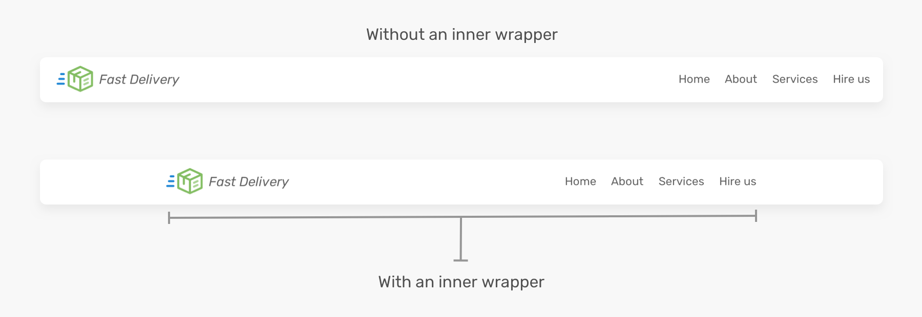
Notice how the first header is too wide because it doesn’t have an inner wrapper. While the second one looks much better. For that reason, the HTML needs to be tweaked as below.
<header class="site-header">
  <div class="wrapper site-header__wrapper">
    <a href="#" class="brand"><img src="logo.svg" alt="brand" /></a>
    <nav class="nav"></nav>
  </div>
</header>
And the flexbox should be moved to the .site-header__wrapper element.
.site-header__wrapper {
  display: flex;
  justify-content: space-between;
  align-items: center;
}
flex-wrapThis will act as a defensive CSS method. When the screen is small, there is a possibility of horizontal scrolling. See the figure below:
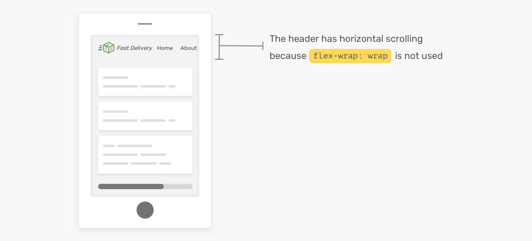
Without flex-wrap: wrap being set, there will be a horizontal scrolling. Make sure to include it!
What I like about using flexbox is that it makes it easy to handle multiple variations of a header design. Based on the previous header design, I explored some options for the header element like adding a button, search input, and changing the order of the child items.
Let’s explore how to implement them with flexbox.
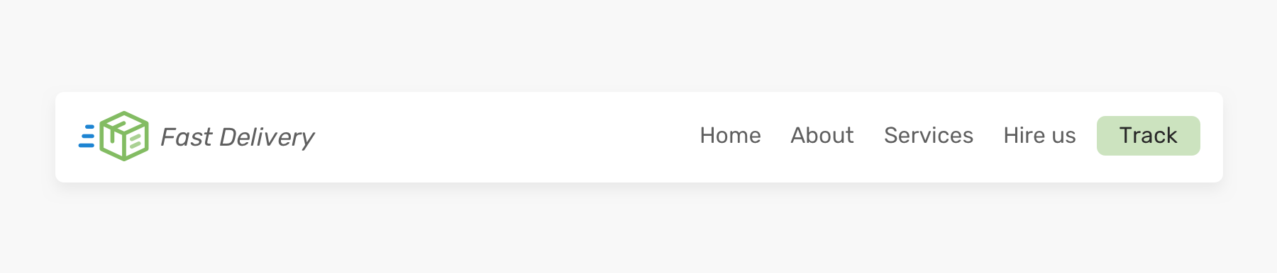
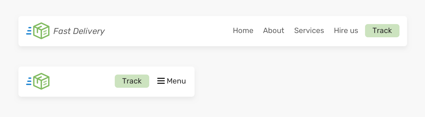
I added a button next to the navigation links. How this should be handled? Should we add it inside the navigation as a link? Or it should be separated from the navigation? I would go for this.
<header class="site-header">
  <div class="wrapper site-header__wrapper">
    <a href="#" class="brand"><img src="logo.svg" alt="brand" /></a>
    <nav class="nav"></nav>
    <a href="/track-shipment" class="button">Track</a>
  </div>
</header>
In that case, the spacing can’t be done with justify-content: space-between. Instead, I will use margin-left: auto for navigation. It will push it and the button to the far right.

Separating the navigation and the track button is useful for mobile, as we will need to keep the button and show a mobile toggle button next to it.
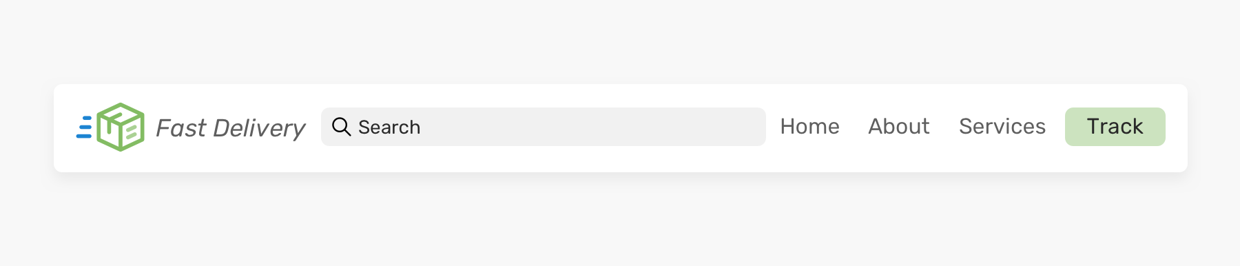
Similar to the first variation, this one has a search input that is taking the remaining available space. With flexbox, this can be achieved by using the flex property.
<header class="site-header">
  <div class="wrapper site-header__wrapper">
    <a href="#" class="brand"><img src="logo.svg" alt="brand" /></a>
    <div class="search"></div>
    <nav class="nav"></nav>
    <a href="/track-shipment" class="button">Track</a>
  </div>
</header>
.search {
  flex: 1;
}
And you are done! Now, the search input will fill the available space between the brand and the navigation. However, this has some limitations. On smaller viewports, the header will look like the below.

The search input width shouldn’t be less than that, as it will be hard to type and see the full text. See the below for some solutions:
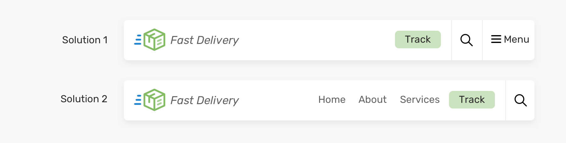
I like the second solution better as it doesn’t hide the navigation very early. Generally speaking, I try to avoid hiding an element if it doesn’t affect the layout.
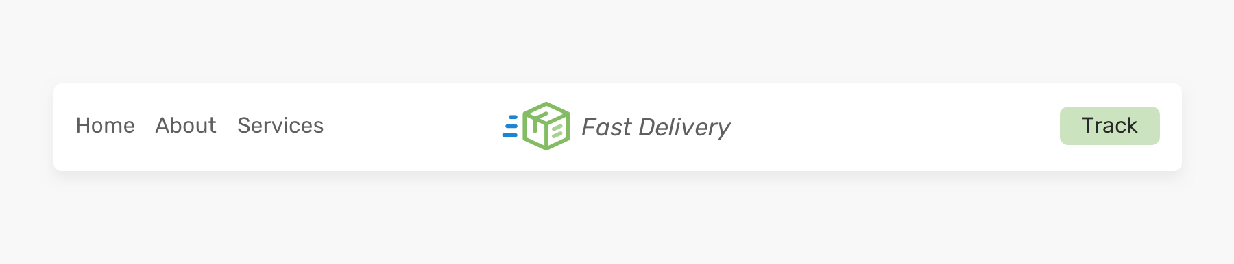
For this one, the HTML markup is the same, but the visual order of the header items is different. How we can achieve that? You might be thinking that using order can solve this, right?
<header class="site-header">
  <div class="wrapper site-header__wrapper">
    <a href="#" class="brand"><img src="logo.svg" alt="brand" /></a>
    <nav class="nav"></nav>
    <a href="/track-shipment" class="button">Track</a>
  </div>
</header>
.site-header {
  display: flex;
  justify-content: space-between;
}

.nav {
  order: -1;
}
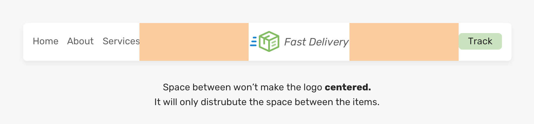
The solution for this is to give each child item a flex: 1. This will distribute the available space between them.
.brand,
.nav,
.button {
  flex: 1;
}
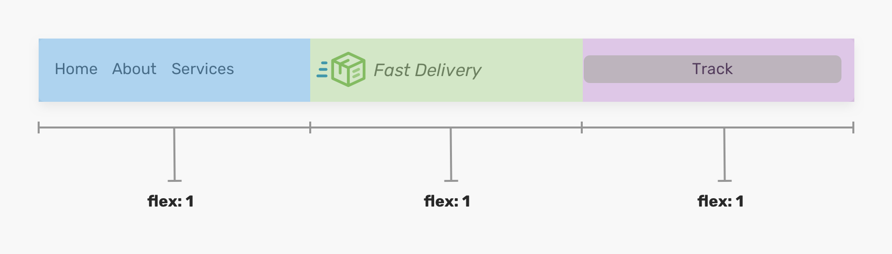
Something weird happened to the button element. It became too big because of flex: 1. The only way to fix this is by wrapping it into another element.
<header class="site-header">
  <div class="wrapper site-header__wrapper">
    <a href="#" class="brand"><img src="logo.svg" alt="brand" /></a>
    <nav class="nav"></nav>
    <div class="button-wrapper">
      <a href="/track-shipment" class="button">Track</a>
    </div>
  </div>
</header>
With that, we can center both the logo and the button below.
.logo {
  text-align: center;
}

/* Please don't mind the naming here. I know this is presentational, but it's for demo purposes. */
.button-wrapper {
  text-align: end; /* end is equalivant to right in LTR languages */
}

Keep in mind that this approach can easily fail in case more navigation links were added. You need to make sure that the number of navigation links won’t exceed a specific limit. Here is an example with the logo being off the center.
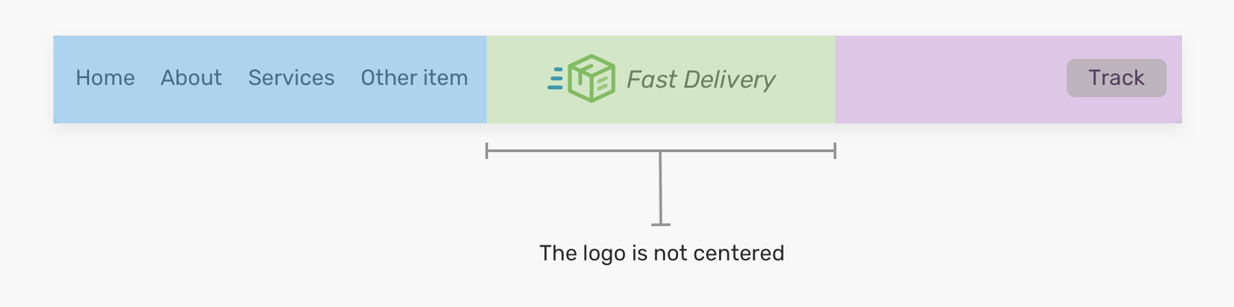
As you see in the figure above, the logo is not centered. So that’s something to keep in mind to avoid such an unexpected issue.
Now that I explored some different header designs and how to build them, let’s move on to some important concepts that can help us while building a header.
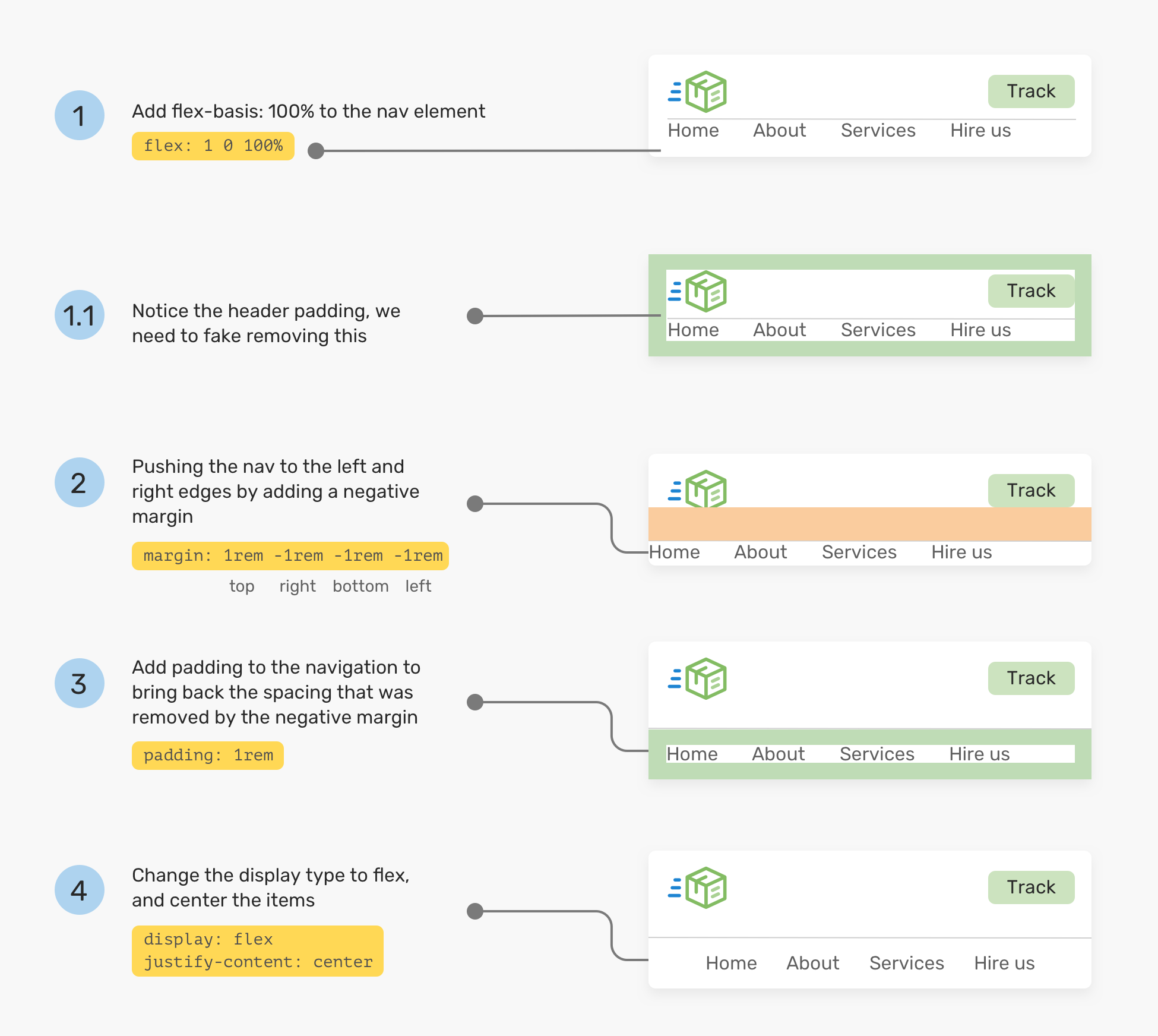
I like to use flex-basis: 100% in case an element needs to take the full width on mobile, such as important navigation that can’t be hidden.

From the mockup above, it might sound straightforward. In reality, it’s not. Usually, a header might have an inner spacing (padding), and when we force an item to take the full width, it won’t happen unless the padding is cleared. However, it’s not practical to remove the padding as it will affect other elements in the design.
Here is a workaround of fixing this:
flex: 1 0 100% to the navigation element.order in case it’s needed. Sometimes, there might be other elements and we want to make sure that the navigation is the last one.margin with a value equal to the header padding. This will make the navigation take the full width.padding to the navigation, this will add some breathing space.justify-content: center to center the navigation items (Not important)..nav {
flex: 1 0 100%; /* [1] */
order: 2; /* [2] */
margin: 1rem -1rem -1rem -1rem; /* [3] */
padding: 1rem; /* [4] */
display: flex; /* [5] */
justify-content: center; /* [5] */
}
And here is a visual walkthrough of the process.
With the flex gap property being supported in Chrome and Firefox, it’s now easier than ever to add spacing between flex items. Consider the following header:

To add the highlighted spacing, all you need is adding gap: 1rem to the flex parent. Without the gap, we will need to the spacing in the old way.
/* Old way */
.brand {
  margin-right: 1rem;
}

.sign-in {
  margin-right: 1rem;
}

/* New way */
.site-header {
  /* Other flexbox styles */
  gap: 1rem;
}
Beware that you need to make a fallback when using the gap property. I wrote a detailed article on that topic.
That’s all for this article. Let me show you the thing I made!
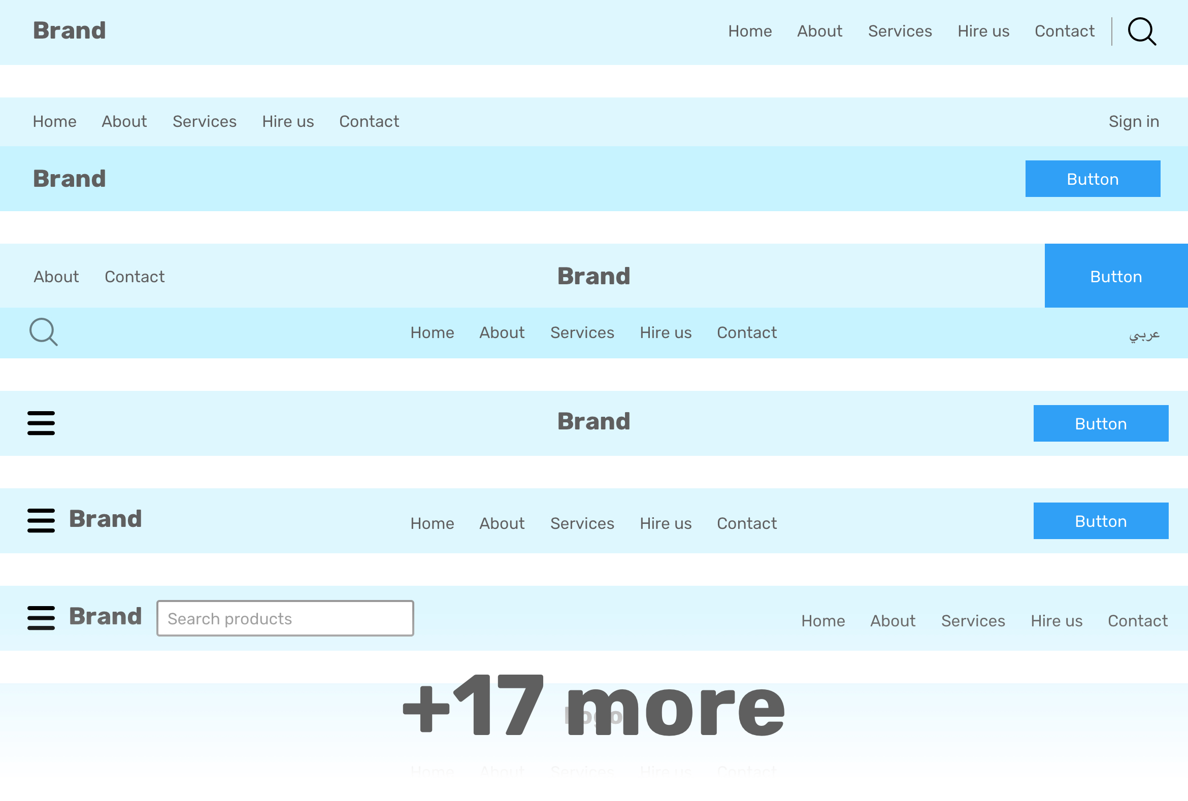
I got the idea of designing and implementing a blueprint website header components. The reason is that I can pick one and use it for a new project pretty quickly. I made 17 headers so far and aiming for more in the coming weeks. While working on them, I tried to focus on the following:
Check them out on headers-css.vercel.app or Github.
I’m excited to let you know that I’m writing an ebook about Debugging CSS.

If you’re interested, head over to debuggingcss.com and subscribe for updates about the book.
此内容由惯性聚合(RSS阅读器)自动聚合整理,仅供阅读参考。 原文来自 — 版权归原作者所有。